What Is Regression Analysis?
A regression analysis is used in statistics to figure out if there is a relationship, or "correlation," between two variables. You can use it for lots of things -- from figuring out whether more rainfall correlates with more crop growth, to how your blog has grown over time.
As long as you have only one independent variable (ex: time), one dependent variable (ex: blog traffic), and a fairly large sample size, regression analyses can tell you a lot about your blog traffic growth.
To determine the relationship between two variables, we'll find the best-fitting line for a set of data. This best-fitting line represents the general direction in which the data is going. To understand how fast your traffic is growing, you need to know the components of a regression analysis.
The Anatomy of a Regression Analysis
There are three different things you need to know about a regression to analyze it properly. Here's what one looks like for reference:

1. Scatter plot
To run a regression analysis, first we need to plot our data points -- and the best way to display the data is through a scatter plot. The X-axis is the independent variable, and the Y-axis is the dependent variable.
2. Best-fit line
We've already covered what a best-fit line actually means, but you should also know which types of lines you should look for. There are three major types of lines you should investigate:
Linear
This is a straight line -- it means you're growing steadily. You're progressing at the same rate over time. Here's what that line looks like:
Exponential
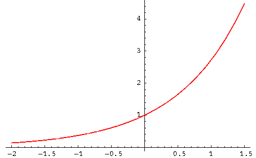
This is a line that curves upward very quickly and doesn't flatten out -- you're progressing at a faster and faster rate over time. Here's what that line looks like:
Logarithmic
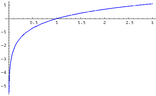
This is a curved line that flattens over time -- basically, you're progressing at a slower and slower rate over time, and potentially reaching a "ceiling" where you wouldn't expect to grow much more. Here's what that line looks like:
There are more types of lines than these, but these are the most important for you to know.
3. R²
R², or R squared, is a number between 0 and 1 that tells you how well the line fits the data set. The closer to 1, the better the line fits the data set -- and to draw correlation conclusions from these graphs, you want to be fairly close to 1. So with an R² of 0.98, you can say that 98% of the variance in Y is explained by the variance in X.
Multiple Regression Analysis
Regression analyses don't all just compare two variables to each other, though. If you have more than one independent variable (or "predictor") affecting your data, you might want to see if each of them are individually influencing the trend you're seeing. To do this, you'd need to run a multiple regression analysis.
A multiple regression analysis helps determine if a set of dependent variables have an influence on something's performance. Think of it like multiple linear regression analyses, where you want to test the individual regression of two or more independent variables on the same dependent variable. For example ...
- In a linear regression analysis, your Y axis = blog traffic and your X axis = time.
- In a multiple regression analysis, Y = blog traffic, X¹ = time, X² = paid advertising, and X³ = news articles.
How to Interpret Multiple Regression Analysis
In the first example above, you'd simply want to see if time has anything to do with the growth of your blog's traffic. In the second example, you'd want to see if time, paid article promotions, and news articles each helped grow your blog traffic.
So, when analyzing blog growth, you'd start with one linear regression test in Excel between Y and X¹. Your Y value might be all traffic excluding traffic from X² (paid promotions) and X³ (news articles). Then, run a regression test to find your R², then another with traffic that includes X², and another with traffic that includes X³.
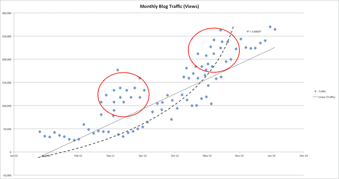
Consider our original regression analysis graph at the beginning of this article. Now see it right above this paragraph, with additional plots. The red circle on the left could be traffic from paid article promotions, whereas the circle on the right could be traffic from news articles.
Either of these independent variables can change the R² value of your trendline, and suddenly there's an exponential regression between your news articles and your total blog traffic.
How to Run Regression Analysis in Excel
- Export your data into Excel.
- Graph the data using the scatter plot function.
- Open your trendline options.
- Choose which type of trendline you'd like to test.
- Find your R² value.
- Record R² back in your spreadsheet.
- Remove your trendline.
- Run steps 4-7 again using new types of trendlines.
- Compare R² values. Whichever is nearest to 1 is the best fit.
To figure out how your traffic is trending, you basically need to run a regression analysis using each of the three lines mentioned above, and then compare their R² values. The one with the highest R² is the best fit for your data.
Warning: You may find that none of them have a high R² or that the highest R² isn't actually that close to 1 -- that means your data doesn't fit any of these lines exceptionally well. In those cases, you should gather more data and then re-run the regression analysis.
Here's how you can run a regression analysis in Excel.
1. Export your data into Excel.
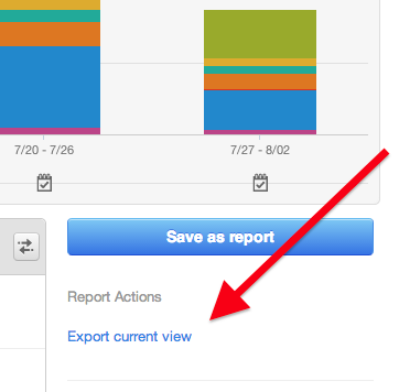
In our example, we'll be loading blog traffic numbers into Excel. (HubSpot customers, you can find this information in your Sources report -- and make sure to select your blog subdomain from the top dropdown before exporting.)
Once you get the export open in Excel, make sure to remove all other information besides the row for each month and the row for traffic. HubSpot customers, you can find all the information you need under the "Visits" tab.
2. Graph the data using the scatter plot function.
Having located your exported file, your data will open in a new Excel spreadsheet. Organize your data the way you want them in each cell. When analyzing blog traffic over time, for example, it makes sense for "Time" to take the X axis and "Traffic" to take the Y axis. So we'll dedicate two separate rows in Excel for these metrics.
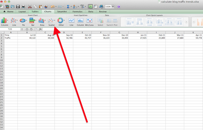
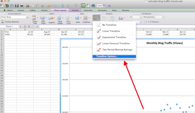
3. Open your trendline options.
In the top navigation, choose 'Chart Layout' > 'Trendline.' This will open a dropdown menu of options for trendline types. These include:
- Linear.
- Exponential.
- Linear Forecast.
- Two Period Moving Average.
You can also select 'Trendline Options,' where you can set additional preferences for the trendline you want to use.
4. Choose which type of trendline you'd like to test.
Under 'Type,' select which line style you want to use in your regression analysis. For our blog traffic test, we'll use linear, as shown in the screenshot below.
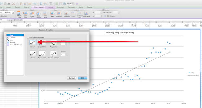
5. Find your R² value.
Remember what R² is? This number between 0 and 1 indicates how much your trend line actually fits the shape of your scatter plot. Select 'Options,' then 'Display R-squared value on Chart.' R² will appear next to your line. After you're done, click 'OK.'

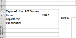
6. Record R² back in your spreadsheet.
In the cells to the left of your graph, record the R² value that was displayed at the end of your scatter plot's trendline.
Plan on running more than one regression analysis, each with different trendlines, then recording each of their R² values in their own cells in your original spreadsheet -- as shown below. This will allow you to determine which type of trendline best explains the shape of your scatter plot. The type of line with the R² closest to the number 1 is your best-fitting trendline.
7. Remove your trendline.
Click on the line, then hit "delete" on your keyboard. Time to see if a different trendline more closely supports your data trend.
8. Run steps 4-7 again using new types of trendlines.
Repeat steps 4 through 7 for exponential and logarithmic lines. The more trendlines for which you find R² values, the more accurate your regression analysis will be. You want to be absolutely sure of the type of trend your data is showing, and stopping after one linear regression analysis is often not enough testing to draw a conclusion from.
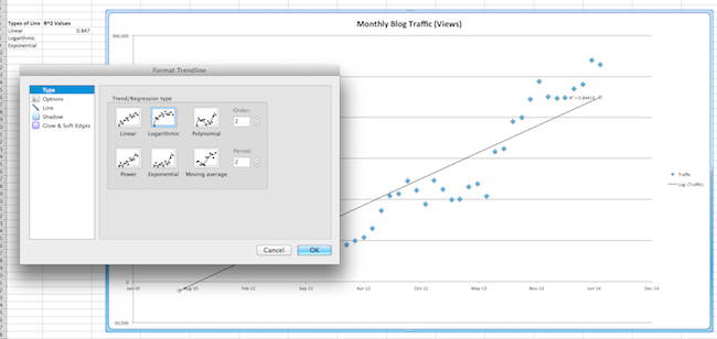
9. Compare R² values. Whichever is nearest to 1 is the best fit.
If you're linear, you're growing at a steady rate. If you're exponential, you're growing at an increasing rate. If you're logarithmic, your growth is slowing.
It's possible that none of them are a great fit -- see the warning above for more information on this.
In our example, exponential regression is the best fit because it has the highest R², at 0.896, and all are relatively close to 1. (Click the image below to enlarge it.) This means the exponential line is the best fit for your blog growth, and since it's increasing exponentially, you have been growing quickly.
That's it, folks! By now, you should have an idea of how fast your blog is growing. Remember, this is only an indication of your past growth. Anything can happen in the future to throw off your traffic.
Image credits: Math is Fun, SOS Math
.png?width=112&height=112&name=Image%20Hackathon%20%E2%80%93%20Vertical%20(69).png)


![Blog - Data Visualization [List-Based]](/hs-fs/hub/53/hub_generated/resized/4268a670-43f2-448f-9acf-036fb4a99a84.png)
![19 Types of Blogs that Make Money in 2025 [+Examples]](https://53.fs1.hubspotusercontent-na1.net/hubfs/53/blogs-Jan-05-2024-05-12-25-3281-PM.png)


![Compounding Blog Posts: The Best Way to Grow Your Blog's Traffic [New Data]](https://53.fs1.hubspotusercontent-na1.net/hubfs/53/00-Blog_Thinkstock_Images/compounding-blog-posts.png)

![12 Ways to Get More Blog Subscribers [Infographic]](https://53.fs1.hubspotusercontent-na1.net/hub/53/file-1564803527-png/Blog-Related_Images/How_To_Get_More_Blog_Subscribers.png)
