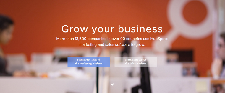
A couple weeks ago, Dan Kaplan (he's not the drunk guy) published a super, ultimate, 2,200-word teardown of our homepage and sent it to us.
As the guy who was recently put in charge of the user experience for HubSpot.com, I immediately dove into his critique. It's not often that you get a deep, thoughtful analysis of your website -- so we jumped at the opportunity to see what Dan thought. His post focused largely on messaging improvements, but Dan's review got me thinking about a larger problem we had.
We needed to work on our homepage.
In fact, just as Dan was writing his blog post, our designers and marketers were having very similar internal conversations. What had started as a simple, beautiful homepage experience had morphed into a complex, confusing, and frankly, kind of boring homepage.
But with so much happening on this page, how should we start improving it? As responsible designers and marketers, we took the most logical approach to solving our problem ...
We Hired a Guy to Have a Few Drinks and Critique Our Site
I'm not kidding. Richard Littauer is a veteran designer and the man behind TheUserIsDrunk.com.
For a small fee, he'll have a few drinks and crank out an entertaining and insightful user test. While this may sound absurd, the concept itself is actually rather simple and arguably valid when used to evaluate a site's user experience. At its core, the test simply seeks to verify whether or not your site is so simple and well designed that a drunk person could use it. And the good news is that it's a relatively easy test to execute, even if you want to skip the drinking part.
So, did HubSpot.com pass the test? See for yourself:
Key Takeaways From Richard's Review
Though Richard's review was entertaining to watch, we were able to obtain some seriously useful information from that test. His analysis uncovered the following three issues with our homepage and overall site:
1) It's not clear what HubSpot is and what we sell.
This is a big one for us and we've seen it come up in tests before, even with sober users. Our all-in-one software has many capabilities, so it's always tough for us to balance detail and simplicity when we're talking about our product. Figuring out the best way to communicate what we offer will be a key focus for us going forward.
2) It's not that "HubSpotty."
Historically, HubSpot's been maniacal about clearly understanding and speaking to our buyer personas -- we have several that the whole company references daily.
But on our homepage, this clear, friendly messaging doesn't carry over. The copy seems complicated and vague, all the while failing to convey that warm "HubSpotty" feeling that our customers get when working with us. Even though we're trying to appeal to a wide, diverse audience, we could stand to simplify our messaging.
So when we'll be brainstorming homepage copy and positioning in the future, we'll work to inject that "HubSpotty" emotion.
3) Our landing page design needs some work, too.
One of things we hear most often is how long our forms are -- but it's a fine line. We want to make it easy for people to fill out the form, but we also want to send relevant, detailed information on to our Sales team so that they can they can best help our prospects and customers. The way we've typically solved this is by using the HubSpot's Content Hub, but we will definitely look into other ways of balancing form length with information needed for Sales.
3 Ways to Improve the User Experience of Your Site
Thinking your site could use a similar overhaul?
If you'd like to make changes based on user experience, there's just one main concept you need to keep in mind: Always focus on the wants and needs of your user. Don't let your CEO, CMO, or Junior Visual Designer dictate the design or messaging. Turn to your users and ask them what they want. Here are a few simple ways to do just that:
1) Gather some qualitative feedback.
Start by user testing your site. You could use a simple and free service like Peek. Interview your customers and ask them what they like about your product, messaging, or online presence. Get to know the human on the other side of the computer by developing empathy within your team.
2) Gather some quantitative feedback.
Notice some issues in your metrics and have a new idea that you would like to test? Run an A/B test for your concept (if you're using the HubSpot software, A/B testing is already built in). You can also use tools like the Behavior Flow in Google Analytics or the Retention Analysis in Mixpanel to understand how visitors are interacting with your site and where potential pain points may exist. Run heat maps and scroll maps on your high impact pages using services like CrazyEgg to see exactly how users are engaging with your on-page elements. All of these tools can help you take a methodical and informed approach to your design and marketing decisions.
3) Pair the data.
Once you have some good qualitative and quantitative data, pair it together to see if there is any overlap. For example, if you notice that users in the user testing sessions complained about a pop-up and your analytics show that the pop-up converts at a rate of 0.01%, it would make sense to reconsider your approach with the pop-up element. Is the offer in the pop-up ineffective? Or do your users just hate pop-ups, no matter what they say? Use those questions to further drive your design and experiments.
Now get out there and put these concepts to good use -- your users will thank you for it.
Website Design


.webp)

![What makes a good website? Here are 16 things I look at [new data]](https://53.fs1.hubspotusercontent-na1.net/hubfs/53/what-makes-a-good-website-1-20250527-1287063.webp)


