I’ve worked with microsites firsthand. I once worked with a software company that ran a strategy to target specific prospects. We had highly personalized content for each target account and a long sales cycle spanning multiple demos.
To keep these target accounts engaged, we decided to compile relevant and personalized content on password-protected microsites. The results were fantastic. We engaged contacts at risk of ghosting. In fact, prospects said that the microsite helped guide important internal conversations.
But, that’s just one example. There are tons of ways you can use microsites, so I’ve rounded up some of my favorites. Let’s dive in.
Table of Contents

HubSpot's Free Website Builder
Create and customize your own business website with an easy drag-and-drop website builder.
- Build a website without any coding skills.
- Pre-built themes and templates.
- Built-in marketing tools and features.
- And more!
What is a microsite?
A microsite is a small, secondary website that is separate to your main brand website. Companies often use them to promote a specific product, service, campaign, or event. Microsites typically use a different domain or subdomain from the main company website and include links back to the main website, but act as a separate entity for the brand.
Microsites can help brands achieve a number of things. As HubSpot Product Manager Alex Girard puts it, “You can use a website to create a digital experience for a number of different moments in the buyer’s journey. It doesn’t have to be just a corporate ‘.com’ website for converting visitors to leads. You can build digital experiences that span the entire customer journey.”
When I make a recommendation to a client to build a microsite, it’s always for a specific purpose, like:
- Launching a specific long-term campaign or initiative.
- Targeting a new audience with very different demographics from their typical customer.
- Promoting an event, whether it’s online or in person.
- Launching a community or branded publication.
However, there are also lots of instances where I would recommend skipping a microsite. For example, a webinar is technically an event but not one that typically requires its own microsite. A landing page would make more sense.
Similarly, a one-off event might not be the best use case for a microsite. But, an annual customer conference would be an ideal candidate for a microsite.
For me, the difference really comes down to your goals and the experience you plan to give customers. Whatever the reason, the goal of a microsite is to engage visitors with a specific message, generate interest, and draw them to your business’s offerings.
Best Microsite Examples
- Website Grader (HubSpot)
- Chrome Music Lab (Google)
- My Creative Type (Adobe)
- The Conversion Code (Chris Smith)
- Future of Car Sharing (Collaborative Fund)
- Blue Heart (Patagonia)
- To the Third Dimension (Emil Villumsen)
- Intel Gaming Access (Intel)
- Life at Home (IKEA)
- I Love Financing Cars (Blinker)
- Out of Darkness (Sunnybrook)
1. Website Grader (HubSpot)
HubSpot Website Grader is a microsite to improve your website, for free. Paste in your site’s URL and your email address, and Website Grader will leverage Google Lighthouse’s automated assessment system to assign a grade to your website.
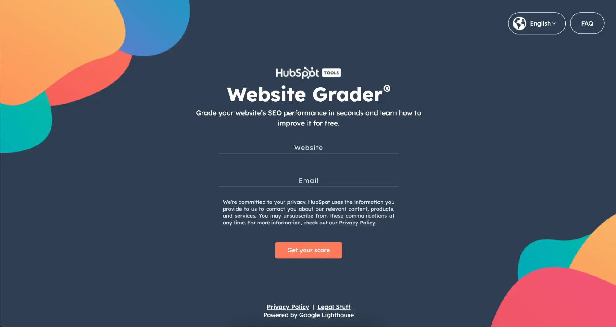
Website Grader calculates your grade based on four key factors — performance (how fast your website is), SEO, mobile, and security — each of which receives its own score. For each factor, Website Grader breaks down your site’s rating and suggests areas for improvement.

Along with its suggestions, Website Grader directs visitors to a HubSpot Academy course on increasing their website grade. If users need more guidance, they can click one of several CTAs on the assessment page to take the course.
I love how this microsite connects directly to HubSpot’s product offering, and provides genuinely useful analysis for users.
2. Chrome Music Lab (Google)
Chrome Music Lab is a microsite built by the Chrome team at Google to make learning music more accessible. It consists of several tools (or “experiments”) that teachers can use with their students.

For example, I had a lot of fun with the Song Maker experiment, which allows you to build melodies simply by clicking a box to record a note.

Chrome Music Lab is totally free to use. It’s on its own domain, and you won’t even see the Google logo anywhere on the site.
But it’s one of my favorite examples of using microsites for long-term brand building. No, it’s not technically selling anything. But I love the subtle association between Google products and creativity and innovation.
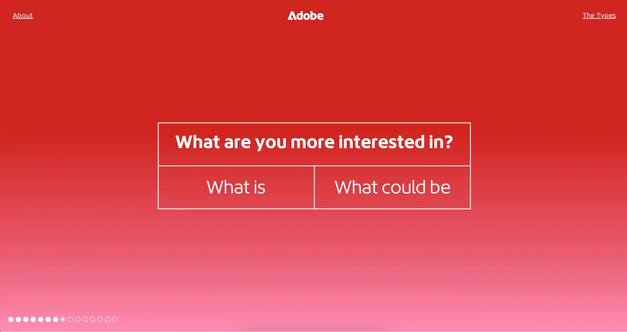
3. My Creative Type (Adobe)
Adobe’s software suite contains more than a couple of industry-standard tools for visual creatives. Beyond the well-renowned tools it makes, a big force behind Adobe’s success is the brand’s ability to align itself with customers through marketing. The microsite My Creative Type is a prime example.

On this microsite, visitors complete a short questionnaire to determine their “creative personality.” The 15 questions assess your thinking, behavior, and outlook, each followed by a playful video metaphor for the answer you give.
At the end, you’re given one of eight creative types (I got “the Alchemist”) and a description of your strengths, potential, motivations, and advice for pursuing creative goals. You can then download your type or share it on social media.
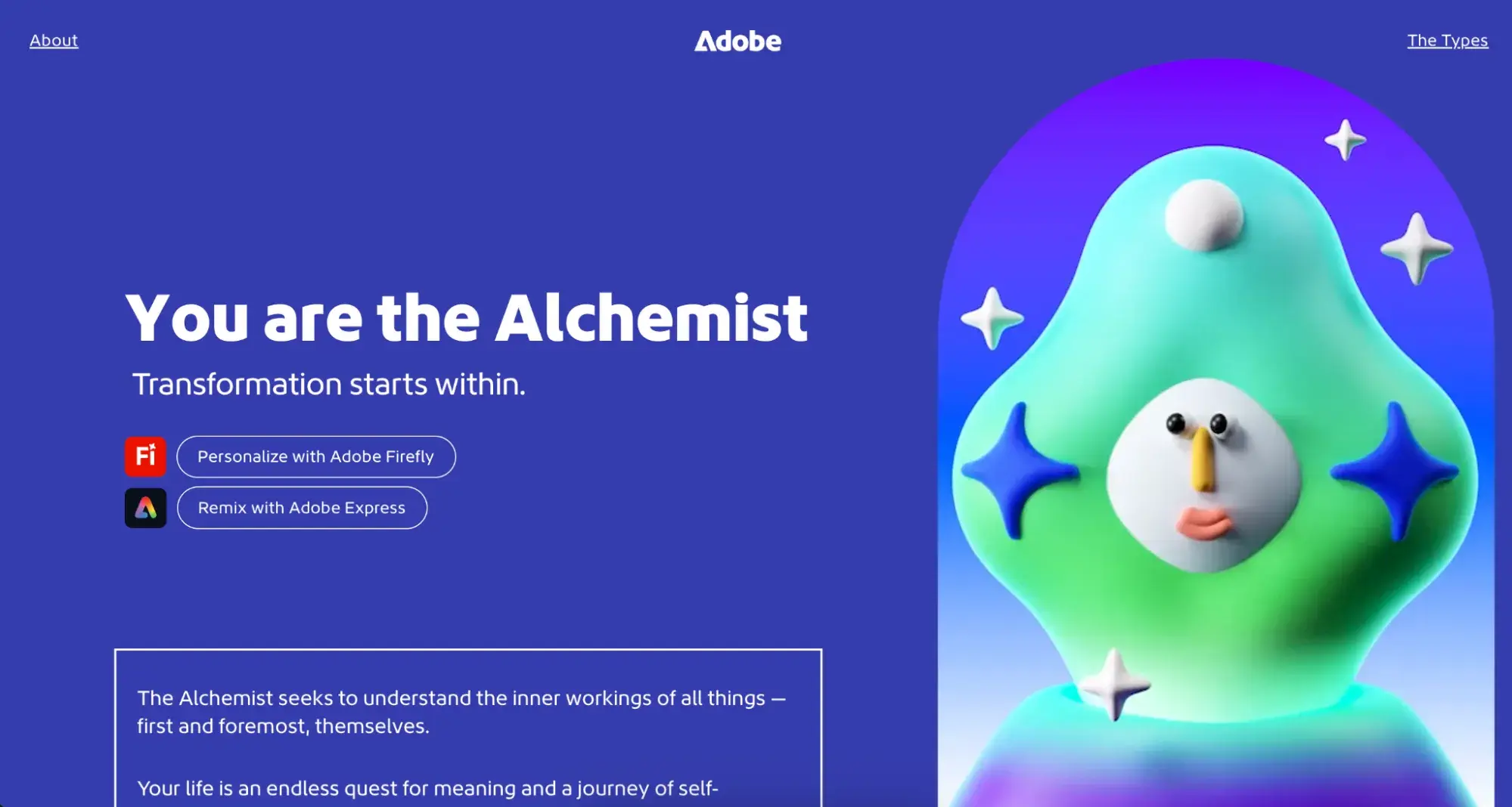
There are a few things I love about this microsite. First off: it’s fun! Adobe takes what is actually a deeply personal exercise and connects its brand to these ideas of creativity. It’s a great example of how to build a user experience by thinking about your brand values first, and how you can translate them to your target audience in a way that’s meaningful for them.
Adobe also takes the opportunity to link back to some of their core products, but the social share options at the end of the quiz also give this microsite experience viral potential.
4. The Conversion Code (Chris Smith)
Chris Smith is a co-founder of Curaytor and a globally recognized marketing expert. When he wrote his best-selling book, The Conversion Code, he built a microsite dedicated specifically to the book.
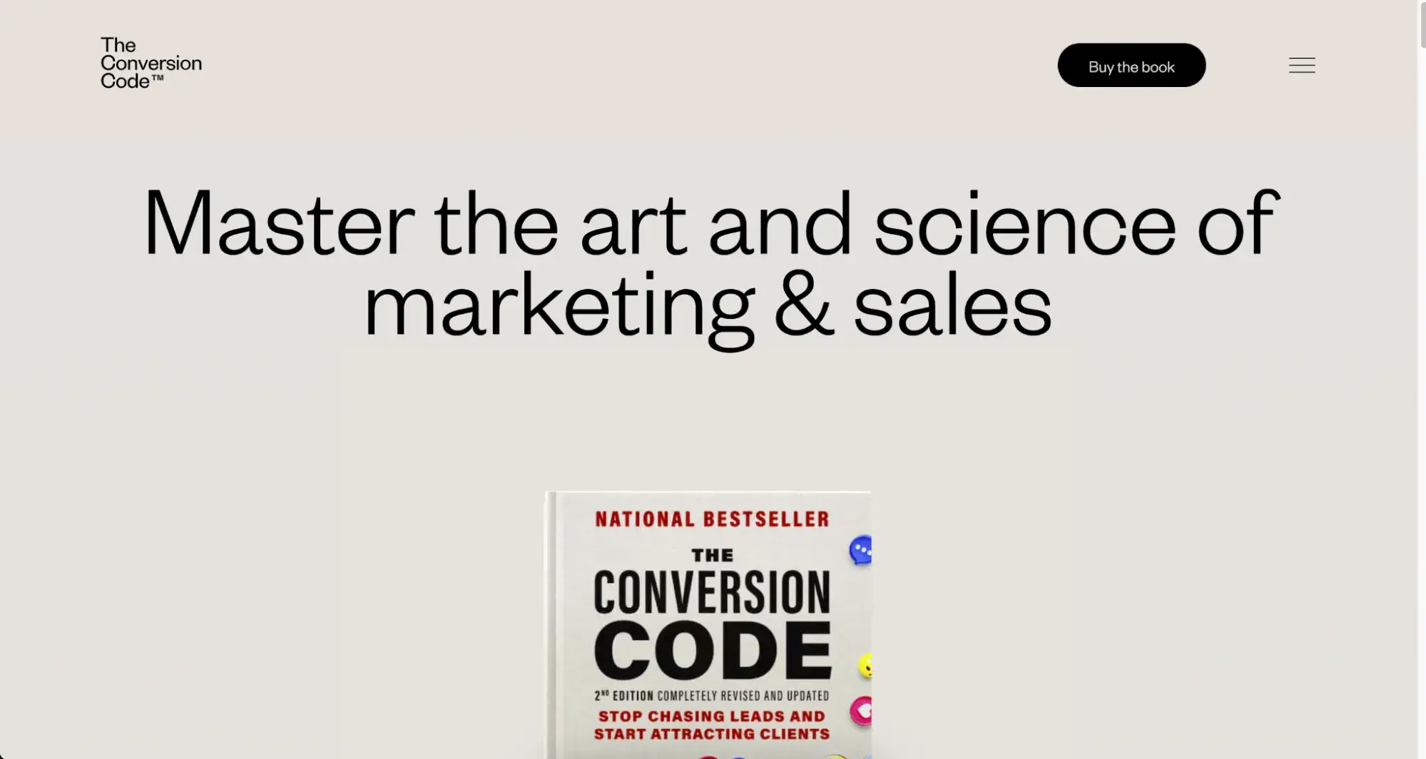
I love this example because it’s all about creating an immersive digital experience as part of selling a product. Lots of authors stick with landing pages or pop-ups on their existing websites to promote a book. But by giving The Conversion Code its own online space, Chris has the space to really showcase the book’s contents and impact.

I like how much emphasis he places on social proof on the microsite to encourage sales, with tons of reviews from other well-known marketers and MarTech founders.

5. Future of Car Sharing (Collaborative Fund)
Collaborative Fund is a venture capital firm based in New York that invests in companies that live “at the intersection of for-profit and for-good.” Their portfolio consists of mission-driven companies that are contributing in areas like health technology, sustainability products, ethical AI, and more.
Future of Car Sharing is a single-page microsite created by Collaborative Fund to promote the idea of car sharing as a way to lower carbon emissions around the world.
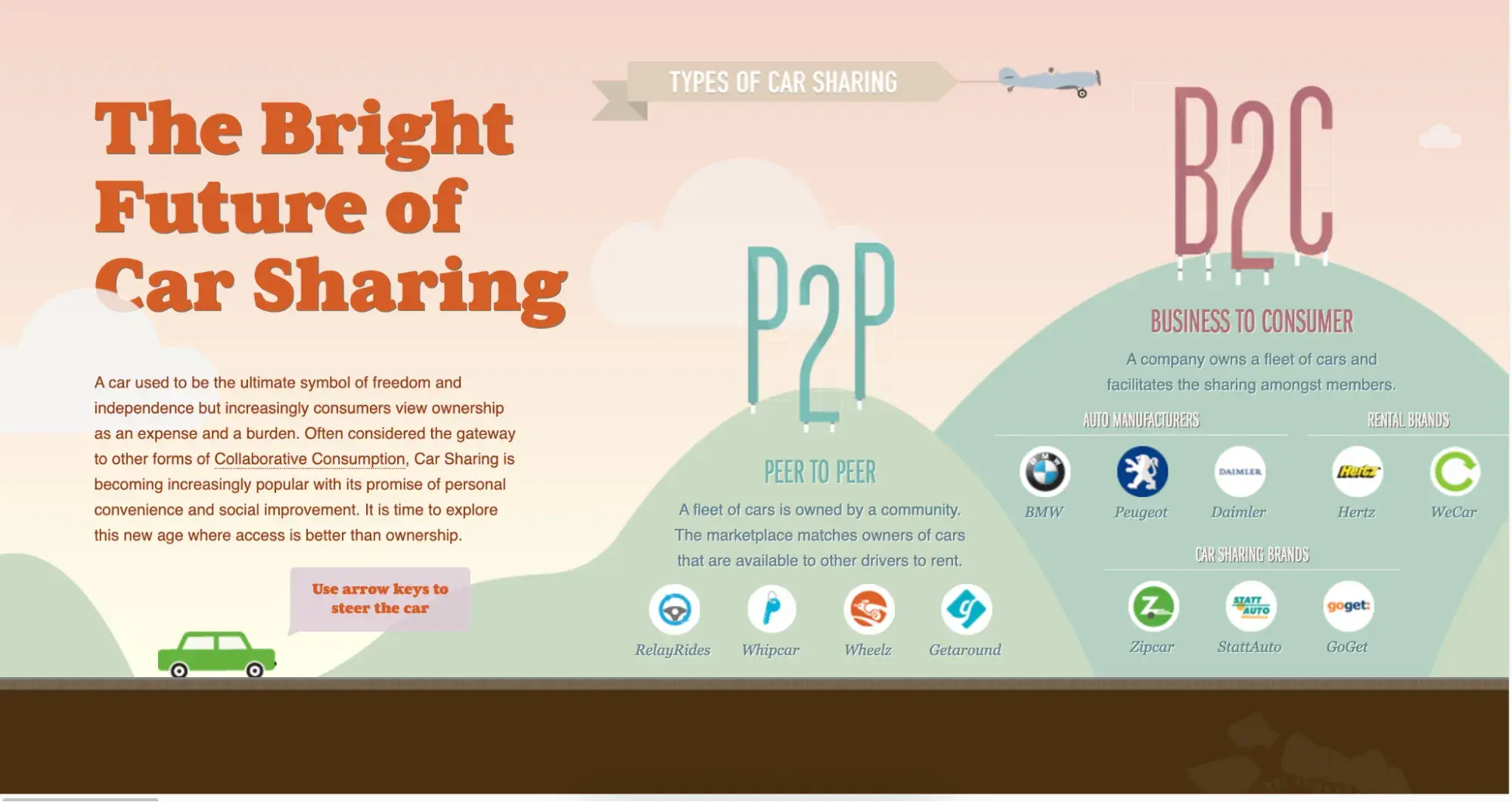
I love the simplicity of both the idea and the execution of Future of Car Sharing. It aligns Collaborative Fund to their core mission, and is a great education piece for consumers to generate awareness for some of the portfolio brands.
I also like the dropdown “Share” call-to-action in the corner of the microsite to encourage users to spread the word via their own social media profiles.
6. Blue Heart (Patagonia)
Patagonia is one of the few exceptional brands that not only offers a top-tier customer experience but goes above and beyond in its advocacy work. In a partnership with Farm League, the company created a microsite to draw attention to environmental harm caused by hydroelectric dams in the Balkan region.
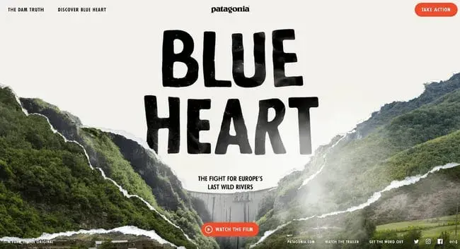
Unlike most other microsites, the Blue Heart website does not include prominent CTAs directing visitors to the main Patagonia website. Instead, it places focus completely on the story being told with various elements: a short film, articles, and an interactive map.
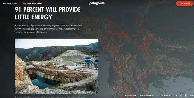
Blue Heart is an engaging, visually rich experience with a mission that goes far beyond generating leads for the business to serve a greater mission.
Many brands engage in social impact initiatives and, in a world where consumers are now shopping more consciously every year, highlighting your company’s commitment to these initiatives is increasingly important.
Microsites like Blue Heart ensure that the work Patagonia does in this area is seen, and understood in full.
HubSpot's Free Website Builder
Create and customize your own business website with an easy drag-and-drop website builder.
- Build a website without any coding skills.
- Pre-built themes and templates.
- Built-in marketing tools and features.
- And more!
7. To the Third Dimension (Emil Villumsen)
To the Third Dimension is a microsite created by designer Emil Villumsen to sell packages of graphics for founders and web designers to incorporate into their websites and branding.

Lots of the PNG packages are free to download, with a small fee for accessing the source files.
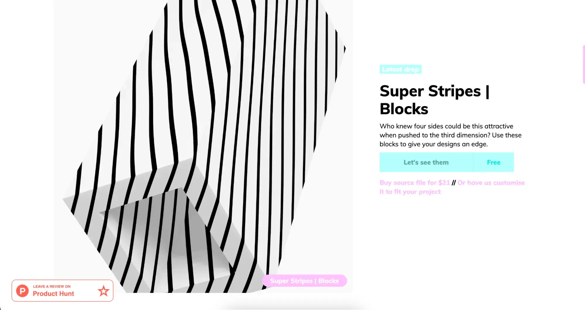
This microsite works so well because there are calls-to-action everywhere to request paid customizations on these designs. So, Emil has turned this microsite into an always-on revenue-generating marketing channel for his core business.
I particularly like the FAQ section, which explains the concept to users in more detail and includes another opportunity to promote Emil’s paid design services.
8. Intel Gaming Access (Intel)
Intel created the microsite Intel Gaming Access to appeal to PC gamers and generate awareness and excitement around new releases.
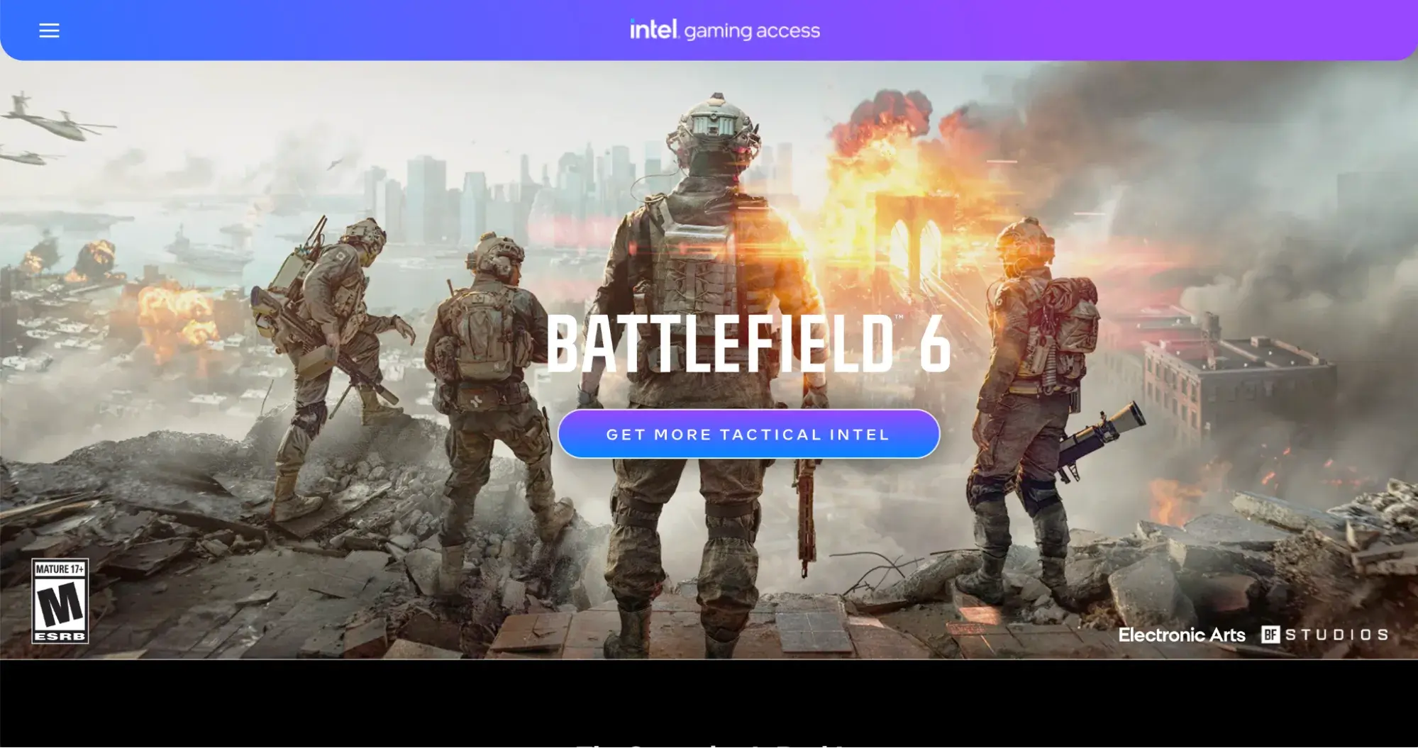
The site is updated regularly to feature new game releases and includes links to deals and giveaways, an online gaming community, and partnerships with game design studios.
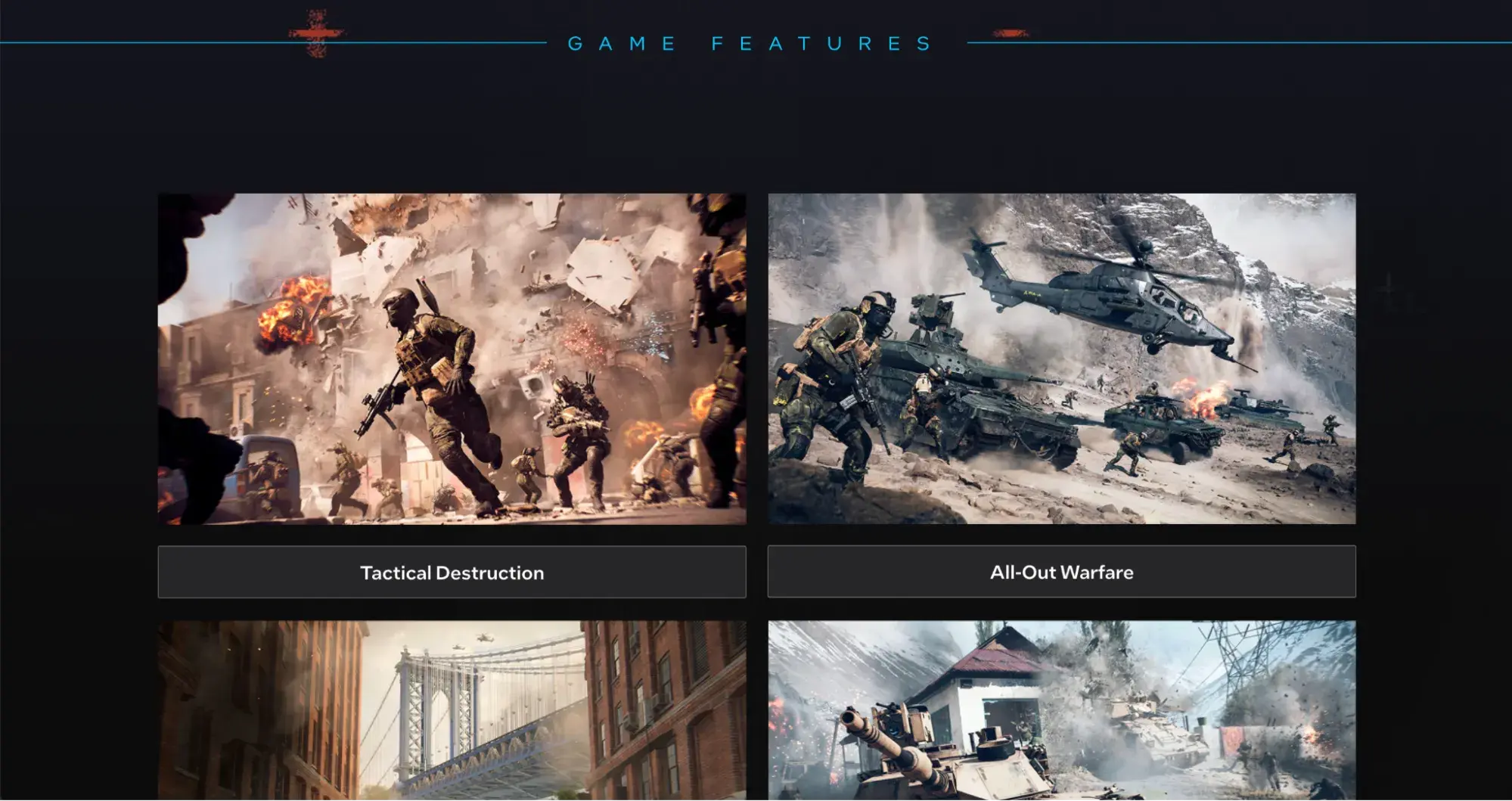
Like a lot of global companies, the main Intel site is very corporate and mostly geared towards investors. Microsites like this allow hardware manufacturers like Intel to speak directly to the end user, and weave their brand into the gaming experience.
9. Life at Home (IKEA)
2020 and 2021 marked a major shift in where and how we spend our time. To shed light on the intersection of mental health and living space, IKEA published a microsite of original research and ways to be happier at home. These first reports focused primarily on the impact of COVID-19. But, the initiative was such a success that IKEA continues to produce these reports annually.
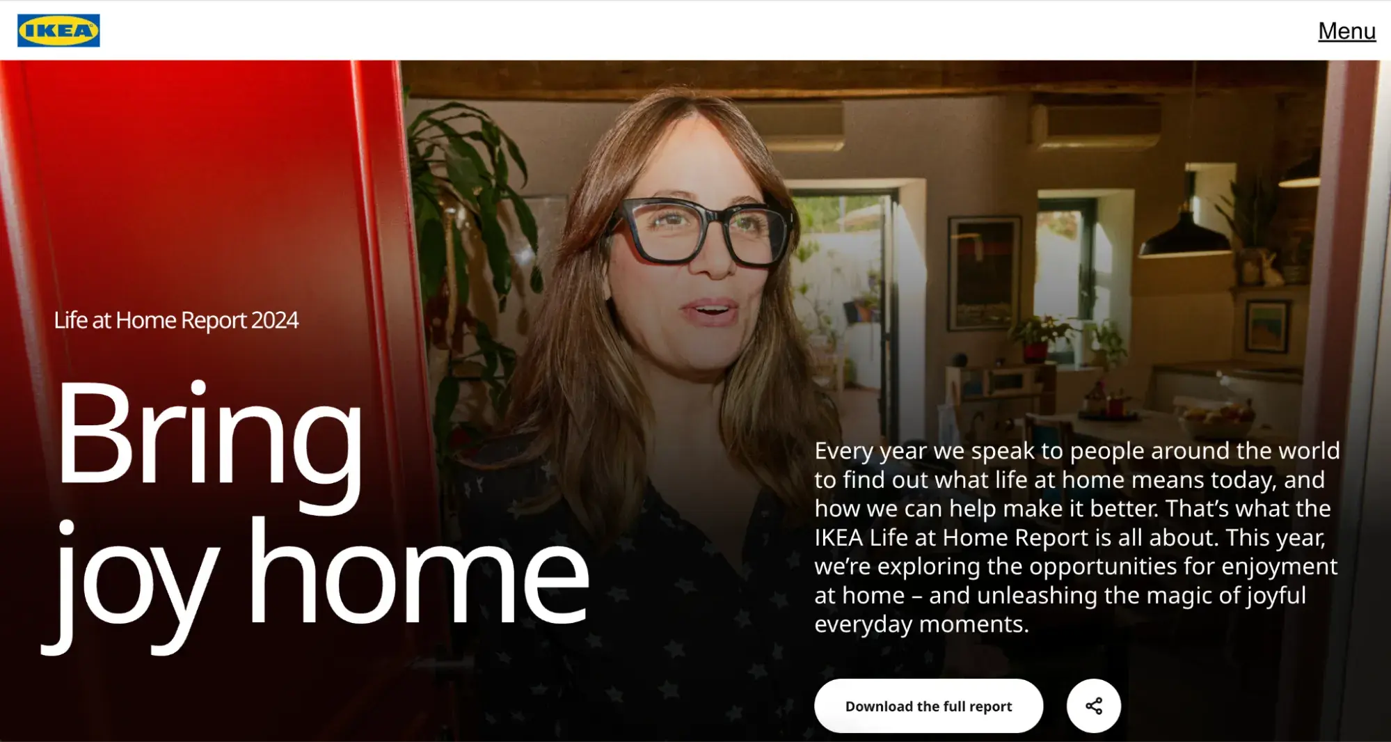
For example, the 2024 report includes findings on home cooking as a key driver of boosting everyday joy in the home.
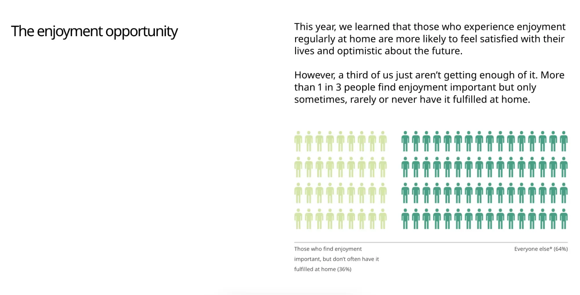
IKEA's microsite expertly connects the importance of safe living spaces and healthy relationships back to its branding, forming positive associations in the minds of visitors and bringing them closer to a purchase. But it does this first and foremost by engaging in a genuinely useful and impactful initiative.
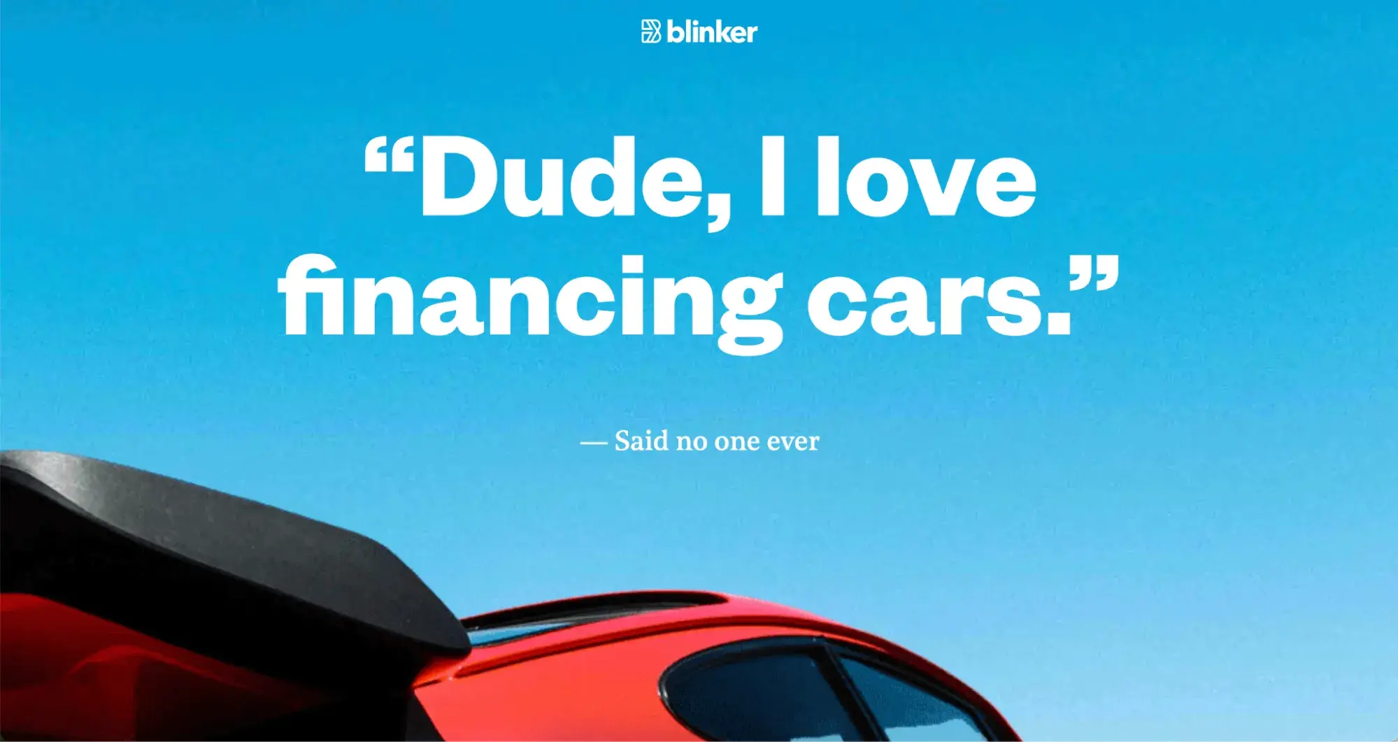
10. I Love Financing Cars (Blinker)
Blinker provides software to manage the financing of car purchases. The main Blinker website is geared towards marketplaces, fleet management, and lenders. So, they built the I Love Financing Cars microsite to explain their app to a completely different audience segment: the end users.
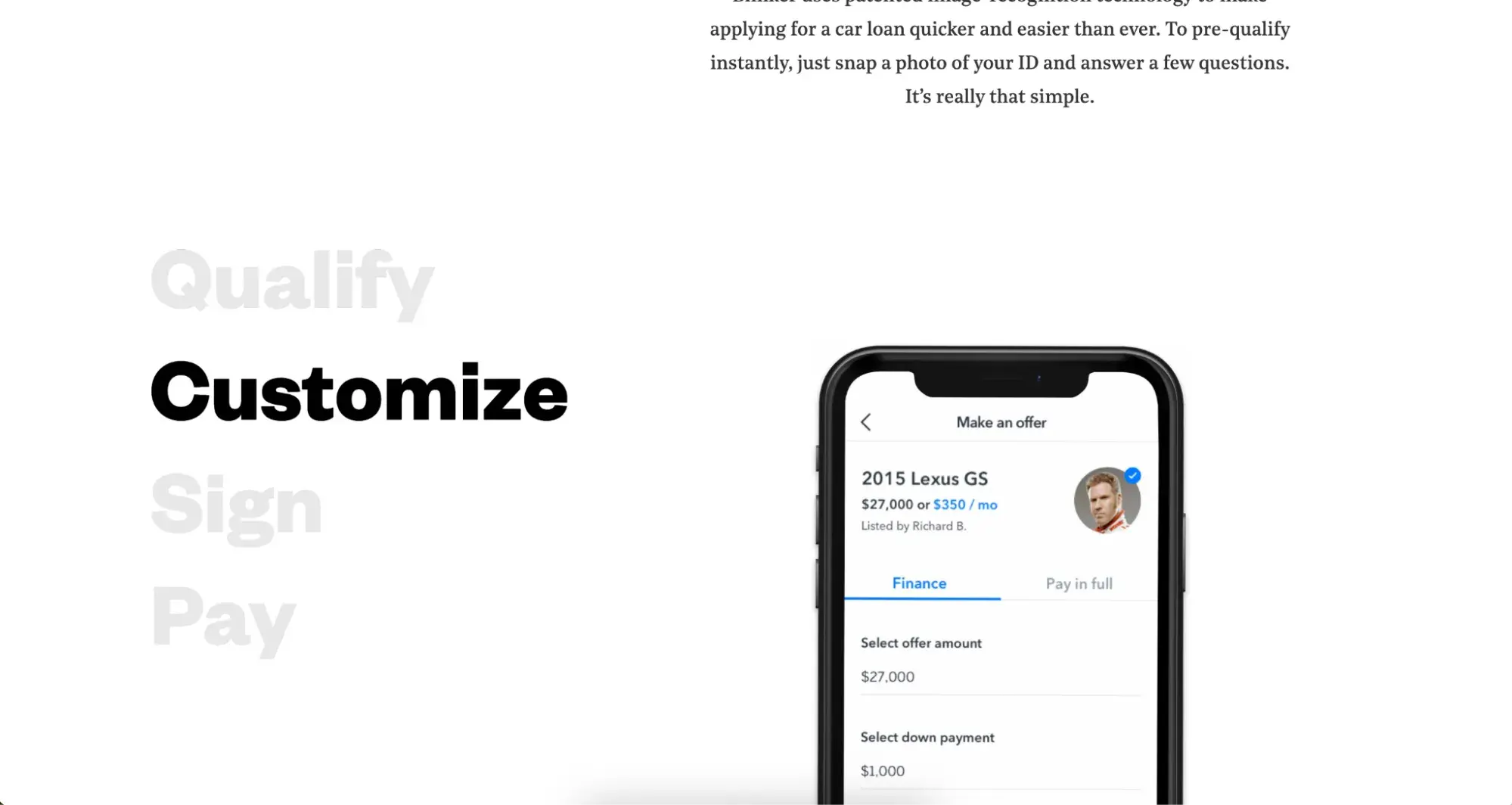
The microsite explains what Blinker is and how the app works for people who want to pre-qualify and apply for a car loan.
When I scroll down through the microsite, scroll effects and detailed images give me a step-by-step explanation of how it all works.
I’ve worked with a few tech companies that face this same challenge. Explaining the product and its benefits to both the companies that buy it, and the consumers who use it can create a messy and confusing user experience on the main website.
A microsite like this is the perfect way to provide completely separate user journeys and ensure the product offering is clear.
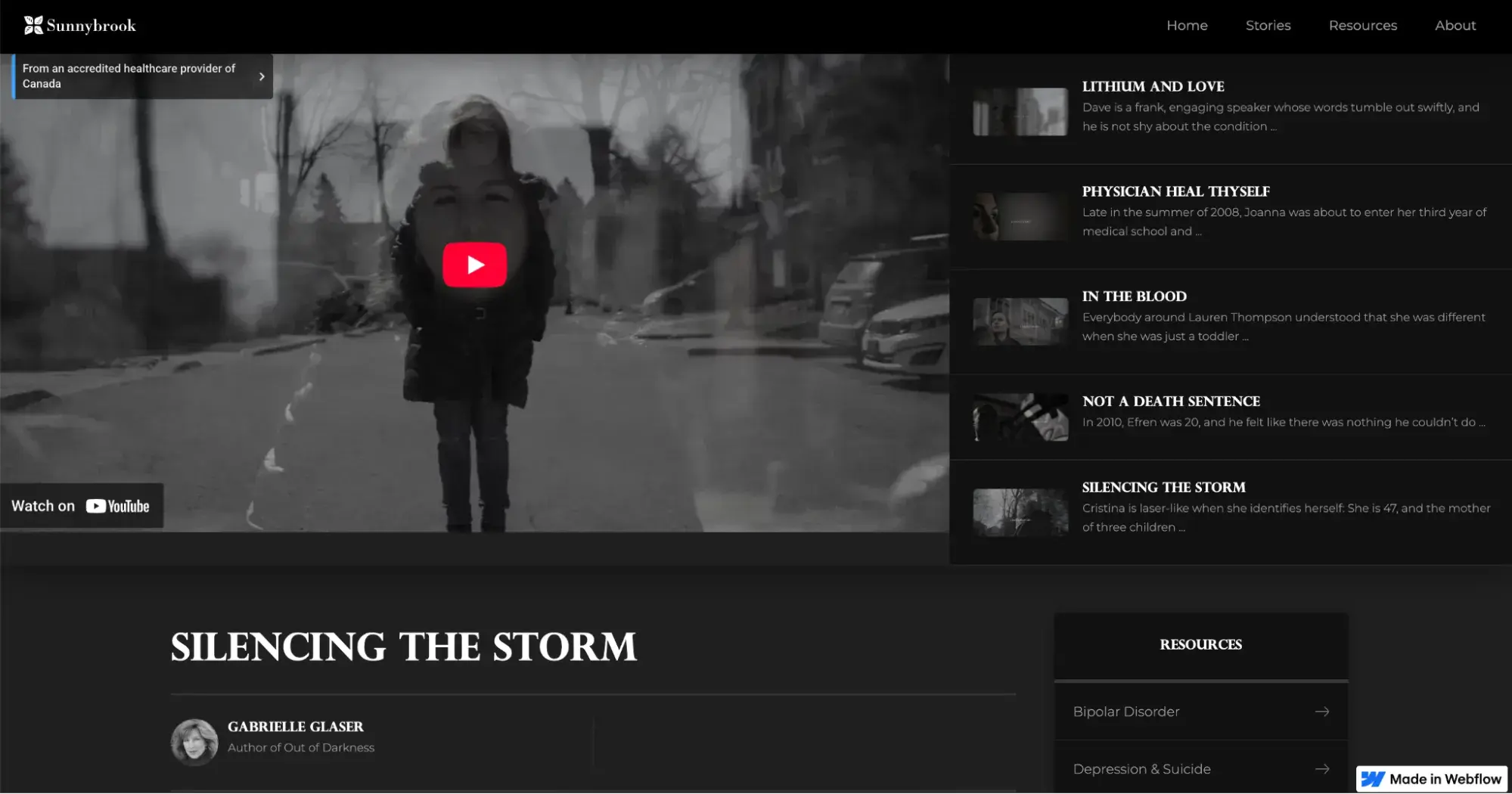
11. Out of Darkness (Sunnybrook)
Sunnybrook Health Sciences Centre is a Canadian psychiatric hospital and trauma center. The team created the Out of Darkness microsite to highlight stories from patients suffering from bipolar disorder and provide resources to generate awareness of the condition and treatment options.

The hub contains detailed accounts from five patients, combining written accounts with video interviews to create an immersive experience around the narratives.
I love the idea behind this project, and I think a microsite is the perfect home for it. The Sunnybrook website contains a ton of information around the clinics, foundation, and more. If the stories were hosted there, they might be lost in the noise.
But, providing a dedicated portal for the project means it can take on its own branding and creative direction for a bigger impact. I like that the microsite also continuously links back to Sunnybrook’s main website for those who might access Out of Darkness and want to seek further help and resources.
Microsite vs. Website
A website is your company’s main digital home. It contains all the information anyone would want to find about your brand, products, services, and story. A microsite is a separate location altogether, often with its own branding. The difference between the two really comes down to purpose.
I like to think of it like this: your website is like your main brick-and-mortar store in the “real” world. And a microsite is like a pop-up shop. You might use it to promote a new product or host an event, for example.
As Girard explains, microsites are “smaller websites, separate from a company’s corporate website, that enable marketers to quickly build content for and report on the success of a specific initiative.”
This initiative could be a campaign, a product launch, an event, or another way to draw in current and potential customers. Still, all microsites are usually focused on brand awareness or conversion. They also typically occupy a domain or subdomain different from the primary website.
Another key difference is (usually) size, hence the name “micro” site. Since microsites focus on one specific purpose or initiative, they tend to be much smaller in size than a main website. As you can see from some of the examples I put together in this article, they can even be as small as a single webpage.
Microsite vs. Landing Page
Microsites and landing pages are similar in that they focus on a single goal, product, event, or initiative. However, a landing page is a single page on your existing website. Microsites, on the other hand, are hosted in an entirely separate location through a subdomain or a completely different domain from your brand.
Landing pages also focus heavily on conversions. I build them when I want someone to download an asset, buy a product, or sign up for something like an event or course. But, a microsite can be built purely for awareness purposes or sharing resources. They aim to build positive connections between people and brands, so visitors are more likely to convert later in their journey.
Microsites: Small But Mighty
Sometimes, you can have a brainwave for a really original idea to build brand awareness or positive user sentiment. But your website just isn’t quite the right place to host it. Sometimes, you need more than just a landing page. This is why I love microsites. It’s like carving out a unique space online to get really creative with your brand and build an experience your customers will love.
So, take inspiration from these examples. Even a single-page microsite, when built with purpose and the end user in mind, can become a new gateway for brand discovery and customer engagement.
Editor's note: This post was originally published in March 2016 and has been updated for comprehensiveness.
HubSpot's Free Website Builder
Create and customize your own business website with an easy drag-and-drop website builder.
- Build a website without any coding skills.
- Pre-built themes and templates.
- Built-in marketing tools and features.
- And more!
.webp)
![How to create a landing page with high ROI [+ expert and data-backed tips]](https://53.fs1.hubspotusercontent-na1.net/hubfs/53/%5BUse-2.webp)
![Signs it's time to redesign your website [+ 15 steps to follow]](https://53.fs1.hubspotusercontent-na1.net/hubfs/53/phaseswebsiteredesign%20copy.png)
%20(7).webp)

![How to start a blog (the right way) and write posts people actually want to read [+ free templates]](https://53.fs1.hubspotusercontent-na1.net/hubfs/53/how-to-start-a-blog-2.webp)
![What is a lead magnet? 20 lead magnet ideas and examples [+ step-by-step]](https://53.fs1.hubspotusercontent-na1.net/hubfs/53/lead%20magnet%20represented%20by%20a%20magnet.webp)