.png?width=112&height=112&name=Image%20Hackathon%20%E2%80%93%20Vertical%20(50).png)
Don’t get me wrong, I’m a huge dog lover and the photos were cute. But neither the business nor the brand had anything even remotely to do with dogs, pets, or animals in any way. It was a professional services firm serving a local market.
I get what they were trying to do from a brand perspective: “How do we make this corporate website less boring and corporate?” I’m a huge advocate of this in general, but this was maybe an example of taking it too far.
So, how can you design and build a corporate website that combines personality to make you stand out, while still building trust and credibility? I rounded up a few of my favorite examples to show you.
Table of Contents
.png)
Free Website Design Inspiration Guide
77 Brilliant Examples of Homepages, Blogs & Landing Pages to Inspire You
- Agency Pages
- Ecommerce Pages
- Tech Company Pages
- And More!
Download Free
All fields are required.
Form not available
Corporate Website Designs I Love
I don’t have a set of rigid criteria for building a “good” corporate website. A lot of it comes down to your brand story and culture, and what you want to get across to your target audience.
Some companies prefer to focus on trust and professionalism, and that’s often a totally valid choice. If I visited my accountant’s website and it was full of quirky copy and puns, I might think twice. Other brands like to inject a little more flair, and if you’re competing in a saturated local market, that can be an important differentiator.
Regardless of which direction you want to take, here are a few of my favorite examples of corporate websites to give you some inspiration.
And if you want to get started building your own corporate site, use HubSpot’s Free Website Builder to craft a website with free themes, templates, and more.
Let’s dive in.
1. HubSpot
HubSpot’s customer platform suite offers a wide range of products, from CRM and marketing automation capabilities to sales and customer service tools.
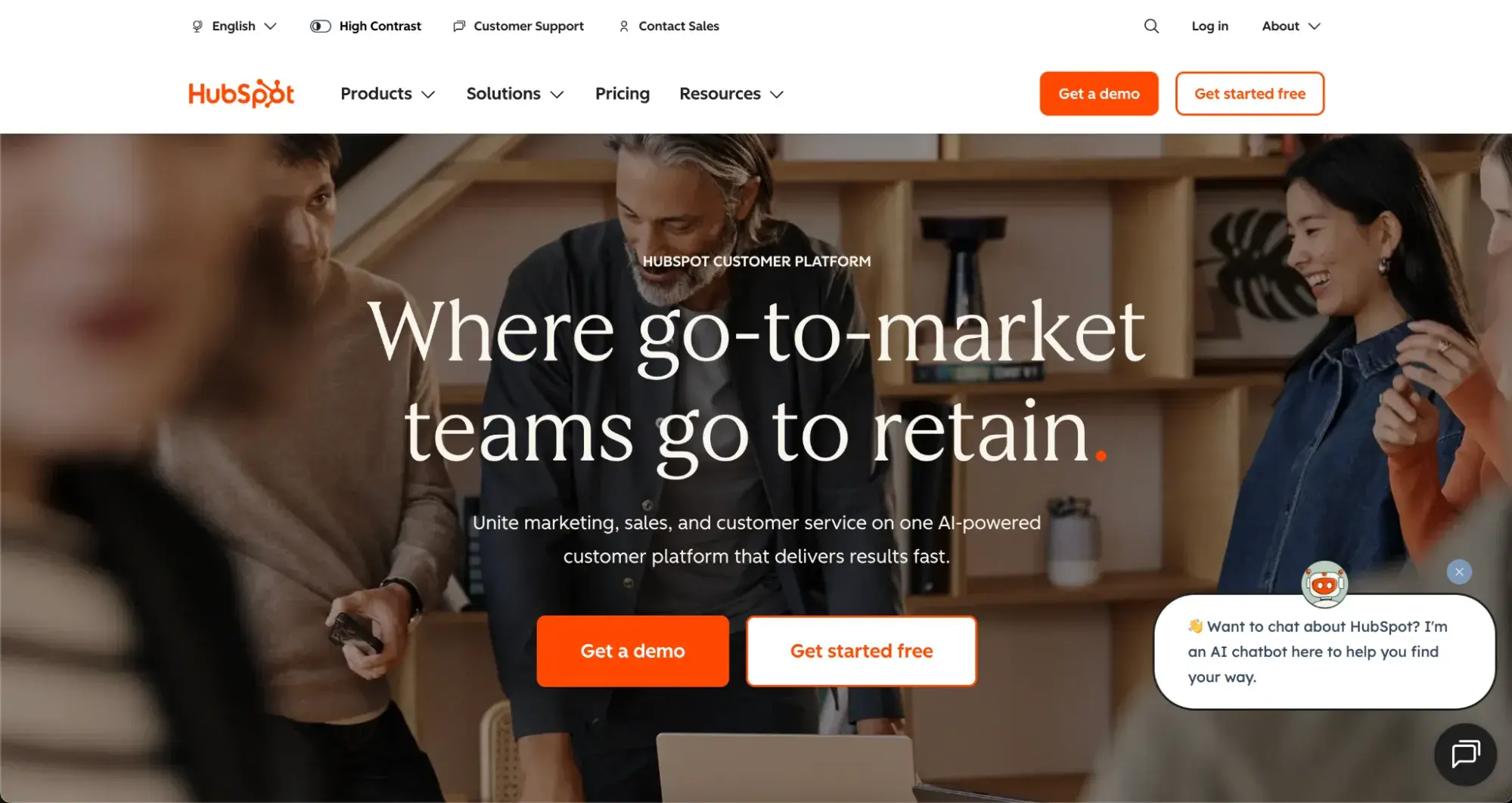
What I like: The copy on the HubSpot website ensures its message speaks to the multitude of teams and audiences it serves. Many teams and people contribute to a go-to-market strategy, and HubSpot provides many tools to help them do it. The combination of imagery in the hero with clean whitespace throughout the rest of the site also really makes the call-to-action (CTA) buttons pop to drive conversions.
2. Bikebear
Bikebear is a creative agency, providing brand design, social media, and other digital marketing services for other businesses. Their website is full of ways to showcase the creative nature of their work and the fun-filled spirit of their brand.

What I like: Even though Bikebear goes pretty full out with injecting some personality into the site (note the bear puns throughout the copy), they don’t overdo it. I can still find everything I need to know about their brand and services, and reach out to get started with my project when I’m ready.
3. Blavity Inc.
Blavity is a media and publishing company, helping brands reach Black and multicultural audiences through their owned ad network and in-house ad technology.
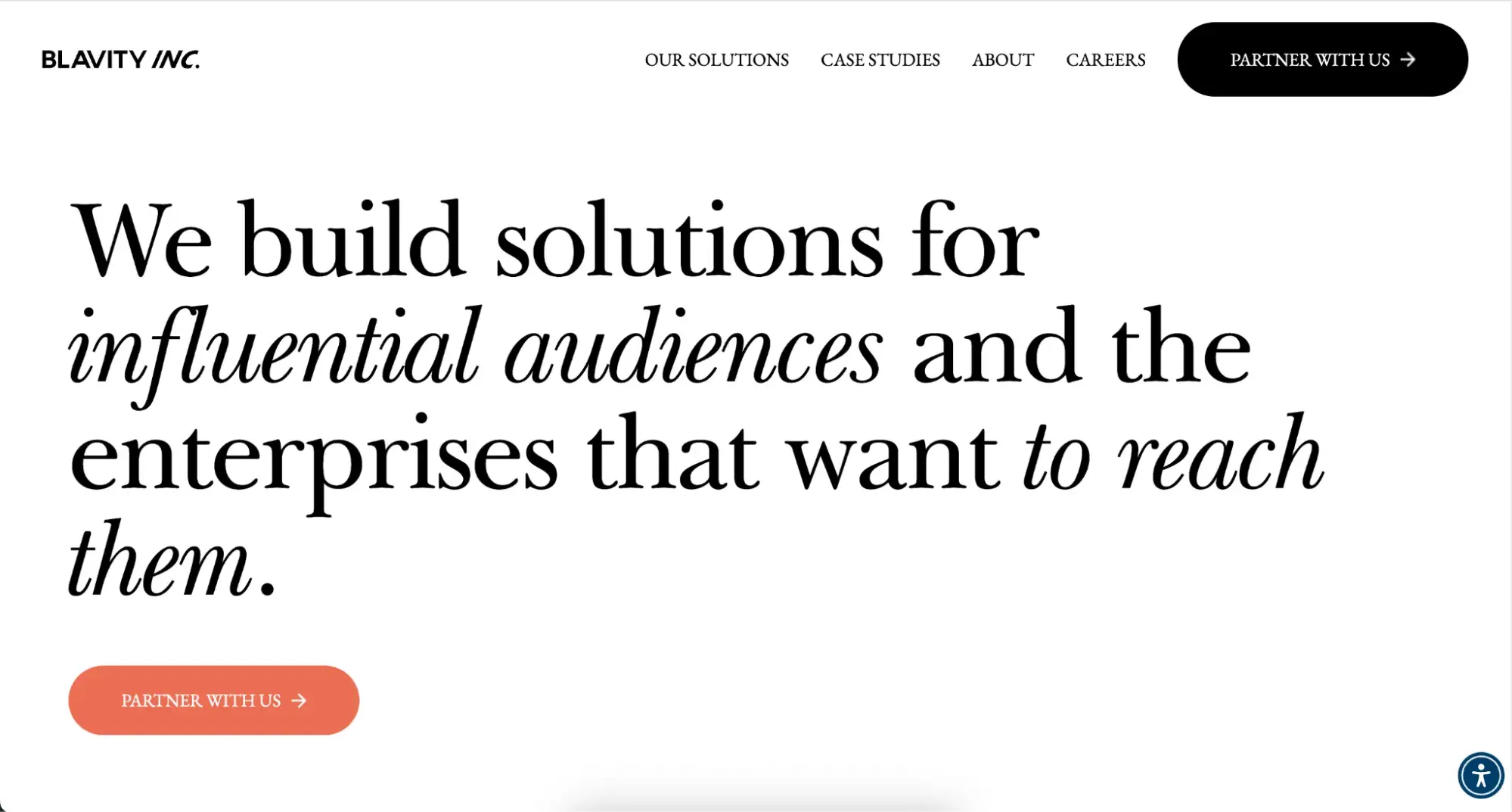
What I like: The Blavity website is clear and simple, with great use of whitespace and accent colors on their CTA buttons and imagery. They also have a built-in accessibility widget so users of all abilities can access and navigate their site.
4. Will Ventures
As a venture capital firm, I expected Will Ventures website to be fairly standard from a “corporate” perspective. But it’s a nice surprise to see inventive use of imagery and a more dramatic design choice. They keep it very simple in terms of copy, focusing on interesting imagery and a scroll effect to build interest as you explore the site.
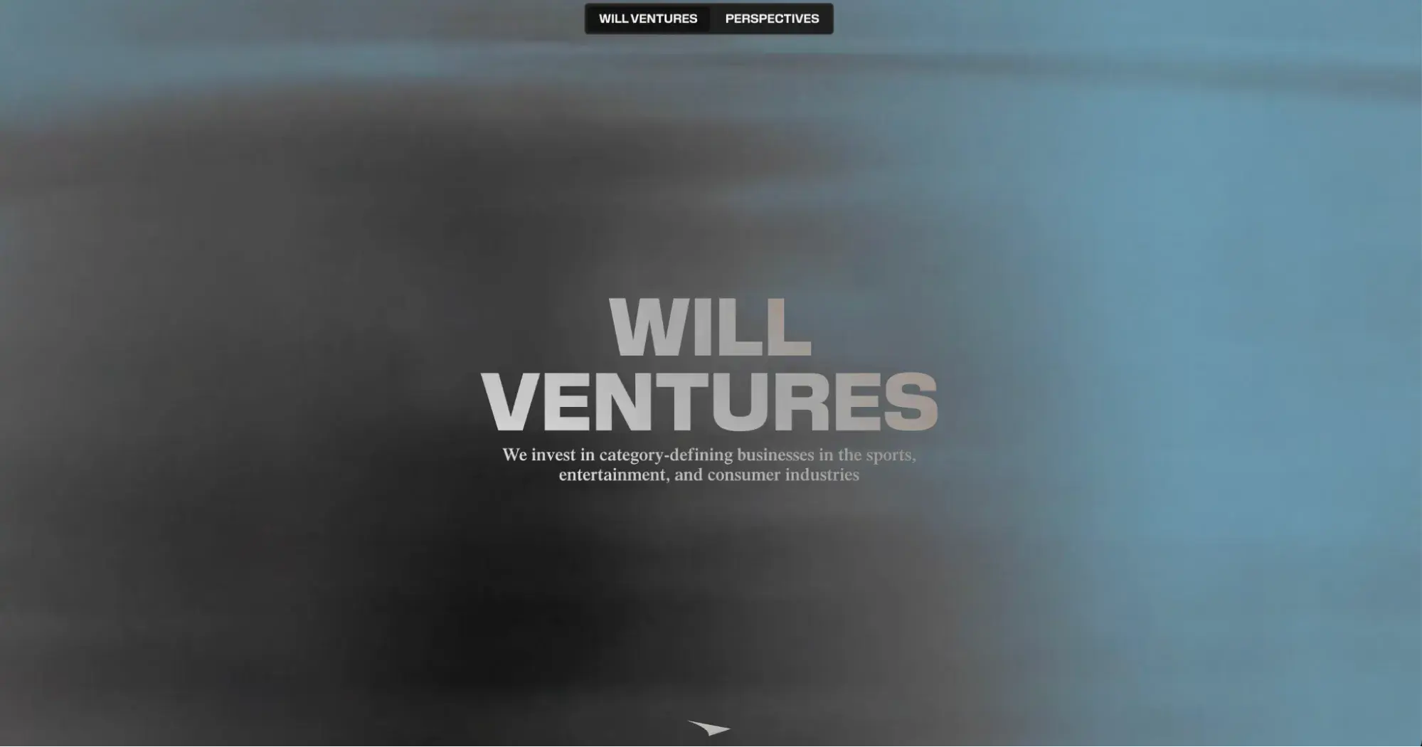
What I like: I love the use of background motion and video in the homepage hero. It complements the site design and messaging without overwhelming it.
5. Vaayu
Vaayu is a software tool for measuring a business’s carbon footprint in real-time. The site uses lots of motion and animation as you load the homepage, and encourages you to keep scrolling to find out more.
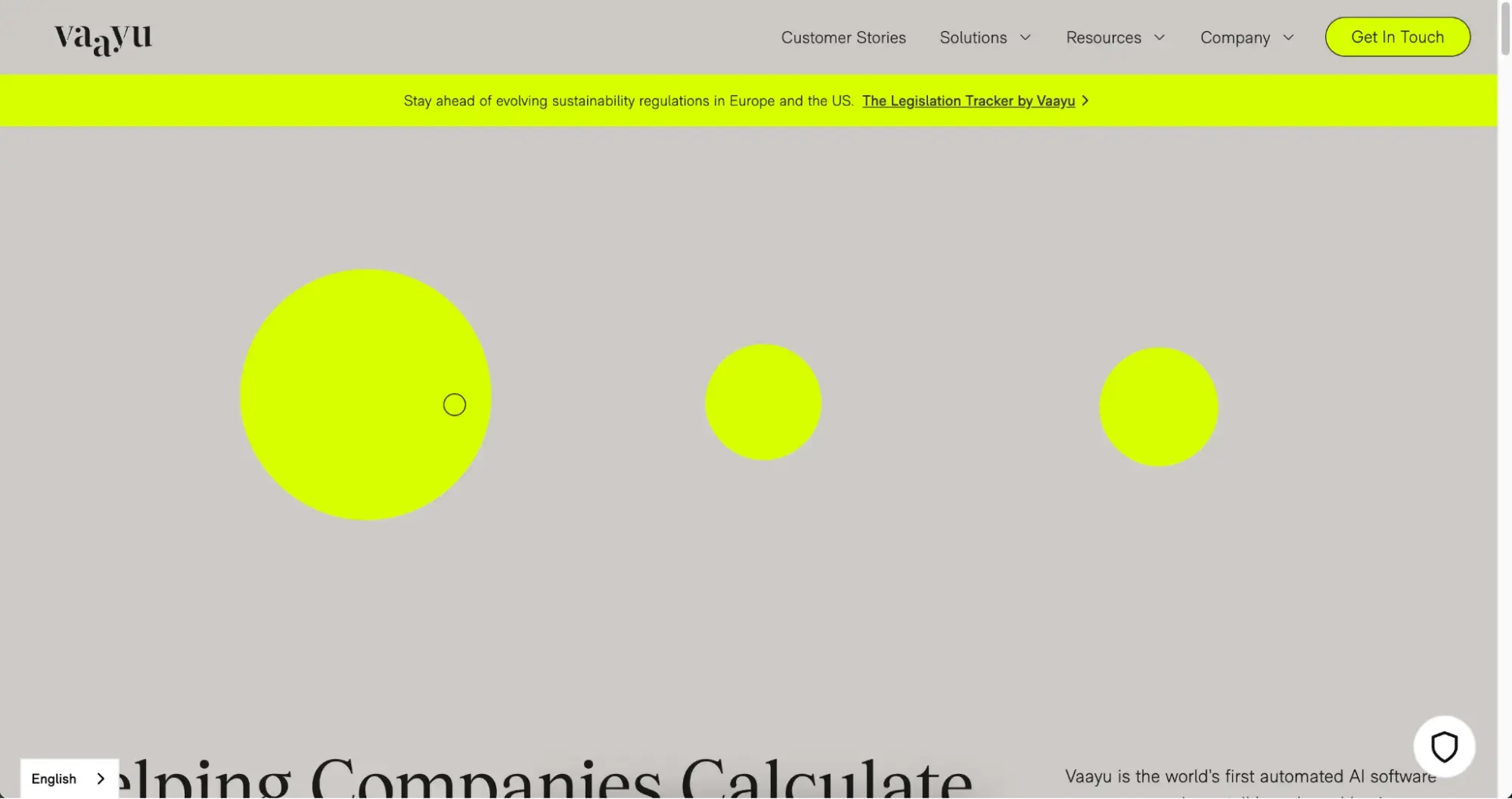
What I like: A one-of-a-kind idea deserves a one-of-a-kind website, and Vaayu delivers. Its user experience is delightful all the way through and stays engaging despite minimal use of color. I particularly love the web texture in the background, too. Take particular note of how they incorporate social proof like customer logos and testimonials.
6. MeanPug
MeanPug is a digital marketing firm that provides services specifically to law firms. You can’t miss this fact, as they build it into their copy and design right from the homepage hero.
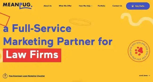
What I like: Converting B2B buyers can take time, and it’s tricky to make it happen on a potential customer’s first visit to your site. Rather than the traditional “Contact Us,” MeanPug uses a CTA to download a legal marketing checklist in its hero section.
7. Stripe
I work with a lot of SaaS companies, and there is a tendency for them to complicate their messaging and clutter up the homepage and features page. Stripe is an example of how to do a SaaS website well. The visuals and copy are clear and beautifully designed, while animations on product visuals encourage users to pause and absorb more information.
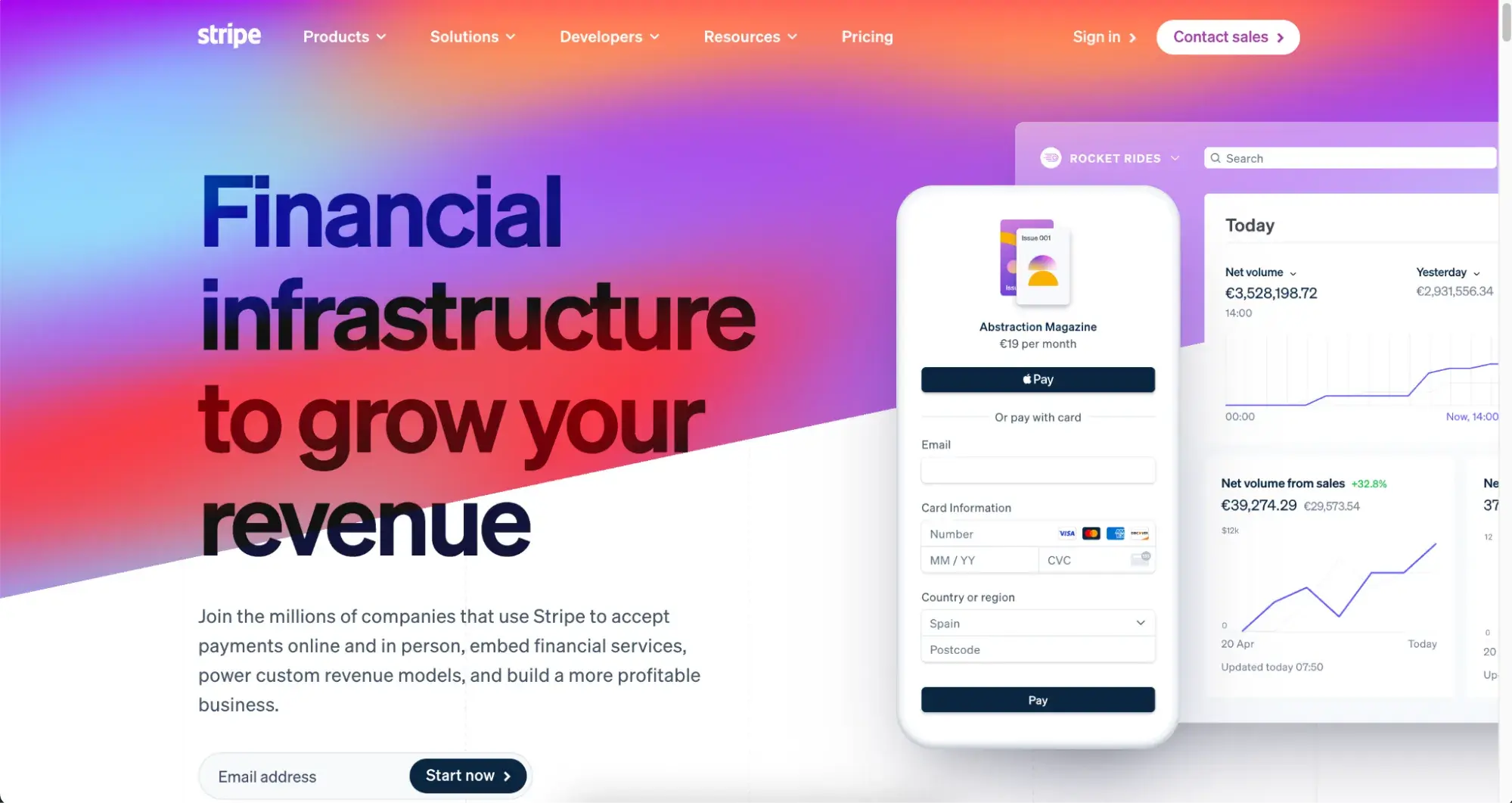
What I like: I think Stripe is a great example of doing the fundamental things exceptionally well. Not too many bells and whistles, just clear visuals, lots of whitespace, and to-the-point copy.
8. GE Aerospace
GE Aerospace builds jet engines, and they lean right into the “cool” aspect of that with the visuals on the website. From video to imagery, they show off what they do best: world-class engineering.
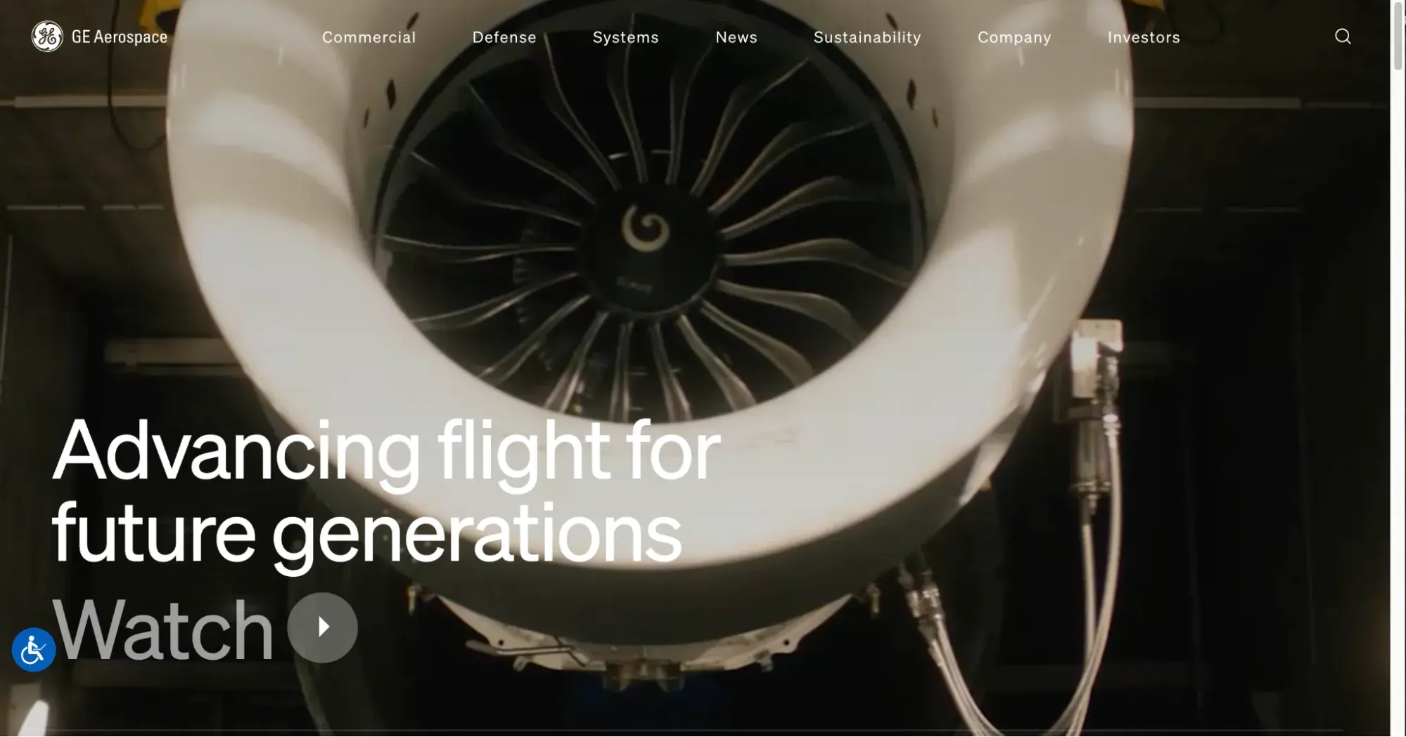
What I like: I encourage brands to use video however they can on their website. Even if it’s embedding recorded customer testimonials, video does wonders for user engagement. GE Aerospace uses it right in the hero section of their homepage to set the tone and show off their machinery. Also, head to their “Company” page to see how they incorporate historic images to tell the story of the brand’s history.
9. Pentagram
Pentagram is a design studio, working on everything from brand identity to custom typefaces and product packaging. The site contains tons of examples of their work with clear navigation for users to get in touch with the team.
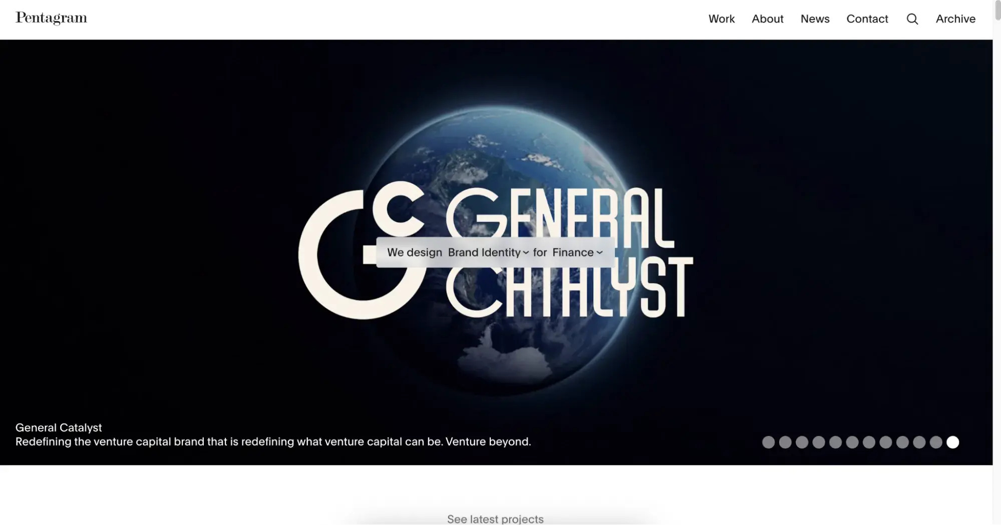
What I like: I like this site particularly for the “Contact” page. Pentagram has four offices across the world, and they showcase each with stunning visuals and clear contact details depending on where a user is based.
10. IDEO
IDEO is a product design company. But they also design brands, services, and experiences. Innovation and experimentation are core to how they work, and they showcase this with a fast-paced, engaging video on the homepage.
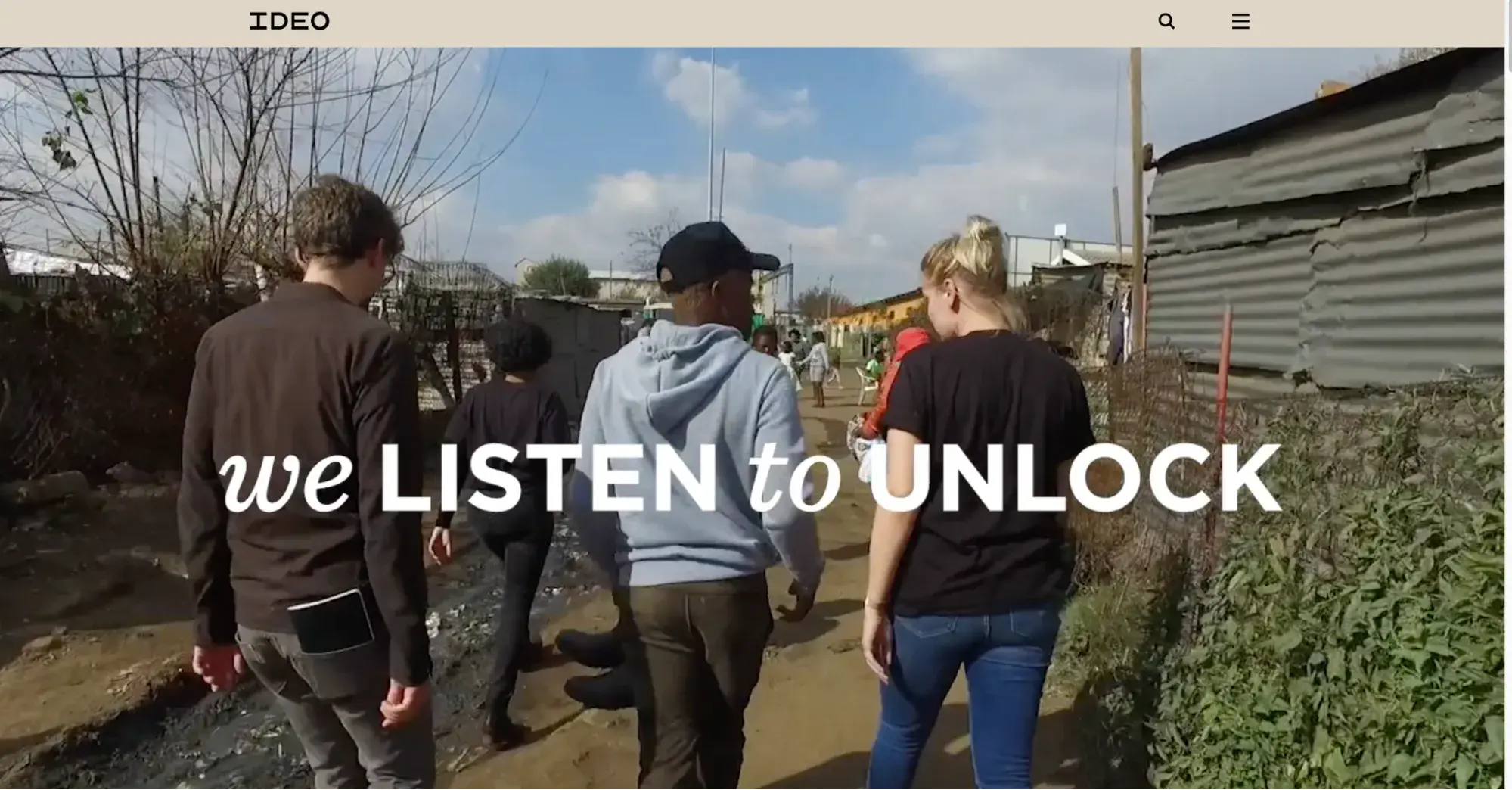
What I like: Name pronunciation is a problem a lot of brands have. I love that IDEO includes a “hear how we pronounce IDEO” audio snippet on their website.
Free Website Design Inspiration Guide
77 Brilliant Examples of Homepages, Blogs & Landing Pages to Inspire You
- Agency Pages
- Ecommerce Pages
- Tech Company Pages
- And More!
Download Free
All fields are required.
Form not available
11. Zaha Hadid Architects
This is potentially one of the most unique corporate websites I have come across. Architecture firms need to convey a lot of things to potential buyers, from trustworthiness and credibility to creativity and innovation. Zaha Hadid Architects uses a very different layout for their website, using pop-out cards for different website sections, with examples of their work taking over the background.
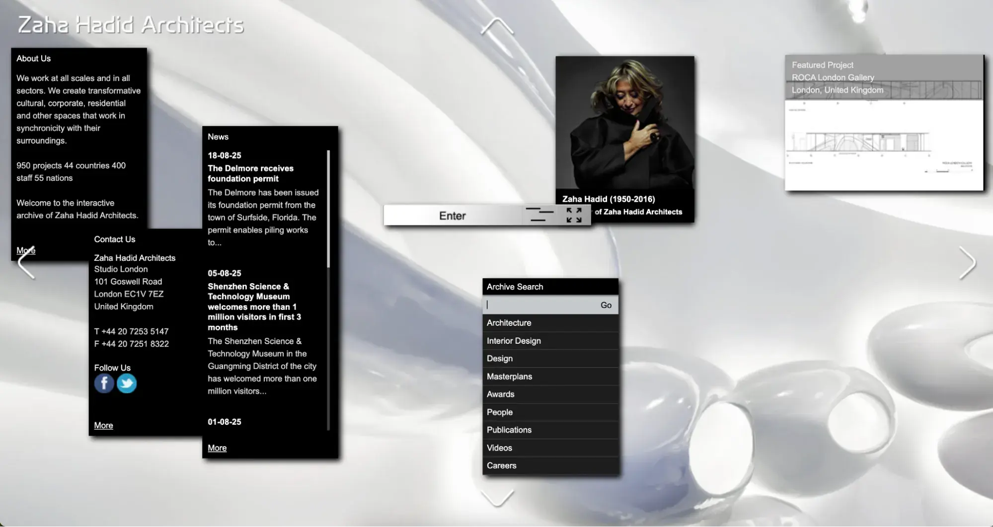
What I like: A lot of portfolio-heavy sites just give users a big list to scroll through. Zaha Hadid Architects have a “related projects” tab, so you can explore more examples within a specific category as you browse.
12. GSK
GSK (or GlaxoSmithKline) is a global biopharmaceutical research and manufacturing company. As a PLC and pharmaceuticals company, their website serves to showcase their research and development efforts and provide information on the company’s performance for investors.
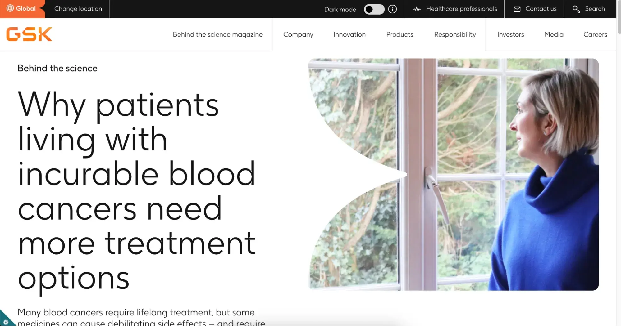
What I like: The company’s website may be mostly investor and PR-facing, but they still manage to incorporate a lot of the human impact of their research and products into it. I like the use of real people’s treatment stories and insights from medical professionals throughout the site.
13. Condé Nast
Publishing giant Condé Nast is home to much-loved magazines like Glamour and GQ. As a parent company, however, it’s catering to a slightly different, more corporate audience than the end readers.
Still, it manages to keep its impact in terms of readership and thought leadership front and center throughout the website.

What I like: I love the background video used in the site’s hero. But I particularly like the scroll effect that sends the video into full screen as you move down the page. Another notable design win is on the News page, where categories make it easy for users to toggle between news coverage, company announcements, and people-related articles.
14. Diageo
Diageo is another parent company of multiple luxury drinks brands that caters well to journalists and investors on its corporate website.
All the photography features Diageo’s brands like Guinness or Pimm’s to reinforce its global reach and extensive portfolio.
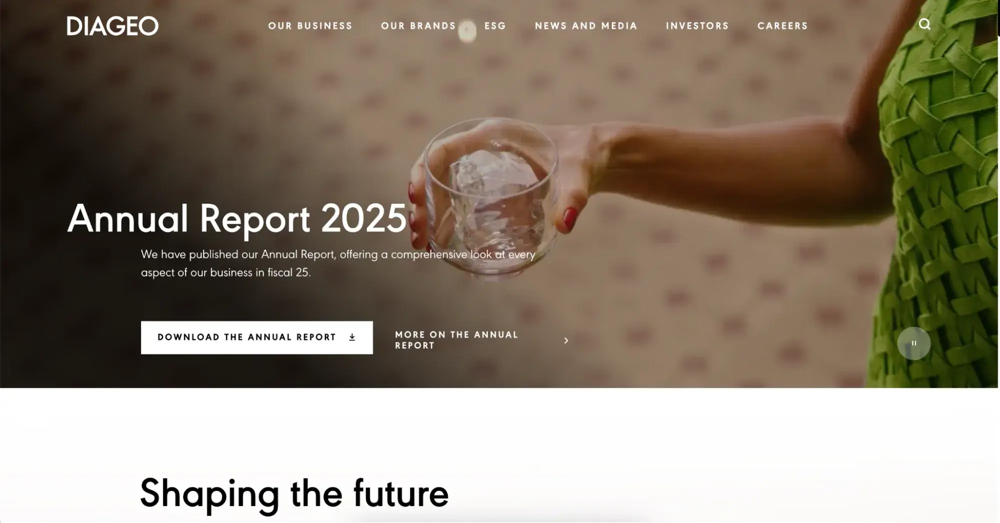
What I like: Diageo’s website is an exceptionally crisp design. Design elements are subtle, like the simple drink pouring video in the background on the homepage. It makes the copy and news items shine more brightly on the page.
15. Sequoia
Sequoia is a software company providing an integrated HR platform for payroll and employee benefits. Their unusual branding and color usage really make the site pop, while the copy is highly benefit driven.

What I like: Social proof is everything for corporate websites, and I always recommend including it wherever possible on B2B sites. From customer logos to client testimonials scattered throughout the site, Sequoia shows all the different ways you can incorporate it beyond a simple logo banner on the homepage.
16. Northvolt
Northvolt is a lithium battery manufacturer for industries like electric vehicles and renewable energy infrastructure. The website focuses on their mission, products, and sustainability and environmental impact.
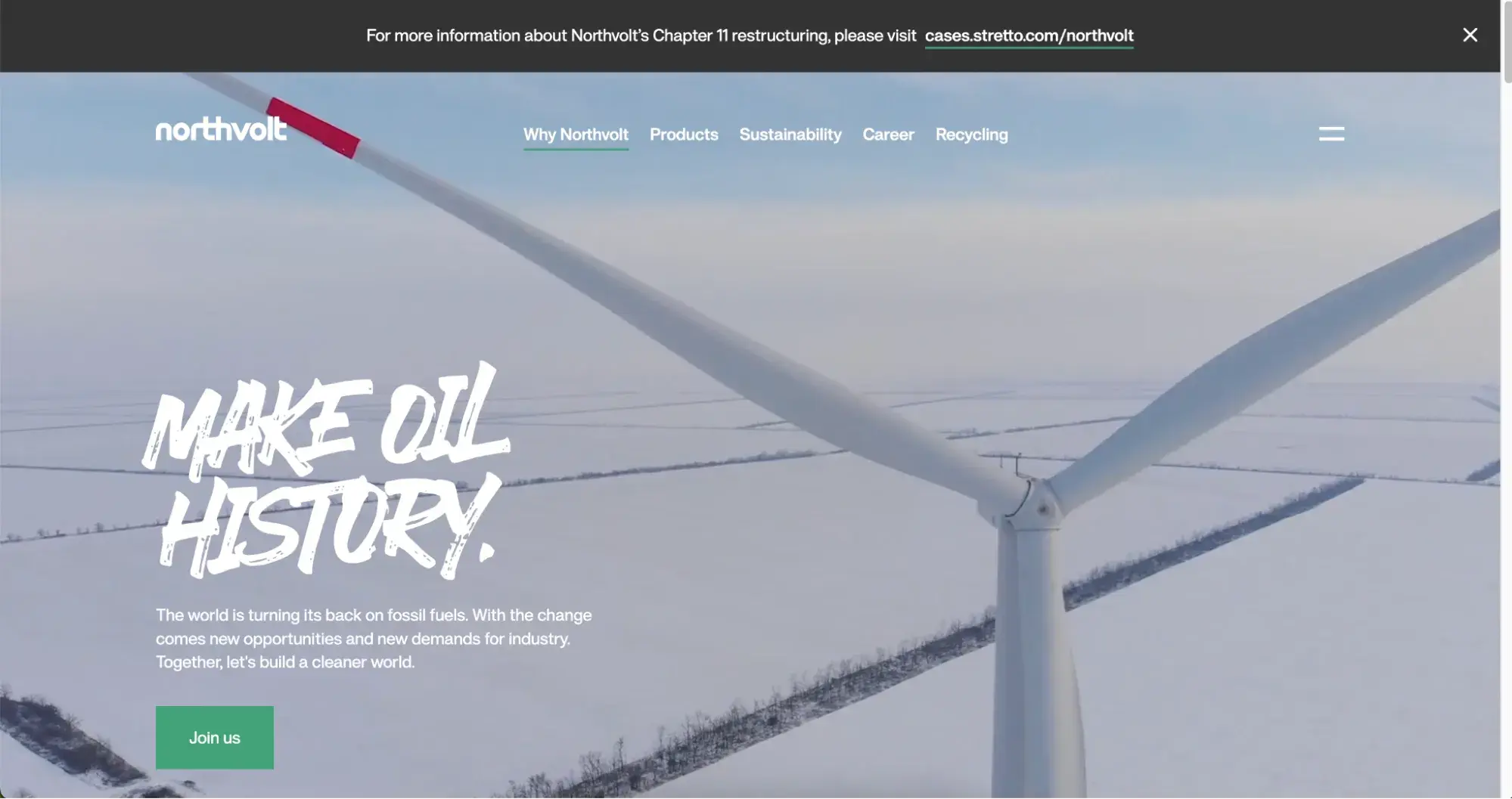
What I like: When I started digging into the Northvolt website, I can see they do a lot. But they don’t clutter up their navigation or homepage with everything. Instead, they’ve built clear user journeys with well-designed navigation and CTAs.
17. Prophet
Prophet is a full service business and marketing strategy agency with a specific focus on go-to-market projects for new brands or product lines.
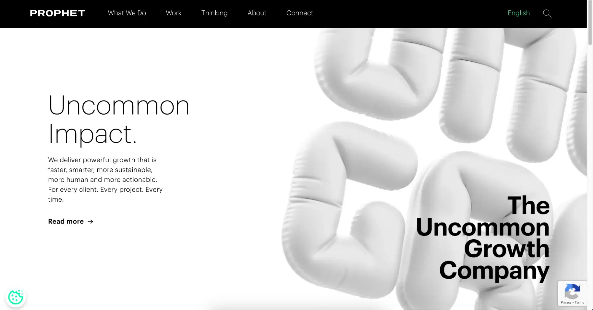
What I like: Prophet does some pro bono work for worthy causes, and they highlight this with a “show pro bono work” in their case studies section. It’s a nice, subtle way to reinforce brand values and community contribution natively on the site.
18. MTN
Telecommunications company MTN is headquartered in South Africa, and operates primarily across African and Middle Eastern countries. Their website has a contemporary, cohesive design that combines a brilliant yellow from their branding with rich, warm imagery for a balanced feel.

What I like: When a company provides a wide variety of services and products and needs to capture the attention of multiple audiences, websites can get messy and difficult to navigate. MTN avoids this by allowing its homepage to focus on brand initiatives (their video podcast, employee initiatives, etc.) while the navigation does the work to funnel users into the right journey, whether it’s investors or customers.
19. GUFR
GUFR is a boutique consulting firm offering strategy workshops and transformation guidance alongside coaching and training services. The website showcases their strong brand identity and places the founders and brains behind the operation front and center.

What I like: When you scroll the GUFR homepage, the website is presented as a wall with art hanging from it. As you scroll, the founders are highlighted as photos on that wall with short bios highlighting their expertise. I think GUFR is a great example of how to do something unique with your site design without compromising on highlighting expertise and professionalism.
20. Everest
Everest is an Enterprise Resource Planning (ERP) platform with AI-driven capabilities for enterprises.
ERP software is often a complex product, with tons of functionality that touches multiple teams and departments. But Everest cuts through that noise with their website design, using lots of whitespace and simple navigation to highlight compelling copy, rather than cluttering up pages with every feature they provide.
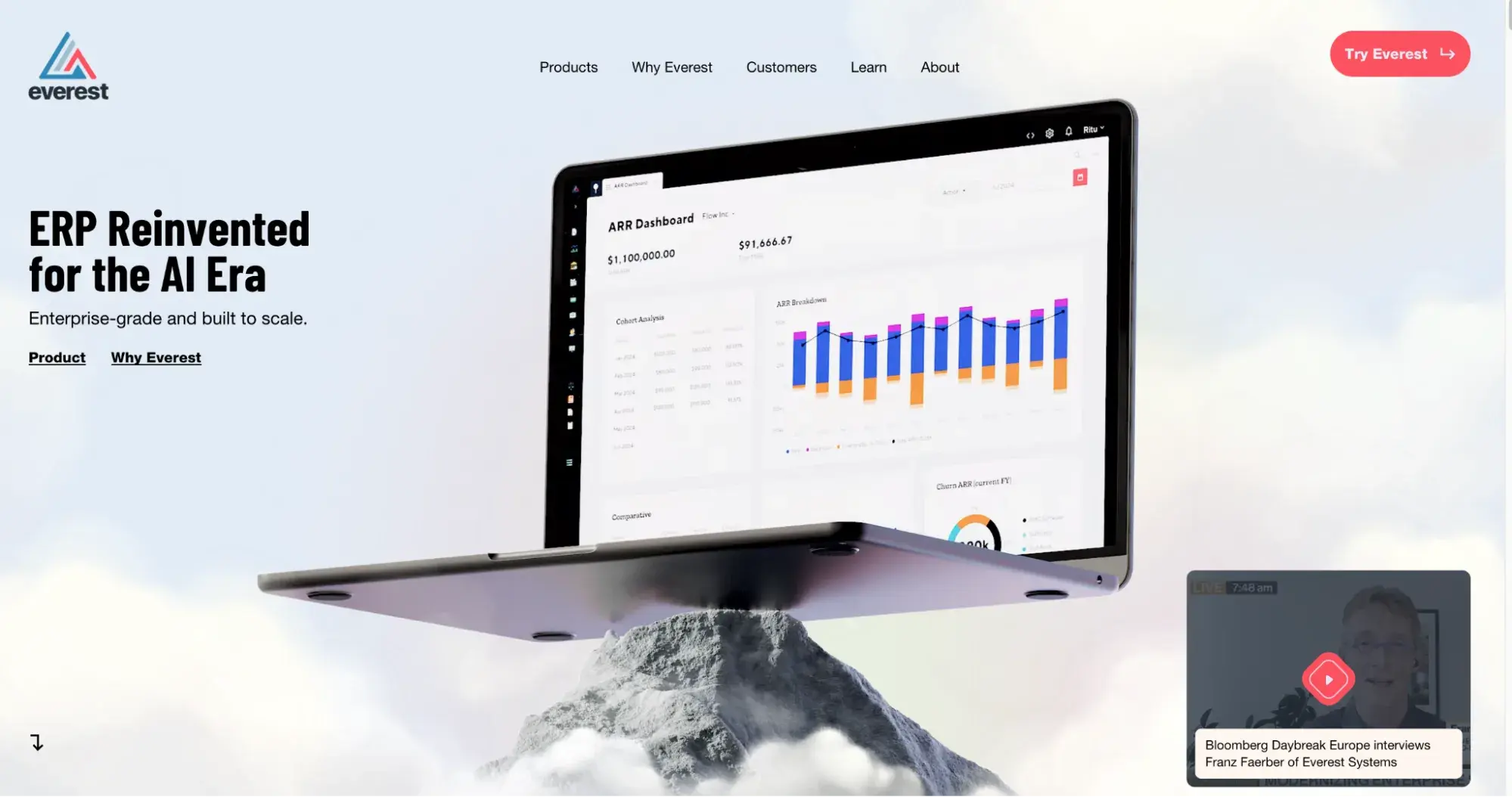
What I like: Everest makes great use of contrast in the website’s design. The homepage hero section is light and bright for impact. But as I scroll, darker monochrome backgrounds take over to highlight one feature at a time with a CTA button that stands out much better as a result.
21. Cult Holdings Co.
Cult Holdings is a brand and cultural consulting group that has worked with huge brand names like Equinox and Netflix.
This is one of the most stand-out examples of a corporate website with a big-bang personality that I could find. They use emotive, almost controversial, language heavily and use an extremely unusual layout and navigation system.
Everything about the brand and website is built to subvert expectations.
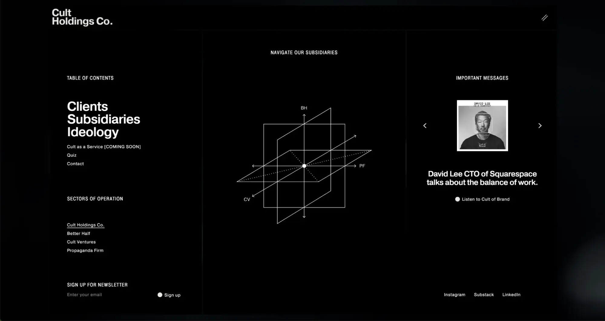
What I like: This type of branding and positioning isn’t for every corporate website. But what I do like is how wholeheartedly Cult Holdings embraces the concept. It’s a good lesson in committing to your brand, whichever direction you’re taking it.
22. ITP Renewables
ITP Renewables is a consulting firm for renewable energy projects, based in Australia but working with a global client base. Their branding features a lot of bright, primary colors, while the website incorporates pages for their services, past projects, and team.

What I like: The homepage hero contains no text, which is a really unusual move for any website, let alone a corporate one. Instead, the pattern moves in response to the cursor to provide an immediate engagement boost. I think this could also work really well if headline copy was incorporated behind the graphic and cursor movement revealed it bit by bit.
23. Bausola Banch
Bausola Banch makes ergonomic working tables. The website hero section is fully automated when you load the website. It also completely flips the color scheme as the video progresses for maximum visual effect.
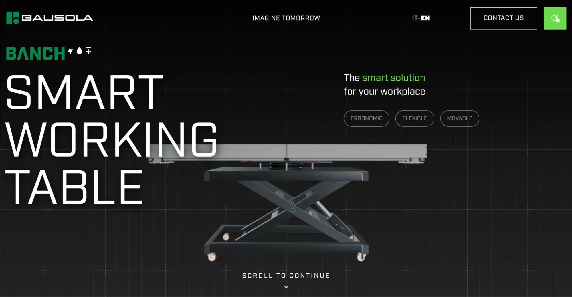
What I like: You don’t see the actual product when you first load the website, but you do see a white background with an overlay to make it look like graph paper. It’s a nice, subtle way to set the tone for the visual imagery of the working table.
24. FidesOak
FidesOak is a consulting, training, and coaching provider in the U.K., focusing on leadership development and cultural transformation. The website uses strong branding and distinctive colors alongside video to drive scrolls and engagement. They clearly outline their philosophies and proprietary frameworks to showcase the team’s expertise.
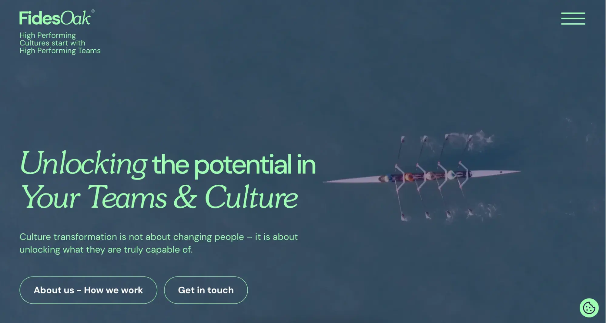
What I like: When I work with consultants or coaches, translating their experience into a “so what” moment for website visitors can be tricky. The team or person behind these organizations is what makes them stand out from the crowd, and I like that FidesOak highlights that human capital right away with an “About us - How we work” CTA button right on their homepage.
Professional Website Tips
Whether you’re starting from scratch or think your corporate website is in need of a facelift, there are a few standard tips you can keep in mind.
I’ve worked on corporate websites with five pages, and those with hundreds or even thousands of pages. Some of the fundamentals remain the same regardless of size or industry.
Keep your branding consistent.
One of the things that sticks out most to me when I’m looking at a client’s website is branding. It’s not that the branding needs to be especially distinctive (although that’s a good thing, too). What’s more important is consistency.
There are many ways the different elements of your website come together to create a cohesive look and feel. Some are obvious, like using the same fonts across all pages. Similarly, I don’t recommend mixing and matching the tone of your copy. It doesn’t make sense to use puns on one page and a more buttoned-up tone on another.
But some are less obvious, like using bold icons in one area but graphics with a completely different design style in another.
One of the most common ways I see this inconsistency creep in is with visuals. Images and videos are important, and 67% of consumers prefer to interact with them compared to text alone. But they need cohesion.
If I’m using stock images, for example, they need to have the same type of lighting and level of warmth and depth to look good together on the same site.
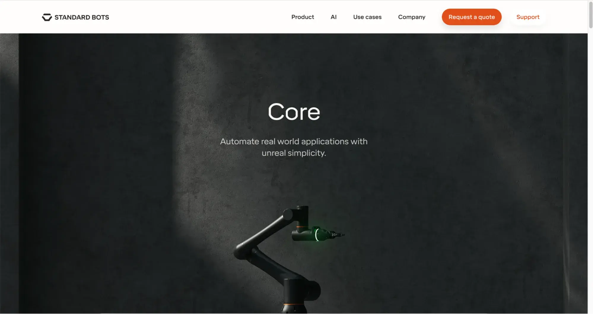
Look at Standard Bot’s website, which showcases its product with stunning imagery and an informative video explaining how it operates. This shows how you can have the best of both worlds.
Don’t make assumptions.
It’s not just corporate websites that I see with this problem. Too many brands make the mistake of assuming their users understand what they do and who they are. Or that they’ll be able to just figure out where to go on the website.
When you’re writing copy, building your pages, and designing your navigation, assume the user knows nothing about your brand or what you provide.
Founders and marketing teams are often “too close” to the product and brand journey, and this can actually make it tricky to get the message across. So, I recommend getting some outside feedback on your corporate website design from people who are not as familiar with your company.
Maintain your site periodically.
Maintaining a website doesn’t have to be a daunting task. You can maintain your website with minimal effort by reviewing the available content, replying to customer reviews, fixing broken links, or even updating your Contact Us pages.
But I also recommend regular maintenance like scheduling updates, security patches, and bug fixes to keep the website safe. Many website building platforms handle this for you, but if you’re using something like WordPress, for example, it’s a good idea to work with a web developer to ensure the site stays secure.
I don’t have a set schedule for how often a site should be updated as it depends on its size and complexity. I often set quarterly reviews of website content to make sure:
- All information is accurate and up to date.
- Nothing is broken or misaligned (buttons, visuals, forms, etc.).
- Any new content or pages are added.
Now that your professional website looks and feels good as new, it’s time to make sure it performs well, too. With HubSpot’s Content Hub, you don’t need to worry about anything; just use its built-in features to ensure your website is thriving.
“Corporate Website” Doesn’t Mean “Boring Website”
As you can see from some of the examples I pulled together here, there’s as much variety to corporate websites as any other kind of site. The fundamentals of good design, a frictionless user experience, and engaging layouts and elements remain the same.
The most important factors for me are clarity and consistency, from how you apply branding to the design to how you write copy for your site pages. When a user can feel this consistency as they explore the site, it builds trust and credibility — both essential elements for a corporate website.
Editor's note: This post was originally published in March 2022 and has been updated for comprehensiveness.
Free Website Design Inspiration Guide
77 Brilliant Examples of Homepages, Blogs & Landing Pages to Inspire You
- Agency Pages
- Ecommerce Pages
- Tech Company Pages
- And More!
Download Free
All fields are required.
Form not available


![15 black and white website designs to inspire your own [+ pro tips]](https://53.fs1.hubspotusercontent-na1.net/hubfs/53/black-and-white-website-design-1-20250520-1336267.webp)

![Gradient Website Design Examples That Prove This Trend Is Far From Over [+Tutorials]](https://lh7-us.googleusercontent.com/htOWIbyCIoCMxSjC4gJunkGnhCzXpccjTrL8NwoGdRdCsSiEmEAxe_qBFkMrzy2Y8d3cwEr_DMzSGHq9Xi-hQFnMJCo8HDQJ1yQGigcSfFxI2QKXo0s7xXSB2sY-eALG1iUqnHXgomcDsnp7AHRSH1s)
![15 Brochure Website Examples to Inspire You [+ How to Make One]](https://53.fs1.hubspotusercontent-na1.net/hubfs/53/brochure-website-examples-1-20250319-362228.webp)
![28 Types of Websites to Inspire You [+ Real-Life Examples]](https://53.fs1.hubspotusercontent-na1.net/hubfs/53/types-of-websites.png)