

Intuition is a powerful and often unexplainable phenomenon of human nature. Using hunches based off of past experience and knowledge, we often believe we can predict another person’s actions or intentions. This cognitive miracle empowers humans to trust their gut feelings and make decisions with little to no objective support. It’s a beautiful thing, but one that often has negative repercussions on your marketing.
When it comes to designing landing pages, there is a difficult balance to achieve between making data-driven decisions and using your intuition. Rather than making guesses or assumptions to fuel your landing page’s performance, your success is dependent on trial-and-error.
Based off an accumulation of industry-wide trial-and-error findings, marketers have formulated “best practices” for optimizing landing pages. The truth, however, is that these best practices don’t work for everyone. There’s no one size fits all when it comes to landing page design.
So if you can’t depend on intuition and you can’t depend on trial-and-error what does that leave you with? How about a combination of both.
With a little bit of intuition and a lot a bit of trial-and-error, you can ensure that your landing page design separates industry best practices from the best practices for your specific business.
Just when you thought your business was on top of its landing page optimization by following the industry best practices, here is your Trojan Horse of landing page design tactics and their unexpected results:
1) Calls-to-Action
The impact of your call-to-action is dependent on two things: where you place it and how you phrase it. With that being said, let’s first take a look at the importance of where you place it.
Despite what best practices say, putting your call-to-action above the fold is not always the answer. For anyone unfamiliar with what above the fold is, it refers to the portion of your website or landing page that is visible without having to scroll down.
In recent years, studies were released stating that content placed above the fold attracted 80% of a consumer’s attention. Marketers were right to interpret this as a sign to always place their value proposition above the fold. They were wrong, however, to think that meant their call-to-action always had to be there.
The image above illustrates a test where Michael Aagaard of Content Verve yielded a 304% increase in conversions by moving the page’s CTA below the fold. Aagaard speculates that this is the result of a direct correlation between the complexity of a product offering and its location on a landing page.
Similar to the way you would handle any situation in life, the complex ones require more time. Instead of forcing your call-to-action on a visitor before they even understand your offer, gradually introduce them to your product/service in a progressive fashion.
If your product or service requires a lengthy explanation in order to convey the full scope of its benefits, it is better to put the call-to-action at the bottom of your landing page. That way, you are giving your visitors more time to digest the information before trying to pressure them into taking your intended action.
The second factor of a call-to-action that we are going to look at is how you phrase it. One of the most beautiful and frustrating things about the English language is our ability to say the same exact thing at least 10 different ways. Your call-to-action is no different, except that the choice you make out of those 10 different options, even if they all mean the same thing, could make all the difference to your visitors.
The image below illustrates the impact that using “Get” vs “Order” made on conversion rates.
As you can see, using “Get” in the call-to-action increased conversion rates by 14.79%. Even though both calls-to-action provide the same offer, the way that offer is phrased has a different psychological impact on prospects.
Best practices typically suggest using actionable language in your CTA. CTA’s such as “Sign Up”, “Register”, “Download”, and “Order” are the commonly used actionable phrases.
The truth is that while “Order” emphasizes what a visitor has to do, “Get” converts better because it emphasizes the benefit the user will receive. This benefit-focused approach is a marketing tactic that should also be incorporated throughout your landing page copy, not just your call-to-action.
2) Images
Using images on landing pages is a common best practice. The split-test below shows one original landing page and its variation, with the only difference being one has an image and one does not. Can you guess which one performed better?
Like most people, if you guessed that Version B won, you are wrong. Version A surprisingly had a 24% increase in submissions without using an image on the page. While the image of the woman above the opt-in form in Version B may have contributed to the overall aesthetics of the page, looks aren’t everything when it comes to conversion.
Like everything else on your landing page, your image needs to have a purpose for being there. Not only does the image in Version B scream “stock photo” (even though it isn’t), it pushes the opt-in form further down the page, which as I mentioned in the previous section, is not necessarily always a bad thing, but is something you need to take into consideration depending on the complexity of your product. In this case, it looks like the CTA performed better above the fold. And if you are going to use a generic-looking stock photo, at least use these awesome ones featuring Vince Vaughn and Dave Franco.
Instead of adding images just for the sake of doing so, make sure every image on your landing page communicates an aspect of your offer that your copy does not. Let’s take a look at the T-Mobile landing page below.
While I don’t think anyone is going to complain about having a picture of Catherine Zeta-Jones on this landing page, the truth is that she has no purpose for being there other than to look good holding a T-Mobile phone. The image provides no real benefit to the visitor and can distract them from the message and intended action that T-Mobile is trying to communicate.
While this landing page was most likely effective for converting the millennial demographic, the older, less tech-savvy generation would benefit much more from seeing an image of the phone and its features. One surveyed shopper in particular said, “Zeta-Jones is a very pretty woman...I just wish I could see the buttons.”
On the other hand, the image in the landing page below is an example of one that effectively utilizes an image. Not only is it aesthetically pleasing, but it shows a preview of the actual product being advertised and a demonstration of how it’s used.
Just like the previous example, a majority of people got this one wrong. Version B proved to be more effective, with a rise in completion rates of 12.6%. This goes to show that, believe it or not, there are times where security badges can actually hurt your landing page’s performance.
What is intended to make your visitors feel safe and secure can sometimes lead to a wrongful association of you asking for money. Since visitors are used to seeing security badges on the check-out pages of websites, putting these on your opt-in form can actually scare them away thinking that you are going to ask for their money next. While frequent web-users typically don’t make this association, not all of your visitors fall into that category; therefore sometimes it is better to save the security badges for later on in your sales funnel, or a different part of your landing page than the opt-in form.
3) Landing Page and Ad Copy
With the rise of Google Adwords came the importance of relevancy between ad copy and landing page copy. This correlation impacts both your Quality Score and search engine ranking, but how important is it from the perspective of your visitors? Let’s take a look at the split-test example below.
To answer that question, matching your ad copy to your landing page copy is extremely important to your visitors. Even though Version B in the example above has a more compelling headline and clearer sub-header, version A increased leads by 115%.
Alone, the header and sub-header copy in Version A are weak. The header does not communicate anything related to the business’s value proposition and sub-header is too vague. What Version A does do well though is tie the landing page in with the PPC ad that drove the user there in the first place.
With on average only seven seconds to capture a visitors’ attention, it’s important that you immediately convince your visitors they are in the right place. Version A’s title reassures visitors that they are in the right place and uses a sub-header that matches what was used in the ad copy.
While an image of the actual PPC ad used in the test above is not available, the image below shows an example of how your PPC ads should be aligning with your landing page.
The better and sooner your landing page complements your ad copy, the better your page is going to convert. This is probably the only time (I hope) you will hear this from a fellow marketer, but when it comes to ad copy and landing page alignment, treat your visitors like dogs.
Create a scent trail for them to follow that keeps stringing them along towards your intended action. If you do not immediately assure them they are moving in the right direction towards what they are looking for, they are going to assume they are in the wrong place and start sniffing somewhere else.
4) Social Proof
There’s no question about the value of social proof. It creates a bandwagon effect that persuades visitors to take your intended action simply because “everybody else is doing it”. With that being said, take a guess at which variation performed better in the experiment below.
If you made the obvious guess, which is the variation on the right––you are wrong.
“But I just told you there’s no question about the value of social proof?!” That is, there’s no question about the value of social proof if you are doing it right. Today, we live in an era filled with Facebook pages that boast millions of followers, and the standards for social proof and follower counts is higher than ever. The truth is, sometimes it’s better to have no proof than low proof.
Social proof can hinder your landing page goals if it is not up to par with your visitor’s [high] expectations. Failure to meet these expectations typically results in a lack of trust from your visitors. The same applies to a lack of social shares on the content you produce.
Fortunately, leaving out social proof is one of the elements of your landing page that won’t hurt your performance. It just won’t help it. If your numbers are relatively low, you can keep your social sharing buttons but simply disable the counter from displaying.
5) Navigation Bars
A popular best practice is to avoid putting navigation bars on your landing pages. Although they are helpful to implement on your website, when it comes to landing pages they tend to distract and lead visitors away from the intended action. Yet, 84% of landing pages still include navigation bars. So, exactly how detrimental really are they to your landing page? Let’s look at the test below to find out.

The only difference in the variations above is that the one on the left has a navigation bar and the one on the right does not. There are no surprises here in terms of which one won. Eliminating the navigation bar means fewer distractions for visitors and the ability to focus on the primary reason they came to this landing page in the first place. What is a surprise, however, is that eliminating the navigation bar increased their conversion rate from 3 to 6%. That may seem like a small number, but in retrospect that is a 100% increase in conversions from one minor change.
Simpler is always better when it comes to landing pages. The easier you make it for visitors to focus on their primary objective, the easier it is to convert them into customers.
If there is one thing that you should have learned from all of these landing page A/B tests, it’s that you never really know what’s going to happen. Just because those results came out of the split-tests ran above, does not mean your business will have similar success. The more tests you run, the better idea you will get of how your particular audience reacts with the different elements on your landing page. Your business should never have a final destination in mind when it comes to A/B testing. Your landing page could always be better, which is why it’s up to your business to test again, and again, and again.
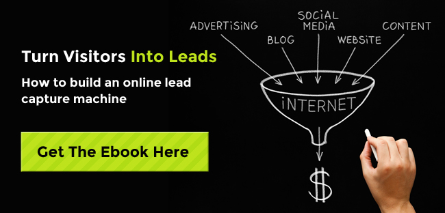
So what else can you do right now to start optimizing conversion rates and begin producing happier customers? Stay ahead of the curve and check out our ebook covering more practices for turning visitors into leads.
A/b Testing

![How I Use Landing Page Split Testing to Find Untapped Marketing Potential [+ 12 Places to Start]](https://53.fs1.hubspotusercontent-na1.net/hubfs/53/landing-page-split-testing-1-20250121-3573417.webp)
![How to Understand & Calculate Statistical Significance [+ Example]](https://53.fs1.hubspotusercontent-na1.net/hubfs/53/how-to-calculate-statistical-significance-1-20250106-7754856.webp)


.png)