As a marketer, I understand the importance of landing pages. A landing page can be the designated page visitors are taken to when they click on an ad.
It can also be the page that follows a call-to-action button or serve as the homepage of a website.

Regardless of how my audience “lands” on a landing page, it encourages them to convert to a lead or customer. Hence, landing pages are uniquely powerful components of a business' digital marketing strategy.
Free Landing Page Builder
Create and test beautiful landing pages that generate leads and look great on any device.
- Build landing pages.
- Turn visitors into leads.
- Optimize for SEO.
- And more!
Table of Contents
- What is a landing page?
- How to Create a Landing Page
- Why do you need a landing page?
- Landing Page Best Practices
- How to Design Your Landing Page
- Landing Page Copywriting Tips
- A/B Testing Your Landing Page
- Landing Page Metrics to Track
- How to Make Your Landing Pages More Effective
- What to Do Post-Conversion: Lead Nurturing
What is a landing page?
A landing page is a website page with a specific purpose — the objective of a landing page is to convert visitors into leads. While there are many landing pages, the intent is the same — get more leads.
Landing pages contain lead forms that ask visitors for their contact information in exchange for something of value, otherwise known as an offer.
The video below will help drive that definition home.
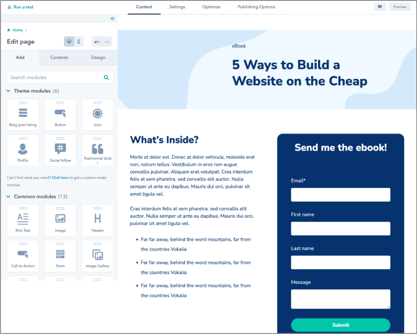
How to Create a Landing Page
Creating a landing page doesn’t have to be complicated. Here are some actionable, step-by-step instructions to help you create one.
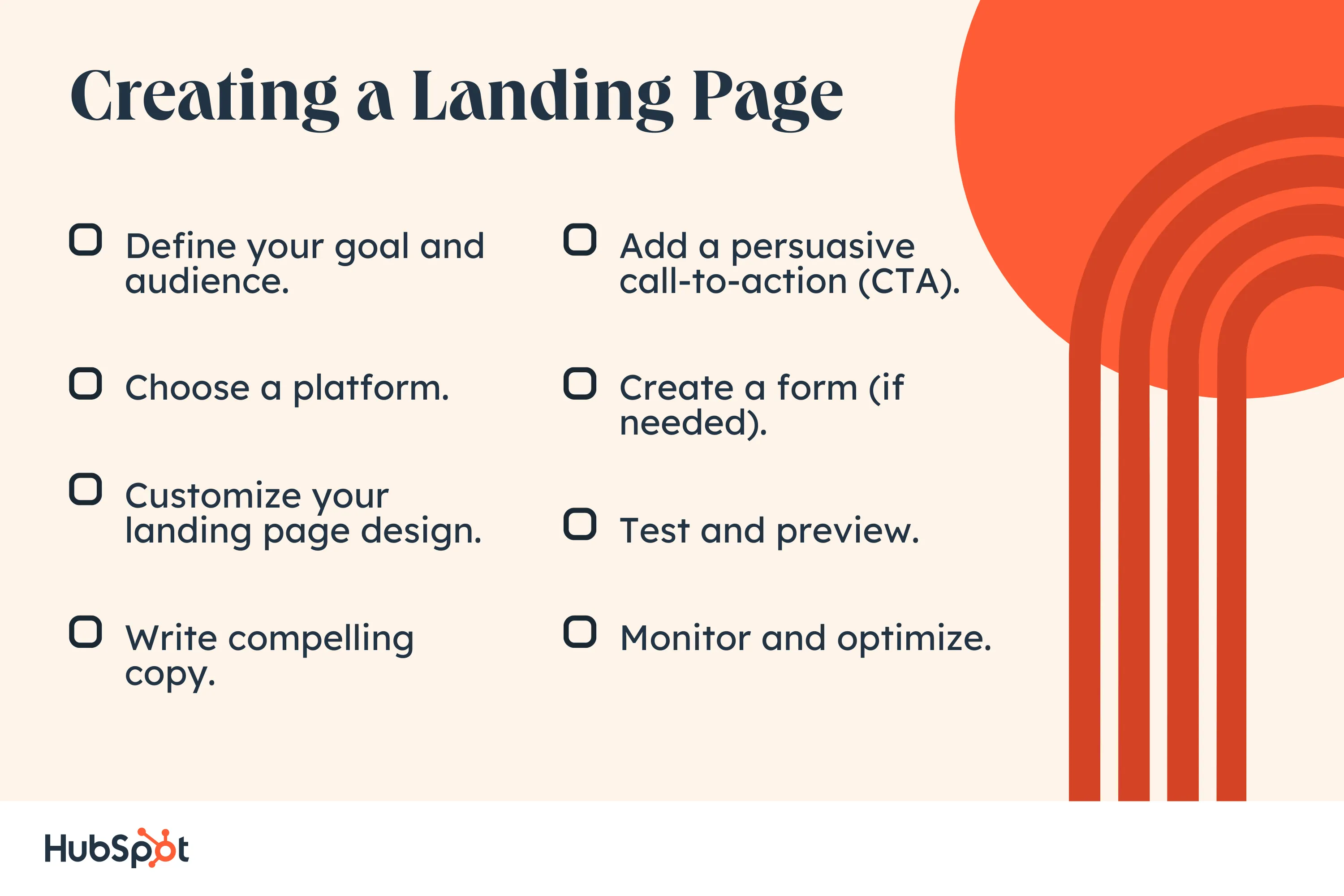
1. Define your goal and audience.
Before you start creating your landing page, you need to define your “why,” “who,” and “what.”
- Why are you making this landing page?
- Whom do you want to visit your landing page?
- What steps do your landing page visitors have to take to help you achieve your goal?
Your answers will guide the process of writing your copy, creating a lead magnet, and adding the necessary elements to your page.
For example, say the reason you’re making your landing page is to generate leads for your upcoming book launch (your “why”). This means that you’ll be targeting people who love to read books in your genre (your “who”).
And to get them on your email list, you’ll have them fill out a form once they land on your page (your “what”).
Here are some CTAs you can use on your landing page to collect leads:
- Subscribe to a newsletter.
- Download a free ebook/guide.
- Sign up for a free trial.
- Register for a webinar.
- Download a coupon.
Pro tip: To get the most results from your landing page, stick to one goal (or one CTA). Not only does this make it much easier to create an effective landing page, but it also reduces the amount of work your visitors have to do when they arrive on your page.
2. Choose a platform.
After setting your goal and defining your audience, the next step is to select the platform you’ll use to create your landing page.
You can use popular content management systems like WordPress and Wix or dedicated landing page builders like Unbounce or Leadpages.
Unbounce and Leadpages, however, can be really expensive, and while WordPress and Wix are free, you’ll likely have to pay for functional landing page templates — which isn’t feasible if you’re new to creating landing pages.
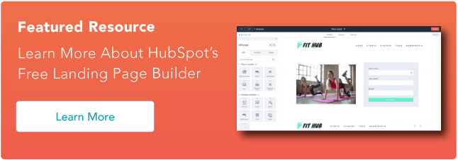
You can work around this problem by using HubSpot’s Free Landing Page Builder.

This tool has the following features:
- A WYSIWYG (What You See Is What You Get) editor that makes it easy to build stunning, yet professional, landing pages.
- An extensive landing page template library so you don’t have to create a landing page from scratch.
- Built-in personalization so you can tailor your page’s content to fit your target audience.
- AI copywriting tools that help you generate compelling copy in just a few seconds;
- Robust analytics so you know who’s visiting your landing page and what they do when they get there.
- Integration with Salesforce and HubSpot’s CRM tools so you can manage the leads your page generates.
With this tool, you can build beautiful, effective, and mobile-responsive landing pages for free. You can also test and optimize these pages yourself. No previous IT experience required.
3. Customize your landing page design.
If you choose to use a landing page template, you should customize the design to match your brand. This includes the colors, fonts, layout, and visuals. Here are some tips to help you with customization:
- Choose a captivating hero image (the large image that’s typically in the area above the fold, right underneath the website header) that shows visitors what your offer is about.
- Use images (product images and stock photos) and illustrations to show the benefits and values that your visitors will gain from your image. Let these visuals tell a story.
- If applicable, include real photographs of people using your product/service (e.g., reading your book, using your face lotion, etc.) to help your landing page visitors connect with you on a personal level.
- Use a color palette that’s a mixture of bright colors and muted tones to create balance and make your overall design more memorable.
- Optimize your images for web loading speed. If not, they might bog down your landing page and make it load very slowly.
Free Landing Page Builder
Create and test beautiful landing pages that generate leads and look great on any device.
- Build landing pages.
- Turn visitors into leads.
- Optimize for SEO.
- And more!
4. Write compelling copy.
After customizing your landing page website, it’s time to include some actual content in it.
The first step to writing landing page copy is to structure it; the typical structure involves a headline, a tagline, the actual copy, visuals (images and videos) and a CTA.
An engaging headline and image can be crucial, but experience has shown me that it can fall flat without well-crafted copy. Your copy must be clear and concise and guide your visitors to the action you want them to complete.
Compelling copy also speaks directly to the visitor using “you” and “your” to engage them. We’ll go more in-depth on copy tips below.
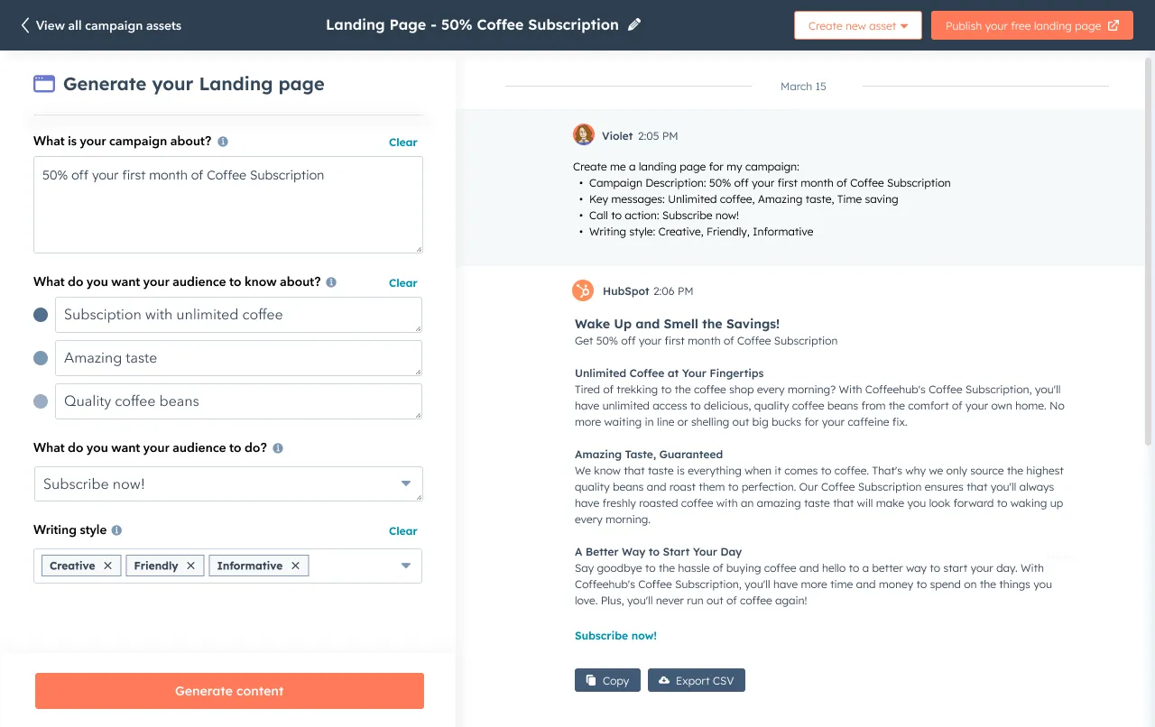
Pro tip: Speed up the writing process by using generative AI to create a rough draft of your landing page copy and refine it to match your brand voice and tone.
With Campaign Assistant, HubSpot users can plug in their main points, features, and CTA and generate a first draft in seconds.
5. Add a persuasive call-to-action (CTA).
After telling your visitors all about your product/service and how they can benefit from it, you’ll need to show them the action you want them to take.
This is your call-to-action (CTA), and it is arguably the most crucial element on your landing page — it’s one of many elements that encourage conversion.
It’s usually in the form of a click-through button, which should stand out on the page, meaning you should use a color contrasting with other elements on the page.
The call-to-action (CTA) should clearly explain what you want visitors to do; that is, use an action verb that spells it out for them, like “submit,” “download,” or “get it now.” More on CTA best practices below.
6. Create a form (if needed).
Sometimes, a CTA button alone would not suffice, especially if you’re targeting different kinds of people with the same landing page. In this case, you’ll need to create a form, like this:

Before creating one, however, determine what information you need from visitors. If you only need their full name and email address, ask for those only.
Don’t ask for their phone number, home address, company name, and job title unless you absolutely need this information to tailor offers to them correctly.
If you’re not sure how to approach this, remember: shorter is better.
In July 2023, we surveyed 101 marketers and advertisers in the U.S. to learn about trends in landing pages. Of respondents, 30.7% said the ideal number of questions on a landing page form to get the best conversions is four.

Beyond that, 10.9% of marketers report only the name and email are essential for a landing page form.
Pro tip: Connect your form to your email marketing and CRM tool to manage and nurture your leads.
7. Test and preview.
Now, you’re ready to launch your landing page!
But before you do that, though, do a final check to ensure that everything looks and functions the way they’re supposed to on the landing page.
Check your copy and ensure that there are no grammatical or spelling errors that will make a bad impression on your audience.
Also, check your design to ensure that all elements are correctly placed and formatted. Verify that all links, forms, and buttons work as expected.
Then, make sure that the contact information of visitors who click your CTA button is safely situated in your email marketing and/or CRM tool.
When you’ve confirmed that everything is as it should be, click “Publish.”
8. Monitor and optimize.
You thought we were done, right? Not quite.
After publishing your landing page, you shouldn’t just forget it; instead, monitor and test it to figure out ways to continue improving upon your landing page elements. The best way to do this is through A/B testing.
Some important elements you should run experiments on include:
- The headline. Try different headlines to see which one resonates best with your audience.
- Visuals. Change the hero image and other illustrations you use on your landing page.
- Form. If you have a form on your landing page, change the number of form fields and the form placement to see which one(s) convert better.
- CTA. Design a different CTA button and tweak the accompanying copy and bit to see which one visitors click on more.
When you conduct these tests and implement your results, you’ll be able to get the best out of your landing page, no matter what your goal is.
Pro tip: Also analyze performance metrics and user feedback, and make necessary adjustments to improve the effectiveness of your landing page over time.
Free Landing Page Builder
Create and test beautiful landing pages that generate leads and look great on any device.
- Build landing pages.
- Turn visitors into leads.
- Optimize for SEO.
- And more!
Why do you need a landing page?
Why would you create a unique page for people to complete a form? Why not just use your homepage or About page?
Still, the short answer is this: A landing page eliminates distractions by removing navigation, competing links, and alternate options so you capture your visitor’s undivided attention.
Complete attention means you can guide your visitors where you’d like them to go, i.e., to your lead form. In sum, landing pages are specifically designed to create conversions.
Our July 2023 survey found that the average landing page conversion rate across all industries is 5.89%. If you’re seeing conversions beyond 10%, you’re hitting (and exceeding) this benchmark. We found that 43.6% reported generating leads as their goal, while 33.7% said direct customer purchase is their top priority.

Beyond that, landing pages are working. Of marketers, 33.7% saw higher conversion rates in 2023 than in 2022.
Now that you understand their importance, let’s cover landing page best practices to ensure your pages are set up to convert.
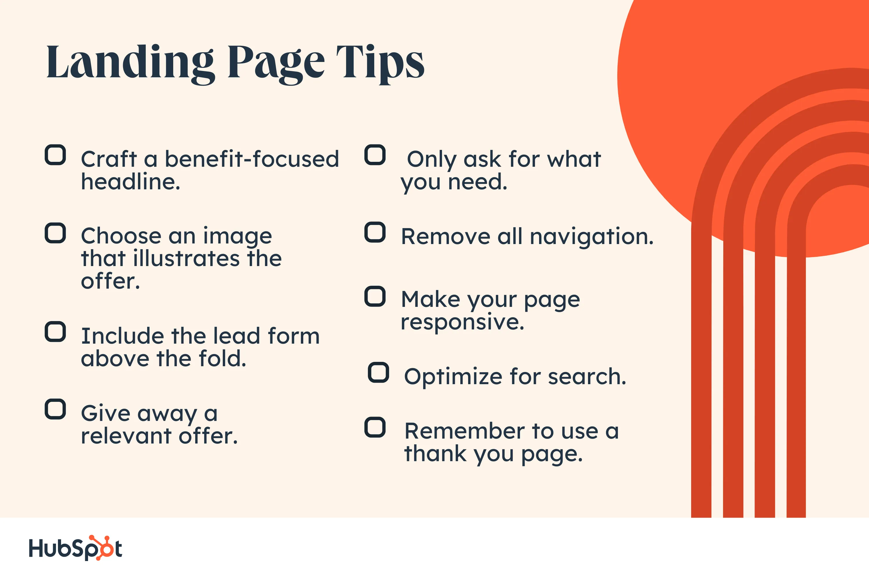
Landing Page Best Practices
- Craft a benefit-focused headline.
- Choose an image that illustrates the offer.
- Include the lead form above the fold.
- Give away a relevant offer.
- Only ask for what you need.
- Remove all navigation.
- Make your page responsive.
- Optimize for search.
- Remember to use a thank you page.
Was that a lot? I’ll break down these landing page best practices below.
1. Craft a benefit-focused headline.
Over the years, I've learned that for every 10 people visiting a landing page, at least seven will bounce off the page. To keep that number low, visitors must understand what’s in it for them within seconds of arriving.
My headline is the first thing they’ll read, and it should clearly and concisely communicate the value of my landing page and offer. The same goes for your own landing page, so craft a clear, direct, and engaging headline.
2. Choose an image that illustrates the offer.
I always include images in my landing pages. The purpose of an image is to convey a feeling — it should illustrate how visitors will feel once they receive the offer.
Specific images may work better than others, so you should always split-test your options (which we’ll cover below).
3. Include the lead form above the fold.
Your lead form needs to be readily accessible should your prospect want to convert immediately — you don’t want them searching and scanning your landing page to find your offer.
“Above the fold” means visitors don’t have to scroll to get to the form — it’s in view when someone hits the page.
This could be a form or an anchor link to the form. Even better: Design your layout to scroll with the user as they move down the page.
4. Give away a relevant offer.
Think of your landing page as part of your lead’s journey to your ultimate offer — your product or service. Your offer is the thing you give in exchange for your lead’s personal information.
Not only should it be compelling enough for your visitor to provide their contact info, but it should also be relevant to your business. Say you sell horseshoes.
Your offer might be something like “10 Simple Ways to Size Your Horse’s Hooves” because, ultimately, you will ask that lead to buy your horseshoes.
You wouldn’t hook them with an offer about organic farming because that puts them on a different path.
We’ll talk more about how compelling offers are below.
5. Only ask for what you need.
You want to gather as much information as possible about your lead, but how much you ask for depends on several factors: how well-acquainted they are with you, where they are in their buyer’s journey, and how much they trust you.
Ask for as little info as you need in your lead form to create a low barrier to entry. A name and an email are more than sufficient to nurture a new lead.
6. Remove all navigation.
Your landing page has one objective and one objective only: to convert visitors into leads. Any competing links — including internal links to other pages on your website — will distract from that goal.
Remove other links on your page to draw your visitors’ attention to your call to action.
7. Make your page responsive.
Like every other page on your website, your landing pages must be responsive to accommodate every viewing experience. The last thing you need is for your form to fall out of view on mobile devices.
Give your visitors every possible opportunity to convert, no matter how they view your page.
You can use tools to help accomplish this. For example, HubSpot's drag-and-drop landing page editor, available in Marketing Hub Starter, makes creating mobile-optimized landing pages and forms effortlessly easy.
8. Optimize for search.
Sure, you’ll be driving visitors to your landing page through email blasts, social posts, and other marketing methods, but your page should also be optimized with target keywords for your paid campaigns and organic search.
When someone searches for your key phrase, they should find your landing page. Similarly, when you target a keyword with paid ads, those words should exist on your landing page.
9. Remember to use a thank you page.
A thank you page is where you send leads once they’ve completed your form. Now, you could just show a thank you message on the same page or ditch the thank you altogether, but there are many reasons why that’s not the best option.
A thank you page serves three essential purposes:
- It delivers the offer that you promised (usually in the form of an instant download).
- It allows you to interest your new lead in additional relevant content.
- It serves as a chance to thank them for their interest, which goes a long way in promoting them to a customer.

Optimize Your Landing Pages
Learn the best practices for generating leads with high-converting landing pages.
- Landing Page Design
- Running A/B Tests
- Example Pages
- And More!
Download Free
All fields are required.
How to Design Your Landing Page
Often, design means creativity, colors, and pretty pictures. We take design a step further for a landing page to mean functional, direction-oriented, and practical.
So, to craft a well-designed landing page, you’ll have to tap into both your right and left brain.
But don’t get me wrong — you still need fantastic imagery and attractive colors to convert your visitors. We’ll touch on how to incorporate all of this below.
Landing Page Structure
The good news is you don’t need to get too creative here. I've found that most landing pages follow a very similar structure because it’s been proven to work.
You can infuse your creativity through branded elements and images, but stick to a landing page format people are used to seeing.
A good landing page has five elements (check out the landing page example below to see these elements in practice):
- Headline that grabs the visitors' attention.
- Relevant image that is relevant to your audience.
- Lead form that sits above the fold to capture visitors’ information.
- CTA that is action-oriented and compelling.
- Copy and description that informs and entices your visitor to complete your form.

Can your landing page include more than this? Absolutely. (Think of social share buttons visitors can use to spread the word about your offer). This is simply the bare minimum.
You need to know your audience, where they are coming from, and where they are in their buyer’s journey to understand how much you need to include. The rule of thumb is to have as much information as you need to get people to convert.
Landing Page Layout
Trust me when I say most people don’t read every word of your cleverly crafted copy. Instead, they skim through and pull out the most important tidbits. Your job is to make those tidbits stand out so your visitor doesn’t miss anything important.
That means a few things …
- Keep the most important information above the fold so your visitor doesn’t need to scroll to get to it.
- Perform a blink test on your page, meaning a visitor should be able to gather the main message in less time than it takes them to blink, i.e., less than five seconds.
- Use white (or unfavorable) space to keep your visitors engaged and focused and to help them comprehend your message.
- Write with bullets and short paragraphs to make your copy easy to digest.
Try to work the critical copy into anF-pattern, which is the direction that most people scan a page online. Work with the flow of visual patterns to drive people to the key points that will get them to convert.
Landing Page Colors
The design of your landing page — including the colors you use — should reflect that of your website.
You’re aiming to form a long-term relationship with the people who visit your landing page, which means they need to become familiar with your branding colors and unique style.
The more they recognize your brand, the more they trust you (and the more they trust you, the easier it is to get them to do what you want them to do).
The areas where you should consider using alternate colors are on the elements of your page that need to stand out — ahem, your CTA button.
Contrast is the name of the game here. Say your branded colors are primarily green; you’ll want to choose a color that can draw users' attention, say purple.
What colors perform well? We did a little research for you to determine which colors convert best.
Landing Page Images
The image on your landing page is one the first things people see, and since people process visuals far quicker than text, it sets the tone for their entire experience.
But how can you choose between millions of stock photos and that company photo shoot that’s taking up all the space on your computer?
Let’s narrow down the selection with a few essential questions:
Who is my target audience?
What does your persona look like? How old are they? How do they dress? What are they interested in?
The answers to these questions are important in determining what image you will place front and center on your landing page.
If it will appeal to your audience, it needs to represent them somehow.
Where on my landing page do I want them to look?
This might seem odd, but it’s based on the idea that people follow directional cues, like where someone is looking or pointing. If you want visitors to fill out a form, consider an image that drives their attention toward that form.
Will this image reinforce my message?
Every element on your landing page serves an essential purpose.
Since your image is one of the first things people see, it should help clarify what visitors can expect from your page. Make sure that your image adds value.
Here are other important things to consider when creating excellent landing page images.
Call-to-Action (CTA)
We’ve discussed your CTA a few times, but since it’s the most crucial part of your landing page, it’s worth mentioning again.
When it comes to the design of your CTA, there are a few tricks that will make it so alluring that visitors feel compelled to click.
To clarify, your CTA includes the button and the copy you use to draw attention to it; these tips cover both.
- Give your CTA a vibrant and contrasting color.
- Focus your CTA copy on the benefit to your visitor.
- Get to the point — try using no more than five words.
- Tell your visitors what you want them to do using action verbs (e.g., Get, Download, Click, etc.).
- Make your button large enough to stand out on the page.
- Give it some negative space — don’t crowd the area around your CTA.
- Follow the flow of the page and place your CTA where your readers’ eyes will go, such as to the right of or below the copy.
- Test your button shape, test your copy. As a matter of fact, test everything (we’ll cover how to do this below).
Beyond that, consider personalizing your CTA. HubSpot research found that personalized CTAs convert 202% better than default versions.

Mobile Landing Page
More than half of website traffic comes from mobile devices; therefore, the user experience should be the same regardless of the device visitors use.
By making your landing page responsive, you give them every opportunity to view and convert, whether on a desktop, phone, tablet, or otherwise.
Optimize Your Landing Pages
Learn the best practices for generating leads with high-converting landing pages.
- Landing Page Design
- Running A/B Tests
- Example Pages
- And More!
Download Free
All fields are required.
Landing Page Copywriting Tips
After design comes excellent copy; your objective is to be compelling, instructive, likable, concise, effective, trustworthy, and informative. How? Keep reading.
1. Cover the main points.
No matter how you position it, there are a few main points that you need to hit with your copy.
Those main points are your persona’s pain point, the solution to that pain point, how your solution works (features), how your solution will improve their situation (benefits), and verification that it works (social proof).
Most of what you write needs to address how you can help your prospect, not how awesome you are (because that’s implied). Let’s go into more depth on these points.
The Pain Point
The pain point that you focus on should be the one that your offer solves. Not to sound negative, but it’s important to touch on the problem your persona is facing so they know you understand what they’re going through.
Empathy is an effective way to build trust. And if they know you get their problem, they’re more likely to trust your solution.
Your Solution
The solution to their pain point is what you’re offering in exchange for their information. Illustrate a clear path between their problem and how your solution is the remedy they need.
Features
Knowing your solution may not be enough to convert leads, so you need to mention what’s included in that solution. If it’s an ebook, what are the subjects you cover?
If you’re promoting a webinar, how will it work, and what will you teach?
If it’s a service, what can they expect? Give your potential lead all the information they need to make a decision.
Benefits
Your copy should be heavy with benefits to the user because that’s what they care about — what’s in it for them. While features list what your offer has, benefits tell visitors how their situation will be improved.
Using your solution paints a vivid picture of how much better their life could be.
Social Proof
Studies show that social proof is adequate for persuading people to take a desired action.
Social proof comes in the form of logos of brands you’ve worked with, testimonials from previous clients, reviews of your product, or confirmation that others have purchased your service.
In essence, people also want to know that others have used and benefited from your solution. You validate your offer without saying anything by including social proof on your landing page.

Touching on each of these points will provide you with well-rounded copy that answers all of your visitors’ questions, which brings me to my next point.
2. Preemptively respond to objections.
A key part of writing persuasive copy (copy that gets people to convert) is dismantling objections before they even come up. Now, this takes some skill … or at least some help from a friend.
Once you’ve laid your foundation by addressing all the main points, put yourself in your prospect's mind and think about where they might protest or challenge you as they read.
For instance, if you say, “We’ve helped Fortune 500 companies bring in customers,” your reader might scoff or doubt it unless you follow that statement with social proof.
Do this exercise for every section of your page (or ask an unbiased friend to help) until you’ve covered every possible objection. When you get questions from people visiting your landing page, use that as feedback to further sharpen your copy.
To ensure your landing page meets every need, seek constructive criticism from your first few converted leads.
3. Build trust with your prospect.
You read a sales page, and the company wrote, “Our product has helped 100 people, and it might work for you, too!” Meh. I’d probably pass and find a company with a solution that can work for me.
Your goal is to build trust with your visitor, and the way to do that is to come across as an authority.
Besides using social proof, some other ways to build trust are:
- Write how you speak and address your prospects like a live customer.
- Cite statistics that support your message.
- Use case studies that highlight customers similar to your target.
- Be relatable. Show your audience that you’re human by admitting failures, opening up about doubts you’ve had, and being honest. The caveat is you should only share what is relevant to their struggle; don’t just divulge anything.
4. Use click triggers.
Click triggers eliminate that last bit of doubt before a visitor converts. You can think of them as lick Probability Enhancers (yes, I made up that term).
They are copy-positioned next to your CTA, which pushes your prospect over the edge by easing their mind and mitigating the risk of converting.
Below are some practical ways to employ click triggers:
- Money-back guarantee.
- Easy unsubscribe.
- Quote from a successful or happy customer.
- Blurb on “what to expect.”
- Price slashing.
- Privacy policy.
- Some other creative method.

Whatever you choose, click triggers will give your conversions the boost they need.
A/B Testing Your Landing Page
Everything we’ve discussed until this point is great…in theory.
However, your business differs from others, and your target audience is unique. How do you know if the copy you chose is working?
Or if your CTA placement is correct? Or what colors perform best?
Or which image to choose?
You test it. That’s how. Split testing (or A/B testing) is probably nothing new to you as a marketer, and split testing your landing page is just one more experiment to add to your list.
Let’s briefly go over how to best A/B test your landing pages.
What is A/B testing?
A/B testing simply splits your traffic into two (or more) page variations to see which performs better.
While you could do this manually by launching one take for some time, then another for the same amount of time, it’s far more efficient to use software that allows you to split test and track your results.
The main components of an A/B test are variants, or the two versions of the page, the champion, or the original page, and the challenger, or the page you modified to test against the original.
How to A/B Test
The most essential trick to split testing is minor tweaks with each experiment.
For instance, you don’t want to split-test your headline and image simultaneously because you won’t know which element garnered the results.
For this reason, stick to testing one element at a time. If the “winner” becomes your champion, you can create a new challenger to test the next element.
You repeat this cycle until you reach a conversion rate that you’re happy with (and that falls within realistic expectations, which we’ll cover below).
What should you test?
You can test virtually anything on your landing page. But while that’s possible, you may want to limit your test to a few of the most impactful elements of your page, like:
- Headline copy.
- Image.
- CTA color.
- Click triggers.
- Copy on the page.
- Lead form length and fields.
These tests will have the most significant impact on your conversion rates. Try starting with the simplest change, like a headline or CTA color, then work your way to the more significant undertakings, like your page copy.
Optimize Your Landing Pages
Learn the best practices for generating leads with high-converting landing pages.
- Landing Page Design
- Running A/B Tests
- Example Pages
- And More!
Download Free
All fields are required.
Landing Page Metrics to Track
Metrics will tell you everything you need to know about how well your landing page is performing and give you some insight into improving it. It’s hard to know exactly what will work when you launch a page.
Measure and track meticulously in the beginning until you reach a relatively good conversion rate; then, you can track your metrics less frequently.
Page Visits
How many visits are you getting on your landing page? The more visits, the more you increase your probability of conversions. Adjust your paid strategy or redefine your keywords to drive more traffic to your page.
You can also inform your current followers about your offer through emails, social media, and your website.
Traffic Source
Knowing where your traffic is coming from will let you know where to double down or ditch your efforts. Most marketers have a landing page promotion strategy. (In fact, only 3% don’t). Here’s where they invest their efforts:
- 7.9% — link building.
- 32.7% — paid advertising.
- 43.6% — email marketing.
- 5.9% — podcast promotion.
- 13.9% — YouTube promotion.
- 51.5% — social media promotion.
- 28.7% — Internal links in blog posts.
- 35.6% — search engine optimization.
- 17.8% — Partner/affiliate marketing.
- 20.8% — CTAs and banner advertisements on the website.

Submission Rate
This is the number of people who have completed your lead form and landed on your thank you page. You can tweak your page to increase this number, but make sure to A/B test so you know what’s working.
Contacts
Contacts refer to the number of leads that you generate from your form. This differs from submissions because duplicate contacts are only counted once, meaning if a current lead fills out your form to get your offer, they don’t affect the count.
Heat Mapping
This is more of an observation of how people interact with your page than a metric. Heat mapping can show where people scroll, what they read, and how they engage with your page. This is all valuable data when thinking about your page layout and structure.
Bounce Rate
If visitors are coming to your page and leaving immediately, you must examine whether the content aligns with the offer. Does your copy capture visitors’ attention, and do visitors automatically know what to do when they land on your page?
Is your page a reflection of the copy you used to get people to visit it?
Form Abandonment
This metric tells how many people start filling out your form but don’t complete it. If this number is particularly high, some adjustments to consider are introducing new click triggers, shortening your form, or making it more transparent what you want your visitor to do.
Benchmarks
You must judge your landing page against industry norms and across a similar audience to know if it’s performing as expected. Check out some industry benchmarks to set as your baseline, but don’t be discouraged by other company’s results.
No matter what’s going on, diagnosing and healing your landing pages is possible if you pay attention to the metrics.
How to Make Your Landing Pages More Effective
There are always tweaks you can make to boost landing page performance. Below are a few great tips to get your landing pages leveled up.
Optimize your landing page.
Optimize is such a confusing word, isn’t it? Are we talking about imagery, copy, keywords, or UI? The answer is yes — we’re talking about all of it. Optimize just means to make your landing page the best it can be, and that can include a myriad of modifications.
You'll need a pretty expansive guide if you want to know everything you can do to optimize your landing page. And, guess what, we have one here.
Present an outstanding offer.
You could argue that anything free qualifies as “good,” but that isn’t exactly true. Not only should your offer be free (we’re not talking sales pages here), but it must also be good enough to warrant a stranger giving you their personal information.
Let’s face it — many companies are competing for your audience’s attention, asking for their information and soliciting them via email. So, what’s going to make you stand out from the pack? An outstanding offer, that’s what.
Here are a few questions to determine if you have a compelling offer or not:
- Does my offer solve a pain point for my target audience?
- Is there a clear benefit that a lead can gain from this offer?
- Can my offer rival the competition?
Decrease page load time.
A single-second delay in page load time means 7% fewer conversions and 11% fewer page views. Slow page load times can also result in customer dissatisfaction and frustration.
Landing page load time is a metric to take seriously. If you need some tips, check out this resource on decreasing page load time.
Keep the buyer’s journey in mind.
Since you’re driving traffic to your landing page, you should know where your visitors are in their buyer’s journey. That means you’ll see if they’re trying to diagnose a problem (awareness), looking for a solution to their problem (consideration), or are ready to close (decision).
Your copy and offer should reflect this if you want to convert. It’s no different from other marketing materials — meet your visitors where they are.
Create a seamless experience.
No one should be surprised when they arrive on your landing page. It should be exactly as advertised, meaning it should be consistent with your copy.
Use the exact words on your landing page that you used to get people to arrive there, whether it was a paid ad, social post, blog CTA, or email. If you want people to stick around, you must avoid the bait and switch at all costs.
Create a clear path to conversion.
There should be no guesswork involved in navigating your landing page. Once someone arrives on your page, what you want them to do should be clear — submit their info to your lead form. Your goal is to guide visitors to your form using creative directional cues.
Here are some ways to point your visitor to a conversion:
- Choose an image of a person that is either gazing in the direction of or meaning to your form.
- Make your CTA a contrasting color to draw attention to it.
- Use arrows that point to your lead form.
- Insert anchor text that brings people back to the form when clicked.
- Give your CTA some negative space on the page.
- Frame your lead form with a bold color or outline.
Optimize Your Landing Pages
Learn the best practices for generating leads with high-converting landing pages.
- Landing Page Design
- Running A/B Tests
- Example Pages
- And More!
Download Free
All fields are required.
Add scarcity to your offer.
Few emotional marketing tactics work, as well as fear and the fear of missing out (more formally known as FOMO).
Consumers don’t like to lose their ability to choose, and once you make it clear that your offer is in high demand and/or short supply, they’re going to clamber to get it.
The other reason this technique works is that people want things that are hard to obtain — that signifies value and exclusivity.
To show scarcity, mention how little of your offer is left, include a countdown timer, and use words like “ends soon” or “last chance.” We want you to be genuine, so only employ actual tactics for your business.
Bottom line: There are many ways to use and benefit from this technique.
Use video.
Recent HubSpot research found that 38.6% of marketers said video is the #1 landing page element that impacts conversion.
Video marketing is becoming increasingly popular for good reason. Not only do customers prefer to see videos from companies, but 88% of video marketers say that video gives them positive ROI.
The key is to create a compelling video that doesn’t distract visitors from your ultimate goal: the call to action. If you’re on the fence about using video, here are some reasons that might push you over the ledge:
- Increases conversion rates.
- It is a more personable way to share a message and connect with prospects.
- It can be more engaging than an image and will get visitors in the habit of clicking (and converting).
- Can reduce the number of support calls or tickets you receive.
- It is processed 60,000 times faster than text.
If you plan to employ this tactic, VidYard has some helpful landing page video guidelines to follow.
Are you excited yet about how you can improve your landing pages? Sure, there are quite a few, but that just means that a poor-performing landing page doesn’t have to stay that way. Take it one tactic at a time and build as needed.
What to Do Post-Conversion: Lead Nurturing
So, you have an optimized landing page that converts like a charm. Now what? You don’t want to leave those leads hanging. Instead, you want to nurture them into becoming customers, then nurture them more. Here’s how.
Optimize your thank you page.
I hope you’re not tired of optimizing yet. Your thank you page is the first thing someone sees after they convert, so it is an excellent opportunity to delight your new lead even more than you already have.
Your objective is twofold: deliver your promised offer and get them interested in something else on your site.
Your thank you page should:
- Thank your new lead (go figure)
- Provide links to relevant content on your site
- Invite your lead to follow you on social media
- Ask your lead to subscribe to your blog
- Automate a follow-up email with the offer
Guide them along their buyer's journey.
Your new lead will make their way to the decision stage with or without you. You want to be the one to help them get there. You’ve gathered valuable information about your lead to anticipate what they need next.
Provide content or resources to bring them to the subsequent stage of their journey; you might just be their option for the decision stage. After all, we know that prospects buy from companies that they know, like, and trust.
Form a relationship.
Once someone signs up to receive information from you, they become a potential customer with whom you should work hard to build a relationship and connection.
The good thing is you already know what they’re interested in and their pain points, so you can target them with additional, helpful content and personalized marketing.
Grow Better with Landing Pages
Landing pages will account for most of your new leads, demanding your attention. With the many tweaks, additions, and variations you can implement, there’s no reason you can’t have a landing page that converts well.
As long as you follow the best practices we covered above, you’ll be on your way to a high-performing landing page.
Editor's note: This post was originally published in August 2019 and has been updated for comprehensiveness.


![Why You Need to Create More Landing Pages [Data + Tips]](https://www.hubspot.com/hubfs/create%20more%20landing%20pages.png)