Here's a comprehensive list of tips and tricks every marketer should know to master mobile marketing.
What is mobile marketing?
Mobile marketing uses any and all digital, social, and related content marketing channels to reach an audience via their mobile devices. In a sense, it takes a marketing strategy -- its messaging, design, and target audience -- and optimizes it for delivery through a smartphone or tablet.
While mobile marketing limits the use of some marketing channels you might focus more on outside of mobile, it also presents several new ones. The following is a list of marketing channels you can include in a mobile marketing strategy -- we'll go over each of them in more detail in this guide.
Mobile Marketing Strategy
A mobile marketing strategy uses a combination of marketing channels to connect with an audience through a mobile device, and generates leads through these channels. Which channels you use depends on where your buyers spend their time and what type of content they're consuming on their smartphone.
Responsive Website
A responsive website is one that might've been developed originally for PC, but has been optimized for navigating to and from on a mobile device. This "responsive design" allows users to reveal buttons, text, and webpages within the website they might not be able to see on a mobile screen had it not been optimized correctly.
Making your website responsive allows it to remain a critical marketing channel when your audience switches from computer to mobile. Learn how to make your website mobile-friendly using this guide.
Mobile Search
More than 60% of Google searches take place on a mobile device, as opposed to a computer. With such a high percentage of searches done over a smartphone, search engine optimization (SEO) should be just as a big a part of a mobile marketing strategy as it would in a broader digital marketing strategy. Learn about some of the most important Google ranking factors here.
Email Marketing
Did you know mobile users check their email three times more often than non-mobile users? Not only that, but mobile is responsible for at least 50% of all email opens, according to data we collected from Campaign Monitor. Make sure the email newsletters you deliver to your subscribers are optimized for viewing on most mobile email platforms -- we'll go over how to do this in a few minutes.
Social Media
Not only is social media enjoyed on mobile at least as much as it is on PC, but some social networks are designed for mobile. Instagram, the mobile photo-sharing platform, has more than 1 billion monthly active users -- and all of them are required to upload photos via their mobile device. Implementing an Instagram presence -- in addition to social networks like Twitter and Facebook -- into your mobile marketing strategy is a no-brainer (if your audience is on Instagram, that is).
SMS Marketing
SMS marketing is another term for text marketing, which uses text messages to reach an audience with messaging related to their business. Texts aren't often associated with brands, and therefore texts from anyone other than a person's known contacts can be dicey. Nonetheless, there are types of SMS messages that are appropriate coming from a business. I'll elaborate later in this blog post.
Mobile App Development
It sounds like a big undertaking, but with just a few engineering resources, you can attract your audience through app marketplaces native to various smartphones. What sorts of apps should you create, you ask? That depends on what your goal is. Got an event coming up? Deliver the event schedule to attendees through a mobile app. Are you in the software business? Your customers might crave a mobile version of your product -- you just don't know it yet.
Virtual and Augmented Reality
Virtual and augmented reality are two of the newest opportunities in digital marketing, and in some cases, all a user needs is a smartphone to enjoy it.
Whereas virtual reality (VR) simulates entire environments through a smartphone, augmented reality (AR) literally "augments" the appearance of what's in front of a user when they look through their mobile screen. Numerous companies have already taken advantage of this technology to offer branded experiences to their customers and even help them make better purchase decisions. Home decor vendor, Wayfair, for example, recently created an AR feature as part of its mobile shopping app that lets its customers see what an item might look like in a certain spot in their home.
How to Launch a Mobile Marketing Strategy
To launch a mobile marketing strategy through the channels outlined above, you'll do three things right off the bat:
- Identify your mobile users. See if site visitors are indeed using mobile devices to visit your site and what devices they are using most frequently. Knowing the devices used to visit your site most frequently, such as an iPad, Android, Blackberry, or iPhone, will help you prioritize optimization efforts toward those devices.
- Set measurable and realistic goals. If you're just getting started with mobile marketing, this will help you determine if your tactics are working. For example, if you're looking to start an SMS campaign, a good first goal would be to build your opt-in database. If you'd like to optimize your site for mobile, consider starting with the content assets that drive the most leads to your site as a way to dip your toe in the mobile waters.
- Create a test base. Identify some loyal customers on which to test new mobile campaigns. Mobile requires customization, and a short test phase in which users can give you feedback will help catch glitches and create a better user experience before a large-scale rollout.
Mobile's Limitations
As I mentioned earlier, optimizing a marketing strategy for mobile devices should take into account the things users won't have access to when switching from PC to mobile. Here are a few of those things to remember when launching your mobile marketing strategy:
- Customize for mobile, not desktops. While mobile devices have capabilities beyond the desktop computer, also keep in mind their limitations when designing a mobile site or app. Create content and designs for a small screen, no mouse, and a device on which extensive typing is unwieldy.
- Don't require users to sit through renderings of large images. Not only can it be expensive depending on their data plan, but it can also waste their time and will probably result in site abandonment.
- Create short forms. You can ask users to fill out forms, but pare down the fields as much as possible. Typing on a smartphone is a nuisance at best and difficult at worst, so shortened forms and those with pre-filled options the user can scroll through are ideal.
- Don't hide content behind multiple clicks. If a user would click three times to get to a webpage on their desktop, they might only put up with two clicks on a mobile device before giving up.
Mobile's Capabilities
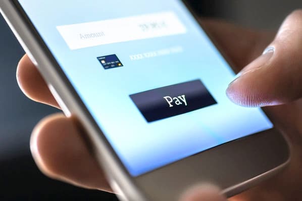
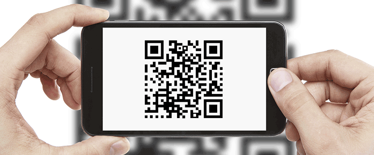
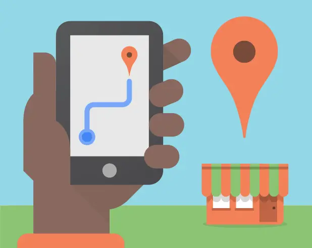
- Use features specific to mobile devices. Take advantage of all the great features of today's mobile devices when thinking of mobile marketing campaigns. For example, you can use GPS to let users check in at your establishment (you can even provide a reward for those who do), offer click-to-call functionality, and provide provide QR codes that lead to a targeted landing page. These features make for great mobile marketing because they address the needs of mobile users in a way traditional internet marketing cannot.
- Create content tailored to small screens. Shorter content that is formatted in bitesize chunks is ideal for the mobile experience. Be succinct, and embrace bold headings, bullet points, and numbered lists to break up longer paragraphs and make it easy for the reader to find what he needs.
- Add big buttons and calls-to-action (CTAs). You might've been told to make your product-focused website buttons a vibrant color to encourage visitors to click on them. Well, on mobile, size is just as important. People need to be able to easily tap on their phone's screens when navigating a website, and thumbs come in all shapes and sizes. Enhance the size of your most important conversion points just a little bit so your visitors can easily select the button they intended to select.
Making Your Email Marketing Mobile-Friendly
Create plain text and HTML email versions.
Some email clients will default to plain text and give readers the option to show pictures, while others will load pictures automatically. Be prepared by ensuring your emails render quickly and clearly in either scenario.
Write descriptive alt text.
Alt text, or alternative text, is the text that displays in lieu of an image when graphics can't render. If your email header is an image with a generic name, change the alt text to something that relates to the subject of the email.
Craft a crystal clear subject line.
When mobile users have a few minutes to check their email, they commonly divide their inbox into three categories: "read now," "delete," and "save for later." With a vague subject line, you're sure to end up in the "delete" category. Create a clear subject line to get your email read immediately, or at least starred for later.
Be an identifiable sender.
However your reader is most likely to know you, identify yourself as such in the sender field. This will help alleviate any confusion that would otherwise put you in their trash bin.
Integrate Mobile With Your Existing Inbound Marketing Strategy
If you already have a marketing strategy in full swing, how do you go about updating it to incorporate mobile? In addition to optimizing your website with responsive design, and enhancing your social media presence to include mobile-specific platforms like Instagram, you can also do the following:
Integrate mobile campaigns with your CRM.
As with any other campaign, you can and should track and nurture leads that come through mobile campaigns using your existing customer relationship manager (CRM). Don't have a CRM? You can use ours for free.
Use mobile to move leads through your funnel.
They've opted in to your campaign or pulled up your site, so they're already interested in you. Take advantage of that knowledge by providing content and a user experience tailored to their needs on a mobile device. For example, those in retail or ecommerce can optimize online checkout for mobile and provide easy access to reviews. B2B marketers can let users register for and listen to webinars on their mobile devices.
Include calls-to-action.
Mobile browsing should be more streamlined than desktop browsing, but calls-to-action are still a must. Compile the CTAs you're using across all marketing campaigns, and select those that make sense to use in your mobile campaigns to create a congruent user experience.
Integrate paid search.
Your mobile marketing strategy can include a paid search component by posting Google Mobile ads through your Google Ads account. Be sure to use strong calls-to-action tailored to your mobile searchers.
Customizing the Mobile Experience
It's one thing to take a marketing campaign mobile, but it's another thing to make this campaign unique to your brand. Here's how you can customize the mobile experience to your unique audience:
Use both mobile apps and mobile sites.
There's a lot of debate around whether or not mobile apps are better than mobile sites, but there's room for both. Think of mobile sites as a way to reach a wider audience and bring in people through the top of your funnel, and use mobile apps as a way to increase engagement among people in the middle of your funnel. Use your mobile site to encourage readers to download your mobile app.
Develop a mobile app.
The iPad floats somewhere between the PC and a mobile device. If you find tons of users are using an iPad to access your site, develop an app for them that is more robust than what you might offer someone on a smartphone.
Test different devices and browsers.
Just like you test your site in multiple browsers and check how emails render in multiple email clients, test your mobile campaigns on multiple devices and in multiple browsers to ensure the experience is consistent throughout.
Create content that addresses the needs of mobile users.
If you have a storefront and directions, then click-to-call functionality is important. If you sell products, make it easy to find a coupon code. Mobile users know what they are looking for, so anticipate those needs when creating content. And if you aren't a mind reader...ask them!
Leveraging SMS Marketing
Like I said earlier, SMS marketing (a.k.a. text marketing) can be a difficult channel to get just right. Mobile users are receptive to branded text messages, but only in special circumstances. When done right, though, they can be a boon for your brand awareness across your industry. Here are a few examples:
Use SMS for voting and polls.
SMS stands for short message service, and it's an easy way to receive feedback and increase engagement from your audience if you had a recent interaction with them or an ongoing relationship wherein you earned their phone number. Send your audience texts that allow them to vote or fill out a poll that helps you improve your service offerings.
Get a short code.
You know those screens that say "Text 12345 for your 10% off coupon"? That sequence of numbers is called a short code. Get your own short code for use in SMS marketing campaigns. Then, distribute them to your customers after they perform a certain behavior on your website, like claiming a reward or subscribing to updates from you. Here's an example:

Use SMS for alerts.
If you don't think the short code campaigns are up your alley, you can still use SMS for customer alerts. Give people the option to sign up for an alert when a product on backorder is available, or to receive a reminder when the webcast they signed up for is broadcasting.
Keep in mind text marketing, just like email marketing, is largely unwanted if you attempt to reach people by contact information they didn't personally give you. Make sure all of your lead-generating campaigns request email addresses and phone numbers before using them.
Be Legit
With great power comes great responsibility. Mobile marketing channels like SMS and app development can give you more data on your customers, and that data must be protected. Here are a few ways to do so:
Make opting out easy.
Be as legit with mobile marketing campaigns as you are with everything else. If you're using SMS or a multimedia messaging service (MMS), make it clear how to opt out and if any rates may apply if the user engages in your campaign.
Be secure with user data.
If users are submitting sensitive information over their mobile device -- such as credit card information, email addresses, or physical addresses -- ensure you've taken precautions to protect that data from unauthorized use or distribution. Learn how to comply with GDPR, Europe's latest data privacy law, on this page.
Make terms and conditions clearly visible.
If a user has to agree to terms and conditions before participating in a mobile marketing program, ensure it's easy for them to understand what those are. It is also illegal to automatically check that box for them, so there's extra incentive to make the legalese crystal clear.
Implementing Mobile Marketing
Ready to get started? Here are some parting thoughts ...
- Let people choose to use mobile browsing. There are some sites that have optimized for mobile, but the functionality we know and love from a desktop browsing session hasn't made the cut. Make sure you give your users the option to switch to back and forth from mobile browsing so they can get back to a more familiar format if they feel confused or limited by their options.
- Train employees on mobile functionality. If other employees will be interacting with users of your mobile site, mobile app, or SMS campaigns, ensure they understand the campaigns so they can answer questions and understand their value proposition.
While mobile marketing is a widely accepted approach to business growth, not every channel will be right for you. Continue monitoring what works and what doesn't, and refine your own best practices to fit the needs, interests, and location of your buyers.
Image credits: daryl_mitchell, dnfisher, ecastro, Wesley Fryer
Mobile Marketing
![Why you still need SMS marketing & how to get started [+Data]](https://53.fs1.hubspotusercontent-na1.net/hubfs/53/image1-May-11-2026-10-37-53-9492-PM.webp)
.webp)