.png?width=112&height=112&name=Image%20Hackathon%20%E2%80%93%20Vertical%20(70).png)
When I’m working with a client on redesigning or optimizing their website, the “About Us” page comes pretty far down the priority list. We tend to spend a lot more time on the “high visibility” pages like the homepage or services pages. But that doesn’t mean the About Us page isn’t important, and I think it still deserves the same level of care and attention.
![→ Download Now: About Us Pages Guide [Free Lookbook]](https://no-cache.hubspot.com/cta/default/53/f3ca18eb-3e09-4cf6-9f6b-c23d8a48a49a.png)
The About Us page is where you can reinforce the core values of your brand and put a human touch to your website. Some companies choose to tell the story of how the company formed, for example, while others include team photos or corporate values. I’ve rounded up some of my favorites so you can see just how impactful they can be.
Download the guide to review what we love about these amazing about us page examples, plus a few tips on how to make one of your own.
Table of Contents
- What makes a good About page?
- How to Write a Winning About Page: A Plug-and-Play Guide
- 7 Tips for Designing a Beautiful + Functional About Page
- About Us Page Templates and Examples
- About Me Page Templates and Examples
- Frequently Asked Questions on About Pages
Featured Resource: Our Favorite About Us Pages
.webp?width=350&height=454&name=Image%20Hackathon%20%E2%80%93%20Vertical%20(70).webp)
Download the guide to review what we love about these amazing About Us page examples, plus a few tips about how to make one of your own.
What makes a good About page?
Like any part of the website, your About page needs to be visually pleasing and well structured. But the true characteristic of a good About page is authentic and interesting content.
It’s an opportunity to set the stage for clients, and show them not just what you do, but why they would want to work with you. Similarly, potential employees might visit this page to get a sense of team culture and corporate values to learn why they should work for you.
This doesn’t mean going over the top with quirky team photos or making bold claims. That’s an approach that people can often see through and comes across as performative or inauthentic.
So, I recommend keeping it real with your About page content. Showcase your brand’s achievements, values, team, or story. But make sure it’s grounded in reality and is a true reflection of what people will find when they meet or work with you.
.png)
Unlock even more About Us page examples!
Get inspired by these awesome 'About Us' page examples and learn how to make yours great, too.
- "About Us" Pages Overview
- What to Include on Your Page
- Dozens of About Us Page Examples
Download Free
All fields are required.
How to Write a Winning About Page: A Plug-and-Play Guide
I looked at dozens of About pages to understand exactly what goes into creating a beautiful yet functional page introducing you/your company.
I’ve condensed all my learnings from this exercise into a seven-step guide for building an excellent About page.
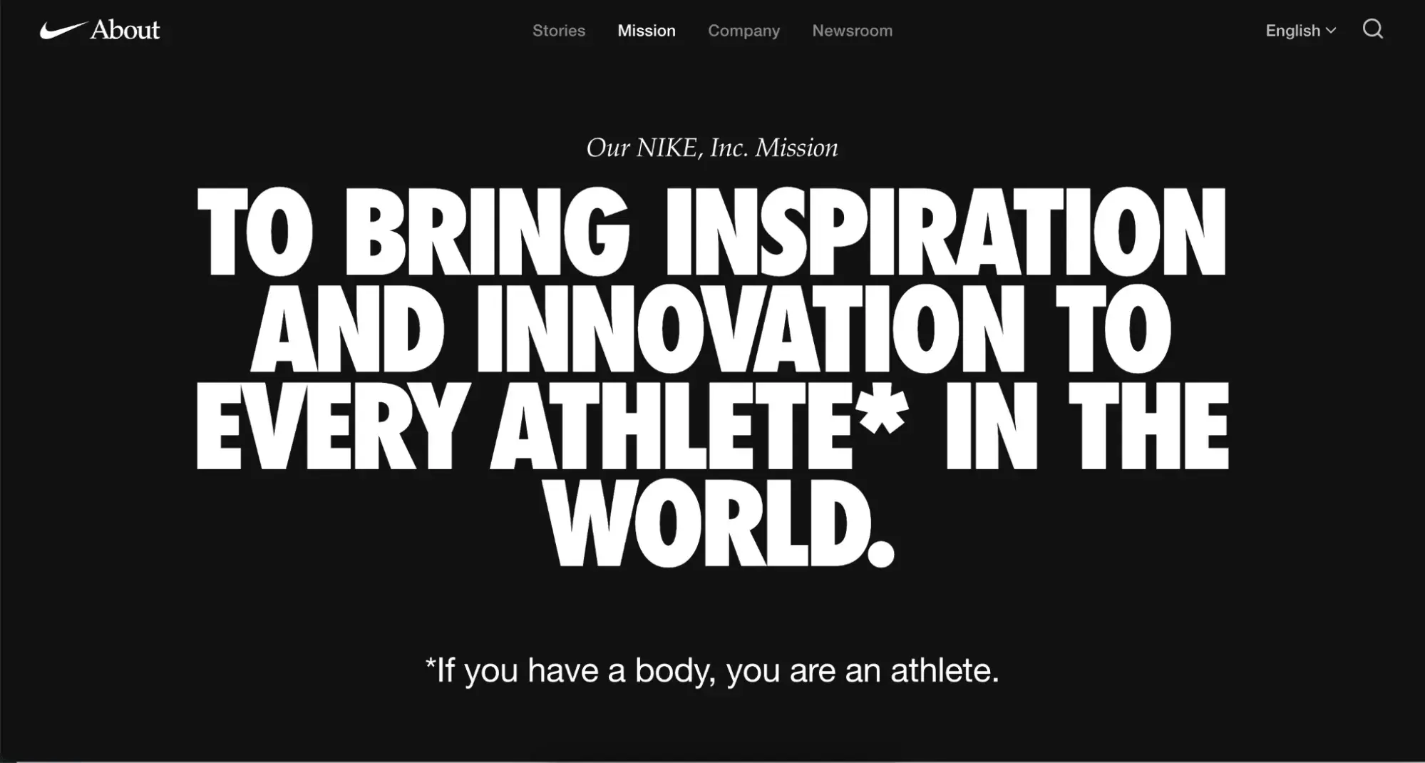
1. Establish your mission statement.
The About page is the perfect spot to highlight your mission statement. What really makes your brand tick, and what is your company ultimately setting out to do? It sets the tone for both your brand and the rest of the About page.
Take a look at this example from Nike. I particularly like the asterisk note that highlights the brand’s inclusive approach to athletics and sports.
You won’t see anything about their products in the mission statement. It’s more about who they are as a brand. And that’s why the About page is the perfect place for it. I recommend scrolling through the rest of the page to see how they expand on this with their core values and featured initiatives.
2. Create a narrative around your story.
Not every brand has a funny or interesting founding story, and that’s okay. Don’t get me wrong: If you do have an interesting founding story, by all means, tell it. But that doesn’t mean you can’t build an engaging and effective narrative all the same.
One example I like is Miro’s About page. There’s no grand lightning-bolt moment or cute family-founded business history. It’s just an authentic explanation of the “why” behind the software and brand, highlighting the founder’s personal experience in the industry and how he built the software to tackle real-world challenges that will resonate with potential customers.

Pro tip: I recommend isolating the milestones that came before and during your company’s founding. Use them to give readers some backstory on your current venture and connect the dots to where the brand is today.
3. Outline how you’ve evolved.
I’m a big fan of showing how a brand has changed over time. I find it useful for several reasons.
Let’s say there’s some old press or information about your company out there, but now things have changed. If I put a timeline on the About page showing how and why those changes happened, whether that relates to products and services or something like a complete re-brand, it gives everyone a concrete explanation of the change.
One example I like is Nokia. They’re a big brand with such a rich history that they actually separate it onto an entirely separate page of the website’s About Us section.

But I think it’s something that could be replicated as a section within a single About page.
Nokia uses a mixture of graphics and text to showcase how they have evolved the brand both visually and across their product lines. I particularly like the timeline that highlights key innovations and events.

4. Emphasize your “aha!” moment.
Every good company was founded on an idea — something the current marketplace might not yet offer. And that’s what makes your story truly unique.
Again, I think many companies believe this has to be something very unique or distinctly newsworthy. But it could be something as simple as the “why” behind your company, like your founder realizing that nobody else in the market offered the right levels of customer service. Or how they built up years of experience in the industry before making the leap to build something of their own.
Either way, the best way to represent an aha! moment is to make it personal.
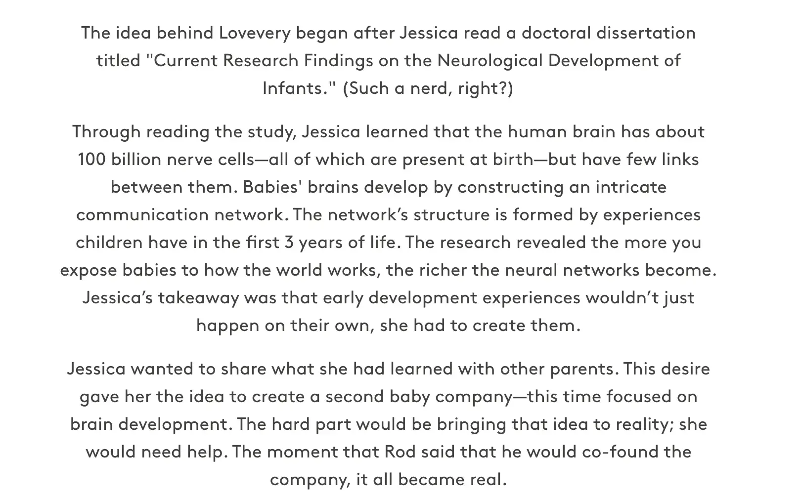
I love this example from Lovevery, a children’s toy company that blends Montessori principles with subscription-based toy kits. The founder, already running a successful baby food company, read a research paper about brain development in children under three years old and realized she could bring these crucial developmental experiences to families through tailor-made products. The About page tells the story beautifully and grounds the brand in this aha! moment.
5. Talk about your audience.
I know it’s tempting and an easy mistake to make when the page is called “About Us” or “Our Story.” But your About page shouldn’t talk only about you.
It’s also an opportunity to show how that story connects to your target audience, from their values to their challenges.
I like to think of it as a way to show prospective customers that you know them and that you can help them. Similarly, I recommend remembering that potential employees or investors will likely land on this page, too.
It’s what I like about Trainn’s About page. They highlight what’s in it for users and emphasize the product’s unique differentiator.

6. Share your brand values.
Many of the companies I work with focus on places like LinkedIn and job portals for their employer branding. But potential employees are also likely to visit your company’s About page.
In fact, I think they’re probably one audience who will pass the most critical and discerning eye over it. They want to know why they should contribute their time and skills to your company, and that you’ve created a positive work environment.
That’s why I recommend highlighting your core brand values and illustrating how you work as a team. Done right, this contributes to attracting top talent and candidates who genuinely align with your internal culture.
Your values speak a lot about your business and set clear expectations for those who want to work with you. I really like how Canva does this. Their values aren’t vague pieces of lip service that have been created as a check-the-box exercise. They clearly explain how the company approaches their product, customers, and their work together internally.

7. Add social proof.
I think the term “social proof” automatically makes people think of customer testimonials. But it can also mean customer logos, media coverage, or content that backs up your commitment to social impact or community initiatives.
One client I worked with sponsored a local sports team. But, apart from a couple of local news articles on Google, they weren’t highlighting it anywhere online. I built regular posts with photos from the team’s games into their social strategy, and added a “[Brand Name] in [Their Location]” section to the About page, with photos of employees at the team’s games and some other items about their sustainability efforts.
Social proof is about creating a positive impression and giving credibility to the claims you make. I like how Asana handles this on their About Us page.
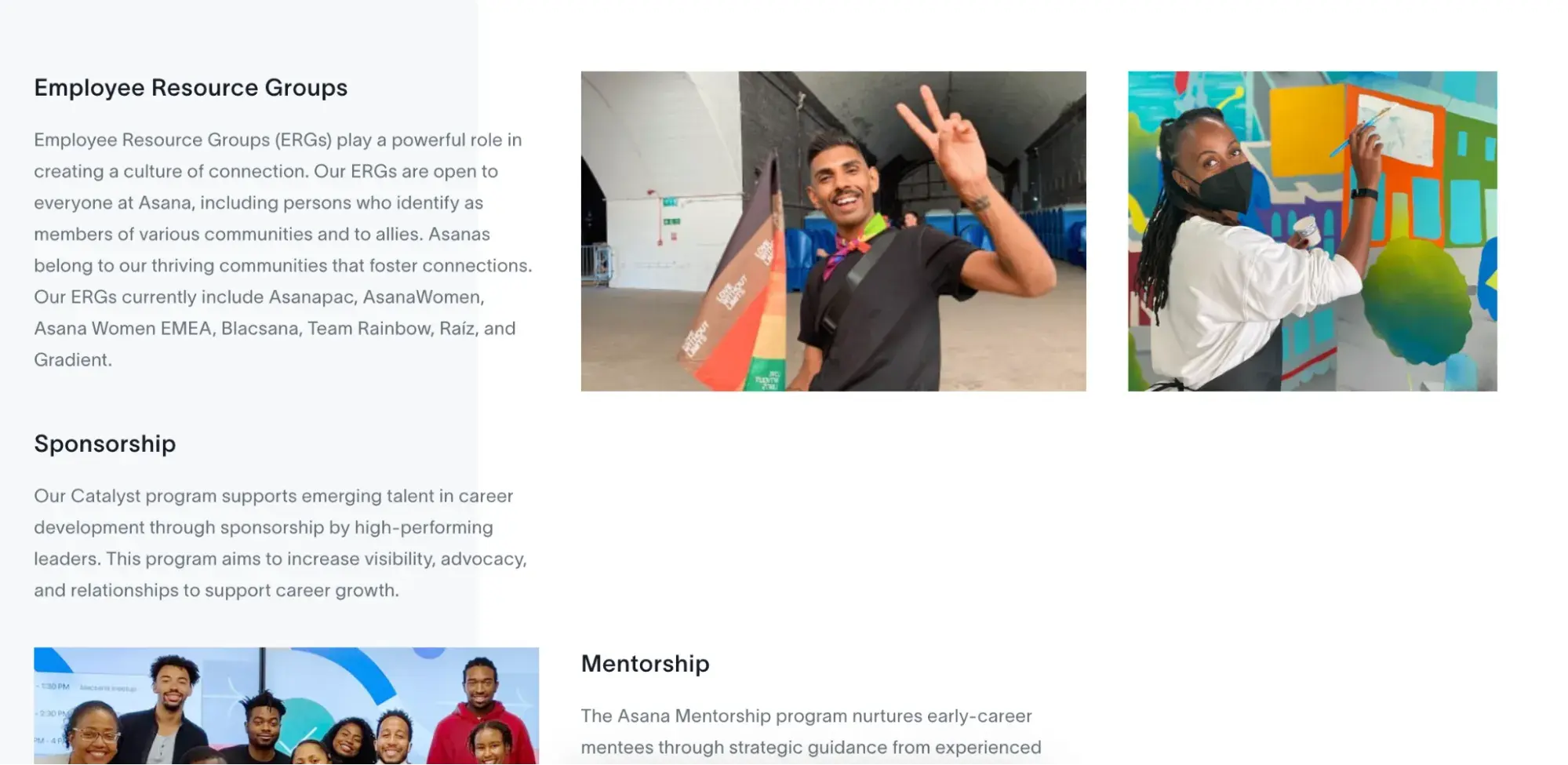
They link to a dedicated page for employee initiatives, highlighting the real-world impact of their commitment to values like “Heartitude” and “Give and take responsibility.” They also highlight notes from the CEO alongside other press on their About page.

7 Tips for Designing a Beautiful + Functional About Page
A brilliant About page design goes beyond just incorporating your company color schemes. The visuals, fonts, and colors you use can make a huge difference for end-users.
Here are seven of my top tips for designing an About page that makes people click.
Unlock even more About Us page examples!
Get inspired by these awesome 'About Us' page examples and learn how to make yours great, too.
- "About Us" Pages Overview
- What to Include on Your Page
- Dozens of About Us Page Examples
Download Free
All fields are required.
1. Choose a good color palette.
Humans have a natural response to different colors, and the colors you choose can impact your conversion rates. So, I always design About pages with color psychology in mind.
Of course, I still have to work within the existing brand color schemes most of the time. In those instances, I might decide to test different colors from the brand on things like backgrounds and buttons to determine which generates the most clicks and conversions.
One good example of color usage is BlueCross. Their BlueShield logo and web page make use of the color blue, which signals security, strength, wisdom, and trust. It shows patients that they’re in knowledgeable hands.

2. Humanize your brand with visuals.
I’m a huge advocate of adding a touch of “human” to your website whenever possible. I’ll carefully construct copy and make recommendations on visuals with this in mind.
But it’s even more important in a brand-focused area of the site like the About Us page. The visuals here should humanize and bring to life all the claims you’re making about your values and story. Stock photos might be acceptable for a blog post, but using them here can come across as inauthentic.
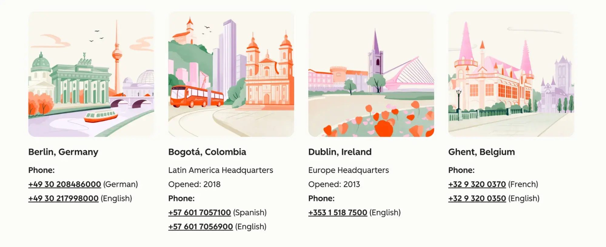
Here’s an example of humanizing the content with visuals, even if it’s not photographic. As an international company, HubSpot has lots of offices around the world. We highlight this on the HubSpot About page with on-brand graphics illustrating each city, letting both customers and potential employees alike know that we value our global community.
I’d also recommend going a step further by using videos to tell your company’s story whenever possible. People seek connection, and there’s no better way to connect than to appear on camera.
3. Choose some awesome staff photos.
Keeping to the theme of human visuals, I definitely recommend adding staff photos. If you keep a separate “Meet the Team” page, that’s fine. Maybe that’s where formal headshots and staff bios live. But many brands add this as an individual section on their general About Us page.
Whether you choose to add a grid of headshots or not, I still recommend using team photos and group shots on the About Us page. Depending on the size of your company, this could be just the founders or the C-suite.
I like how Monday.com handles this on their About page. They’ve incorporated professional shots of their real team in the office, bringing their company culture to life.
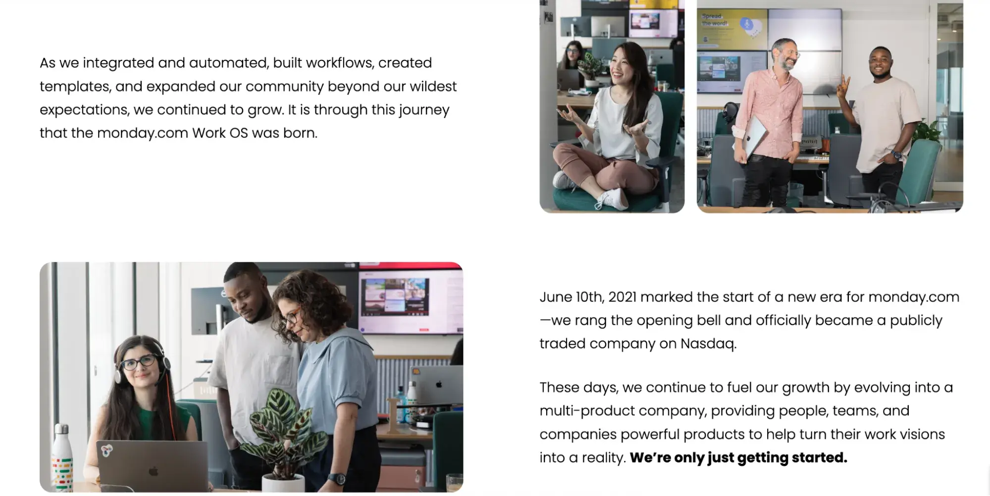
Pro tip: Hiring a professional photographer for some group photos and candid shots is well worth the investment. It ensures the look and feel of the photos is consistent with your brand and across all of the shots.
4. Use readable fonts.
This is another design recommendation I make throughout an entire site. Finding quality fonts is crucial when designing a website. If you want to use more than one font, tools like fontpair will provide you with excellent font combinations.
Additionally, I always make sure the font is accessible to individuals with disabilities, so all visitors have a rich experience when going through the About page.

5. Avoid long paragraphs and sentences.
Unlike other pages on the site that I craft purely with the target audience in mind, the About page is still mostly the brand talking about itself, no matter how “human” I make it.
This means I have even less time and space to capture a user’s attention and keep them engaged. So, long paragraphs and sentences are definitely off limits. They make my content difficult for readers to consume. So, as a general rule, my paragraphs won’t exceed 3-4 lines, and I’ll aim to keep sentences under 20 words.
Bonus: Shorter blocks of text make your page easily scannable across different screen sizes!
6. Make the page responsive.
Not everyone will visit your page on their desktop browsers. In fact, as of May 2025, 64.35% of all internet browsing happens on mobile devices.
I know that many users will visit a site from tablets and smartphones. Responsive design makes sure the About page looks great on all devices. It’s a way of ensuring content “resizes” itself no matter the size or shape of the screen.
I use paid tools to check things like page responsiveness, but there are free tools out there. Try this responsive design checker. It’s an excellent option for testing the appearance of your About Us page on 26 screen sizes.
7. Improve page load time.
I spend a lot of time on the technical side of website optimizations. This means checking how fast the website loads for users and doing everything I can to speed it up.
Slow websites lose users quickly. They’ll simply click back to search results or the previous page or, worse yet, head to a competitor’s site instead.
You can check your page speed for free using Google’s PageSpeed Insights. One of the fastest and easiest techniques I use to improve page speed is reducing the file size of on-page images.
About Us Page Templates and Examples
About Us Templates
When it comes to the content and structure of an About Us page, it can depend on the brand. But no matter your business, here’s my quick template for what to include:
- A mission statement. This describes the purpose of your business as it relates to the industry or market you serve.
- A vision statement. Outline the future of your business in this section.
- Your values. Core values help the reader connect with you and your business on a personal level.
- A target market summary. Your site visitors want to know that they’re in the right place and that your company can help them.
- A brief company history. Besides piquing your visitors’ interest, a brief company history can help the press describe your business accurately.
After you write a draft, you can use one of HubSpot’s done-for-you website templates to create your page layout. You can install and customize these templates in minutes.
Done-for-you About Us Page Templates
I usually start with the copy and structure for an About Us page. These are important elements, but I always want to make sure I showcase the brand story and identity to the world with beautiful visual elements, too. Done-for-you templates give me a nice structure to get started. I’ve curated these About page templates to help you create a compelling user experience.
1. Tokomoo Template (WordPress)
The Tokomoo template is a tasteful choice, and combines simplicity in layout with quirky design. The “meet the team” section sits at the top, with geometric designs, and striking typography showcasing the humans behind your brand. It makes plenty of use of whitespace and a clean white background without feeling dull.
What I like: I think, without the pops of color, this template would veer too close to being boring. But the subtle design elements and bright greens and yellows take care of that. I also like that it comes with plug-and-play sections for things like “Our Services.”
2. Parallax Template (Shopify)
I love the website themes and templates available on Shopify. There are so many other elements to think about with an ecommerce site that I find it helpful to get started with some of their out-of-the-box designs.
Parallax is sleek and soothing, and the About Us page template provides a simple banner image and paragraph text you can build on.
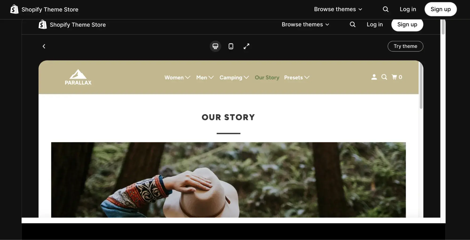
What I like: This template is ideal if you want to focus on imagery in the banner with simple paragraph text to tell your story.
3. Munchies Template (WordPress)
Not all brands I work with want to build out extensive brand stories or About pages, and that’s fine. In those cases, something like the Munchies template is perfect. It combines imagery with simple text blocks so you can tell your story with visuals or copy (or both).

What I like: In a mobile-first digital world, I’m always concerned about having a responsive site. So I like that this template is already fully optimized for mobile.
3. Mobirise Template (WordPress)
The Mobirise template is simple in terms of visual elements and color usage, but I really like the layout and use of whitespace. I also like it for About pages because it gives plenty of pre-set opportunities for adding team imagery.

What I like: Rather than having an entire dedicated About page, the menu item on this template jumps the user down to the simple page section I’ve shown above. It’s perfect if you need a website up and running quickly but don’t want to build a separate page.
Best About Us Page Examples
1. Yellow Leaf Hammocks
Yellow Leaf Hammocks is a mission-driven ecommerce brand. They sell handwoven hammocks with a focus on manufacturing and employing sustainably.
Their About page is a great example of how to tell a brand story, explaining both the origins of the idea and how they operate today.

What I love: Yellow Leaf uses a mixture of video, images, and copy to illustrate their values and impact. They link out to more detailed impact stories and emphasize their core mission every step of the way.
2. Apptopia
I’ve worked with a lot of B2B tech companies, and it can be difficult for them to break through the “corporate” and add a human touch to their brand. Apptopia is an example of why I continue to recommend it, even for brands whose products are highly technical.
Apptopia’s About page combines headshots and bios of their C-suite alongside a full breakdown of the entire team. This includes headshots and titles for the canine members of their team, including Flash, “Infurstructure” Engineer, and Leto, “Bark-end” Programming. Cute, right?

What I love: Apptopia’s About page doesn’t do anything flashy in terms of layout or microinteractions. It’s all about the visuals and copy.
3. Moz
Moz is an interesting one. They became a hugely popular search marketing tool before an acquisition and dramatic expansion in their product suite into paid advertising and social media solutions.
Then, in 2016, they backtracked massively and returned to their core search marketing roots. On the About page, they address this journey in meticulous detail. It reinforces trust with long-time customers and keeps their strategic decision making transparent, while also providing a clear timeline for investors and press.

What I love: There are no bells and whistles on the Moz About page. Instead, they focus on a clear objective: telling their story. From the page’s headline “The Moz Story” to a quote from Rand Fishkin, Moz’s founder, I like that they keep the content clear and uncluttered with links to other pages like Careers and press releases.
4. Doomtree
Doomtree is another brand that takes a storytelling approach to the About page. They’re a musical collective, and they detail how the band formed and their unique style along with some press quotes to emphasize the quality of their album releases.

What I love: Doomtree is a creative collective, and they lean on this in everything from the visuals to the copy on their About page. I like that they link out to detailed, individual bios for each artist, too, to bring even more color to their story.
Pro tip: Find ways to use multimedia elements. If a picture is worth a thousand words, a video will be worth many times more. Consider combining your unique story with audio and visuals like Doomtree.
5. Ceros
I could have added screenshots of multiple areas on the Ceros About page because each section of the page is unique. They open with a clever animated hero section and follow with a mix of striking visuals and numbers that highlight the bottom line results they achieve.
The team section doesn’t focus on static headshots, but leads the page seamlessly from what they do, to their values and job openings for prospective employees.

What I love: “Where creativity meets conviction” is exactly what this About page conveys. I love how they have combined truly creative on-page elements while also focusing on the real-world results they achieve.
Unlock even more About Us page examples!
Get inspired by these awesome 'About Us' page examples and learn how to make yours great, too.
- "About Us" Pages Overview
- What to Include on Your Page
- Dozens of About Us Page Examples
Download Free
All fields are required.
6. Sweet Loren’s
Sweet Loren’s is a brand started by cancer survivor Loren, who then embarked on a mission to provide clean food for those with a sweet tooth. The About page weaves her personal story and the brand’s mission together through timelines and a note from Loren herself, reinforcing the brand’s commitment and customer promises.
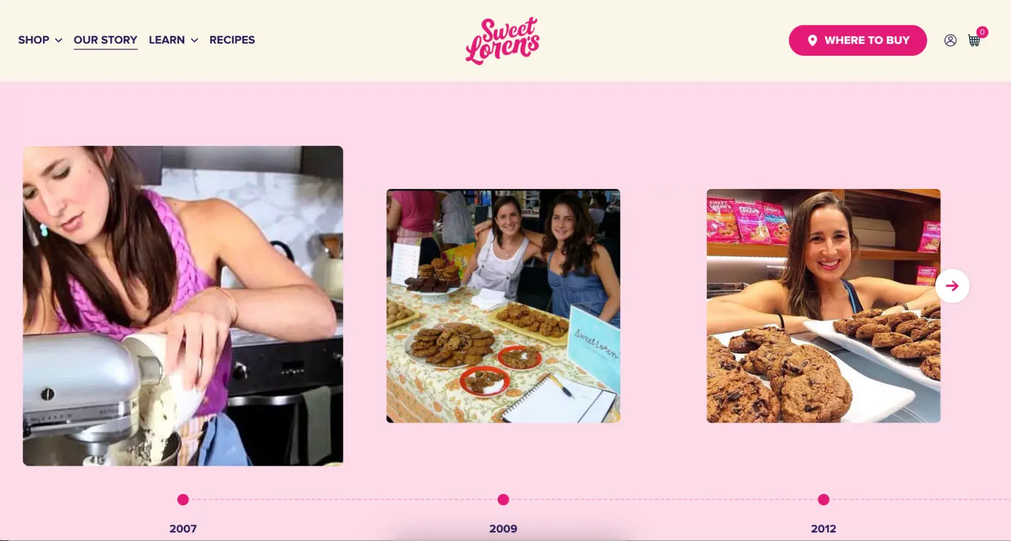
What I love: Loren’s About page is super easy to follow, and I love the use of video, imagery, and copy to tell the story. The timeline combination of text and imagery keeps the human element of the brand front and center at all times.
7. TalEx
TalEx began when two women left a major recruiting firm to build their own. They’ve since seen huge growth, and the About page is dedicated to telling that story while emphasizing that their core values of “disrupting the norm” and “truly talking the talk and walking the walk of diversity and inclusion” remain the bedrock of their operations.
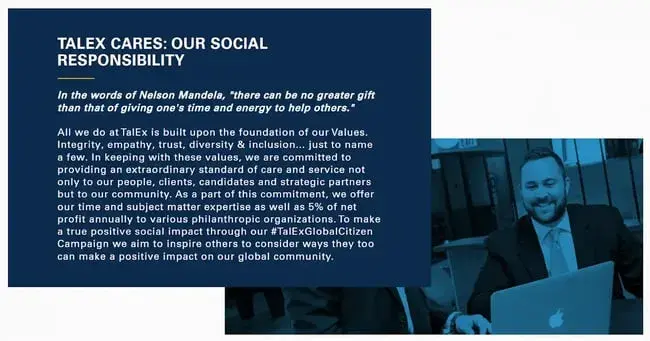
What I love: This is another example of not needing lots of animation and on-page elements to build an effective About page. I love TalEx’s mission and story, and the truth is, when you can genuinely stand behind your brand’s values and mission, well-written copy augmented with on-brand visuals can be all you need.
8. LoveBug Probiotics
LoveBug started when founder and mom, Ashley Harris, experienced a depleted immune system as a result of broad spectrum antibiotics after the birth of her son. Both she and her son became ill, and Ashley started looking into probiotic solutions.
Fast forward to now and this successful brand provides probiotic supplements for babies, kids, and adults. The About page tells this story with empathy and understanding as a narrative that will resonate with lots of parents out there.
The page then moves on to reinforce the four pillars of probiotics, using video and visuals to combine the brand story with the scientific background.

What I love: Under each of the four pillars of probiotics, users can select “Geek mode” for a more detailed, scientific explanation. I thought this was a really unexpected and engaging way to encourage users to learn more.
9. Who Gives a Crap
I love this company’s branding, messaging, and overall vibe. They’re tackling a serious issue, namely the environmental impact of traditional toilet paper, but they bring humor every step of the way.
It helps to get the message across quickly and keep people engaged with what is, let’s face it, a pretty unglamorous topic.

What I love: I can’t overstate the level of irreverence on this About page, and the image above is definitely on the lighter side. But the reason it works is because it’s genuine, and you can tell that the brand truly believes in their mission and the work they do. If you want a lesson on good copywriting for About pages, I highly recommend checking it out in more detail.
10. Basecamp
Almost the entire Basecamp About page is a letter from the founder. It’s a project management system built by what was previously a design firm. They created the software as a response to their own challenges managing client work.
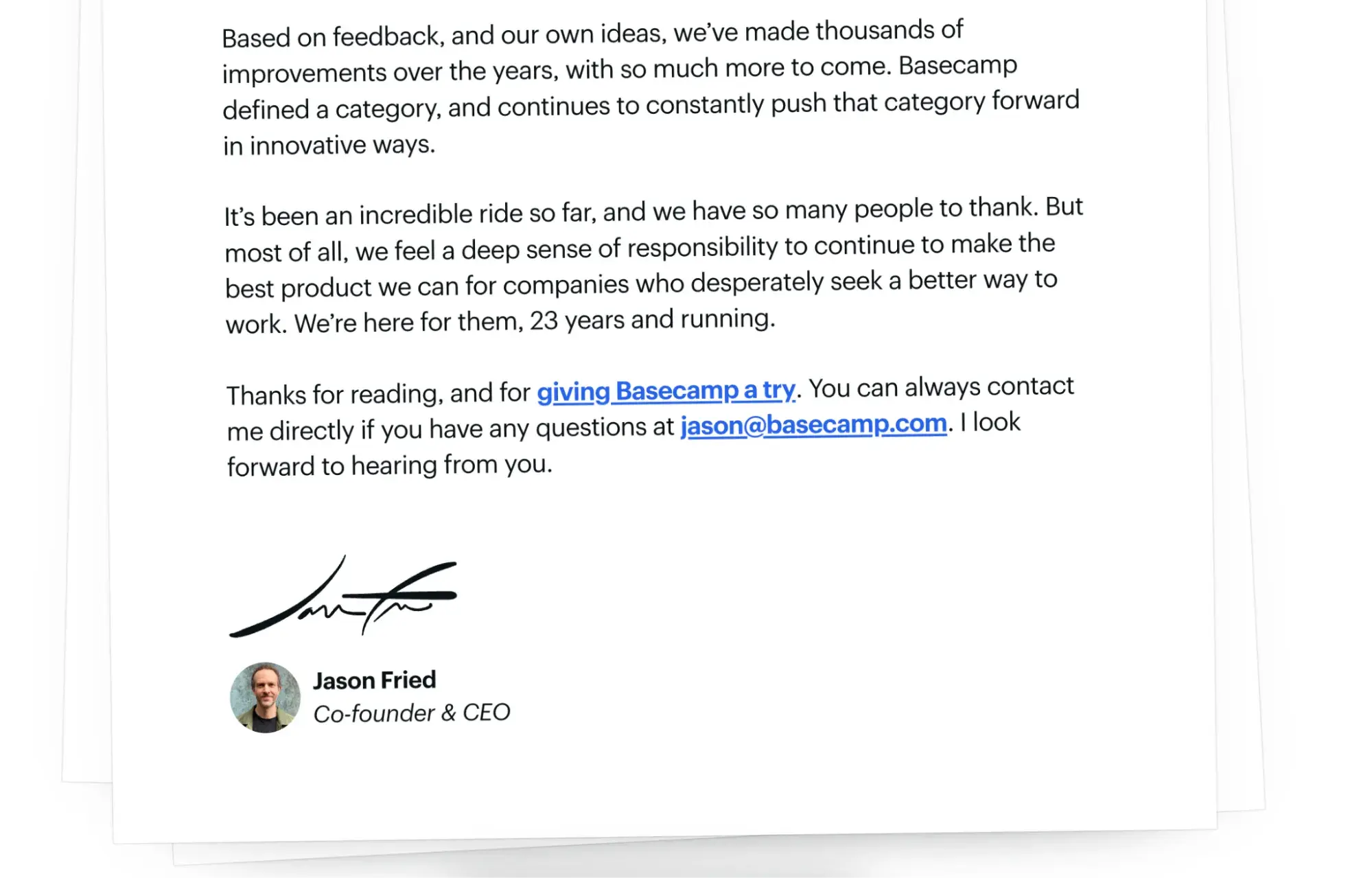
What I love: Simplicity strikes again! I love the visual effect on this page, which makes Jason’s message look like an actual letter. They don’t add to it with any other section or graphics, just a clean, clear focus on the brand’s founding story.
11. Airbnb
Big brands can find it tricky to create an engaging About page. There’s a lot to focus on between investor information, founding stories, values, careers, and impact.
Airbnb manages to combine many of these elements together without overcrowding the page. The founder story is short and sweet, but emphasizes how the core of the brand remains true to its roots. Meanwhile, the scrolling timelines break it down in more detail.

What I love: The visuals on the “Fast facts” section brings home just how far and wide the brand has spread, while also emphasizing the potential income for hosts who want to sign up to the platform.
12. Dropbox
Dropbox is another big brand that’s made it to this list. They keep the About page very simple, with a brief history before showcasing the executive team and board of directors with headshots and short bios.
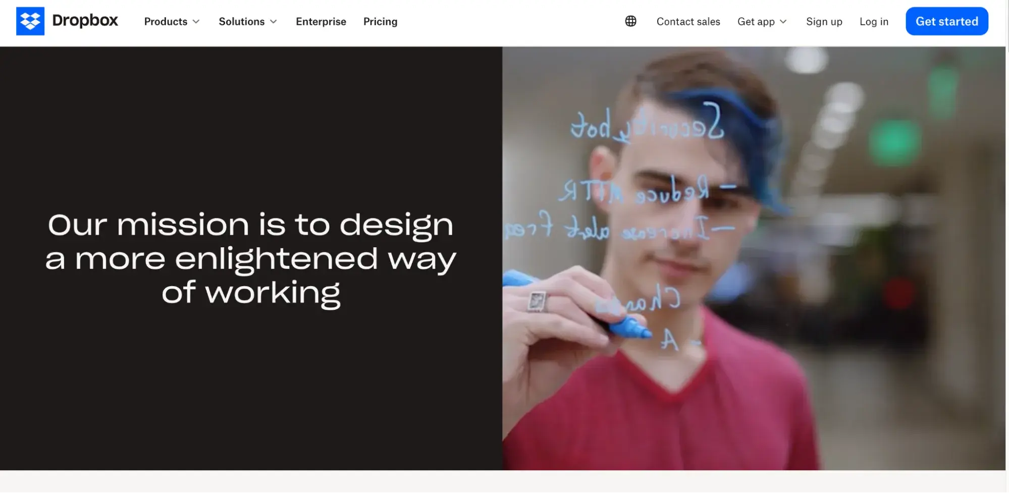
What I love: The mission of the brand is front and center in the hero section of the page. I particularly like the video on the right hand side of the hero to showcase this mission in action with the Dropbox team.
13. Zappos
Zappos is an online fashion brand and their About page focuses on the values and culture of the company.
It’s a great way to give both customers and prospective employees a sense of who they’re buying from or the culture they would be working in. It combines text, animations, explosive visuals, and video to get this across to the user.
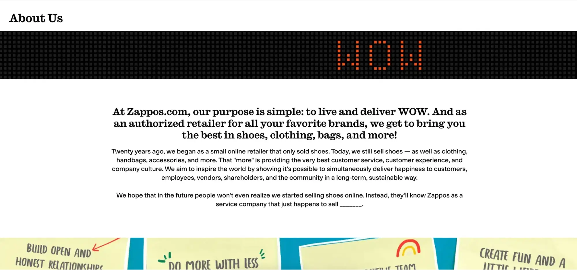
What I like: Video is great for engaging people, but I’m not a fan of including video just for the sake of it. What I like about Zappos is they’ve used exclusive footage of real employees for their About video, from working together at their desks to stopping by the coffee shop in their office building. It gives the page a more authentic feel.
14. Headspace
Headspace’s mission is to “provide every person access to lifelong mental health support,” something they open with in the hero section and continue to highlight throughout the page.
They also include photos of their team, clinical leadership, and board of directors. For a brand that deals with a topic and product as sensitive as mental health, this reinforces the expertise behind the company to build user trust.

What I love: I really liked the section on evidence-based outcomes in the image above. It’s another great way to build trust for potential users and is backed up with source data to validate it further.
15. Goodr
This eyewear brand makes sunglasses, and they’ve got a bright and cheerful brand that perfectly suits their product line.
On the About page, they use the space to reinforce the brand personality with witty copy and a brief but engaging founding story.

What I love: The page uses a clever animated, scrolling banner to showcase the benefits of their product, which is a great way to keep the product front of mind for customers who may be exploring the page.
About Me Page Templates and Examples
About Me Template
When I’m working with an individual, like an executive coach or a consultant, for example, I’ll tweak my approach slightly. They give a lot more room for injecting personality and history into the About page, so here is my go-to template:
- Your purpose. This describes your purpose for doing the work you do. What gets you out of bed each morning? Try using the Ikigai map for guidance here.
- Vision statement. Who are you, and where are you headed? Believe it or not, people are looking to you for leadership. Show them how you’re leading your life and what inspires you to move forward.
- Your core values. Personal core values help the reader connect with you and find common ground.
- Personal statement. Whether you share your hobbies, family life, or fun facts, a brief personal summary helps the reader relate to you on a personal level.
Let’s take a look at these elements in action.
Done-for-you About Me Page Templates
1. Coax Template (WordPress)
What I like most about the Coax template is the page layout. It moves from a simple but visually engaging banner into an “About Me” section.
Then, you can take the opportunity to highlight your experience in a timeline format, followed by a bar graph that showcases your specific skills.
It’s almost like a resume in website format. I like it for freelancers, consultants, and anyone providing B2B services.
It’s also a template powered by Elementor, a WordPress page builder that makes customization easy.

2. One-Page Portfolio Template
Instead of a wall of text, this About Me page is neatly divided into separate sections. The text at the top of the page allows you to describe your mission and background.
The icons in the next section call attention to three specific services you provide. But what I like most is the amount of space for showcasing images. It makes it ideal for creatives like photographers who want to show off visual representations of work samples and previous projects.
This template is also fully mobile responsive already, so I wouldn’t need to worry about that when building out the page.

3. Beckham Template
Freelance templates are important because many freelancers need an online portfolio and About Me page, but might lack the know-how to build one.
The Beckham template has a structure perfectly suitable for freelancers, with sections to outline your full resume. The layout is super clean and areas for contact details and portfolio items are already structured into the site.

What I like: The hamburger menu icon with a pop-out to link to other pages is a nice touch. By swapping out information and images, you could easily build this template into a live site within a day.
4. Calvin Template
This template works for all kinds of services, as it has places for text, images for visual projects, and pre-built icons and sections for your services.
The design is simple but engaging, and it would be easy to switch out the color palette if you wanted to.
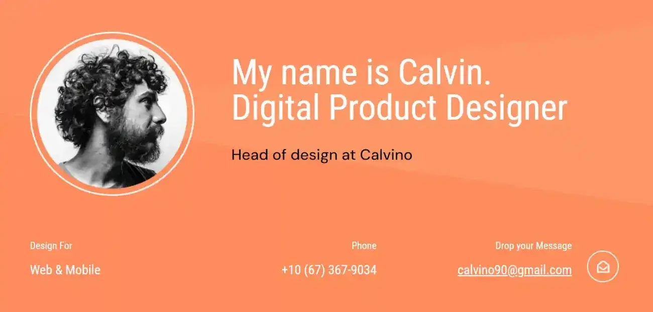
What I like: Customer testimonials are a crucial element of an About Me page, and this template has a scrolling banner for testimonials already in place.
Unlock even more About Us page examples!
Get inspired by these awesome 'About Us' page examples and learn how to make yours great, too.
- "About Us" Pages Overview
- What to Include on Your Page
- Dozens of About Us Page Examples
Download Free
All fields are required.
Best About Me Page Examples
1. Joe Payton
Joe is a web designer and developer. With so many cookie-cutter websites out there, Joe uses his website and About page to really show off his skills.
His About page uses graphics, text, and microinteractions to keep the user scrolling and interested.
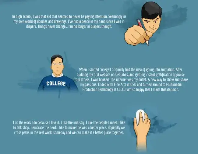
What I love: Firstly, I think the graphics on the page are excellent and a great showcase of Joe’s skills. But I also like how they guide you through his story, with just enough text to tell the story without losing the reader.
2. Aja Frost
All right, we might be biased in highlighting this professional, as Aja is our very own senior director of global growth at HubSpot. Nonetheless, the ingenuity she brings to the company isn’t lost on her website’s About Me page.
Being a data-driven professional, Aja knows her clients are looking for more than her writing skills.
They want to see how her content has performed. With that in mind, her About Me page tells a story of her career growth, which peaks — no pun intended — at an impressive line graph showing the result of an SEO strategy she implemented for the HubSpot Blog.

What I love: Aja understands the value of being personable even in a digital space like an About Me page. She closes out her About page with a personal note on what she does in her spare time — a great way to humanize yourself in the eyes of your potential customers.
3. Madison Butler
Madison Butler is an HR change-maker “committed to deconstructing the status quo and rebuilding corporate America, one organization at a time.” She does this through her DEI work and her advocacy.
So central is her story and personality to the brand, that her About page also serves as the website’s homepage.

What I love: When you’re a one-person band, I think having your story right up front on the homepage is an excellent idea. At a certain point, clients are buying into you just as much as the services you provide. I also love how much personality Madison injects here with her use of color and on-page elements.
4. ShaDrena
ShaDrena is a creative designer and art director. Her entire website speaks to how she thinks outside the box, from the layout to the typography choices.
The About page is no different, with an usual blank space in the middle. Further down the page, she calls this blank area out explicitly with a small headline reading “(space to breath).”
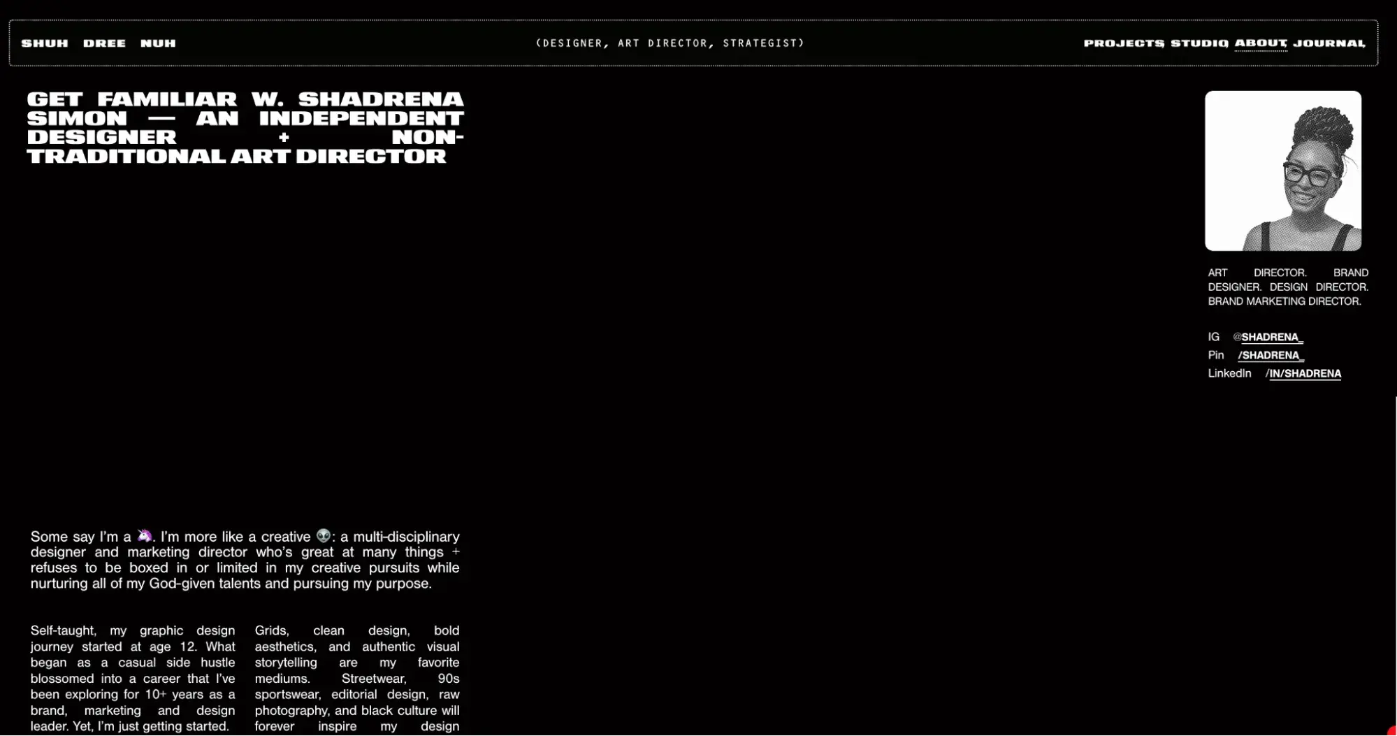
What I love: ShaDrena’s About page is a great example of daring to be different. She has actually updated this page over the years, with different layouts and copy. But what has never changed is her willingness to experiment, something I highly recommend trying with your own page.
5. Haley Shapley
Haley is a freelance writer and author, and her website places a strong emphasis on showcasing her work.
On the About page, she tells her story in a few simple paragraphs. As a writer, she knows how to get her background and personality across seamlessly. Further down the page, she includes quotes from editors to emphasize the quality of her work and provide social proof.
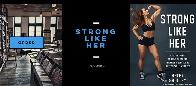
What I love: Rather than focusing solely on portfolio pieces, Haley uses her website to communicate her personality and values. I think it really helps her About page stand out from the crowd.
6. Cathy Derus
Cathy is an accountant and works with online businesses on their financial strategies, bookkeeping, and taxes.
The overall site is bright and friendly, with photos of Cathy adding a human touch. She uses her About page to differentiate herself. Rather than standard bookkeeping and tax filing, she provides financial strategies for business owners to make the most of their income.
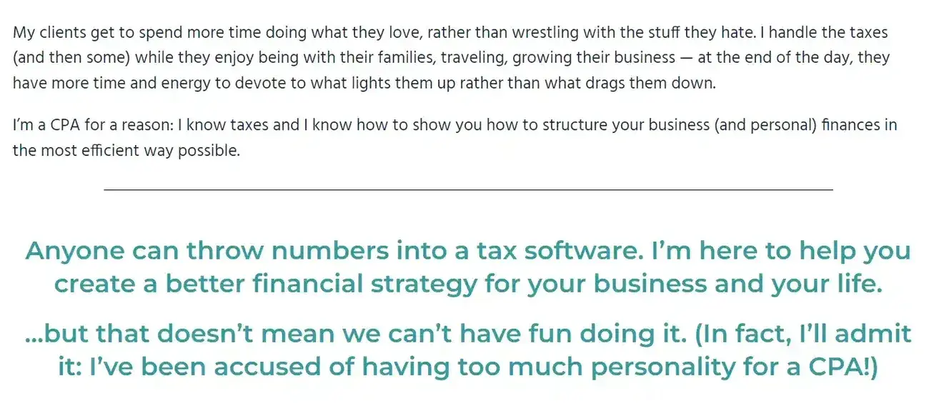
What I love: Accounting and taxes are not exactly a thrilling subject for most of us. I love that Cathy has taken the time to add some personality to her About page. Rather than playing it safe with muted colors and an overly formal tone, her About page gives users a taste of what it would be like to work with her.
7. Austin Kleon
Austin is a writer, illustrator, and New York Times bestselling author. With so many skills to showcase, he keeps a static banner of his books to the left to increase conversions.
Further down the page, after an official bio for “copying and pasting,” as Austing puts it, he adds a touch more personality with FAQs and an embedded video interview.

What I love: I think the FAQ section is a really clever way to give users a bit more of a “behind-the-scenes” glimpse into your personality, and Austin also uses it to further plug his books. I also love that he includes a question about advice for younger artists just starting out.
8. Marie Forleo
Marie is an entrepreneur and speaker. On her website, she plugs her podcast and has several courses available.
So, why should you learn from Marie? That’s exactly what she uses her About page to tell you. Marie provides a detailed and highly personal bio to showcase how she made it from humble beginnings to a spot on Oprah’s studio set.

What I love: Marie really puts her entire story out there, and writes it in a highly compelling and encouraging way. I also love that she signs it off with a personal signature at the end of the page to make it feel like she’s speaking directly to the reader.
9. Jessica Hische
Jessica is a designer and specializes in lettering. She’s also a New York Times bestselling author of children’s books.
Her About page is short and sweet, but she does provide a long list of world-class brands she has worked with for social proof.

What I love: Jessica incorporates samples of her work in the most natural ways throughout her site. On the About page, she does this by including a professional photo standing in front of a wall of her own work in the background.
10. Amy Porterfield
Online business expert, Amy Porterfield, showcases her huge success on her About page. She highlights wins, like being featured in Forbes and MSNBC, or being a bestselling author. And she weaves her story into the page through highly visual timelines and punchy copy.

What I love: Amy’s About page is extremely well designed, and I think it’s a go-to example of how to leverage design and copy together to keep users engaged. She uses different font sizes, icons, text underlines, and graphics to guide the user easily through the page.
11. Jon Acuff
Jon is a speaker and author and has written several books about productivity and how to achieve your goals.
His About page is simple, featuring a headshot, a statement explaining his mission, and an official bio.

What I love: Jon uses the first half of the page to explain his mission, but he puts the user at the heart of it with repeating sentences starting with “you.” This copy is personal, and speaks directly to his audience. Underneath, however, he still provides his official press-facing bio which is a great double use of the space.
12. Mike Kus
Mike is a graphic designer working on everything from complete brand kits to web design. His About page shows his flair for creativity and highlights examples of his work that make you want to learn more.
The portfolio tiles are also cleverly animated to draw the eye as you scroll down the page.
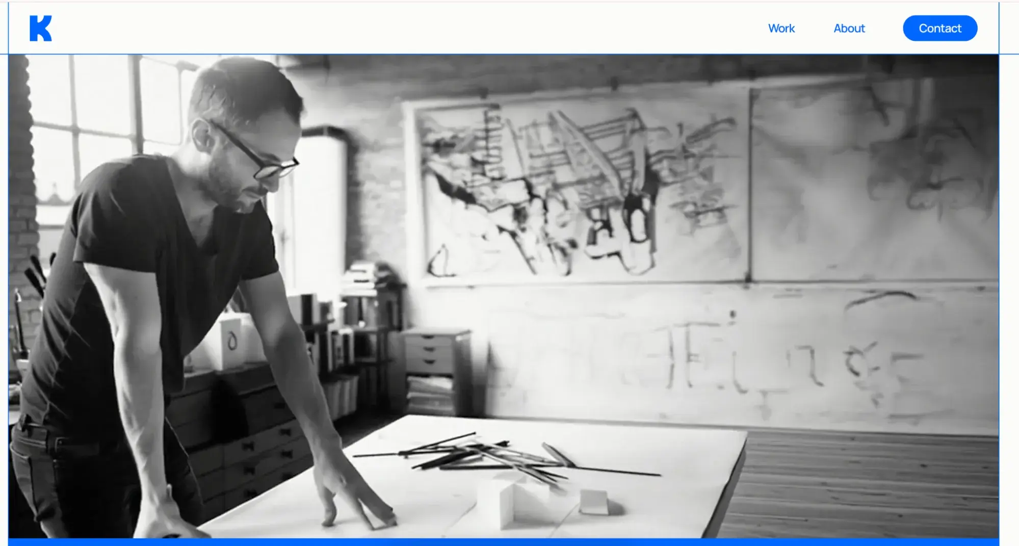
What I love: I really like Mike’s use of video on the About page. Instead of an interview-style video or stock footage, he uses a very simple few shots of himself at work. It’s a nice way to give a “behind the scenes” look without a big production.
Frequently Asked Questions on About Pages
How do I write an About Us page?
Here’s how I usually approach an About Us page:
- I establish the brand’s mission statement.
- I work with my client to build a narrative around their story.
- I write the page copy and outline how the brand has evolved.
- I make sure to emphasize the “aha!” moment.
- I put the brand’s audience front and center by making sure my copy speaks directly to them.
- I include the brand’s values.
- I add social proof like client testimonials and media mentions.
What is the point of an About Us page?
I spend time on About Us pages because they’re an opportunity to give the audience a closer look at the brand, from who it serves to what it stands for. I recommend showcasing your brand’s mission, values, and story to tell people what you’re building and why.
Depending on your company, it can serve to attract top talent, direct investors to relevant resources, or provide more information on how your brand has evolved over time. I take these objectives into account with every About page I work on.
How do I write an About Me page example?
When writing an About Me page, it’s important for your message to be authentic and to let your brand’s personality shine true. I like to keep information succinct, but powerful, and use visuals like imagery and animations to keep the page engaging. One of my tips is to make sure it fits with the tone and branding on the rest of your site.
Tell the world all about you.
I know your About page may not feel like a high priority, especially if you’re in the middle of a full website design. But I would give it the time and attention it deserves. It’s one of the only places where a user willingly reads and absorbs this much information about who you are and what you do, so take advantage. Highlight what makes your brands unique, not just your products or services.
If you get the About page right, you’re setting the tone for how employees and customers will interact with you. So, make sure to get off on the right foot!
Editor’s note: This post was originally published in October 2020 and has been updated for comprehensiveness.
Unlock even more About Us page examples!
Get inspired by these awesome 'About Us' page examples and learn how to make yours great, too.
- "About Us" Pages Overview
- What to Include on Your Page
- Dozens of About Us Page Examples
Download Free
All fields are required.