I’d been working on the HubSpot website for several months when the déjà vu struck.
My team and I were going over the initial wireframes for a new page. As always, we’d started the project with the noble goals of better branding, an improved user experience, and sleeker designs. And, as always, we had ended up debating the most minute details.
Do we use sentence case or title case for our headers? Did we decide to round the corners of our buttons? Which version of the logo did we want on landing pages? Hadn’t we had these conversations before?
We all knew we needed to improve our process, but it seemed easier to put it off until after the next project. That is, until we reached a breaking point.
It was time to make our process more manageable, scalable, and regulated. It was time to build our own website style guide. Here's how it all played out.
What’s a Style Guide?
First off, we needed to define what was going into our style guide (or “pattern library”).
Basically, a website style guide is a resource that defines all elements that go into the website: code snippets, design assets, guidelines for copywriting, etc. Some style guides focus more on design; others on development. Many style guides also formalize the best practices and processes for how the team should work together.
The goal is to create a centralized hub of information that should allow anyone to understand and replicate the process of designing and building for your site.
Building Our Designs From Scratch
With so many different designers and developers working on the website, we found ourselves with a hodgepodge collection of templates, style sheets, and modules on our hands. This was troubling, as there was no unified design that could be retrofitted into a cohesive style guide.
Though this project was getting bigger by the second, we decided it would be better in the long run to start afresh and design brand-new styles for the site. We also wanted to incorporate some completely new elements, like adding a new font and reworking our form styles.
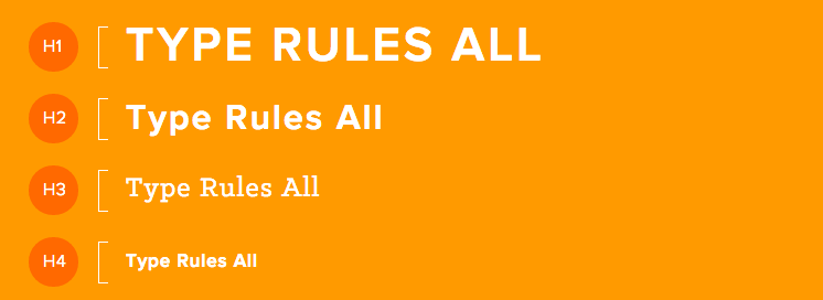
And so we began the process of formalizing our designs. We decided to start with typography: choosing and updating font styles seemed relatively straightforward. Yet this seemingly simple update yielded some telling roadblocks.
First, when I started testing out our approved font styles on existing pages, they didn’t always look as good as we’d imagined. It became clear that the font styles needed to be adjusted to be compatible with many different parts of the site; even then, some of our custom-designed pages needed to be reworked to fit the new styles.

After typography, we backed up a little. We combed through our existing website, looking for patterns. Most pages were built with similar skeletons: some sort of photo header, various subheaders, blocks of copy or photos, and rows with one or two CTAs. We decided to make a list of the most important, repeated elements, and build those elements as reusable custom modules. We envisioned a set of full-width modules that could stack together to build any page.
Making it Modular
While the purpose of this style guide was to streamline our design and development process, it was also important that we created something non-designers and non-developers could leverage. The decision to make it modular was rooted in just that.
By designing all the modules at the same time, we were ensuring that the style was cohesive, and we could mock up how pages would look with various combinations of modules. And even though we’d figured out an effective way to modularize our website, we still encountered some serious challenges.
As we started to make final design decisions, I realized we’d all had slightly different ideas about how our site was going to look. Since the style guide touched so much of the website, we wanted to involve everyone who worked on design, development, or branding, however, it’s impossible to accommodate the insight and opinions of so many people. That said, we ended up making decisions that we deemed best for the website users, while building something flexible enough to allow easy updates.
Preparing for the Launch
Finally, after months of designing, building, testing, and rebuilding, we had developed a set of modules for use across the HubSpot site. But how to display them?
We wanted anyone using the modules to be able to understand the design principles that went into their creation. Furthermore, we wanted to create a reference for future designers on our team and anyone else who might need to iterate on our styles.
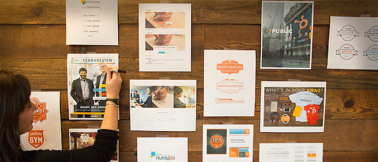
After some discussion, we built out two pages to house our finished style guide: Foundations and Components. The Foundations page goes over our design and branding principles, including specific details regarding our typography, iconography, colors, logos, and imagery. The Components page shows those design elements in action: we use this page as a library of all our customizable modules used for website development. We then set up recurring trainings with the marketing team so that everyone could use the guide for their projects.
And with that, the style guide had launched.
Life After the Style Guide
When we finished the style guide, I quickly realized that it wasn’t just a major revamp of our site styles; the style guide had totally changed how my team tackles new projects and interfaces with the rest of the marketing team.
Now, all of our projects reference the style guide in some form or another. As soon as we receive a new project request, we check to see if it might be something that can be built solely through our style guide components. If not, we’re conscious of creating and building new elements that fit with our guide. When we receive a project that requires a more custom or novel approach, we’re cognizant of how we might be “breaking” our style guidelines; sometimes this opens the door to iterating on our current styles.
The style guide has improved so many parts of our workflow, but I think these are some of the most important benefits:
- Design and development work together more efficiently. Before the style guide conversations, we didn’t have a shared vocabulary between design, development, and other stakeholders. Now, we all have a common reference point for our current and future designs.
- We get to work with cleaner, more scalable code. On the development side, our code base is now far cleaner and easier to maintain. Whenever I start a new project, I immediately reference the global styles and variables from the style guide. Furthermore, I can now make changes that will be reflected across all parts of the website.
- Our onboarding process has become more standardized. Getting new team members up to speed is so much easier when we can point to an interactive document to illustrate our design and development philosophies. The style guide also serves as an inventory of all our approved, polished design elements and their accompanying code, so there’s no need to track down old files or question whether or not something is out-of-date.
Of course, it wasn't just my team that benefited from the style guide: other members of the marketing team could now make their own pages without needing to wait for design or development resources. One of my coworkers was telling me how she was rebuilding a significant part of the website, a task which would have taken at least six weeks at her last company. The style guide allowed her to finish in about a day. How crazy is that?
4 Tips for Building Your Own Style Guide
A style guide can feel like it carries more weight than smaller projects, like one-off page builds or small-scale custom apps. And in many ways, it does: it’s a huge undertaking that will theoretically affect every page on your website.
To build it properly, you need to make choices about countless creative details. To implement those changes, you’ll need to refactor or replace thousands of lines of existing code. It can be grueling. It helped me to remember that this is a one-time process that helps avoid those repetitive conversations in the future.
Here are a few tips that I learned from the process:
- Before you start, designate the project leaders. I’d recommend starting with clear decision-makers on both the design and development sides so that you don’t get stuck waiting for your team to come to a consensus on any one detail.
- Look at other companies’ guides for inspiration. If you’re not sure where to start, go through other companies’ guides and pull out the parts that seem most important to your process. For starters, I’d recommend taking a look at Starbucks, GitHub, and MailChimp.
- Remember that your guide will change over time. It’s important to not get too caught up in nitpicky details. As long as you’re building your style guide to be easily maintained and updated, you can refine and iterate your styles over time.
- Make sure you DO change your guide. A style guide means that you don’t have to redesign your entire site to experiment with little changes, so try to make sure that your guide doesn’t sit stagnant post-launch. Start A/B testing, get user feedback, and observe how your team is working together.
Ultimately, if your website is anything like ours -- somewhat large, always changing, worked on by multiple designers and developers -- a style guide becomes more than a nice-to-have. It’s a necessity. And it’s worth it, I promise.
Want to check out the finished product? Our finished style guide consists of two pages, Foundations and Components. Both sections of the style guide were designed by Anna Faber-Hammond and built by me (Annabeth). We’d love to hear what you think in the comments section below.
Branding


![How Internal Marketing Helps You Build a Strong Brand From the Inside Out [Experts Weigh In]](https://53.fs1.hubspotusercontent-na1.net/hubfs/53/internal-marketing-1-20241126-7031360.webp)

