Table of Contents
A sell sheet is a physical first impression. It captures the essence of your brand‘s identity and your product’s purpose. It's often distributed to prospects through the mail, via email, or at actual meetings.
Your sell sheet demonstrates your products' capabilities and professionalism. Distributing informative, well-constructed sell sheets shows your business has a lot to offer. You can also convince on-the-fence prospects to make a purchase and keep your business top-of-mind.
There are some key design elements every well-crafted sell sheet needs. How you decide to construct yours is ultimately up to you. However, it's in your best interest to incorporate at least some of these components — all customized with your company’s branding.
1. Your Logo and Product Name
This might go without saying, but prospects need to know who you are and what they're buying. Be sure to display these elements prominently. The rest of the document should reflect this branding, including your brand colors and fonts.
However, keep in mind that you only have one sheet. Be aware of how much space you're taking here. Clear branding in a small package can go a very long way.
2. Full-Color Visuals
A sell sheet is, at its core, a ploy for attention. That all starts with compelling visuals. If you sell something physical, the recipient should get a sense of exactly what the product looks like. Include images of the product itself if you can — ideally from multiple angles.

Give prospects a first look at what they‘re being pitched. If your sell sheet is strictly text, it won’t be anywhere near as convincing. Prospects need to visualize themselves leveraging the product.

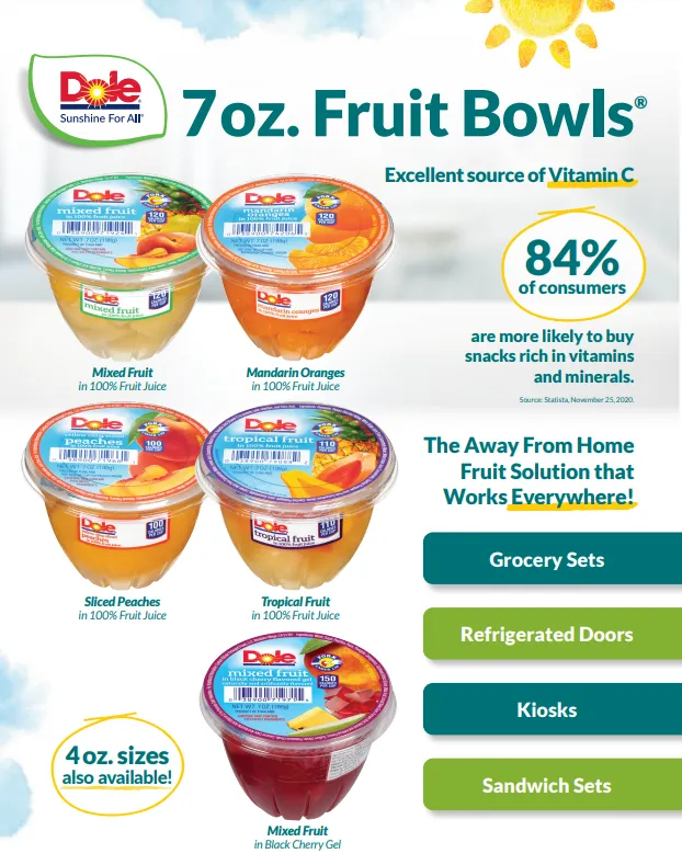
This sell sheet from Dole has several colorful, attractive images of the product it's promoting. It has different pictures of the various kinds of packaging and other relevant products Dole offers for its sliced peaches.
The key here is commanding attention. The images the company uses are engaging without being abrasive. Always aim for that.
Creating a more interactive experience engages the customer in larger ways than just having a verbal discussion. But what if your product isn’t a physical good? You can opt for illustrations or pictures with relevant data to convince the buyer to make a purchase. If you have a brand mascot, you can include that visual as well.
3. An Attention-Grabbing Headline That Sticks
This aspect sets the tone for the rest of the copy. Make sure it's concise and catchy.
Your headline could be as simple as your company slogan, but that might not be your best course of action. If you can come up with something that better captures the essence of the product itself, go with that.

Here‘s a headline from a sell sheet for Dole’s Chef Ready Frozen Fruit Cuts. It‘s direct, compellingly worded, and designed to grab attention. It captures the essence of what the product actually is. If someone were to read only the headline, they’d still understand what the product is for.
In addition to the headline, let’s look at the design. The most descriptive words, “perfect burst” and “fruit flavor,” are the largest text and in the brightest color. This draws the audience’s eyes and reinforces the biggest benefits of the product.
4. An Intro Paragraph
An introductory paragraph can give prospects some perspective on your company's identity, reliability, and esteemed reputation.
If a prospect has never heard of you, they might be reluctant to buy from you — even if they‘re interested in the product. It can’t hurt to give some insight to calm their nerves and establish yourself as an authority in your space.
5. Product Specifications and Benefits Supported by Hard Data
This component is the real meat of the sell sheet. It‘s where you prove your product is worth your prospects’ time and money. Establish clear benefits that they can expect to see, but don't stop there. You have to have hard statistics to substantiate your claims.
Also, give some specifics about what the product is and how it functions. Those are necessary, but your big selling point will still be the potential benefits.
6. Appealing Data Visualization
If you‘re including hard data to back your claims and product specifications, it’s in your best interest to arrange it appealingly. Make sure your statistics are easy to make sense of, and that often means presenting them graphically.
Your sell sheet isn‘t a research paper. Prospects won’t be interested in poring over and making sense of a full page of raw data. It‘s a bite-sized picture of your product, so you’re best off presenting your data in a digestible fashion.

Here‘s another example pulled from Dole’s Chef Ready Frozen Fruit Cuts sell sheet. Here, the data on fruit preferences is laid out to be clear and concise. The fruit backdrops are fun and engaging without compromising the value of the data they support. It's an excellent example of a company making dry data palatable in a sell sheet.
7. A Clear-Cut Call-to-Action
This is the most essential component of all. Say you make an outrageously compelling sell sheet. A prospect reads it and is absolutely hooked. Your visuals, data, graphs, headline, copy, and tone all blew their mind. They're totally on board.
That would be awesome, but if you didn't have a call-to-action included in your sheet, all of that excitement might go to waste.
Always give the next steps in your sell sheet. Make sure prospects know where to go after they've been sold on your awesome pitch. Should they visit your website? Should they give you a call at the provided number? Should they email you? Should they go to specific retailers where your product is carried?
A sell sheet is always designed with intention — this is where that intention is expressed.
.webp)
Sell Sheet Template
There‘s no be-all, end-all standard for sell sheet design. In many ways, it’s an excellent opportunity for your company to express some creativity.
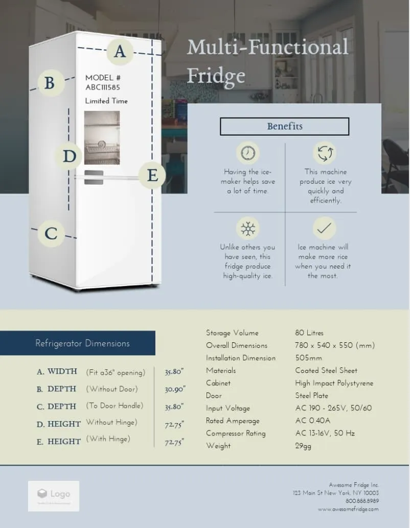
Still, it can be helpful to have a jumping-off point to reference and structure your sheet around. Visme, an online graphics tool, provides some excellent sell sheet templates like this one:

Ultimately, your sell sheet is just that — your sell sheet. There's no strictly regimented strategy or formula that you can follow to expect incredible results. You’ll have to tailor your efforts to highlight the best parts of your product.
Still, there are some guidelines you can reference to ensure that you're including the necessary information in your sell sheet and conveying it convincingly.
Bringing Your Ideas To Life
Having a sell sheet is a make or break for a company and should be treated with care. Creating an inviting, colorful, inventive display of what you have to offer. This statement and its call to action promote your brand. So make sure your one-pager is eye-catching and informative.
Sales Pitch
.png?width=112&height=112&name=Image%20Hackathon%20%E2%80%93%20Horizontal%20(38).png)


![23 Elevator Pitch Examples to Inspire Your Own [+Templates & Expert Tips]](https://53.fs1.hubspotusercontent-na1.net/hubfs/53/_category_page.png)

![12 best sales presentations to inspire your sales deck [+ 5 tips]](https://53.fs1.hubspotusercontent-na1.net/hubfs/53/sales-presentation-guidelines-1-20251024-8016063.webp)
.png)

.jpg)

.jpg)
