
And trust me: The results are well worth the effort you and your team will put into analyzing your data.
Table of Contents
.png)
Free Market Research Kit
5 Research and Planning Templates + a Free Guide on How to Use Them in Your Market Research
- SWOT Analysis Template
- Survey Template
- Focus Group Template
- And More!
Download Free
All fields are required.
Form not available
How to Analyze Survey Results
- Understand the four measurement levels.
- Select your survey question(s).
- Analyze quantitative data first.
- Use cross-tabulation to better understand your target audience.
- Understand the statistical significance of the data.
- Consider causation versus correlation.
- Compare new data with past data.
Before we jump in, here’s the fictional business I’ll be sharing throughout the post for added context:
I sell high-quality goat soap to customers seeking natural ingredients for their skincare needs. To better understand my customers, why they like (or dislike) my products, and what they need, I sent them a survey.
Let’s say of the 100 customers I asked to participate in my survey, 94 of them participated — thanks to my well-written survey questions. Now, I have some raw data to sort through.
Here’s what I’m doing to analyze the survey results.
1. Understand the four measurement levels.
Before analyzing data, it’s helpful to refresh vocabulary from stats class and define the four measurement levels.
These levels determine how survey questions should be measured and what statistical analysis should be performed. The four measurement levels are nominal scales, ordinal scales, interval scales, and ratio scales.
If you’re like me and your statistics course feels like another lifetime ago, let’s take a minute to define what each of these terms means.
Nominal Scale
Nominal scales classify data without any quantitative value, similar to labels. An example of a nominal scale is, “Select your goat soap scent from the list below.”
The choices have no relationship to each other. Due to the lack of numerical significance, you can only keep track of how many respondents chose each option and which option was selected the most.
Ordinal Scale
Ordinal scales are used to depict the order of values. For this scale, there's a quantitative value because one rank is higher than another. An example of an ordinal scale is, “Rank the reasons for using goat soap.”
You can analyze both mode and median from this type of scale, and ordinal scales can be analyzed through cross-tabulation analysis.
Interval Scale
Interval scales depict both the order and difference between values. These scales have quantitative value because data intervals remain equivalent along the scale, but there's no true zero point.
An example of an interval scale is in an IQ test. You can analyze mode, median, and mean from this type of scale and analyze the data through ANOVA, t-tests, and correlation analyses. ANOVA tests the significance of survey results, while t-tests and correlation analyses determine if datasets are related.
Ratio Scale
Ratio scales depict the order and difference between values, but unlike interval scales, they do have a true zero point. With ratio scales, there's quantitative value because the absence of an attribute can still provide information.
For example, a ratio scale could be, “Select the average amount of money you spend shopping for soap.”
You can analyze mode, median, and mean with this type of scale and ratio scales can be analyzed through t-tests, ANOVA, and correlation analyses as well.
2. Select your survey question(s).
Once you understand how survey questions are analyzed, I suggest you take note of the overarching survey question(s) you‘re trying to solve. Perhaps it’s “How do respondents rate our brand?”
Then, look at survey questions that answer this research question, such as “How likely are you to recommend our brand to others?” Segmenting your survey questions will isolate data relevant to your goals, and using customer service software can help you connect with your customers.
If I learned anything from my college professors, it was this: Your experiments are only as good as your design. The same goes for your surveys. So, you should take some time to select the best, most appropriate survey questions.
Or, work smarter, not harder. Use a survey maker. A survey maker can help you create a mix of close-ended and open-ended questions to get the best, most accurate responses.
- Close-ended questions. A close-ended survey question gives a limited set of answers. Respondents can't explain their answer and they can only choose from predetermined options. These questions could be yes or no, multiple-choice, checkboxes, dropdown, or a scale question. Asking a variety of questions is important to get the best data.
- Open-ended questions. An open-ended survey question will ask the respondent to explain their opinion. For example, in an NPS survey, you‘ll ask how likely a customer is to recommend your brand. After that, you might consider asking customers to explain their choice. This could be something like “Why or why wouldn’t you recommend our product to your friends/family?”
Here are a few example questions I might ask my soap buyers to hopefully elicit their opinion, instead of just “Yes” or “No.”

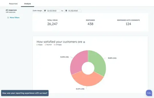
Pro tip: You can present your questions in a form. Plus, using a form builder makes it easy to conduct survey data analysis. You can use it to look at the results of individual questions, which, in my opinion, makes it easy to glance at and quickly analyze.
3. Analyze quantitative data first.
Quantitative data is valuable because it uses statistics to draw conclusions. While qualitative data can bring more interesting insights about a topic, this information is subjective, making it harder to analyze.
To me, it’s helpful to recognize that most qualitative data comes from open-ended questions. These questions allow participants to share their opinions and feelings without being pigeon-holed into pre-populated responses.
Quantitative data, however, comes from close-ended questions that can be converted into numeric values.
Once data is quantified, it's much easier to compare results and identify trends in customer behavior. It’s best to start with quantitative data when conducting survey data analysis.
That’s because quantitative data can help you better understand your qualitative data.
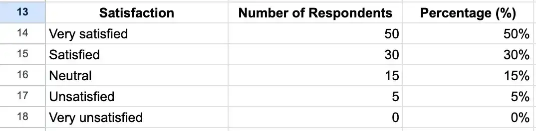
Let’s look at my goat soap sales. If only 50% of my soap customers say they're very satisfied with my product, I should focus on why the rest are not as happy. This can help me identify roadblocks in the customer journey and correct any pain points causing churn.
4. Use cross-tabulation to better understand your target audience.
If you analyze all of your responses in one group, it isn’t entirely effective for gaining accurate information. Respondents who aren’t ideal customers can overrun your data and skew survey results.
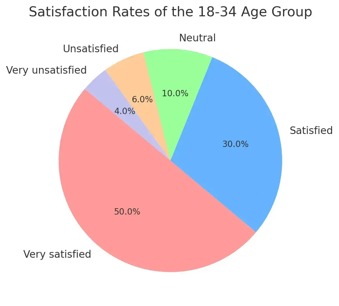
For example, let’s say my target soap buyers fall within the age range of 18 to 34-year-olds. If I were to include data outside of my intended audience, the results of my satisfaction analysis would be incorrect.
Here are two pie charts to compare the differences. The first is my target demographic. Notice the neutral result.
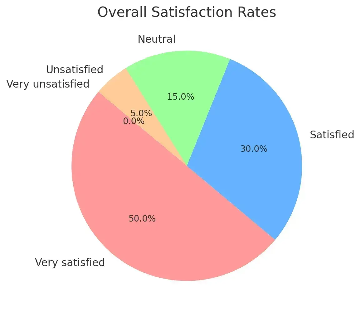
However, when I include data from every customer, my results change.
Instead of lumping my results together for survey data analysis, I should segment responses using cross-tabulation. With cross-tabulation, you can analyze how your target audience responded to your questions.
Split Up Data by Demographics
Cross-tabulation records the relationships between variables. It compares two sets of data within one chart. This reveals specific insights based on your participants' responses to different questions.
For example, you may be curious about customer advocacy among your customers based in Boston, MA. Cross-tabulation helps you to see how many respondents said they were from Boston and said they would recommend your brand.
Pulling multiple variables into one chart allows us to narrow down survey results to a specific group of responses. That way, you know your data only considers your target audience.
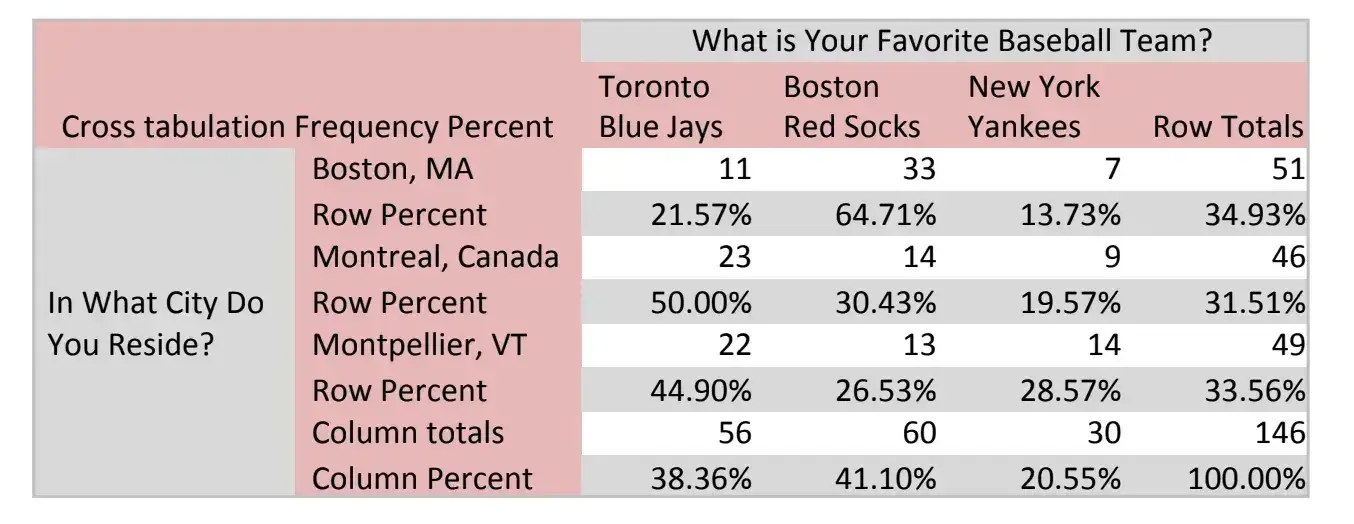
Below is an example of a cross-tabulation chart. It records respondents’ favorite baseball teams and the city in which they reside.
5. Understand the statistical significance of the data.
As I mentioned in the last section, not all data is as reliable as you may hope. Everything is relative, and it's important to be sure that your respondents accurately represent your target audience.
For instance, let’s say your data finds:
- 33% of respondents would recommend your brand to others.
- 75% of them were over 40 years old.
However, the problem is that your target audience is 18 to 29 years old. In this case, this data isn’t statistically significant as the people who took your survey don’t represent your ideal consumer.
Random sampling — selecting an arbitrary group of individuals from a larger population — can help create a more diverse sample of survey responses. Additionally, the more people you survey from your target audience, the more accurate the results will be.
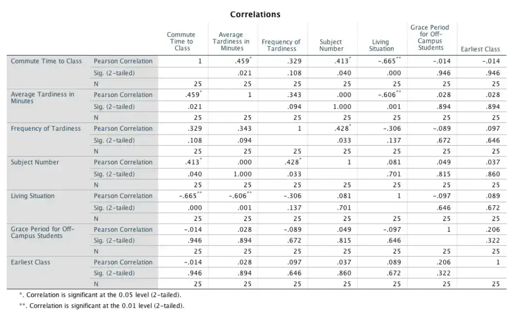
Running an analysis on software like SPSS (shown above) will tell you if a data point is statistically significant using a p-value.
If you look just below the table, the key indicates:
- *Correlation is significant at the 0.05 level (2-tailed).
- **Correlation is significant at the 0.01 level (2-tailed).
This indicates which values are statistically relevant in your analysis.
If a data point's statistical significance or p-value is equal to or lower than 0.05, it has moderate statistical significance since the error probability is less than 5%. If the p-value is lower than 0.01, it is highly statistically significant because the probability of error is less than 1%.
Pro tip: I like to use analytical reporting software to help with my survey data analysis.
6. Consider causation versus correlation.
Another important aspect of survey analysis is knowing whether your conclusions are accurate.
For example, let’s say we observed a correlation between ice cream sales and car thefts in Boston. Over a month, as ice cream sales increased, so did reports of stolen cars.
While this data may suggest a link between these variables, we know there’s probably no relationship. Just because the two are correlated doesn‘t mean one causes the other.
In cases like these, a third independent variable typically influences the two dependent variables. In this specific example, it's temperature.
As the temperature increases, more people buy ice cream. Additionally, more people leave their homes and go out, leading to more crime opportunities. While I know this is an extreme example, you never want to draw an inaccurate or insufficient conclusion.
Pro tip: Analyze all the data before assuming what influences a customer to think, feel, or act a certain way.
7. Compare new data with past data.
While current data is good for keeping you updated, it should be compared to data you've collected in the past.
If you know that 33% of respondents said they would recommend your brand, is that better or worse than last year? How about last quarter?
If this is your first year analyzing data, make these results the benchmark for your following analyses. Compare future results to this record and track changes over:
- Quarters
- Months
- Years
- Whichever interval you prefer
You can even track data for specific subgroups to see if their experiences improve with your initiatives.
Now that you‘ve gathered and analyzed your data, the next step is to share it with coworkers, customers, and other stakeholders. Don’t just share a list of numbers — presentation is key!
A clean presentation aids in helping others understand the insights you’re trying to explain.
In the next section, I’ll explain how to present your survey results and share essential customer data with the rest of your organization.
Free Market Research Kit
5 Research and Planning Templates + a Free Guide on How to Use Them in Your Market Research
- SWOT Analysis Template
- Survey Template
- Focus Group Template
- And More!
Download Free
All fields are required.
Form not available
How to Write a Survey Report
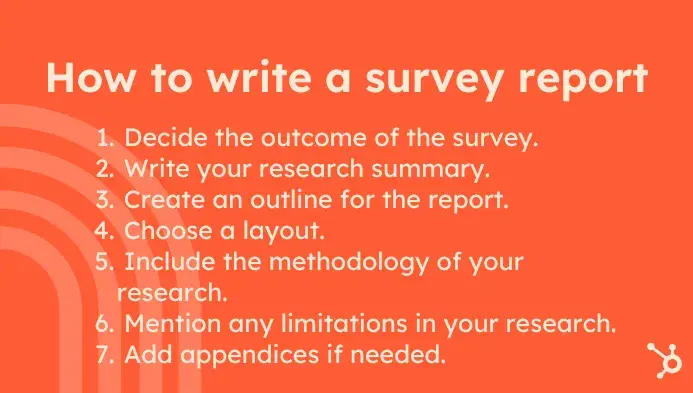
1. Decide the outcome of the survey.
Believe it or not, writing the intro to a survey report isn't always the best first step. If I’m writing anything, whether it’s a report, a blog post, or a case study, I rarely write the introduction first. Instead, I focus on the outcome.
By starting with the outcome, I get a better feel for the specific takeaways I want my readers to understand.
So, to keep your report focused on a specific outcome that you want the reader to take away, start by explaining the outcome in detail. This section of the survey report will be included in the middle, but it's a great way to get your bearings when writing, especially with a longer report.
The outcome of the survey report should:
- Reveal what could happen if the stakeholders reading the report were on board with your analysis.
- Offer some ideas for outcomes of a new product offering based on the result of customer feedback.
- Explain the rationale behind price adjustments to the price of a service to increase revenue.
- Explain why you should enter a new market that shows potential for the organization to expand.
Pro tip: When writing this section, ensure the survey analysis data you‘ve collected fully supports the outcome. For instance, I try to avoid ideas that can't be substantiated by the other information in the report.
2. Write your research summary.
Next, summarize your research findings.
In this part of the survey report, you‘ll include notable results and any information that correlates with other studies your company may have done in the past.
The summary is the part of your survey that readers will focus on the most. It’s a condensed version of your survey findings, jam-packed with golden nuggets. The research summary should be no more than a page long, as you’ll get into the meat of your report in other sections.
Pro tip: To make it even easier to read, I suggest including headers above paragraphs to guide your readers through the content.
3. Create an outline for the report.
Now that you have your outcome and summary, it‘s time to develop the outline. Because the survey report is typically around eight to ten pages long, you’ll want to use a concise outline that includes all the relevant information the stakeholders will want to know.
Here's a sample outline I like that you can customize:
- Introduction. Setting the stage for the report.
- Summary. Summarize the findings and key elements of the research.
- Methodology. Explaining how the research was conducted.
- Results. Describing what the research revealed.
- Outcomes. Analyzing the results in the context of your organization's goals.
- Limitations. Revealing any research oversights or areas for further research.
- Conclusion. A summary of the research analysis and why the audience should care about it.
4. Choose a layout.
After completing the outline, you‘ll know how much space you’ll need for each section. Depending on your preference, survey reports can be published in portrait or landscape layouts.
Let’s take a brief look at when you should use one layout over the other.
When to Use Portrait Layout for a Survey Report:
- Portrait landscape is best used when the report is text-heavy. Charts and graphs with more rows than columns also work well in portrait-style layouts.
- Avoid dedicating entire pages to images or infographics in this layout, as it takes away space from important text-based content.
When to Use Landscape Layout for a Survey Report:
- Use a landscape layout for your survey report when your report will be design-heavy. High-quality imagery, graphs, and charts work well in landscape because there's more space for text-based content beside the visuals.
- Too many text-heavy pages can make a landscape report feel much longer than it actually is.
Pro tip: In terms of the overarching design and layout of your survey, I highly recommend starting from a survey template. HubSpot also has free customer satisfaction templates that are a great starting point as well.
5. Include the methodology of your research.
The methodology section of your report should explain the who, what, and how of your research. It explains:
- How your survey was conducted.
- Who was invited to participate.
- What types of tests are used to analyze the data.
- Why you chose certain tests for the analyses.
You might use charts or graphs to help communicate this data. It's okay to be detailed here — the readers will want to know that the outcomes of the survey are valid and based on relevant research methods.
Make sure you also include:
- The number of participants.
- How they were selected.
- Any demographic data you collected about them.
- Your process for selecting the survey questions.
In my opinion, the methodology section of your report is one of the most important sections. This section can help you or your readers conduct an exact survey analysis at a later time with new information.
6. Mention any limitations in your research.
No matter how much you prepare before conducting your survey, you‘ll find some information in the results that could’ve been more conclusive had you considered another variable. But I’ve got good news for you: Research can be continued in the future.
The limitations section sets the stage for future researchers to pick up where you left off or correct any mistakes you made in the current survey.
7. Add appendices if needed.
If you're fortunate enough that all of the survey analysis data you present fits neatly into a chart within the report, you may not require an appendix at the end.
But if the graphs and charts you include on the pages are truncated versions of large data sets that provide context, you should include them in their raw forms at the end of your report.
Pro tip: If you use an appendix, reference it throughout the reports so your readers can review it for a deeper understanding of your content.
How to Present Survey Results
Now that you have your results, you must present them well — as in, accurately and intelligibly.
1. Use a graph or chart.
Graphs and charts are visually appealing ways to share data. Colors and patterns are easy on the eyes, and data is often easier to understand when shared visually.
However, it's important to choose a graph that highlights your results in a relevant way.
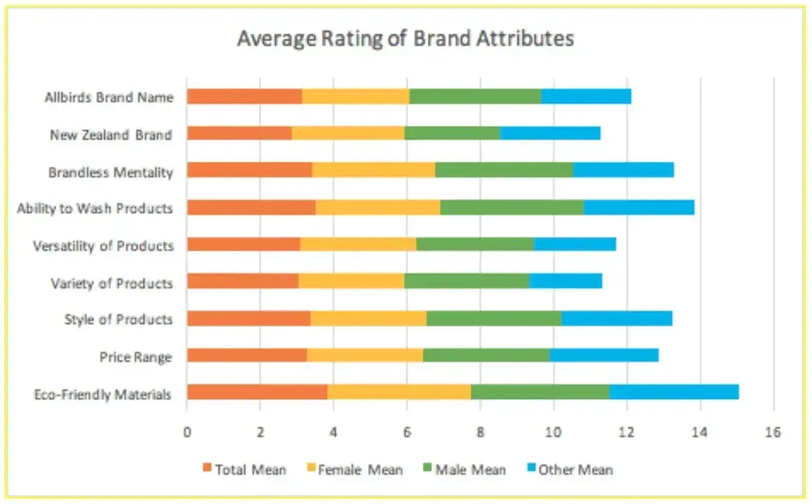
The image above is an example of a stacked bar graph my team created using data on the brand Allbirds.
If you‘re having trouble reading it, you’re in good company. I received feedback that it was confusing to understand. That‘s because the data wasn’t organized in a way that would make sense to a stakeholder who's unfamiliar with our project.
So, I decided to revamp our graph's image and came up with the design below:
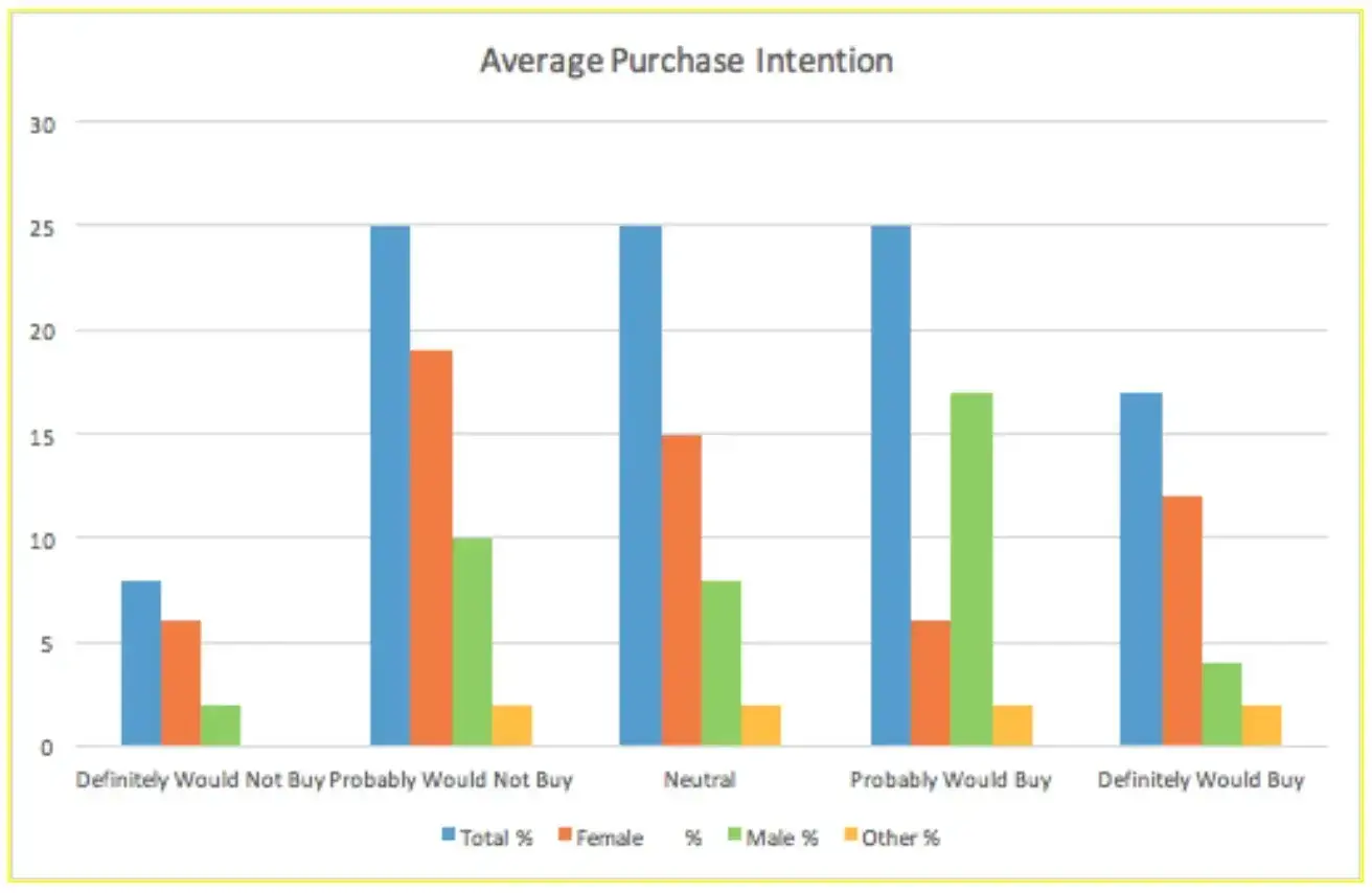
This bar graph is much simpler to read because it has a clear key and individual bars for each variable. The design fits the data that we're trying to display. Readers can easily understand the information we obtained from our survey.
Depending on the survey you've conducted, there are many types of graphs and charts you can use. A few options you can choose from are:
- Pie charts.
- Venn diagrams.
- Line graphs.
- Scatter plots.
- Histograms.
- Pictograms.
Pro tip: Pick one that accurately displays your data and is clear to your stakeholders.
2. Create a data table.
Tables are a great way to share numerical data. You can use software like SPSS or Excel to display data easily, like in the survey data analysis example below.
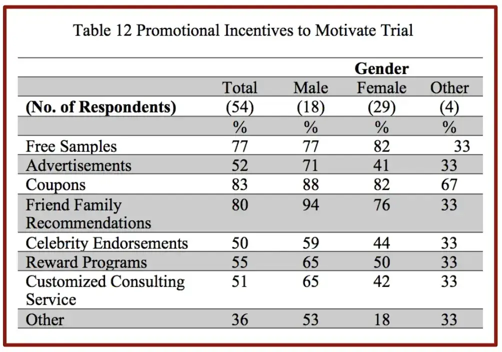
This table was created from a cross-tabulation analysis.
I removed the unnecessary information — statistical significance, mean, median, etc. — and focused on the data we wanted to share: the percentage of each gender that preferred each promotional incentive.
This gave us a format that demonstrated the percentages we were looking to share with our stakeholders.
3. Tell a story with survey data analysis.
Former Vice President of Merchandising at Chewy, Andreas von der Heydt, shared a profound message on LinkedIn about the power of storytelling with data.
In the image below, Legos are arranged in five different ways:
- A random assortment.
- Color-coded.
- Arranged in varying heights.
- Positioned in a visually appealing way.
- Constructed into a house.
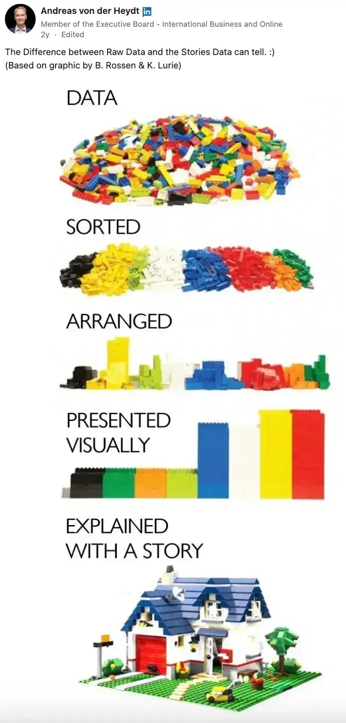
One of the primary goals of good data analysis is to weave information together so that it builds upon each other — just like building a house.
Some data will serve as the foundation of your story, and all the points in your presentation will tie back to this foundation.
From there, you‘ll structure your key findings like the walls of a house. These key findings support the conclusion of your research, which acts as the roof. That’s the primary point you want to make when presenting your data analysis.
I understand that communicating data can be tricky, especially when stakeholders have varying degrees of analytical skills. But no matter how sophisticated (or not) your team is, a story will always resonate.
Pro tip: Take the time to identify the point the data leads to and structure a story around that conclusion.
4. Make a visual presentation.
Sometimes, combining visuals with text creates a thorough description of your findings. A presentation could be a good fit for showcasing your data in these cases.
This gives you a chance to present the earlier stages of your survey, including:
- Research questions.
- Hypotheses.
- Survey questions.
- Analysis methods.
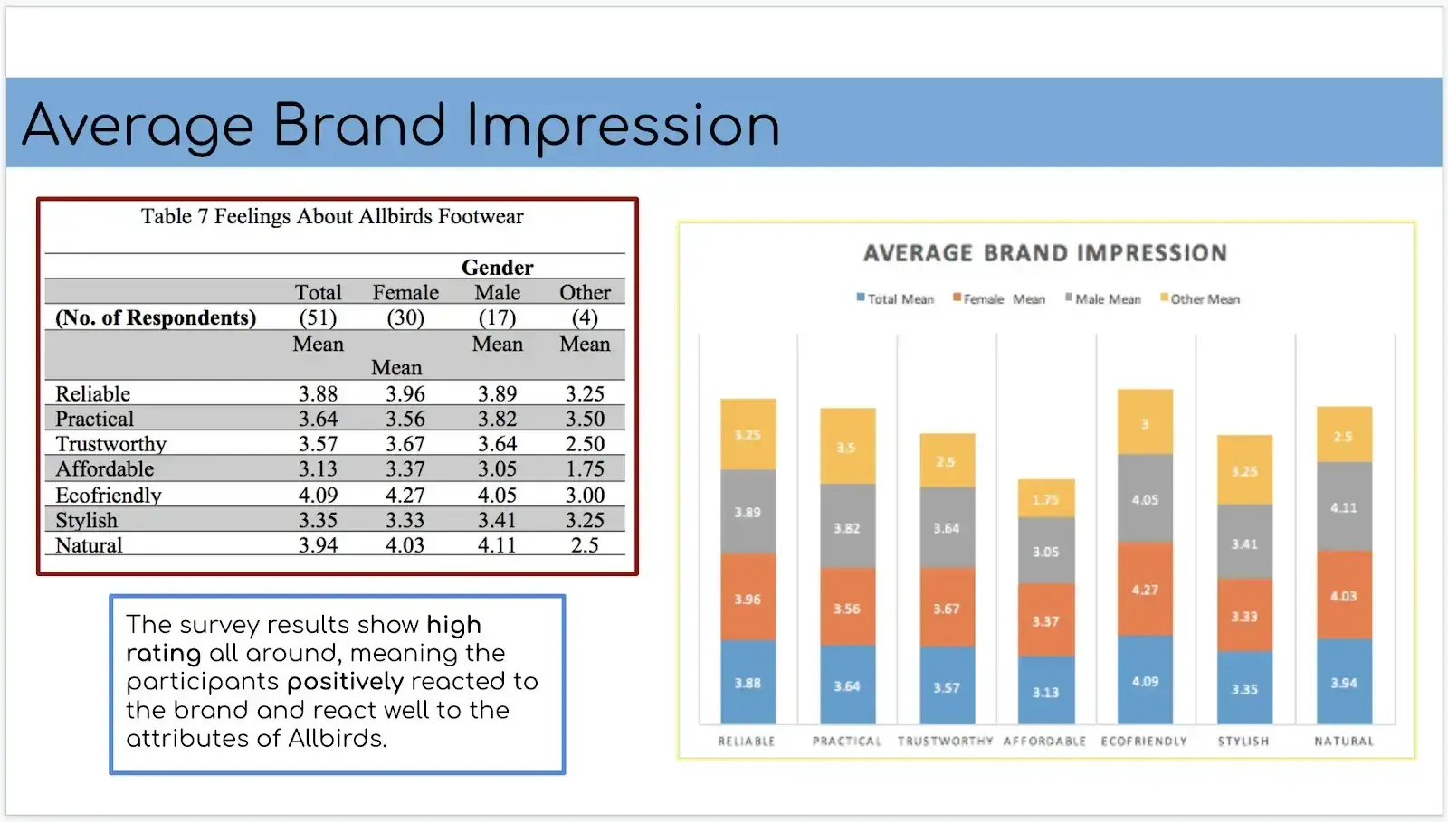
This slide from my presentation combines a graph with a table and some text. The same data is shared in three different ways to appeal to people with different learning styles:
- Those who prefer visuals.
- Those who prefer numbers.
- Those who prefer words.
5. Put together an infographic.
If you need to share data that's easy to read and quick to consume, infographics might be your best bet. I like infographics because they can quickly share lots of information in a visual representation.
Remember the Lego post? That was an infographic.
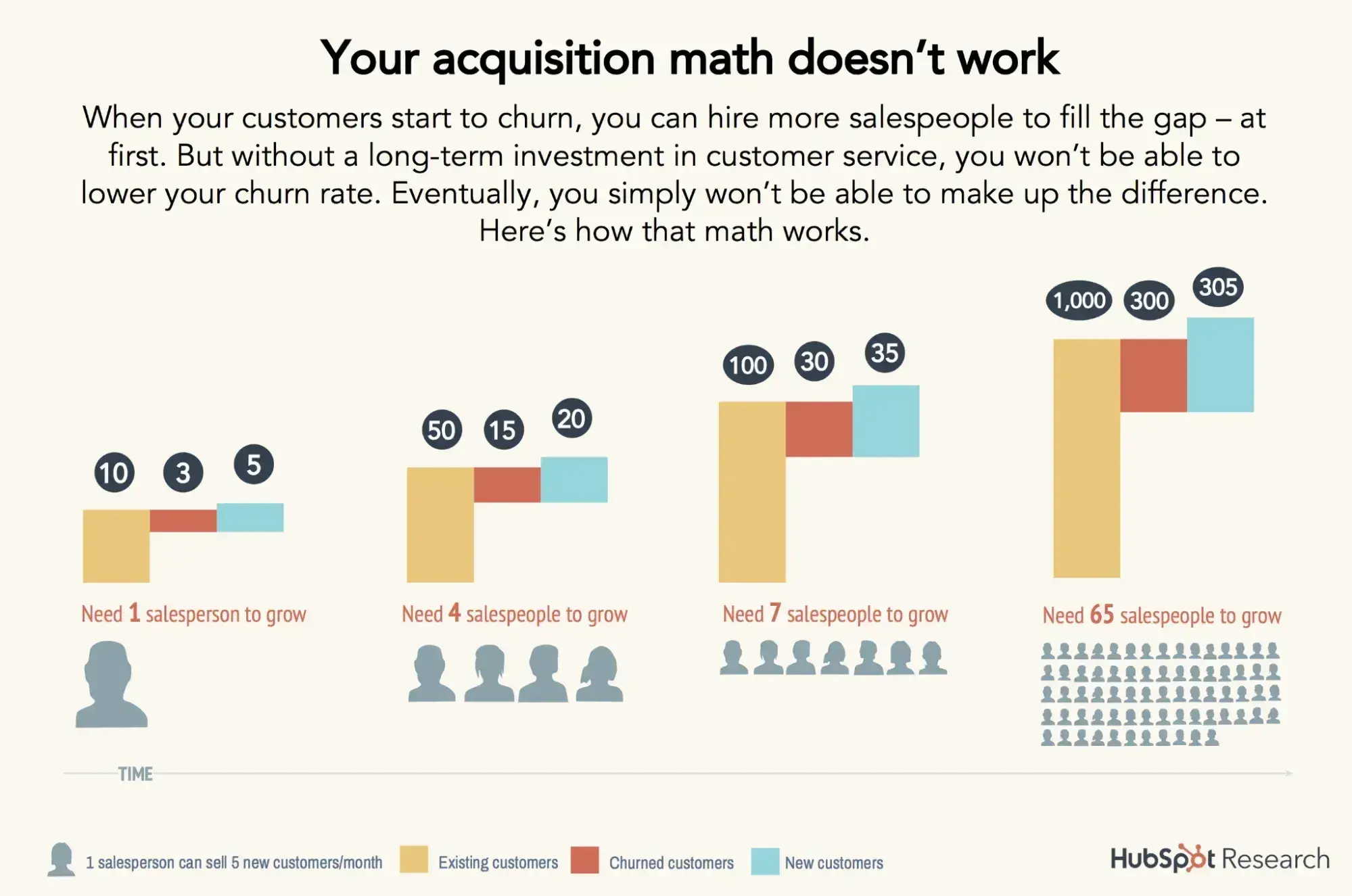
This HubSpot Research infographic explains survey results through icons, numbers, and descriptive text. Infographics are incredibly effective for this purpose, breaking down complex ideas into simple messages that are more appealing to read than blocks of text.
6. Use survey results in a report.
Sometimes, those blocks of text are essential for persuading stakeholders. If you present data to senior executives or business clients, you might want to prepare a full report on your findings.
You wouldn’t refer to this document during a presentation, but you might hand this to your audience to read through on their own time.
This is the table of contents page from my report on our survey project. It‘s important to keep track of all the work you’ve done and maintain records of how you conducted your survey. That way, you won't make similar errors or have to duplicate any research.
Free Market Research Kit
5 Research and Planning Templates + a Free Guide on How to Use Them in Your Market Research
- SWOT Analysis Template
- Survey Template
- Focus Group Template
- And More!
Download Free
All fields are required.
Form not available
Survey Report Template Examples
I find creating new survey reports from scratch to be difficult, so I like to use survey report templates for analyzing and presenting my data.
Below, I’ll share some free downloadable templates to make things easier. When choosing a template, look for one that includes placeholders for graphs and images and multiple page layouts, so you have some variety.
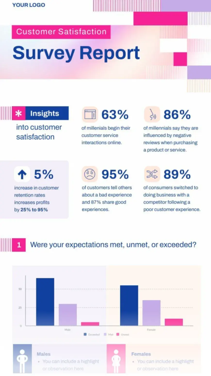
1. Customer Satisfaction Report - Piktochart
Not only is this report eye-catching, but it also includes key insights at the top of the infographic. This placement automatically provides readers with added value, without causing them to search for it.
This template can be customized to fit your brand easily. As an infographic-style layout, you'll love this template for data-heavy reports.
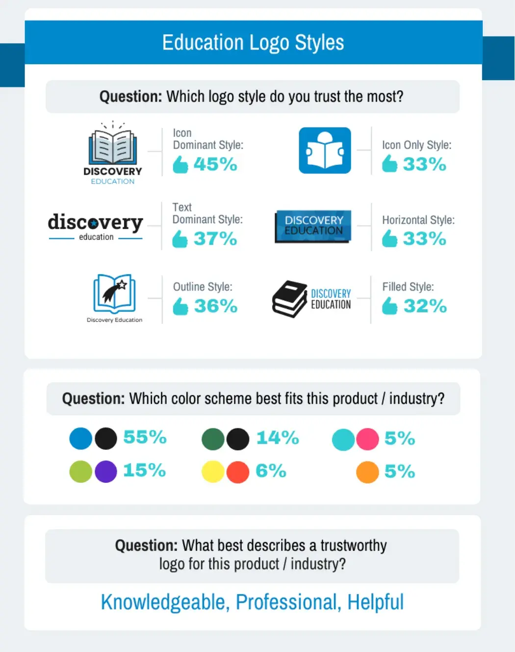
2. Education Logo Survey Results Template - Vengage
I like this Vengage report template. First, this is a great template for multiple-choice survey questions. It offers plenty of space to describe the varied answers your audience might give.
One of the rare gems of this template, in my opinion, is its ability to balance large, clear images that don't crowd out the important written information on the page.
Use this template for hybrid text-visual designs.
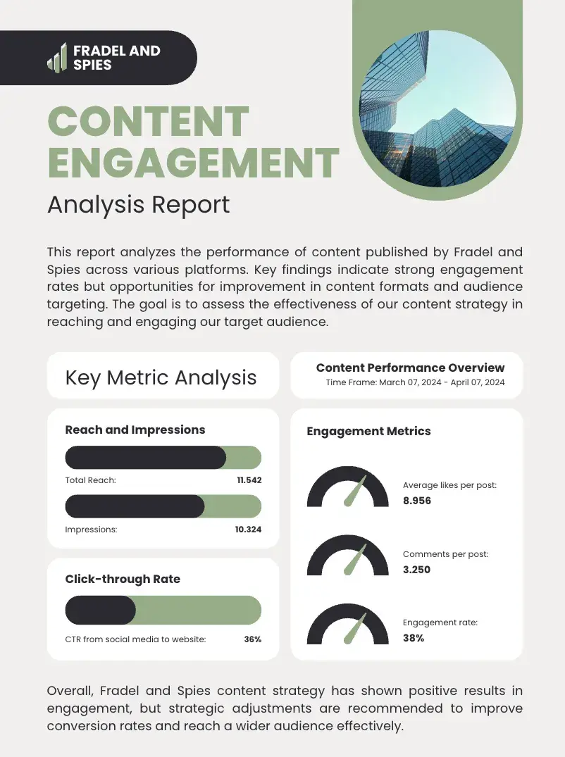
3. Green Minimalist Content Analysis Report - Canva
The Green Minimalist Content Analysis Report template by Canva is a vertical-style presentation that can also be used for survey reports. It comes with plenty of space to provide context as well as charts and graphs that you can tailor to your research and data.
Don’t love the green? No problem. Canva’s editor makes it easy to customize any template to fit your brand.
Tips for Survey Data Analysis
Now that you know all of the ins and outs of survey analysis, it’s time for me to share some of my expert tips to make conducting a survey and running an analysis of the results easier for you.
1. Define your objectives.
Before you begin asking your customers survey questions, define your objectives. I know it can be tempting to pepper your customers with all manner of questions, but doing so will lead to results that might not make any sense.
Instead, I suggest you take some time to plan your survey.
Ask yourself why you want to conduct a survey and what you hope to accomplish with it. This will help you define your objectives and stay within their bounds.
2. Check and clean your data.
Once you’ve collected your survey data and before you run analysis on it, you need to check your data.
As much as I would like to think all customers take the time to answer survey questions appropriately, I also know that some will just click responses to get through it.
Silly responses will skew your results and, ultimately, give you a lousy survey analysis.
Take some time to check your data and clean it. Remove any obvious junk or corrupt results before you begin.
3. Use the best, most appropriate tools.
You can run all the mathematical equations on your data by hand. However, this will take some time, and if you’re not strong in math, it can introduce the potential of errors.
Instead, consider using analytical software (like HubSpot’s dashboard and reporting software or customer feedback software) to help with your survey analysis. Analytical software can save you time and reduce errors.
Plus, thanks to the emergence of AI, some software can forecast your data so you can make better predictions and understand potential outcomes.
4. Use visuals to help explain your data.
I know I am not the only one whose eyes glaze over when reading a table of numbers. Presenting your numbers in a table makes it easier for your audience to glance over them and get the wrong impression.
Using graphs to organize and explain your results is the way to go.
5. Clearly report your findings.
My final tip is to clearly report your findings. It can be tempting to mold the results into what you want them to say. But doing so is dishonest and a misrepresentation of your customers.
Make sure your results are precise and fairly represented. You’ll want an accurate representation of your results to better plan future initiatives or business decisions.
Conduct Survey Analysis Like A Pro
It's one thing to collect data, but without a strategic analysis process, you could struggle to reach conclusions that justify pursuing your business goals. Follow the tips in this post to produce well-crafted data analyses that will support even the most aspirational projects.
Editor's note: This article was originally published July 2019 and has since been updated for comprehensiveness.
Free Market Research Kit
5 Research and Planning Templates + a Free Guide on How to Use Them in Your Market Research
- SWOT Analysis Template
- Survey Template
- Focus Group Template
- And More!
Download Free
All fields are required.
Form not available
![16 best free online survey makers and tools [+ recommendations]](https://53.fs1.hubspotusercontent-na1.net/hubfs/53/free-online-survey-maker-1-20251028-2654831.webp)


![Leading questions: What they are & why they matter [+ Examples]](https://53.fs1.hubspotusercontent-na1.net/hubfs/53/leading-questions-hero.webp)
![How long should a survey be? The ideal survey length [New data]](https://53.fs1.hubspotusercontent-na1.net/hubfs/53/how%20long%20should%20a%20survey%20be_featured.png)


![Customer Profiling in 10 Easy Steps [+ Templates]](https://53.fs1.hubspotusercontent-na1.net/hubfs/53/customer-profiling_2.webp)