1. Swappa Bottle
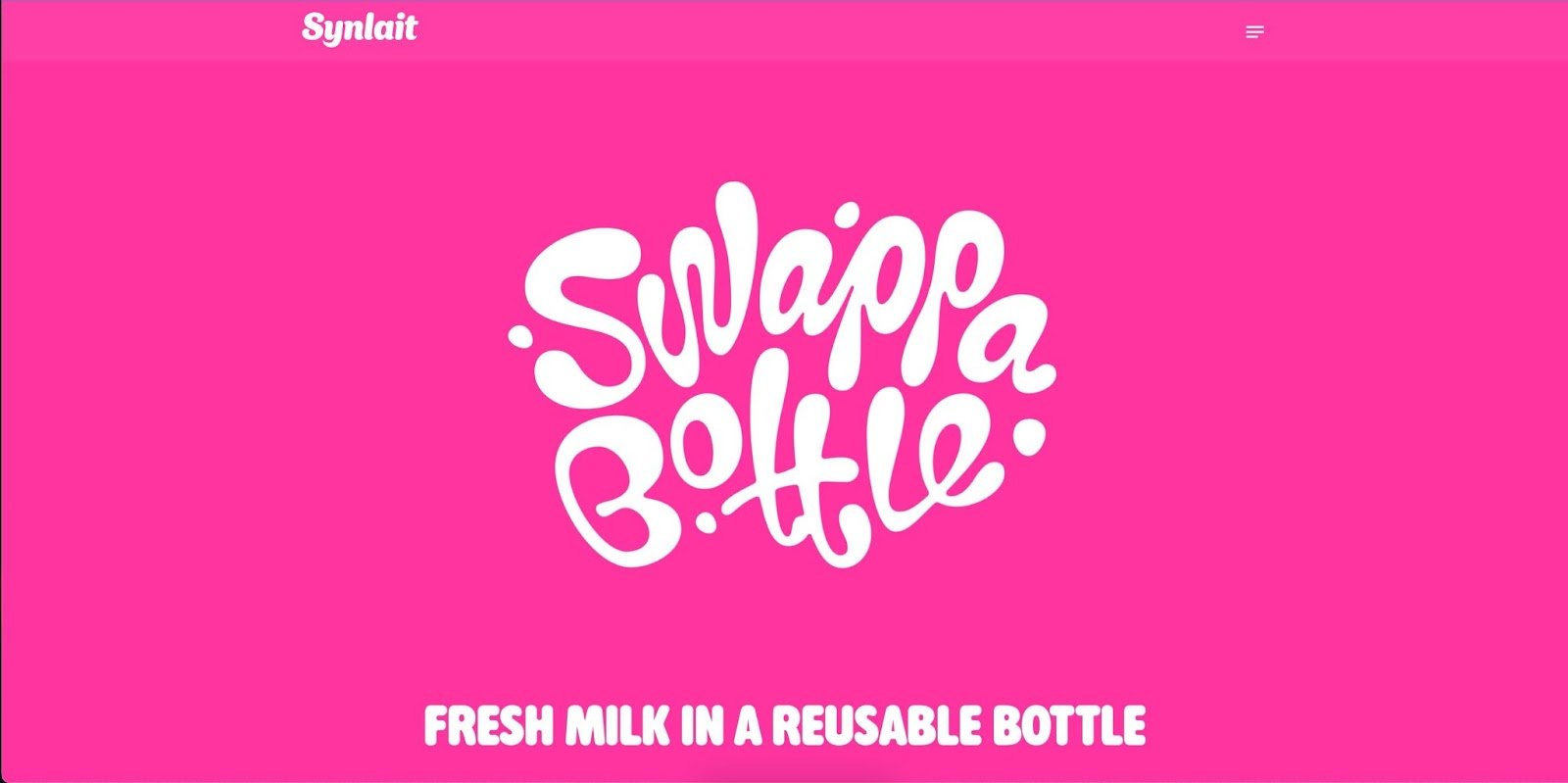 The best one-page websites combine an intuitive design with a strong mission message. The Swappa Bottle website by Synlait does just that. When you first enter the website, you are immediately greeted by ‘Fresh Milk In A Reusable Bottle,’ which neatly sums up what the company is all about.
The homepage is well-designed and easy to navigate, with clear calls to action guiding users toward learning more about the product. The font choices on the site reinforce the brand's connection to milk and dairy products subtly and effectively.
What We Like: The use of visual stimuli throughout the site is impressive — the high-quality images and videos create an immersive experience that successfully conveys the benefits of using reusable stainless steel bottles for milk. This website was built using the HubSpot free CMS tool, and you can tell by its modern design. The Swappa bottle website is a fantastic example of a website that prioritizes design and mission-driven messaging.
2. Garden Studio
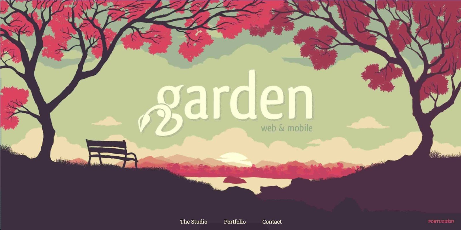
The website for Garden Studio stands out in terms of visuals and user experience. As a digital studio that makes designs for clients, Garden Studio's website reflects its expertise in interactive design.
From the stunning visuals to the intuitive layout, the site showcases their skills in an engaging and informative way. Navigation on this website is also seamless — the website design makes it easy to find what you're looking for, whether it's information about Garden Studio's services or examples of their previous work just by scrolling.
What We Like: The Garden Studio website is an excellent example of a design-forward website that prioritizes aesthetics and usability.
3. Mark My Images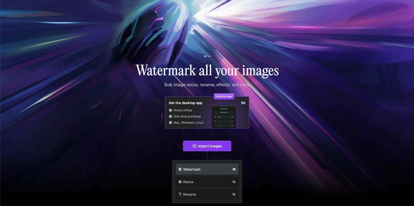 Mark My Images is a great example of a website prioritizing straightforward functionality. — it's a website that makes it easy for users to put watermarks on their images.
What's particularly impressive about this site is its simplicity. The homepage is concise and to the point, with a clear call to action guiding users toward the watermarking tool.
What We Like: Mark My Images demonstrates that a website's effectiveness can come down to how easy it solves a problem for users. Sometimes, one page is all you need.
4. Refire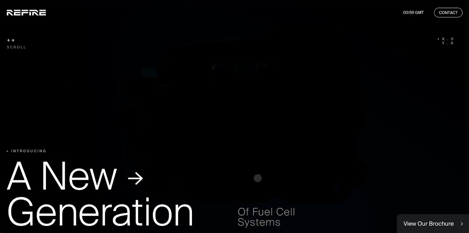 The Refire website tells a complete story while showcasing the client's brand and expertise. As an international hydrogen energy technology company, Refire's website communicates its mission and educates users about how the company got there.
What stands out about this website is the combination of great visuals, statistics, and storytelling to convey Refire's brand. The site features key statistics showing proof of the company’s success and the impact of Refire's products and services on real-world applications.
What We Like: Refire's website is a great example of how storytelling and visual elements can create an impactful website that efficiently communicates a company's mission and expertise.
5. Josef Kjærgaard
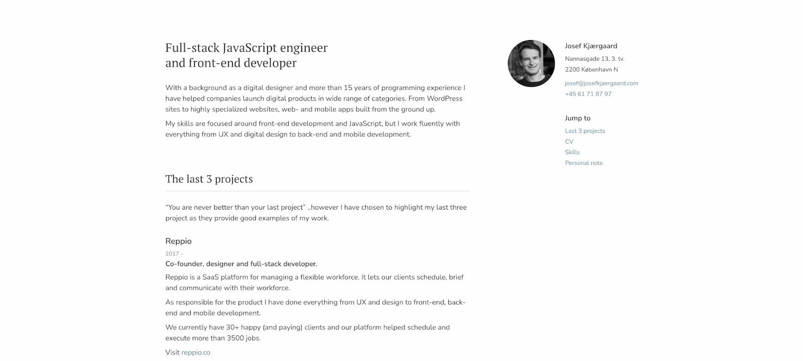 The website for Josef Kjærgaard is a great example of a website with a simple yet effective design that others can easily replicate.
This website is a great example for those looking to build a website portfolio - it showcases his skills and past work clearly and concisely while also providing ways to get in contact with him. The minimalistic design of the website works well to keep the focus on the content while still being visually appealing.
What We Like: Josef Kjærgaard’s website is a perfect template for those who just want a simple one-page website where they can display their past projects and contact information.
6. Kelly Clarkson
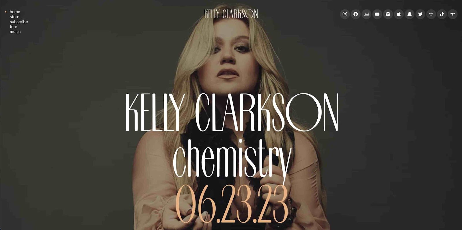 Kelly Clarkson's website is beautifully designed. The site features a sleek and modern layout that showcases her brand and personality. This website effectively links to her social media, has tour dates, and uses clear and effective CTAs to listen to her music.
It is a great example of how a celebrity website should be. With this site built with WordPress, Kelly Clarkson shows how you can use a website as an extension of your personality.
What We Like: Beyond this being Kelly Clarkson we’re talking about, the website itself is among the most visually appealing of all the one-page websites we’ve listed so far. If you’re an artist, this website is a great template for you to use to show off your projects.
7. And Apartments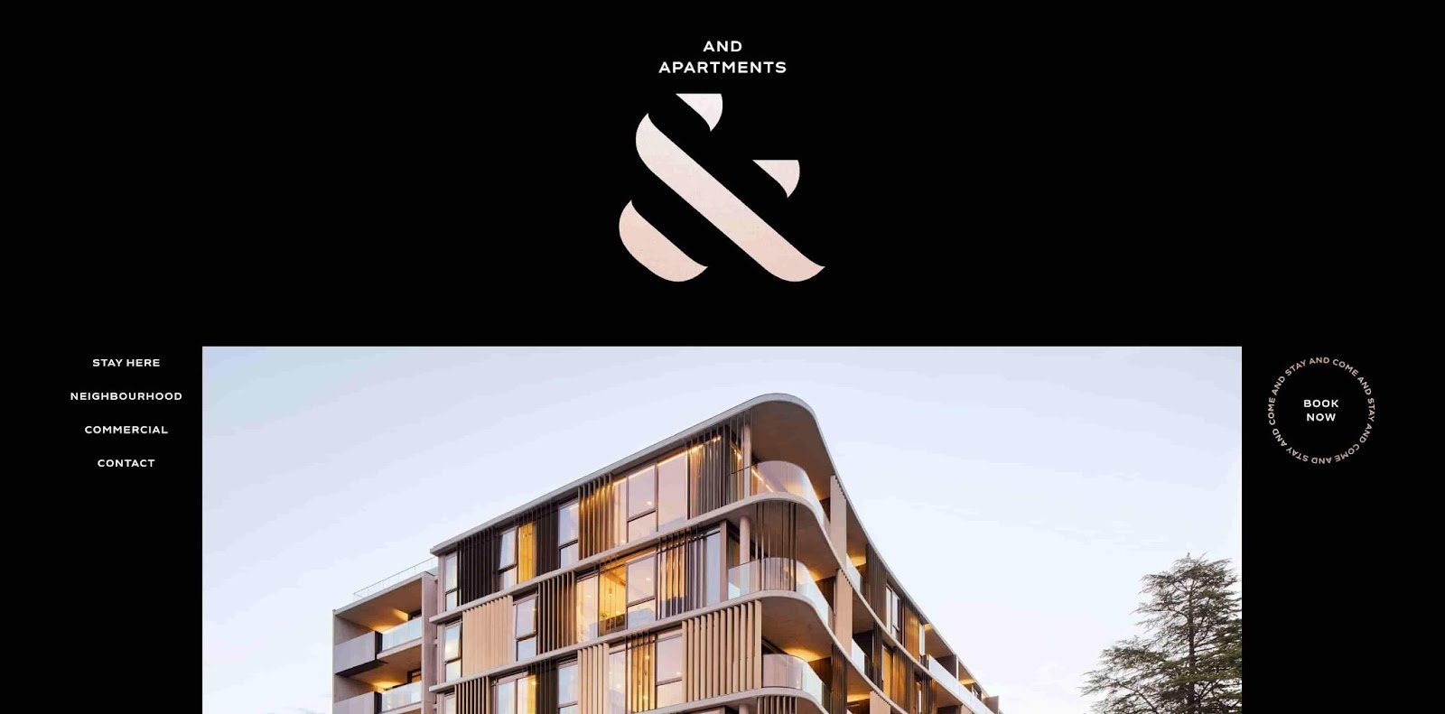 And Apartments is a luxury living apartment complex in Braddon, Australia. The And Apartment website is a great example of a website that showcases its products and services. The site does an excellent job of highlighting the luxurious living experience provided by the apartment complex.
The visuals throughout the website, coupled with the interactive design and usability, provide an immersive and engaging user experience. Additionally, the website successfully communicates the value of the great location, amenities, and overall lifestyle experience that And Apartment offers.
What We Like: And Apartment's website is a great example of a quality one-page website design that captures the essence of the company's brand and priorities. It uses the one-page style to communicate to its customers that staying in this complex is simple, but elegant.
8. Video Creator Course
 One-page designs should be impactful and engaging while effectively communicating the value of a company or organization. The Video Creator Course website is a great example of a well-executed one-page design.
As an educational website that teaches users how to create videos, the site showcases example videos and course modules in a user-friendly and highly intuitive design. The site's navigation is effortless, with clear calls to action guiding users toward sign-up and purchase. The pricing plans are also presented clearly and succinctly, making it easy for users to find the best plan for their needs.
What We Like: Video Creator Course’s website successfully achieves the goal of a one-page design - to create a visually appealing and highly informative experience that encourages user engagement and sign-up.
9. Freelance Brain
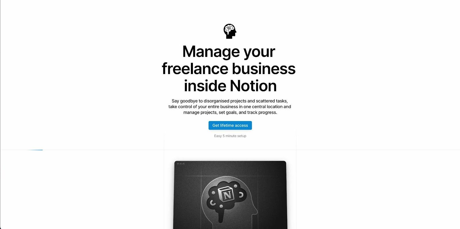 As a business management tool for freelancers, the Freelance Brain site highlights the tool's capabilities in a visually appealing and informative manner. Through highly impactful and interactive screenshots, users can easily understand the tool's power and how it can help them with their freelance business.
Another noteworthy aspect of the website is its prominent calls to action, which stand out clearly in the design. The Freelance Brain website demonstrates how an impactful and intuitive one-page design can make an incredible difference in conveying a product's functionality and value.
What We Like: One-page designs effectively showcase a product or service. The Freelance Brain website is a great example of this type of design.
10. Portrayalist
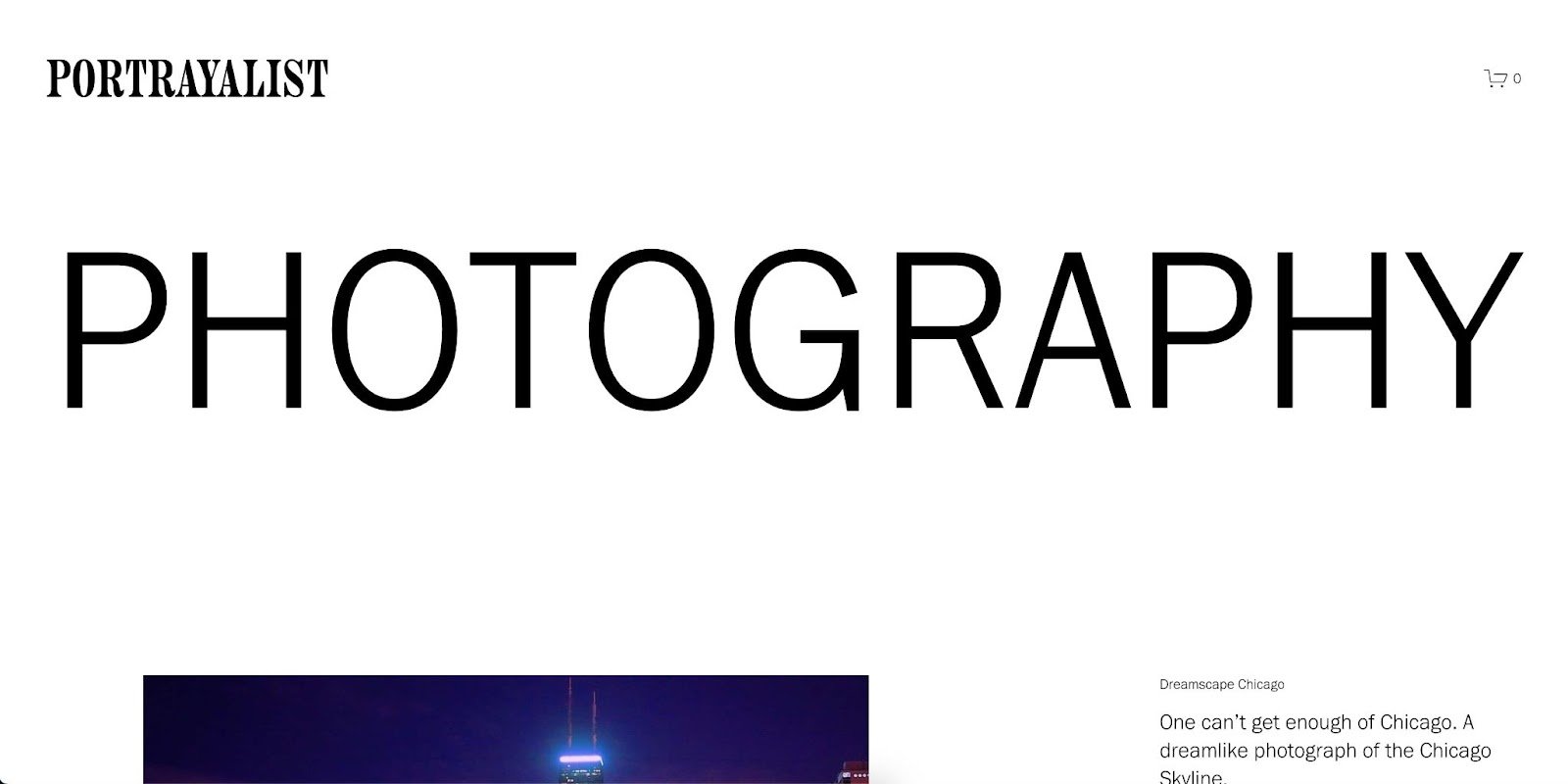 Portrayalist’s website is a great example of a simple yet engaging one-page design. As a photographic portfolio site, Portrayalist’s website focuses squarely on the photography itself.
The use of white space, clean fonts, and minimalistic design creates a feeling of elegance that reflects the quality of the work being showcased. The site's intuitive navigation keeps users engaged, and the impactful visuals make it hard to leave the page.
What We Like: These design elements create a site that effectively showcases the artist's work and draws users in for a consuming visual experience. Portrayalist’s website is a masterclass in the power of a well-designed one-page portfolio site.
11. SubZero Ice Cream
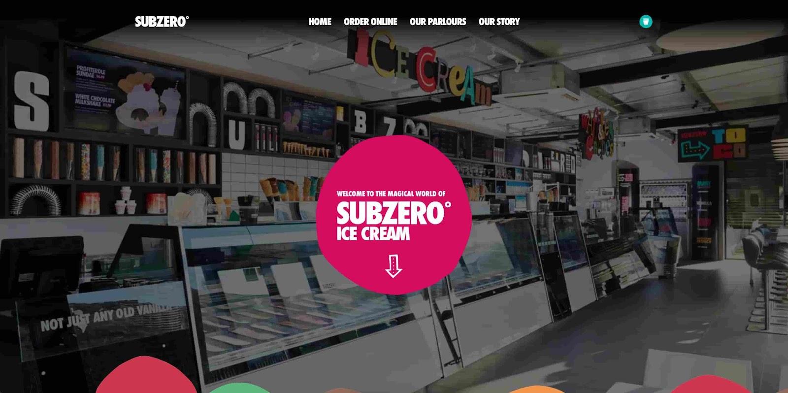 SubZero IceCream’s website is a great example of a one-page website that effectively tells a story. The site features clear, easy-to-read font choices and vivid and mouth-watering visuals that showcase SubZero’s award-winning ice cream.
The background visuals on the website are especially effective, allowing users to feel like they're experiencing SubZero's ice cream in real time. The website creates a clear and memorable impression, eliciting a desire to enjoy a scoop of ice cream for dessert.
What We Like: SubZero IceCream’s website is a great example of how a one-page design can use effective storytelling and visual stimuli to make an impact.
Getting Started With a One-Page Website
Now that we've looked at some examples of one-page websites, it's time to get started on your design. Remember, the key to a successful one-page website is to focus on your core message, keep your design clean and simple, and use engaging visuals and typography to make an impact.
With these principles in mind, you're well on your way to creating a unique and effective one-page website that will captivate your visitors. So, whether you're building a personal portfolio, an e-commerce store, or something in between, we hope you can use these examples as inspiration.
Website Design Examples



![15 black and white website designs to inspire your own [+ pro tips]](https://53.fs1.hubspotusercontent-na1.net/hubfs/53/black-and-white-website-design-1-20250520-1336267.webp)

![15 Brochure Website Examples to Inspire You [+ How to Make One]](https://53.fs1.hubspotusercontent-na1.net/hubfs/53/brochure-website-examples-1-20250319-362228.webp)
![28 Types of Websites to Inspire You [+ Real-Life Examples]](https://53.fs1.hubspotusercontent-na1.net/hubfs/53/types-of-websites.png)

![10 of my favorite interactive websites [+ how I make my own]](https://53.fs1.hubspotusercontent-na1.net/hubfs/53/%5BUse%20(1)-Sep-27-2025-03-02-58-8817-PM.webp)
![30 Furniture Website Design Examples I Love [+ How To Make Your Own]](https://53.fs1.hubspotusercontent-na1.net/hubfs/53/Google%20Drive%20Integration/furniture%20website%20design_32023-1.png)
