.png?width=112&height=112&name=Image%20Hackathon%20%E2%80%93%20Vertical%20(50).png)
Best Charity Website Examples
- St Jude Children's Hospital
- PAI
- Autodesk Foundation
- Trevor Project
- The Hunger Project
- Friends of Animals
- Legal Defense Fund
- Helen Keller International
- Cancer Research Institute
- American Civil Liberties Union (ACLU)
- Environmental Defense Fund
- Earthjustice
- Elizabeth Glaser Pediatric AIDS Foundation
- Dian Fossey Gorilla Fund International
- Center for Constitutional Rights
- Planned Parenthood
- Waterkeeper Alliance
- Learning Ally
- Breast Cancer Research Foundation
- ChildFund International
- Center For Community Change
- Government Accountability Project
- Amazon Conservation Team
- Diabetes Action Research and Education Foundation
- Lupus Research Alliance
1. St Jude Children's Hospital
Keeping things straightforward, St. Jude opens with a slogan that clearly states its mission, “Finding cures. Saving children.”
Front and center, you're given a glimpse of the work that goes on at St. Jude with video footage of families, doctors working with patients, teams of hospital staff, and scientists working on breakthrough treatments.
What we like: Further down the page, you’ll find testimonials of former patients, news, and coming treatments. They also included easy-to-access patient resources and donation buttons with added incentives to inspire generosity.
2. PAI

Doing more with less, PAI sticks to using still images for the homepage while making their site feel animated and bold. They employ a bright, minimalist color palette.
Animated actions give the page a dynamic first impression. Links shift colors as you hover over them. Text that reveals itself as you scroll down. Captions that bounce as each image slides into the frame.
What we like: PAI keeps its layout free of clutter. It presents the information through links while informing us on what they do, where to support them, and how we can take initiative.
3. Autodesk Foundation

This company already has a reputation for being a leader in design tools. Autodesk took what it did best and found a way to have those tools make a bigger impact.
This foundation focuses more on community engagement. Autodesk encourages creative types to see how they can invent or redesign technology in a more eco-friendly, cost-effective way.
What we like: Their site includes a portfolio of the various startups and initiatives they have funded.
4. Trevor Project

The Trevor Project’s site immediately highlights how it assists LGBTQIA+ youths. The organization makes resources for this community easy to find. A directory of counselors who can help site visitors is right at the top of the homepage.
The Trevor Project employs bright colors, clean lettering, and a collage of portraits without overwhelming visitors with visual clutter. This creates a warm and welcoming atmosphere.
What we like: The layout doesn't overwhelm users with information and keeps the content easy to navigate for volunteers, donors, and those looking to better understand themselves.
5. The Hunger Project

What we like: Often, when tackling a complex issue like hunger, you would need to find ways to make smaller, simpler goals to make changes. A nebulous topic should be handled with a focused approach.
The same can be said when designing a platform that groups information like who you are and what you do with clearly organized sections to find information. This charity focuses on empowering groups of women to spearhead initiatives, collectively working to encourage their communities into action.
6. Friends of Animals

Using textures resembling the edges of torn pages, the Friends of Animals home page feels torn directly from a magazine or newspaper.
They know how to grab a viewer's attention with their bold modern font and give us an impression of their goals with nice little touches like scribbling out the word “Exploiters” to drive the point of what they are fighting.
What we like: The site uses lots of white space with images to outline its objectives, success stories, and how to take action. FoA piques our curiosity with the clever use of short teaser statements above a large “Learn More” link box, urging visitors to proceed further.
7. Legal Defense Fund

Taking on racial injustice across the country involves a lot of activity, so you want to keep site visitors up-to-date frequently. The Legal Defense Fund finds a way to showcase their efforts, helping people have a finger on the pulse of recent events and inspiring others by showing how easy it is just to show up.
What we like: A slideshow focusing on new issues or protests demonstrates a fantastic way to stay on top of your movement's happenings.
8. Helen Keller International
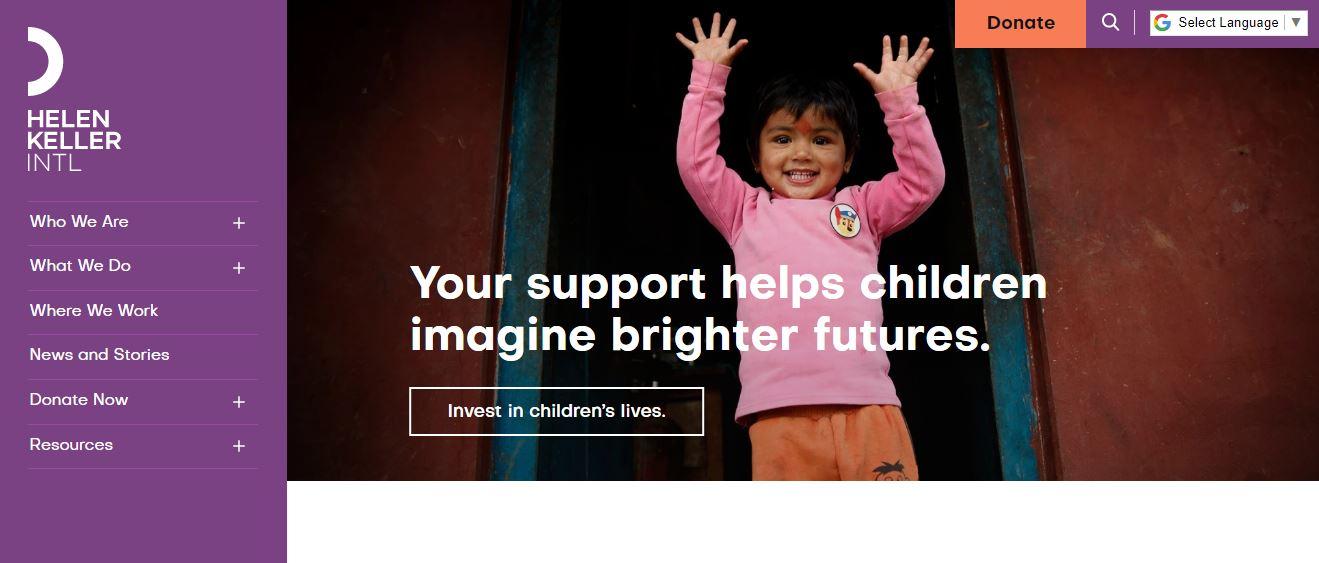
Historical figures have inspired many with their legacy of overcoming unbeatable odds. Helen Keller is one powerful example.
What we like: A left-side sticky menu allows visitors to scroll down the page and read up on updates while the side menu scrolls along with them, saving the hassle of returning to the top to navigate the different pages.
9. Cancer Research Institute
When a cause is complex, you need to design your site as a network of services, each tackling various aspects of your focus area. There can be many ways to build the structure of your site, branching off different areas you deal with.
Pro tip: Just like the Cancer Research Institute, we suggest you compartmentalize the many moving parts of the charity site. The site has groups of drop-down menus with several columns to direct users to the tools the charity has to battle and defeat cancer.
10. American Civil Liberties Union (ACLU)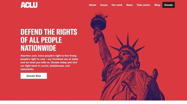
Employing a bright solid red background gives us a feeling of dire urgency, demands our attention, and stirs us into action.
What we like: As you scroll down, the colors change as the articles posted go from a cooler blue in the news section to hopeful yellow when reaching the links to initiatives taken to face the issues.
11. Environmental Defense Fund
Going with a bright blue theme for our bright blue world, the Environmental Defense Fund uses lots of visuals to draw users’ attention. Focusing more on action and ways everyone can make a change, the site offers many simple solutions that visitors can implement daily.
Pro tip: Having the content of your charity site focus on actions that users of the site can make is a great way to grow your cause and make a meaningful, collective impact.
12. Earthjustice

Going with a design as clean as their intended focus, Earthjustice immediately lets us know what they're fighting for. We are treated to a hi-def slideshow of the wildlife their current initiative will save while fighting polluter industries on a legal front.
What we like: Using large bold typography to display their many offices, teams of lawyers, and the number of cases already taking legal action, they establish their broad scope of work. For your site, provide many examples of the victories and success stories your charity has won to inspire hope in visitors.
13. Elizabeth Glaser Pediatric AIDS Foundation

Greeted by a looping full-screen video reel of children and families across the globe, we step into the lives of families and physicians, striving to eliminate AIDS.
What we like: Even more impressive is how, as the video scrolls down, it uncovers other images with links below. These links offer more interactive tiles with hover effects and pop-out buttons with more information. This all helps to spread awareness and inform people of what is currently known about AIDS.
14. Dian Fossey Gorilla Fund International
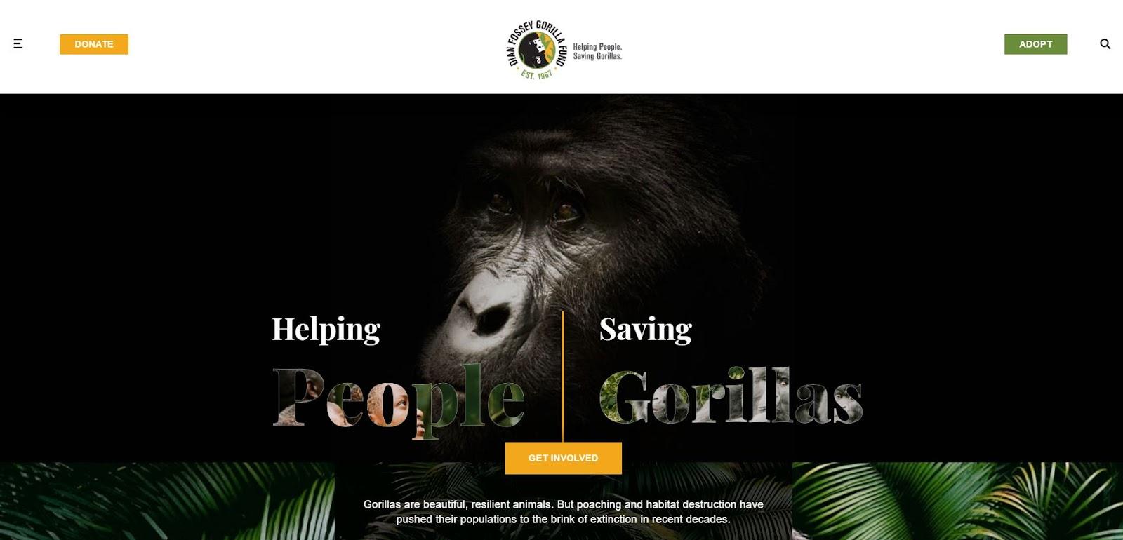 They say eyes are the windows of the soul, so what better to open a website homepage than with a closeup of a set of eyes?
The homepage of Dian Fossey Gorilla Fund International zooms in on the face of a gorilla blanketed in shadows, creating a sense of empathy towards these creatures facing extinction.
What we like: The site makes the most of social media, integrating its Instagram posts into its site.
15. Center for Constitutional Rights
 Speaking of social media and traditional community engagement methods, the Center for Constitutional Rights uses a layout similar to classic community bulletin boards.
Pro tip: You can emulate this twist on traditional methods of communication with links to tweets, press releases, fact sheets, open positions, event invitations, opinion pieces, and more.
16. Planned Parenthood

With the cost of healthcare skyrocketing, one charity strives to advocate for and provide affordable and safe access to reproductive healthcare. Planned Parenthood uses an easy-to-access search tool for finding local physicians in their network, making finding access to care a lot simpler.
What we like: We appreciate their use of vibrant colors in the banners providing us with information about the issues, frequently asked questions, and anonymous tips.
17. Waterkeeper Alliance

This multinational effort was founded by a group of people banding together and ignoring their nation’s political differences to focus on protecting the world’s water supply.
Designed to resemble diving equipment, the layout of the Waterkeeper Alliance’s site gives us a unique nautical theme, transporting us into the sea itself.
What we like: Lots of sapphire blue tones and textures of waves meeting at the shore of a dark backdrop juxtapose the bright text to inform visitors of their efforts across the globe.
18. Learning Ally
Everyone has their own ways of retaining information. Learning Ally looks to provide alternative tools, empowering kids with learning difficulties.
What we like: By keeping their site simple, using clearer fonts, and including lots of visuals, they make it easy for parents and their children to find options to assist them in improving their learning.
19. Breast Cancer Research Foundation
Family can be a great source of strength and comfort, especially regarding something like cancer. That's why this charity makes its case by focusing on what truly matters.
What we like: Using friendly colors, and images of families dealing with cancer, Breast Cancer Research Foundation evokes a feeling of home. This makes them more relatable and connect with people more easily.
20. ChildFund International
ChildFund keeps its tone bright and optimistic, sticking with green and yellow as its theme while looking out for children worldwide. You would want your charity site to remind you of something familiar for users to connect with, and ChildFund is a wonderful example to draw inspiration from.
What we like: This charity’s site evokes feelings of reading the back of a cereal box with its use of playful colors and images.
21. Center For Community Change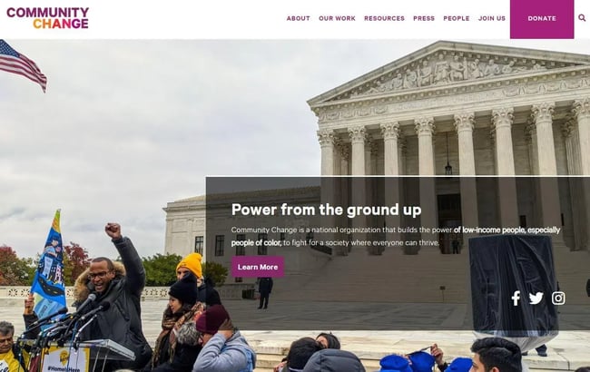
Taking on systemic issues requires making big waves, as Community Change’s website layout with broad sections. They even have to set up a secondary site to host all their articles, movies, and podcast episodes, as well as showcasing leaders taking charge in the movement.
What we like: When you want to show people you mean business, you take bold actions that end up as stories. Nothing says bold like images stretched across the web page.
22. Government Accountability Project

Going with a more judicial theme, the Government Accountability Project evokes a feeling of a monolithic institution. Using a uniform tone of legal blue, they illustrate their goal of seeking justice.
What we like: Whistleblowers need to know someone is looking out for them. This site assures users they aren't alone in their fight and can rely on the Government Accountability Project's team.
23. Amazon Conservation Team

Give your site a feeling of spectacle by using a video background that thrusts us into the world of the people you are trying to support. The Amazon Conservation Teams homepage shows us swooping landscapes and panning shots of people tending to the land, immersing viewers into the ecosystem.
What we like: Scrolling down, we see a count of the organization's accomplishments, such as how long they have been at work, the millions of acres preserved, and the amount of improvement that has been made over time.
24. Diabetes Action Research and Education Foundation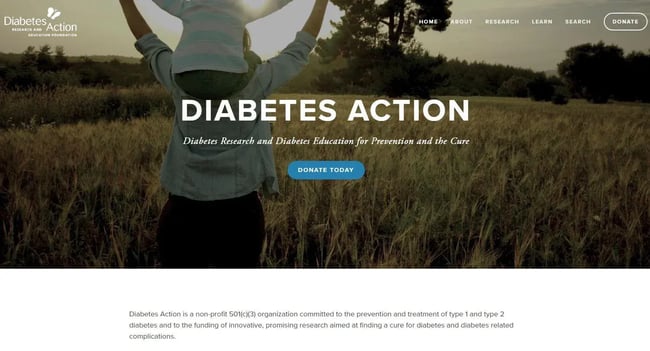
Some sites can feel overwhelming by the amount of content they keep on their homepage. Diabetes Action keeps things tidy by sorting things into four groups: How To Help, Research, Learn About Diabetes, and About Us.
What we like: The site layout helps narrow down where to find what people are looking for and controls the flow of information. Additionally, in each section, they respect the reader’s time by keeping information on such a complex disease, what they do, and how to help — short and to the point.
25. Lupus Research Alliance
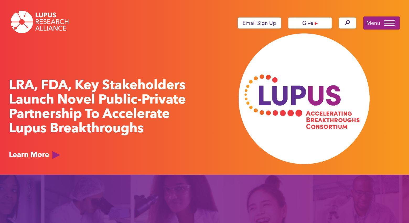
As you scroll, the top bar turns white and follows viewers down, showing options available while giving an impression of a shift between night and day. Among other design features, LRA uses hover effects on thumbnails, revealing text previews, videos, statistics of successes, and the different research grants they fund.
What we like: A great way to design your charity site is to make your visitors feel a sense of hope. Starting off strong, the Lupus Research Alliance immerses us in a warm gradient of red to yellow, with a white circle reminding us of a new dawn.
How to Design a Charity Website
- Consider the platform you’ll be using.
- Gather inspiration for your layout.
- Build a body of content for your site.
- Set up your donation method.
- Enhance your site’s visibility.
1. Consider the platform you’ll be using.
Stary by researching the platforms you can use to build your website. With an abundance of options to choose from, we would suggest you can take advantage of HubSpot’s free Content Managing System. Here you can create a site without going through the time-consuming process of hiring and commissioning website builders.
2. Gather inspiration for your layout.
We mentioned 25 of our favorite charity website designs to help get your creative juices flowing, but that doesn't mean you should stop looking for inspiration. Take the time to see what's out there and take from them what you like.
3. Build a body of content for your site.
While looking at the other charity sites, consider what to insert into your homepage, dropdown menus, or inner pages.
Consider adding testimonials, success stories, videos, news articles, press kits, progress updates, contact information, and where the funding goes. You want to ensure your content is compelling and informative to your site's visitors.
4. Set up your donation method.
A charity site would rely on, what else, charity. Having a method for contributors to your nonprofit available on your site can be done in many ways, including single or monthly recurring payment options.
A plugin to manage your donations is crucial to accepting donations, managing a database of contributors, and generating tax forms. Some of the best plugins include GiveWP, Boomerang, and DonorPerfect.
5. Enhance your site’s visibility.
While word of mouth can be a reliable way of spreading your cause's influence, having search engine optimization (SEO) increases the chance of users coming across the website.
Frequent updates, utilizing tags and categories to narrow down terms, enhances your charity site's ability to get picked up by search engines. Links to social media vastly increase visibility due to their pre-established global network giving it a broader reach.
Plugins such as Squirrly SEO or Yoast SEO can automatically or easily customize desired metadata tags, optimize titles, and merge content with social media platforms.
The Best Charity Website Designs
We've gone through 25 of the best-rated charity sites by CharityWatch.org as examples to draw inspiration from, but those are just a small fraction of all the sites out there.
The choices available are as vast as the number of tools at your fingertips. You can do your best to emulate a charity site you admire or develop your own unique style that will garner support for your cause.

Website Design Examples

![15 black and white website designs to inspire your own [+ pro tips]](https://53.fs1.hubspotusercontent-na1.net/hubfs/53/black-and-white-website-design-1-20250520-1336267.webp)

![Gradient Website Design Examples That Prove This Trend Is Far From Over [+Tutorials]](https://lh7-us.googleusercontent.com/htOWIbyCIoCMxSjC4gJunkGnhCzXpccjTrL8NwoGdRdCsSiEmEAxe_qBFkMrzy2Y8d3cwEr_DMzSGHq9Xi-hQFnMJCo8HDQJ1yQGigcSfFxI2QKXo0s7xXSB2sY-eALG1iUqnHXgomcDsnp7AHRSH1s)
![15 Brochure Website Examples to Inspire You [+ How to Make One]](https://53.fs1.hubspotusercontent-na1.net/hubfs/53/brochure-website-examples-1-20250319-362228.webp)
![28 Types of Websites to Inspire You [+ Real-Life Examples]](https://53.fs1.hubspotusercontent-na1.net/hubfs/53/types-of-websites.png)

![10 of my favorite interactive websites [+ how I make my own]](https://53.fs1.hubspotusercontent-na1.net/hubfs/53/%5BUse%20(1)-Sep-27-2025-03-02-58-8817-PM.webp)
![30 Furniture Website Design Examples I Love [+ How To Make Your Own]](https://53.fs1.hubspotusercontent-na1.net/hubfs/53/Google%20Drive%20Integration/furniture%20website%20design_32023-1.png)