Getting your website started may seem like a tough process. But we are here to show you that not only is it within reach but also there are dozens of examples and inspiration to choose from. So we went ahead and put together a list of 25 construction websites we love along with tips for how to make one for your business.
1. Marker Construction Group

What we like: When you land on Marker’s homepage, you're greeted with a stunning image of a pristine property, complete with pool and palms. Positioned in the corner of the page are the navigation options set in a sleek font directing you to information about the business, their portfolio, news and info, and most importantly, contact info. The web page features a slideshow of images, showcasing just some of the stunning projects that are safely tucked away in their portfolio.
Scrolling down the page will reveal the mission statement at Marker followed by testimonials from satisfied customers. They display some of the services they provide as well as a convenient call-to-action (CTA) to contact for an appointment. Both beautiful and user-friendly, Marker’s has everything that makes a good construction website.
2. H.J. Russell

What we like: Located in Atlanta, Georgia with over 70 years in the business, H.J. Russell has been delivering excellence for quite some time now. Their tagline, “Delivering Exceptional Results,” is displayed front and center when you first land on the homepage. Scrolling graphics of a few of the projects H.J. Russell has had a hand in over their tenure along with services and navigation options are listed at the top, complete with drop-downs for easy navigation.
Opening the portfolio for the company reveals just why this company has made it over 70 years. It shows schools, federal buildings, and even museums at locations across the country. The light and appealing color scheme and a standard text format give off a modern feel when exploring this website.
3. W.S. Cumby

What we like: Sleek and inventive, W.S. Cumby’s web design has us in awe. It’s a more modern approach to construction web design — timed scrolling graphics make up the landing page with an impressive menu system located on the right side in tab form. When opened, it shows all the services provided, their portfolio, and contact info. Each listed service takes you to a page with more information.
Scrolling down the page shows off some of the impressive work performed by W.S. Cumbly along with a brief history of the company. A cool color pallet and stylized fonts add to the modern aesthetic and provide a calm demeanor for your viewing pleasure.
4. Dingman Pools

What we like: Switching gears, we have Dingman Pools, a full service pool contracting and construction company based out of Long Island, New York. We love the vibrant images used for the landing page along with the stylized fonts which give the page a vibrant and inviting feel. Selecting the drop-down menus at the top of the screen reveals many options for services, testimonials, and contact info.
They even have a link to look into financing information for your next pool project. Scrolling down the page gives you information about the services provided as well as already completed projects. At the bottom of the page, BBB and certification badges are displayed proudly, showing dedication to quality service.
5. Brown Construction Collective

What we like: BCC sticks with the vertical scrolling design for their page, showcasing services and images in a sunny, friendly fashion. Bright colors and large fonts make this web page an absolute joy to view. Scrolling downward, BCC highlights their experience and why they are the best choice. Our favorite feature of this web page is the addition of an online chat. Chat functions give an extra window to a user-friendly experience. Eliminating the need to make a long phone call to inquire about a simple situation adds tons of value to a consumer. Online chat functions show that you value the consumer's time.
6. JDG Construction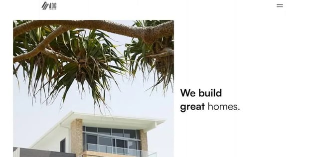
What we like: JDG backs everything up a bit and goes for a more simple design initially, and then takes it up a notch. The page contrasts between a solid white background and interactive scrolling. Immediately upon landing, the tagline “We Build Great Homes” is shown in a bold black font. The page shows images sliding into view as you scroll down, detailing some history of the business and the owners. Scrolling further, the page flips to a solid black format, detailing completed projects and services. Following that the displayed projects slide sideways. At the end of the list, the page begins to scroll down again and returns to the white design.
We love the contemporary feel that the JDG website gives off, from scrolling the page to opening up the tiling menu in the top right corner. Everything in this website is catered to wow the website's visitors.
7. BritoConstruction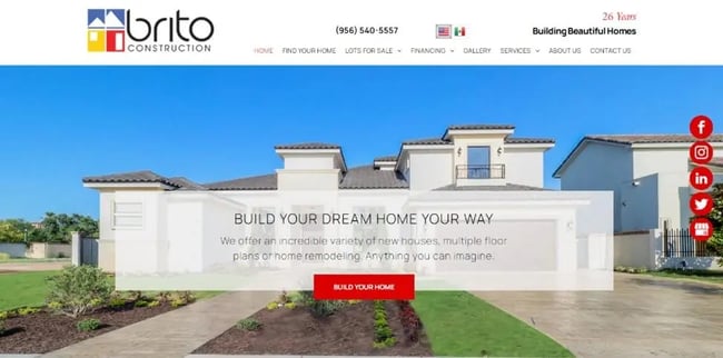
What we like: On a scale of 1-10 in vibrancy, we have to give Brito Construction a 10. From the moment you land on the homepage, you are greeted with bright, vibrant images of homes and projects. The red tabs on the side and the CTA in the center complement the color scheme in an eye-catching way. Standard font details your options at the top of the page while social media icons are displayed on the right, giving a more friendly feel.
Traveling down the page you'll find services offered, a gallery, testimonials, and contact info so you can start your next project. A video walkthrough showing off 25 years of experience in the industry and an online chat function completes the effect of this modern web design.
8. Gnomon Construction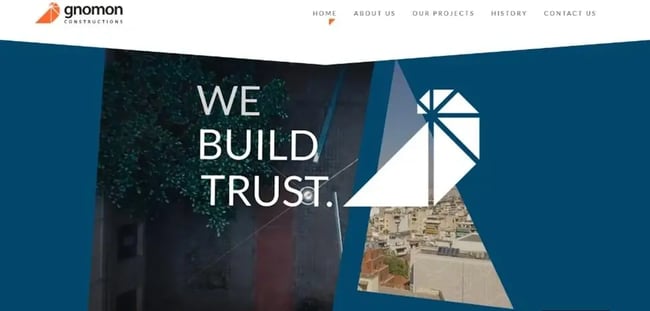
What we like: Based in Athens, Greece, Gnomon Construction’s web design has a bold look, using a deep blue color pallet set against a beautiful Grecian setting. The tagline “We Build Trust” slides into view as you open the homepage in a short sequence. Scrolling down the page shows off the company's rich history spanning back to the 1960s. The informative excerpts move into place as you scroll down in an almost playful manner. With the rich orange and blue color scheme and interactive setting, this website is fun to navigate and still holds true to its purpose.
9. Snyder Construction Group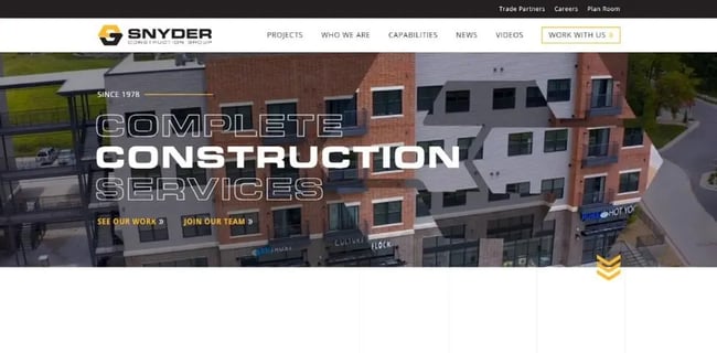
What we like: Snyder sticks to a more modern website design while leaning into the construction color pallet theme. Opening the website starts a video backdrop, walking through projects and designs. From the homepage you can scroll down to learn more about the team and services provided or navigate the top menu to view videos and news as well as contact info and a dedicated area to the history of the company. One of our favorite features are the options to work with Snyder. Just on the landing page, becoming an employee is listed twice, showing the company is growing and experiencing success.
10. Gordon Mitchell Contractors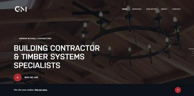
What we like: Not every website design needs to be extravagant. Sticking to the basics can result in a beautiful website, such as the case for GM Contractors. The slightly faded images set against the black background are pleasing to the eye. GM leans into a simple modern design while keeping all the features of our previous choices, and we love it.
11. Blach Construction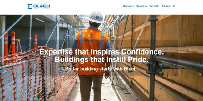
What we like: With impressive emphasis on safety, Blach is by no means reinventing the wheel but rather improving on it. It uses bold fonts set against images of safe working conditions, displaying its team atmosphere prominently on the front page. It’s a very straightforward example of what a successful construction website can be.
12. Thorsen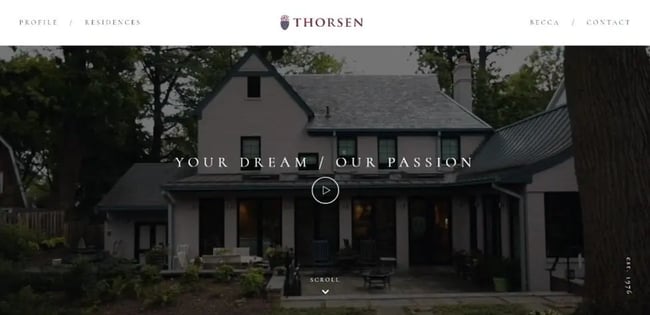
What we like: A personal favorite of ours on this list, Thorenson’s homepage is a cinematic experience. Landing on the homepage brings you to a video titled “Your Dream/Our Passion,” showing you how they make your dreams come true. Making your way down the page brings you to educational literature detailing the Thorenson philosophy and showcasing some of the projects they have completed. Eye-catching and dynamic, Thorenson has taken a simplistic modern design and made it an experience.
13. Culpepper Construction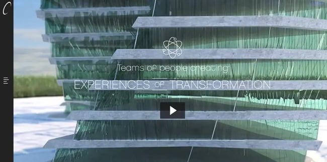
What we like: Speaking of dynamic themes, we have Culpepper Construction. It features an impressive video showing design possibilities taking center stage and menu options on the left. Scrolling down provides literature on the business and featured projects.
The entire landing page is eye-catching and futuristic, giving off a modern vibe while propelling you into the future with the design opportunities being engineered for the best possible experience.
14. Precision Overhead Door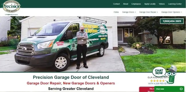
What we like: Precision Door has a unique approach to business because it is franchised but the franchisee has the ability to design their own website — and Precision Door of Cleveland is doing it right. Styled with the trademark green the contractor service is known for, it showcases their 5-star rating and chat features. They focus on their specialty and establish their authority in garages. This website is a great example of another company that isn't reinventing anything but gets the basics perfectly.
15. IMC Construction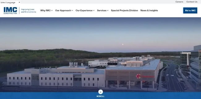
What we like: While this choice is not going to blow you away, the clean CGI video of completed projects on the landing page is visually pleasing. Sticking with a color palette that leans heavy into blue tones, IMC takes the vertical scrolling style of the page and makes it its own.
Making your way down the page gives you a brief history of the company and showcases just some of the services available. Clean, straight forward fonts make up the body of the information, making the page easy to understand.
16. Coleman Construction

What we like: Coleman Construction is a great option for viewing pride in work ethic. The main page is tiled with various images showing the company’s excellent safety standards and completed projects. Moving down the page you're greeted with info on the business and services provided. Navigating the options at the top of the screen provides you with more info on the company. A cool gray color palette makes up the bulk of the web page and we think it's just fantastic.
Sharon Coleman founded the company 25 years ago and that success is painted all over their homepage.
17. J. Russell Construction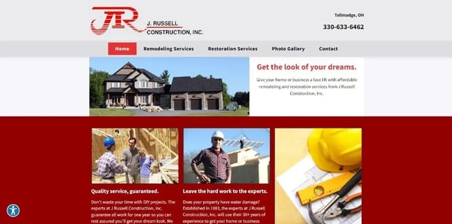
What we like: This website is not going to wow you with gimmicks or motion videos. Instead it takes a straightforward, simplistic approach. Some images detail the services they provide, there’s some history on the business, and a way to contact and book. We love how “to the point” this website is — it’s a great inspiration for anyone wanting a more basic website that completes its goal. Certifications are listed at the bottom and the site has a low impact gallery for you to explore.
18. Otto Baum Company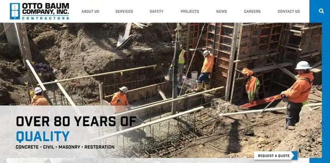
What we like: Here’s another website that's designed to put emphasis on quality service. Upon landing on the homepage for Otto Baum, you're shown immediately over 80 years of quality service and images showing work sites with workers all wearing the proper protective gear. Sticking with a modern style blue-and-black theme, you scroll down the page to find more services they offer. One of our favorite add-ons for this web page is the employee section at the bottom, listing workers that are celebrating their time with the company.
19. Choates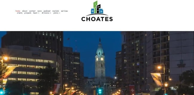
What we like: Now this choice on the list is a website with it all — from stylized graphics of Philadelphia to the navigation options to news, podcasts, contact, projects, and more! Choates covers all the bases when it comes to their web design with over 50 years in the biz and their own radio station. This website is at the top of the list when it comes to features and add-ons to look for for your website.
20. Powers & Sons Construction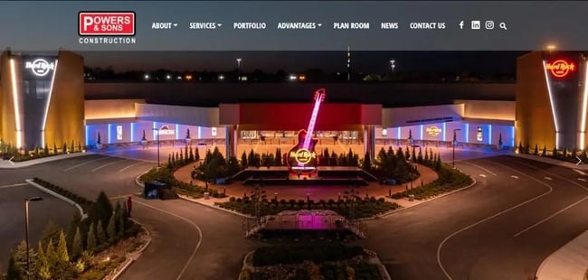
What we like: Powers and Sons really lives up to the name on this website. They definitely have the power. Opening the page, you're treated to some fantastic imaging showcasing completed projects ranging from the Hard Rock Cafe to schools and even amphitheaters. With an impressive repertoire like this, we expect the web design to be top notch, and we're here to say we are not disappointed. Scrolling down gives you a view into the business and services provided as well details for the multiple locations they operate out of. Perfect inspiration for building an impressive website.
21. Ozanne Construction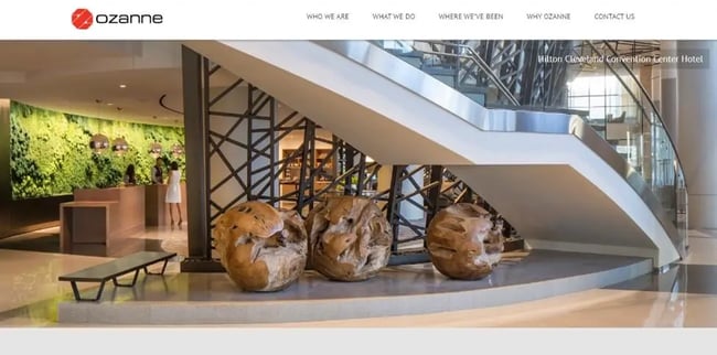
What we like: Ozanne Construction really leans into the beautiful imaging of their work. As a multi-disciplinary construction company, Ozanne has over 60 years under their belt. At first glance, the homepage looks simplistic in design, but under the layers there’s an impressive website to draw on. The bright, vibrant images and clean fonts filling out the body of information work together to create a stunning sight.
22. A. Marie Design + Build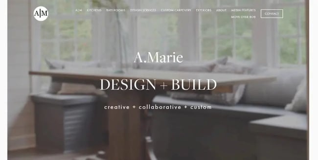
What we like: A softer, more neutral design, A. Marie is a contracting renovation company. The cool gray color palette paired with the Times New Roman font really gives an impressive vibe. Scrolling through the homepage, services are all listed with large images; you can click on the services and get an in depth look into each. Going further down the page, you're greeted with examples of projects that have already been completed. A user-friendly experience from start to finish.
23. Cahill Contractors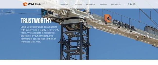
What we like: Cahill gets right to the point with their design, showcasing some of the equipment they use on the day-to-day and “Trustworthy” in large lettering. Navigating the page gives you a look into the history of the business and the services they offer. Social media options are laid out in the top right corner, giving another look into Cahill Construction.
24. Bjork Construction Company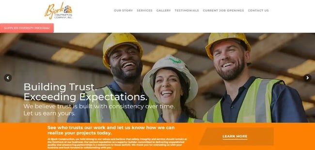
What we like: Bright and friendly is the description we would use for the Bjork website. An orange color palette and white fonts set the stage for the happy graphics that are displayed here. Opening the page, you’re immediately greeted with the largest smiles, really leaning into comfort for not only the consumer but the workers as well. Also right on the homepage you can view others that trust their service, and we love that — it provides that visual proof that your company is worth the consumer’s time. Real-life interactions from satisfied customers is a fantastic way to draw attention.
25. CTI
What we like: Last on our list we have CTI. With their focus on environmental safety and restoration, we had to include this one on our list. Upon landing, the CTI web page gets right to the point. It displays gorgeous images showing the sites they’re currently working on and provides easy-to-navigate menu options. CTI is by no means reinventing the wheel but does a fantastic job representing their company and their goals.
How to Design a Construction Company Website
1. Get inspiration from established construction websites.
Through this list we have shown you multiple websites to pull inspiration from, and there are so many more out there. Search for construction company websites and explore. Think of how you would like your web page to look and see how the various websites can inspire you or what you can add on.
2. Decide on the services being offered.
Before we start going into templates and designs, make a solid decision on what services you would like to prominently display on your website. We would focus on the most popular services you offer and create a separate page for the complete list of services provided. Having a clear direction on your business and what you want to offer spells out success.
3. Choose a website builder.
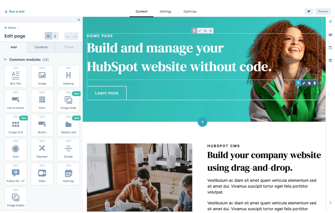
Now it's time to choose the builder for your website. We have looked at other sites to gain inspiration and made a list of services we want to provide for a clear direction. There are many options to choose from when it comes to your site builder, and we have some fantastic template options linked below. Be sure to include these features when selecting your web designer:
- Homepage builder
- Pop-up builder
- Online reservation system
- Online chat functions
- Testimonial carousel
- Social icon widgets
4. Choose a template.
Next, once you have decided on your builder, it's time to pick your template. Like we stated, HubSpot has plenty of template options for you to choose from or you can look into the built-in templates from the builder you have chosen. We recommend sticking to construction style templates to ensure it provides all the elements you’ll need — you’ll especially want a site which displays images of your projects well. However, as long as you stick to the guidelines we’ve laid out, your website will be a success.
5. Integrate online chat/communication.
One of the more important features for today's market is an online chat feature. We recommend looking into this option. Not only does it give the consumer a quick way to ask questions and contact the business but having an online chat function also gives an impression of care for the consumer.
6. Optimize website for mobile.
Last but not least, we recommend that you optimize your website for mobile searches. With a majority of online traffic coming from mobile browser searches, having this optimized will add that extra layer of user experience that your website needs. The name of the game is creating an easy and lasting experience for the consumer, whether on desktop or mobile.
Construction Website Designs to Inspire Yours
Through this list, we’ve brought some of the best construction web designs out there to you. Gain inspiration from these designs and look through other options out there. Use some of the extra features that websites can offer to better serve your clients. Select the best services you want to advertise and build that 5-star experience today.
Website Design Examples
.png?width=112&height=112&name=Image%20Hackathon%20%E2%80%93%20Vertical%20(50).png)


![15 black and white website designs to inspire your own [+ pro tips]](https://53.fs1.hubspotusercontent-na1.net/hubfs/53/black-and-white-website-design-1-20250520-1336267.webp)

![15 Brochure Website Examples to Inspire You [+ How to Make One]](https://53.fs1.hubspotusercontent-na1.net/hubfs/53/brochure-website-examples-1-20250319-362228.webp)
![28 Types of Websites to Inspire You [+ Real-Life Examples]](https://53.fs1.hubspotusercontent-na1.net/hubfs/53/types-of-websites.png)

![10 of my favorite interactive websites [+ how I make my own]](https://53.fs1.hubspotusercontent-na1.net/hubfs/53/%5BUse%20(1)-Sep-27-2025-03-02-58-8817-PM.webp)
![30 Furniture Website Design Examples I Love [+ How To Make Your Own]](https://53.fs1.hubspotusercontent-na1.net/hubfs/53/Google%20Drive%20Integration/furniture%20website%20design_32023-1.png)
