But, I also agree that creating a financial website that looks great, is easy to navigate, and provides valuable content is no small task.
I have been analyzing website designs for quite some time. The best ones I’ve come across have these things in common: they combine clean design with a simple interface and offer visitors a wealth of helpful resources.
Every great design starts with a bit of inspiration, so I’ve compiled a list of 40 outstanding financial website designs to help you get started.
1. Wise
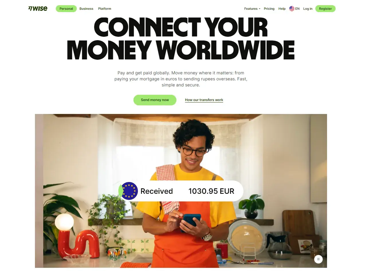
What I Like: I am a big fan of the Wise website, mainly because of their personalization. They have different website copy for visitors depending on the location selected.
For instance, I selected my location as the U.S, so the hero section explains to me how I can send money to pay mortgages in Euros or conveniently transfer money back home in Rupees.
This personalized messaging is something that very few websites manage to pull off so effectively. It feels like Wise understands exactly what I might need based on where I’m located and the currencies I’m dealing with. That extra effort to tailor the experience for users from different regions makes the whole process feel seamless and relevant.
What also stands out to me is how clean and intuitive the design is. There’s no overwhelming clutter or distracting elements in the navigation — just straightforward information presented in a way that’s easy to digest. It’s clear that Wise prioritizes user experience, which is why their website consistently ranks as one of my favorites.
Key Takeaway: The tailored experience for users from different regions is a major strength.
2. Revolut
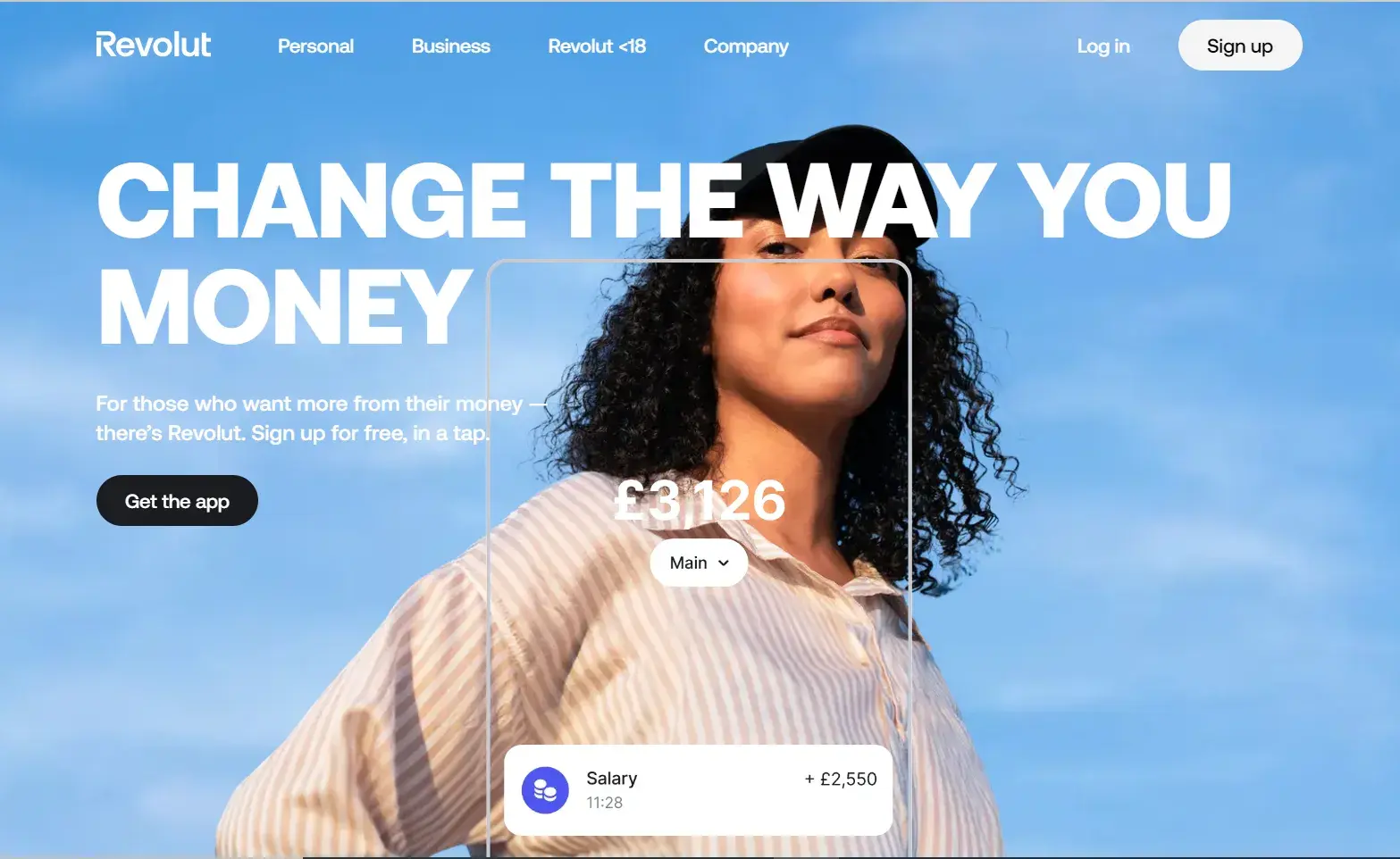
What I Like: Revolut is another one of my favorite financial services website designs. It stands out for one reason: Revolut allows youngsters who are below the age of 18 to be included in the financial world.
The site navigation has a section titled “Revolut <18” which shows that they have a product that’s relevant for minors. This section is easy to find and navigate, which shows they’ve really thought about making the experience user-friendly for both teens and their parents. The layout is simple, with bright, engaging visuals that appeal to younger users without feeling childish.
I also appreciate how transparent they are about what features are available for this age group. They break everything down clearly, whether it's learning about budgeting, managing their first card, or setting savings goals.
Key Takeaway: I like how Revolut genuinely wants to teach younger users good financial habits, and their website design reflects that commitment to education and independence.
3. PayPal
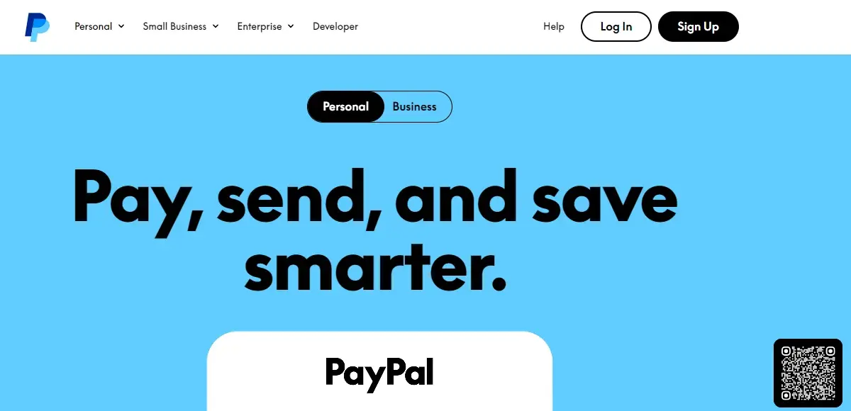
What I Like: PayPal is one of the leading mobile payment options for online transactions, and PayPal’s website design choice shows that they know this user preference.
As the primary goal of PayPal's website is to bring users to download the app, the website has a floating QR code on the entire homepage which links to the app download.
I like how this CTA is a subtle yet constant nudge that exists throughout the homepage. I personally feel like it is a great tactic that shifts focus from traditional website engagement to a more app-centric experience.
Another key design element that I admire on PayPal's website is the clean and minimalist layout. It reduces cognitive load for visitors, and this is critical in financial services where security and clarity are primary concerns.
Key Takeaway: This website design stands out because PayPal has effectively removed the friction from their processes.
4. Zero
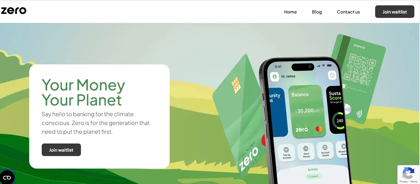
What I Like: Zero is one of the few fintech companies that revolve their website entirely around sustainability. They have centered all their messaging around the issue of climate change.
From my experience analyzing designs of financial websites, I have seen that most companies are focused on convenience and speed as their main differentiators. Zero, on the other hand, is carving out a niche by addressing one of the most pressing global issues of our time.
Plus, they’ve made sure the eco-friendly messaging on their website translates into actionable steps. There’s a clear focus on guiding users toward greener financial decisions through display metrics such as “sustainability score.” This way users can make lifestyle choices that reduce their carbon footprint.
Key Takeaway: The nature-inspired imagery and clean, bold typography reflect both the mission and the services of this fintech company.
5. Papara
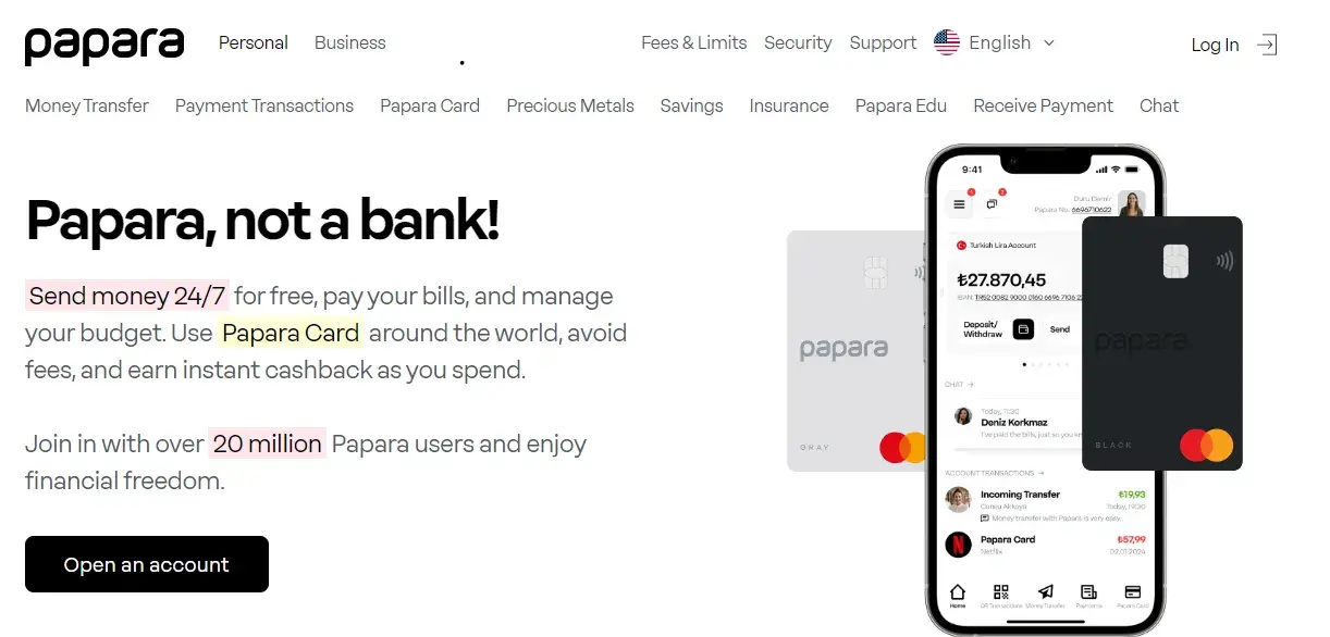
What I Like: The Papara website made it on my list of best financial services website designs because everything on the website feels intuitive.
I never felt lost or confused when navigating the site, whether I was reading about the payment transactions or looking at the different designs of Papara card. For me, the website’s usage of soft, calming colors felt easy on the eyes and highly effective. Plus, the navigation is seamless so everything feels easily accessible.
Basically, it’s the kind of website that removes any anxiety around handling finances, and for me, that’s key.
Key Takeaway: With the right amount of white space, Papara makes navigation intuitive and reduces friction in the user journey.
6. Stripe
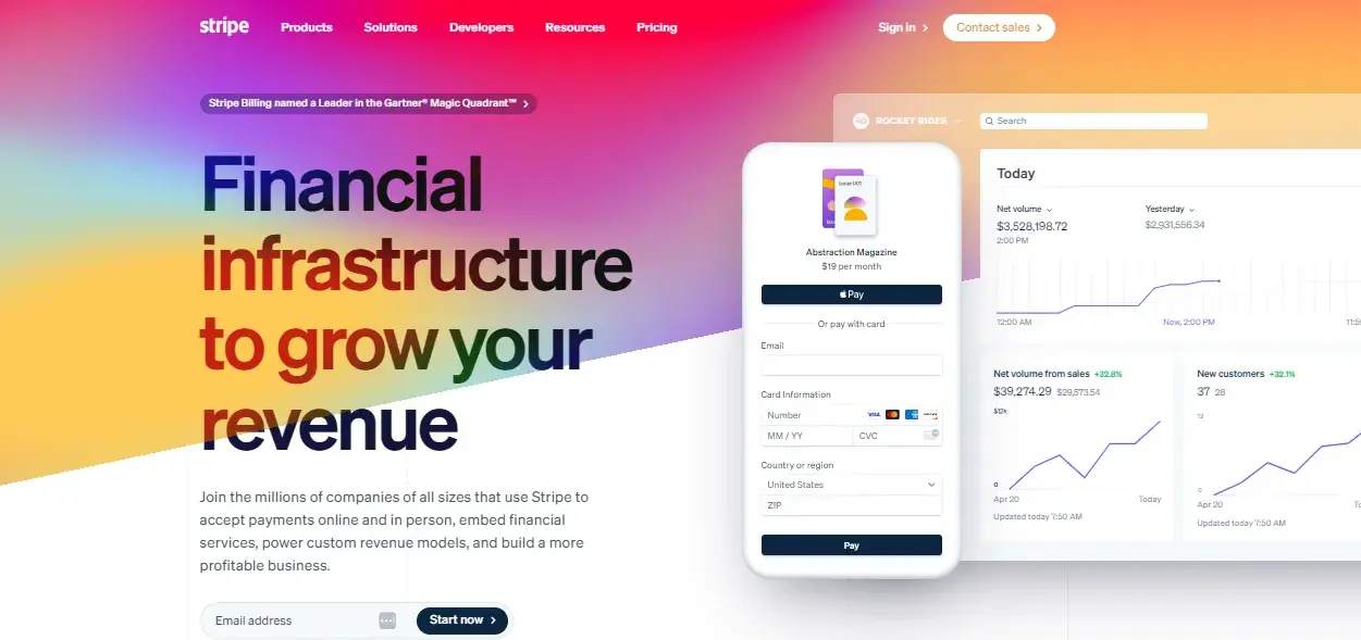
What I Like: I have been aware of Stripe’s financial services almost since the time they started operations. But even if I was visiting their website for the first time, the hero section and the list of companies mentioned would have immediately communicated that Stripe is a trusted and established player in the financial services industry.
This immediate association with major companies such as Google, Shopify, and Amazon is a powerful trust signal. It’s also a design strategy that doesn’t rely on flashy visuals but instead on credibility through association.
What I feel is particularly clever about Stripe’s design is how they balance simplicity with the depth of their offerings. Despite being a complex financial services provider, their website remains incredibly approachable. Their use of white space prevented me from feeling overwhelmed.
Every section — from the product breakdowns to the developer resources — is designed to guide the user step by step. Each section of their website also emphasizes action. For instance, if you're a developer looking for API documentation or a business trying to integrate payment systems, Stripe makes the next steps clear.
Key Takeaway: Stripe uses the logos of the industry giants in the hero section which do all the heavy lifting in terms of building confidence with potential users.
7. Remitly
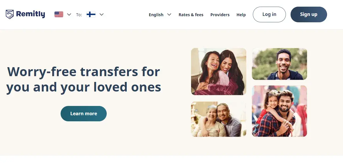
What I Like: The Remitly website has a very straightforward navigation bar, which simply asks from which country you‘re sending money and where it’s being sent. The receiving country is automatically determined based on your IP address, and the website adapts its content accordingly — similar to what Wise does.
What I love about Remitly (and what sets it apart) is that it takes an extra step by displaying the logos of all the receiving banks in the destination country, offering an additional layer of trust and reassurance.
I feel that reassuring users that their money will arrive safely at well-known institutions is a smart move. When sending money internationally, the recipient’s familiarity with the local banks can be a huge factor in building confidence.
Another aspect I appreciate about Remitly's website design is how they have displayed the rates and fees. The process of entering the amount you want to send and instantly getting to know the calculated exchange amount minus the fees is smooth.
Key Takeaway: This design minimizes friction and keeps the focus on the user’s immediate needs.
8. SadaPay
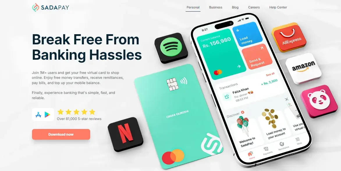
What I Like: The first thing that stands out about the SadaPay website is its modern and clean design. The layout is easy to navigate and makes the most of white space — SadaPay has clearly designed their website to make their services feel approachable.
Another standout was the animation. While skimming through the website, my eye was drawn to the animation that showed the steps — in less than ten seconds! — for receiving payments via their app.
Key Takeaway: This website effectively simplifies complex processes and encourages users to take action.
9. Verifone (previously 2Checkout)
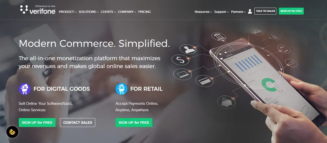
What I Like: Although 2Checkout is now Verifone, the website only subtly displays this information. Because most users, including me, recognize this online payment processing service as 2Checkout, the website has maintained familiarity while integrating the new branding.
The layout is clean and re-iterates how the platform is made to grow around your business and how 2Checkout plays a part in the success of all teams within an organization.
I’m not really a fan of having more than one CTA, so I think the website can reduce its CTAs from three to one in the hero section. Even if you intend to target two different sets of users, giving too many options right from the start might not create a smooth flow.
Key Takeaway: The website navigation features a well-organized “Solutions” button that allows for precise targeting.
10. Easypaisa
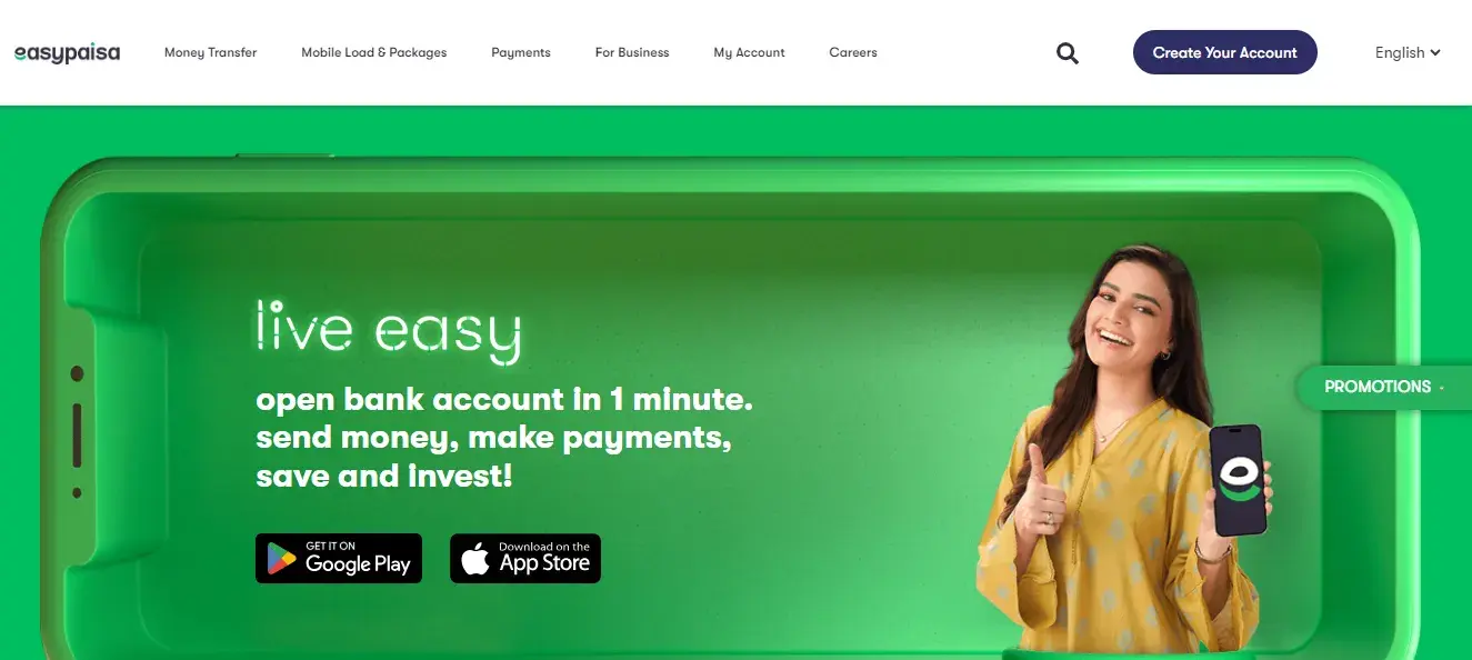
What I Like: The design of this financial service website is easy on the eye. There are two particular aspects that I find especially appealing: the combination of human images and animated visuals, and the vibrant green color. I believe incorporating both types of visuals can enhance user experience by creating an inviting atmosphere.

Easypaisa also proves that providing financial service doesn’t need to be all serious. Highlighting interactive elements such as games adds a layer of fun and engagement. I’m of the view that this helps make finance feel less intimidating.
The functional side of the website is just as impressive; the navigation is straightforward, making it easy for users to find what they need.
Key Takeaway: The harmonious blend of visuals and usability.
11. Consensys
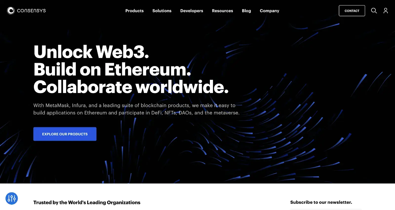
What I Like: If you're after a sleek, modern website design that efficiently delivers a wealth of information, I highly recommend checking out Consensys. The homepage grabs your attention with a large, visually striking banner and a seamlessly integrated menu, making navigation effortless.
As you scroll down, you’re greeted with a clear overview of their services, followed by a selection of featured blog posts that keep you informed and engaged.
Key Takeaway: The blog posts are where Consensys really shines. Web3 is still a new and confusing topic for many, and their blog makes the subject feel more accessible. Great job incorporating educational and informational value here.
12. RockWallet
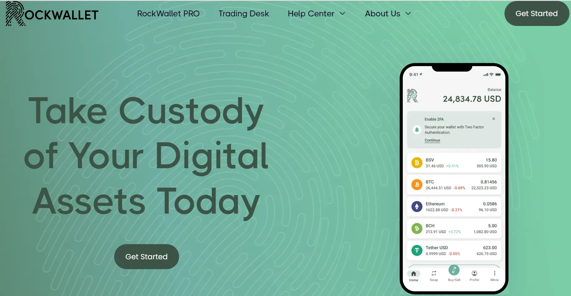
What I Like: This website’s design is refreshingly simple and user-friendly. The homepage provides a concise explanation of its purpose, paired with a clear visual of the app. As I scrolled down on the homepage, the value proposition was beautifully explained using their app screens.
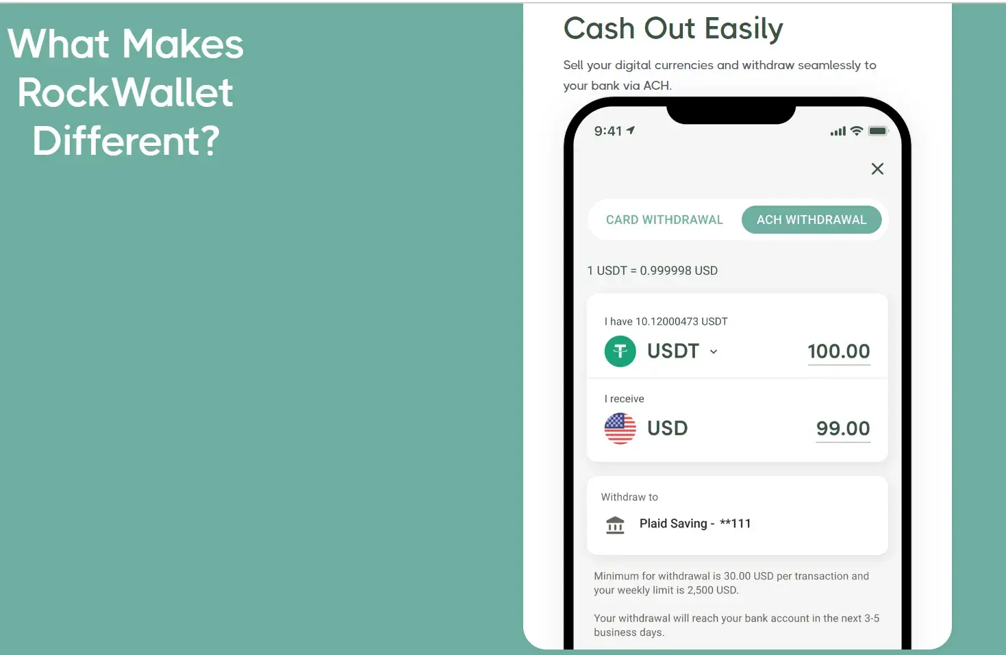
For some reason, I’ve always had this lingering fear that investing in crypto means my money could disappear into the void, never to be recovered. I know this might not be the case, but having a reassuring message goes a long way in easing these concerns.
RockWallet does exactly that by providing me the option to cash out easily. Plus, the minimalistic design of the homepage makes the messaging even more impactful.
Key Takeaway: Instead of having a CTA that says “Sign up,” the website breaks it down into three easy steps. This way I know exactly what to expect when I click on the “Get Started” button.
13. Butter Payments
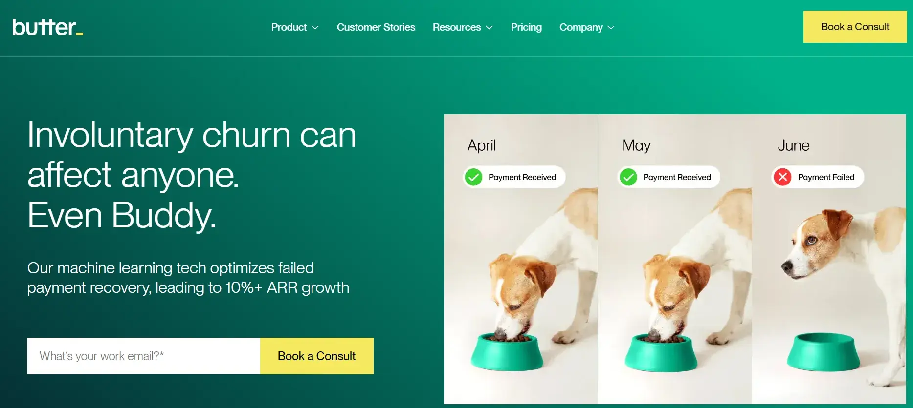
What I Like: Butter Payments is designed to make sending and receiving payments online effortless, and its simple, clean layout reflects that. The site’s easy navigation and homepage are filled with strategic calls-to-action (CTAs) to drive conversions across different messaging.
One feature I love on the homepage is how they have used a pet as part of their key messaging in the hero section. This interactive element not only stands out but also makes a compelling case for why visitors need to remember Butter Payments' services.
Key Takeaway: Find ways to make your website stand out. Give your clients a way to click and proactively learn more about your business.
14. CyberCube
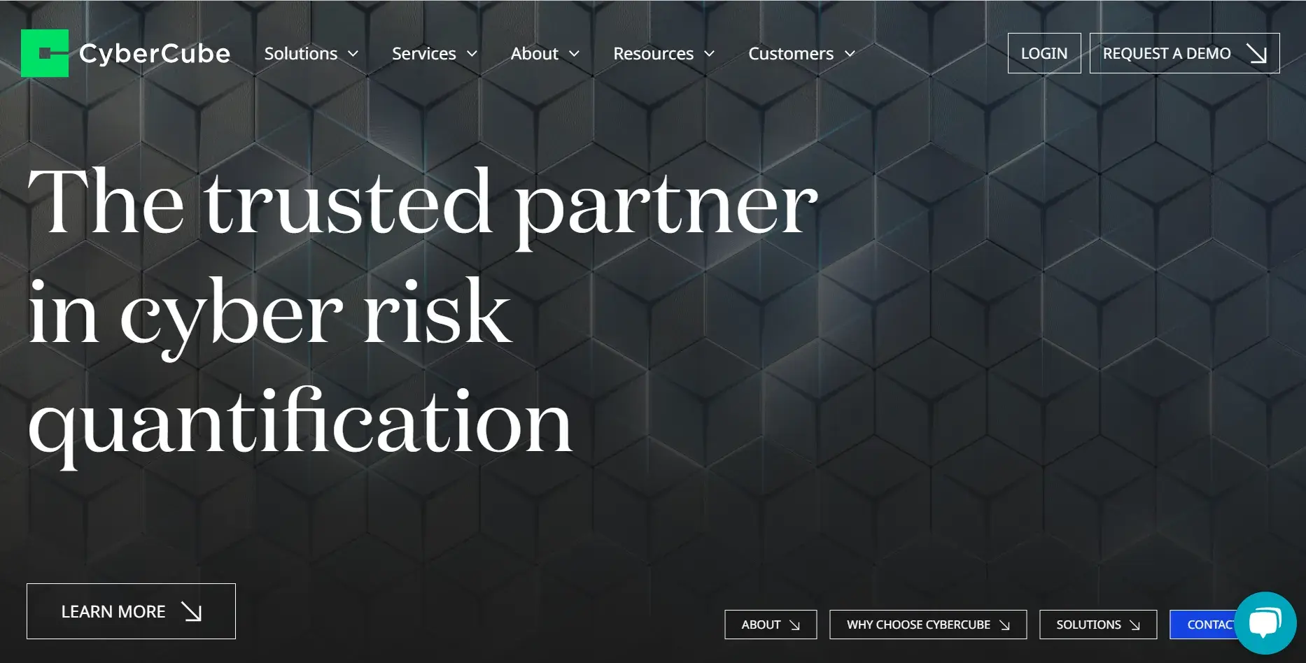
What I Like: If you‘re not selling physical products like a bank or credit card company might, you’ll need to find creative ways to visually represent more abstract services. CyberCube does this brilliantly, using an engaging animation in their homepage’s hero section.
CyberCube specializes in cyber risk analytics, so they try to make their website as informative and accessible as possible for users.
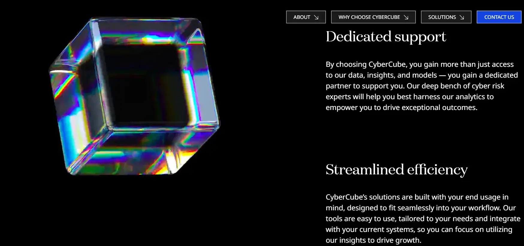
As you scroll down on the homepage, I like how a video wrapper is autoplays. The left column has been made sticky, so as I scrolled down I was able to read the content on the right easily and my browsing experience was cohesive.
I also like how they have a section with a chart that showcases their role in cyber risk analytics. But overall the website is very text-heavy. In my view, the design could be improved to give bite-sized information instead of full paragraphs to cater to the diminishing attention spans of users these days.
Key Takeaway: If you don’t have a physical product, leverage artistic representation and make the design more appealing.
15. Paytient
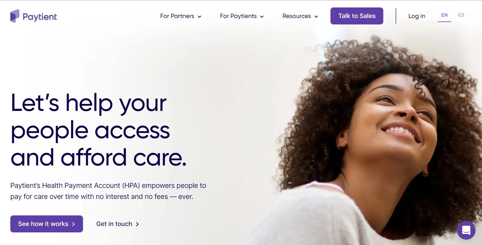
What I Like: Many people start their search for financial services on Google, and just because they land on your website doesn’t mean they instantly know who you are or what you offer. Paytient, a health insurance management company, uses its homepage to educate visitors right from the start.
I understand that while not every company can have a catchy name like Paytient, it’s crucial to find a way to clearly communicate what you do on your homepage. I am of the opinion that one should use any opportunity to educate and engage right from the moment someone arrives on your site.
Key Takeaway: The site offers social proof of other brands that use Paytient. Use your roster of clients to your advantage and build trust with visitors.
16. Yuga
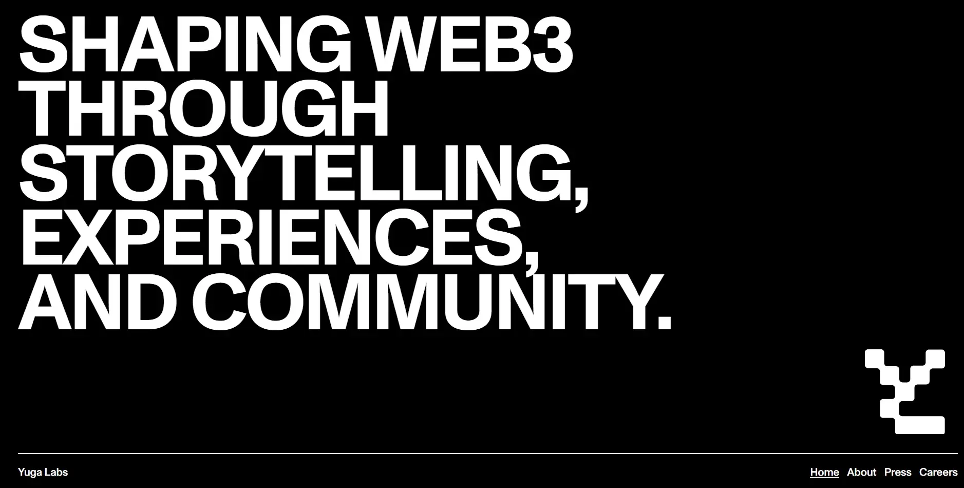
What I Like: Animations can help your site stand out from the rest. If you have a web team with the right CSS, Java, and HTML chops, you can create a truly interactive experience for your users.
Take a look at Yuga’s website for inspiration. If you click the about section, you’ll be guided to an interactive timeline. Different elements move and slide across the screen as you scroll.
For a Web3 company, I feel that showcasing yourself as cutting edge is important. This sleek, futuristic design helps reinforce the brand’s futuristic image.
Key Takeaway: The homepage is immediately engaging and futuristic.
17. Vouch
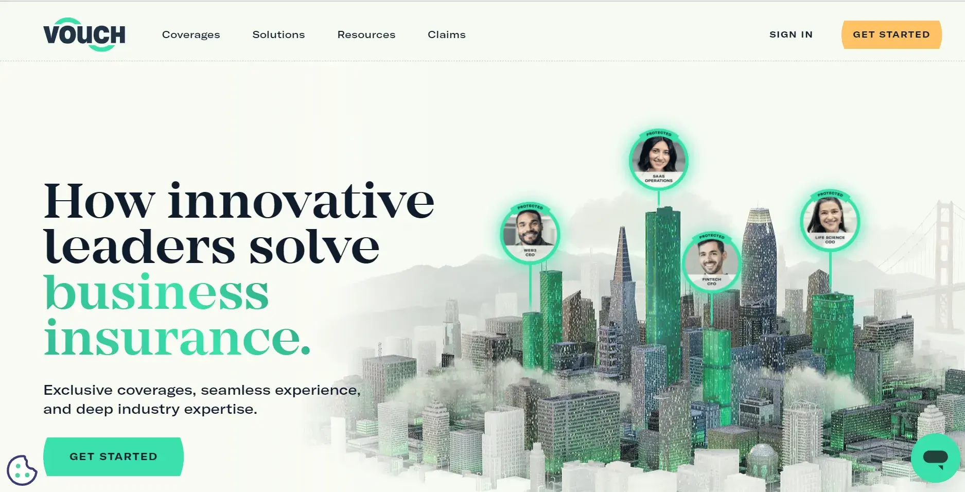
What I Like: Vouch is a full-service insurance solution for scaling technology companies. Their website has a clean design, using a limited color palette.
Remember: Too many clashing colors can leave users’ heads spinning. Vouch opts for mainly neutral tones — beige, black, and gray. This helps its greenish accent color really stand out.
Key Takeaway: A support chat box is readily available at the bottom of the screen but doesn’t automatically pop up in an intrusive way. This gives the user the power to learn more about the brand when they’re ready.
18. Flowcarbon
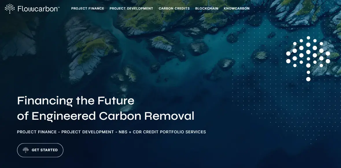
What I Like: Your website should do more than just explain what you do — it’s also a chance to show why your work really matters. Flowcarbon, which focuses on carbon trading and finance, does this brilliantly. I love how they’ve set up a blog, a news section, and a resource library, all aimed at keeping users informed.
Flowcarbon knows its audience cares about the environment, and I see the value in how they cater to that. Their users want the latest on sustainability efforts in finance, so these sections are not just informative — they’re a smart way to engage and build trust.
Key Takeaway: The website design is visually engaging and perfectly aligned with the brand, so users understand the purpose of the site as soon as they land on it.
19. Bilt Rewards
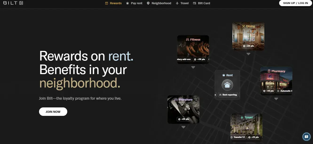
What I Like: When building a website, keep your layout simple. Bilt Rewards acts as a perfect example.
I also love how they have included a slider right below the hero section to display the customer testimonials from leading companies. The slider makes it hard to skip this section. My initial idea was just to skim through the website, but the slider caught my eye, and I ended up reading more than two reviews.
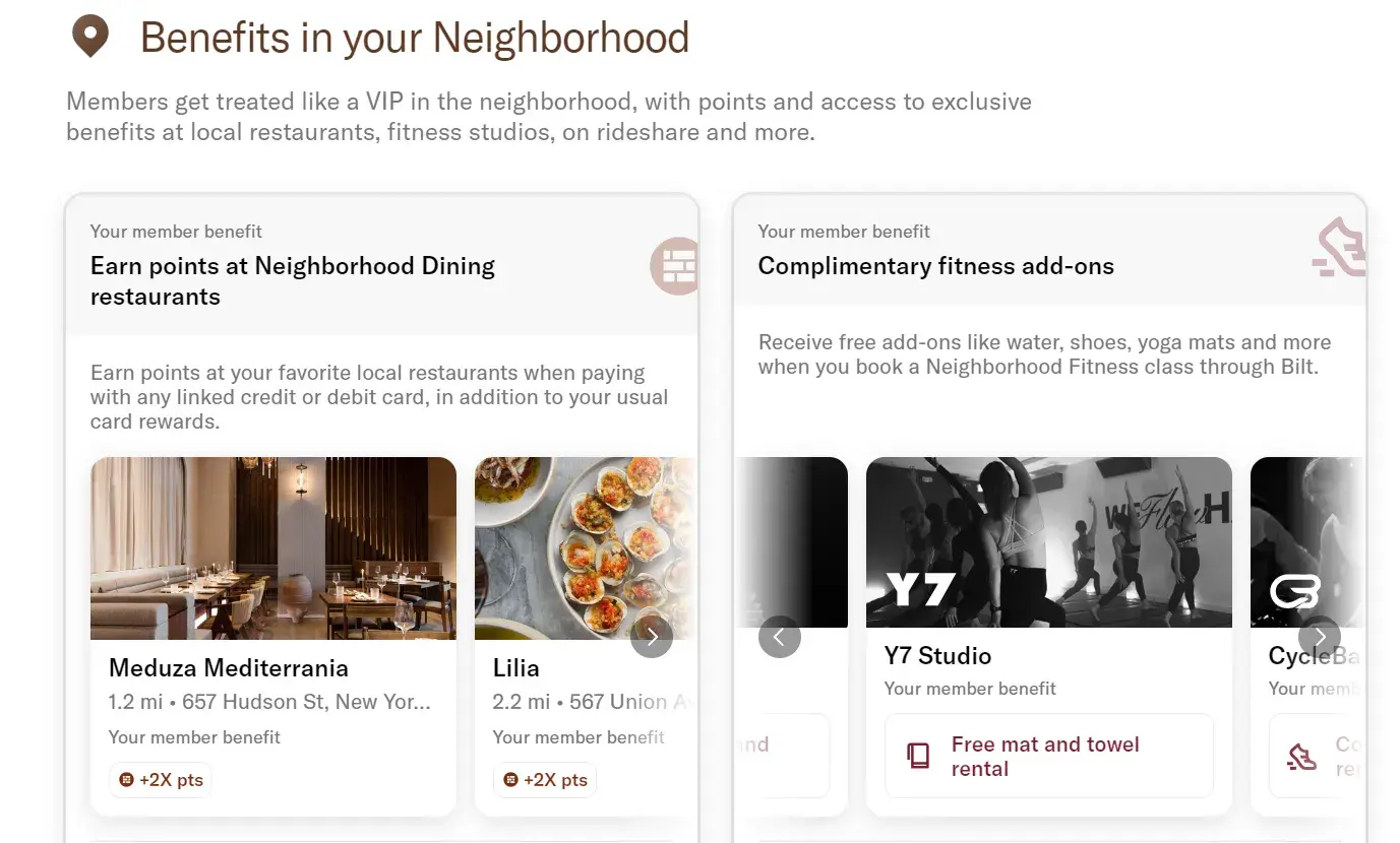
The website design prioritizes clarity, with a clean layout and easy-to-navigate structure. I like how the rewards are divided into “benefits at your home,, “benefits in your neighborhood,” “benefits when you travel,” and so on. The other unique aspect is that each benefit has a slider inside, so users can clearly see where the member benefits apply.
Key Takeaway: Loyalty programs encourage repeat customers. Allow users to easily earn rewards for using your product or engaging with your site.
20. Stavvy
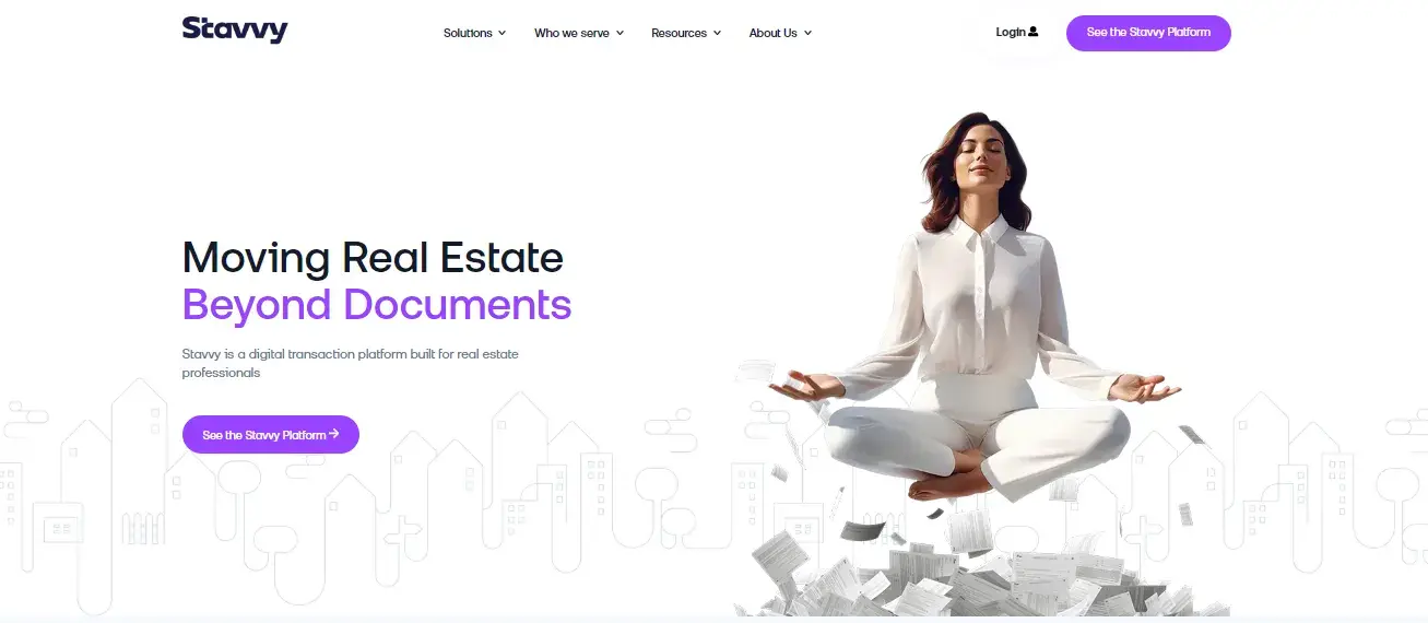
What I Like: Stavvy is a digital mortgage platform. Their site includes news, a blog, and case studies that provides financial tips and information. I like how the simple website design makes the process of securing a mortgage easy. If you offer a complex product, my suggestion would be to make sure to have a simple explanation.
With the recent design update, Stavvy has used AI-generated images in their homepage. I am not a fan of AI-generated images. My motto is to keep things as human as possible, especially in the financial sector where personal connection is paramount. On Stavvy’s website, I was unable to tell at first glance if the images were AI-generated or not (apart from the hero section — that one is pretty obvious).
Key Takeaway: The website has detailed resources for anyone wishing to explore more about the services in the financial sector.
21. M-Pesa

What I Like: As the leading mobile money service in Africa, I was impressed by how M-Pesa’s website reflects both its reach and simplicity. The design is focused on usability, catering to both personal users and business owners.
What I particularly appreciate is how they have used the website as an opportunity to display the UI of their mobile application. Just by looking at the images, I was able to come to the conclusion that it is not overloaded with complex features. From my experience, the quicker you make it for users to understand, the quicker you are able to attract people who are new to digital financial services.
Overall, the design complements what the website is all about. One area I believe could be improved is the CTA buttons in the hero section. The slider features a “Learn More” button, but it doesn’t respond when clicked, which affected my overall user experience.
Key Takeaway: The website uses lots of images with real people with whom the audience can easily connect with.
22. Citigroup
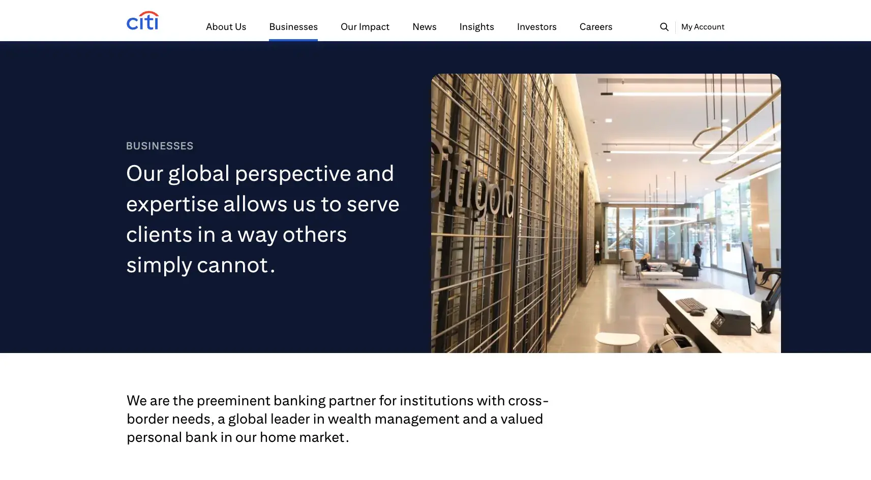
What I Like: In terms of financial website design, Citigroup truly stands out as a leader in the industry. I appreciate the clean, modern layout that emphasizes simplicity and ease of use.
The homepage features various content blocks that showcase various products and services. At the end of almost each block, there’s a well-placed CTA that encourages visitors to explore their credit card offerings. In short, the website made it easy for me to find what I needed without feeling overwhelmed.
Key Takeaway: The website uses plenty of vibrant colors and imagery.
23. Bank of America
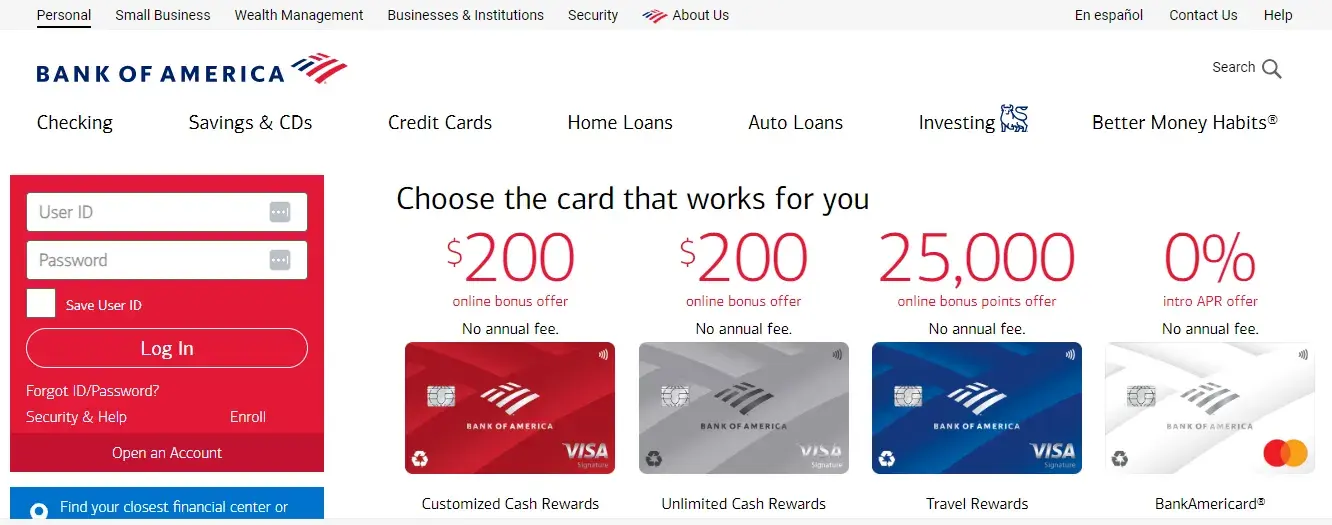
What I Like: When it comes to online banking, Bank of America has one of the best websites in the business. The site is easy to navigate, with all the features and information you need clearly laid out and available right from the homepage.
While the website has a slightly busier design than others, it provides plenty of useful resources for personal financing and investing. For example, let’s look at the page above.
Someone in search of a credit card can see their options right away. They’ll know that they’re already in the right place.
The bottom of the homepage contains a large block of content, clearly intended for SEO purposes. I think this section could be presented more effectively to encourage users to actually engage with it.
A more thoughtful design, possibly incorporating visuals or breaking up the text, would make the content more approachable and reader-friendly.
Key Takeaway: The login window is above the fold on the homepage rather than hidden away, so users don’t have to navigate any further to access their accounts.
24. Gordon Brothers
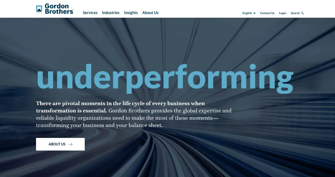
What I Like: Gordon Brothers offers a diverse range of financial services, from appraisals and investments to intellectual property management. Despite this broad scope, they’ve created a website that allows users to quickly grasp what the company does.
The website is thoughtfully structured, featuring four main pages in its navigation. Each section of the homepage is designed with the clear intent of guiding users to explore these pages.
While they’ve included CTAs for all their pages, I think the contact CTA could be made more prominent. Instead of being limited to just the top-right corner of the navigation, it could be highlighted in other key areas for better visibility.
Key Takeaway: The homepage hero features memorable, attention-grabbing keywords that really stick with me.
25. Startup Wiseguys
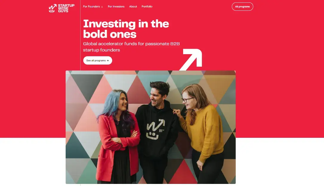
What I Like: Instead of merely claiming that you can make an impact, it’s essential to demonstrate your reach to website visitors. Startup Wiseguys serves as an excellent example of this approach.
Their site offers invaluable resources for entrepreneurs seeking to fund their businesses, featuring a comprehensive database of over 4,000 investors and a directory of startup accelerators and incubators.
I particularly love how Startup Wiseguys leverages social proof on their homepage. A visually striking map, created with the brand’s colors, showcases their global influence. When you hover over the map, you get an illustration of how many founders and mentors exist in that particular region.
Key Takeaway: The site uses imagery from accelerator events to showcase their past successes and engage visitors.
26. Fidelity
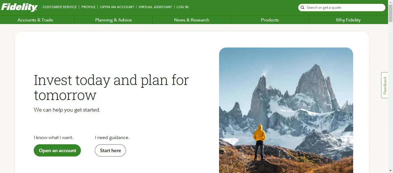
What I Like: While it’s not the most modern design on this list, the Fidelity website is a great example of how to cater to existing customers and new website visitors alike. The site navigation is clear and concise, with a login button readily available on the homepage.
Before I could access the Fidelity website, I was greeted with a brief excerpt of the terms and conditions that I needed to read and accept.
What I appreciate about the website’s copy is its straightforwardness; this simplicity is both effective and engaging. I also love how they incorporate images of families together, which fostered a personal connection with me.
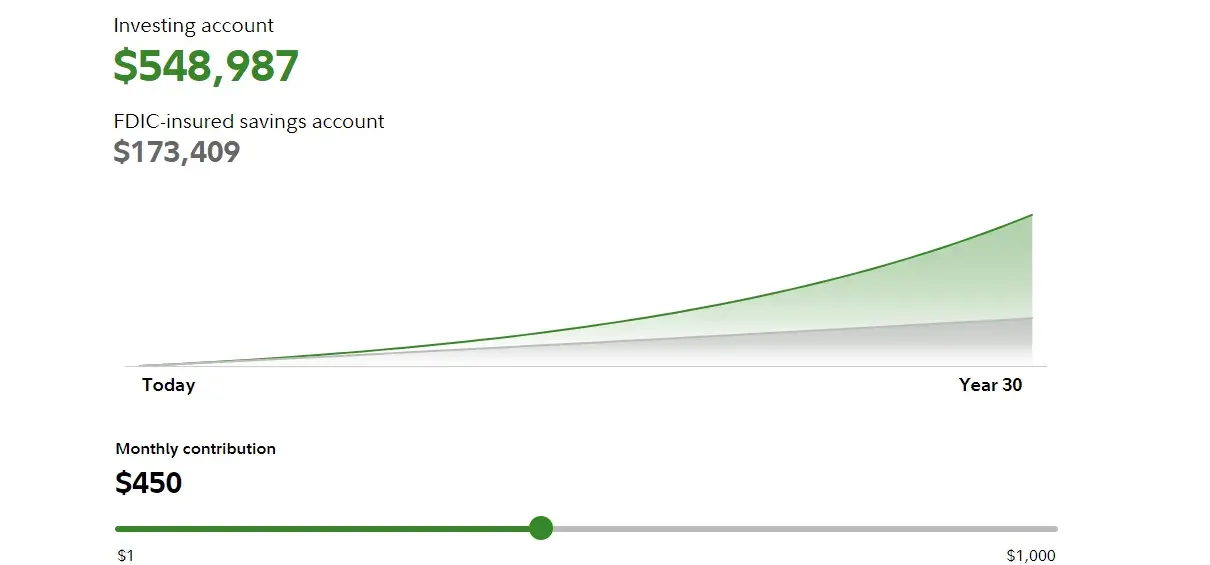
The website also features an interactive slider that allows me to adjust my monthly contributions and see how they will impact my savings account balance.
Key Takeaway: Fidelity’s website builds a strong connection to their brand and helps customers understand their products easily.
27. 3Commas
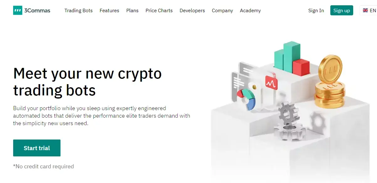
What I Like: 3commas.io is a website that helps users manage their crypto portfolio. The site also provides lots of interactive tools, including signal bots, trading views, and price charts.
I find that they have marketed their bots on the website in a very attractive manner which also encouraged me to stay on the page longer. The website’s homepage also features their mobile application that showcases how trading can be done smartly.
The overall idea is to make crypto trading easier and I think that the features displayed do an effective job at boosting engagement and providing users with a reason to get that free trial.
Key Takeaway: They have acknowledged the customer’s pain point in their copy and have come up with a smart way to pitch their solution.
28. Float
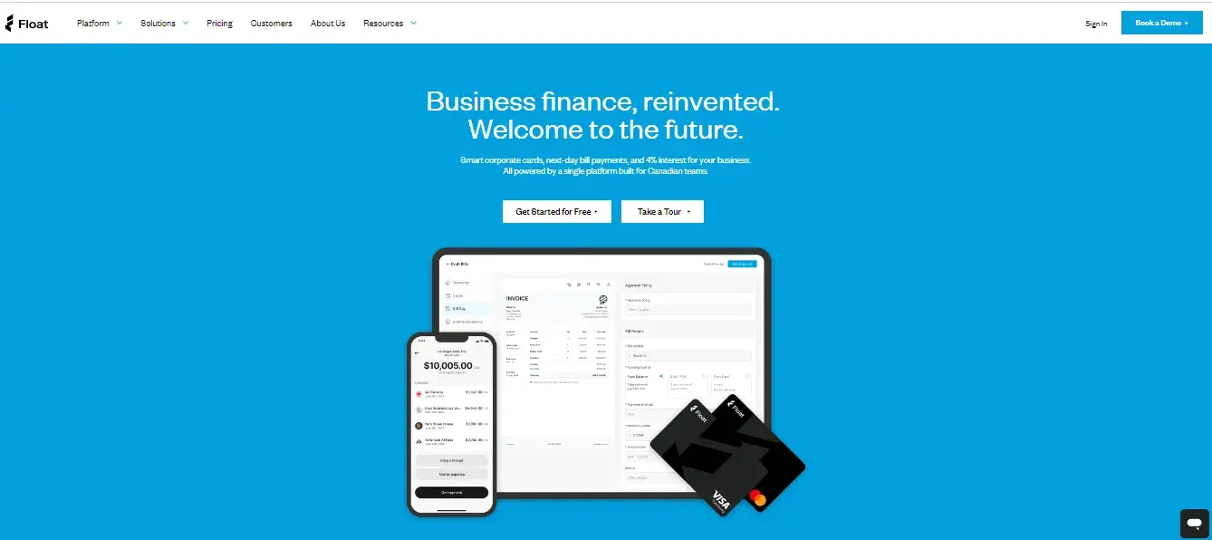
What I Like: Unlike most websites that present the same content to all visitors, regardless of their role or seniority, Float takes a more tailored approach. What I really admire about Float is how they’ve structured their solutions based on specific roles. They offer a dropdown menu that allows you to select whether you’re a CFO, CEO, accountant, or another position.
With this strategy, the content you see is relevant to your job function. I feel that this personalization makes it much easier for users to find the solutions that speak directly to their needs.
Key Takeaway: In the hero section, they showcased their card, mobile app, and tablet interface in one cohesive display, which instantly conveyed the look and feel of their platform.
29. Save
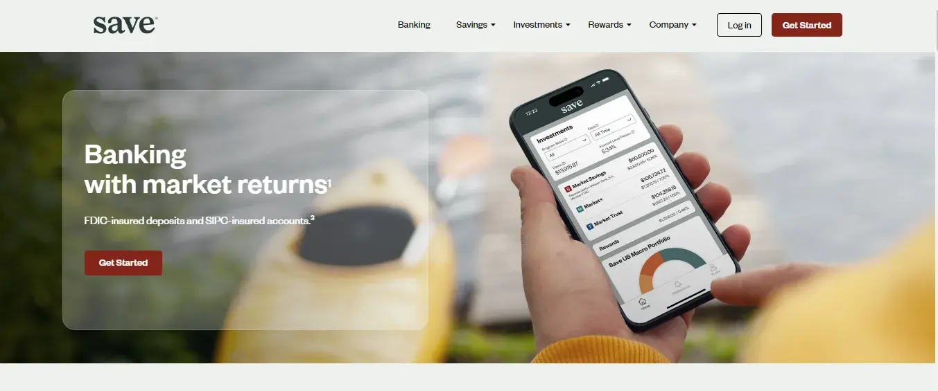
What I Like: When it comes to design, I always advocate for making the most of simple shapes and icons, and Save is a perfect example of this approach done right.
Save, an app that helps users manage their savings and investments for higher returns, communicates its value proposition through a clean, minimalist layout. Each step is represented by an icon within a circle, paired with a brief explanation of how Save can help you grow your savings.
I feel that this approach transforms what could be a dull list into an engaging and visually appealing experience, making the information easier to absorb and more enjoyable to navigate.
Key Takeaway: The website makes it very easy for users to get started by creating an account or ordering a wealth card.
30. SpaceFund

What I Like: As a company that provides venture capital for space startups and companies, the website design reflects just that. In a very captivating way, the website showcases the cosmic journey of SpaceFund.
Even though I’m not someone who can be called a real space enthusiast, I still find myself drawn in by the site’s design. It uses imagery and elements that evoke a sense of exploration and innovation, which perfectly aligns with their mission of funding space ventures.
One thing I appreciate is how SpaceFund demonstrates its databases, such as the space startup ecosystem insights and the portfolio. These are essential for anyone looking to secure SpaceFund, but they don’t overwhelm the user experience.
All the essential information is woven into the layout in a way that feels natural and intuitive. Basically, I found the data in the other pages of the website without feeling lost.
Key Takeaway: The design approach used by SpaceFund doesn’t just inform: it inspires and invokes the forward-thinking feeling.
31. My Cashline
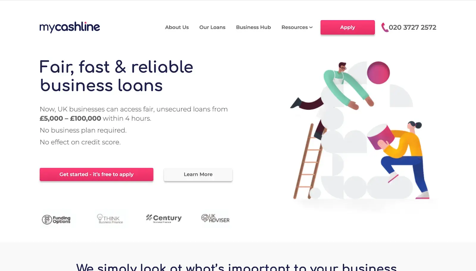
What I Like: My Cashline provides fast business loans in the U.K. The website is clean and modern, with a simple layout that makes it easy to navigate. The combination of a white backdrop with pops of color ensures important messaging and CTAs stand out.
The section with testimonials felt like I am reading a personal story. Usually testimonials feel superficial, but the layout and presentation here give them a sense of authenticity. The design choice also invites trust which — like I mentioned above — is crucial when dealing with financial services.
Key Takeaway: My Cashline has provided a contact number in a bold font right on the navigation, so it was always visible and easy to find no matter where I was on the site.
32. Zopa
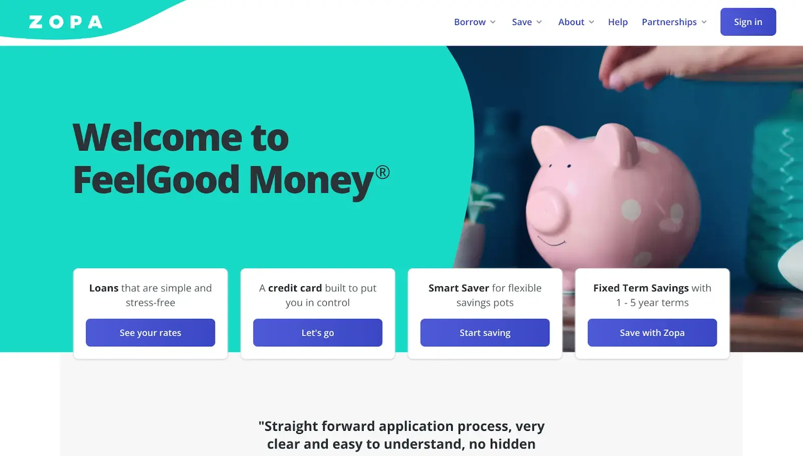
What I Like: Zopa is an online bank with a beautiful website and mobile app. Previously, the homepage featured a dynamic video reel in the homepage, but they’ve recently shifted to a more static design. In my view, this change brings a cleaner, more focused look that emphasizes simplicity without compromising on impact.
Another thing I liked about the website is how they have created a search bar to find the answers to the most common financial questions by just entering a few keywords. In my opinion, the idea of having a mini search engine on your website is brilliant.
Key Takeaway: The website has an efficient and user-friendly way to provide immediate assistance.
33. Trading 212
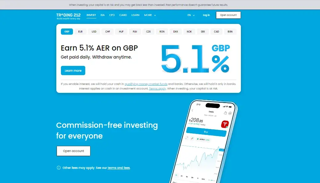
What I Like: Trading 212 is an investment platform and mobile app that allows users to buy and trade stocks. What I love about their website design is how it effectively showcases the trading process on the mobile application using dynamic images.
It all starts with the first screen of the application. Three options were displayed on the side, and when I clicked on one of the options, the screen changed accordingly. Also, when I hovered over the image, it moved, creating an extra layer of interactivity.
Key Takeaway: The homepage contains a walkthrough of the app in action, so visitors can get a preview of how it all works.
34. JPMorgan Chase
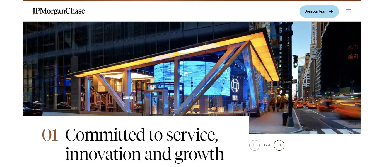
JPMorgan Chase, as a renowned and trusted institution, has a website that reflects its status — well-designed and rich in information. What really stands out to me is how the site puts people at the forefront.
Through thoughtful imagery of families, office workers, and employees, JPMorgan Chase conveys that its services are truly centered around people. The website also does a fantastic job showcasing diversity. Visitors from all walks of life can easily envision themselves banking with JPMorgan Chase.
Key Takeaway: There is a personal and inclusive touch that is added to the user experience in the website.
35. Evertas
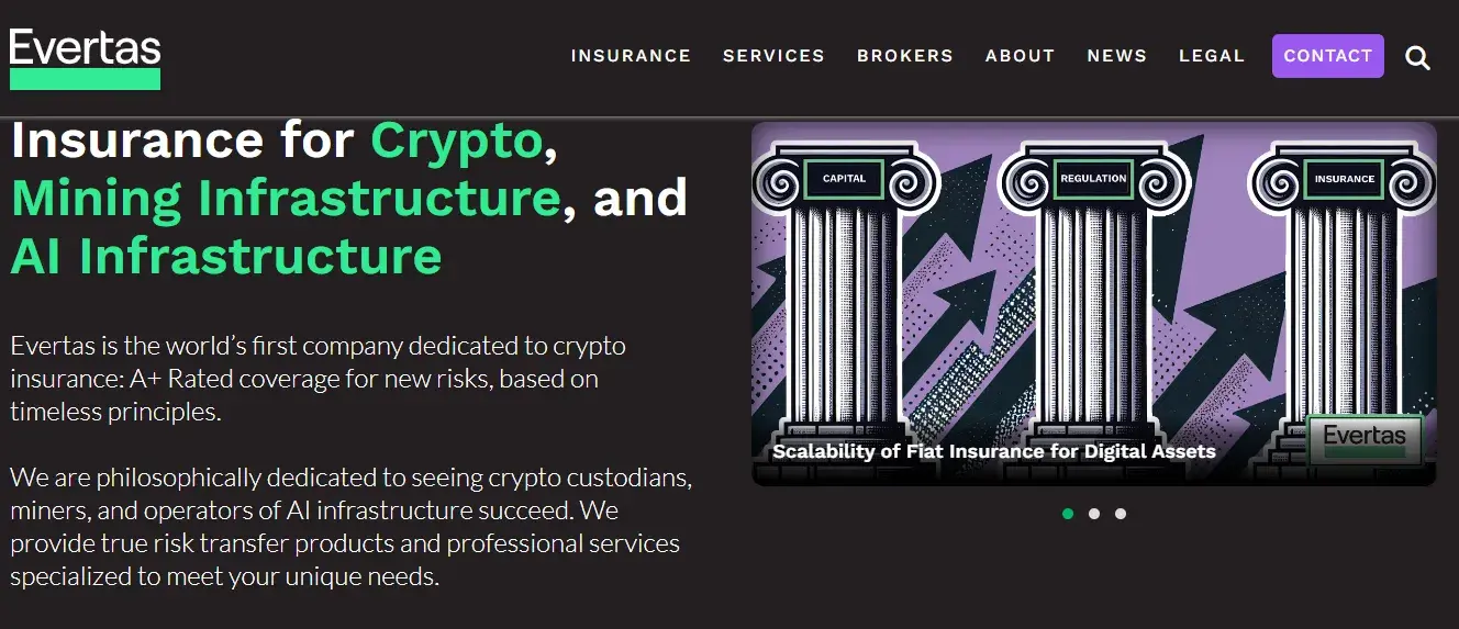
What I Like: I didn’t know much about crypto insurance until I came across the website of Evertas. The above the fold section of the homepage talks about the company itself and the sliding images on the right helped me understand what the company does. Evertas has effectively used their homepage to make their offering tangible.
One aspect that stood out to me was how they break down complex concepts into digestible information. The news section presents information in an accessible manner, so I got educated on the latest happenings in the world of crypto. In my mind, there is a strong association between the knowledge I gained and Evertas.
Key Takeaway: The dedicated partners section is prominently featured on the homepage.
36. CIBC
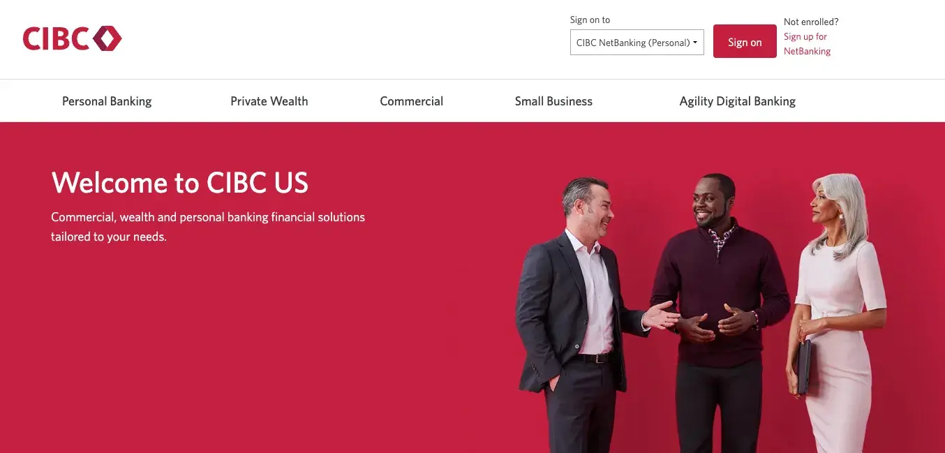
What I Like: The CIBC website is both modern and highly intuitive. It makes it easy for users to access account logins and explore offers directly from the homepage.
What I found unique was how the site integrates CIBC's iconic branding through its imagery and color scheme. This creates a seamless and consistent user experience throughout.
The homepage also has a section to search for questions. I asked a niche question, so the website directed me to the next most relevant question that was present in their directory.
Banks often face challenges with providing exceptional customer service. Using the website as a platform to answer queries is a thoughtful (and cost-effective) design feature. In my view, it is a great way to bridge the gap between automated support and personalized service.
Key Takeaway: The website is visually engaging and easy to navigate.
37. Allica
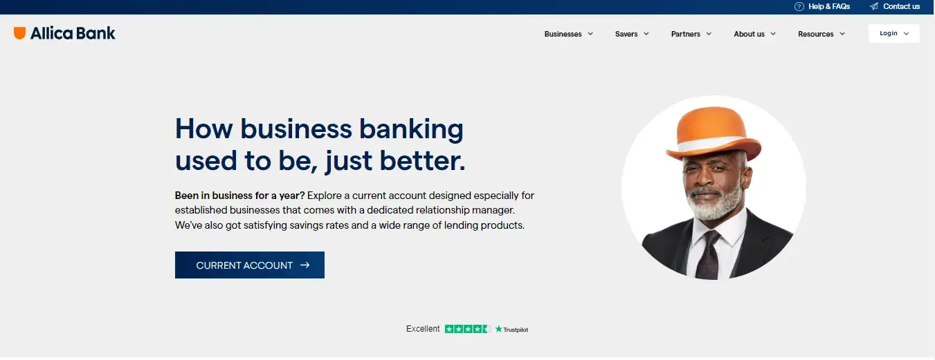
What I Like: Allica Bank, a U.K. bank focused on businesses, does a fantastic job of conveying its value proposition through a website that is both clear and straightforward. What really stands out to me is how they’ve used a slider to showcase their TrustPilot customer reviews.
The website uses simple and effective design choices and enhances usability and user engagement. A great example is in the product showcase section: when I hovered over each product, the background color smoothly transitioned from white to blue. This subtle shift drew my attention and made it easier to focus on the details.
Key Takeaway: The website has small but impactful touches that elevate the overall browsing experience.
38. Zip
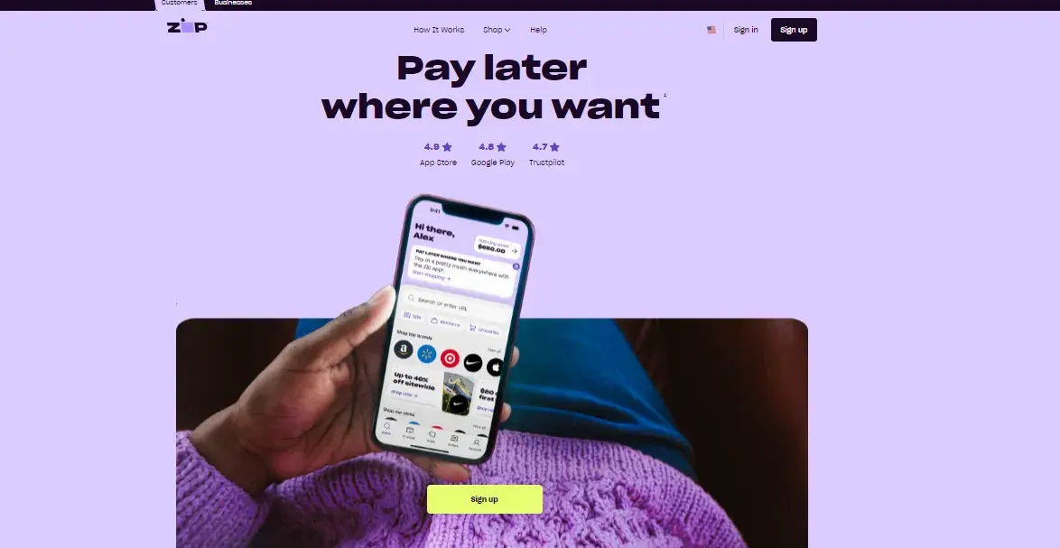
What I Like: Zip has used a scroll animation on their website that adds a dynamic element to the user experience. As I scrolled down on the homepage, the animation started to enlarge. This guided my attention to the bottom navigation bar on the mobile application. All this while, the “Sign Up” CTA button remained on the center of the screen.
From my experience analyzing website designs, I have noticed that well-executed scroll animations can really enhance engagement by creating a sense of flow. The key is to help users stay connected to the content without feeling overwhelmed.
Key Takeaway: Upon entering the website, users must choose their region so they get the most relevant information according to where they are located.
39. Atom Bank
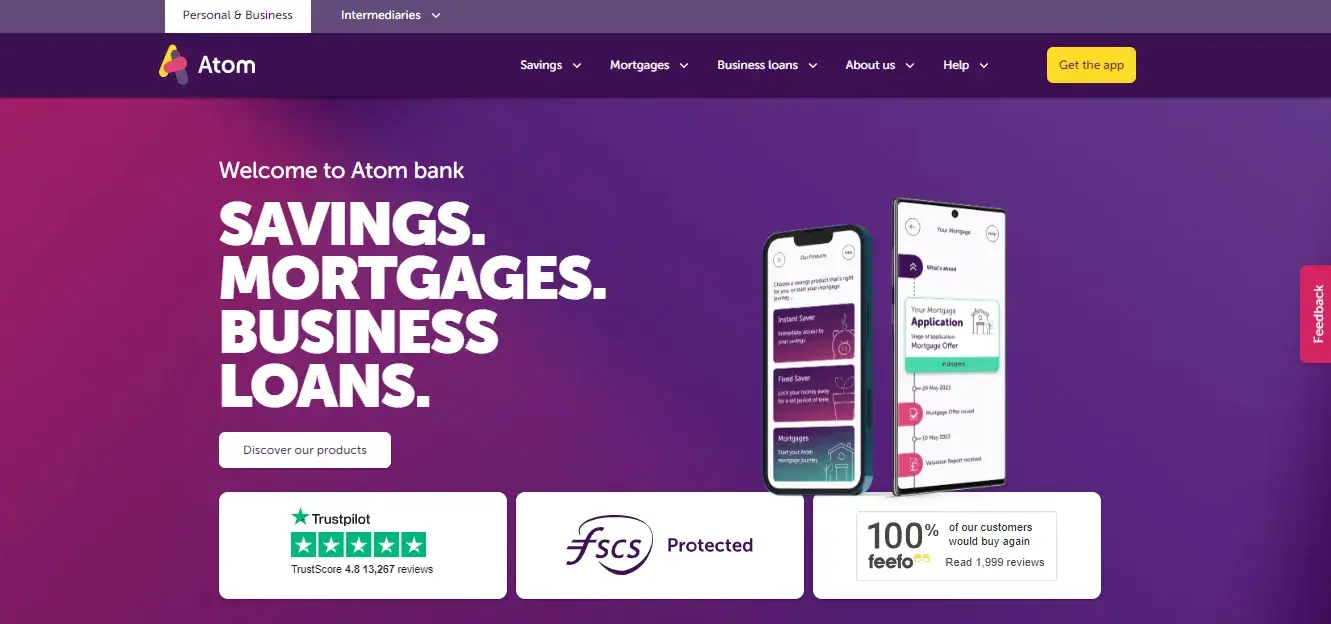
What I Like: Atom’s website makes brilliant use of color, immediately catching your attention and setting it apart from other financial sites. What I find particularly fitting is their choice of purple.
From a color psychology perspective, purple symbolizes wealth and royalty, making it an ideal choice for a financial services platform. In my view, a good design subtly reinforces the brand's values while adding a layer of sophistication and Atom does exactly that.
One area where Atom could improve is the customer testimonial section. While they mention having Trustpilot reviews, none are displayed directly on the site. Instead, I had to click a link that redirected me to Trustpilot to read customer feedback. From a design standpoint, I feel that this isn't the most user-friendly approach.
Key Takeaway: Using unexpected color and design elements can help set your business apart in a crowded space.
40. SwissBorg
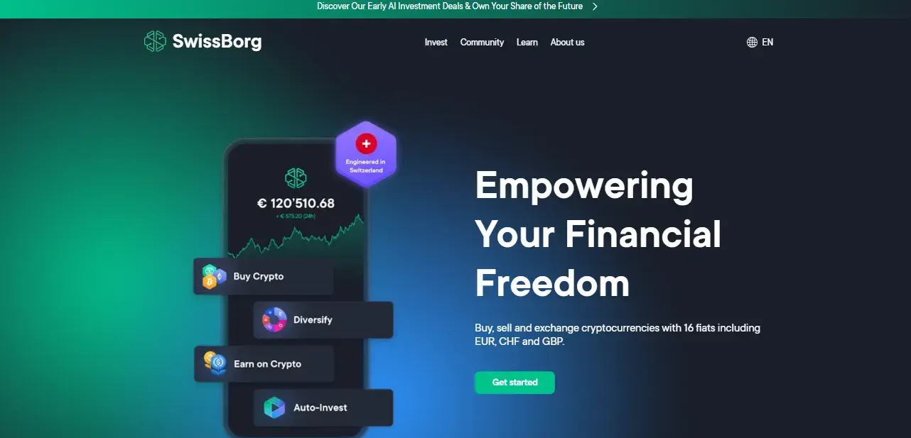
What I Like: For some reason, I have always been skeptical about cryptocurrency and require a lot of social proof to build my trust. The SwissBorg website does a fairly decent job doing this by showing the exact number of users that are currently investing in crypto assets.
The homepage also has a lot of social links to demonstrate where the community is most active. For instance, I was also able to click on the company’s LinkedIn and see the number of followers. Design elements that incorporate transparent metrics provide a strong sense of reassurance. The website did convert my skepticism into trust.
The website also features screenshots of the app so users can better understand the value proposition, and the links to download the app are prominently displayed.
Key Takeaway: This website also uses striking design and colors to make an impact.
Final Tips for Financial Services Website Design
My recommendation to anyone designing a financial website is to keep a smart balance between fun and professional. Design a website that encourages financial literacy in a way that feels empowering rather than overwhelming.
Make use of security badges, customer testimonials, and clearly stated policies that build credibility with the user. In an industry like financial services, trust is everything.
Design-wise, remember to make the most of white space. Too many elements cluttered together create confusion. Visitors won’t know where to look next.
My final suggestion for anyone designing for financial services is to make sure to integrate elements that encourage users to become a part of your community.
Editor's note: This post was originally published in March 2023 and has been updated for comprehensiveness.
Website Design Examples
.png?width=112&height=112&name=Image%20Hackathon%20%E2%80%93%20Vertical%20(50).png)

.png)

![15 black and white website designs to inspire your own [+ pro tips]](https://53.fs1.hubspotusercontent-na1.net/hubfs/53/black-and-white-website-design-1-20250520-1336267.webp)

![15 Brochure Website Examples to Inspire You [+ How to Make One]](https://53.fs1.hubspotusercontent-na1.net/hubfs/53/brochure-website-examples-1-20250319-362228.webp)
![28 Types of Websites to Inspire You [+ Real-Life Examples]](https://53.fs1.hubspotusercontent-na1.net/hubfs/53/types-of-websites.png)

![10 of my favorite interactive websites [+ how I make my own]](https://53.fs1.hubspotusercontent-na1.net/hubfs/53/%5BUse%20(1)-Sep-27-2025-03-02-58-8817-PM.webp)
![30 Furniture Website Design Examples I Love [+ How To Make Your Own]](https://53.fs1.hubspotusercontent-na1.net/hubfs/53/Google%20Drive%20Integration/furniture%20website%20design_32023-1.png)
