In today's competitive business world, providing a seamless user experience across all platforms is no longer a luxury but a necessity. That's precisely where adaptive design proves its worth, ensuring an unparalleled user experience, irrespective of the device. This article will delve into the details of adaptive web design, exploring its uses, and contrasting it with its prime contender, responsive design.
What is adaptive web design?
Adaptive design helps bridge the gap between devices and delivery by serving up graphical user interfaces (GUIs) capable of contextual adjustment based on screen size. Designers create multiple GUI templates in different sizes — then, when visitors arrive on your website, the most appropriate size is selected and displayed to deliver the best user experience (UX).
Based on this definition, it’s clear that adaptive web design recognizes the increasing variety of screen sizes used by visitors today — it acknowledges the popularity of specific screen sizes among the mobile devices.
The result is a best-fit framework: While there may be outlier devices with uncommon screen sizes that don’t deliver the optimal UX under an adaptive model, the vast majority of site visitors will see form and function tailored to their specific viewpoint.
Key Aspects of Adaptability
Adaptable web design relies on the general commonality of device screen sizes to deliver usable content and contextual functions. Typically, adaptive developers create fixed design layout for six screen pixel widths:
- 320
- 480
- 760
- 960
- 1200
- 1600
Designers create these six GUI templates with critical features, links, and functions to ensure they’re available whenever a new visitor arrives. When users access your website, the best-fit size is selected and displayed on their device.
Worth noting? While differing sizes will have similar design, there’s no requirement that they’re identical — depending on screen width and key functionality, developers may choose to add, remove, or shift key features around to ensure the overall experience remains consistent (even if the form changes slightly across design interactions).
Need an analogy? Think about clothing sizes. Catering to the widest market possible means creating a range of standard sizes that fit most customers. Some are outliers at either end of the scale while others occupy the middle ground between size boundaries. By opting for a best-fit approach, however, companies can adapt to the broadest set of customer needs.
Responsive vs. Adaptive Design
Responsive design emerged as an alternative to adaptive design and focuses on accommodating any device at any size. Sparked by the rapid uptick in mobile device use, responsive design uses a single, fixed GUI layout that actively responds to user screen size.
In theory, this allows every user to experience webpages or other graphical elements as intended — no matter the size of their device. Many CMS systems offer responsive design capabilities to support the increasing number of diverse mobile device users on websites.
But which approach comes out on top? Let’s break down some of the big benefits and potential drawbacks of each solution.
Adaptive Design Pros
The biggest benefit of adaptive design? A tailor-made approach. Instead of scaling a desktop website up or down to meet user device demands, adaptive initiatives let developers create the best-fit experience for unique device viewpoints.
For example, smaller-width designs can be made simpler and streamlined to account for reduced screen size, while higher-resolution offerings can include more content and greater control to deliver ideal UX.
Adaptability Design Cons
The best-fit nature of adaptive design makes it less flexible than responsive design alternatives. Developers must create multiple design templates based on standard widths but users may still encounter form or function issues if their screen size lies even slightly outside the norm.
Time is also a concern — companies must have the available staff resources, or be willing to spend on outside help, to identify key GUI elements, design multiple instances, and deploy them at scale.
Responsive Design Pros
When it comes to responsive design, cost is a critical factor. Instead of spending on development, testing, and iteration for six separate site templates, companies can design a single version that automatically scales up or down on-demand. This also empowers speedy delivery — responsive solutions can be quickly deployed across site backends to deliver on-demand GUI resizing.
Response Cons
While responsive design should deliver a tailored experience for users no matter their device size, issues with CSS or HTML markers could cause problems in responsive screen sizing. In addition, outside elements such as advertisements may not load properly and visual elements are at risk of shifting on-screen in response to differing screen sizes.
It’s also worth noting that many responsive designs are simply scaled versions of desktop sites, meaning they can take far longer to load on mobile devices than best-fit adaptive offerings.
Adaptive Design Examples
What does adaptive design look like in practice? We’ve collected a few examples for your review.
1. Amazon

The online retail giant, Amazon, opted for adaptive web design to speed loading times and deliver a consistent UX for their massive, global customer base. In addition, mobile users can easily switch from app view to full-site view if they prefer the look and feel thanks to robust adaptive templates.
2. USA Today

Ease of use and straightforward navigation are critical for USA Today’s website. Users must be able to find what they want, when they want it — otherwise, possible screen and advertisement shifting caused by responsive design could make the page look cluttered and send users to a competitor’s site instead.
3. The Home Depot
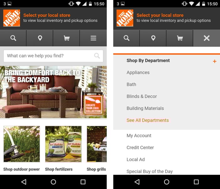
The Home Depot’s mobile app is distinctly different from its desktop site, offering device users a streamlined experience when shopping online. Adaptive design makes this possible, since their developers had the freedom to create templates that matched specific device categories rather than condensing the full desktop experience onto smaller screens.
Implement Adaptive Design on Your Website
Adaptive web design offers a best-fit approach to digital content delivery and the end-user experience. While responsive solutions promise a one-size-fits-all approach, the segmented structure of adaptive design makes it possible for developers to customize and curate comprehensive, context-sensitive GUIs.

Website Design