Your goal is to convey information and instructions to the viewer in a digestible way, while still being pleasant to the eye. To help you strike the right balance, we have compiled a list of the best 25 barbershop websites.
1. Swank Salon
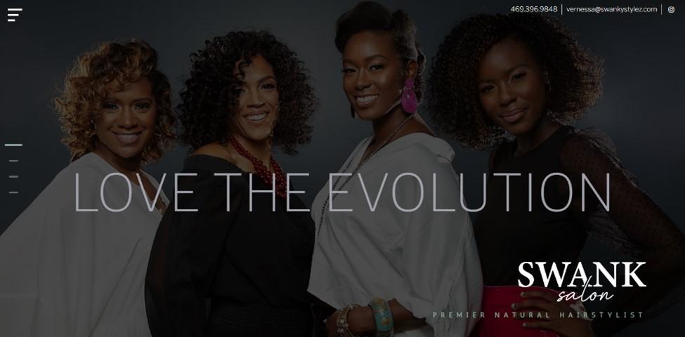
A personal touch can go a long way when creating that perfect hero image. Swank Salon showcases this with an opening page featuring inviting smiles and a clutter-free interface. Swank Salon also has a sleek sidebar revealing your options when highlighted.
What we like: These choices show a clear, simplistic, modern design with an inviting feel. By following the sidebar, you can find information about the team and the business, as well as options for booking and contact.
2. Fruits Hair Lab
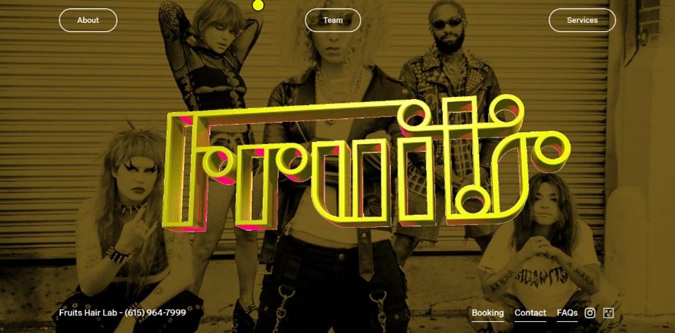
Fruits Hair Lab takes a unique turn regarding its website design. Stationed in the music capital of the heartland of Nashville, Fruit's web design grabs hold of that musical lineage and pairs it with the retro aspect of the “Hair” era of music. From the bold stylized choices with the background to the loud Fruits logo spinning on the home screen, it screams personality.
What we like: With that said, even with the stylized look, the website's true purpose isn't lost. Information is easily obtained by following simple on-screen prompts or clicking the phone number to schedule your appointment.
3. Freshcut
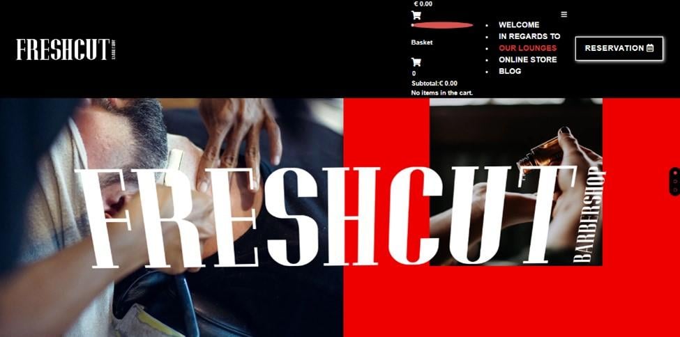
Quick and to the point can be equally effective when deciding on your web design. Freshcut allows the user to interact with the logo, as moving the pointer tilts it. There are also front-facing pictures, leaving little to the imagination.
What we like: Easily understood and to the point with a modern feel, this web design gives a striking first impression while keeping a simplistic design. A bold font and deep color theme just add to the professional vibe Freshcut provides.
4. V’s Barbershop
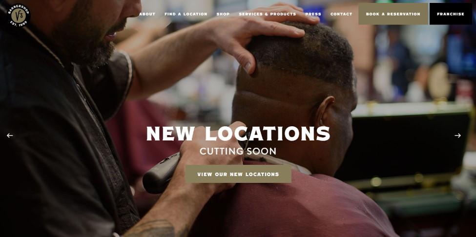
V’s Barbershop shows exactly what they have to offer on the homepage. With a large graphic showing their 5-star work, clients know they're in the right place. Easily accessed options are displayed across the top of the screen. A quippy “cutting soon” pun completes this design's inviting feel. When navigating through the rest of the website, you're treated to more images of the business with a continued clean look.
Pro tip: Showing that you have new or multiple locations right away allows clients to easily choose where they want to go.
5. Karin and Company

Karin and Company exudes a modern professional vibe. Neatly organized, we love this clear and clean design. Navigation options are clearly labeled and neatly positioned at the top of the page. Contact info is displayed in the top corner, while a clear call-to-action (CTA) to book an appointment takes center stage. This web design is easy to use while still maintaining a professional aesthetic.
What we like: There’s a large emphasis on the spectacular hairstyles and colorings on Karin and Company’s landing page, showcasing what they do best. With links to all their social media platforms, this website is a great example to draw inspiration from.
6. Baxter Finley
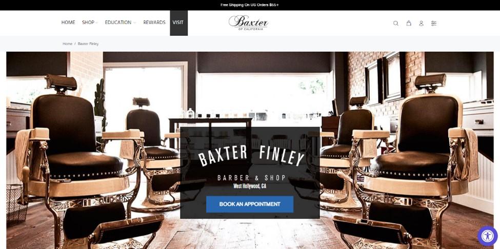
Baxter Finley has an old-world feel packed into a modern design, featuring the antique-style chairs you’ll enjoy your cut in. This web design embraces a classic demeanor and still gets the point across.
What we like: Baxters allows you to book your appointment, explore the business, or just shop. There’s no question about where you should go when navigating Baxter Finley.
7. The Lady Clipper
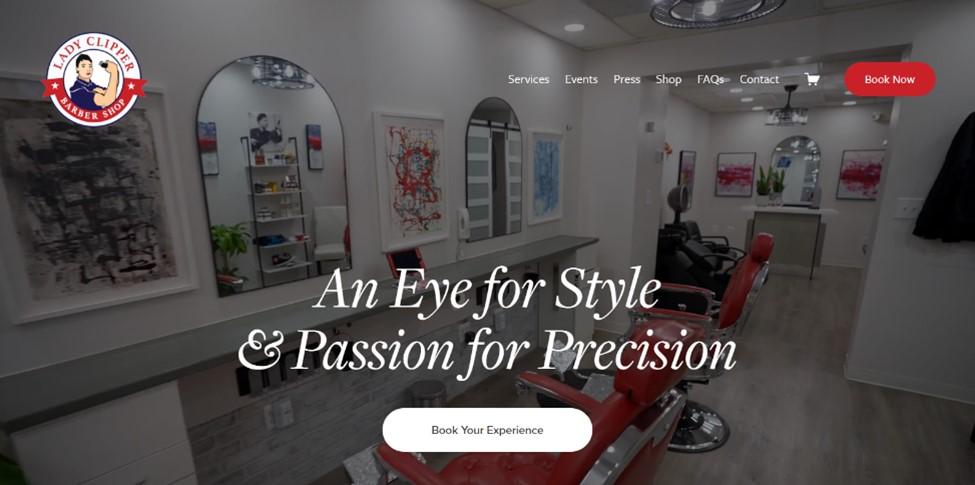
When you land on The Lady Clipper’s homepage, you’re greeted with a video tour of their business. It takes you through the clean equipment and surroundings in the background while you navigate the web page. The site offers multiple locations to book, navigation, services, events, and many articles on the business’s success.
What we like: This page is eye-catching and reassuring that you've made the correct choice when looking to book your next experience at The Lady Clipper.
8. Eddy’s Barbershop
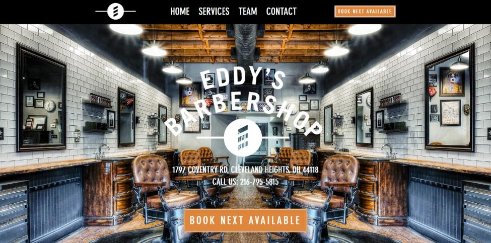
Eddy’s Barbershop website maintains a neat, centered style. When you land on the homepage, there isn't a question about where to go next. With a vintage feel showcased in the background and all of your options presented clearly at the top of the page, Eddy’s uses a straightforward approach done right.
Clicking on the “Team” option will bring you down the page to a gallery showing off the team, each member with their own bio.
Pro tip: Emphasizing your employees when building your website can show trust in your staff and provide the consumer with another level of comfort when choosing a location.
9. Shear Elevations
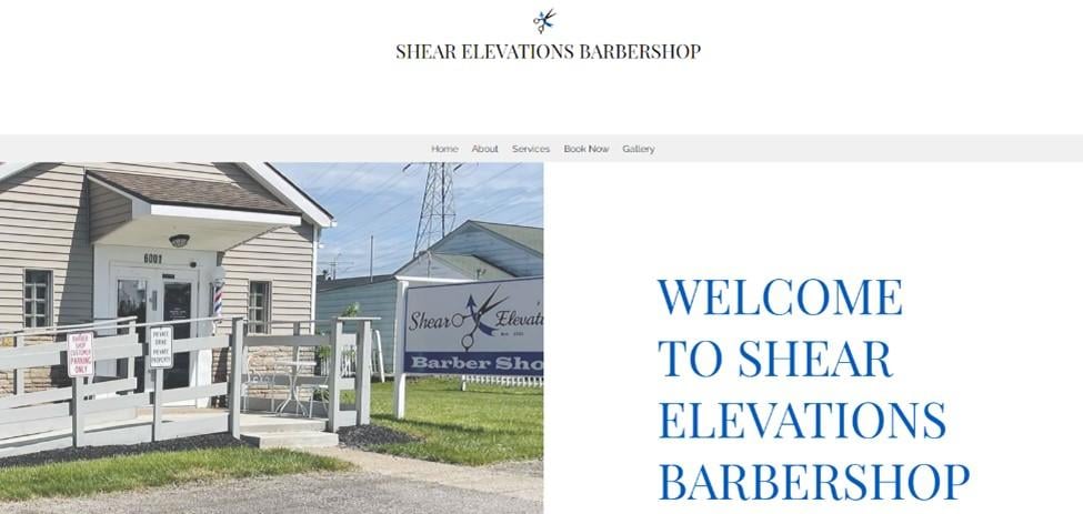
Not all websites need to be extravagant and busy. Some of the most successful businesses, such as Shear Elevations, take a lighter approach with their web designs.
As you scroll the page, the location slowly pans off-screen. All of the information is presented to you in a vertical fashion for booking and hours. At the top of the page, you can navigate to their about section, which gives you a little backstory on the business.
What we like: Owners Christoper and Desiray keep to the philosophy that you can have a simple, modern design and be just as effective as the biggest budget websites.
10. RazzleDazzle Barbershop
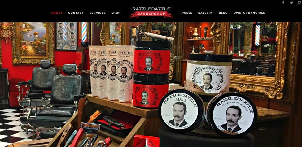
RazzleDazzle is impressive in that it truly embraces its brand. From the moment you open the website, the edgy antique aesthetic is displayed on their merchandise and business interior. From the homepage to the gallery, RazzleDazzle embraces an edgy ‘40s to ‘50s burlesque theme while not taking itself too seriously.
What we like: You can navigate the locations and various services from the top of the homepage. There's a section dedicated to press that shows off videos and articles written about the business.
11. Steven Tabach
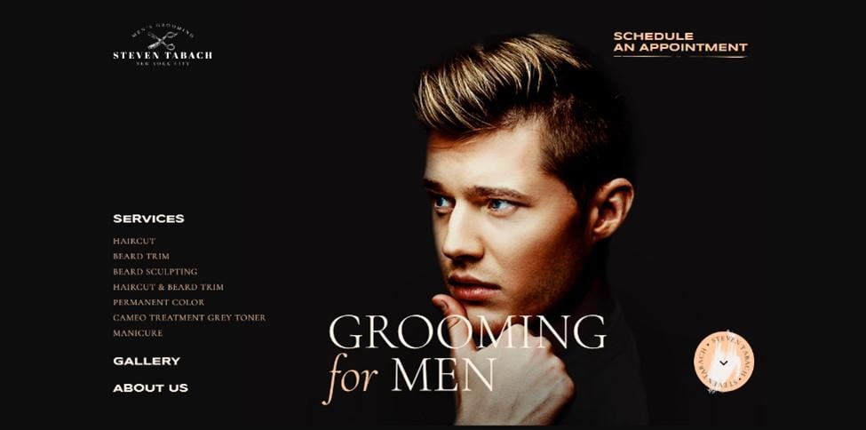
Leaning to a more contemporary side of website design, we have Steven Tabach. Clean and simplistic while giving off an edgy appeal, the homepage is your main guide to the entire experience.
Services are displayed as soon as you get to the homepage, with additional options to view some information on the business or a gallery to preview some of their best work.
What we like: Located in New York City, this website really encapsulates an almost prohibition-era atmosphere while keeping a contemporary design. This is a great example of appealing to a localized demographic and casting a wider net for the average consumer.
12. Abel’s on Queen
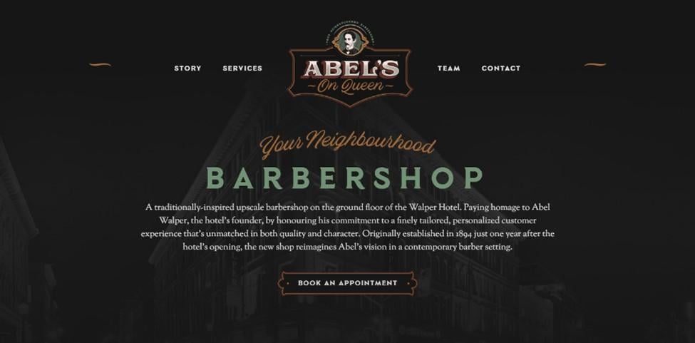
Abel’s on Queen is another great example of catering your website to the community it's a part of. When first landing on the homepage, you’re greeted with a welcoming message for your neighborhood barbershop, a background highlighting the location, and a brief description of the business.
By navigating the options at the top, you get access to a landing area dedicated to the team, services provided, and an interesting peek into the haunting history of the hotel that houses the business.
What we like: Showing off a contemporary feel while simultaneously giving you the haunted backstory of the location is a great way to involve the area's history while maintaining a professional demeanor.
13. I Love LuLu Hair Café
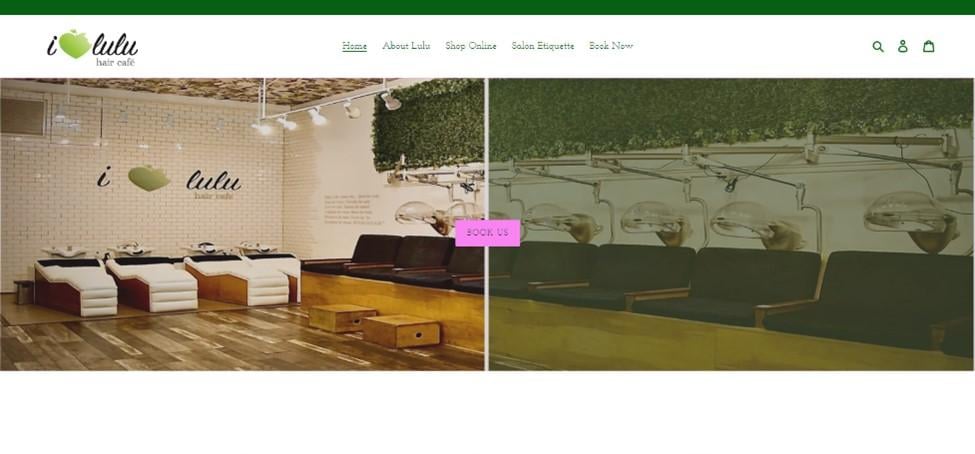
When you first land on Lulu’s homepage, you’re greeted with a warm and inviting background scene, showcasing clientele being pampered.
What we like: Easy to navigate and easy on the eyes, Lulu’s Hair Cafe checks all the boxes for what we look for in a successful web design. The CTA to book an appointment is front and center. You can also learn more about the business and shop online for preferred products.
14. Legends The Barbershop
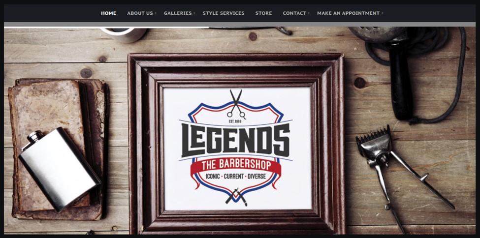
Legends takes a simplistic design and capitalizes on it. With a vertical scrolling format, they take you through the homepage as it displays videos, their tagline for the business — ”Iconic, Current, Divisive” — along with scheduling options and an invite to an ongoing newsletter.
What we like: By simply highlighting the options at the top of the page, you can view drop-downs with plenty of options to choose from.
15. Etch
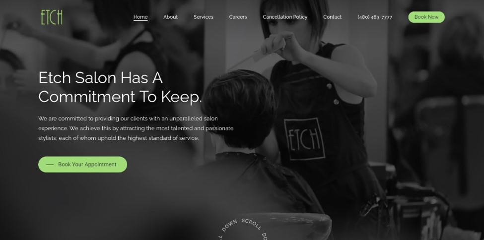
The Etch landing page also features the vertical scrolling design but uses it differently. From the start, a video of a day on location plays in the background. All the while, Etch’s mission statement is front and center, promising an unparalleled experience.
What we like: Scrolling down the page, you're given some background for the business, services provided, team members, and more! With edgy text design and clear imaging, the true intent of the business is captured.
16. Cut Ups
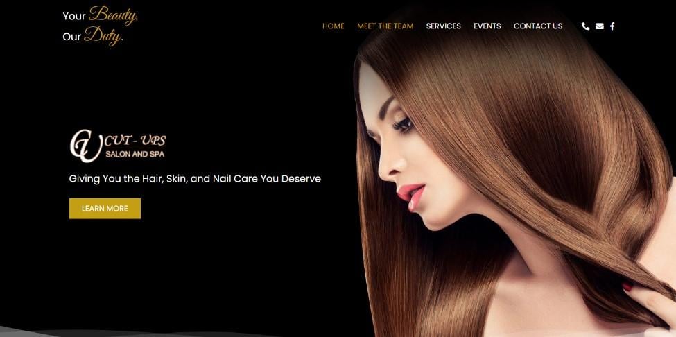
Cut Ups gets right to the point. Opening the homepage, you’re greeted by a model with a fabulous sheen on her hair. Playful but alluring fonts direct you through the various options given on the page. As you scroll down, Cut Ups’ values and services are prominently listed with inviting pictures showcasing their services.
What we like: Multiple CTAs to contact and book your next appointment throughout the site make the experience user-friendly. At the same time, you can look through other options listed at the top to meet the team or even view upcoming events.
17. Rose City Barbershop
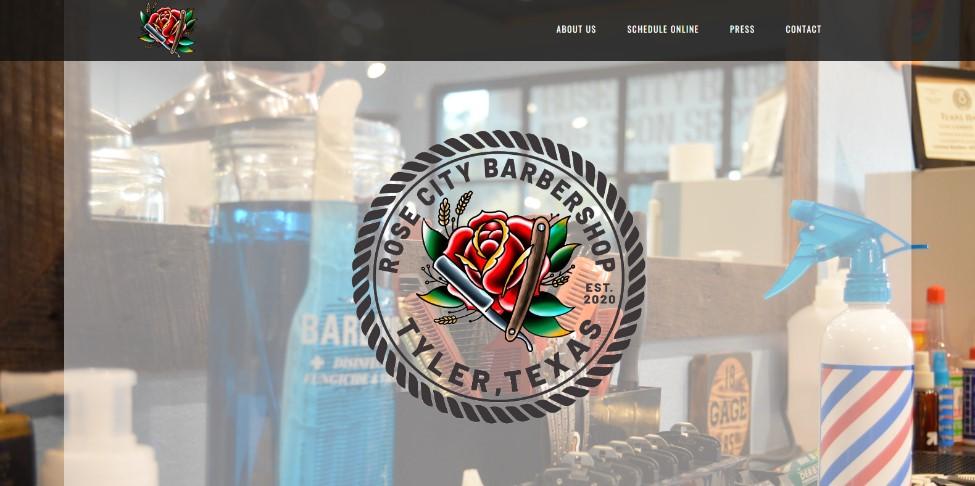
Rose City's scrolling design for its webpage leaves no one guessing. Services, hours, booking, and even a mapped location can all be found neatly arranged on the front page. Each option has a stylized look and font to showcase what Rose City is going for with its image.
What we like: Combining an old school vibe with a modern look, this website offers a great user experience with visually appealing graphic design.
18. Ollie’s Barbershop
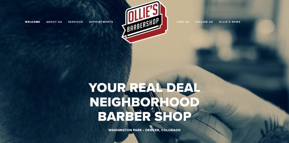
Ollie’s features a “clean cut” design. Starting on the homepage, you can view a large hero showing a customer receiving a trim. Clean, bold font claims that Ollie’s is the real deal, and with the look of this design, we agree.
What we like: From bold to comforting, the clean-cut font and the stylized black-and-white graphics give this web page an impression of comfort.
19. Dapper Barbershop
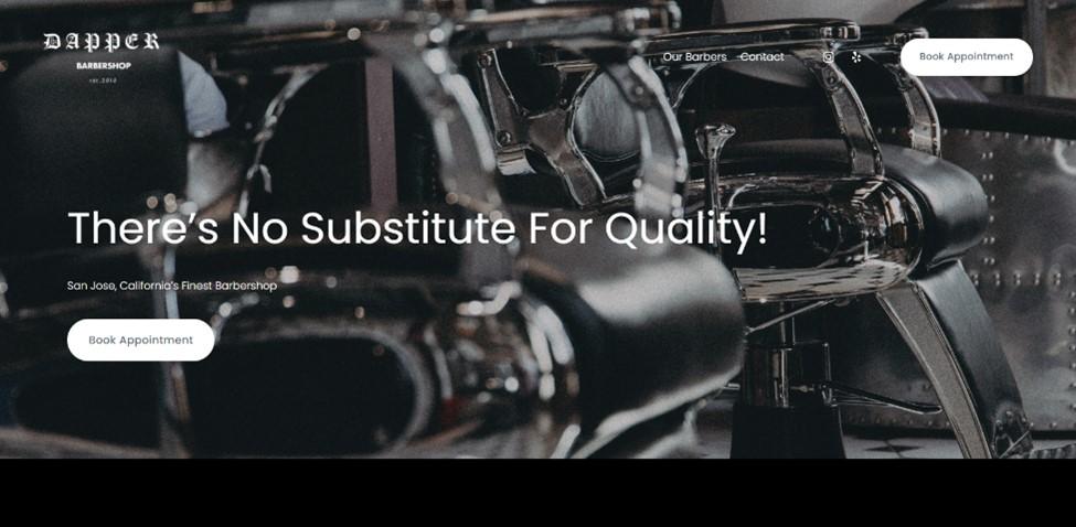
Dapper leans into a noir feel to their landing page. The background is black-and-white, highlighting the clean, edgy designs of the seats you'll be relaxing in.
What we like: Scrolling down the homepage shows Dapper’s pride in its work. Pictures showcasing the team's work and satisfied customers compliment the opening tagline, “There’s no substitute for quality!”
20. Shorty's Barbershop
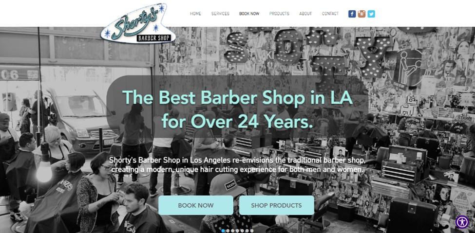
With a tenure like Shorty’s, crushing over 24 years in the Los Angeles area, it's no surprise that their web page has made it to this list. The opening image has so much to see, with the black-and-white aesthetic and 1950s neon logo. Shorty’s homepage says, “Come on down, it's fun here.”
What we like: Scrolling graphics show the bustling day-to-day and features some of the best styles available. Easy-to-read fonts highlight the various areas to explore. Booking an appointment has never been easier.
21. MJD Barbershop
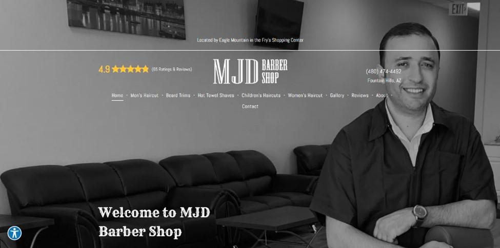
MJD gives renewed meaning to the personal touch. From the moment you land on the homepage, you're greeted with a friendly smile from the owner, gently welcoming you there. Western-style fonts list your options as you navigate the homepage.
The contact info, title, 4.9-star rating, and services are all listed, while the background promotes the business's vibe: good service and a smile.
What we like: Navigation is satisfying. You can choose from the options in the center or scroll down the page for a summary.
22. Applewood Village Barbershop
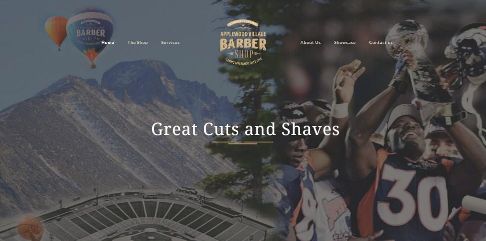
Including hometown pride in your design is always good, and Applewood Village Barbershop showcases that. Located in Lakewood, Colorado, the beautiful mountain vistas of Colorado, prominent sporting victories, and a history going back to 1954 are presented in the background.
What we like: It’s easily navigable as all the options you could need are positioned at the top of the page, and scrolling down gives a quick option for booking and location.
23. Levant Barber Shop

Featuring a barber’s pole and the invitation to “Look Your Best,” Levant’s website layout uses alternating dark and light bands on its homepage to share important information and showcase its barbers. Everything you might need to know can be found right on the landing page.
What we like: Topped with clear, yellow CTAs, this website's visual appeal and user experience are exemplary. They also proudly share customer reviews, increasing their social proof with new visitors.
24. Ace of Fades Barbers

What we like: The video montage in the hero gives website viewers a true taste of the “ultimate experience in Men’s Grooming” that Ace of Fades claims to offer.
Below that, they display a gallery of their work, letting the photos speak for themselves. Coupled with easy navigation and clear CTAs, this website is simple. Still, it provides clients with everything they need for a satisfying online experience that will lead right to the business’s doorstep.
25. Milwaukee Street Barbershop

What we like: This website is both personal and professional. Focusing on the owner’s, Jont, decades of experience, it invites clients to get a cut with barbers who take their craft seriously.
In addition to online booking, photos, and location, the website offers the personal touch of “Jont’s Playlist.” Consider making your website stand out by sharing your story and offering something fun or unique to attract and keep clients.
How to Design a Barbershop Website
- Get inspiration from already successful web designs.
- Choose a website builder.
- Choose your template and design.
- Set up an option for booking.
- Showcase your success!
1. Get inspiration from already successful web designs.
Getting started on creating your barbershop can be a stressful process. But we're here to tell you that generating the right look to fit your business doesn't need to be stress-induced. There are hundreds of already established websites to draw inspiration from.
Doing a simple search will open up dozens of ideas. So before looking into templates, look up existing barbershop websites and see what’s working for them.
2. Choose a website builder.
After researching your design and finding inspiration, you’ll want to choose a website builder. Select this based on the front-facing features.
You'll want to do your homework for this step to ensure that the software you choose will fit the website you are trying to build. A few specifics you will most likely want in building a barbershop website are:
- Barbershop-specific templates.
- Aesthetics and user-experience builders.
- A built-in online reservation system.
- A storefront builder.
- Secure payment options.
Looking for these key features when selecting a website builder for your barbershop will give you a running start. With little to no coding involved, you can create a custom design that caters to the experience you want to give.
3. Choose your template and design.
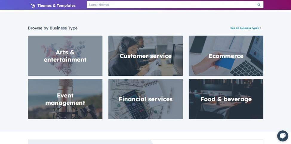
Once you’ve chosen the website builder, it's time to select your template. We recommend a vertical scrolling template for your barbershop design.
Having a menu for site visitors to navigate the page and the ability to scroll is a best practice when creating the perfect barbershop website. When selecting your template, you also want to ensure online reservation options are present and can be displayed prominently alongside your services.
The most viewed pages on barbershop websites are the services and booking options, so making those are clear and easy to follow will ensure success.
4. Set up an option for booking.
The most important aspect of your barbershop website is for clients to be able to book an appointment online. Many consumers look to online booking for ease of use and to maximize their time.
Highlighting available time slots with specific team members while showing the brick-and-mortar location will provide the customer with comfort. They'll know exactly what they are buying into before ever stepping through the door.
5. Showcase your success!
Providing clear imaging of what barbershop experience you are providing is equally as important. Displaying services provided and photographic proof of those services adds to the overall comfort for the customer. They now have visual proof that your services are among the best.
Another common practice now is to display your team. Showing off your team draws in new clientele and forms stronger bonds with your current one. Providing a human connection shows your pride in your staff and highlights how successful your business is.
Barbershop Website Designs to Inspire Yours
This list shows some of the best barbershop website designs to inspire you. Since you're no stranger to “making the cut,” we recommend taking the inspiration we’ve provided and building the website of your dreams. With the right design paired with a 5-star experience, success is well within reach.
Website Design Examples
.png?width=112&height=112&name=Image%20Hackathon%20%E2%80%93%20Vertical%20(50).png)

![15 black and white website designs to inspire your own [+ pro tips]](https://53.fs1.hubspotusercontent-na1.net/hubfs/53/black-and-white-website-design-1-20250520-1336267.webp)
![15 Brochure Website Examples to Inspire You [+ How to Make One]](https://53.fs1.hubspotusercontent-na1.net/hubfs/53/brochure-website-examples-1-20250319-362228.webp)
![28 Types of Websites to Inspire You [+ Real-Life Examples]](https://53.fs1.hubspotusercontent-na1.net/hubfs/53/types-of-websites.png)

