For any good web design, we take the following principles into consideration:
- SEO
- Website UI/UX
- Effective Advertising
1. Stalnaker

Starting off our list is Stalnaker Law. Immediately, you are greeted by a header detailing what and where the firm practices. The stunning backdrop places further emphasis on the fact that the firm is based in Florida.
What We Like: Stalnaker’s website is intuitive, interactive, and effectively communicates its services which is the best way to produce conversions. Not surprising since this website was built with Content Hub
2. Skadden

Skadden, Arps, Slate, Meagher & Flom LLP is a global law firm with 20+ locations worldwide. Its website lists its core values as innovative, collaborative, and client-centric, which are reflected in its website design.
What We Like: Skadden’s blog enhances its SEO and allows the firm to reach a wider audience.
3. Simpson Thacher & Bartlett LLP
 Simpson Thacher & Bartlett boasts a professional website befitting a law firm. The color palette is designed to remind visitors of a courtroom, already creating that connection within prospective clients’ minds.
What We Like: The search bar in the middle of the homepage is client-friendly and helps improve the website’s user experience.
4. Latham & Watkins LLP

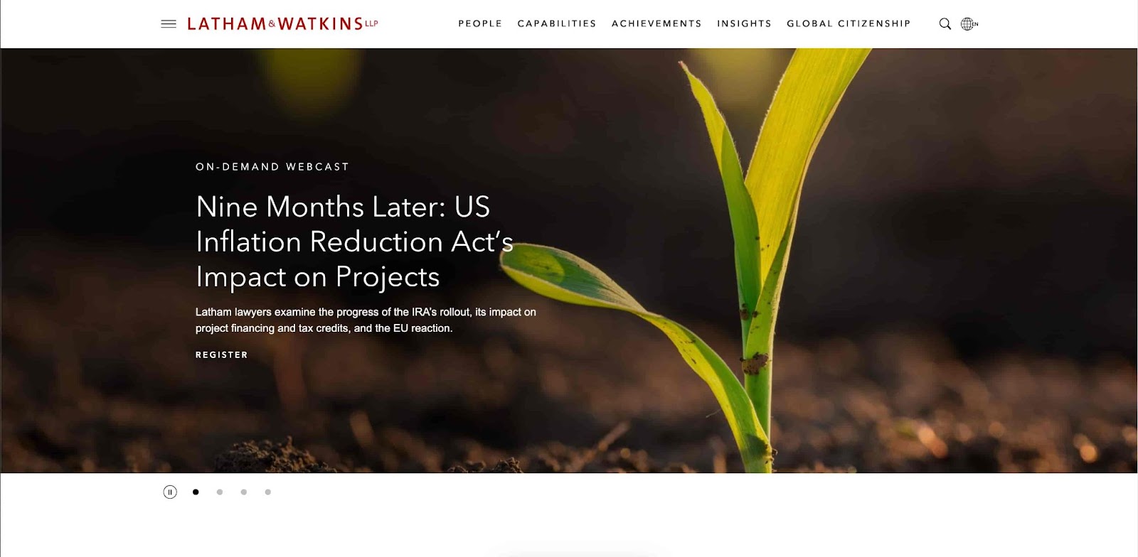
Latham & Watkins uses its website homepage to promote its blog so that the firm can reach a wider audience; this is a great SEO strategy. You can also click on the header for more information on the firm itself, what the firm has done, and the lines of work it is in.
What We Like: This website is clean, simple, intuitive, and effectively uses a blog to increase web traffic.
5. McDermott Will & Emery

The McDermott Will & Emery website is another example of making good use of a blog. This website also has a section for upcoming events so you can keep up with the firm.
What We Like: This website has a beautiful design, is easy to navigate, and showcases what the firm is all about.
6. Davis Polk

DavisPolk’s homepage is a good inspiration if you’re looking for a simple design that gets the message across.
What We Like: DavisPolk has news updates to let visitors keep up with recent happenings of the firm. The website also has clickable headers for more information.
7. Clifford Chance

Clifford Chance uses a bold color palette to grab visitors’ attention, and get prospective clients. By featuring a hot-button topic like AI, the website instantly gives visitors a reason to stay on the website, even if they don’t have any pending legal issues.
What We Like: This attention-grabbing website highlights the important aspects of the firm while having a blog to bring in prospective clients.
8. Freshfields Bruckhaus Deringer

Freshfields Bruckhaus Deringer’s website has a minimalist background with arrows pointing up to establish the upward trajectory of the law firm.
What We Like: This website is simple and elegant, while immediately bringing attention to past work that the firm has done.
9. White & Case LLP

White & Case is a global law firm that focuses on complex domestic and multijurisdictional cases. The website has news, a search bar for lawyers, and information about the firm’s services.
What We Like: This website is another good example of the use of a blog in website design, and has more information about the firm itself.
10. Linklaters

Linklaters is a law firm with 3000+ lawyers (including partners) that is always on the lookout for new industries to branch out to. You can see this in the firm’s choice to focus on the gaming industry on its homepage.
What We Like: By appealing to a specific industry on the homepage, Linklaters is improving the chances of converting prospective clients in the gaming industry. There are also more services available in the header for visitors to look around.
11. Debevoise & Plimpton

This website is aesthetically pleasing and attention-grabbing, creating a positive impression on its visitors.
What We Like: Everything a client needs to know about Debevoise & Plimpton is there on the left, easy to see.
12. Gibson Dunn

This website gives 3 category search functions to help visitors find exactly what they are looking for.
What We Like: Gibson Dunn’s Innovative and strategic design enhances the functionality of its website, making it easy to navigate and explore. Good site navigation is key for both your users and SEO. However, navigation that helps your site rank well can be tricky, and that's where AI marketing tools like FirmPilot can help law firms.
13. Wilmer Hale

Wilmer Hale, like other websites on our list, implements a search bar for user convenience and social proof if you scroll down.
What We Like: This well-designed website seamlessly integrates different design elements, such as typography, color, and layout, to create a cohesive whole.
14. Ropes & Gray LLP

Ropes & Gray’s website greets the visitor with social proof of awards, along with blog articles, to give prospective clients a reason to navigate through the website.
What We Like: This website uses bold fonts, unique illustrations, and immersive images to create a memorable user experience.
15. Allen & Overy

Allen & Overy’s minimalist design helps emphasize its employees, giving the website homepage a personal touch.
What We Like: The thoughtful use of white space and uncluttered design enhances this website's readability and engagement.
16. Shearman & Sterling

Shearman & Sterling has news on its homepage as social proof for its prospective clients to show that the firm is high-quality, like its website.
What We Like: This website design considers the needs of the intended audience, providing content that is relevant, timely, and useful.
17. Kirkland & Ellis LLP

Kirkland & Ellis employs a minimalist approach to their homepage, choosing to emphasize recognition of the firm’s achievements.
What We Like: This minimalist approach to website design uses negative space and simple typography to convey information in a straightforward and compelling way.
18. Paul | Weiss

Paul Weiss takes an old-school approach to its website design, much like its approach as a law firm. The classic look of the homepage delivers firm news, client news, and awards to further cement its business acumen.
What We Like: This website does a phenomenal job of reflecting the organization's priorities, values, and goals, creating a cohesive identity that resonates with its audience.
19. Hogan Lovells

Hogan Lovells has an interactive web design that is stunning and visually appealing, keeping prospective clients engaged as they learn more about the law firm.
What We Like: This website balances form and function, providing an effective way to present content while also offering an engaging user experience.
20. Arnold & Porter

Arnold & Porter is a global law firm that offers regulatory, litigation, and transactional services. The homepage is beautifully designed and brings attention to the great work that this firm does.
What We Like: This website offers an intuitive configuration that enables easy and fast maintenance of web content.
21. Jones Day

Jones Day is a law firm that is committed to client service, and proudly displays this throughout its intuitive and engaging homepage.
What We Like: This website helps visitors find what they are looking for seamlessly through the effective use of menus, search bars, and call-to-action buttons.
22. Sullivan & Cromwell LLP
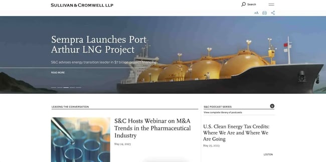
Sullivan & Cromwell greets its visitors with information about the firm’s latest ventures, already helping prospective clients visualize what it would be like to work with the firm.
What We Like: The images on this website are used not only to create visual interest but convey important information as well.
23. Covington

Covington employs a minimalist design to place emphasis on its header ‘Strategic Foresight at the Intersection of Law and Policy’.
What We Like: This website creates a modern and sophisticated brand identity, signaling professionalism and reliability to its audience.
24. Perkins Coie
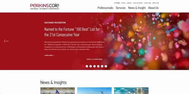
Perkins Coie’s homepage uses a colorful palette in celebration of its recognition of one of the best companies to work at for 21 years in a row. This communicates to visitors that the company is prestigious and committed to its clients.
What We Like: This website makes effective use of color to create a visual interest that aligns with branding and business objectives.
25. Foley & Lardner LLP

Foley & Lardner uses its websites to communicate how the firm is on top of the latest in technological developments with an article on AI.
What We Like: This website balances user experience and aesthetic appeal to achieve a functional and visually comprehensive design.
Stand Out from the Crowd with Expertly Designed Attorney Websites
Creating a well-designed attorney website can make all the difference in today's competitive digital landscape. The 25 attorney websites featured in this post offer a range of design inspiration, from sleek and modern to traditional and sophisticated.
While each design is unique, each prioritizes a clean and professional appearance while offering a user-friendly experience. By taking inspiration from these top attorney website designs and incorporating their best practices, attorneys can stand out and win over prospective clients.
Website Design Examples
.png?width=112&height=112&name=Image%20Hackathon%20%E2%80%93%20Vertical%20(50).png)


![15 black and white website designs to inspire your own [+ pro tips]](https://53.fs1.hubspotusercontent-na1.net/hubfs/53/black-and-white-website-design-1-20250520-1336267.webp)

![15 Brochure Website Examples to Inspire You [+ How to Make One]](https://53.fs1.hubspotusercontent-na1.net/hubfs/53/brochure-website-examples-1-20250319-362228.webp)
![28 Types of Websites to Inspire You [+ Real-Life Examples]](https://53.fs1.hubspotusercontent-na1.net/hubfs/53/types-of-websites.png)

