Let me save you some time and frustration by delving into the options to show you what no-code website builders are, what to look for in a good one, and the best ones out there.
Spoiler alert: What’s “good” and “best” may depend on your abilities and needs. There are options here for design experts all the way to a single-page builder that’s perfect for excited dabblers.
Table of Contents
- What is a no-code website builder?
- What to Look For in a No-Code Builder
- Best No-Code Website Builders
What is a no-code website builder?
Think: Legos. They come in various colors, sizes, and can be specialized to make different things — maybe wheel pieces and windshields, for instance. When you buy a kit, you have specific, prefabricated pieces to build one thing. You don’t have to melt plastic, inhale fumes, and use brick-shaped molds to have fun making a toy motorcycle.
Now, imagine that you’re building a website. You don’t have to program one from scratch anymore. No-code website builders are like those Lego sets that can build 3 toys with the same set of prefabricated pieces.
Instead of being limited to three websites, though, the options are endless and flexible to fit your branding, use case, and desired functionality.
And dare I say — it’s fun?
I will also include pricing information below, and it’s cool to know that all but one of the builders on this list have a free trial at least, and a fully free version at most. For the majority, though, you have to pay for full functionality.
What to Look For in a No-Code Builder
The first step is to find out what you need and want for your own website. Find a site you really enjoy and take some notes about what it is you like best. Is it the organization of content? Is it a color scheme? If it needs to be competitive, what are your competitors doing right that you would also like to incorporate?
For my purposes, a no-code builder has to be easy to use and always needs to provide the following:
- Templates — a collection of various style templates (usually called themes) that are easy to manipulate to your needs.
- Framing — a simple and straightforward path to laying out the bare bones of your entire website before adding any details.
- Internal linking. Your site pages should connect to one another via links to keep potential customers on your site and/or carve a conversion path.
- Design features — the ability to upload your branded material, then color-match
- Integrations — efficiently pull from work that is already done, or lead a user to more content.
- Support resources. As someone who doesn’t have great coding skills and began with little idea about the nuts and bolts a website needs to function, support resources are a must. This could be video tutorials, text walk-throughs, forums, FAQs, etc.
Something that’s nice to have in addition is a text-filling feature. Traditionally, website builders would use Lorem Ipsum — a mashup of Latin text — as a placeholder to visualize their text layouts until meaningful content was created for that space.
Today, no-code website builders may have generative AI text features, which is one of the best uses I’ve seen for AI tools.
As of the writing of this article, AI can search its data for topical information and then generate content about that topic. If the data it pulls from isn’t accurate — such as an internet full of unreliable information — the content may not be accurate, either.
But it will be topical and fill space quickly and easily. It gives a closer approximation of what your pages will look like until it’s time to craft branded, credible content.
Best No-Code Website Builders
1. HubSpot’s Drag and Drop Builder
HubSpot goes at the top of the list because it comes with confetti. The language is friendly and accessible, pop-ups guide you along, signing up is free, and the branding makes me smile.

From this starting point, I use the left-side navigation bar to hover on Content and then click Website Pages. I’m going to try out the AI feature and click that button. It asks me some easy questions like the business name and industry. I’m using my side hustle Threadcraftian for this, which is pet accessories with fun prints and personalization:

Next, I choose Sell Products. For the Site Style, I click through the options. The one that best fits my brand is Elegant because of the colors, text, and overall warmth. So here’s where we start:

Okay, so it looks like they have block editing. This is where you can select a section to work in. You can easily add and remove blocks by activating the plus sign between them. Within the block will be various modules such as text fields and buttons that you can add or change to suit your needs.
Clicking on the header takes you to a global content editor, which is where you can edit the menu, logo, button, and other details in the header. When you’re ready to add a Product page, About page, Blog, or whatever else, you’ll click File, New, Page, name your page, and then select a template for the kind of page you want to build.
I’ll leave all of that alone for now and just work on the home page. It’s super intuitive to change the background image. You just click on it, and a sidebar pops up on the left, including Backgrounds. I click that, hover over their image, and click Replace.
I upload my own banner … and this is awesome! I don’t have to do this one image at a time. I’m not sure which banner size is going to work best, so I just drag all three over:

When trying them out, I use the banner best fit for this website design. Then, I click into the rich text field and start manipulating elements. I choose to delete the text and work on the button.
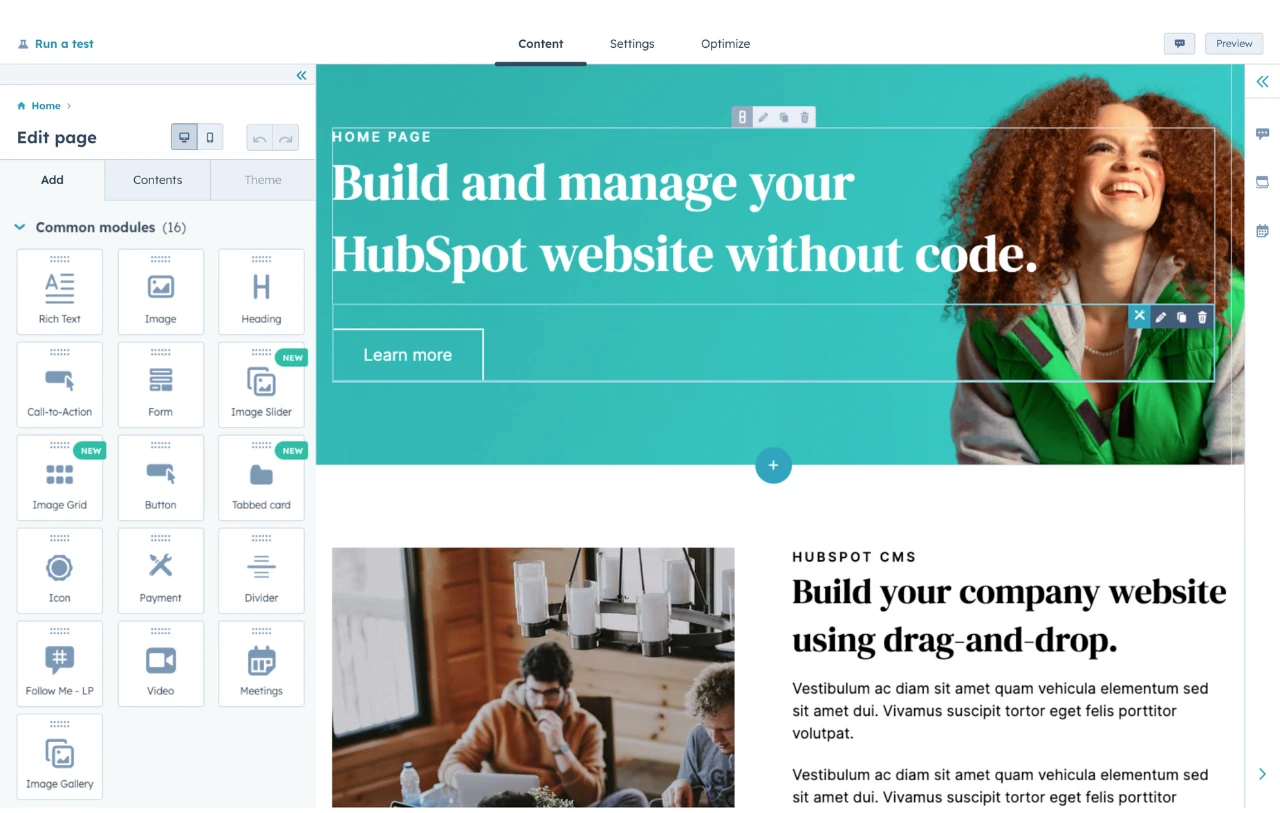
There is a Style option on the sidebar which I use to change the color of the button, round the edges, and adjust the alignment to where I like it. You can see below that the left sidebar has a ton of options on tiles that you can just drag and drop to build your site up.

Then I scroll down the webpage and there’s a text section that was created by AI. I’ll need to do a heavy lift on that text later because it’s way off on brand voice and doesn’t hit the details I would want it to. It’s not a HubSpot thing, it’s an AI shortcoming with generative text anywhere you apply it. While we all expect it to get better, writers and editors are definitely still needed to better refine the copy.
For now, though, I’m not wild about the Products section because, to me, it’s a bit too wordy for the home page. I delete those modules, change the layout to four columns, then drag and drop four product modules.
Now to create the products! It prompts you to do this for the modules. I fill out a bit of product info and add a photo. Again, at this point I can select and drag a bunch of my images at once, so I do that — it saves lots of time. Once I have four products filled out, I link them all to a product page that I can work on another time. It’s shaping up beautifully.

Why I like it: To be clear, I’m not just hootin’ about the team I’m rootin’ for. The drag-and-drop interface is easy to use. There are loads of customization options during the free build without being overwhelming.
There are hundreds of fun and branded icons to pick from, and AI can give you a jump start if you’ve never built a website before. There’s even a way to search Google for images built right into it, and it connects to Canva so you can design banners, images, etc. You don’t ever need to leave the builder.
Key Features
- It comes with a free custom domain
- Tons of native integrations
- Templates galore, both free and paid
- The drag-and-drop functionality is great for visual thinkers
Best for: People who want to build an all-in-one solution for running their business with a website. The HubSpot CMS connects to the website, and there are tons of supporting features that are all designed to work natively and seamlessly in HubSpot’s products.
One thing I wish it was a little better at is being able to drag and place items exactly where you want them instead of having to make alignment adjustments within the module.
Because of this and the navigation that takes some getting used to, I’d say that a beginner could poke around and figure it out, but people with just a little more experience with site building will have a quicker and easier time with it. I’d definitely recommend it to friends and colleagues just for the integrations that keep you from having to flip between windows/applications.
2. WordPress.com (Not WordPress.org — they’re different!)

The one, the only, the geriatric millennial’s introduction to no-code: WordPress. And yes, WordPress.com is a different thing than WordPress.org. Think of them like mama and baby bears. Org is the mama from whence Com came. Org is the open-source development version where people who can code go to make something cool in collaboration with other developers. It doesn’t include hosting, domain, or site security support.
If you are self-hosting and know how to manage site security, purchasing domains, etc., WordPress.org costs less to work with. WordPress.com costs more, but you get inclusive support, and it appropriately fits this list of no-code website builders, so that’s the WordPress we mean for the rest of this section.
With it, you get the core functionality, hosting, domain, and security that works time after time to the tune of over 474 million WordPress websites — from small, personal portfolios to major brand representation.

Programs that have been around the longest have the most support available. That’s important for WordPress, because you will definitely need help at some point. There are endless details for beginners to get bogged down in because its tools can be so specific.
Its power comes from that granularity, making it a good fit for experienced site-building professionals creating enterprise-level websites. But for new users, just the dashboard can be overwhelming:

Once upon a time, WordPress was definitely not an intuitive no-code website builder. There is a learning curve that scared me away for years. When I finally gave it a go, I had so many questions. Luckily, there were answers — but most of the time, the answer was, you can’t do that with the theme you’re using.
So I’d try to switch themes but lost the work I’d done because the new theme didn’t support the things I’d accomplished on the old one. So I’d have to start over again. It was wildly frustrating, and after all that work I’d end up with something basic — clean and functional, yes — but very standard.
My floral design portfolio, luckily, didn’t need to do much beyond holding photos and some text:

Since then, it looks like WordPress may have done some work to make their website builder easier to use and more accessible? I’ll try it out today. I’ve clicked on the painting of flowers from the WordPress.com home page. I’m going to stick to the free version that you can get started with, but you’ll have a lot more customization and functionality the more you’re able to pay:

The dashboard still looks like the one I shared up above. I’ll focus on the setup steps in the middle. I take care of general settings such as site name and timezone, save that, and a box pops up for Next Steps, which I click.
Next in Setup is Update Design, where I can opt for AI Assistant or Excerpt — but not really because I have to upgrade to get any buttons to activate. So I look for something else to do and see Block. But I can’t seem to select The Art of Connection to change it to Asheville Floral Design.

I can’t even change the font size of what’s there. Hmm. I delete the block and add a new text box, set it as an H1 so it will be big, type Asheville Floral Design and center it up. It is not big. Again, I cannot seem to figure out how to change the size of the text.
Nothing here is intuitive to me. I’ve spent 20 minutes and accomplished nothing. The worst part is that I’ve used this program before and thought it’d be easier this time, but it’s not.
The most I ever managed to create with Wordpress is my writing portfolio, which you’re welcome to take a look through as an example of the best I could squeeze out of it a year or two back. It took hours and hours.

Pricing varies to give you different levels of functionality from the very basics up to Enterprise abilities.

Why we like it: It’s a known quantity that experienced designers rely on to create robust websites for their clients. We’ve seen what it can do for decades, and for those who can financially invest in its features, it’ll be easier to set up.
For those who have the time to invest, you can learn. But if you’re in a time crunch and don’t have much money to spend, you’ll have better luck with others on this list.
Pros
- Powerful granularity
- In-house hosting available
- Free wordpress.com domain
Cons
- Not particularly user-friendly or intuitive
- Have to pay for very basic features
- Constant roadblocks where you need to upgrade to continue
Best for: Larger businesses that can hire someone who knows what they are doing. Be ready to pay them well, because their skills were hard-won over a long span of time.
3. Elementor

So…this is what I needed for WordPress, apparently. They appear to have three main products: Their own website builder, a drag-and-drop website builder plugin for WordPress sites, and static/headless site generator for WordPress.
There are no free options for trying Elementor’s products, so I’m not going to be able to show you a whole lot about this one, but if you have your mind made up to jump into WordPress, this could be a very valuable diving board that doesn’t cost much to try:

Why we like it: Their drag-and-drop plugin makes WordPress easier to work with. Elementor also offers design kits that act as templates. If you were interested in learning how to build your own templates, Elementor would be a great asset to you.
Pro tip: They highly recommend you start with the free Hello theme:

Best for: People who want a little more user-friendliness in their WordPress experience, people who want more template options, and website designers who want to build their own templates.
4. Wix

Wix has been on my radar for a long time, but I haven’t had occasion to try it out until this fine day with you. The very first thing that jumps out to me on the Wix homepage makes me very happy for fresh, new beginners. When you click on Product, they tell you immediately the nuts and bolts you need — the essentials.

These were elusive to me, and made me afraid to try making websites for years. I didn’t even know what questions to ask! And here Wix answers it with no preamble: You need a domain. You need a host. You need website security.
You can buy them from many different providers. I’m sure Wix is happy to provide them to make setting up your site — with their essential resources — extra easy. I’m going to give their website designer a spin.

You have an option to let AI take the reins and generate a site design, but I think I’ll save that adventure for another builder. Wix asks me what kind of business I have, and I say Pet Clothing Shop because my son and I make pet bandanas for my side hustle, Threadcraftian.
I give it my business name, that I want to start something wholly new, mine are physical products, I want an online store, and then to sell on social media and in person. It sets me up with a dashboard and gives me a list of things to complete, very clear and easy steps to follow.
I’ll work my way down the list but will skip steps that cost money, such as the domain, so I can just explore the builder:

It’s quick and easy to connect this website to my PayPal account, add my first product — a cat bow tie — and upload one of my own photos. I add product info and am delighted that there are options to set up pre-order and subscriptions — these are awesome options that reflect buying trends.
Next, I will start designing my website. They do in fact offer the AI text generator, which I will take advantage of.

It did a pretty good job filling out the size guide. I only made a few changes to get here:

As for the main/landing page, it only took a few tweaks, font changes and additions, image swaps, and we have a very sweet home page.

I’m really impressed, actually. Being able to make changes directly on the page by selecting or double-clicking various elements made changes very easy to make. You still have the option of relying on left-side navigation if that makes more sense to you.
Pricing? It’s pretty straight-forward. You can try it out for free, and if you want to try out a Premium plan, that comes with a 14-day trial.

Why we like it: From what I’ve seen, Wix is doing a great job of helping you through the non-creative, non-sexy side of website building. It helps you take care of the nuts and bolt on the back-end and then walks you through the steps to front-end design — from nailing down a domain all the way to hitting that exciting Publish button.
Best for: Anybody, really! It’s intuitive enough for beginners, and you can keep it simple by using their images, then just bring in your own product photography. There are even photo editing options within Wix to use to help you get a better tonal match between your photos and the overall look of the website.
For more experienced users, there are plenty of details and customizations to sink your teeth into — go ahead and make it just how you imagine.
5. Squarespace

A friend first mentioned Squarespace to me around 2008 when I wanted to build a website but was lamenting how difficult I found WordPress to be due to its granularity. Years later, when my family and I were bringing a 60-acre farm back to life from deep neglect, I leaned in to create a Squarespace website focused on the market garden aspect of the farm:

It was very easy to create the top menu bar and build the framework of the site. The pastoral image above was available from Squarespace’s own catalog of images that you can choose from. I opted for a clean and traditional font, and chose a black-and-white core design that let the colorful, growing things pop off the page.

You can see on the Brassicas image above, a red save button for Pinterest. This was a super useful integration feature for us. I’ve always found that Pinterest is an excellent source of traffic for anything visual, and food is always best marketed with delicious images, so it was a natural pairing.
Something I deeply appreciate about Squarespace is the quick and easy buttons they have to switch your view from desktop to mobile in the design space:

There’s nothing fun about having to do the same work twice, just in different formats. Squarespace lets you skip that tedium by offering themes that create both versions simultaneously so you can find a layout and arrangement of elements that look great on both.
You can try out anything they have for 14 days, and they give two pricing options: Monthly and Annually. Obviously the annual prices break down to more value per month if you can afford to pay up-front.

Why we like it: Framing up a full site with standard components such as Home, Shop, and About was a surprisingly swift process. Setting up the blog took a little longer. However, it was easy to figure out, format it how I wanted to, and add photos and content. The images you can choose from are crisp and plentiful, and the blog scheduling feature was very welcome.
Pro tip: It can be helpful to design from the mobile perspective. A problem I kept having was that the title would look great on desktop, but when I switched over to mobile, the last letter or three would drop down to the next line, which looks silly and takes away from your perceived authority.
Best for: Speed, really. Clean aesthetics and quick design. I did go back and try the AI design feature, and as long as I’m not being picky and have my own product images to import, I could have a serviceable website built in under 30 minutes. I think that’s pretty impressive, and their 14-day free trial is plenty of time to explore it.
6. Webflow

Okay, so just aesthetically, Webflow looks like the Photoshop of site builders and will likely be a natural transition for graphic designers who want to create a website. I have had a very humbling experience lately writing a piece about graphic design software, so please keep your hopes nice and low for what I’m about to do.
Oh, excellent! It has templates. I will definitely be using one. I like the look of one called Propel, so now I’m ready to try out the builder.

It does have a checklist to work down that pops up with your template with Create a Site already checked off. Phew. Templates are awesome. I’ll work my way down the list. Ha! They give you a little pop-up tutorial preview to help you figure out what to do. I love it because I need it so much:

Okay. Editing the text inside the text element was pretty self-explanatory. Then I was able to leverage their main support resource, Webflow University, to figure out how to change out the sushi background for bananas:

However, I can’t seem to get various elements within the body where I want them. I want Johnny dog with the rockin’ ears to the right of the banana background. I want Threadcraftian top and center with the Pet Accessories line right below it and the Barkin’ button below that. They are not drag and drop, nor can I find the setting to move them in a grid.

Webflow’s no-code website builder is clearly way beyond my abilities. I’d have to do a deep dive into the tutorials for about a week to be able to poke around here enough to make something functional for Threadcraftian. It’s not a bad thing — this suite of tools is clearly very useful for designers hired by a company to build something bespoke, so there’s definitely a need for this.
Pricing has two types: General and Ecommerce. There is a free option for light lifts, and I think their base-line packages are pretty affordable for what you get.

Why we like it: Masters need master tools. Graphic designers need more than plug-and-play to create new and attractive site design. If you have to use Webflow and find a decent template, don’t be like me and foolishly try to change it. Let it be easy — just change the text and use background images that you’ve edited in different software. You should be okay.
Pro tip: Undo is Ctrl+Z in most software suites. You probably knew that already. I was searching everywhere for an undo button. It took me a long time to click on the tiny W icon at the tippy-top left corner to find a way to undo the madness I wrought. Then, I was Ctrl+Z’ing all over the place.
Best for: People with a background in graphic design who want to build a website and work with lots of fine details.
7. Shopify

Shopify is consistently near the top of site builders for small businesses, and I’ve found a lot of success with it. I’ve been selling on Etsy and Facebook Marketplace. I’ve also been advertising on Pinterest, FB, and Instagram for years. It was a constantly disjointed song and dance that got truly wild during the holiday sales season — until I got Shopify.
I was impressed by how easy this was to use and how much it could do. There were an ocean of apps and plugins that made it possible for my website to do everything I wanted, without it getting overwhelming.
Plus, it just looks better to me than anything else I’d tried to build before. Functionally, it works a lot like the HubSpot no code builder, with which I was also able to make another good-looking site that I felt good about. I just happened to find Shopify first a few years ago.
I pasted the homepage pieces together so you could get a larger view:

A small detail that I was able to pull off with a plug-in made a huge difference to me: a toggle switch that made it so customers could get a fun bandana with no embroidery for one price, or toggle Personalization options to the On position to get a personalized bandana at the higher price — it would also collect the pet’s name, preferred font, and thread color.

Most of the apps are free, but that one had a small price attached that I was willing to pay. Here’s a shot of the free apps I used to port everything from my Etsy shop over — including a neat widget that displays my Etsy customer reviews on my Shopify site — as well as manage shipping, add my print-on-demand products from Printify, and lots more:

In the background you can see where to click into the Customization section of the theme. It was all very easy for me to figure out, and you can see that the dashboard is pretty much just a straightforward, left-hand navigation bar.
Pricing tends to vary with different deals they have at different times. You can try any tier for free, you can pay monthly, or you can save long-term by paying annually up front:

Why we like it: It is super easy to bring in your product info, photos, and inventory from other sales sites such as Etsy or Ebay, then integrate various theme modifications, social and sales channels via apps to create a highly functional master business hub.
Pro tip: There is a less expensive option that gives you more time to build while you’re not ready to take payments yet. If you try to cancel, there’s a Change Plans button, and you’ll see the option called Pause and Build. It keeps all of your data and lets you keep working on your website for $9 per month until you’re ready to upgrade to launch, which activates it to take payments. I haven’t had a reason yet to pay for more than the $29-$39/month Basic plan.
Best for: Small businesses with physical items or digital content for sale, especially if they want one source of truth that brings together info from all of your other online properties.
8. Carrd

Sometimes we don’t need a full-blown website. There are times we just need a landing page, a directory, or a very simple sales page. This is what Carrd excels at, and today I’ll be using it for personal branding — a virtual business card.
The first thing I do is choose a Sectioned template that is free to use. Useful Instructions pop up, and I am thankful. Plus, for people like me who are afraid they will forget it all after the next intrusive thought, they even tell you how to get it back: Menu, Instructions.

It is incredibly easy to use. I would recommend this to my own grandmother, but still be in the same room with her to help her understand the Lorem Ipsum and make sure she can find her pictures.
If you want to add something, you click the + and then just pick what you want to add. When you want to manipulate an element, you click on it to select it, and the things you can change pop up on the left-hand side. There is more to change at the top with little icons that stand for Appearance, Animation, and Settings. I personally found that I did not need the animation or settings menus at all.

I went ahead and made my entire virtual business card and published the free version of it — it was that quick to put together and could be a useful asset to me in the future.
Pricing-wise, there are three pro-level tiers that get you more functionality, bells, and whistles as you go:

Why we like it: It is exactly the right amount of detail and functionality to make something simple look great. When you need less than what you’re finding in a web builder for a small project, Carrd is perfect.
Pros
- Carrd is easy to figure out, and it provides an simple gateway to the internet
- There’s a lot of solid, basic functionality packed into it without being overwhelming
- Attractive and useful templates to choose from, including free and paid options
Cons
- Carrd is not what you need when you want to build a whole, proper website
- No blog option for SEO — the alt text for images looks like the only real SEO tool
- The UX is a bit different than the easy drag-and-drop options out there, but it’s a very brief learning curve that still makes sense
Best for: Small businesses with a few strong products, people who need a landing page or a directory that funnels people to the next thing, like the virtual business card I whipped up.
An Experienced Perspective
There are a lot more builders out there to explore, but the sector changes rapidly as startups get running and fall. I wanted to make sure that I covered big names that I know are powerful, brands with a longer reputation, and those that I’ve worked with personally. Some newer options that may be worth a look sometime include Dorik, Duda, Tylda, and Zyro.
I was surprised by how little WordPress.com has developed in terms of intuitive design given what a leader it is in the website builder space. I think of it as the Adobe Photoshop of its niche, where it’s great for advanced users. For relative beginners it’s like breaking a boulder with your noggin — with headaches to match. I wish Elementor had a free trial or just some smaller functionality to try myself.
Final Thoughts
- My personal favorite on this list is Shopify, but I do wish it had a less expensive monthly option because my 1st quarter can be pretty slow.
- To me, the HubSpot builder is on par with Shopify — they really do seem to have a lot in common.
- If I were starting all over again to dabble in website design, I’d start with Wix.
- SquareSpace is a good follow-up to Wix when you want to start building skills beyond drag-and-drop.
- Carrd is a very easy-entry option for people who just need a bit of space on the internet.
Now the question bounces to you, friend. Which no-code website builder looks like a good fit for your needs and abilities?
Content Management System



.png)


.webp)


