.png?width=112&height=112&name=Image%20Hackathon%20%E2%80%93%20Vertical%20(50).png)
We’ve compiled 26 brown website design examples we love, hoping they inspire your website design. From brown so dark it’s almost black to light tan hues, we’re sure you’ll find the right shade of brown to suit your needs and help you create truly stunning brown websites.
26 Great Brown Websites
- YMC
- LINCOR
- Slate
- Madonna
- Art4web
- Ultima
- Black Girl Sunscreen
- Ami Cole
- London Grant
- Twigs Paper
- Themes Kingdom
- Alps Coffee
- House of Aama
- 696 NYC
- Clint Agency
- Joe + Monroe
- Green Rebel
- La Pierre Qui Tourge
- Context is Half The Work
- Wookmama
- Noni Ceramica
- Jen Pierce
- Neighborhood Provisions
- UPS
- Florets
- Make Breathing Room

HubSpot's Free Website Builder
Create and customize your own business website with an easy drag-and-drop website builder.
- Build a website without any coding skills.
- Pre-built themes and templates.
- Built-in marketing tools and features.
- And more!
1. YMC

What we like: Our first brown website is YMC’s lovely website. The software company based in Switzerland develops software solutions for its clients. It’s surprising that a software company chooses a shade of brown for its website. After all, most of the biggest tech companies opt for white, blue, red, or brighter colors.
While those can work, we love the contrast made possible by the brown background. Brown usually evokes reliability and durability, qualities every client would want from its software provider. The brown background overlaid with sharper colors, text, and graphics conveys the company’s reliability, inviting potential clients.
2. LINCOR

What we like: If you’re into luxury watches, you might have heard of LINCOR. This European brand creates some beautiful timepieces, which might make one wonder why it chose to use brown for its website. Although similar luxury watch websites use other colors, LINCOR’s brown website example ensures that it stands out in your mind.
Furthermore, remember that brown signifies culture, tradition, and origins. Therefore, using brown in its website design conveys these emotions. Additionally, it embodies sophistication, which any luxury brand aims for. Therefore, you might also consider using brown for your website if you have a luxury brand.
3. SLATE

What we like: What color comes to mind when considering a milk company? Definitely not brown. But what if your company sells chocolate milk, lattes, and mix sticks? Then brown makes sense, right? We think so too, and that’s why we love Slate’s brown website design. We like how this website creates a mood of relaxation, earthliness, and endurance.
We also love how this website’s design focuses attention on the site's content. A large part of the site’s homepage features the products the company sells, and the color scheme matches the selling point of offering chocolate milk and sticks to visitors.
4. Madonna

What we like: If there’s something that brown especially evokes, it's class, elegance, tradition, and privilege. Well, that’s what Madonna wants you to feel when you walk through its doors, and we certainly get that from its website. The acclaimed restaurant/bar/cafe based in Antwerp has a website that conjures a modern, classy, and elegant feel.
The website also provides the essentials, including menus, reservation links, location, and open-close times. If you own a restaurant or bar, we’re sure you can create something like this.
5. Art4web

What we like: For Art4web, the brown color comes naturally as its hero image is of a person with brown skin color. This beauty website is a beautiful example of what can happen when the web designer and brand embrace the brown palette for their website. The designer used a split screen, which causes the page to only unfold on the right part of the screen.
The website doesn’t use just one shade of brown either. As you scroll down, light brown appears in the background, with the text also employing a different shade of brown that warmly contrasts with the rest of the page for excellent visibility. Overall, it’s an inviting website that’s remarkable in its presentation.
6. Ultima

What we like: At first glance, it’s clear that the Ultima website is a hotel website. However, it differentiates itself due to its use of brown in its hero image and the homepage sections. The backgrounds, titles, and subtitles all have a shade of brown. Even the elements on hover use brown. The underlying color scheme evokes class, coziness, and luxury, all fitting concepts for a five-star hotel.
We also love that the website doesn’t overwhelm visitors. Everything is clearly laid out, and visitors can easily make bookings, inquire, or just learn more about what the hotel offers. It’s an excellent example of using color to immerse visitors in a website’s atmosphere.
7. Black Girl Sunscreen

What we like: Black Girl Sunscreen is an e-commerce website that sells sunscreen for black people. It has a strong mission to create for people of color, and this value is reflected in its simple yet effective website design. The website’s color scheme includes shades of brown, black, and tan, indicating its focus on reliability and catering to its demographic.
From a design standpoint, Black Girl Sunscreen’s product and home pages are simple. The image backgrounds are consistent across products. The product photos, even in color, have a kind of brown tone to them. With intuitive navigation and imagery, Black Girl Sunscreen nails the overall aesthetic.
8. Ami Cole

What we like: Ami Cole aims to enhance natural beauty, with all its products designed to highlight the skin of POCs. Its skin tint is available in different melanin-rich shades. Therefore, it’s interesting that the website features a brown color palette all through. While the brand’s ethos embodies “glowing skin that doesn’t take a lot of work,” there’s no doubt that a lot of work went into creating this beautiful website.
This brown tint to the product photos, icons, and logo gives the company a cool, trendy feel while giving a warm, down-to-earth, and inclusive vibe.
9. London Grant

What we like: Let’s now go to Atlanta, Georgia, to check out a famous natural body care company.
London Grant produces simple yet beautifully crafted products to help customers glow inside and out. The brand is inspired by the art of “less is more,” which is clear from a first look at the website. London Grant has a simple design, but everything works as it should.
The page content is relatively simple as London Grant gives only what you need to know; reviews, products, and where to buy products. All the products have been carefully created to appreciate beauty. With that in mind, we think the brown color scheme of the website is appropriate.
10. Twigs Paper

What we like: This business designs and sells eco-friendly greeting cards. With a focus on sustainability, it’s not surprising that the brand’s website uses earthly brown tones.
The website’s color scheme includes shades of brown and green, which are the default colors of nature. Therefore, visitors to the website are immediately primed to consider that this paper company keeps the environment in mind. The primary background color is a sandy brown interspersed with shades of green. Overall, it’s one of the best brown website designs we’ve come across.
11. Themes Kingdom

What we like: Many website designs today favor brighter colors like blue and green, so finding one that doesn’t go with the grain is refreshing. Themes Kingdom is a WordPress theme creator that offers services to blogs, restaurants, and portfolios. If you’re looking to hire a company to help your brand’s website development, you’ll look for something dependable, right?
Well, Themes Kingdom’s brown website design subconsciously conveys those qualities. It therefore stands out from the competition and creates a warm, memorable presence that nudges visitors to find out more.
12. Alps Coffee

What we like: If there’s any company you’d expect to have a brown color scheme for its website, it’d be a coffee company. The Alps Coffee website uses brown as it’s very suggestive of coffee. Different shades of brown are used, from the hero image down to the text color and icons.
There’s a particular design coherence and visual balance brought on by the website’s brown color scheme. The result is a lovely site that pays tribute to the art of coffee brewing and production.
13. House of Aama

What we like: House of Aama is a mother-and-daughter-founded brand that aims to become the next “great expression” in fashion. Well, they’ve sold us on their rustic, artsy website design with its brown tones and color scheme. The brand targets selling dresses to people of color, and this theme runs through its website design.
House of Aama knows what it does well and shows this through product photos and a brown color scheme. Icons are visible and clear wherever they appear on the page, and the color theme runs from the start to the end of the page, thus creating unity within the page and giving coherence to the content.
14. 696 NYC

What we like: 696 NYC is an e-commerce website that offers handcrafted, fine-quality ceramics, vessels, and objects by Japanese artists. The website features beige, bamboo, blue, green, and gold, but a brown color scheme runs a thread through all its pages.
We like the choice of brown because it’s frequently associated with tradition, which is a significant selling point of the website.
15. Clint Agency

What we like: Design agencies usually prefer to use bright, fun colors to showcase their expertise, especially on their websites. Clint Agency, a product and service design agency based in France, chose brown instead.
It works, though, partly because the site’s created to be fun to explore, with colorful, movable stickers and icons. The website manages to strike a balance between being down-to-earth, professional, and creative.
16. Joe + Monroe

What we like: Joe + Black’s handcrafted candles are showcased in all their aromatic glory on this website. While the brand’s candles are made of a vegan blend of fruits and infused with natural essential oils, its website is simpler. It features a brown theme throughout, which gives off a grounded, relaxing vibe that potential customers are looking for.
By combining this brown website design with olive green tones, the brand website gives off a natural, sustainable, and traditional atmosphere. It’s definitely a design you can imitate to a pleasant effect.
17. Green Rebel

What we like: Green Rebel’s website is one of the coolest brown design websites we’ve discovered. The site uses brown for most of its typography and graphics from start to end. As a brand that promotes sustainability, nutrition, and healthy living, this brown color scheme is a masterstroke.
Furthermore, some of the textures of the website continue this earthy and grounded vibe, which, combined with the typography and graphics, contributes to an organic feel.
18. La Pierre Qui Tourqe

What we like: Many of the websites we’ve checked out with a brown website design tend to be grounded and serious, which is why we’ve included this fun website to even things out. La Pierre Qui Tourge is a fun website that uses a variety of shades of brown for its primary color palette. It then balances this with some bright colors, which creates a fun, whimsical vibe that we absolutely dig.
The visuals are playful and make you crave some of those delicious-looking cookies on display.
19. Context is Half The Work

What we like: The brown accent used on this website is one of its more unexpected features, giving it a vintage, mid-century vibe. The website is an archive for the APG, a company that initiated and organized placements for artists in industry or public institutions.
We believe its design and the brown accent perfectly match its purpose.
20. Wookmama

What we like: This website uses brown as the primary color on its landing page. Its accent color is a deep brown, and shades of brown are found in the content and on most pages. The call-to-action button is also set in brown, with the text a light shade of brown.
As you scroll down, the page shifts, creating a nice effect that keeps visitors intrigued. All of these create unity on the page and make the website memorable.
21. Noni Ceramica

What we like: Besides being grounded, classy, and earthy, brown is also known for its minimalist vibe. Well, Noni Sao Paulo’s website perfectly encapsulates its brand and products. The e-commerce store features warm shades of brown and other earthy tones that match the store’s products.
It combines this brown palette with product images that complement the natural colors. The parallax scrolling effects complete this simple landing page's professional and luxurious feel.
22. Jen Pierce

What we like: Jen Pierce’s photography website oozes class and elegance. The photo gallery gives the website a great foundation. What makes this website really stand out is how the white and brown elements combine to give a subtle but impressive overall color palette.
23. Neighborhood Provisions

What we like: This website displays a superb use of color to create a mood. Its poignant, bright brown color palette evokes the excitement of warm, sunny fun days. Shades of orange and beige combine with brown to hold enraptured visitors.
The clean lines here combine the content into neat boxes, resulting in a fun and pleasant browsing experience as you look for your favorite meal to order.
24. UPS

What we like: UPS is perhaps the most popular example of a company that uses the color brand in its branding, including its website. The deep brown coloring stands out against the white background and is a lively way to introduce visitors.
We love the strong, reliable organizational vibe the brown palette gives. Once users land on the website, it’s usually easy to figure out exactly where they want to go.
25. Florets

What we like: Florets takes the use of brown to another level. Aside from the color in the pictures and the white text, the entire website is all brown. The company prides itself on its traditional preparation of sourdough bread.
Thus, the conventional, deep brown palette suits its traditional roots perfectly. Aside from denoting tradition, brown’s the usual color of bread, so it only makes sense that the company’s website matches the color of its product.
26. Make Breathing Room
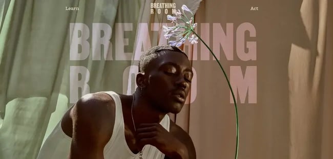
What we like: The brown tones used on this website match its somber theme of tackling police brutality against African-Americans. While other colors are interspersed on the website, the brown palette dominates. Combined with the contrasting, clear, and concise text, this powerful website encourages action.
Indeed, it’s a textbook example of using color to make visitors feel the emotions you want.
How To Design a Brown Website
- Get inspiration from existing brown websites
- Choose a website builder
- Make the site easy to navigate
- Customize your color scheme
- Make website content easy to read
- Optimize the website for mobile
1. Get inspiration from existing brown websites.
There are several brown website examples you can draw inspiration from as you start creating yours. You can check out how they use the brown color scheme to attract their audience.
Not only can you be inspired by the color scheme, but you can also learn from other website features, such as the use of media, the design, scrolling features, and more.
2. Choose a website builder.
Now that you’ve got a better idea of what you want your website to look like, the next step is choosing the CMS or software you’ll use to build the brown website.
It’s best to choose a website builder that allows you to create a custom design and color scheme. WordPress and Wix are some of the most common options.
3. Make the site easy to navigate.
Regardless of the color scheme, you should allow users easily find what they are looking for.
Furthermore, a site with good navigation helps improve your search engine results.
4. Customize your color scheme.
Although most website builders come with pre-set templates you can use for your website, you stand out from your competition by customizing the template to suit your needs.
Some ways you can stand out include:
- Adding your logo
- Adjusting the pre-set color scheme
- Modify the navigation menus
- Customize the size, colors, and fonts of buttons.
5. Make website content easy to read.
If your website has high readability, it’ll be easy for visitors to scan through it and take in information more easily.
If you’re building a brown website, keep contrast in mind. Thus, ensure that your text color and background have sufficient contrast. You can use an online tool like the Contrasts Checker to test whether there’s enough contrast.
6. Optimize the website for mobile.
Since people increasingly spend more time browsing the internet via mobile devices, it’s best to ensure your website is mobile-friendly. A mobile responsive website is more likely to capture the attention of your visitors.
The Best Brown Website Designs to Inspire Yours
This list of 26 websites has shown different websites that have used the brown color to good effect. We encourage you to take inspiration from the examples you like and use that to build your brown website.

Website Design Examples


![15 black and white website designs to inspire your own [+ pro tips]](https://53.fs1.hubspotusercontent-na1.net/hubfs/53/black-and-white-website-design-1-20250520-1336267.webp)

![Gradient Website Design Examples That Prove This Trend Is Far From Over [+Tutorials]](https://lh7-us.googleusercontent.com/htOWIbyCIoCMxSjC4gJunkGnhCzXpccjTrL8NwoGdRdCsSiEmEAxe_qBFkMrzy2Y8d3cwEr_DMzSGHq9Xi-hQFnMJCo8HDQJ1yQGigcSfFxI2QKXo0s7xXSB2sY-eALG1iUqnHXgomcDsnp7AHRSH1s)
![15 Brochure Website Examples to Inspire You [+ How to Make One]](https://53.fs1.hubspotusercontent-na1.net/hubfs/53/brochure-website-examples-1-20250319-362228.webp)
![28 Types of Websites to Inspire You [+ Real-Life Examples]](https://53.fs1.hubspotusercontent-na1.net/hubfs/53/types-of-websites.png)

