.png?width=112&height=112&name=Image%20Hackathon%20%E2%80%93%20Vertical%20(50).png)

In this post, we’ve also provided tips on building a simple yet comprehensive chiropractor website yourself.
Best Chiropractor Website Design Examples
- The Joint Chiropractic
- Modern Chiropractic Chicago
- Australian Chiropractor Association
- Chiropractic First
- Chiropractic Care Clinics
- Milton Chiropractic Clinic
- Largs Chiropractic
- Top Chiropractic
- MVP Chiro and PT
- South Loop’s Premier Chiropractor
- The Healing Path
- Chicago Chiropractic
- Goodyear Chiropractic
- Atlant Chiropractic
- Advanced Chiropractic Relief
- Fidelity Health Care
- Katherine Chiropractic
- Healing Hands Chiropractic
- SF Spine Pain Relief Center
- River Oaks
- Stine Chiropractic Clinic
- ChiroLouie
- Denver Chiropractic
- Chiropractic of Naples
- 528 Chiropractic
- Vitality Chiropractic
1. The Joint Chiropractic

What we love: The Joint starts with an attractive hero image and a prominent, clear tagline. It couples these features with clear CTAs offering specials for new clients and the ability to find the nearest branch.
We also like the calm color palette and contrasting text, making it easy for visitors to learn more about the brand.
2. Modern Chiropractic Chicago
![26 Chiropractor Website Design Examples We Love [+ How To Make Your Own]-Apr-19-2023-01-45-09-8992-PM](https://53.fs1.hubspotusercontent-na1.net/hub/53/hubfs/26%20Chiropractor%20Website%20Design%20Examples%20We%20Love%20%5B+%20How%20To%20Make%20Your%20Own%5D-Apr-19-2023-01-45-09-8992-PM.webp?width=650&height=462&name=26%20Chiropractor%20Website%20Design%20Examples%20We%20Love%20%5B+%20How%20To%20Make%20Your%20Own%5D-Apr-19-2023-01-45-09-8992-PM.webp)
What we love: CTAs are critical to the success of your website, and our second featured website certainly knows this. We love how it uses text and images to draw attention to its CTAs. The website also makes it easy to contact them by having their phone number and social media handles right on the header.
3. Australian Chiropractors Association
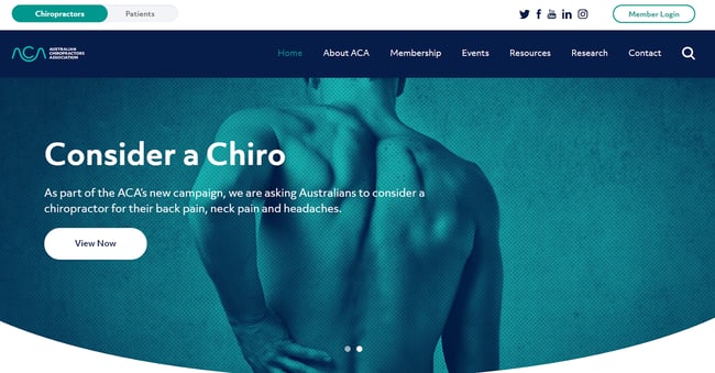
What we love: While specific businesses own most websites here, the Australian Chiropractors Association’s website is more of a directory to help patients find nearby services. We love how the website makes this clear immediately with its outstanding CTA design and placement.
4. Chiropractic First
![26 Chiropractor Website Design Examples We Love [+ How To Make Your Own]-Apr-19-2023-01-45-06-2066-PM](https://53.fs1.hubspotusercontent-na1.net/hub/53/hubfs/Google%20Drive%20Integration/26%20Chiropractor%20Website%20Design%20Examples%20We%20Love%20%5B+%20How%20To%20Make%20Your%20Own%5D-Apr-19-2023-01-45-06-2066-PM.png?width=650&height=329&name=26%20Chiropractor%20Website%20Design%20Examples%20We%20Love%20%5B+%20How%20To%20Make%20Your%20Own%5D-Apr-19-2023-01-45-06-2066-PM.png)
What we love: Building a chiropractic website often requires providing a simple and easy-to-navigate user experience. You also should have a CTA button on the page’s front and center. Chiropractic First ticks all these boxes right away, and we love that. It also caps it off with a clean layout and graphic menu buttons.
5. Chiropractic Care Clinics

What we love: We love the color palette here as well. The CTA is visible at first glance on the homepage in this design. When visitors scroll down on the homepage, they’ll see an image gallery and embedded videos that we expect will improve SEO optimization.
6. Milton Chiropractic Clinic
![26 Chiropractor Website Design Examples We Love [+ How To Make Your Own]-Apr-19-2023-01-45-05-0265-PM](https://53.fs1.hubspotusercontent-na1.net/hub/53/hubfs/Google%20Drive%20Integration/26%20Chiropractor%20Website%20Design%20Examples%20We%20Love%20%5B+%20How%20To%20Make%20Your%20Own%5D-Apr-19-2023-01-45-05-0265-PM.png?width=650&height=307&name=26%20Chiropractor%20Website%20Design%20Examples%20We%20Love%20%5B+%20How%20To%20Make%20Your%20Own%5D-Apr-19-2023-01-45-05-0265-PM.png)
What we love: Up next is this lovely website from Milton Chiropractic Clinic. It features excellent use of whitespace, cool colors, and a contrasting CTA button that immediately draws focus. It also has a featured reviews and testimonials section to build visitors' confidence in the clinic.
7. Largs Chiropractic

What we love: Largs Chiropractic’s website features the now-standard attention-grabbing CTA button, cool colors, and a full-width hero image depicting its services. However, something that draws our attention even further is how it personalizes the services by including profiles of its staff on the homepage.
The homepage is thorough regarding its wide range of services; however, it manages not to overwhelm visitors either.
8. Top Chiropractic

What we love: Top Chiropractic’s website immediately tells visitors what sets it apart from its competition. For example, its header highlights how it focuses on upper cervical services, reiterating that in its copy just above its popping CTA.
9. MVP Chiro & PT

What we love: We love how clean this website looks. It has an exciting tagline and a clear CTA on its header and hero image. We also like the high quality of photos used here, which lends an air of professionalism. Additionally, it includes a menu and social media icons on a sticky header.
10. South Loop’s Premier Chiropractor

What we love: This website opens with a captivation slider video introducing visitors to the practice. Additionally, they provide video testimonials of clients and increase the air of credibility by providing Google and Yelp review links and their Facebook handles.
11. The Healing Path

What we love: The color green symbolizes growth and healing, and this website uses this to significant effect by employing a green palette throughout the website.
Additionally, the high-quality images here make the service look more clinical and professional. Furthermore, the “Book Now” CTA is glaring, but in a great way. All the elements combine to form a site that will attract visitors and get them to take action.
12. Chicago Chiropractic

What we love: We particularly love how this website uses its CTA. For one, no matter how far you scroll, the “Contact Us!” CTA follows you. The header contains useful links about appointment booking and what to expect on your first visit to the practice.
13. Goodyear Chiropractic

What we love: If your practice offers different services, you can take a leaf from Goodyear Chiropractic’s book. The website showcases the services offered by using an intro slider. This makes it easy for clients to know whether the practice can help them.
They also include clear, inviting CTAs and make the company more human by featuring its team of carers.
14. Atlant Chiropractic

What we love: We particularly love websites that use clear CTAs. It’s easy to get caught up in making a website look good without remembering to make your CTA stand out.
Atlant features a visually appealing design and features that captivate visitors, but they remember that all that visual appeal is pointless if visitors don’t contact them. The website, therefore, uses contrasting colors to draw attention to its CTAs.
15. Advanced Chiropractic Relief

What we love: Has your practice won any awards? Including it on your website can serve as social proof for your practice. Advanced Chiropractic is an award-winning practice, and it’s not shy about letting visitors know.
The navigation is excellent, and the buttons are visible and crisp. The website also uses loads of up-close, high-quality images of the award-winning chiropractor.
16. Fidelity Health Care

What we love: The color combination, attractive images, and neat layout make Fidelity’s website stand out. In addition, the website places essential information like contact details and location in easy-to-locate points.
Additionally, there’s a section dedicated to the doctor’s experience and disposition, which gives any potential client an idea of what to expect from the practice.
17. Katherine Chiropractic

What we love: This website captures visitors’ attention with an embedded video. Importantly, it allows them to make a booking or register as a new patient immediately. By reducing distracting features, it aims to improve leads by focusing on generating leads through its CTAs.
18. Healing Hands Chiropractic

What we love: Eye-catching CTAs will never go out of fashion, and this website makes a case for why that’s so. The different-colored CTAs set against the backdrop of a high-quality hero image and captivating headline make this one of our favorite websites.
The services section also deserves praise for its simple yet appealing card design. Overall, we expect this to convert many visitors to clients.
19. SF Spine Pain Relief Center

What we love: While many chiropractic websites use people as the background image, this website tries something bold by using the San Fransico skyline and the urban vibe on the homepage. The images and the warm colors of the design convey adventure and activity. It’s a great message to clients that they can overcome their injuries and enjoy living in the city as well.
20. River Oaks

What we love: River Oaks’ website has a homepage design that catches visitors' attention. The image displays a patient receiving an adjustment, perhaps the most common service for a chiropractor.
Potential clients must know the type of health services you offer, and River Oaks’ website clearly lays out these specialist services.
21. Stine Chiropractic Clinic

What we love: This is one of the friendliest chiropractor websites we came across as we wrote this list. It’s very user-friendly and usable thanks to its clean and simple design. As you can see, essential buttons and text are positioned for easy readability and improved navigation.
22. ChiroLouie

What we love: The website opens with a welcoming homepage design thanks to its full-width image. It couples this with an unmissable CTA at the top of the page that urges visitors to book an appointment. Although it has a pop of color, it’s not overdone, and the text remains highly visible.
23. Denver Chiropractic

What we love: We like how the 3D video attracts new patients with its rendition of the human musculature and nervous system. Combine that with a clear CTA and straightforward content, and you have a simple yet terrific website. The website uses high-quality images and content to craft an appealing proposition to any potential client.
24. Chiropractic of Naples

What we love: This website’s uncluttered feel is worthy of imitation. Each section is straightforward while offering useful information for new patients or clients. We also love the use of text and images to highlight the services offered.
As you scroll, you learn more about the chiropractor and how the practice can help clients deal with specific problems.
25. 528 Chiropractic

What we love: 528’s website allows visitors quickly go to any page they want due to the nice, straightforward design of the icons. The icons are wreathed in a blue and white color scheme which is a nice touch and splendidly contrasts the captivating full-width hero image.
26. Vitality Chiropractic

What we love: Vitality’s website is our final consideration. It works because of its non-conventional design. Unlike others with boxy frames, the website uses different shapes that offer variety. Furthermore, CTAs exist on almost every frame of the page, which should help convert visitors.
How to Design a Chiropractor Website
- Check out other chiropractor websites
- Select a website provider or CMS
- Choose a chiropractor template
- Make the website mobile-friendly
- Have clear CTAs
- Integrate practice information
- Check out other chiropractor websites.
1. Check out other chiropractor websites.
Before searching for the tools you need to create your website, we recommend you check existing sites offering similar services. For example, check out existing chiropractor websites to get a feel for what they’ve done well and what you can improve on.
When you do so, you’ll get inspiration for website elements like color palettes, sign-up systems, and others that can attract the clients you want.
2. Select a website provider or CMS.
Website providers like WordPress, Squarespace, Wix, GoDaddy, and others can be invaluable help when building your chiropractor website. The software you choose will depend on the features you want your website to have.
As you’re interested in a chiropractor website, some of the features we recommend you look out for in your builder of choice include:
- Pre-built and customizable templates
- Online sign-up forms
- Booking system
- Map integration
- Responsive templates
These features allow you to tweak the website as much as you want, collect leads, let visitors make bookings, and find your physical location easily.
3. Choose a chiropractor template.
For a chiropractor, the website must clearly outline services and pricing, provide a reservation method, and make contact information easily accessible. Several pre-built themes and templates offer these features.
Aside from the features already mentioned, such templates also have the following:
- Booking calendar
- Translation services
- Custom widgets
- Social sharing buttons and email opt-in forms
- Custom color schemes
As mentioned already, several options on the market provide such templates. Check out some of these templates from Wix, Themeforest, and WordPress.
4. Make the website mobile-friendly.
Most of all traffic to your website will come from mobile devices like smartphones or tablets. Therefore, it’s crucial that your website’s optimized for use on these devices. If visitors try to visit your website and it’s hard to navigate or read on mobile, they’ll leave for another chiropractor.
5. Use clear CTAs
A significant feature of our favorite chiropractor website designs is the use of clear CTAs. Call-to-action increases the chances that visitors take the next step of making a booking at your practice, so you must include it.
Use engaging features like contrasting colors, iconography, and appealing content to create these CTAs.
6. Integrate practice information.
When visitors go to your website, whether on their mobile devices or computers, they should be able to find contact information that lets them call your office immediately. If your website lacks this feature, you’ll miss out on many potential clients.
Get Inspired by Chiropractor Website Designs
The 26 chiropractor website examples we’ve listed above incorporate features that’ll increase their reach and the number of people contacting them for their services. They are made to help visitors make a booking or contact them for more information.
Consider these examples and choose the features that suit your website best. Then use these to build your chiropractor website. We look forward to your positive experiences.

Website Design Examples


![15 black and white website designs to inspire your own [+ pro tips]](https://53.fs1.hubspotusercontent-na1.net/hubfs/53/black-and-white-website-design-1-20250520-1336267.webp)

![Gradient Website Design Examples That Prove This Trend Is Far From Over [+Tutorials]](https://lh7-us.googleusercontent.com/htOWIbyCIoCMxSjC4gJunkGnhCzXpccjTrL8NwoGdRdCsSiEmEAxe_qBFkMrzy2Y8d3cwEr_DMzSGHq9Xi-hQFnMJCo8HDQJ1yQGigcSfFxI2QKXo0s7xXSB2sY-eALG1iUqnHXgomcDsnp7AHRSH1s)
![15 Brochure Website Examples to Inspire You [+ How to Make One]](https://53.fs1.hubspotusercontent-na1.net/hubfs/53/brochure-website-examples-1-20250319-362228.webp)
![28 Types of Websites to Inspire You [+ Real-Life Examples]](https://53.fs1.hubspotusercontent-na1.net/hubfs/53/types-of-websites.png)

