Creating a standout website can be challenging, so we’ve compiled 31 of the best nightclub website design examples we’ve discovered. We’ll also walk through how to design a successful club company website.
1. Lucid
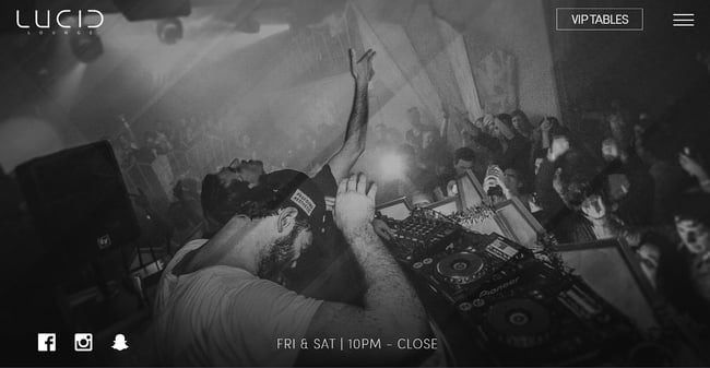
What we like: Lucid is one of the several entertainment centers in downtown Milwaukee’s entertainment district. Given the number of other competing clubs, its website must stand out, and it does precisely that. We love the full-page professional photography backgrounds that promise a great time.
We also like the minimalist logo and the way the social media pages are right there as you land on its homepage. In addition, the navigation menu is intuitive, and CTAs frequently appear as you scroll through the website.
2. Paradise Beach Club Mykonos

What we like: Photos and videos can make any website unique. Well, this website does use these to great effect. The embedded video is very engaging, promising visitors that they’ll spend no dull moment at Mykonos’ premier club.
The website copy is brilliant too. It intrigues visitors by highlighting the caliber of musicians who have graced the club, the five-star reviews from top-rated sources, pictures from previous parties, and more.
3. Pacha
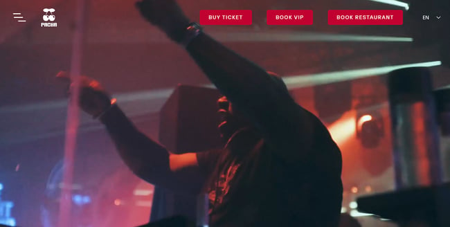
What we love: Your club website can either have a subtle theme or go all out, taking visitors on an exhilarating journey. Pacha, one of the most popular clubs in Ibiza, brings visitors on a trip, leaving them itching to book a flight out to Spain.
The website opens with an embedded video of lights, life, party, and pure fun. The navigation menu is right above the video and includes bright red CTAs that nudge visitors to take action.
4. Womb
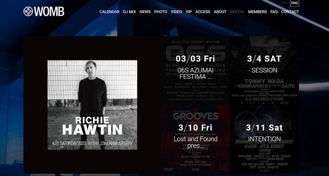
What we love: Womb is a Japanese club with a website that spotlights that you should expect loads of revelry all night long. Once you arrive on the page, you see upcoming events you might be interested in.
Below the events is a prominent CTA that urges you to make reservations immediately. And if you still want to check out what the club offers, there are loads of pictures and links to upcoming events. You’ll also find an About Section on the homepage. There’s a social media element, too, including Facebook, Twitter, Instagram, and YouTube links.
5. Liv
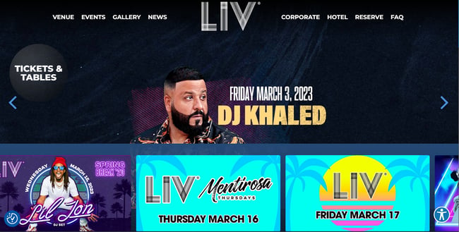
What we love: Liv has been featured everywhere, from TV to lyrics from prominent artists. It’s one of the biggest clubs in the US and sets the standard for clubs worldwide. Its website also looks the part, with its bright, vivid pictures and colors. Its carousel menu shows upcoming events backdropped against a black background.
Below the menu, you’ll find the social media handles of the club and a signup form that invites you to join its community.
6. Avalon
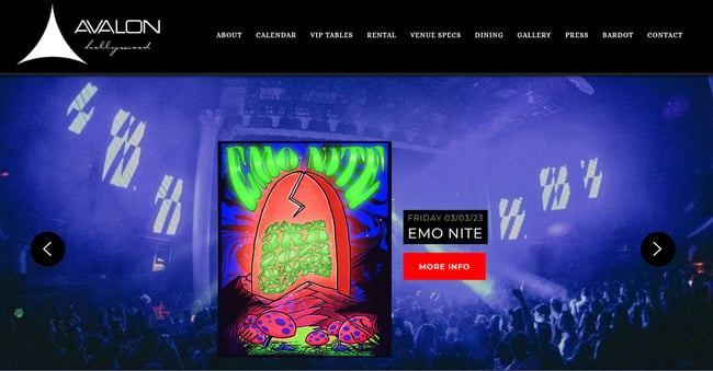
What we love: Avalon is an acclaimed nightclub and one of the oldest of its kind in LA. It showcases its pomp with a simple yet effective website. The black background and bright images give this website an elegant feel.
Though simple, it gives visitors the essentials: reservation links, an email sign-up form, and contact information.
7. Hakkasan
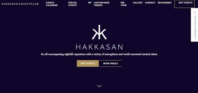
What we love: At first glance, Hakkasan’s website doesn’t seem like a nightclub website, as it gives off a mysterious vibe. Upon closer inspection, you’ll discover what a gem of a website it is.
This nightclub doubles as a fine-dining restaurant and a world-class nightclub. That’s why the website focuses on a classy image before it “lets its hair down” the lower you scroll. Overall, we love the minimal, clean layouts throughout the website.
8. Story

What we love: Story goes opposite to the previous example — it’s one of the legendary Miami Beach nightclubs and is operated by the owners of Liv. We love bright colors for nightclub website designs, and this website serves us right away.
As you scroll, you’ll find more photos that showcase the club’s vibe and its services.
9. Marquee
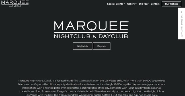
What we love: We now return to the simple, quiet design exemplified by Marquee. Like Hakkasan, Tao Group owns Marquee nightclub, so we aren’t surprised that it has the same classy look. We particularly care about Marquee’s homepage. As you arrive, you’re welcomed by a monochrome color scheme that clearly tells you what Marquee is.
This simple style continues as you scroll because Marquee only provides what you need: events, performing artists, subscription forms, reservation links, and social media channels.
10. Lavo
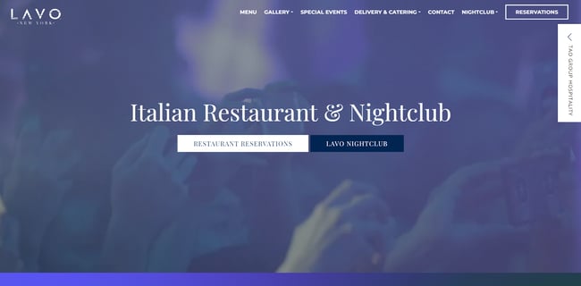
What we love: The muted colors found in other Tao Group-owned nightclubs are absent, although if you squint hard enough, the Tao DNA still exists. For starters, this website opens with an embedded video that captures Lavo's dual function.
The use of multimedia is powerful and offers a bubbling, unique vibe. Content here includes reservation times, reservation links, and social media links.
11. Subclub
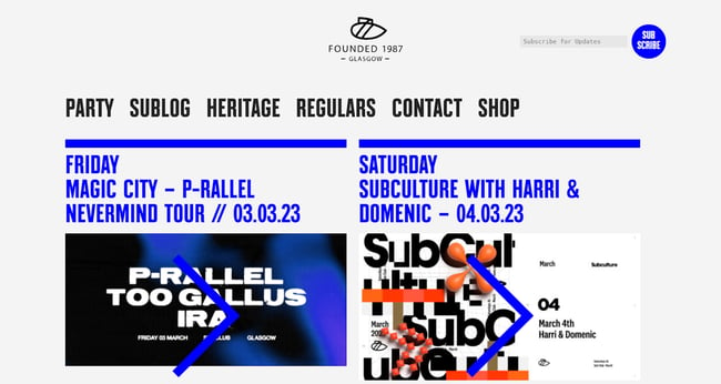
What we love: Subclub is legendary for its in-house music and is one of the most frequented nightclubs in the UK. Aside from the hype surrounding this nightclub, its website does plenty of work convincing anyone looking for fun to check it out.
The website looks simple, but this makes it stand out positively. It has a blue and white color scheme that’s attractive and simple. It also includes essentials like upcoming events, ticket links, and more.
12. Ministry of Sound
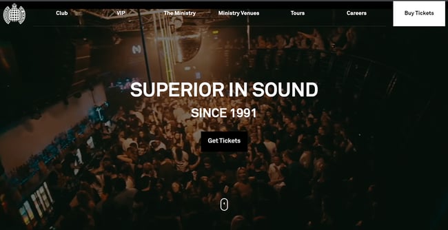
What we love: This redesigned website is one of our favorite club company websites so far. The embedded video is engaging, and large vivid photos bring the club to life on the screen. The copy is quirky, and as you scroll, you’re invited to “stalk” the club on its provided social media handles.
The site captures the story and style of the club and feels like a breath of fresh air.
13. New City Gas
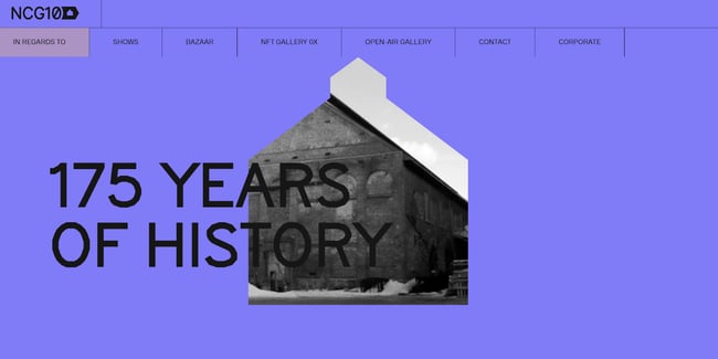
What we love: New City Gas creates a unique clubbing experience, and its website replicates this vibe impressively. Its color palette is nothing like what we’ve seen so far, but we love it.
The website features a cut-out of the club’s silhouette that changes scenes as you scroll down, with smooth animation effects that apply to images. Also, take a hint from its navigation menu, as it’s one of our favorites.
14. The Castle Club
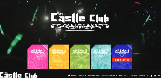
What we love: The Castle Club is Cyprus’ premier club and brings five separate arenas under one roof. We particularly love how the website immediately directs visitors to different arenas depending on what they’re looking for.
It’s a website rich in details as it offers booking information and links and gives a high-level overview of each arena. The navigation is clearly laid out, and all you need is a scroll and click away.
15. Roxy
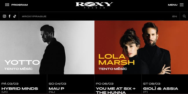
What we love: The homepage immediately draws attention with its carousel display of vivid and detailed pictures. The contrast between pictures is interesting and is far from muted.
This website is also excellent because visitors can watch the clubs’ YouTube videos on the homepage. It also features one of our favorite navigation menus.
16. QNightclub
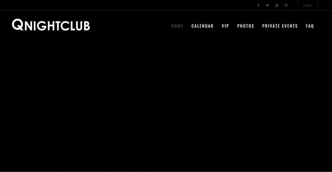
What we love: Dark and moody websites are appreciated here, so we’ve included this all-black website by QNightClub. It features a header with social media links. The homepage also features an email signup form, a calendar of upcoming events, and directions to the club.
17. Coda
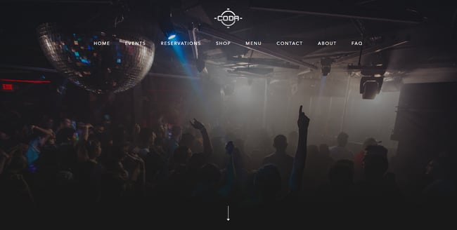
What we love: This is a contemporary website that includes an image gallery, social media links, a mega navigation menu, event descriptions, and an About Us section. Beautifully crafted, Coda’s website is fast and effortless to navigate.
18. Gorg-O-Mish
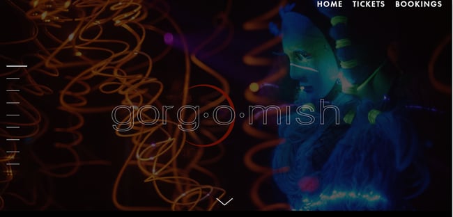
What we love: We love this bold, edgy website design because of its contemporary feel. It tweaks regular features like its navigation menu to produce an exciting and mystical feel. It’s rich in content about the club's proud history and boasts an image and video gallery.
Additional features include an online booking system, the ability to sign up for newsletters, and an embedded map.
19. The Piston
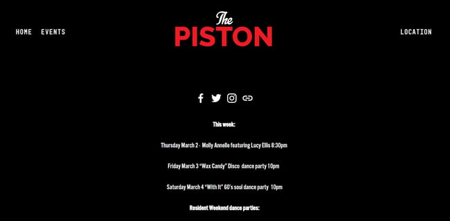
What we love: The Piston is among the biggest names in Canadian nightlife. It’s a huge club that offers more space than its counterparts, which explains its “no reservations” policy. The website reflects that, as there’s no option for making any bookings. All you get on the website are the social media pages, upcoming events, and directions. We love how this design reflects the “we don’t care” vibe of the company — just come and have fun.
20. Rebel
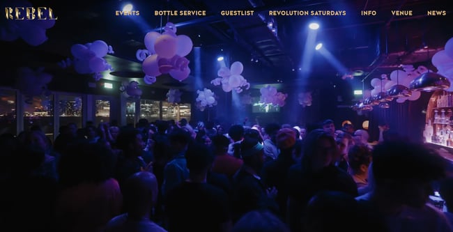
What we love: Rebel’s a vast entertainment complex designed in Las Vegas’s finest megaclub style. Everything, from performers to table service and production, is high-end, and its website perfectly conveys that. Once you land on the page, you’re immersed in sights and colors as performers and partygoers are revealed in full-screen videos.
These videos are followed by information on upcoming events at the club, social media pages, a newsletter signup form, and other content that convey the club's playful vibe.
21. Hi Ibiza
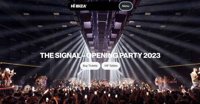
What we love: The acclaimed Hi Ibiza club appears in different polls as one of the best clubs in the world. Its website conveys vibrancy with its full-screen photos and video gallery.
As you scroll downward, you learn more about what to expect from the nightclub. We also like how the floating Menu button appears no matter where you are on the screen, which lets you quickly visit other sections of the website.
22. Echostage
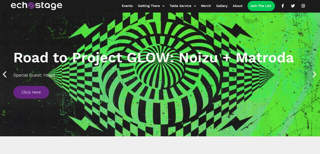
What we love: For many years, Echostage has held a top spot as one of the best clubs in the world. We love its simple but effective website. There’s minimal fuss on this website, and it contains everything you need. This includes a header menu that lets you make reservations, learn about the club, know upcoming events, and get directions.
23. Zouk
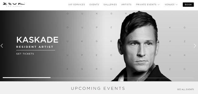
What we love: The famous Zouk club conveys that clubbing can be a classy event, and its website evokes this vibe.
The website turns up the class, starting with a unique logo that seems more like what you’d find from a five-star hotel. This classy theme continues with its simple tiled layout and pleasing color palette. The website is simple and doesn't aim to overwhelm you. You can find whatever you’re looking for with a quick scroll.
24. Chinese Laundry

What we love: Chinese Laundry club is an iconic underground nightclub in Sydney, and its website teaches how to design a simple club website. Like the previous example, this website doesn’t overwhelm visitors — the navigation is clear, and all options are obvious. Everything is laid out whether you’re looking to buy tickets, know about upcoming shows, or look for directions.
25. Bootshaus
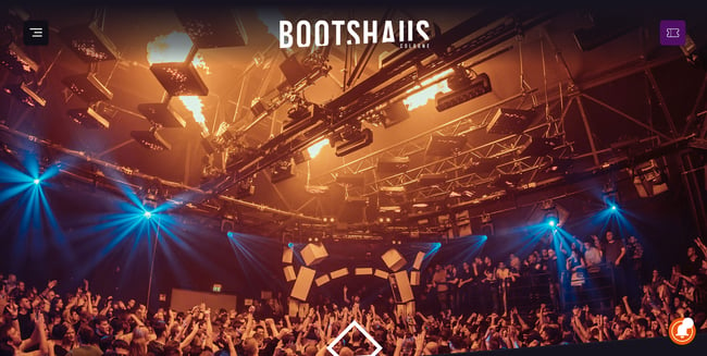
What we love: Boothaus is another website that skimps on effects and gimmicks but makes up for it with a straightforward design that saves you time. The club uses a pleasing color scheme, visual textures, and clear CTAs that pop up wherever you are on the screen.
26. Berghain
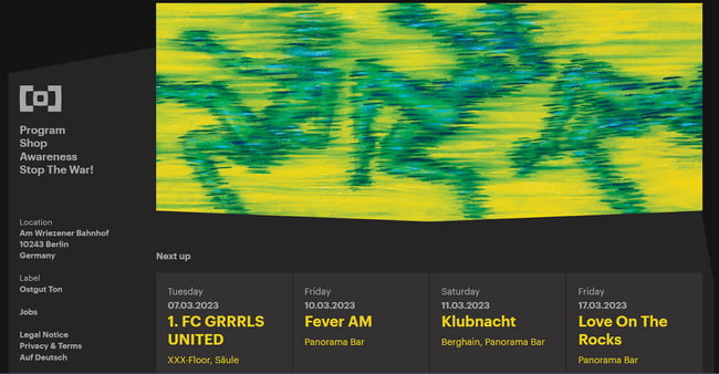
What we love: Visiting Berghain’s website is reminiscent of having a fever dream, with its jarring color scheme that is sure to leave an impression. The design captures Barghains’ weirdness and atmosphere.
As you scroll, you learn about upcoming events and the club’s overall concepts and services. Finally, the website finishes with an email signup form.
27. Papaya
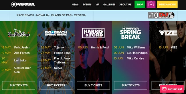
What we love: This website turns up the color, which is expected as it's an open-air festival club located on Pag's beautiful Zrce beach island. The visuals here are playful, and while Croatia isn't known as a clubbing destination, Papaya makes you crave its parties and zest.
28. The Warehouse Project
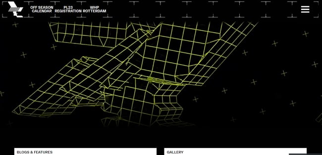
What we love: The Warehouse Project prides itself on its unique aesthetic and vibe in the heart of Manchester. We believe this is seen on its website too. It offers a nice, dark aesthetic throughout, with the only concession to color being the event banners. It also uses multimedia to leave an impression on visitors.
29. Exchange LA
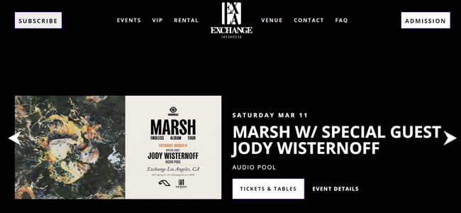
What we love: Based out of LA, Exchange doesn’t reinvent the wheel on its website. Instead, it opts for a simple, straightforward example of what club company owners should include on their website. Immediately you land on the homepage, the header directs you to subscribe, make reservations, contact the club, or get answers to any questions you might have.
It also includes an image gallery and a signup form at the bottom of the page. It’s a simple website you can build without much technical expertise.
30. Fabric London
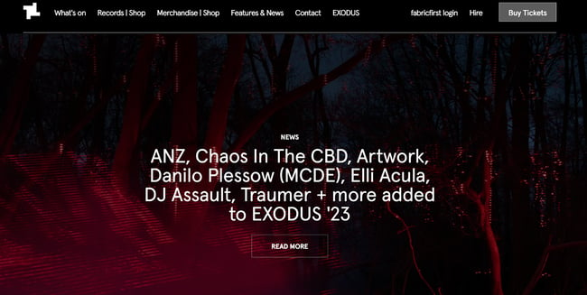
What we love: Dark color schemes are popular among nightclub websites, and we especially love how Fabric London uses them to good effect. The header smoothly changes from a dark red to an opaque dark as you scroll down the website.
31. Illuzion
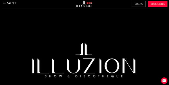
What we love: Illuzion is Thailand’s premier nightclub, and we like its simple one-page design. It’s an excellent example of how simplicity can still be attractive. The club knows what it's about and does well and tells you through a full-width video.
It also features clear CTAs and a navigation menu that stands out. No matter where you are on the page, you can find out about upcoming events and make reservations.
1. Get inspiration from other nightclub websites.
We strongly recommend that you look at existing nightclub websites before building yours.
As you examine existing sites, you’ll better understand what will work for your site and what you need to discard. In addition, you can draw inspiration from their color schemes and other design elements.
2. Choose a CMS or website builder.
After drawing inspiration from the nightclub website you like, the next step is to choose the CMS or website builder you’ll use to create your company’s website.
When choosing, be sure to consider the features each CMS offers, including pre-made templates and extensions. Since you’ll be creating a club website, you’ll likely need a CMS website builder with features like;
- Secure payment options.
- Built-in booking or reservations system.
- Mobile-responsive templates.
- Menu builder.
- Specific nightclub templates.
3. Select a nightclub theme or template.
You could start building your website from scratch or take advantage of pre-built nightclub themes from a content management system like Content Hub. Or you could choose a template that has the following features:
- Telephone links
- CTAs for booking or ticket purchase
- Contact information and social media links
- Image and video backgrounds
4. Customize the template.
Although pre-built templates do most of the work for you, you should customize the template to make it stand out. To that end, you should consider including the following:
- Cub logo
- Color scheme
- Images from your club
- Social media pages of the club
- A custom navigation menu
- Placement of CTAs
- Signup forms and other personalized forms
When you do these, you’ll deliver more value to any visitors to your website.
5. Include an Events page.
An Events page is one of the essential features of a nightclub website. All of the websites we listed above have some form of this page.
Depending on the theme or website builder, you’ll have various options for adding an Events page. We recommend that it includes information the audience cares about, like the date, time, and artists performing.
6. Make the website responsive.
More people today use their mobile devices to research services and products, so your club site’s design must be responsive on mobile. This way, people can easily buy tickets or book events with their smartphones.
The Best Nightclub Website Designs to Inspire Yours
We’ve listed up to 31 different nightclub website examples that we love and hope that it inspires you. All of the websites are straightforward to use and contain information that visitors to such websites look for. They mainly show upcoming events and allow visitors to buy tickets.
We hope you’re inspired by these examples and incorporate some of their features into your nightclub website.
Website Design Examples
.png?width=112&height=112&name=Image%20Hackathon%20%E2%80%93%20Vertical%20(50).png)


![15 black and white website designs to inspire your own [+ pro tips]](https://53.fs1.hubspotusercontent-na1.net/hubfs/53/black-and-white-website-design-1-20250520-1336267.webp)

![15 Brochure Website Examples to Inspire You [+ How to Make One]](https://53.fs1.hubspotusercontent-na1.net/hubfs/53/brochure-website-examples-1-20250319-362228.webp)
![28 Types of Websites to Inspire You [+ Real-Life Examples]](https://53.fs1.hubspotusercontent-na1.net/hubfs/53/types-of-websites.png)

