.png?width=112&height=112&name=Image%20Hackathon%20%E2%80%93%20Vertical%20(50).png)
My decade of experience with websites has taught me that the ones people enjoy most aren’t always the most beautiful, but the ones that remember your choices and priorities.

I value a website that suggests exactly what I need, rather than pushing generic content. Visuals may impress me for a moment, but they quickly stop holding my attention. Dynamic design solves that problem. It updates content in real time, adapts to user behavior, and creates interactions that feel natural.
Most of the work happens quietly, such as a smooth transition, a timely suggestion, or a layout that shifts as you browse. It can make a site feel alive without calling attention to itself.
To gain a better understanding, I revisited some of the most dynamic websites and noted the specific design choices that elevate them above the rest to inspire your own design.
.png)
Free Website Design Inspiration Guide
77 Brilliant Examples of Homepages, Blogs & Landing Pages to Inspire You
- Agency Pages
- Ecommerce Pages
- Tech Company Pages
- And More!
Download Free
All fields are required.
Best Dynamic Websites
- Netflix
- Steam
- Scratch
- Etsy
- Medium
- Quora
- xAI
- Size
- Active Theory
- Lusion
- Dockyard Social
- Reflexion
- Top10
- Advisor
- Educated Guess
1. Netflix
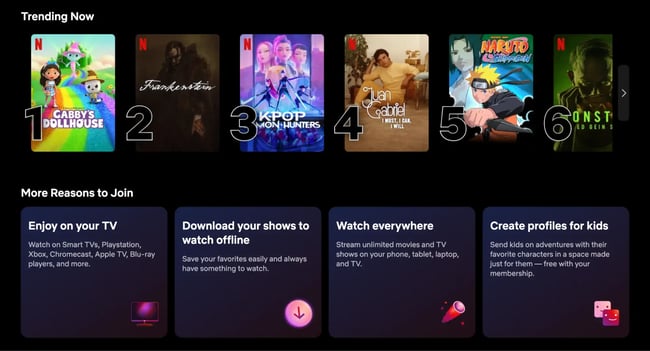
What I like: Netflix’s homepage greets each user with a personalized showcase. I feel like the site understands my mood and keeps showing similar suggestions.
Usually, the thumbnails of the movies that start playing previews are very impressive. It gives a hint of the movie, and I can decide whether to continue or not. I won’t lie that there are times when I keep hovering and exploring, and never actually pick a movie to watch. No judgment, right?
The content carousel is constantly updated with new movies and TV shows based on my watch history. That’s really convenient. For instance, I am not a big fan of romantic movies, so I don’t often see recommendations for them.
I also like catching up on something right where I left off. The next time I log in, I know the movie or series will be right there, ready to restart and continue watching.
Aside from that, the little features, such as “Top 10 in your country” or “Because you watched X,” help make Netflix more personalized and give me a unique user experience. I suppose every user feels this same sense of uniqueness and personalization.
Netflix’s website is the epitome of dynamics, and it really knows how to keep viewers engaged. I would never have imagined that a simple catalog could be so engaging.
2. Steam
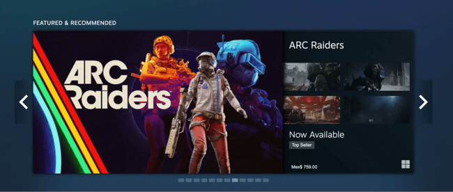
What I like: As a gamer, it feels good that the Steam homepage knows me. It gives me my type of game recommendations whenever I get in.
At first glance, Steam’s design appears to be a simple grid of game thumbnails, but once you start interacting, you’ll notice the interactivity and the depth.
The search bar immediately suggests results as you type, and the filtering options update the game list without requiring a page refresh. This means you can change the listings based on genres, price range, or user ratings, and see them change places on the fly.
Game pages are also content-rich and dynamic. They don’t just have static descriptions. They include autoplaying video trailers, real-time user reviews and ratings, and even a live feed of community discussions or game artwork.
I also love the wishlist feature. You can add an upcoming game to your Steam wishlist, and the moment it’s released (or goes on sale), Steam will pop up a notification and update the site banner to inform you.
Between the achievement showcases on user profiles and the ever-updating activity feed, it’s these real-time interactions that make the site feel alive.
3. Scratch
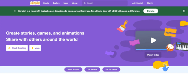
What I like: Scratch is one of my favorite examples of community-driven dynamic design. It’s an educational platform where people (often kids, but not always!) create and share their own games and animations.
The first thing I noticed is the homepage feed. I found numerous user-generated projects there, which are updated frequently.
The standout dynamic feature on Scratch is the “Remix” button on projects. This allows any user to take someone else’s project, make their own tweaks, and publish a remixed version. The site actively encourages this collaborative creativity, and it’s amazing to see projects evolve as they pass through different hands.
Scratch’s online project editor is also interactive. You drag and snap code blocks together, and the changes happen live in the preview pane. The site even gives you instant feedback if there’s an error in your code or if a sprite (character) is doing something.
Scratch is an ecosystem of creativity. And once you start poking around, it’s hard not to get sucked into making a little game or story of your own.
4. Etsy
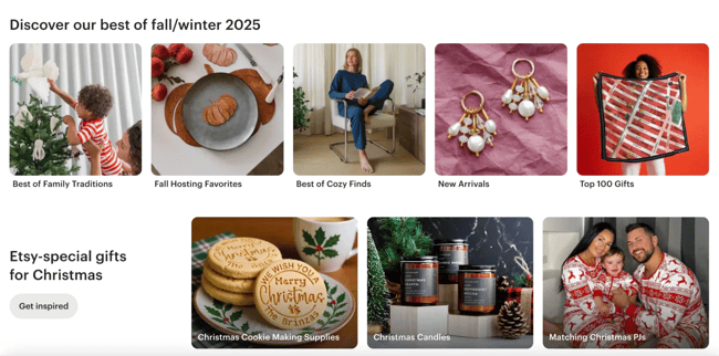
What I like: Etsy’s marketplace feels personal and alive. The site presents itself with a clean, grid-based layout of product images, but operates behind the scenes based on your behavior.
I noticed that after I browsed one lamp, my Etsy homepage started dynamically showing me different types of lamps and even recommended some “similar items” and “shops you may like.”
The Etsy search function is also dynamic and user-friendly. I just started typing, and it autocompletes suggestions and trending searches in real-time. Etsy has a very interesting filter option, though. When I clicked the filter, the page instantly narrowed down, with filter options appearing on the left side without a full-page reload.
One of the coolest dynamic touches Etsy introduced is listing videos. Many product listings now have short videos alongside images, so you can see them for real. Sellers on Etsy each have their own storefront page, which they can customize with branding, announcements, and rotating featured items. It feels like exploring a shop in a mall.
Overall, Etsy has a friendly, simple design and a lot of powerful, flexible features that make it easy to find unique things you didn’t even know you wanted.
5. Medium
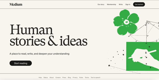
What I like: As a content person, I spend a lot of time on Medium, and the dynamic features they’ve rolled out over the last couple of years are very cool.
First off, the homepage feed. It’s uniquely yours. Medium’s algorithm picks articles for you based on what you’ve read, what you’ve liked, and the people you follow. When I open Medium, I’m greeted with new stories in my favorite categories (technology, AI, etc.), as well as some unusual suggestions that actually pique my interest.
The design is clean and minimal, but don’t let that fool you. There’s a lot of dynamic tech behind it. For example, if you’re a member, you can listen to articles instead of reading. Medium added an audio narration feature that is built right into the site. If you click the “Play” button, any article will instantly turn into a mini-podcast for you.
Writer profiles are also dynamic — they not only list all the writer’s articles, but they also show real-time follower counts and recent activity. Medium feels super personal and interactive, even though it seems simple. Every reader can find what they need in this library.
6. LinkedIn
What I like: LinkedIn is probably the most official web platform online. But that doesn’t mean it’s boring. It’s always active and filled with the latest news from the business world.
I spend a lot of time on LinkedIn, so I’m fairly familiar with how it works. The feed is constantly updated with new posts, job openings, and trending stories. LinkedIn feels quite personal and suggests personalized content. It shows me jobs I might like and people I might know, based on what I’ve been looking at or who I’ve connected with.
The design is clean and simple, with a lot of blue, white, and space between things. It’s easy to look at, and over the years, it’s gotten smoother and easier to use. LinkedIn has even added a few fun things, like simple puzzle games and a dark mode for browsing at night.
The top navigation bar works in real-time. I can see messages, notifications, and invites right away. The only drawback is that the messaging is far from perfect. It can feel a little awkward at times.
Overall, LinkedIn feels like a professional network that’s always alive and changing. It keeps things fresh, helpful, and more fun than you’d expect from a professional site.
7. Quora
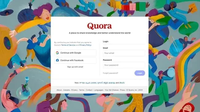
What I like: While Quora was originally a site for asking and answering questions, its dynamic design has made it more like a social media site. If you’ve fallen into Quora, you know how addictive it is.
The homepage is made just for you. It shows questions and answers based on the topics you follow and what you like to read or click on. So far, I have found pinpoint personalization.
The design looks simple, with a lot of white space and a two-column layout. But there’s a lot happening behind the scenes. The left sidebar gives you quick access to Spaces (which are like topic groups) and real-time notifications, so you always know what’s new.
I really like the process of the best answer rising to the top. The users who upvote answers they find helpful, which allows the user community to help pick the best stuff for you.
Quora also learns fast. If you follow a new topic or like a few posts about something like AI or design, your feed will quickly change to show more questions related to that subject.
On my smartphone, the scrolling feels smooth. New answers load as I read. If you start writing your own answer, Quora might suggest similar questions. Quora is more like a living knowledge network. It’s always changing and growing, with new ideas, answers, and things to learn every time you refresh the page.
Free Website Design Inspiration Guide
77 Brilliant Examples of Homepages, Blogs & Landing Pages to Inspire You
- Agency Pages
- Ecommerce Pages
- Tech Company Pages
- And More!
Download Free
All fields are required.
8. xAI (Grok)
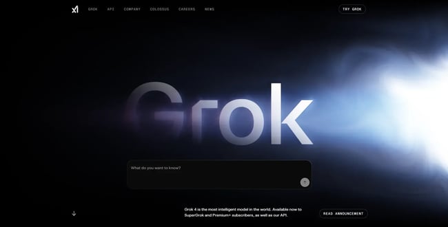
What I like: xAI’s Grok site has become my favorite UI so far. It feels like it was designed by aliens! This is so futuristic and dynamic. Exactly the vibe it’s going for.
When I first opened the page, the word “Grok” appeared like a planet emerging from a solar flare, surrounded by a glowing blue nebula that shifts and ripples in real time. Move your mouse even slightly, and it tracks your movement like a living aurora. The light responds almost as if the site itself were alive.
The copy “Understand the universe” sits just above a simple black chat box. It’s bold and minimal, yet it perfectly captures the product’s purpose.
As you scroll, the site flows through xAI’s universe, Grok, the API, Colossus, company vision, careers, and news. The middle orbital shape with multiple questions allows you to go straight to Grok AI chat to find the answers.
Even the navigation reflects the site’s simplicity. Small micro-interactions, such as hovering buttons, text pulses, and light shifts, keep everything feeling responsive and alive.
Grok’s website doesn’t just showcase AI. It also feels like AI. Every animation, transition, and reactive glow reflects the sheer intelligence and precision of the technology behind it.
9. Size.
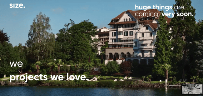
What I like: Size’s website is bold and simple at the same time. Right away, it opens with a full-screen background video, showing awesome shots of buildings, rooms, and designs they’ve designed and developed.
One thing I really like is the menu. Instead of a bunch of buttons, there’s just one that takes you straight to their portfolio. From there, you can check out all their work. When you click on a project, it doesn’t load a new page. Instead, it opens smoothly, like a slide-in or modal overlay with animation transitions.
The combination of video, parallax scrolling, fade-ins, and subtle motion effects makes you forget you’re on a website. It feels more like an interactive presentation.
Keeping a website minimalistic is a brave choice, but it really works. Every animation, from the loading screen to the page transitions, feels intentional and fluid. Size shows that sometimes less is more on the surface, while more is more underneath.
The entire site looks simple yet feels incredibly high-tech and creative. It left a strong impression on me and made their brand feel bold, confident, and smart.
10. Active Theory
What I like: The Active Theory website didn’t feel like a normal portfolio to me. It's more like I had stepped inside a digital art piece that kept shifting as I moved through it.
Every scroll changed the lighting, the shapes, and the way the visuals reacted to my cursor. What impressed me most was how the site blends 3D graphics with fluid transitions. One moment you’re looking at a clean section with project thumbnails, and the next you’re dropped into an immersive scene showing off the work. Nothing ever feels static.
Everything has a purpose and responds to the way you interact with it. As I explored more pages, the design stayed consistent with its cinematic transitions. It’s the kind of website where you don’t realize how much time you’ve spent on it because each interaction pulls you deeper in.
In this case, I must admit that dynamic design doesn’t always mean personalization. Sometimes it is the motion itself that keeps you engaged.
11. Lusion
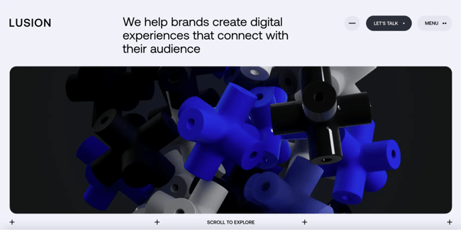
What I like: The Lusion website gave me an insane experience! I felt I was in a movie theater watching a sci-fi movie rather than going through their portfolio.
The moment I landed on the page, the visuals shifted with my scroll, and the background shapes reacted gently to my movements. It felt like the whole site was breathing with me. I really enjoyed the interactive astronaut further down the page — it was an extraordinary experience.
As I explored, each section opened with soft animations that never tried too hard. Text slid in like it was meant to guide me, and 3D elements faded into view without breaking the flow.
It had that rare balance where every motion felt intentional, not flashy.
The website told a story without saying much. Clicking a project didn’t load another static page. Instead, the layout reshaped itself, the visuals moved around me, and I felt like I was being pulled into the work rather than being shown a portfolio.
The entire design feels dynamic in a quiet, confident way. Nothing screams for attention, but everything responds. I left the site feeling like I had experienced the brand, not just browsed it.
12. Dockyard Social
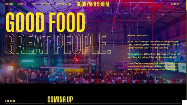
What I like: Dockyard Social’s website is a dynamic website full of color and life, perfectly matching the food market it represents. The full-screen photo splashed with bold text that reads “Good Food, Great People.” It’s bright, loud, and full of personality.
I can scroll down to the text animation that drifts across the screen with “What’s it all about?” It moves slowly, almost inviting me to scroll. The page transitions smoothly into clean white sections that explain what Dockyard Social is.
Each one is layered over moving backgrounds or looping clips, and the combination of live imagery and text creates a parallax effect that makes the site feel alive.
Further down, the food vendors take center stage. A bright image carousel showcases mouthwatering street food, including burgers, sushi, and nachos, all photographed in close-up detail. When I hover over each vendor’s logo, an image of their signature food shows up. It’s simple but engaging, and I want to keep scrolling to see what happens next.
One of my favorite parts was the events calendar. Instead of a boring list, it shows events on a timeline you can drag or swipe. I moved it left and right to check out weekend events, such as Halloween Drag Bingo and rugby game viewings.
The menus at the top also stay in place while you scroll. The logo gets smaller and the background color shifts, which adds a nice touch and keeps things feeling smooth.
13. Reflexion
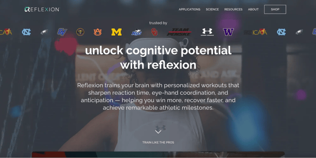
What I like: Reflexion’s website homepage opens with a video of athletes using Reflexion’s lightboard and headset, overlaid with a bold line that reads “Unlock Cognitive Potential with Reflexion.”
Initially, the video plays within a framed section, but as the text fades, it expands to fill the entire screen. The effect feels cinematic, like you’re stepping directly into the action.
I didn’t even have to click anything to understand the product. The site was already showing me.
The website uses images that slide in, headlines that fade up, and icons that animate as they appear. Each scroll feels purposeful. Every little movement adds clarity to what Reflexion does.
The site also uses dynamic social proof. Logos of professional teams and universities appear in a subtle marquee, followed by testimonials on a moving carousel. The design is really clean and modern. Most of the background is white, and the text is bold and black. That makes the videos and animations stand out more.
They use bright blue and yellow only in a few spots, which helps your eyes know where to look without feeling too busy. Moreover, every other page features a similar dynamic design, with videos playing in the background. So the design is consistent throughout the website.
14. Top10
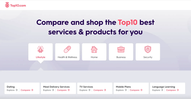
What I like: Top10.com proves that comparison sites don’t have to feel overwhelming or spammy. From the moment I landed, the design felt calm and organized, with lots of soft blues, white space, and rounded edges that made browsing surprisingly relaxing.
The homepage immediately shows what’s trending. There’s a “Top 10 Trending Lists” section with topics like “Best Web Hosting Providers 2025” or “Best Online Therapy Services 2025.” Each list shows when it was last updated, and many are recent, which gives the impression that the site is constantly refreshed behind the scenes.
When I clicked into a list, I found tables that allowed me to compare options. I could click to see more details, filter by features, or even slide a little bar to change what mattered most to me.
The rankings changed as I adjusted things, which helped me find the best option for me, not just the top pick for everyone. The footer and main menu list all the categories from dating and business software to security and travel.
Hovering or clicking opens mega-menus with subtopics and featured articles that slide in gently. It feels structured yet fluid, letting you explore without feeling lost.
At one point, a small widget popped up asking if I needed help choosing a VPN. It was actually a short quiz that recommended a provider based on my answers. It was fast, surprisingly accurate, and made the experience feel more interactive.
15. Advisor
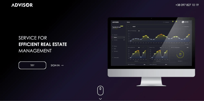
What I like: Advisor’s website has completely changed my idea of what a corporate software site should be. It’s made for automating property management. Not the most exciting niche, but it’s one of the most creative and dynamic corporate designs I’ve seen.
It starts with a fun loading screen. The word “HELLO” shows up letter by letter, then it says, “I AM YOUR ADVISOR” in a glowing, futuristic font. It sets a techy, modern vibe right away.
The main part of the site is built around an A–Z theme. Each letter represents a feature, such as A for Automatic Data Collection, B for Monitoring Comfort, and so on.
As I scrolled, each section faded or slid into view with its own motion pattern. It felt like watching an animated storyboard that explains the product’s logic one frame at a time.
There are also a few interactive details throughout. Icons move, background shapes float around, and one cool graphic of a building lights up floor by floor as the text explains how it tracks different levels.
Even the loading animation is custom. It’s not just a spinning circle. It also matches the rest of the site’s style and feels like part of the experience. In one part, lines are drawn between sensors and cloud gateways to illustrate how data is transmitted. It’s a smart way to explain something pretty complex.
The navigation bar is sticky, but its appearance changes slightly as you scroll. The header gets smaller, and the logo has a tiny animation. Everything is smooth, clear, and helps you understand what Advisor does.
16. Educated Guess
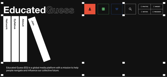
What I like: Educated Guess’s website throws out the rulebook of web layouts and is one of the most creative websites I’ve ever seen. The site literally looks like a book rack. The left side features a column with the navigation menu, and the right side displays the content.
The left navigation is stacked vertically, featuring menu buttons such as Network, Syllabus, About, and Join. Each is styled in a way that resembles the spine of a book on a shelf. The coolest thing is that when you click on one of those menu items on the left, it doesn’t take you to a new page. Instead, it changes only the left side of the page area to show that section.
If you clicked on one of the sub-links in the right content, it would either open in the same right pane or split into even more sub-sections. It’s really smart that this design lets me work on two panes at the same time.
Visually, the site features a simple design with black text on a white background, using accent colors for highlights and links. It depends on the layouts rather than the flashy graphics.
The Educated Guess website design seems like a game-changer. Although the UX may seem quite difficult to grasp at first, the UI is certainly not something you typically encounter every day.
Ready to take your visitors through a dynamic experience?
After exploring these examples, one thing I can say for certain is that dynamic web design is the way to go if you want to impress and engage today’s visitors.
Sure, anyone can throw in some cool animations. However, I’ve learned that it takes deep understanding to create animations that fit the story and flow smoothly. Every hover effect, content carousel, real-time update, or personalized recommendation is there to either delight the user or make their journey easier — or both!
Now, as someone who’s built and tweaked websites, I can practically hear your brain churning with ideas. Turn that boring UI into an interactive experience!
I’ve seen how dynamic features can turn visitors from scrolling to getting involved. And when users are engaged, they stay longer, which helps them trust what you’ve built.
Editor's note: This post was originally published in December 2023 and has been updated for comprehensiveness.
Free Website Design Inspiration Guide
77 Brilliant Examples of Homepages, Blogs & Landing Pages to Inspire You
- Agency Pages
- Ecommerce Pages
- Tech Company Pages
- And More!
Download Free
All fields are required.
Website Design Examples

![15 black and white website designs to inspire your own [+ pro tips]](https://53.fs1.hubspotusercontent-na1.net/hubfs/53/black-and-white-website-design-1-20250520-1336267.webp)

![Gradient Website Design Examples That Prove This Trend Is Far From Over [+Tutorials]](https://lh7-us.googleusercontent.com/htOWIbyCIoCMxSjC4gJunkGnhCzXpccjTrL8NwoGdRdCsSiEmEAxe_qBFkMrzy2Y8d3cwEr_DMzSGHq9Xi-hQFnMJCo8HDQJ1yQGigcSfFxI2QKXo0s7xXSB2sY-eALG1iUqnHXgomcDsnp7AHRSH1s)
![15 Brochure Website Examples to Inspire You [+ How to Make One]](https://53.fs1.hubspotusercontent-na1.net/hubfs/53/brochure-website-examples-1-20250319-362228.webp)
![28 Types of Websites to Inspire You [+ Real-Life Examples]](https://53.fs1.hubspotusercontent-na1.net/hubfs/53/types-of-websites.png)

![10 of my favorite interactive websites [+ how I make my own]](https://53.fs1.hubspotusercontent-na1.net/hubfs/53/%5BUse%20(1)-Sep-27-2025-03-02-58-8817-PM.webp)
![30 Furniture Website Design Examples I Love [+ How To Make Your Own]](https://53.fs1.hubspotusercontent-na1.net/hubfs/53/Google%20Drive%20Integration/furniture%20website%20design_32023-1.png)