.png?width=112&height=112&name=Image%20Hackathon%20%E2%80%93%20Vertical%20(50).png)
An event website isn‘t just a place to share dates and speakers. It’s a positioning tool that builds credibility, communicates value, and reduces the hesitation that keeps potential attendees from clicking register. Across dozens of event platforms, the strongest sites prioritize clarity over decoration and make registration feel simple and inevitable.
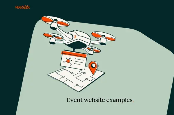
In this guide, I'll walk through 20 event websites, explain what makes them effective, and share tips for designing your own event website with the same strategic foundation.
Table of Contents
Best Event Websites
- The New Yorker Festival
- Inbound
- Dreamforce
- New York Film Festival
- SXSW Conference
- LWT
- Summit Series
- Smorgasburg
- Boston Calling
- Bloomberg Live
- Newport Folk Festival
- Swiftogeddon
- TEDx Events
- The Other Art Fair
- Brooklyn Book Festival
- All Things Go Music Festival
- Chicago Marathon
- Sundance Film Festival
- Cannes Advertising Festival
- Boardmasters
1. The New Yorker Festival

The New Yorker’s festival website reflects the publication’s editorial authority. The restrained design, dark artistic background, and subtle animations create an intellectual atmosphere that mirrors the brand itself.
In my experience reviewing cultural event websites, authority-driven brands perform best when they avoid overselling and instead focus on their legacy.
What makes this event website effective is its alignment with the brand. Every visual choice reinforces heritage and credibility, which is essential when selling tickets to conversations and ideas rather than entertainment alone.
What I like: The site proves you don’t need reinvention to stay relevant. Consistent branding builds long-term trust, and trust drives ticket purchases.
2. Inbound

HubSpot’s INBOUND event website is a masterclass in hierarchy. The hero section clearly presents the event name, date, location, and a bold “Register Now” CTA above the fold.
From a conversion standpoint, this reduces friction immediately. Visitors don’t have to search for basic information, which supports faster decision-making.
What I like: The primary CTA appears instantly on both desktop and mobile, which likely improves conversions significantly during high-traffic launch periods.
3. Dreamforce

Salesforce’s Dreamforce website sets the benchmark for large-scale conference design. A dynamic hero video draws users in emotionally before transitioning into modular content blocks that organize thousands of sessions.
Despite the massive volume of content, the layout avoids cognitive overload through spacing, consistent card design, and clear category segmentation.
From what I’ve seen, large-scale event websites often collapse under their own content weight. Dreamforce shows how a strong structure can prevent that.
What I like: This landing page is precisely designed to overwhelm you. The site feels warm, lively, and welcoming as an event space.
4. New York Film Festival

The NYFF landing page is all about simplicity and clarity. It feels more like a cultural publication than a typical event site. Key actions — such as exploring the lineup, browsing past editions, or becoming a member — are naturally integrated into the website flow.
This works strategically because film audiences often care about artistic credibility. The site positions the festival as a cultural institution rather than just a weekend event.
What I like: It builds prestige first and urgency second, which is a smart approach for events driven by cultural value.
5. SXSW Conference

SXSW is an enormous conference for global creatives. It connects the worlds of music, tech, film, culture, and more, all rolled into one. Connecting so many diverse interests into a single event website requires perfect alignment, and the designers did a fantastic job.
The SXSW event website design is colorful and vibrant. The typography and spacing establish a hierarchy that supports its multi-track structure and an exciting video at the top of the landing page, highlighting recent years' top moments.
You can easily find key information such as dates, locations, and ticket options. The layout stays flexible and easy to scan, even with a lot of content. Navigation feels smooth, and the design avoids unnecessary flair, which makes the page feel professional rather than promotional.
What I like: The balance between energy and organization makes the site exciting without sacrificing usability.
6. LWT (Lesbians Who Tech) Squad Summit

The LWTSquad Summit website is an artistic representation of energy and enthusiasm. The whole website is full of LWTSquad’s activities, plans, people, and programs. Instead of a header image, they used a video cycling through the amazing, happy moments from previous events.
Hovering over a speaker's headshot displays their name and a link to learn more or register for their talk. Scrolling triggers smooth transitions of elements onto the page, adding a lively feel.
From working on community-driven events, I’ve found that clearly highlighting speakers increases session-level engagement and perceived value.
What I like: The branding and energy of this site are fantastic. LWTSquad Summit consistently uses bold colors from the Pride flag to create a cohesive look. The design makes it fun for people of all interests.
7. Summit Series

Leadership summits are usually suits and a corporate vibe, but Summit Series flips that expectation on its head. When I went to that website, I felt like I had walked into an art exhibit!
The design leans into a retro-cool, vaporwave-inspired collage style. On the homepage, you might see surreal landscapes mixed with photos from Summit’s past retreats. It’s visually amazing and immediately tells me that Summit is not a typical stuffy conference.
What I like: It uses design as a form of positioning. Before reading a word, you understand this isn’t a typical business conference.
8. Smorgasburg

Smorgasburg is a popular food festival, and its website is both delightful and performance-optimized. One clever trick I noticed was a simple “Welcome” message on a plain-colored background, which then transitions into a full-bleed photo of the bustling food market.
Smorgasburg’s site doesn’t over-complicate things. The content is focused on what matters (when, where, what food to expect). It's straightforward with locations and times, vendor lists, and an email subscription button.
In my experience, simplicity has a positive impact on outperforming heavy animation on mobile devices, largely for location-based events.
What I like: It‘s the perfect reflection of minimalist web design principles. Regardless of it being a food festival, there aren’t many photos of the food on the website, only of people, which shows it's about culture.
9. Boston Calling

Boston Calling, a major music festival in Boston, greets you with an immediate rush of excitement via its website. The homepage opens with a heartfelt letter to the fans, the big stages, and the lively audience, with a musician performing in the background.
It’s the kind of intro that gives me goosebumps, as I am a musician and have been to music festivals all my life. The site’s design has a fun, slightly edgy vibe but remains easy to navigate with menu tabs for Lineup, Tickets, Info, and Past Highlights.
I’ve seen email list placement directly impact ticket sell-outs in cases when lineups are released in waves. This strategy supports long-term growth.
What I like: The design is fun and whimsical without being hard to use. I also appreciate the consistent branding of every element, from the fonts to the color scheme.
10. Bloomberg Live Events

Bloomberg is a well-known source for serious business and market news, and its Bloomberg Live events site maintains a professional, data-driven tone with a minimalistic approach.
Instead of flashy animations or videos, the homepage presents a clean grid of upcoming events. Each event is listed by name and topic (for example, “Bloomberg Invest:”), set against a simple white or subtle patterned background.
If you are going for high-level executive audiences, clarity and trust matter more than spectacle. That’s something I’ve learned working and observing B2B event websites over time.
What I like: The website isn’t crowded, so you can focus on the content.
11. Newport Folk Festival

Newport Folk Festival’s website understands that the stars of a music festival are the performers and the music itself. The homepage features an engaging gallery of images from past festivals — legendary artists and newcomers alike performing on stage.
Many of these images have a play button overlay, and clicking one takes you to a YouTube video of that performance. As a music fan, I love this feature because it lets me experience a bit of the festival right on the site and gets me excited about who might perform next.
Since Newport Folk often sells out and has surprise guest performers, they know their audience doesn’t want to miss news. The navigation menu is simple with options to view the lineup, buy tickets, learn about the festival’s history, and even shop festival merch.
What I like: The Newport Folk event website feels alive and interactive. I like how they transform their website from a static brochure to a living community by incorporating video clips.
12. Swiftogeddon

Swiftogeddon's site is a masterclass in understanding your audience. The homepage literally states, “Swiftogeddon is a night run by fans, for fans to come together and worship at the altar of Taylor Swift: non-stop Swiftie all night.”
This enthusiastic copy immediately sets the tone for the Swifties. The design features a lofty photo of the fans dancing on the floor. It‘s like a ballroom, which is totally on point for this event’s playful branding.
The rest of the site is pretty simple. Photos of the previous events. Email subscription option to receive the dates and locations of upcoming Swiftogeddon club nights across the U.K., along with links to tickets.
What I like: Knowing and speaking your niche audience‘s language is sometimes the best design strategy. The site may not be fancy or high-tech, but it doesn’t need to be. It‘s authentic, and that’s why it works.
13. TEDx events

TEDx events are independently organized all around the world, but the main TEDx website ties them all together. The design, overall, is what you’d expect from TED: clean, modern, with a bold red accent color and the classic TED font.
When I visited the TEDx site, I was greeted by a world map dotted with pins marking upcoming TEDx events across every continent. I could zoom in on my region to see if any TEDx talks were happening nearby.
Even though each TEDx is run separately, the site provides a cohesive brand experience, and each event page follows a similar template. You can filter events by type (community, university, etc.) or date, making it easy to find a talk that interests you.
What I like: I admire the brand consistency and identity while featuring local content. No matter if it’s TEDx in New York or Nairobi, the website design makes it feel part of the same family.
14. The Other Art Fair

The Other Art Fair hosts multiple art fairs across cities like London, Brooklyn, Los Angeles, and Sydney, and its website showcases each upcoming fair as a card with a striking piece of artwork.
Once you click through, you get all the details, such as venue location with photos of the space, event dates, a list of exhibiting artists, ticket info, and even highlights of special installations or sponsors.
The site's aesthetic is modern and eclectic, which suits an event that showcases emerging, independent artists. There’s also an online shop integration for buying art from past fairs, extending the event’s experience year-round.
What I like: The site makes it effortless to navigate multiple events. I can quickly switch between city fairs and get the info I need, all while enjoying beautiful visuals of art.
15. Brooklyn Book Festival

I think The Brooklyn Book Festival‘s website is one of the clearest examples that simple doesn’t mean boring. It comes with simple, illustrative graphics that use the festival's signature color scheme throughout the site.
What I love is how consistent the visual branding is. Every page you click, from “Authors” to “Volunteer,” continues that same color motif and clean layout. There's also custom artwork displayed prominently, which gives the site character and local flavor.
What I like: As a book freak, the Brooklyn Book Festival site makes me crave being there. It‘s proof that you don’t need bells and whistles to be effective.
16. All Things Go Music Festival

The All Things Go Music Festival website caught my attention with its serene and dreamy aesthetic. Instead of a rock-and-roll motif, it opts for a soft color palette that was unexpected for a music fest.
The festival‘s lineup is presented as a stylised poster graphic, with band names and artists typed out in a cool font, headliners large and opening acts small. It immediately tells me who’s playing and sets the mood.
What I like: I appreciate the poster-style lineup display, which doubles as art and information. The whole site feels calm and organized, so that I can have a calm mental preparation for the festival day.
17. Chicago Marathon

The Bank of America Chicago Marathon‘s website is a great example of how a sponsor’s brand should be perfectly aligned with the event. The color scheme prominently features Bank of America's red and blue.
The homepage features an image carousel of runners. You can almost feel the emotion and achievement, which immediately connects you to what the marathon is about.
There are quick links for runner registration, course maps, spectator guides, and past results. The marathon organizers know many visitors come for very specific info, so those answers are one or two clicks away at most.
What I like: The site remains simple to navigate at an event of this magnitude, which is critical when thousands of people are searching for information.
18. Sundance Film Festival

The Sundance Film Festival’s website has been light, airy, and modern. The homepage features an image carousel that might showcase scenes and news from recent events.
The navigation is extremely user-friendly, which is important for an event website. I was happy to see the subscription button at the bottom with a graceful design. This kind of content anticipates user needs.
What I like: The balance of inspiration and practical info is spot-on. Overall, the site feels both glamorous and welcoming, which is exactly the vibe Sundance aims for.
19. Cannes Lions Advertising Festival

The Cannes Lions festival (often called the Oscars of advertising) has a website that efficiently delivers a lot of necessary information without feeling cluttered. It keeps their basic information like speakers, program details, experience, and most importantly, the CTA to buy passes at the center.
Visual design-wise, the site uses the Cannes Lions logo and colors (blue and white) heavily, and includes photos of past award ceremonies, workshops, and networking parties to give a flavor of the experience.
What I like: It’s very user-centric. Everything I might need as a prospective attendee or entrant, such as pricing, travel info, and schedule, is either on the homepage or one click away.
20. Boardmasters

Boardmasters is a multi-day festival built around surf culture, sound, and seaside escape with a major live music lineup on the Cornish coast. The homepage's bold, full-width coastal imagery and clear value proposition convey surf-meets-music culture.
The design stands out and strikes a balance between liveliness and storytelling, with functional event details. It makes users feel connected to the brand and allows them to quickly access essential information.
What I like: What I like most is the balance between lifestyle storytelling and clear navigation. I can instantly see the visuals on the Cornish coast, and it feels immersive without being chaotic.
How to Design an Event Website
Designing an event website that converts requires more than a good-looking template. It needs a clear structure, the right platform, and intentional design decisions that guide visitors from curiosity to registration. Here are the key steps to follow
1. Source different forms of inspiration.
The first thing is to dive deep into your brand‘s personality and understand its characteristics. Your event website should reflect your brand’s personality and appeal to your target attendees.
Start getting ideas that reflect your vision. I often start by creating a mood board of elements I love from other sites' images, color schemes, layouts, and even small interface details. Then think about what kind of experience you want to create.
For example, if you‘re running a tech conference, you might draw inspiration from sites like INBOUND or Dreamforce that use dynamic content. If it’s a community festival, perhaps a simple, colorful approach like the Brooklyn Book Festival site would work.
2. Pick the right software for your needs.
Decide on the website platform or content management system (CMS) you’ll use to build the site. This is a crucial step that can impact how easily you can implement your design ideas.
If you’re not a developer, website builders or CMS options like HubSpot’s CMS, WordPress (with event themes/plugins), Wix, or Squarespace can be great because they often have pre-made templates for events.
In my experience, it’s worth investing time in testing a couple of platforms with a mock page. If you start using a CMS without knowing it and then have to switch platforms in a few days, that would be extra work. So learn from your mistakes or choose wisely early on!
3. Select a theme or template.
An event theme or template lets you quickly transform the appearance and atmosphere of your site without having to build everything from scratch. It typically includes layouts and features tailored specifically for event websites. For instance, you might look for a theme or template that offers:
- Clickable social media links.
- CTAs for registering on every page.
- CTAs for registering to be a speaker.
- Customizable text-based price and event packages.
- Forms for Q&A and other inquiries.
- Multiple areas for location and contact information, including website footer.
- Image and video backgrounds.
Having these features or add-ons will ensure you can create a custom design with little to no coding.
4. Customize your design.
Customization is where brand identity meets usability.
Yes, you should align fonts, colors, and imagery with your brand. Replace stock images with real event photography. Upload clear pricing details. Add social proof.
But every design choice should answer one question: Does this help someone register faster?
Avoid decorative elements that distract from the primary action. Most visitors are looking for Tickets, Agenda, Speakers, or Location. Make those obvious.
Design should reduce hesitation, not introduce it.
5. Integrate an event registration system.
To streamline your booking process, you can integrate an online registration system, such as Weezevent, which offers tailored minisites for event organizers. Your attendees can easily get tickets, and you don’t have to worry about keeping track of all your appointments.
Create an Event Website That Engages Visitors
Every event website on this list varies in tone, audience, and size, but the best ones share a foundation of clarity, structure, and intent. In my experience, the distinction between a visually appealing event website and a high-performing one is rarely aesthetic. It‘s structural. It’s how quickly visitors find dates, understand value, and feel confident registering. It's how well the site balances inspiration with logistics.
When building an event website, the most useful starting point isn‘t colors or animations. It’s understanding what the audience needs within the first five seconds, what might make them hesitate, and how to remove that friction before it costs a registration. Design supports emotion, and structure drives conversion. When those two elements work together, the website becomes the engine behind the event's growth.
.png)
Free Website Design Inspiration Guide
77 Brilliant Examples of Homepages, Blogs & Landing Pages to Inspire You
- Agency Pages
- Ecommerce Pages
- Tech Company Pages
- And More!
Download Free
All fields are required.
Form not available
Website Design Examples


![15 black and white website designs to inspire your own [+ pro tips]](https://53.fs1.hubspotusercontent-na1.net/hubfs/53/black-and-white-website-design-1-20250520-1336267.webp)

![Gradient Website Design Examples That Prove This Trend Is Far From Over [+Tutorials]](https://lh7-us.googleusercontent.com/htOWIbyCIoCMxSjC4gJunkGnhCzXpccjTrL8NwoGdRdCsSiEmEAxe_qBFkMrzy2Y8d3cwEr_DMzSGHq9Xi-hQFnMJCo8HDQJ1yQGigcSfFxI2QKXo0s7xXSB2sY-eALG1iUqnHXgomcDsnp7AHRSH1s)
![15 Brochure Website Examples to Inspire You [+ How to Make One]](https://53.fs1.hubspotusercontent-na1.net/hubfs/53/brochure-website-examples-1-20250319-362228.webp)
![28 Types of Websites to Inspire You [+ Real-Life Examples]](https://53.fs1.hubspotusercontent-na1.net/hubfs/53/types-of-websites.png)

