.png?width=112&height=112&name=Image%20Hackathon%20%E2%80%93%20Vertical%20(50).png)
In this blog post, we'll look at 24 hair salon websites and highlight key elements for creating an optimal online presence.
Best Hair Salon Websites
- Yukie Natori New York Salon and Spa
- La Maison
- Tiara Salon
- Avanti
- Barrow
- Amaci
- Curl
- Wild Honey
- Ginger and Maude
- Meche
- Nova Arts
- Deseo Salon and Blowdry
- House of Dear
- The Upper Hand
- Oxana
- Beauty Studio
- Shine the Heights
- Bishops Cuts/Color
- Chaz Dean Studio
- Salon Royale
- Coiffurium Salon
- Undone Salon
- Akari Salon and Spa

HubSpot's Free Website Builder
Create and customize your own business website with an easy drag-and-drop website builder.
- Build a website without any coding skills.
- Pre-built themes and templates.
- Built-in marketing tools and features.
- And more!
1. Yukie Natori New York Salon and Spa

Located in the heart of the action in Midtown Manhattan, Yukie Natori’s website reflects the luxury, glitz, and glamor of the City that Never Sleeps. Your website only has a split second to make your first impression, and that’s where this website excels.
Everything is in the first few modules. The navigation bar and the “Services We Offer” section quickly show the visitor how to find more information on the services they’re looking for.
What we love: Their eye-catching hero image also has a slight rippling animation, adding a bit of movement to what could have just been a static image.
2. La Maison Salon and Spa
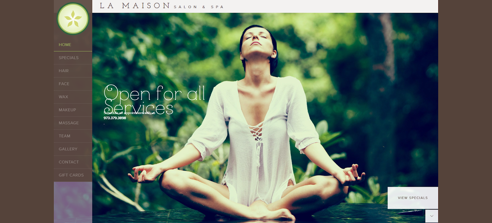
Everything about New Jersey’s La Maison Spa website design emphasizes relaxation and self-care. The color palette, image choices, and other design elements blend seamlessly together to emphasize this feeling.
Their imagery is front and center on the homepage, with large block designs filling the screen. The labels are all perfectly contrasted, so they are easy to read. This leaves no doubt as to what the visitor is looking at nor where they will end up should they click a link.
What we like: As visitors scroll, the navigation bar scrolls with them so they can always dive into a particular service they are interested in.
3. Tiara Salon

Illinois-based Tiara takes a minimalist approach to their website design. They put their images front and center and let them make a clear first impression on the visitor. Visitors are greeted by a carousel of various images showing people of all genders and ages, showcasing without words that they welcome everyone.
What we like: Their website continues this approach with clear, concise text that tells the visitor exactly what they need to know in as clear of language as possible.
4. Avanti Salon

Newbury Street in Boston is an elegant, luxurious shopping center catering to those looking for top-of-the-line. Avanti’s modern and stylish website design sticks to a very black-and-white color palette, making any colors in the imagery, especially hair, pop on the page.
In contrast with some of the other salons listed here, Avanti puts their stylists' information front and center, reassuring potential clients that they are in the hands of experts.
What we like: Their services pages take a similar approach and go into specific details about each treatment.
5. Barrow Salon

Sometimes, differentiation means taking a different approach than everyone else. Instead of focusing purely on showing off previous work, Barrow Salon in San Francisco showcases its gorgeous location in the Dogpatch neighborhood.
This gives first-time visitors a real feeling of what it would be like to have their hair done in that location.
What we like: Coupled with a clean, sleek design with easy-to-navigate pages, Barrow’s design oozes coolness, which is exactly in line with the vibe of owner and stylist Michelle Snyder.
6. Amaci Salon
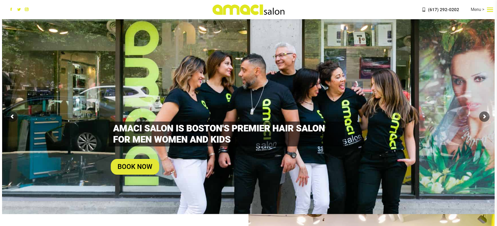
Another change of pace from purely showing off previous work, Amaci Salon lets the owners and operators take front and center in a natural, candid photograph. This makes the salon feel like a real place staffed by real people.
The website features a color palette that pops off the page with a modular, blocky style that similarly draws the eye.
What we like: There are interactive elements across the page, so it feels like interacting with a website and not just looking at a digital brochure.
7. Curl Kitchen

Curly hair has a reputation for being notoriously difficult to manage and style, making salons that specialize in it hard to come by. Curl Kitchen out of Chicago puts this front and center on their website, letting visitors know they are experts in this arena.
What we like: Their site features a flowing, whimsical design that is still easy to navigate with a light pastel palette that contrasts nicely with the text and featured images of previous work.
8. Wild Honey

What we like: Visitors come to your salon’s website with a goal. Your website should give them all the information they need as clearly as possible. Wild Honey out of San Diego offers everything a first-time visitor would need to know without leaving the homepage, including several options for booking an appointment.
9. Ginger & Maude

Done well, video can be an highly effective scroll stopper. Ginger & Maude’s first impression is a short video loop that captures attention without being distracting.
Their mission says, "We don’t just love hair, we love people." This takes center stage with several options to book an appointment right away.
What we like: The text contrasts with the video in the background and makes it easy to see exactly what the visitor is supposed to pay attention to.
10. Mèche Salon

Meche Salon offers another excellent use of video, this time in multiple places across the page. Visitors to the LA-based Mèche are greeted first by a video reel of the salon in action.
Even their “about us” section offers a video, which helps potential clients feel like they’re getting to know the proprietors.
What we love: Lots of movement is incorporated throughout the website, with interactive elements on every page.
12. Nova Arts Salon

Creating a consistent website experience that reflects the business’ mission and goals should be priority number one for salons or any business. Beyond just being a hair salon, Nova Arts of Los Angeles has an artistic angle that comes through in its photography choices, website content, and design choices.
What we like: The site features an off-kilter design that reflects these artistic sensibilities well, with pages featuring asymmetric elements and careful use of white space.
.png)
Free Website Design Inspiration Guide
77 Brilliant Examples of Homepages, Blogs & Landing Pages to Inspire You
- Agency Pages
- Ecommerce Pages
- Tech Company Pages
- And More!
Download Free
All fields are required.
Form not available
13. Deseo Salon & BlowDry

Every word on your website should be there for a reason. Denver hair salon Deseo has this present across the board. Its pages are chocked full of content that helps visitors get more information about its services. The site also speaks to the salon's luxury experience.
What we like: The headline on their homepage (“because it has to be perfect”) isn’t about the hair salon itself. It’s speaking directly to a potential new client's concerns.
14. House of Dear

Adding elements that give the illusion of texture can help draw visual interest and differentiate between elements on the page. House of Dear in Dallas uses this well to draw attention to particular pieces of information or emphasize certain aspects of the site, such as navigation menus or call-to-action buttons.
What we like: Their overall design opts for the horizontal module approach, where clear demarcations between sections stretch across the entire screen. This makes it easy to see what you should pay attention to no matter where you are on the site.
15. The Upper Hand

One of the biggest obstacles websites have (especially for brick-and-mortar businesses like salons) is proving to the visitor why they should visit their location rather than others. Dallas-based salon Upper Hand puts its social proof front and center when potential clients land on their page, showing off their accolades.
What we like: The salon allows clients to connect on their chosen social media network. Keep in mind that whenever you’re offering social media options to your site visitors, you should always ensure that those pages are updated consistently.
16. Oxana Salon

What we like: Many of the salons on this list have opted for the traditional static navigation bar at the top of the page. Another option that is worth exploring is the so-called “hamburger menu.” This provides visitors with a visual cue to signify where the user needs to go to explore the website further, which can improve overall user experience and help lead users down a logical path.
17. Beauty Studio

Your website offers a great way of explaining your more custom offerings in a clean, easy-to-follow way. For instance, Las Vegas salon Beauty Studio offers a “we come to you package” where their stylists come to wherever you are in the area.
Their homepage outlines this in a numbered format, making it seem simple, easy, and frictionless.
What we like: Showcasing your unique product offerings is another way to leverage your salon’s website to drive more appointments from potential new clients.
18. Shine the Heights

The worst thing that can happen when someone visits your website is that they think they’ve seen everything, but there’s still more room to scroll. Houston’s Shine the Heights salon signals that there’s plenty more to read by using arrows.
What we like: The arrows encourage people to see what else the website offers instead of jumping for that back button on their browsers.
19. Bishops Cuts/Color

While it sometimes sneaks below the conscious mind, typography on a website can be an important part of design. It helps to set the tone and style of the site and can draw attention to particular pieces of information or create an emotional connection with the user.
What we like: The bold typographic choices made by Bishops Cuts/Color make it stand out and make a bold statement about its brand. Likewise, it makes it easy to read on any device, ensuring visitors know exactly what they’re looking at.
20.Chaz Dean Studio
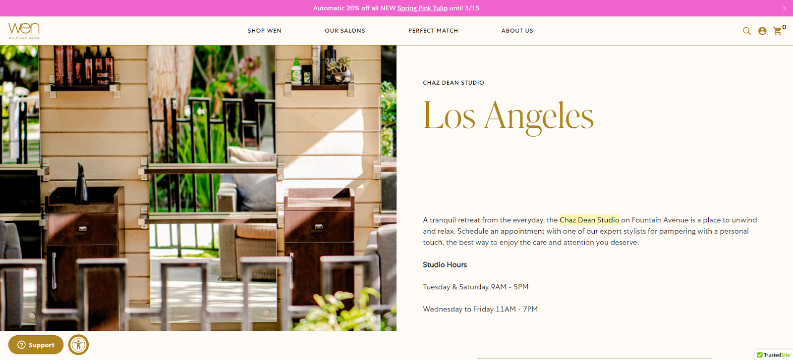
When most visitors hit a webpage, they go from left to right, then top to bottom, as they read in what is called an “F-pattern.”Chaz Dean ’s website is designed to take advantage of this reading pattern. Their website has imagery loaded on the left side of the page while the important information is on the right.
What we like: The visitor's eye is drawn to the image at first. Then, as they read across the page, they see the information they’re looking for, such as hours or services.
21. Salon Royale

Rule number one of your website is that it should be written with your audience in mind. There aren’t any other important rules. One of the things that Salon Royale in Pittsburgh does exceptionally well is embedding its social media presence front and center on its website.
Pro tip: If your ideal audience spends more time on Instagram than Google, be sure you’re accommodating that in your website design. When people visit your website, they’re far more likely to continue interacting with your brand if you’ve got their preferred channels on the page.
22. Coiffurium Salon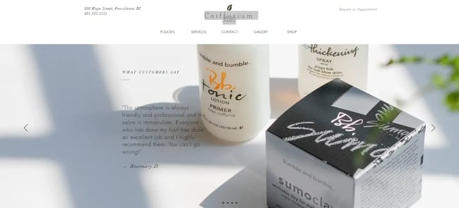
No matter how things change in the world, one thing will remain consistent: People will always look to other people for their opinion as they’re exploring something new. Case in point: Coiffurium in Providence, RI, capitalizes on this idea by putting customer stories front and center on their carousel images on their homepage.
What we like: Coiffurium includes a Google reviews module at the bottom of the page that keeps recent reviews front and center.
23. Undone Salon

What we like: Undone Salon’s blog gives them a great way to showcase the work they’ve done, highlight services and products, share tips and advice, create engaging content, and more. Any hair salon could benefit from an ongoing blog to build customer relationships, establish trust, and bolster credibility. All these things together can help draw clients' attention.
24. Akari Salon & Spa

A clear visual hierarchy on a website is a must. This means having it designed so that the eye is drawn to one element over another in a particular order.
For instance, the eye is first drawn to the person when looking at Portland, Maine-based Akari Salon & Spa. Then, you see the headline “self-care is important” and a CTA to book an appointment before exploring the rest of the page.
Pro tip: Working with a professional designer can help you emphasize the right elements on the page at any time.
HubSpot's Free Website Builder
Create and customize your own business website with an easy drag-and-drop website builder.
- Build a website without any coding skills.
- Pre-built themes and templates.
- Built-in marketing tools and features.
- And more!
How to Design a Hair Salon Website
Much like a haircut can make a particular first impression, so should a hair salon's website design. This only underscores the importance of having a well-designed, user-friendly website that puts your salon’s personality and talent front and center while making it easy for current and potential clients to book appointments.
Here are a few things you should consider while designing your site.
1. Keep it simple
When designing your salon’s website, it's important to remember that less can often be more. A clutter-free, straightforward layout allows visitors to easily navigate your site and find the information they want without feeling overwhelmed.
2. Put your mission/vision front and center
Think of your website as your digital business card. It’s making a first impression whether or not your business is open that minute. For that reason, it should reflect your brand's identity and ethos.
Whether showcasing your commitment to sustainable practices, highlighting your passion for avant-garde hairstyles, or emphasizing your dedication to customer satisfaction, your core values should be clearly communicated to your site visitors.
3. Select your imagery carefully
The images you choose for your site should showcase the quality of your work and set the right tone for your brand. Be sure that all the photos on your site are high-quality, professional photographs that highlight your salon's unique style and features.
Some options include images of your salon's interior and close-ups of your stylists' work. As a last resort, you can use styled stock photos that evoke the feel and atmosphere of your salon to fill out any missing spaces.
4. Incorporate video and movement
Another way to engage site visitors and showcase your salon's personality is by incorporating video and other interactive elements into your website. This could include video tutorials of popular techniques or styling tips, interviews with your stylists, or behind-the-scenes footage of your salon in action.
By offering dynamic content like this, you can provide a more immersive and enjoyable user experience, while setting your salon apart from the competition.
5. Make appointment booking a breeze
One of the primary reasons people will visit your website will be to make an appointment. This process must be as easy and user-friendly as possible. If you already use an online booking system, ensure it integrates seamlessly with your platform. If you don't, consider adopting salon booking software that makes booking a breeze.
Users should be able to easily view available appointments, select their preferred service, and confirm their booking without making a phone call or sending an email.
Build your dream hair salon website.
Having a well-designed, user-friendly website is table stakes for any business today – and hair salons are no exception. With these tips in mind, you'll be well on your way to designing a hair salon website that's a cut above the rest.
Free Website Design Inspiration Guide
77 Brilliant Examples of Homepages, Blogs & Landing Pages to Inspire You
- Agency Pages
- Ecommerce Pages
- Tech Company Pages
- And More!
Download Free
All fields are required.
Form not available
Website Design Examples


![15 black and white website designs to inspire your own [+ pro tips]](https://53.fs1.hubspotusercontent-na1.net/hubfs/53/black-and-white-website-design-1-20250520-1336267.webp)

![Gradient Website Design Examples That Prove This Trend Is Far From Over [+Tutorials]](https://lh7-us.googleusercontent.com/htOWIbyCIoCMxSjC4gJunkGnhCzXpccjTrL8NwoGdRdCsSiEmEAxe_qBFkMrzy2Y8d3cwEr_DMzSGHq9Xi-hQFnMJCo8HDQJ1yQGigcSfFxI2QKXo0s7xXSB2sY-eALG1iUqnHXgomcDsnp7AHRSH1s)
![15 Brochure Website Examples to Inspire You [+ How to Make One]](https://53.fs1.hubspotusercontent-na1.net/hubfs/53/brochure-website-examples-1-20250319-362228.webp)
![28 Types of Websites to Inspire You [+ Real-Life Examples]](https://53.fs1.hubspotusercontent-na1.net/hubfs/53/types-of-websites.png)

