Want to create headers that captivate your audience and drive meaningful engagement? This is the guide for you. Below, we’ll discuss key elements and best practices of website header design.
Table of Contents
- Common Header Elements
- Header Design Best Practices
- The Best Header Designs We’ve Seen Online
- How to Design a Blog Header
- Tools to Build a Better Header
A well-designed header prompts readers to interact with your content, leading to conversions. Conversely, a poor design can result in high bounce rates and missed opportunities.
Common Header Elements
Some headers have simple solid-color backgrounds, while others use images to make more of an impact. While there are no hard-and-fast rules, there are some design guidelines worth considering. Let’s start with common header elements.

Your Company Branding
When it comes to your website, everything should follow the same branding. You want your fonts, colors, and logo to be consistent. This makes your website identifiable. Visitors will know they’re in the right place. Put your logo and branding in the header so visitors can identify your business.
Let’s say I’m starting a blog where I pair different books with caffeinated beverages. I have created a mockup for this site, pictured above. My header has the name of my blog, “Books and Brews,” my logo, and a few navigation items.
Call-to-Action (CTA)
Calls-to-actions prompt your visitors to take a specific action. With one click, they can explore your offerings. Some headers include a brief CTA, such as a newsletter sign-up or free trial. The key? Make sure these CTAs are small, simple, and to the point.
On my website prototype, I’ve included a “Subscribe” section in my header. This directs people to my newsletter, where they can see my takes on coffee and books.
Minimal Text
Since you’re dealing with minimal space, keep your text to a minimum too. Your header text might include your slogan or a blurb about your product, but you don’t need to include your entire mission statement.
Books and Brews sticks to a simple format. Most of the text in the header are hyperlinks or directly reflect the brand identity.
Navigation Tools
Your header is more than just a design element. This section includes the navigation menu for your site. Incorporate navigation links to the most important pages or pillar pages of your site. This can include links to your product page, sale items, or sign-up page.
In my example, there are only four pages liked. One features book recommendations, the other coffee recommendations, a link to the main blog, and a newsletter sign-up page. These are the highest traffic, most important pages of my blog. I want to make sure that these pages remain prominent.
Search Bars
Your visitors are impatient. Including a search bar on your site will help them find the information they want quickly. This keeps your audience on your site for longer, instead of searching for information elsewhere.
Your search bar doesn’t need to be prominent. On Books and Brews, it opens with just a click on an icon.
Header Design Best Practices
Now that you know what your header should include, it’s time to dive into the world of design. Having all the right elements only works if you create a visually appealing site. Here’s how.
Keep it simple.
Your visitors browse hundreds of web pages every day. You want to make navigating your site simple, avoiding visual and decision fatigue. Too many elements — from colors to text to links — create clutter. Instead, your header should deliver the basic information that captures visitors’ attention.
I made a sample blog for my friend’s cat, Miso. Let’s take a look at two header designs.
This is my first attempt. The header has too many colors, drawing the eye to too many navigation elements. There are also too many pages to choose from. My visitors won’t know what to visit first. I also have a logo with a real cat, which distracts from my overall branding.

Now, let’s review my redesign. I swapped the cat cut-out with a simple paw icon. There is one set of colors for the navigation. The page we’re currently on is bold. Other links are standardized and less prominent.

Provide direction
What next? Where do visitors find what they’re looking for? From simple search bars to quick navigation tools, it’s worth pointing users in the right direction.
Pro tip: This is where your CTAs come into play. If you want your visitors to subscribe, check out your YouTube channel, or book a demo, make those links prominent.
Visual hierarchy
Guide users' attention with visual hierarchy techniques. This lets you direct your visitor toward important elements. Contrasting colors, size variations, and appropriate spacing all denote important information.

On Life With Miso, I put the “Subscribe” CTA in a pill-shaped button. It is also the only light-colored text against a dark background. This CTA is also surrounded by white space, so it stands out. These visual cues emphasize that subscribing to the newsletter is important.
Consistency across pages.
Maintain consistency in the design and layout of your header across all pages of your website. This helps users navigate seamlessly and reinforces your brand identity.
Looking for an example? The header on the Life With Miso homepage follows me across the site. When I look at a blog post, I see the same design. If I want to listen to a podcast episode after reading about cat food, I don’t have to search.
Optimize for speed.
While it’s important to have a beautifully designed header, the look of your site shouldn’t impact its performance. That’s especially true when it comes to page load times.
Avoid large images in your header. Instead, optimize image sizes, reduce unnecessary code, and prioritize performance to deliver a fast and smooth user experience.
Remember responsive design.
Headers that adapt well to different screen sizes, including mobile devices, are crucial for providing a seamless user experience. Be sure your header maintains its functionality and visual appeal across devices.
The Best Header Designs We’ve Seen Online
Now that you know what to look for, we want to share some role models worth emulating. Take a look at our favorite header design examples below.
1. Katie Mai: The Art of Simplicity

The best headers have a clean and uncluttered design. They focus on essential elements and avoid unnecessary distractions.
One of my favorite examples was made by artist Katie Mai. Her website header features her logo, a circle with her name in vibrant colors. There are only six links below in the same font and consistent colors. When you hover over a link, the item changes color.
What we like: Katie Mai has a concise header that ensures that visitors can quickly navigate her website.
2. The Believer: Making the Most of Visuals

Headers don’t have to be all text. Images, icons, and familiar symbols can provide suitable navigation.
Let’s check out the literary magazine The Believer. Their header features the magazine name in its font, surrounded by pastel colors. Instead of a standard navigation menu, icons appear on the left-hand side. A larger menu slides out when clicked.
Pro tip: Use high-quality visuals that align with your website's theme and purpose.
3. Di Rosa Center for Contemporary Art: Intuitive Navigation
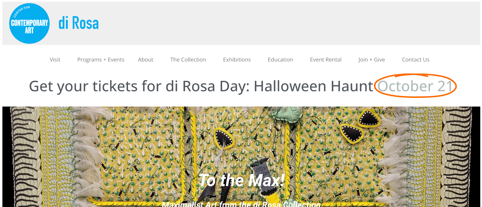
Headers that incorporate whitespace effectively create a sense of balance and elegance. Adequate spacing around elements can enhance readability and make the header visually appealing.
To see these concepts in action, check out the di Rosa Center for Contemporary Art.
This California-based art museum keeps its header simple, surrounded by white space. This makes the text easy to read and navigate. Further, the header design never clashes with the art displayed on the site. This is especially true when contrasted with the museum’s promo for its maximalism exhibit.
Pro tip: An organized and user-friendly navigation menu makes it easy for visitors to find what they're looking for.
Website Header Design Templates
What does a great website header look like? If you’d rather not build your own from scratch, we’ve compiled a list of some great free options to get you started.
1. Atlas Free
Atlas Free is a free blog template designed to convert your prospects, provide social proof, explain your product, build your brand, and help you launch new pages quickly.
2. Studiocanvas

StudioCanvas is a blog template where you can build a high-converting website in a fraction of the time. StudioCanvas comes out of the box with amazing features designed to help you get the most out of your website.
3. Spark

Spark offers nine highly customizable templates and 21 easy-to-use drag-and-drop modules to build a beautiful, functional site that highlights your brand story in no time — without needing to know a line of code!
Wondering how to design your own blog header? Let’s dig a bit deeper into what it takes to create a customized header.
How to Design a Blog Header
First, you need to find the dimensions of your existing header, which are measured in pixels across width and height.
Start with your website’s administrator or website layout area — the exact format will vary across hosting providers and website platforms — and look at the header dimensions listed. (If the dimensions aren‘t there, try right-clicking on your website’s current header and saving the image. Then, select the image and right-click Properties to find its dimensions.)
Once you’ve identified the required height and width, you can either build a header in a paid image editing program, such as Photoshop, or by using free tools, like Gimp or Microsoft Paint 3D.
No matter which method you choose, open your new header in your image editing tool to adjust its size. If you’re using Paint 3D, for example, open the image and then select Crop in the upper left-hand corner. Then, adjust the width and height accordingly on the right-hand sidebar.
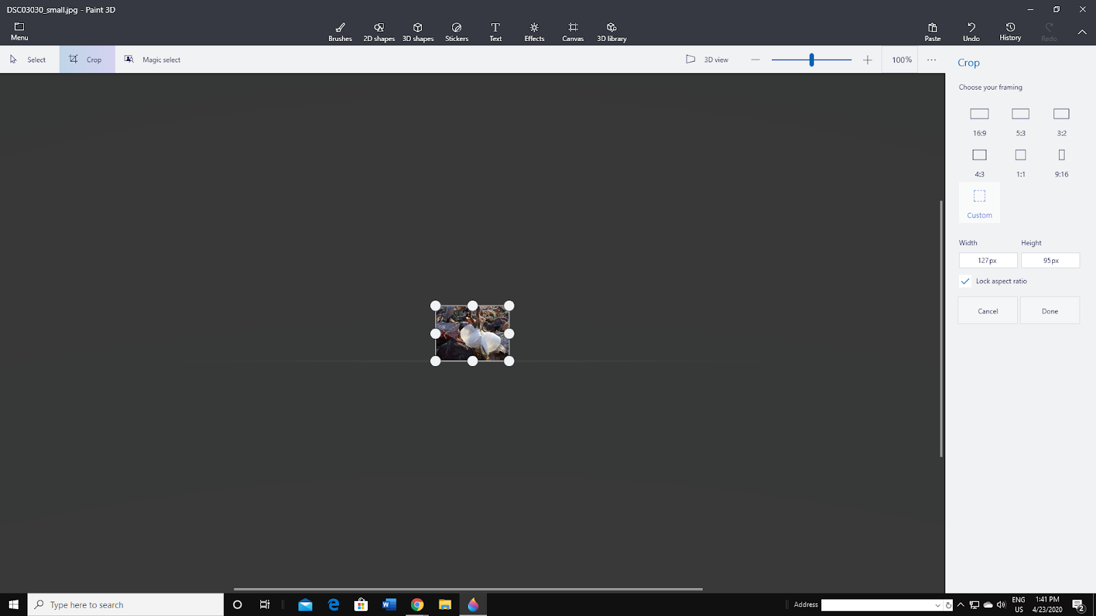
You can adjust both dimensions independently or select Lock Aspect Ratio to ensure the proportions of your photo remain the same. Photo editing programs also let you add text effects and background colors to your header image.
Once your custom header is complete, you’ll need to upload the header to your website.
Tools to Build a Better Header
If you’re looking to go beyond basic text and images to include search bars, navigation links, or other media elements, you’ll need some website development expertise and experience — or you can use site-building tools to help build a better header.
1. Content Hub
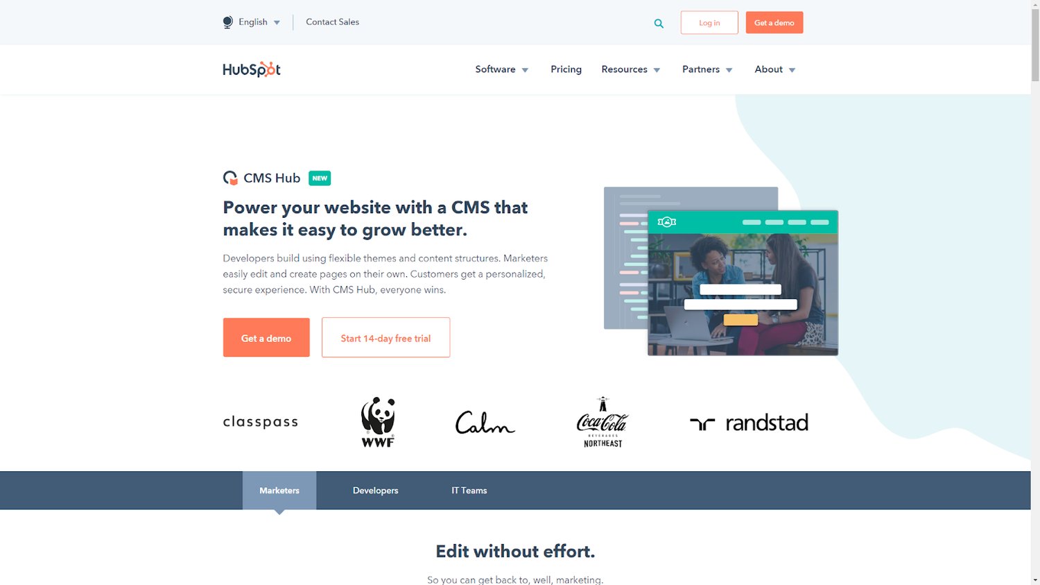
Content Hub, HubSpot’s content management platform, is a full-featured site builder and content management tool. It integrates with your HubSpot CRM and other Hubs (and associated metrics) to give you a clear picture of visitor traffic, conversions, and click-through rates.
When armed with the right information and tools for your business, you'll be well-equipped to create impactful, effective headers for your website.
2. Weebly
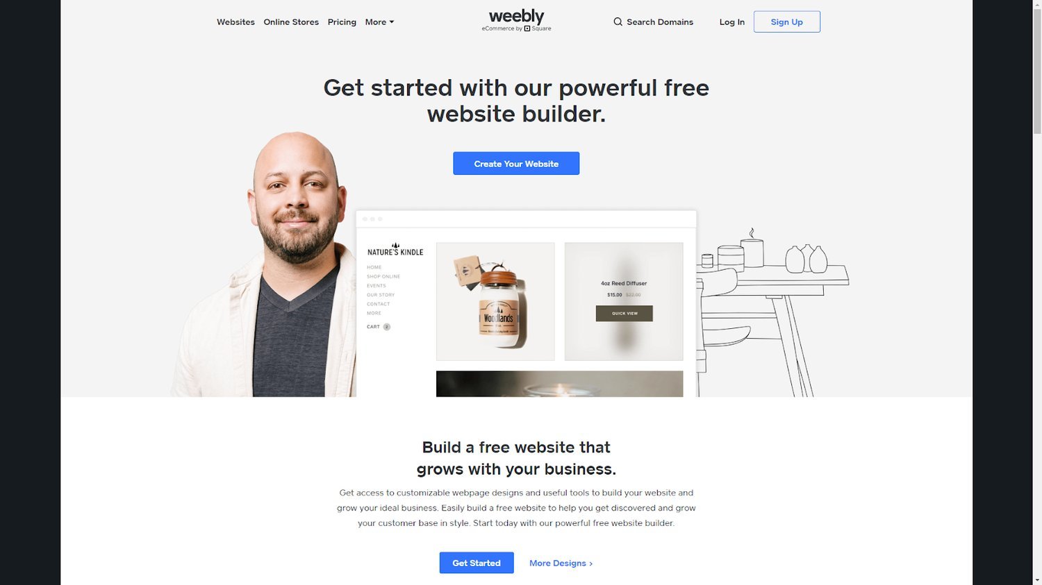
Weebly lets you quickly create and edit your website with a variety of tools and templates. Build headers that suit your style and brand to capture visitor interest.
3. Wix
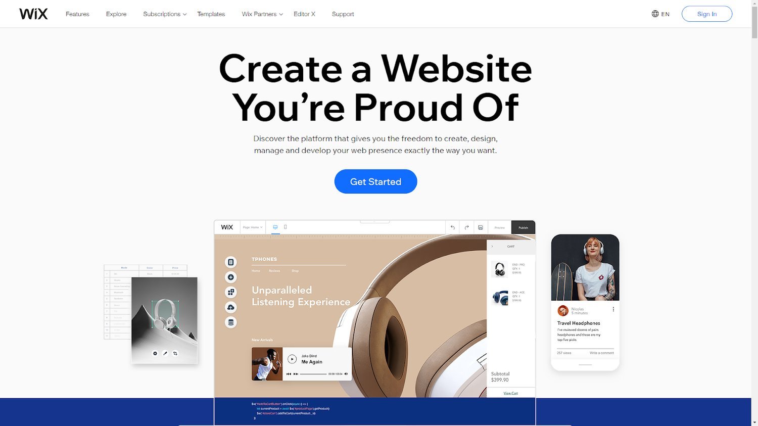
Wix allows you to customize any element of your site to create components that work best for your brand. With easy mobile editing and SEO capabilities, Wix will help you ensure your header stands out.
Ready to design your header?
Header design seems like a simple task — however, translating multiple elements and operations into a clear, concise, and contextual design isn’t always as straightforward as you may think. So, be sure to keep header elements and best practices in mind, use the right tools and software, and incorporate templates for support and direction.
Website Design


