.png?width=112&height=112&name=Image%20Hackathon%20%E2%80%93%20Square%20(10).png)

What is horizontal scrolling?
Horizontal scrolling is a page navigation method in which the user scrolls left and right to reveal content from the sides of the window or container. Horizontal scrolling can be achieved by clicking and dragging a horizontal scroll bar, swiping sideways on a desktop trackpad or trackpad mouse, pressing left and right arrow keys, or swiping sideways with one’s finger on a touchscreen.
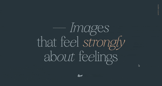
In other words, the scroll wheel causes the page to move horizontally across the screen rather than vertically. Here's an example of vertical scrolling on a photographer's website:

Whereas vertical navigation is foundational on the vast majority of websites, we see horizontal much less frequently. This is because horizontal scrolling is widely regarded as an ineffective and outdated UI method with few practical uses.
That might sound a bit harsh, so let’s expand on it and discuss why you probably aren’t scrolling sideways all too often.
.png)
Free UX Research Kit + Templates
3 templates for conducting user tests, summarizing your UX research, and presenting your findings.
- User Testing Template
- UX Research Testing Report Template
- UX Research Presentation Template
Download Free
All fields are required.
Form not available
Disadvantages of Horizontal Scrolling
Opinions on horizontal scrolling skew negative among both web designers and web users. Even I’m not too keen on it myself for a few reasons:
It violates users’ expectations.
Vertical scrolling is the navigational norm. Aside from the occasional stylistic embellishment, every web page structures its content vertically. So, naturally, users will expect to scroll this way and not left-to-right.
It’s okay to break a design rule every so often to add some visual flair and spice. But, defying this particular convention without a clear purpose will confuse and frustrate visitors more than engage. And many will just assume your page/page element is broken.
What about touchscreens, though? While the emergence of smart mobile technologies has normalized the sideways swiping gesture (looking at you, Tinder), users will naturally scroll down on a mobile website if unprompted. So, it’s typically best to keep the vertical scrolling on both your desktop and mobile sites.
It has a high interaction cost.
In UX terms, interaction cost is the amount of effort it takes for a user to complete an action, such as interacting with a page element. Interaction cost comprises (1) how hard we have to think about a task and (2) the physical effort required to complete the task.
Vertical scrolling has a low interaction cost. Again, we expect it, so we hardly need to think to do it. It’s also ergonomically efficient to scroll vertically, thanks to your mouse wheel, trackpad, or arrow keys.
Horizontal scrolling, on the contrary, has a much higher interaction cost.
Mentally, we must adjust to the new scroll orientation and process content entering from a new screen direction. We’re not used to the extra cognitive load, and this negatively impacts our viewing experience. Users in need of the horizontal scroll bar also need to locate this element, which takes extra work.
Horizontal scrolling is more physically demanding on users as well. Trackpad and mobile users may swipe sideways to reveal content, but this isn’t possible for desktop users equipped with a standard mouse. These users must either move to the arrow keys or click and drag the scroll bar.
It’s easily missed or ignored.
This problem stems from a lack of expectation — if users don’t know that horizontal navigation is coming up on a web page, they won’t look for it, missing out on potentially relevant content.
Clear visual cues to horizontal navigation, such as arrow icons or informational text, can partially resolve this problem. But, there’s still a chance users will miss it. If they do happen to notice the cues, it still might not be clear to them what the hidden content actually is. In this scenario, most simply won’t be bothered to engage with content outside the viewport.
It presents challenges for accessibility.
An extra scroll dimension compounds the difficulties of plain vertical scrolling, especially when both are used at the same time. A page element with both horizontal and vertical scrolling can disorient, and is difficult for people with motor impairments to use.
For those with physical limitations, mental limitations, or just less experience with tech, horizontal scrolling is often an unnecessary obstacle that can be avoided with better design.
When Horizontal Scrolling Works
Given the problems with horizontal scrolling, you might wonder if there’s ever a case where such a function would be useful.
But don’t rule it out just yet. There are a few instances in which horizontal scrolling may be effective if implemented carefully and precisely. Let’s now cover its most common uses:
To Conceal Secondary Content
On any website, you want to minimize the amount of scrolling users must perform to reach their desired content. This is where horizontal-scroll can come into play: You can save vertical page space by placing a special element, one which reveals related content from a horizontal scroll.
Most implementations of this method clearly indicate the scrolling feature, and offer an alternative navigation method, like a button click, to reveal more content. For example, users can horizontally scroll through an image gallery or thumbnail links to blog posts or news articles.
To Display Offerings by Category
On a related note, horizontally scrolling containers are useful for segmenting your content by category. Users scroll vertically to find their category of interest, then sideways to locate a specific product, video, article, or another type of item within that category.
Ecommerce sites use this method to divide their catalog into product types. Streaming platforms do the same with their films and series. See how Netflix integrates horizontal scrolling into its UI:

Also, notice that this example offers a scrolling alternative, arrow buttons.
To Navigate a Large Image or Visual Element
Sometimes a single element might be too big for your page, and you want to fit it into a smaller window element. Maps, images with a lot of detail, and stretched-out visualizations like timelines all present this design challenge. To help users navigate and explore a large 2D plane, consider employing horizontal scrolling.
However, note that a drag-and-drop method is more commonplace nowadays than dual vertical and horizontal scrolling. User testing is useful for determining which approach works best for your specific instance. In any case, these large visual elements should be navigable with the keyboard as well, for accessibility.
Free UX Research Kit + Templates
3 templates for conducting user tests, summarizing your UX research, and presenting your findings.
- User Testing Template
- UX Research Testing Report Template
- UX Research Presentation Template
Download Free
All fields are required.
Form not available
Horizontal Navigation Best Practices
- Avoid horizontal scrolling on full webpages.
- Enable other interaction methods.
- Design horizontal scrollbars like vertical scrollbars.
- Make the horizontal scroll option visually apparent.
So, you think horizontal navigation has a place on your website? Here are some guidelines to keep in mind:
1. Avoid horizontal scrolling on full webpages.
Horizontal scroll should never replace vertical scrolling on a full web page. Violating this convention will alienate the majority of users.
If you want different sections of your main page to transition horizontally, consider triggering a horizontal animation with a vertical scroll, as seen on this impressive design agency website:
In this example, the user is scrolling downward. The entrance of media from the right is unexpected at first, but you quickly pick up on what’s happening.
2. Enable other interaction methods.
Even if horizontal scrolling serves your page, we recommend giving desktop users another way to reveal hidden content. An arrow button can have the same function:

Mobile users will experience fewer issues swiping sideways, so buttons aren't necessary on mobile sites. Still, the primary scrolling orientation should stay vertical on touchscreen devices.
3. Design horizontal scrollbars like vertical scrollbars.
On desktop, horizontal scroll bars should be available within their containers. Horizontal scroll bars should look like and function like their vertical counterparts for design consistency. Avoid custom styling in your scroll bars, since they serve to assist and should not steal focus
There are a couple of exceptions to placing visible scrollbars. If there are buttons on both sides of the container which allow users to scroll, users can click these instead of dragging a scrollbar. Also, don’t show a scrollbar if the contents of a container loop back to the beginning at the end of the content stream.
4. Make the horizontal scroll option visually apparent.
Be sure to minimize the chance of visitors missing your content by signaling that horizontal scrolling is possible.
In addition to button indicators like arrows, you might set your scrolling containers such that a horizontal scrollbar appears on mouseover.
Or, try showing a sliver of hidden content in your scrollable container. Ecommerce sites like Patagonia do this for product listings — notice the product thumbnails poking out on both sides of the display container:
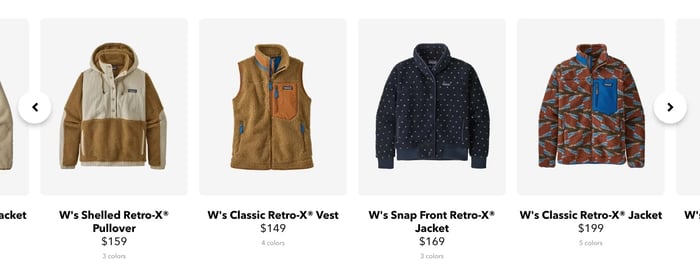
Lastly, instructional text like “Scroll for more” also works. Try all of these implementations in your prototyping and testing.
How to Create Horizontal Scrolling Containers in HTML and CSS
When an HTML element — let’s say a <div> — contains content that exceeds its boundaries, this is called overflow. For example, in a standard web page, all content below the fold is overflow in the browser window.
To enable horizontal scrolling, we can use the CSS property overflow-x.
If we assign the value scroll to the overflow-x property of the container element, the browser will hide horizontally overflowing content and make it accessible via horizontal scrolling. For this to work, the widths of both the container element and child element (the element in the container) must be specified.

Let's break down this method into more detail below.
Step 1: Use HTML to create the container.
In this example, I’ve created a <div> container element with a width of 500 pixels. Inside this <div> container is a <p> child element with a set width of 1000 pixels. Since the width of <p> exceeds the width of <div>, the text overflows to the right of the container.
Here’s the HTML code for my example as shown above. You might notice we use some horizontal scrolling on our code snippets, too:
Step 2: Use CSS to specify a set width for the container and apply scroll behavior.
Setting overflow-x: scroll to the container <div> renders a scrollbar inside it.
Here's the corresponding CSS code for my example:
Want to flesh out a fancy horizontal scrolling element? CSS Tricks, Codeburst, and UX Collective all offer detailed tutorials you can reference for building custom containers.
How to Disable Horizontal Scrolling
If you do not set the width of the child element within its parent <div>, the contents of the child element will wrap around to the next line, avoiding overflow. You can also set the overflow-x CSS property to hidden, which prevents child content from wrapping within its container but turns off sideways scrolling.
Another solution is to set the width of child elements to 100%. This tells the child content to wrap around to the next line to avoid getting clipped by the container edge, no matter the width of the container.
Scrolling Sideways
For most of us, vertical scrolling is a reflex — it just makes more sense than its horizontal alternative. However, horizontal scrolling does have a place in modern web design. When implemented sparingly and intentionally, this method can help structure your pages and present content in a useful manner.
Ultimately, you’re designing for the average visitor, so usability precedes any stylistic embellishment. If you have doubts about your horizontal scrolling elements, test them with real users (not fellow designers). If feedback is negative, don’t hesitate to fall back on a different approach.
Editor's note: This post was originally published in September 2020 and has been updated for comprehensiveness.
Free UX Research Kit + Templates
3 templates for conducting user tests, summarizing your UX research, and presenting your findings.
- User Testing Template
- UX Research Testing Report Template
- UX Research Presentation Template
Download Free
All fields are required.
Form not available
User Experience

![How to become a UX designer, a step-by-step guide [expert tips]](https://53.fs1.hubspotusercontent-na1.net/hubfs/53/become-a-ux-designer-1-20240731-321437.webp)


![How to Add a Parallax Scrolling Effect to Your Website [Examples]](https://53.fs1.hubspotusercontent-na1.net/hubfs/53/scroll-Aug-11-2023-05-24-08-8793-PM.png)

![20 UX Design Examples Hand-Picked by Experts [With Analysis]](https://53.fs1.hubspotusercontent-na1.net/hubfs/53/ux-design-examples-1-20250404-8425368.webp)