.png?width=112&height=112&name=Image%20Hackathon%20%E2%80%93%20Vertical%20(50).png)
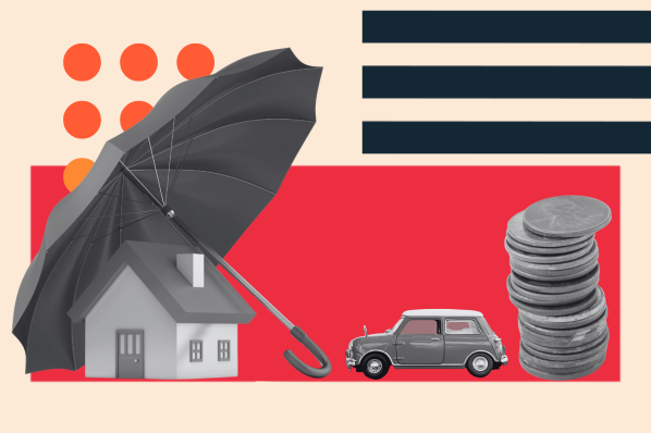
Ready to get started? Let’s dive right in and look at some of the best insurance website designs out there. Happy browsing.
1. Brightway Insurance

Brightway Insurance's website is modern, minimalistic, and easy to navigate. It prominently displays their different policies and makes it easy to get started with a quote.
The site features an FAQ section that answers common questions and a blog that helps customers stay up-to-date on industry news.
What we like: This website is clean and straightforward, making it a great example of best practices for insurance websites.
2. Geico

Geico's website is bright and cheerful, featuring an intuitive navigation bar that makes it easy to find the coverage you need. They also offer online chat support for more complex questions and concerns.
What we like: The site prominently displays customer testimonials highlighting their commitment to customer service, and the layout is professional yet inviting.
3. Esurance

Esurance's website is modern, stylish, and easy to use. The site prominently displays its best-selling products and offers helpful resources, such as coverage calculators and FAQs.
The navigation bar is clearly labeled, making finding what you're looking for easy. Not to mention there's a straightforward call-to-action (CTA) to get a quote.
What we like: Esurance has a helpful app that makes managing your policy even easier.
4. State Farm

State Farm's website is professional and well-organized, making it simple for customers to find the best policy for their needs. The bold red in the hero image and red accents below reinforce State Farm’s branding throughout the site.
What we like: The site features helpful resources such as tools and calculators that help you estimate your costs and potential savings. They also offer a variety of discounts that make their products more affordable.
5. Allstate

Allstate's website is modern and feature-rich, offering customers a wide range of products and services. The site prominently displays customer testimonials to highlight the quality of their coverage.
What we like: The navigation bar is clearly labeled and easy to use, making it simple to find the best policy for your needs. You can even lookup multiple quotes at the same time.
6. Liberty Mutual

Liberty Mutual's website is modern, stylish, and easy to navigate. The site prominently displays its best-selling products and offers many helpful resources, such as coverage calculators and FAQs.
The simple white website with yellow accents keeps the site clean and not visually distracting. And although it first displays a “Get my price” CTA at the top, Liberty Mutual directs readers who are not yet ready for a quote to other resources just below this.
Pro tip: Offer more value to your readers and establish yourself as an authority by writing (and promoting) a blog with relevant information.
7. Progressive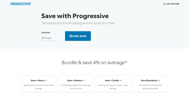
Progressive's website is modern, stylish, and easy to use. The navigation bar is clearly labeled and makes finding what you're looking for simple.
They highlight just four of their most common offerings so site visitors aren't overwhelmed. Then, they direct visitors to view the rest of their products if they need something different. They also provide a search function if you can’t find what you’re looking for in the menu.
What we like: The cartoon illustrations provide a unique feel to this website, making it stand out from the others that often feature photos of real people.
8. Farmers Insurance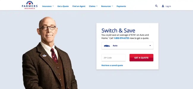
Farmers Insurance's website is clean and straightforward. The site prominently displays its best-selling products and offers a variety of helpful resources, such as coverage calculators and FAQs.
What we like: Farmers Insurance provides an online chat service for more complex inquiries and concerns. Plus, they prominently display a phone number for those who’d rather call.
9. Nationwide

Nationwide's website is modern, feature-rich, and easy to navigate. The site prominently displays the best policies with helpful resources such as coverage calculators and FAQs. They also have an app that makes managing your policy even easier.
What we like: Nationwide includes helpful buttons for current customers, such as “Pay a bill” and “Get ID card,” ensuring their site attracts new clients and serves current ones.
10. American Family Insurance

American Family Insurance's website is modern, stylish, and easy to use. The navigation bar is clearly labeled and makes finding what you're looking for simple. They also offer helpful resources such as coverage calculators and FAQs.
Plus, they provide a mobile app for clients to quickly take care of their insurance needs.
What we like: The curvy arrows help direct viewers down the page, and they include a fun “Listen to the jingle” CTA that makes the site more personal.
11. Travelers Insurance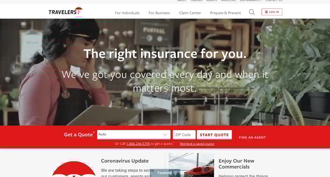
Travelers Insurance's website is modern, feature-rich, and easy to navigate. The videos in the hero show various scenarios when you’d want to be insured, visually illustrating why you need coverage and captivating their audience.
The site prominently displays the best policies with helpful resources such as coverage calculators and FAQs.
What we like: The sticky header conveniently stays with you as you scroll, ever ready for you to get a quote, find an agent, or call Travelers for assistance.
12. USAA Insurance

USAA Insurance's website offers the ultimate online experience — modern, comprehensive, and user-friendly. Its navigation bar is aptly labeled for fast and effortless access to its vast resources — from insurance to retirement to membership. Their headlines highlight what percentage you can expect to save.
Pro tip: USAA emphasizes its unique mission: serving the military community. If your agency has a particular mission, share it loud and clear.
13. The Zebra Insurance

Zebra Insurance offers a great website experience, with a modern and stylish design that makes navigation effortless.
Better yet, Zebra is a marketplace that searches through other insurance companies’ offerings to find the best match for customers so they can make informed decisions about their policies.
What we like: The website is simple and keeps visitors focused on Zebra’s service. There’s only a small navigation bar at the top for other inquiries.
14. Experian Insurance

From its modern aesthetic to intuitive navigation, Experian Insurance has created one of the best insurance websites on the market.
The gray background in the hero makes the white text and pink CTA stand out for website visitors. The header comes down as you scroll, so the “Get started” CTA conveniently follows you until you’re ready to press it.
What we like: Labels are simple and make it easy to find exactly what you need without a hassle. Plus, they provide helpful resources like coverage calculators and FAQs for further assistance.
15. Loop Insurance

Loop Insurance's website is modern, stylish, and easy to navigate — making it one of the best insurance websites available.
The horizontal bars of text and images make the site easy to read, while the soft yellow background and brown text keep the site easy on the eyes. They invite readers to dive into their unique mission of reinvesting in their community through the “Our Story” tab.
They also offer helpful resources such as coverage calculators, FAQs, and a blog, plus they have a helpful chatbot feature so they can answer more complex questions and concerns.
What we like: Loop Insurance offers discounts on their policies to make them even more affordable for customers. With Loop Insurance, you can rest assured you're getting the best insurance website experience possible.
16. Protective Insurance

At Protective Insurance, they understand that navigating insurance can be an overwhelming task. That's why their website has been designed with visitors’ convenience in mind — a streamlined navigation bar allows you to find what you need quickly and easily.
They focus on getting site visitors where they need to go from the homepage, whether it’s getting a quote, submitting a claim, viewing products, or learning more from their blog.
What we like: Notice that the hero image (and all the images on the site) focus on families, speaking to their target audience. Their white and purple brand colors also create a consistent experience throughout the site.
17. Westfield Insurance

Westfield Insurance's website looks modern and provides intuitive navigation labels for a simplified search experience.
The combination of the soothing brown with orange CTAs is easy on the eyes but draws viewers’ eyes to the important buttons. Plus, they offer beneficial resources such as their coverage calculators and FAQs to answer any questions you may have.
What we like: They provide an online chat service if you need more advanced help or would like additional clarification.
18. Chubb Insurance

Chubb Insurance has taken the hassle out of finding insurance by creating a modern and simple-to-navigate website. The large blocks of color keep the design simple but engaging. They also highlight blog posts on their homepage to offer more value to their visitors.
What we like: Not only that, but they provide helpful resources such as coverage calculators and FAQs to make researching policies easier than ever before. To top it off, discounts are available, so you can be sure you're getting the best deal possible!
19. Erie Insurance

Erie Insurance's cutting-edge website is designed with the user in mind. A straightforward navigation bar lets you quickly locate any resources or information needed to manage your policy. The blue in the hero is soothing, with an important invitation to get a quote.
Furthermore, it’s simple to make an account, pay a bill, or log in to your account if you’re already a customer.
What we like: Erie Insurance highlights its values of diversity, equity, and inclusion on its homepage, so you can rest assured knowing what the company supports.
20. Mercury Insurance

Mercury Insurance's website is intuitive, modern, and effortless to navigate due to its straightforward labels. The company highlights customer reviews and recognition from Forbes to emphasize the value it offers clients.
What we like: Besides sharing some of their blog posts on the homepage, Mercury Insurance also includes standard useful resources such as coverage calculators and FAQs for your convenience.
21. Country Financial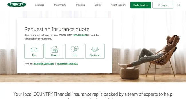
Country Financial's website is modern and straightforward, with a well-marked navigation bar that simplifies finding what you need.
The green CTAs echo the brand’s color and invite visitors to “Find a local rep” rather than simply request a quote. This emphasizes the personal connection of a client with a rep, saying a lot about the services they offer without so many words.
What we like: Country Financial provides useful materials such as coverage calculators and FAQs, plus they have an app to make managing your policy even more convenient.
22. Unum Insurance

Unum Insurance provides an impressive user-friendly website to ensure customers have a stress-free experience when navigating their site. Whether you need help understanding coverage terms or need assistance choosing the right policy, Unum’s helpful calculators and FAQs are readily available.
What we like: The blue and white blocks guide website visitors down the homepage, displaying their various insurance offerings and inviting visitors to join a webinar. Their CTAs focus on visitors learning more, rather than jumping straight to selling their products.
23. United Health Insurance

United Health Insurance's website is modern and user-friendly, with a clearly labeled navigation bar that makes finding what you need a breeze. The company uses photos of families to engage its website visitors and link to its specific offerings on the homepage.
What we like: United Health Insurance has a “Find a doctor” CTA in the header, a helpful resource when someone quickly needs to find a doctor in network.
24. AIG Insurance

AIG’s site is modern, organized, and easy to use. Its hero connects clients and website visitors to one of the company’s leaders rather than offering a quote or deals. This gives their audience the chance to get to know the company first.
What we like: The entire homepage introduces viewers to the company, and from there, you can discover particular offerings relevant to your needs.
25. Amica Insurance

With Amica Insurance, you can navigate its modern and user-friendly website with ease thanks to its clearly labeled navigation bar and simple layout.
Amica Insurance opens with a welcoming image of a mother and daughter along with a unique navigation feature — the white square has two tabs, one labeled “Get a Quote” for potential customers and the other labeled “Quick Links” with helpful resources for current clients.
What we like: The homepage is clean, with just a few buttons inviting visitors to read more. Their online chat service is available for assistance if any complex inquiries or questions arise.
26. Legal & General Insurance

When you choose Legal & General Insurance, you're assured of a modern and user-friendly website experience.
What we like: Their navigation bar is organized on two levels — the higher level divides Legal & General’s offerings between “Personal,” “Advisor,” “Employer,” and “Institutional,” with subcategories for each of those.
27. Ladder Insurance

Specializing in life insurance, Ladder Insurance makes it easy to purchase coverage with its modern and intuitive website. With their clearly labeled navigation bar, finding what you need is a simple process.
They also offer useful resources like coverage calculators and FAQs for customer satisfaction, as well as an online chat service for more complex inquiries or concerns.
What we like: The sticky header makes pressing the “Get my price” CTA easy for site visitors. Further, the minimal design, which balances text and images, makes the site a breeze to navigate and enjoy.
28. Ethos Insurance

Choosing Ethos Insurance for your life insurance needs comes with unbeatable advantages. Their modern, clean website provides customers with quick and accurate navigation labels to find the answers they need quickly.
Ethos provides lots of info on the homepage so clients feel comfortable choosing their services, including a FAQs section.
What we like: Ethos has various CTAs scattered throughout, each with a different title such as “Get my rates,” “Check my price,” “Start applying,” and “Get started” — each invitation appealing to a different audience segment.
29. Northwestern Mutual Insurance

Northwestern Mutual Insurance offers an unparalleled online experience. Their website is up-to-date, organized, and user-friendly, with a well-marked, sticky navigation bar to help you swiftly find what you’re looking for. The adventurous photos in the hero inspire visitors to think about what their lives could be with the support of Northwestern Mutual.
The blue and yellow theme throughout the site provides consistency, with the yellow attracting eyes to the CTAs.
What we like: The company also invites viewers to sign up for their weekly email newsletter, which is a great way to provide value to your audience while staying top of mind.
30. Omaha Insurance

When you choose Omaha Insurance, it's easy to find exactly what you need with simple navigation labels. The quote form greets you right on the homepage, letting potential customers cut to the chase. Plus, this company offers helpful resources like coverage calculators and FAQs that make your experience even more convenient.
What we like: Need a bit of extra help? Online chat services are available for complex questions or concerns.
Getting Started
Creating the best insurance website design requires careful consideration of your target audience, brand identity, and user experience. Your website should be modern, easy to navigate, and offer helpful resources so customers can find what they need quickly and easily.
By following best practices for web design and taking the time to craft a unique user experience, you can create an insurance website that will stand out from the competition.
Now that you’ve seen some of the best examples of insurance website designs, you can start implementing your ideas. With the right design and best practices in mind, you’ll be well on your way to creating an amazing insurance website. Good luck!

Website Design Examples


![15 black and white website designs to inspire your own [+ pro tips]](https://53.fs1.hubspotusercontent-na1.net/hubfs/53/black-and-white-website-design-1-20250520-1336267.webp)

![Gradient Website Design Examples That Prove This Trend Is Far From Over [+Tutorials]](https://lh7-us.googleusercontent.com/htOWIbyCIoCMxSjC4gJunkGnhCzXpccjTrL8NwoGdRdCsSiEmEAxe_qBFkMrzy2Y8d3cwEr_DMzSGHq9Xi-hQFnMJCo8HDQJ1yQGigcSfFxI2QKXo0s7xXSB2sY-eALG1iUqnHXgomcDsnp7AHRSH1s)
![15 Brochure Website Examples to Inspire You [+ How to Make One]](https://53.fs1.hubspotusercontent-na1.net/hubfs/53/brochure-website-examples-1-20250319-362228.webp)
![28 Types of Websites to Inspire You [+ Real-Life Examples]](https://53.fs1.hubspotusercontent-na1.net/hubfs/53/types-of-websites.png)

