.png?width=112&height=112&name=Image%20Hackathon%20%E2%80%93%20Vertical%20(50).png)

Table of Contents
- What Is Intuitive Design?
- Why Is Intuitive Design Important?
- How to Implement Intuitive Design on Your Website
- 5 Intuitive Design Examples
What Is Intuitive Design?
Intuitive design is a concept that means making the interface and navigation of a digital product, app, or website as easy as possible to use, so users only have to rely minimally on instruction or direction.
Intuitive design is achieved by making it feel natural to use a product. Users can navigate journeys and complete actions without too much thinking or clicking around almost instinctively. UX designers rely on the existing knowledge, experiences and expectations of users to design intuitively.
It’s why you’ll see similar interfaces across multiple different websites and apps, particularly within comparable industries. This isn’t due to a lack of creativity: it’s a specific and carefully assessed design decision to reduce the learning curve for users and, ultimately, improve conversion and retention rates.
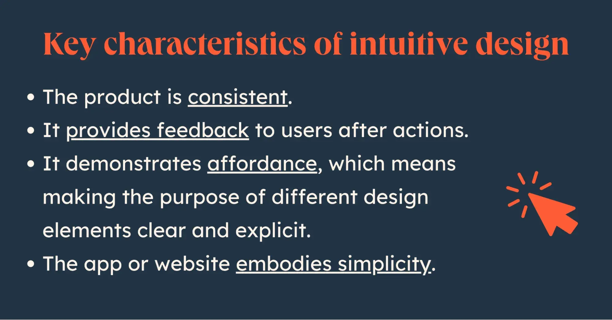
There are a few key characteristics of intuitive design:
- The product is consistent, using visual and written cues the same way throughout the user journey.
- It provides feedback to users after actions (think success messages, color changes or confirmation messages).
- Affordance, which means making the purpose of different design elements clear and explicit, is used throughout.
- The app or website embodies simplicity, reducing clutter and making it easy for users to make decisions and navigate.
Intuitive design may sound like common sense. But I find that problems occur when other goals come into play that cloud the simplicity of a user experience. For example, including too many calls-to-action on a webpage or focusing too much on flashy design that ends up overwhelming rather than helping the user.
Why Is Intuitive Design Important?
More Positive User Experiences
At the forefront of every design decision is the user experience. If people don’t have an efficient and enjoyable time in your app or on your website, your results will suffer. From website conversions to customer churn for an app or software, UX is the glue that holds it all together.
Intuitive design keeps that user-centric focus on your decisions at all times for human-centered design. It puts simplicity and efficiency at the heart of your digital product.
“Intuitive design is crucial for creating seamless and enjoyable user experiences,” says Darryl Stevens, CEO at Digitech Web Design.
“By prioritizing user needs, simplifying navigation, ensuring accessibility, and continually testing and iterating, designers can create websites that are both functional and delightful to use.”
Higher Engagement Rates
When users aren’t struggling to navigate your site, and are not overwhelmed by design elements, they can spend more time engaging with the information and calls-to-action. Intuitive design leads to higher engagement metrics like time on page, number of pages per session, and conversion rates. In fact, good user experiences can boost conversion rates on a website by up to 200%.
“Your users don’t want to expend unnecessary energy trying to figure out a quirky feature to browse products,” says Fintan Collier, senior UX designer at Valtech.
“Another common mistake I see on websites is information overload. Every additional piece of information you add to your site is competing for your users’ attention and reducing your website’s effectiveness.”
Lower Learning Curves
The longer it takes for a user to figure out how to identify and complete an action on your site or app, the higher the chance that they’ll leave and find a more simple product to use. Products that are considered difficult to use have higher churn rates and, therefore, lose more revenue.
The level of tolerance for complexity varies depending on the purpose of your product. For extremely in-depth work and complex tasks, like in a B2B software, users have a higher tolerance for exploring knowledge bases or going through onboarding training. For more universal apps with higher level functionality, that tolerance is much lower.
Whichever bracket your site or app falls into, reducing the learning curve is key. It provides your product with a competitive advantage and makes the whole experience far more pleasant and efficient for users.
.png)
Free Website Design Inspiration Guide
77 Brilliant Examples of Homepages, Blogs & Landing Pages to Inspire You
- Agency Pages
- Ecommerce Pages
- Tech Company Pages
- And More!
Download Free
All fields are required.
Form not available
Lower Costs
UX design mistakes can sometimes be costly to fix. More complicated interfaces also result in more support requests from users.
According to Interaction Design, when McAfee started integrating usability testing for more intuitive design, it reduced their support costs by 90%.
Intuitive design reduces support costs by emphasizing simplicity. This also makes it easier to research and test changes to the UX to further improve the experience.
Positive Brand Perception and Competitive Advantage
The digital realm is more competitive than it’s ever been. We’re past the stage of “there’s an app for that.” These days, it’s closer to “there are 10 apps for that, how do you decide which one is best.” Businesses of all kinds similarly rely more and more heavily on their online presence to drive visibility and revenue generation.
For these reasons, UX has become a significant competitive element. If a website experience is poor or an app is difficult to use, people have no issue turning elsewhere to find an alternative.
In the same way, UX is closely connected to overall brand perception. Users don’t see a website or app as separate from your business; the experience they have is seen as a representation and an integral part of dealing with your brand in general.
How to Implement Intuitive Design on Your Website
Step 1: Make Sure You Understand Your Users
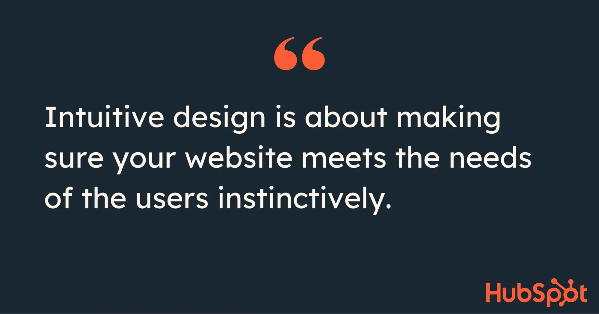
Intuitive design is about making sure your website meets the needs of the users instinctively. To do this, you must first understand the needs, preferences, and typical behavior or expectations of your target audience.
UX research goes a long way towards designing a site that achieves this.
“Conduct thorough user research to understand your target audience’s needs, behaviors, and pain points,” says Stevens. “Use surveys, interviews, and usability testing to gather insights.”
I always leverage research to develop user personas to help guide design decisions, which is especially useful when you have a diverse set of audiences who may approach your site. Stevens recommends the same:
“Developing detailed personas to represent your key user segments helps in designing experiences tailored to their specific needs.”
Step 2: Establish a Clear Visual Hierarchy
Even when I’m working with an established website, the navigation and hierarchy are one of the first elements I look at. Even with a well-designed homepage, poor structure makes it difficult for users to explore your site and take a clear path to conversion.
“One thing I’ve learned is that establishing a clear visual hierarchy is important,” says Cache Merrill, CTO at Zibtek. “When users visit a site, they need to know where to look first.”
One exercise that I find useful is bucketing user personas and content together. On a B2B website, this might mean structuring navigation around industries and/or features. For a B2C website, it could be product categories.
“Organize content in a clear, logical hierarchy. Use familiar labels and intuitive icons to guide users effortlessly through the site,” advises Stevens.
This goes beyond navigation to page by page design. I always focus on above the fold versus below the fold. How can you encourage a user to scroll and what do you want them to focus on when they do? Understanding how multiple visual elements operate on a page to highlight a specific action is essential.
Step 3: Establish Consistency
The term “consistency” in design applies across multiple elements. Firstly, it’s about user expectations. Users explore online and use digital products all the time, and there is a certain level of expectation in terms of finding information and completing actions.
“The users of your website will spend most of their time on other websites, so they expect your website to work similarly. Your users don’t want to expend unnecessary energy trying to figure out a quirky feature to browse products,” says Collier.
“Invest time researching your competitors’ websites and how they function to make your site experience as seamless as possible.”
But consistency also refers to what they experience from one page to the next. If you’re marketing a software product, it can also apply to what they see on your website compared to how your app or product looks and feels.
“Maintain consistency in layout, typography, and color schemes,” recommends Stevens. “This helps users predict and understand how to interact with different elements.”
Consistency makes for good user experience, but also helps you stand out from the crowd and establish a clear and memorable brand identity.
Step 4: Focus on Simplicity
Tons of ideas are floating around during a website design. I usually have multiple stakeholders with different viewpoints collaborating and reviewing everything from copy to page layout. In this stage of the design journey, it can be difficult to maintain the level of simplicity that is critical to intuitive design.
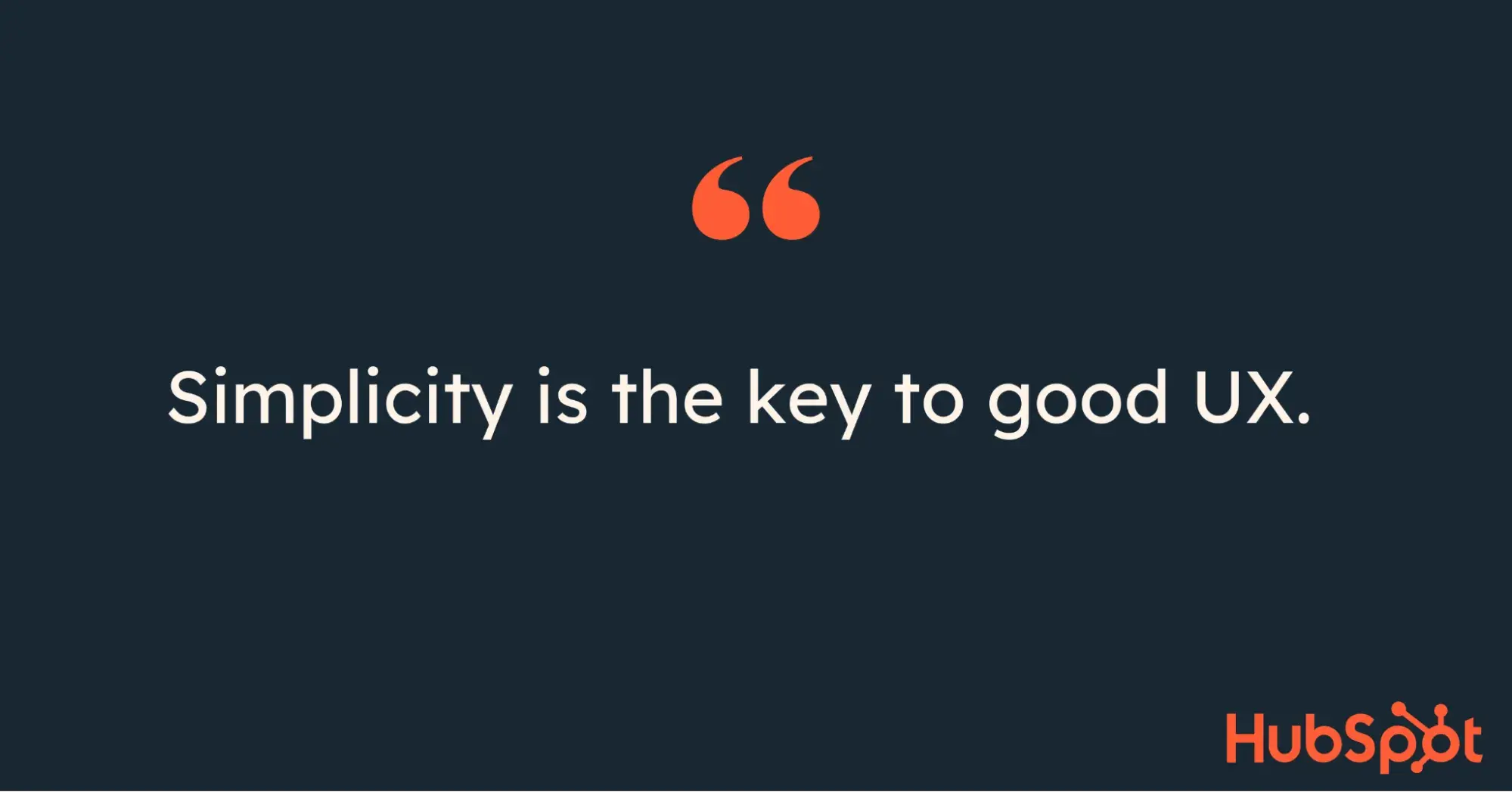
But simplicity is the key to good UX. If you’re struggling to find simple solutions, you may not have spent long enough in the research and planning stages to understand what’s most important to your users.
It’s something that Collier has noted on web design projects at Valtech, too:
“Every additional piece of information you add to your site is competing for your users’ attention and reducing your website’s effectiveness. Be clear about the task(s) your users are trying to complete on your site and pair back the unnecessary elements of your design to increase how intuitive it is.”
Step 5: Don’t Forget Accessibility
Your website should be intuitive for all users, and that includes people who need accessibility features to access and interpret your site. It’s something I’ve noticed more and more in general discourse about online experiences and it’s important to take into account.
Accessibility is a widely required characteristic. The World Health Organization estimates that 1.6 billion people (or 16% of the global population) experience significant disability. Not only are you adhering to best practice when implementing accessible features, you’re encapsulating a significant portion of the market and giving your site one more competitive edge.
Step 6: Give Your Users Cues and Confirmations
Something that I find can be taken for granted is the visual cues we can give users to let them know that they achieved what they were trying to do.
If something looks clickable and you click it, you expect to see some sort of indication that it has worked. Form submissions are another good example. Did the information get submitted successfully? Unless the interface explicitly tells you so, it’s hard to know.
It’s especially important if a function is less obvious at first glance.
“Design elements should suggest their functionality,” says Stevens. “For example, buttons should look clickable, and input fields should look editable.”
Also known as affordances, these visual cues reduce the amount of time users spend clicking and scrolling around trying to figure out what to do.
Free Website Design Inspiration Guide
77 Brilliant Examples of Homepages, Blogs & Landing Pages to Inspire You
- Agency Pages
- Ecommerce Pages
- Tech Company Pages
- And More!
Download Free
All fields are required.
Form not available
Step 7: Test and Iterate
No UX is ever fully complete in my book. Even if I’m satisfied at the end of a website redesign project, I know there’s always room for improvement. It’s also likely that new pages, sections, or functionalities will be needed for the site in the future, at which point you’ll need to keep all the same intuitive design principles in mind.
I’ll typically employ a few tactics to continue testing even after a website goes live. A/B testing is my go-to, but if it’s possible to get feedback directly from users it’s a major plus.
“The best way to prevent a lot of errors and ensure your design is intuitive is to speak with the real users of your website,” says Collier.
“While the thought of requesting feedback on your website’s design from users can be daunting, it will pay dividends. Talking to five users will uncover at least 70% of the issues with your site and uncover the common problems that you should focus on fixing.”
If you’re not sure where to start and could do with some extra guidance, try this UX design template.
5 Intuitive Design Examples
One of the best ways to understand intuitive design is to check out some stellar examples. Here are some of my favorites.
1. Airbnb
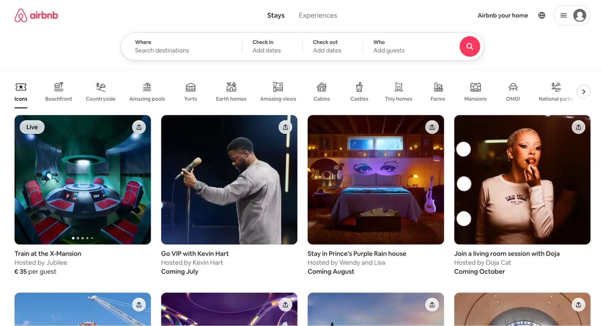
I really like the Airbnb website because in an industry that’s full of highly cluttered travel websites, Airbnb really does keep it as simple as possible.
From the search functionality to the ability to filter by types of properties and experiences, Airbnb endeavors to make your search straightforward and intuitive.
When it comes to actually using the app and booking a trip, the confirmation process is clear with multiple affordances and a beautifully simple messaging system for host and guests.
2. Apple
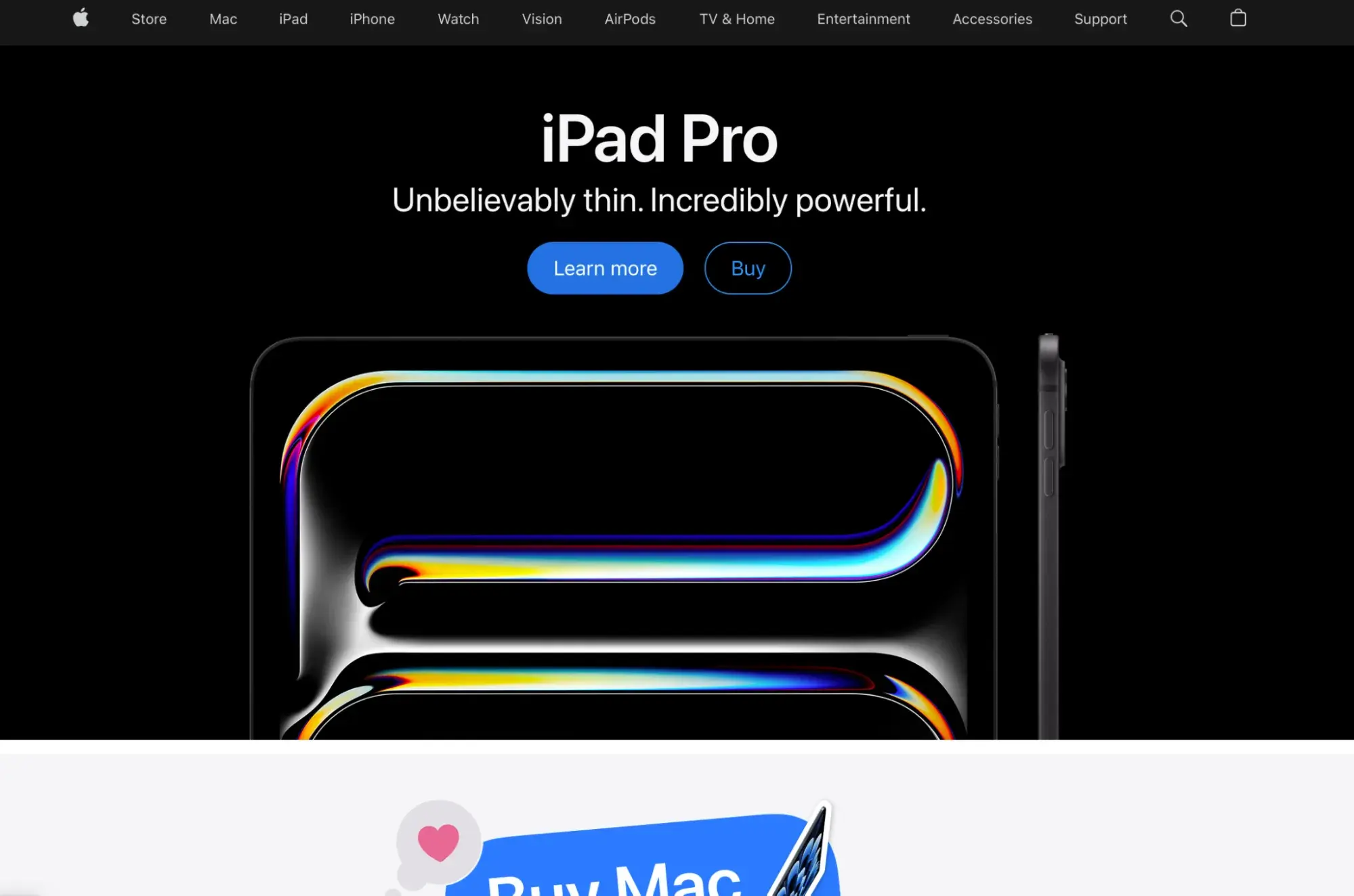
The Apple website has always stood out for its simplicity. But what really strikes me about it is the navigation.
Between buying devices and more diverse offerings like Apple TV, the website has to cater to a lot of different target audiences and user journeys. The site navigation makes it extremely clear where to go, and the simplicity of the design and calls-to-action speak for themselves.
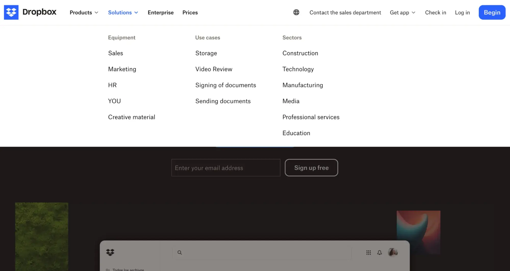
3. Dropbox
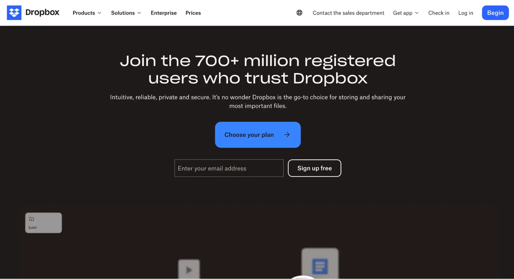
Dropbox is a great example of a B2B site that incorporates intuitive design.
Alongside the clean and sleek visual design you would expect, Dropbox includes items like use cases, features, and industries to provide each website visitor with a clear user journey and the ability to explore the solution in whatever way makes most sense to them.
4. Netflix
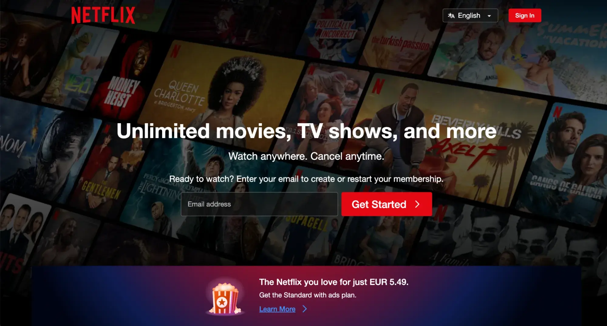
Netflix incorporates intuitive design on both sides of the coin. The website is clean and very simple with a prominent call-to-action. On scrolling, visitors can see examples of the content they can expect from the platform.
The experience continues seamlessly once you sign up for an account. Netflix keeps everything from layout, colors, and graphics to imagery and affordances very consistent for a more intuitive user experience.
5. Canva
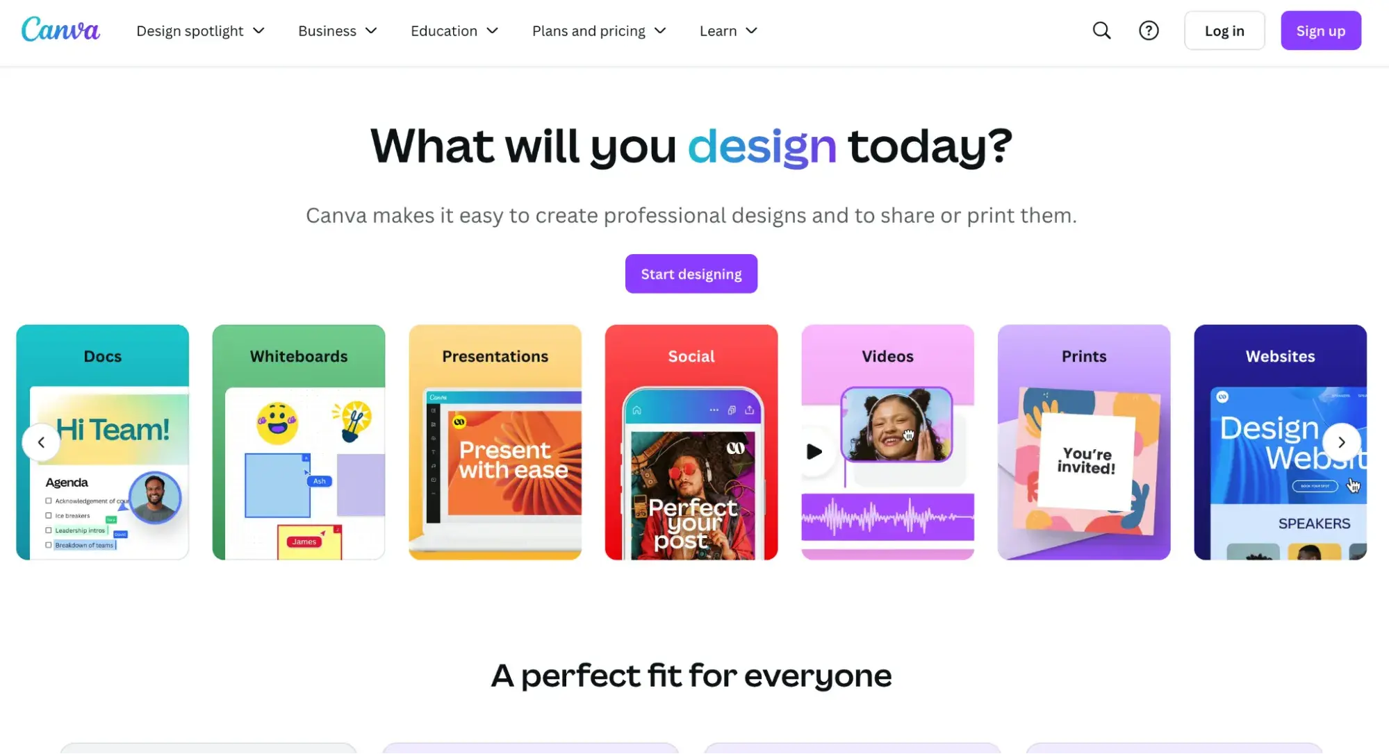
There are a plethora of features available on Canva. When there are so many features to promote and make available to your users, intuitive design becomes more complicated to achieve.
But Canva does this by taking user expectations from similar design tools into account. Search functionality is included at almost every level of the product. The left side bar on both the main dashboard and in individual designs is well categorized and makes it easy to find what you need and discover new, useful features.
Intuitive Design Means Effective Design
In my own experience, and through listening to the experts, I can confidently say that almost every aspect of your site design can be tested and iterated on for incremental improvements.
That being said, intuitive design helps you lay user-centric groundwork that sets you off on the right foot – and keeps your future design decisions aligned with your target audience. The result is a website or app that delights and retains users, turning them into loyal customers and advocates for your product and brand.


![How to become a UX designer, a step-by-step guide [expert tips]](https://53.fs1.hubspotusercontent-na1.net/hubfs/53/become-a-ux-designer-1-20240731-321437.webp)


![How to Add a Parallax Scrolling Effect to Your Website [Examples]](https://53.fs1.hubspotusercontent-na1.net/hubfs/53/scroll-Aug-11-2023-05-24-08-8793-PM.png)

![20 UX Design Examples Hand-Picked by Experts [With Analysis]](https://53.fs1.hubspotusercontent-na1.net/hubfs/53/ux-design-examples-1-20250404-8425368.webp)