While many options exist, finding design inspiration that matches your business and building a website using a template you like is important. Being able to showcase your work best will help when prospective customers want to book your business. Here are 25 website designs that we love and want to show off as inspiration.
1. QAL Surroundings
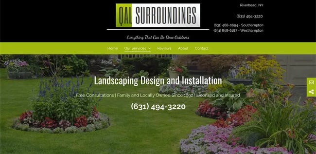
What we like: QAL Surroundings lays everything out on the front page. The navigation is clean and clear to click-through, prospective clients and customers know how to get in contact, and they highlight that they’ve been in business since 1992.
2. Huntergreen
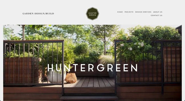
What we like: When you open the website, you are greeted with a calm and serene scene, welcoming you to the website and the garden. The beauty is in the simplicity of the website, showcasing their work, being easy to connect with and letting the visuals speak for themselves. The brand is strong and the visuals carry that through, with clean copy and crisp text.
3. Hess Landscape Architects
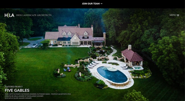
What we like: From this bird’s eye view, you can see everything that Hess Landscape Architects has to offer: clean designs, crisp lines and an eye for beautiful landscaping. The website mirrors these design sensibilities, featuring an image carousel that shows off some of its recent work and possibilities for customers.
4. Best Bet Lawn
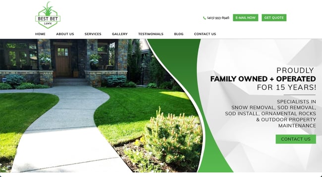
What we like: If you’re looking for a one-stop shop that does it all, Best Bet Lawn is the place for you. Displayed on its homepage are its services, the fact that they’ve been specializing in for 15 years, highlighting that its family owned and operated. The bright green colors are welcoming and bright, and the font pops on the page to draw the viewer in and welcome them to the page.
5. Mulkern Landscaping and Nursery
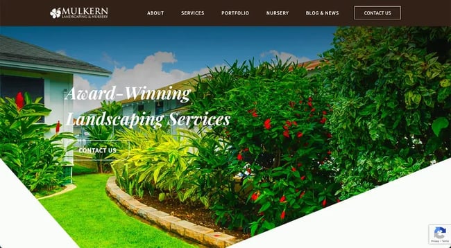
What we like: This is a very colorful display of the work that Mulkern is doing, with eye-catching visuals and text that stands out against the background. Plus, its blog offers insights into lawn care and design, offering more value to prospective and current clients. The bright colors are warm and welcoming, and mirror the services that it provides.
6. Melillo Bauer Carman Landscape Architecture
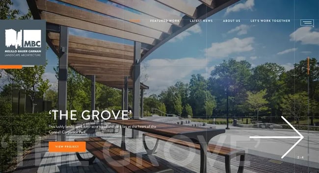
What we like: The entire site showcases Melillo Bauer Carman Landscape Architecture’s best work, using examples that mirror the crisp lines and technical thinking that go into their designs. The visuals are fun to flip through, as they’ve included a carousel style into their homepage and prospective clients can click into different projects to best understand what work can be done.
7. Elizabeth Pena
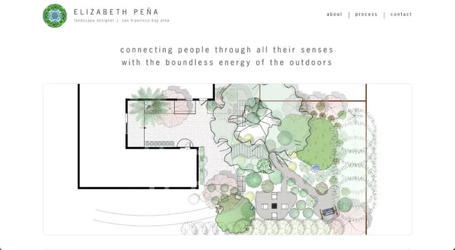
What we like: This website stands out by showcasing the company's ethos against the backdrop of one of its designs, using light colors, airy font, and watercolor design. Elizabeth Pena is an expert in her field and breaks down her process in the tabs so that potential clients can follow her on the design journey and be a part of the process.
8. Gibbs Landscape Co.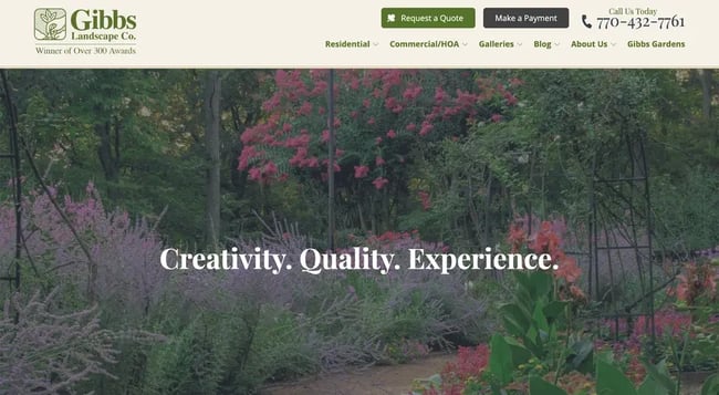
What we like: Gibbs Landscaping Co is another great example of a website that displays multiple types of offerings, highlighting its services on the homepage as its header. The copy is clean and concise, and the navigation is easy to click through so prospective clients can find exactly the services they need. Gibbs also offers a blog, like a few of the websites we’ve seen before, so that clients can understand Gibbs’ experience and point of view.
9. Wave Hill
![25 Landscaper Website Design Examples We Love [+ How To Make Your Own]-Apr-24-2023-07-47-14-3899-PM](https://53.fs1.hubspotusercontent-na1.net/hub/53/hubfs/25%20Landscaper%20Website%20Design%20Examples%20We%20Love%20%5B+%20How%20To%20Make%20Your%20Own%5D-Apr-24-2023-07-47-14-3899-PM.webp?width=650&height=359&name=25%20Landscaper%20Website%20Design%20Examples%20We%20Love%20%5B+%20How%20To%20Make%20Your%20Own%5D-Apr-24-2023-07-47-14-3899-PM.webp)
What we like: Wave Hill’s website opens on a sweeping and calming video, welcoming the viewer to the website. The light and airy design makes this stand out, and the colors play more into the light nature of the page. The website itself is easy to navigate, with different tabs in the header to click through.
10. Domenick Bulfamante & Sons Inc

What we like: This is another great example of a website that uses video to capture the viewer’s interest at first opening the page. The bold text is a great contrast to the video playing in the background, highlighting their services and offerings, while also being able to see their work in action playing in the background. This website also includes a portfolio of work, which is helpful in showing off different capabilities.
11. Kiefer Landscaping and Nursery
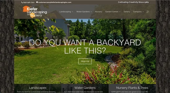
What we like: Kiefer Landscaping plays more into the woodsy elements of landscaping and design, including a fun border that also shows off their nursery. This is another great example of a company that shows off its long standing foundation and rich history since 1984. The site introduces the viewer to the story of Kiefer Landscaping through visuals and light and airy text, providing a sense of woodsy serenity.
12. Manscapers
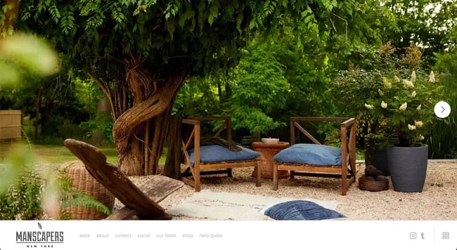
What we like: Manscapers offer a simplicity to its designs that helps showcase its work. The website isn’t crowded and includes a carousel of images that provides examples of its eye-catching designs. Simple is the way to go here, as any more elements added would throw off the balance of serenity.
13. Mark Tessier
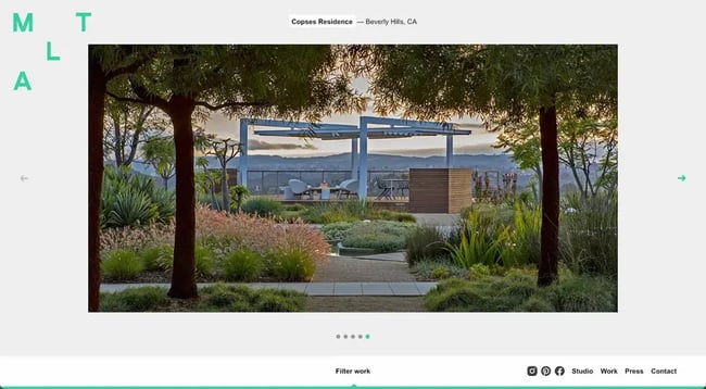
What we like: Mark Tessier is another prime example of design that is simple, yet effective. The carousel of images shows different types of work while the footer allows for easy navigation. The website tells a story in so few words on the front page, inviting visitors to take a step inside the photos and imagine themselves there. The simplicity of the text also invites the viewer to click through the website to get the fuller story of the company itself.
14. Green Tree Landscaping
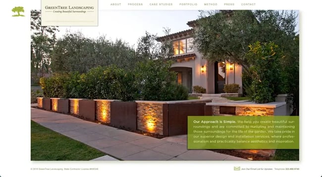
What we like: This website combines two of my favorite elements in websites that we’ve seen so far: a clear background image that shows off the work, and text that pairs with it to display the brand’s ethos and message. Here, Green Tree Landscaping details its approach while also showing you what that approach looks like in practice, telling its unique story.
15. Reveal Design
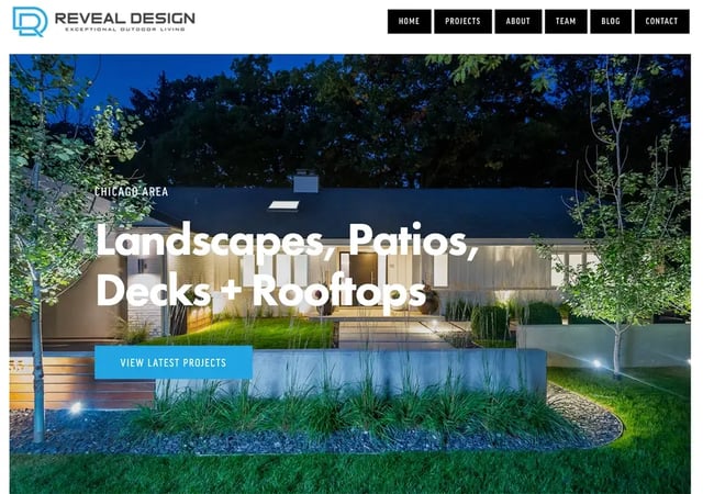
What we like: Chicago-area local landscaping company Reveal Design brings together elements of clean design with eye-catching font front and center. Here is another good example of a website that showcases its portfolio and latest projects so prospective customers can quickly and easily access them.
16. Mike’s Landscaping
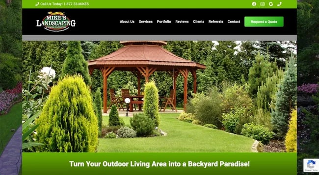
What we like: Mike’s Landscaping promises to turn your living area into a backyard paradise and its website matches that promise. The website is relaxing yet robust, with Mike’s showing off its designs and landscaping through the pages. The green header adds a nice splash of color that mirrors the splash of color it can offer clients.
17. The Garden Builders
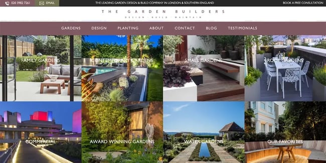
What we like: The Garden Builders is the perfect example of a website showcasing a business’s many talents and offerings. The Garden Builders boasts everything from its family gardens to its commercial work to cast a wide net for its prospective customers, all while not crowding the homepage design.
18. Land Con
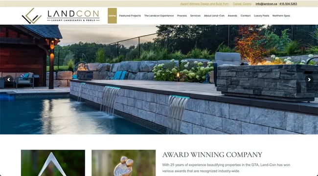
What we like: Land Con breaks away from some of the other examples we’ve seen, offering a sense of peace and serenity for the viewer. While different in certain aspects like the waterfalls and pools being showcased, it's similar to the others we’ve seen by offering a carousel of images on the homepage, highlighting examples of recent work that could mirror the work they would offer for a prospective client. Land Con’s text is clean and concise, showcasing recent awards they’ve won.
19. Pearl Landscaping
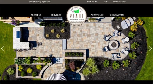
What we like: This website shows a bird’s eye view of their designs, inviting viewers to look at things from a different angle. One design element we’ve seen a lot of is on display here is the image carousel. This allows for the viewer and potential customer to see all the different forms of design Pearl Landscaping can do. It also includes a link to its portfolio in the header, which is another good way for Pearl Landscaping to showcase its work it can do for its customers.
20. LiveWell Outdoors
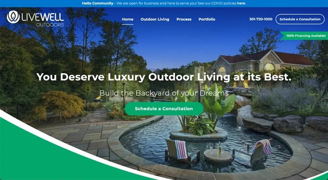
What we like: LiveWell Outdoors brings in many elements that we’ve seen in past examples including a cohesive branding style and font that matches the airiness of the brand. The colors of the background photo make the text pop and make it visually eye-catching while also being relaxing at the same time. Here, we also see elements of good CTA practices, by also displaying multiple points for the viewer to schedule a consultation.
21. Long Island Landscape Designs
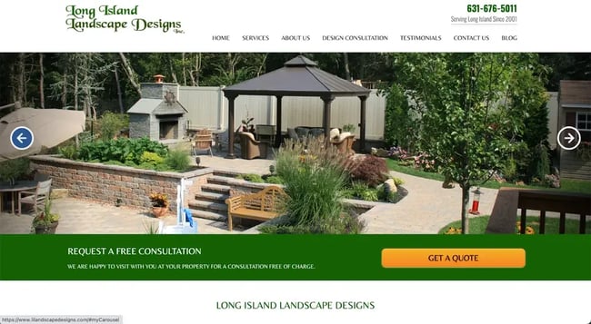
What we like: Long Island Landscape Designs shows off some of its best work through the photo carousel, so that ideas start to form in its potential customer’s head. The copy is crisp, and the big CTA ‘Get a Quote’ button is eye-catching for each website viewer.
22. Cipriano’s Landscaping
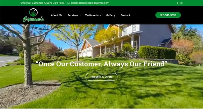
What we like: The website opens on a sweeping video that showcases the work being done by the company. Prospective customers can imagine they’re walking up to their lawn, which has been professionally designed by viewing this sweeping video. The bright colors of the video are contrasted by black header, where the eye is drawn so that customers can navigate the rest of the website well.
23. Cutters Landscaping
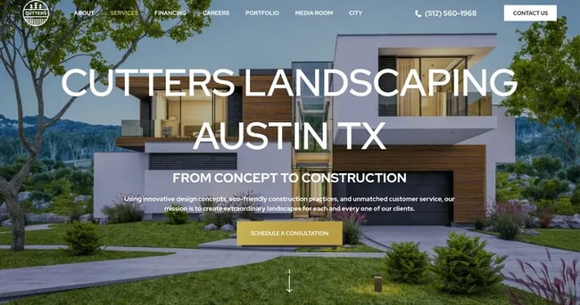
What we like: The viewer is immediately drawn to the crisp clean lines of both the website design and the font, which mirror its landscaping services. Cutters Landscaping, in concise and clean copy, boasts its eco-friendly construction practices and excellent customer service, while also proving through visuals its innovative design. The brand’s ethos and pathos are on display, in addition to its eye for visuals.
24. Dennis 7 Dees
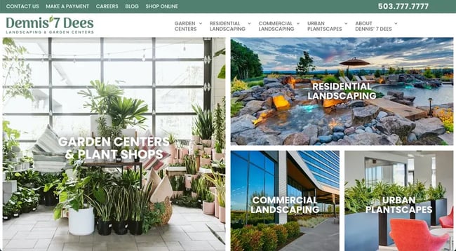
What we like: Here is another great example of a company that looks to display multiple of its services and offerings, and does so in a tasteful and eye-catching way. The colors of its offerings standout against the white text, and the border helps distinguish its offerings. The phone number is easy and accessible for potential clients and the blog offers a look into Dennis 7 Dees insights and process.
25. Branch Out Landscapes
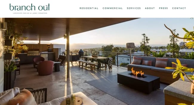
What we like: We finish our list with one last example that we believe best personifies the elements that we’ve seen emulated throughout the list: The design is light, airy and breezy, there is an image carousel included on the homepage, and the header identifies easy navigation for the viewer. In short, we’d love to step into the relaxing nature of any of these photos on the website.
How to Design Your Landscaping Website
Source different forms of inspiration.
Like the lawns that you design, your landscaping website should be a reflection of your brand’s personality and style, with elements that make sense for your business. When thinking about what you would like your website to look like, create a list of elements and designs you would like to see for your business.
These examples above give a great starting point. Do you want to lead with text of a carousel of visuals? Is there a service you want to display the most? Where do you want to put your online booking link and contact information? Looking at these different examples should start turning your creativity wheels.
Pick the right software for your needs.
The questions above then lead into the next part of the process, which is picking the right software to host your website. Are you looking for something where you can lift specific elements from a template and modify it or are you looking to build your website from scratch?
The content management system or website builder you chose will likely have a directory of themes or templates, where you can use filters or the search bar to find ones related to your landscaping design, with a specific layout, and more. Maybe you want to lead with visuals, or maybe there are more elements you’d like to include. All of this can be found when you pair up with the right software.
Select a theme or template.
A salon theme or template can help you easily change the look and feel of your site without having to code it from scratch. It will also have layouts and elements that are specifically suited for restaurant websites. For example, you may want a theme or template that has:
- clickable telephone and social media links
- CTAs for booking appointments on every page
- customizable text-based menus
- forms for booking and other inquiries
- multiple areas for location and contact information, including website footer
- image and video backgrounds
Having these features or add-ons will ensure you can create a custom design and salon offerings with little to no coding, accept reservations and orders online, and have a marketplace where customers can order gift cards, merchandise, take home treatments and more.
Customize your design.
Once you have picked where you’re going to be building your website, the fun part begins. Pulling from the inspiration in this article, you can pick and choose which elements you would like to include, which pieces make sense for your business to highlight and which aspects of your brand you would like to put on display.
To capture your unique brand identity and make the design your own, you’ll want to do the following:
- add your logo
- change the color palette and font to match your branding
- replace the stock images with images of your designs and past work
- update the placeholder copy
- upload your pricing
- insert social media icons
- add personalized forms
- customize your navigation menus
- change the size, colors, and fonts of buttons
Integrate an online contact system.
To streamline your booking process, you can integrate an online contact system so that your clients and customers have ease of contacting you. Keeping them in one consolidated place will allow for streamlined business processes and continued better customer service. This is one element we’ve seen included on each website and is a crucial CTA for your business so that customers can contact you and request a quote.
The Best Landscaping Website Designs to Inspire Yours
From this list, we’ve included many different websites to pull inspiration from. One thing these sites all have in common, however, is a foundation in UX principles. Each website is crafted with the goal of helping you book a service.
So, take pointers from the examples you like, then combine them into something that’s truly your own. Seeing what you’ve been able to do in the world of landscape design, we know this process is where your creativity can shine, and you can show off your best work.
Website Design Examples
.png?width=112&height=112&name=Image%20Hackathon%20%E2%80%93%20Vertical%20(50).png)



![15 black and white website designs to inspire your own [+ pro tips]](https://53.fs1.hubspotusercontent-na1.net/hubfs/53/black-and-white-website-design-1-20250520-1336267.webp)

![15 Brochure Website Examples to Inspire You [+ How to Make One]](https://53.fs1.hubspotusercontent-na1.net/hubfs/53/brochure-website-examples-1-20250319-362228.webp)
![28 Types of Websites to Inspire You [+ Real-Life Examples]](https://53.fs1.hubspotusercontent-na1.net/hubfs/53/types-of-websites.png)

