While a CMS or website builder will offer a module to create tables with a click of a button, you can create tables from scratch with some basic HTML and CSS.
HTML tables can help you display large amounts of data in a way that's easy to scan, compare, and analyze. For example, you may use a table on your pricing page to allow prospects to compare the key features of your pricing plans.
Download Now: How to Land a Developer Role in
the World of AI [Free Checklist]
In this post, we'll go over everything you need to know about the HTML table element, including:
- why make a table in HTML
- when to use (and not use) HTML tables
- how to make a basic table in HTML
- how to edit
- how to change the font size of a table cell
- how to center a table
- how to create a table within a table
Why Make a Table in HTML
Tables allow the reader to see results or conclusions at a glance, rather than poring over text to find the numeric data or key points. Making a post or page more readable in this way can help attract and keep visitors on your site and ultimately improve their user experience.
That’s why we use tables across the HubSpot blogs. Below is a table at the end of SiteGround vs. HostGator Review, which summarizes the 2,000-word article in less than 200 words.
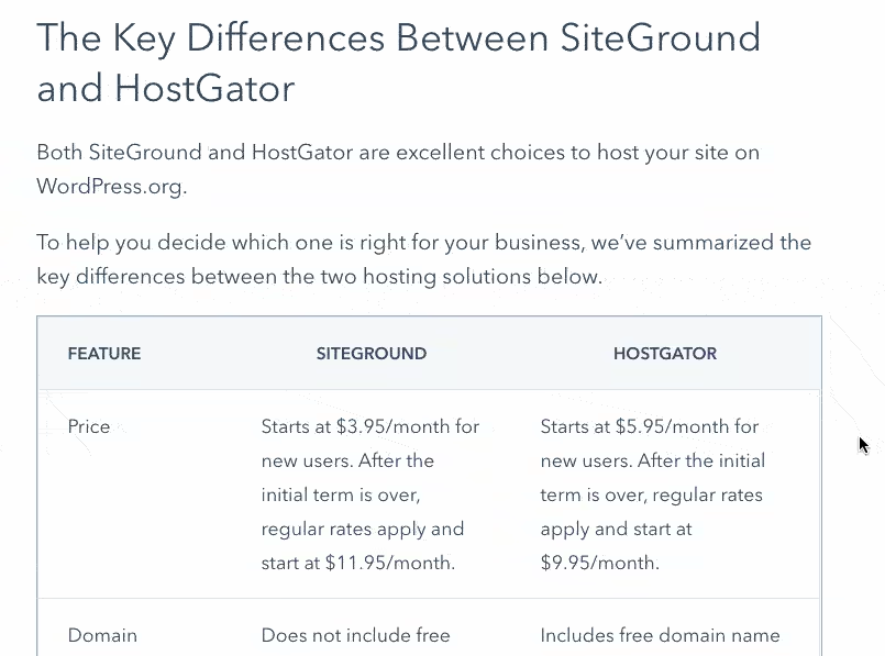
While this table was built with a click of a button in Content Hub, you can also use HTML and CSS to make tables from scratch.
Let's walk through some specific use cases for HTML tables below.

How To Land a Developer Role in the World of AI
A free checklist to you help you stand out from the competition featuring Software Developer and YouTube Creator Tech With Tim.
- Expert advice on how to build a portfolio
- Top programming languages to learn
- Resume building and interview tips
- Resources to strengthen communication skills
Download Free
All fields are required.

When to Use HTML Tables
When creating a blog post or web page, you might want to include data that isn’t best represented by text. Say you want to display a breakdown of the diversity of your workforce. Since this data would be too complicated or detailed to simply write out, you could use tables to organize and present it.
Here are some other use cases for HTML tables:
- summarizing a blog post comparing multiple tools
- displaying key features of pricing plans for comparison
- showing the store hours of your retail location on your website
- reporting precise values, like the loading speed of the fastest WordPress themes
- displaying data with different units of measurement, like rank and percentage
While tables can be a great addition to some blog posts, pricing tables, and more, they should not be used for certain purposes. Let's quickly look at those below.
When Not to Use HTML Tables
HTML tables should be used for displaying and organizing any type of tabular data. They should not be used for laying out web pages. This was a technique used in the past when CSS was less advanced and web browsers did not consistently and reliably support CSS positioning. Now, CSS has multiple layout techniques, including the display property, flexbox, and grid, that are more powerful than HTML tables and are widely supported by web browsers.
Below are the most common reasons to avoid using HTML tables for layout:
- Complex code: Table layouts generally involve more complex markup structures than proper layout techniques, in part because they often include multiple layers of nested tables. That means it is harder to write, maintain, and debug code for table layouts.
- Accessibility issue: Because of their complex markup structures, layouts built with tables pose accessibility issues for visually impaired users and other types of users with screen readers. The main issue is that content in a table layout doesn't always make sense when read left-to-right and top-to-bottom. Nested tables and various spans and attributes on table cells can also be difficult for a screen reader to parse.
- Lack of responsiveness: By default, tables are sized according to their content. So additional code is required to optimize table layouts for a variety of devices. Flexbox, CSS Grid, and Bootstrap, on the other hand, are all responsive layout models.
Now that we have a better understanding of why and when to use (and not use) HTML tables, let's walk through the process of making one below.
How to Make a Table in HTML
To make a table in HTML, use the <table> tag. Within this table tag, you’ll place the <tr>, <th>, and <td> tags.
- The <tr> tag defines a table row.
- The <th> tag defines the table header. By default, any text in the <th> tag is bold and centered.
- The <td> tag defines the table data (ie. table cells). By default, any text in the <td> tag is unbolded and left-aligned.
It’s important to note that the <td> tag can contain a range of HTML elements — not just text. Possible elements include images, numbered or bulleted lists, and other tables.
For a visual walkthrough of how to create a table using HTML only, take a look at this video.
You can also use the Bootstrap CSS framework to create stylish tables.
Check out A Walkthrough of the Bootstrap CSS Table Element to learn how.
HTML Table Example
Let’s say you’re creating a table for contact information of your staff. You want to list the name, job title, and email address of each of your three employees. In that case, you’d need three columns and four rows.
That first row would be the header of your table. Here you’d label each column by wrapping the following text — Name, Job Title, and Email Address — in <th> tags. Here’s what that code would look like:
Then you’d create three more rows. Within these <tr> tags, you’d place <td> tags containing the name, job title, and email address of each employee. Here’s what the code would look like for the second row:
You’d then wrap all four rows in the <table> tag. All together, your code would look something like this:
Here’s how the table would look on the front end of your website:
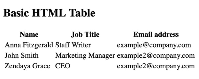
Notice that each column is just wide enough to fit the text, and that there are no borders separating one column or row from the next. The result is cluttered-looking and difficult to read.
Below we’ll look at some ways you can make this table easier to read.
For a visual walkthrough of how to create a more complex HTML table example with HTML and CSS, check out this video by FollowAndrew:
Editing the Table Border
Pro tip: Edit the table border to help the reader understand the relationship among the values, and read the data from left to right and top to bottom.

How To Land a Developer Role in the World of AI
A free checklist to you help you stand out from the competition featuring Software Developer and YouTube Creator Tech With Tim.
- Expert advice on how to build a portfolio
- Top programming languages to learn
- Resume building and interview tips
- Resources to strengthen communication skills
Download Free
All fields are required.

Tables do not have any borders by default. To add borders, use the CSS border property.
Let’s say I want to add a simple black border around my table above. Then I’d just need to add the following CSS in the head section of my HTML file or in my external stylesheet.
The HTML in the body section of the HTML file would stay the same.
Here’s how that would look on the front end:
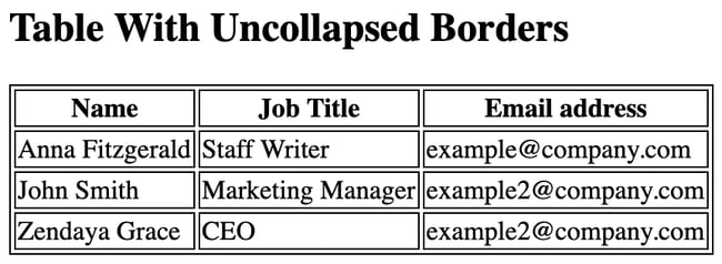
Notice that the borders around the table, table header, and tables cells are separated from each other. To collapse them, use the CSS border-collapse property. You’d simply add this property to your CSS rule set, and set the value to “collapse.” Here’s how your CSS would look now:
Again, the HTML stays the same.
Here’s how that would look on the front end:
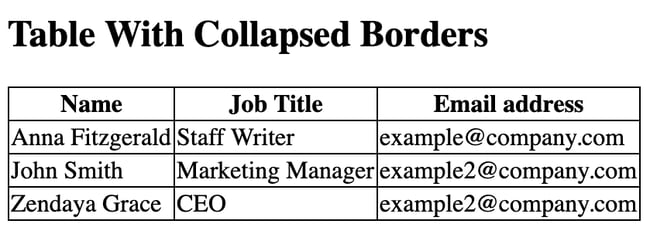
Adding borders has already helped make this table easier to read by clearly delineating which values are names, which are job titles, and which are email addresses — but it still looks congested. Let’s look at how we can add more white space to this table.
Editing the Table Padding
Pro tip: Add padding to a table to make it appear less congested and easier to read.
As mentioned above, tables are only as large as their content requires by default. So your second step is to add more space around the content within the table cells. To do so, use the CSS padding property.
Since padding specifies the space between a cell’s content and its border, you only need to add padding to the table header and table data elements, not the table element itself. That means you’ll create a new CSS rule set that only uses two CSS selectors: th and td. You’d then set the CSS padding property to whatever value you want. Below I’ll set it to 10px.
Here’s what the CSS would look like:
The HTML stays the same.
Here’s how that would look on the front end:
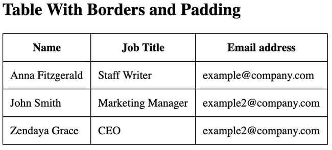
The table is looking much clearer now, but it's still difficult to cross reference the data. We can make that easier by differentiating the header from the other cells. Let’s look at how below.
Editing the Table Header
Pro tip: Edit the table header to distinguish the categories of data from the data points.
To make the table header stand out, you can do something as simple as add a background color to those cells. You’d just need to use the element selector “th” to apply unique style properties to the header only.
Below, you’ll use the same CSS as above but add a third rule set that contains the CSS background-color property. You can then set the property to a specific color value using a hex color code. For this example, I’ll use a hex color code for a soft shade of yellow.
Here’s the CSS:
Here’s how that would look on the front end:
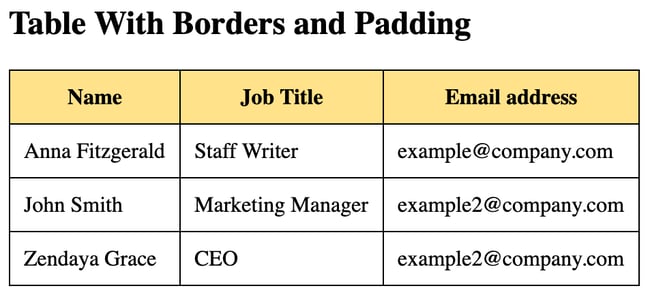
With the header styled, it's easier to scan the table for names, job titles, and email addresses. Some more negative space might make it even easier to scan. Let's look at how to add some by styling a column below.
Editing the Table Column Width
Pro tip: Edit the table column width to add more whitespace in a table.
If you had to guess how to style a column, you might think you’d have to add a style attribute to the cell of each row. That’d be frustrating, right? The good news is you don’t have to.
You can use the <colgroup> tag instead. This tag specifies a group of one or more columns in a table so you can apply CSS to columns rather than cell by cell.
To create this group, you’d add the <colgroup> tag to the body section of your HTML file. Within this tag, you’d then add a <col> tag for every column in your table or every column you want to style. Here’s what the HTML code looks like:
You can then target this group of columns with CSS. Let’s say you don’t want to just specify the padding — or space between a cell’s content and its border — you also want to specify the width of each column. Then you could add another rule set to your CSS and define the width property.
Here’s how the CSS would look:
Here’s how the HTML would look:
Here’s how that would look on the front end:
-1.webp?width=650&height=189&name=How%20to%20Make%20%26%20Edit%20Tables%20in%20HTML-Sep-23-2020-03-03-09-16-PM%20(2)-1.webp)
Let’s say you’d like to change the width of only one column, like the column containing email addresses. Instead of adding internal CSS to the head section of your HTML file, you could simply add a style attribute to the third <col> tag in the body section. Within that attribute, you’d add and specify the width property. Here’s how the <colgroup> tag would look:
Here’s how that would look on the front end:
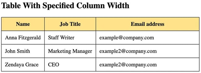
Specifying the column width of your table in this way can provide more space for longer inputs, like email addresses.
In addition to changing the column width of an HTML table, you can make a cell span multiple columns. Let's look at how.

How To Land a Developer Role in the World of AI
A free checklist to you help you stand out from the competition featuring Software Developer and YouTube Creator Tech With Tim.
- Expert advice on how to build a portfolio
- Top programming languages to learn
- Resume building and interview tips
- Resources to strengthen communication skills
Download Free
All fields are required.

HTML Table Column Span
Pro tip: Use a column span if presenting two columns of data that are related, like cell phone and home phone numbers.
In some instances, it makes sense for a cell to span multiple columns. For example, a header cell that titles a group of columns should span more than one column.
To make a cell span more than one column, you can use the colspan attribute. Simply add it to the opening tag of the table header (or a table cell) and set it to the number of columns you want it to span.
For the example below, let’s say you’d like to add both the cell and home phone number of your staff members to the table. In that case you'd add new <th> tag with a colspan attribute set to "2." Then, you'd add two more <td> tags containing the employees' phone numbers to each row.
Note: we'll use the same CSS from the example above.
Here's how the HTML would look:
Here’s how that would look on the front end:

Now that you’ve changed the padding, column width, alignment, and more of your table, you might be looking for a few more ways to make your table stand out on the page. One way is to change the background color of not just the header but the whole table. Let’s go over how.
Editing the Table Background Color
Pro tip: Edit the table background color to differentiate a table from other elements on a web page and draw the reader's eye.
To change the background color of the whole table, not just the table header, then you simply define the CSS background color property for both the table header and table data elements. Here’s how your CSS would look:
Here's how the HTML would look:
Here’s how that would look on the front end:
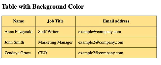
Changing the background color of your table can help it stand out on a web page and draw the visitor's eye to important information it contains.
If you’d like the table header and table data elements to have different background colors, then simply use the two element selectors, “th” and “td,” and set the background color property to different hex color codes or color names.
Here’s what the CSS might look like:
The HTML stays the same.
Here’s how that would look on the front end:
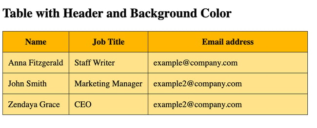
Changing both the header and background color of a table can ensure it stands out on the page and allows readers to easily cross reference the data.
Another way you can make sure your table is not getting lost among other content on the page is to increase its font size. Below we’ll look at how.
HTML Table Font Size
Pro tip: Increase the font size of the table header to grab the reader's attention and help them slow down when reading through the table data elements.
To change the size of the font in an HTML table, use the CSS font-size property. You can use this property for the table header and table data elements. But let’s say you want to increase the font size of the table header only.
Then your CSS would look like this:
Your HTML would stay the same.
Here’s how that would look on the front end:
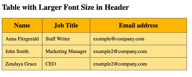
Changing the font size is another way to differentiate the header from the rest of the data in a table, which can make it easier to scan.
Once you’re mostly happy with the appearance of your table, you might be interested in changing its position on the page. One way you can do that is by changing its default alignment. Let’s look at how below.

How To Land a Developer Role in the World of AI
A free checklist to you help you stand out from the competition featuring Software Developer and YouTube Creator Tech With Tim.
- Expert advice on how to build a portfolio
- Top programming languages to learn
- Resume building and interview tips
- Resources to strengthen communication skills
Download Free
All fields are required.

Centering a Table In HTML
Pro tip: Center a table to set it apart from the rest of the left-aligned content on a web page.
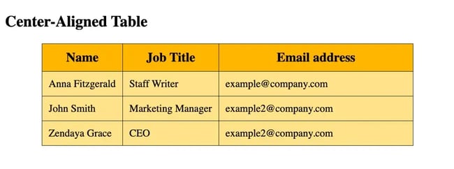
By default, elements, including the table element, will be left-aligned on the page. If you’d like to center it on the page, use the CSS margin property.
First, you’ll add a class name to the table element. In the example below, I’ll use the name “center.” Then you can use the class selector to center align the table element only. The other elements on the page will remain left aligned. Here’s how the HTML will look:
You’ll then add another rule set to your CSS. Using the class selector “.center”, you’ll set the margin-left and margin-right properties to “auto.” That way, the table will take up whatever width is specified by CSS or by the content it contains and the browser will ensure the remaining space is split equally between the left and right margins.
Here’s how the CSS would look all together:
Here’s how that would look on the front end:
Nesting Tables in HTML
Pro tip: Nest a table within a table to create a complex, visually interesting table layout.
You can nest tables — or create tables within tables — in HTML. To make a nested table, simply create another table element with table header, table row, and table data tags and place it inside any <td> tag of the existing table.
Let's say I want to list the home and cell phone of a staff member in a nested table.
Here's how the CSS might look:
Here's how the HTML might look:
Here's how that would look on the front end:

Making Tables in HTML
If you want to share large amounts of data on your website, then use tables to present this data in a way that’s easy for visitors to read and understand. Any of the steps described above can help you add and customize tables to your unique website. You’ll just need to be familiar with some HTML and CSS.
Editor's note: This post was originally published in September 2020 and has been updated for comprehensiveness.

How To Land a Developer Role in the World of AI
A free checklist to you help you stand out from the competition featuring Software Developer and YouTube Creator Tech With Tim.
- Expert advice on how to build a portfolio
- Top programming languages to learn
- Resume building and interview tips
- Resources to strengthen communication skills
Download Free
All fields are required.


![Supercharge Your HTML Email Design With Tables [+ Templates to Get You Started]](https://knowledge.hubspot.com/hubfs/html-email-table-1-20250206-8866146.webp)

![HTML Projects for Beginners: How to Create a Personal Portfolio Page [Step-by-Step]](https://www.hubspot.com/hubfs/personal_portfolio.png)



![How to Embed Google Map in HTML [Step-By-Step Guide]](https://www.hubspot.com/hubfs/Google%20Drive%20Integration/How%20to%20Embed%20Google%20Map%20in%20HTML%20%5BStep-By-Step%20Guide%5D-2.jpeg)
![How to Create an HTML Tooltip [+ Code Templates]](https://www.hubspot.com/hubfs/Google%20Drive%20Integration/How%20to%20Create%20an%20HTML%20Tooltip%20%5B+%20Code%20Templates%5D.jpeg)
![How to Make an HTML Text Box [Examples]](https://www.hubspot.com/hubfs/html-text-box.webp)
