.png?width=112&height=112&name=Image%20Hackathon%20%E2%80%93%20Vertical%20(50).png)

Once you’re ready to get started, be sure to check out HubSpot’s CMS tools which offer a free suite of content management tools for marketers and developers. Now, let’s dive into examples of pink websites.
Best Pink Websites
- Pink Products
- Elementor
- Moonpig
- T-Mobile
- Benefit Cosmetics
- Victoria’s Secret
- Very
- Baskin-Robbins
- Bulb
- Cupcake Jemma
- Donut King
- Claire’s
- HMV
- Bio & Me
- Sheila’s Wheels
- Pink Lady Apples
1. Pink Products

With a brand name like Pink Products, you know exactly what to expect from this website. This lively but fun design is almost entirely pink.
The contrast between white and pink allows the text and menu to really pop. The color pink is psychologically linked to femininity and youth. Considering Pink Products is a brand designed by women for women, pink couldn’t be a better choice for their vibrant website.
The modern design includes lively diagonal sections, and the pink squiggles highlight sections with a youthful, playful feel.
Why we like it: The bright and bold design of Pink Products is eye-catching, stylish, and modern with a fun feel.
2. Elementor

Elementor, a website creation platform, uses the color pink frequently on its website! The hero section is hot pink with burgundy accents color. Pink and burgundy are in the same color family. The colors play well together, and the contrast looks aesthetically pleasing on the page.
Throughout the site, pink makes a second appearance in icons accented against the white background and link rollovers. Elementor reverses the hero color using pink against burgundy in certain sections of the site.
This site feels fun and youthful. Considering Elementor founders started design in their teenage years, this might be exactly what they wanted to evoke through the use of pink. Additionally, Elementor probably wants its product to feel friendly and easy to use.
Why we like it: Elementor goes bold with the pink at the top of the homepage but later brings it in more subtly. The pink hero grabs attention early on and feels fun. Further down the page, Elementor uses pink as more of an accent color so it doesn’t become too overwhelming.
3. Moonpig

Moonpig’s logo is pink, so it’s natural that pink features throughout the website's color scheme. The homepage has a pink banner advertising a 30% offer, pink links, and strawberry CTAs. The hero uses a darker pink than the rest of the site, which helps that section above the fold pop.
A lighter shade of pink is used to separate the “Our Favourite Cards Right Now” section. This color block helps this section stand out, and the pink contrasts the cards.
Why we like it: Moonpig uses different tones of pink to make the color prominent without getting boring.
4. T-Mobile

T-Mobile has pink baked into the brand. Its logo is a magenta square with a white T. This pink features prominently across the website — in hero images, product highlights, CTAs, and footers.
Unlike other sites, T-Mobile stays consistent with one shade of hot pink. They don’t incorporate a lighter tone. The hot pink provides a strong contrast for white text to pop and white breaks in the page allow color blocks to pop.
Why we like it: T-Mobile manages to keep the color looking fresh by incorporating gradient effects and stylistic calls to action, sharing, “Great value and an award-winning network.”
5. Benefit Cosmetics

Benefit Cosmetics is well associated with pink. As a cosmetics brand, Benefit doesn’t shy away from pink within its website color scheme. Pink is the primary color throughout.
Similarly to Moonpig, Benefit embraces different tones of pink to keep the eye engaged and the website interesting. On the Benefit site, you can find brighter pink in banner CTAs, like “FREE HEADWRAP,” and lighter pinks as a background color for products.
Why we like it: Benefit makes full use of the pink color scheme at every opportunity. The pink is representative of the brand, femininity, and sophistication.
6. Victoria’s Secret
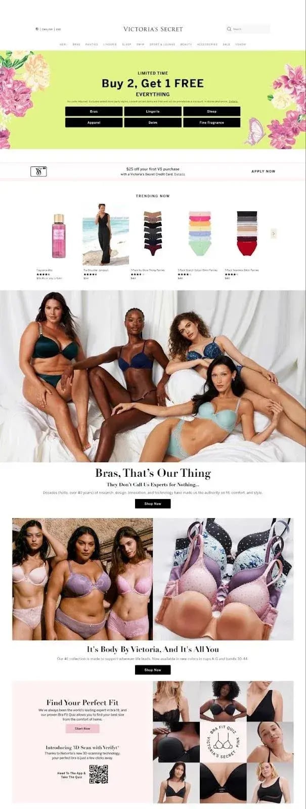
Pink has been part of the Victoria’s Secretlogo and brand since 1977. The color features heavily in their marketing, advertising, and the products themselves.
Because so many of the products are pink, the site doesn’t use magenta in excess. The hero image is a bright green with pink accents that draw the eye. Items for sale are shown over a white background as well, so the pink of the perfume or undergarment isn’t lost.
Pink is associated with femininity and romance, which aligns well with the brand’s elegant lingerie.
Why we like it: Victoria’s Secret uses pink as an accent color. The pink highlights important CTAs, like their bra fitting service, as well as marketing messaging, like free shipping and Victoria’s Secret credit card. Pink is known for creating a sense of urgency which works well for CTAs.
7. Very
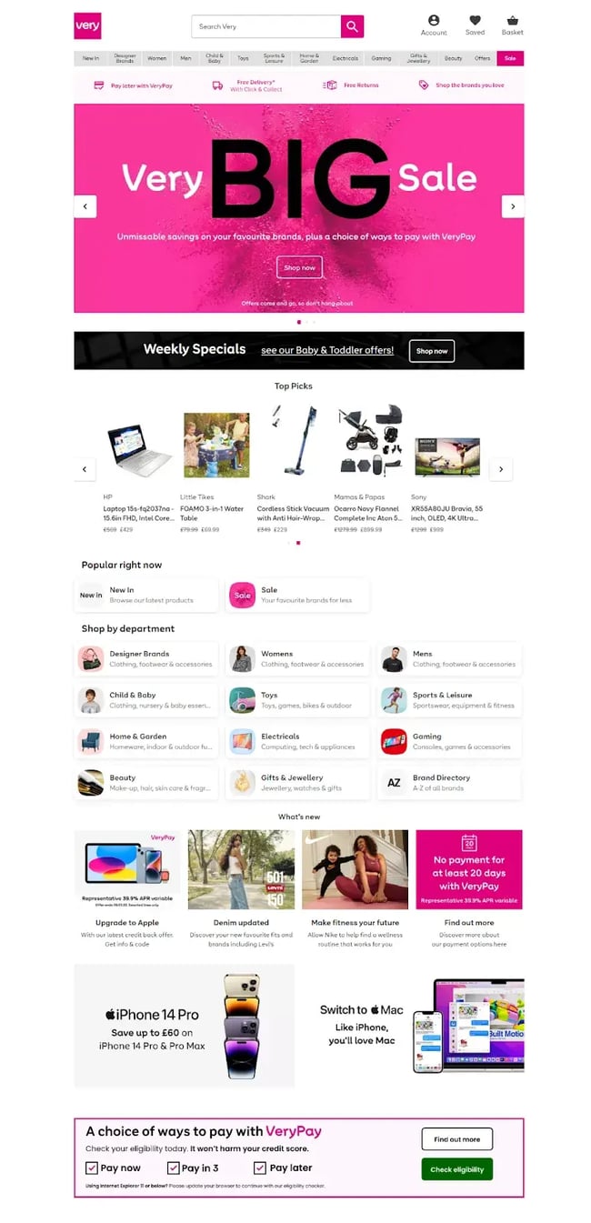
Very uses a pink color schema across its website. Like Victoria’s Secret, pink has been a part of Very’s branding since the beginning. Very’s pink color scheme incorporates different tones of pink.
The logo is a hot pink color, which is also used to help the most important information on the site stand out. The bold pink is used on links, and the color block highlights Very’s payment terms. Pink also makes an appearance in iconography.
Why we like it: The splash of pink in the hero grabs attention and contrasts well with the pink and black font. The pink color scheme continues throughout the site with bold pink tones drawing attention and lighter tones, used as a color block, that help break up information.
8. Baskin-Robbins

In the early days of the Baskin-Robbins brand, pink was the primary color. As the brand and logo developed, pink was complemented by other colors like blue and black. Although the logo is now pink and black, the site pays homage to its memorable color palette featuring all its initial colors.
Why we like it: Baskin-Robbins nods to previous color palettes with CTAs featuring half blue and half pink.
9. Bulb

Bulb uses its brand’s pink across its entire site. In the homepage hero image, pink is used creatively against dark blue. The pink resembles a bulb, and the stylistic pink lines around the bulb look like light rays.
The website’s pink color scheme is featured at almost every scroll and is used in images and icons — even the longhorns are colored pink. Art uses pink and blue as their main colors, creating cohesion across the site.
Why we like it: Bulb creatively uses pink to color the stars in Google reviews. This helps integrate reviews into their marketing, giving them ownership over their excellent review count of 4.9/5.
10. Cupcake Jemma

Cupcake Jemma’s homepage opens to a large pink background on the hero section. The lighter pink is used here to contrast with the darker pink in her book, along with aqua and white. The hero is large, so the book demands the user’s attention.
In the first section below the hero, the website has a different tone of pink so that each section stands out.
Why we like it: Cupcake Jemma’s brand is fun and colorful. The pink brings a layer of playfulness and youth.
11. Donut King

For international business, brand consistency could not be more important, and Donut King is a leading example of branding done right.
The pink in their logo is carried through their entire website. We can also see that pink is used across socials and even within their store. Their strong pink color scheme means you’d never miss a Donut King if you saw one.
Why we like it: This brand has excellent consistency with the pink website color scheme and usage of pink on social and in-store.
12. Claire’s
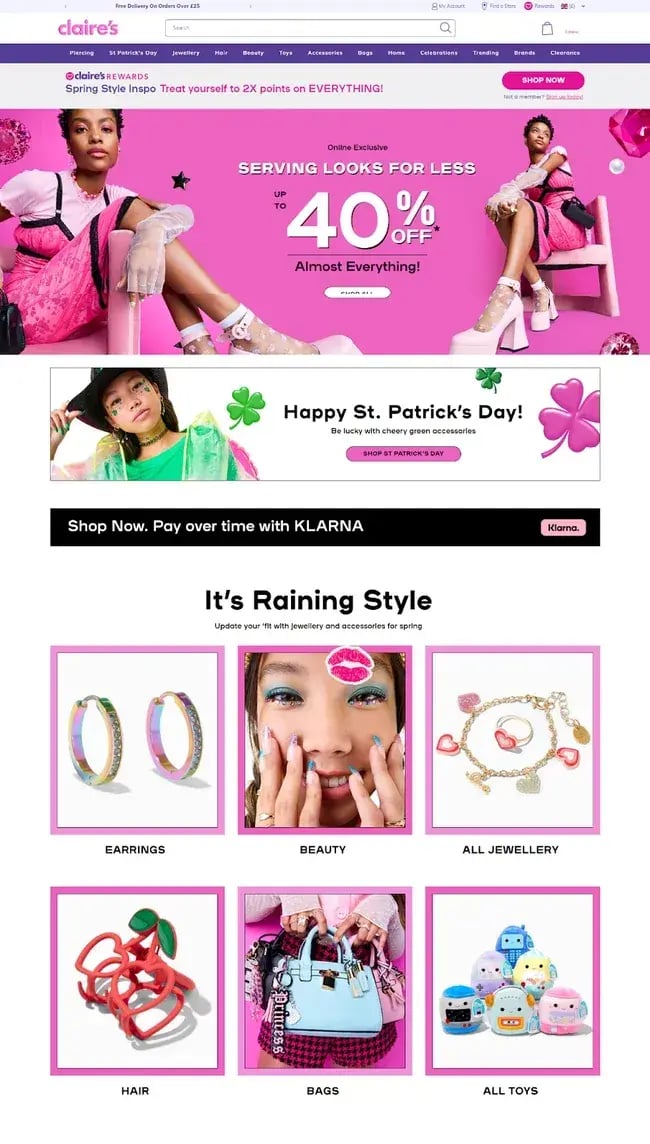
It’s no surprise that Claire’s website uses the color pink well. The brand values center around self-expression and bringing joy.
Claire’s is an accessory brand that predominantly targets teenagers and young women. The pink color scheme on their website and in their branding incorporates all things Claire’s: joy, youth, and femininity.
Why we like it: The bold hero pink borders around Claire’s CTAs keep pink consistent throughout the entire site. The playful pink lips on the “beauty” CTA add a splash of fun.
13. HMV

HMV didn’t always lead so strongly with pink in their logo or their brand. In 2023, their website uses quite a lot of pink. It contrasts well against white and helps buttons stand out with a pink outline.
The “Shop now” text is also in pink, as well as the items they most want to stand out on the website, such as the logo, the cart, and callouts for savings on products.
Why we like it: HMV’s logo wasn’t always pink. The usage of pink now shows how the brand has developed. Pink is bright and modern.
14. Bio & Me

Bio & Me uses pink as a secondary color on their website. The modern hot pink helps draw attention to some of the site’s key messaging, such as free shipping and the brand value propositions (good for your gut, high in fiber, etc.).
Along with a bright orange and purple, pink is used as a background for some of the best sellers.
Why we like it: The pink icons are playful and eye-catching.
15. Sheilas’ Wheels

Sheilas’ Wheels is an insurance company for women. The brand leans into its femininity with a strong pink color scheme. Enter the Sheilas’ Wheels website, and you’ll see a Barbie-esque car that gives you a sense of the brand.
Pink is used in the Sheilas’ Wheels logo, in banner CTAs, and as an accent color to help text pop. Their “Handy Optional Extras” section has a large pink background with lighter pink icons next to white text. The contrast from the darker pink helps the white pop.
Why we like it: Sheilas’ Wheels markets to women and uses pink as a representation of the feminine.
16. Pink Lady Apples

Pink Lady Apples are pink by name and pink by nature — and the Pink Lady Apple website is unabashedly pink. The predominant colors on the site are pink and white. Pink is used as a background color as well as on CTAs. Even the text is pink.
The website carries the brand with the bright pink Pink Lady Apple sticker in the “10 reasons to love Pink Lady Apples” section.
Why we like it: Pink Lady Apples have probably used more pink than other websites in this round-up. They’ve managed to do it so effectively by using textured pink backgrounds to keep the site engaging and to break up pink and white color blocks.
How to Design a Pink Website
If pink is your vibe, you’ll be inspired by the 16 pink website examples above. Now, you need to know how exactly these designers turned pink into a website design that works.
If you follow our top designers’ tips, you can make a pink website that you (and your web visitors) will love.
1. Consider the diversity of pink.
Ichizu Wakabayashi, designer and co-founder at Helios Design, shares how diverse pink can be and exactly how you can use it for different archetypes and styles.
Wakabayashi says, “Pink has been a steadfast trend in popular culture, from fashion to cosmetics to interior design. When browsing bookstores, we are often struck by the many ‘millennial pink’ cover designs that grace contemporary fiction titles.”

When it comes to applying the color pink to web design, there are various possibilities.
You can embrace the color in all its “bubblegum-candy-floss” glory and go for a largely monochromatic look like the following websites have done:

Alternatively, you can “ground” the color with analogous hues from the same side of the color wheel, such as red, purple, and navy, for a more sober look:

Yet another approach is to match the color with its complementary hue, green, and go for an edgy, subversive, slightly off-kilter look, which is bound to grab attention:

Pink works particularly well for brands with Caregiver, Innocent, or Jester brand archetypes. The color is perceived to be warm, approachable, playful, and whimsical, matching these profiles.
“Don’t be afraid to explore pink in your next web design!” Wakabayashi says.
2. Objectively consider your typeface pairings.
Amber Miller, founder and brand expert at Oohlala Studio, says that the typefaces you choose should complement the color pink on your website.
“Serif typefaces come in a range of serious and traditional to more modern and contemporary, the traditional sets (think Baskerville, Bodoni, Didot) have the power to make pink look more refined and elegant,” Miller says.
A more modern serif with swooping decorative glyphs maintains elegance but with a more youthful tone. Miller continues to share tips for sans-serif typefaces that lean into a more contemporary, playful vibe.
“With sans-serif typefaces, weight and geometry play a big role in their perception. Bold and thick sans-serif fonts will make the pink appear more vibrant and intense — these weights work great for sports brands or brands looking to create high impact or portray high energy,” Miller says. “Thin and delicate will have the opposite effect, making it more dainty and subdued. A sans-serif that is more angular and geometric can make it look more bold, edgy, and forward-thinking.”
Miller’s website, Oohlala Studio, is an example of a serif paired with a geometric sans serif.

On script fonts, Miller says, “Script fonts, handwritten fonts or those typefaces with lots of curves and flowing lines can make pink appear softer, and more feminine, they can also help contrast a traditional serif, bringing in a touch of personality and whimsy.”
Larkspur Floral Design is an example of a site using a script in bold pink. This style exudes the brand’s personality but not in a jarring way for clients.

Miller concludes, “The choice of typeface can have a significant impact on how the color pink is perceived. Designers use this to their advantage to create specific moods and emotions in their designs.
Before choosing your typeface pairings, it's important to objectively consider the overall style and tone of the typeface to ensure it complements your brand's personality and message.”
3. Lean into white space.
Kate Smoothy, website designer and owner at Web Hive Digital, advises leaning into white space.
She says, “Use pink to draw the eye to accents on the page, like product images, buttons, and call-out sections. Lots of white space makes your website content easier to digest, and you can use pink to guide the user journey to your conversion points.”
4. Use pink to help your brand stand out.
Chris Evans, designer at The Bearded Web Designer uses Muc Off’s website to illustrate the value of using pink to help your brand stand out.
Evans says, “Muc Off is regarded as one of the leading cycling cleaners in the world and aims itself firmly far from the mundane world of speed and excitement in the sports of motorcycling and MTB cycling.”
Using striking colors, such as bright pink, enforces this brand ethos.
“Muc Off is known in the cycling and motorcycling industry as ‘The Pink Stuff,’ which helps it be memorable but also helps its branding stand out. The design of their website leans further into this with contrasting solid colors and black, white, and pink.” Evans says. “With all their important information and calls to action, all use a bright, almost fluorescent pink to grab your attention — which ensures that your gaze is firmly where the designer wants it to be.”

5. Context is everything: consider your target audience.
Luke Keil, design director at boxChilli Digital Marketing, shares his design tip for working with pink. He says, “Vibrant pinks can be very eye-catching and portray a sense of energy and excitement, usually used as an accent color so it's not so overwhelming.”
Less subdued pinks are usually considered feminine in most of the world but also soothing.
Take a look at Too Faced for a website that uses a soft pink to portray a feminine feel.

“You should always check the culture of your target audience,” Keil suggests. “Some contemporary Asian cultures see pink as a more masculine and mournful color, and there have been warrior tribes in history that use pink as an aggressive color, which makes sense as it's on the red spectrum.”
So it’s important to think about the shade of pink. “A more coral pink would go well with yellows for a feminine family feel, whereas a vibrant pink would work well with classic black and white to draw the eye. You could also pair pink with Emerald for a more luxurious feel,” he says.
Kate Spade is an excellent example of a website using pink and green for a luxury feel.

6. Don’t be afraid of pink.
Leanna Williams, Shopify designer, advises, “Don't be afraid to lean into all-over pink, not just an accent, if it works for your brand. Using a pale pink as a background with complementary accents (especially more pink!) is a great way to carry this through the design.”
To illustrate her point, Williams shares Angela Friedman’s site.

As an extra tip, Williams recommends that brands keep the shade consistent across different platforms, like these Instagram highlights.
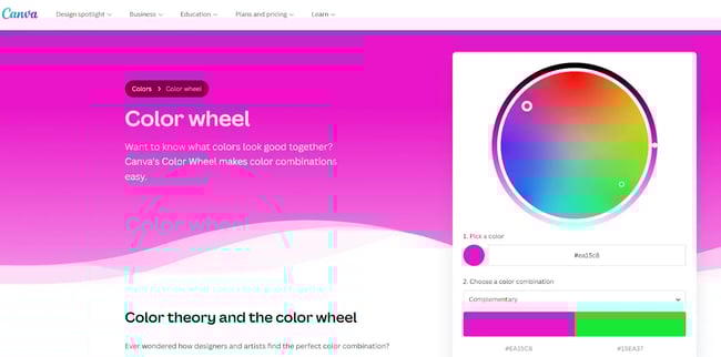
7. Use the color wheel.
When it designing in pink, you don’t need to dive in before you’re confident about complementary colors.
Matt Chiera, founder at Ice Nine Online, says, “Canva has a nice color wheel tool for figuring out complementary color schemes. I find it especially useful in situations where I need to figure out a color scheme that matches with a specific color, especially for lesser-used colors like pink.”
Get started with your pink website.
As demonstrated in these pink website examples, pink can help your website and your brand stand out. With tips from experts, you’re now equipped with design tips for working with pink. Now, it’s time to get started.

Website Design Examples


![15 black and white website designs to inspire your own [+ pro tips]](https://53.fs1.hubspotusercontent-na1.net/hubfs/53/black-and-white-website-design-1-20250520-1336267.webp)

![Gradient Website Design Examples That Prove This Trend Is Far From Over [+Tutorials]](https://lh7-us.googleusercontent.com/htOWIbyCIoCMxSjC4gJunkGnhCzXpccjTrL8NwoGdRdCsSiEmEAxe_qBFkMrzy2Y8d3cwEr_DMzSGHq9Xi-hQFnMJCo8HDQJ1yQGigcSfFxI2QKXo0s7xXSB2sY-eALG1iUqnHXgomcDsnp7AHRSH1s)
![15 Brochure Website Examples to Inspire You [+ How to Make One]](https://53.fs1.hubspotusercontent-na1.net/hubfs/53/brochure-website-examples-1-20250319-362228.webp)
![28 Types of Websites to Inspire You [+ Real-Life Examples]](https://53.fs1.hubspotusercontent-na1.net/hubfs/53/types-of-websites.png)

