.png?width=112&height=112&name=Image%20Hackathon%20%E2%80%93%20Square%20(10).png)

In this post, I’ll talk through what primary and secondary navigation are, when to use each, and the main types of navigation structures. Then, I’ll share some of my favorite secondary navigation examples, followed by some expert-approved best practices to help you build your website navigation like a pro.
Table of Contents
- What is primary navigation?
- What is secondary navigation?
- When to Use Secondary Navigation
- How to Apply Primary vs. Secondary Navigation
- Types of Primary and Secondary Navigation Menus
- Examples of Secondary Navigation Menus
- Secondary Navigation Menu Best Practices
- Nailing the Navigation
What is primary navigation?
Primary navigation is the principal navigation interface on a website. It links to the most important website pages and appears prominently at the top of the homepage and other pages. The primary navigation menu helps users quickly find the content they’re most likely to want to see with minimal searching and clicks.
Importantly, though most multi-page websites have primary navigation built into their user interface, the pages those navigation bars link to will vary. For instance, the primary navigation of an ecommerce website could link to different product sections, a pricing page, and/or a support page.
Take Apple’s homepage: Users could land here in search of any Apple product, so the primary navigation links to their different product category pages.
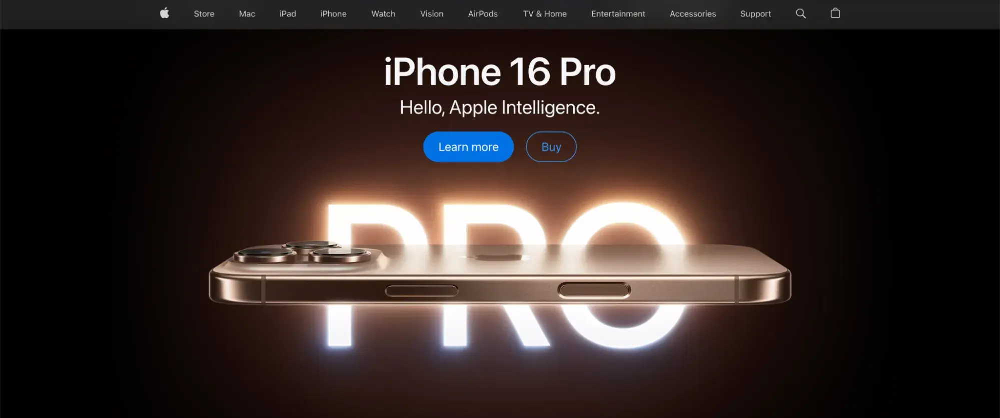
In contrast, a nonprofit might feature “About Us” and “Donate” sections in its primary navigation, as these pages are most relevant to its target audience.
Choosing which links will go into your primary navigation is all about providing an easy gateway to your most in-demand pages.
.png)
Free UX Research Kit + Templates
3 templates for conducting user tests, summarizing your UX research, and presenting your findings.
- User Testing Template
- UX Research Testing Report Template
- UX Research Presentation Template
Download Free
All fields are required.
Form not available
What is secondary navigation?
While your primary navigation lists your top most relevant pages, many larger, more complex websites benefit from a secondary navigation as well. A secondary navigation appears in conjunction with primary navigation and includes links to content that is less important than the primary pages but which should still be easily accessible from any location on the page.
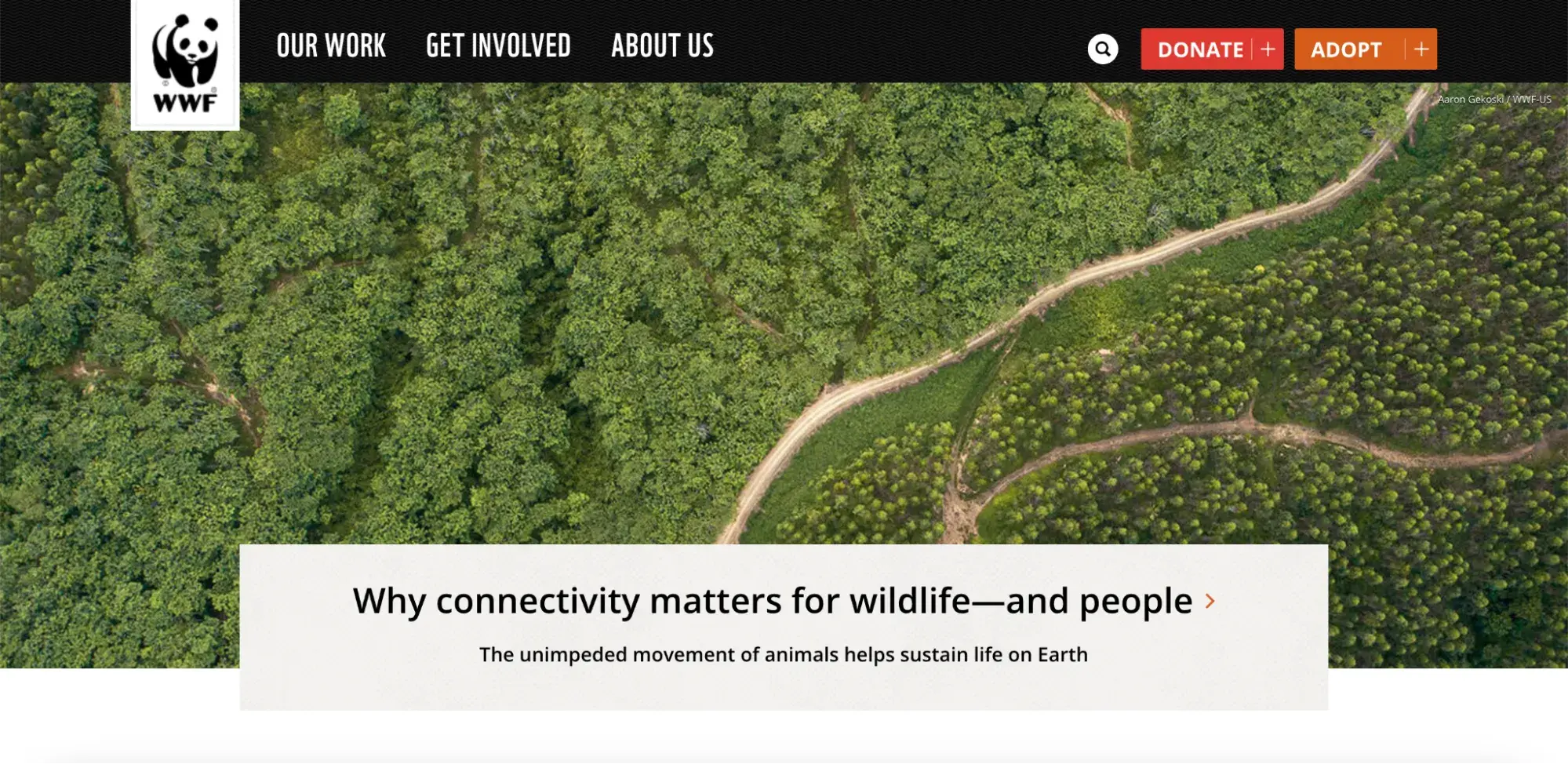
For example, the World Wildlife Fund incorporates both primary and secondary navigation interfaces into its website header. Notice how the primary and secondary menus are separate, and the primary menu is signaled by its placement next to the logo and all-caps typography.
When to Use Secondary Navigation
Importantly, not every website requires a secondary navigation menu. In my experience, a secondary navigation is useful for websites with a lot of different kinds of content, while for more pared-down websites, a primary navigation menu alone may be sufficient.
As Brian Dordevic, founder of the web design agency Alpha Efficiency, explains, “Whether or not you should create a secondary navigation design depends on the size and complexity of your site. You probably don’t need it if you have a small site with only a few pages. Your main navigation should be sufficient for users to find what they need.”
However, Dordevic notes that “if your site is larger and more complex, with many different sections and subsections, secondary navigation can be beneficial. For example, if you run an online store with many product categories, you can help users quickly navigate to specific types of products.”
Dordevic continues, “Another scenario where secondary navigation can be helpful is if you have a lot of content on your site, like a blog or news site. Adding secondary navigation will make it much easier for website visitors to find articles by category, tag, or date, for example.”
In my experience, if you’re not sure whether you need a secondary navigation, see if you can make your website work without one. Then, if you discover that you just have too many pages to fit into your primary navigation (or if you observe that your users are struggling to find key pages on your website), then you can consider adding a secondary navigation.
How to Apply Primary vs. Secondary Navigation
Once you’ve determined that you want to include both primary and secondary navigation, it’s time to determine which links should go where. That means identifying which pages are of primary importance and which are secondary.
This classification process should be informed by metrics and your user base (not by your own opinions, gut feeling, or intuition). Specifically, there are a few strategies I’ve found can be effective in sorting your site’s content:
- Page traffic — Review the traffic analytics for each of your pages to group them into popular and unpopular pages.
- Interviews — Speak with your customers about how they tend to use your site and what you could do to improve its navigation.
- Card sorting — This is a simple activity to help you visually divide your pages into primary and secondary levels. See HubSpot’s guide to card sorting for instructions.
These strategies should help you develop a clearer sense of where your users tend to go from the homepage. Through this process, you might also realize that some pages can be merged or removed, making for a simpler, tidier site.
Types of Primary and Secondary Navigation Menus
Over the course of my career, I’ve learned that there are two ways to implement primary and secondary navigation menus: a combined approach or a separated menu structure.
Combined Menu
In a combined menu, users access the secondary navigation through the primary navigation in a single, dynamic menu display.
When the page loads, only the primary navigation is visible within the menu. Then, when a user interacts with a primary menu (either by hovering their mouse over it or clicking on a link), the secondary navigation links appear in a vertical drop-down or horizontal pop-out display.
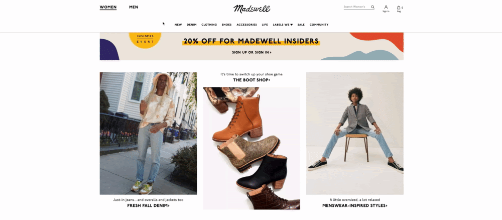
One of my favorite clothing retailers, Madewell, structures their navigation interface in this way. Each primary link reveals a menu of secondary options:
Pro tip: A mouseover trigger works well for opening dropdowns on desktop, but not so much on touchscreen devices or assistive devices. To accommodate for this, I recommend setting your dropdowns to also expand on touch events, click events, and when the “enter”/”return” key is pressed. In this way, you can ensure that your combined menu interface will be accessible across devices.
Free UX Research Kit + Templates
3 templates for conducting user tests, summarizing your UX research, and presenting your findings.
- User Testing Template
- UX Research Testing Report Template
- UX Research Presentation Template
Download Free
All fields are required.
Form not available
I especially like this dynamic menu technique because it helps users access hierarchical content. By design, this approach shows the user where each page belongs within your site structure and which categories contain which subcategories.
In addition, a combined menu also frees up page space by hiding secondary links (though this may be a downside for users who prefer to view all of their options at once).
Separate Menus
If you can spare the space, consider separating your primary and secondary navigation into two static menus instead.
With this approach, the primary navigation menu is typically laid out either horizontally at the top of the page or vertically on one side. Then, the secondary navigation is laid out with its own menu somewhere else on the page.
If you opt for a separated approach, it’s important to make sure that the primary and secondary navigation menus are visually distinct from each other. In addition, you’ll want the primary menu to be larger than the secondary menu and placed more prominently on the page to clearly indicate which menu is which.
For example, Canadian golf retailer Haywood Golf adopts a separated menu approach, using a vertical layout to display first the primary navigation and then the secondary menu.
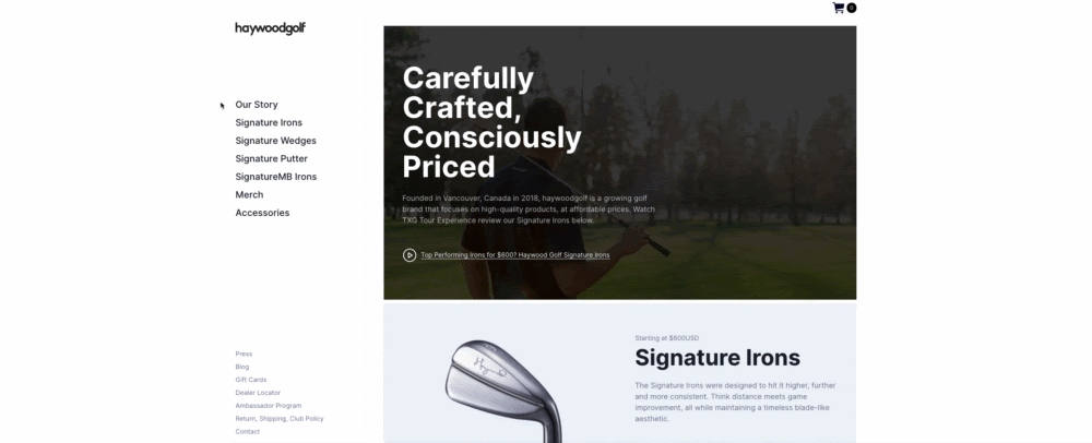
What I like: The Haywood Golf website uses both text size and color to visually distinguish the two navigation menus. It uses larger, black text for the primary menu and smaller, gray text for the secondary menu.
Whether you go with a combined or separated structure, make sure to keep the format consistent across your entire website. After all, inconsistent navigational elements will make it harder for visitors to find the pages they’re looking for, creating a disorienting and frustrating user experience.
Examples of Secondary Navigation Menus
Now that we’ve covered the basics, what does this look like in practice? Here are some of my favorite examples of secondary navigation menus:
1. Zoom
The Zoom website takes an interesting approach to separating its primary and secondary menus.
Rather than listing the two menus one after the other, either vertically or horizontally, this website has two horizontal menu bars, one on top of the other. This enables the website to keep the two menus visually distinct, while still enabling easy access to both.
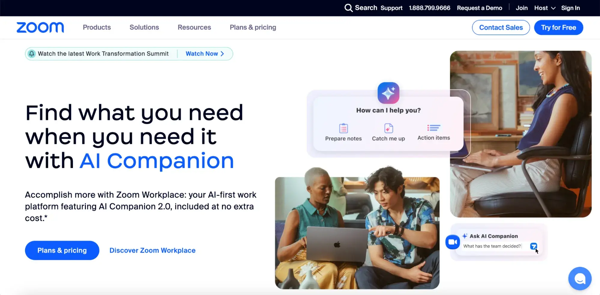
Pro tip: Stacked menus can be a great way to keep your primary and secondary navigation menus distinct while still ensuring both are easily accessible to users.
2. Stripe
While Zoom takes a separate menu structure approach, Stripe opts for a combined primary and secondary navigation. I think this makes sense for Stripe, as it has substantially more pages to include in its secondary navigation than Zoom does.
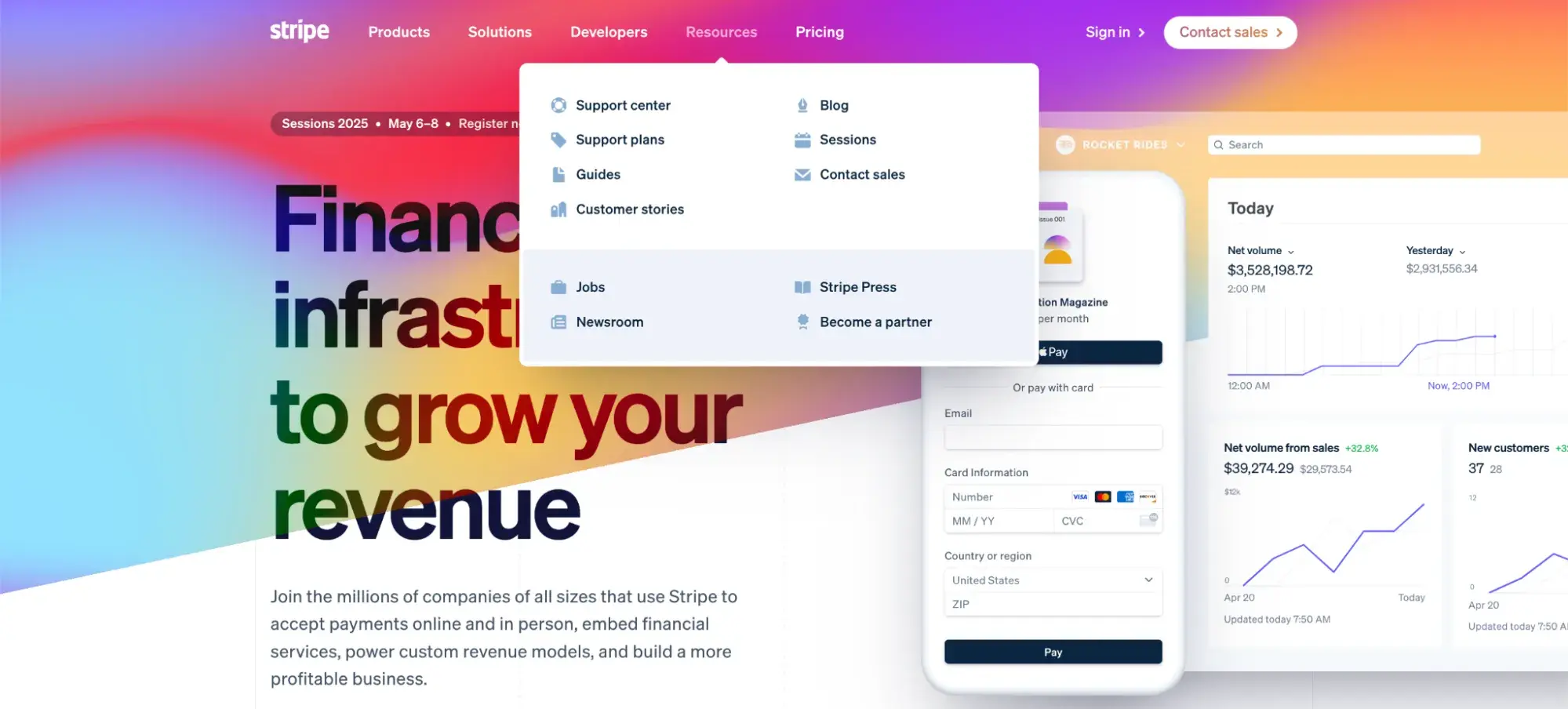
What I like: Initially, the Stripe website displays a fairly limited primary navigation menu. But when you scroll over each primary page, a large, secondary navigation menu appears. This makes it easy to access a lot of different content right from the homepage.
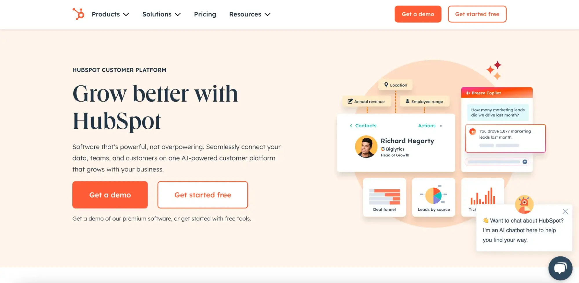
3. HubSpot
I may be biased, but I’ve always loved the HubSpot website’s approach to navigation. When you first visit HubSpot’s website, you’re greeted with a clean, simple menu structure.
However, when you scroll over each primary menu item, an extensive full-page secondary menu pops up, giving you access to many additional pages. In this way, I’d argue that the HubSpot navigational structure offers the best of both worlds, starting the user off with a single simple menu but still ensuring that any page the user might want to visit is at their fingertips.
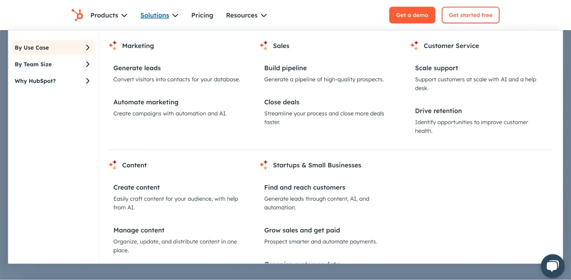
Best for: A combined primary and secondary navigation menu structure is best for websites with a lot of different pages that need to be included in the menu.
4. Zalando
While many ecommerce websites opt for combined menus in order to enable easy access to a large number of product categories, clothing retailer Zalando takes a different approach.
This website lists its primary and secondary navigation menus separately, without requiring the user to click or scroll over the primary menu (e.g., “Women,” “Men,” and “Kids”) to see secondary links (e.g., “Clothing,” “Shoes,” etc.).
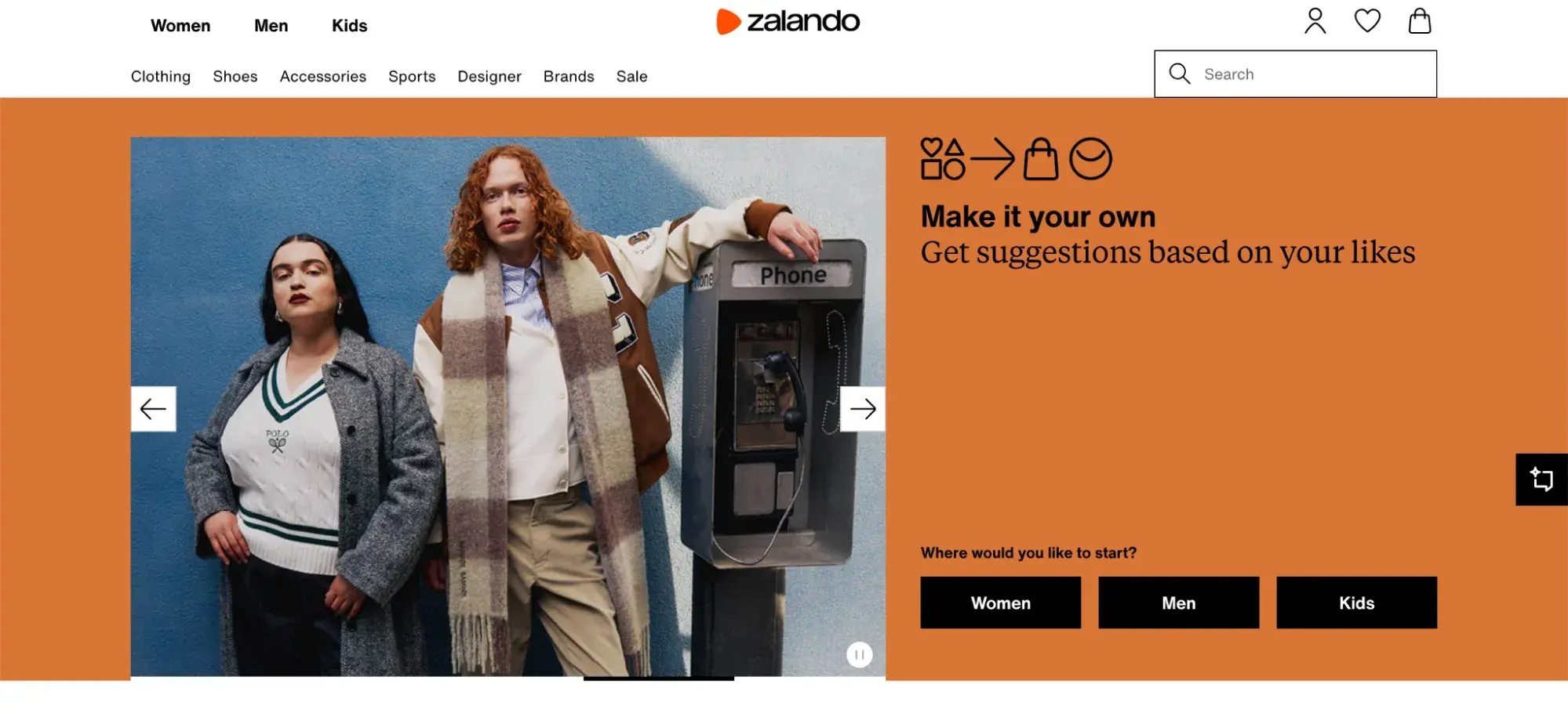
As a consumer, I often find online clothing shopping experiences a little overwhelming. As such, I really appreciated the simple, accessible approach that Zalando took to its website navigation menu design.
Pro tip: A simple, separated menu structure can be a great way to ensure both primary and secondary navigation links are easily accessible (without overwhelming the user).
5. HelloFresh
Another one of my favorite secondary navigation examples is HelloFresh’s website. Meal delivery service HelloFresh leverages a combined menu structure, but with a different approach than many similar websites take: While other websites use a combined menu structure to stuff their secondary navigation full of a large number of links, HelloFresh’s secondary navigation menus are quite sparse.
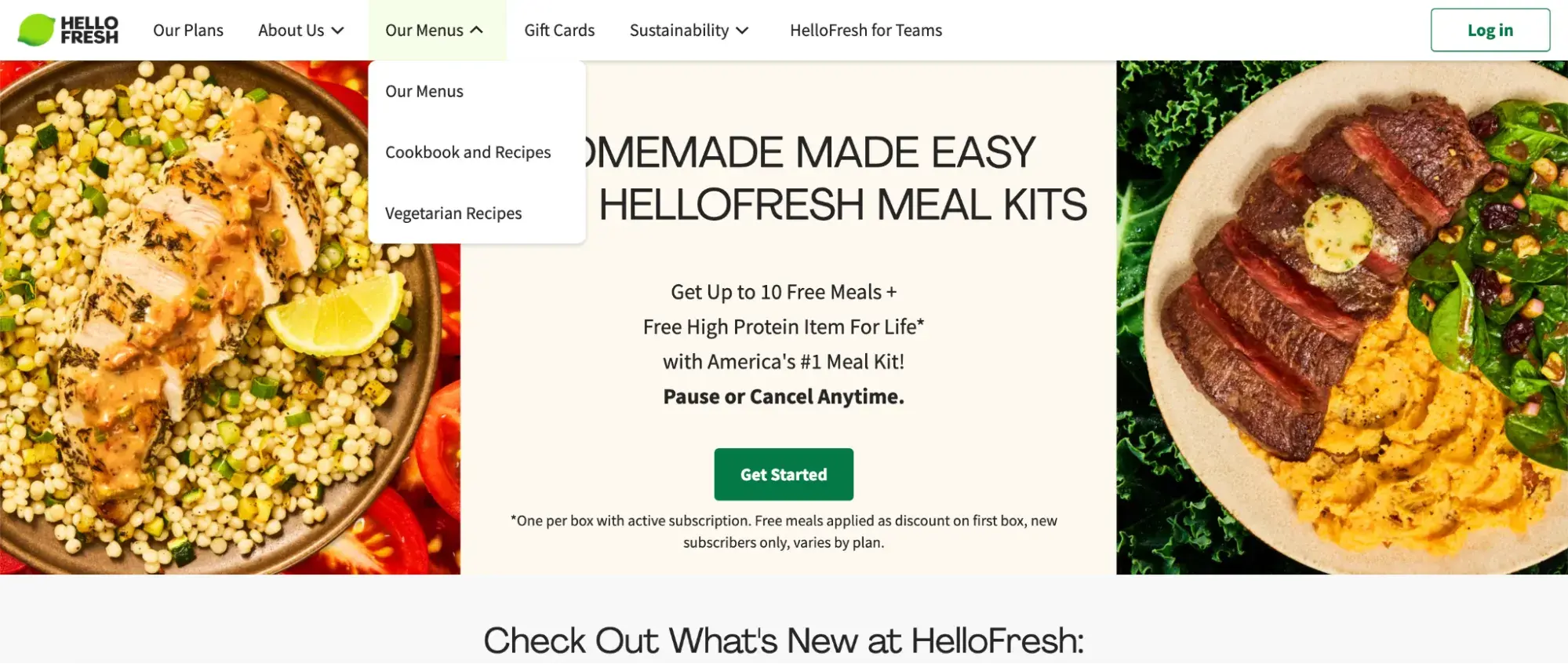
With just three secondary navigation menu items under its “About Us” and “Our Menus” primary links, this website keeps the content within its secondary navigation quite minimal. In this way, HelloFresh enables its website visitors to access the key pages they’re interested in without drowning them in content.
What I like: Limiting the number of pages in your secondary navigation is an effective way to keep your users engaged while still ensuring they can find the information they’re looking for.
Secondary Navigation Menu Best Practices
Over the course of my career, I’ve learned that every business is unique.
Every organization has its own needs and challenges, and as such, there is no one-size-fits-all solution to secondary navigation menu design. That said, there are several best practices that have helped me avoid common stumbling blocks and craft my secondary navigation menus like a pro.
1. Do your homework.
First and foremost, before you start building out your own website navigation structure, it’s vital to do some research on how similar websites have structured their sites. After all, there’s no need to reinvent the wheel.
For example, if you’re launching an ecommerce site, you don't have to start from scratch. Instead, look up five of your competitors’ websites and see how they structure their navigation menus. Do they include both primary and secondary navigation menus or just primary menus? Do they take a combined approach, or do they list their menus separately?
Once you’ve gathered this information, you can determine which elements of other websites you may want to replicate and the areas in which you’d like to take a different approach. In my experience, a bit of research upfront can go a long way in both saving me time and ensuring my website stands out from the competition.
Free UX Research Kit + Templates
3 templates for conducting user tests, summarizing your UX research, and presenting your findings.
- User Testing Template
- UX Research Testing Report Template
- UX Research Presentation Template
Download Free
All fields are required.
Form not available
2. Group pages logically.
When it comes to developing a secondary navigation menu, one of the most important steps is to group your pages logically. Don’t just randomly list your pages across your menus willy-nilly. Instead, to make sure your visitors can find the content they’re looking for, you’ll want to come up with a clear, consistent structure for your menus.
As digital marketing expert and CEO of the B2B brand development and marketing strategy firm Millenium Agency Linda Fanaras explains, “The organization of your website’s content can significantly affect the user experience. You need to arrange your content logically and group related content together to make it easier for users to find what they’re looking for.”
And what does this look like in practice? Fanaras suggests that “one way to achieve this is by creating a hierarchical structure for your website. You can group pages into categories and subcategories and use breadcrumbs to indicate the user’s location in the website hierarchy.”
She continues, “This approach helps users understand how the website is organized and find the content they need more quickly.”
Developing a logical structure for your navigation menus can take some time, but it’s well worth it. After all, in my experience, grouping pages logically can make the difference between a jumbled mess of a website and a clear, accessible online experience.
3. Choose a combined or separated menu strategically.
Once you’ve grouped your pages into primary and secondary navigation menus, it’s time to choose whether you’ll display those links in a single, combined structure or in separate menus. This is not a choice to be taken lightly. On the contrary, I’ve found that it’s essential to be strategic in your choice of navigation menu structure.
At a high level, this choice largely comes down to the amount of content your users need access to. For websites that don’t need to share a lot of content in their main menu, a combined approach can be effective. However, if you want to include a large number of links in your secondary menu, a separated structure may be the way to go.
If you’re not sure where to start, I definitely recommend using a tool like HubSpot’s Content Hub to guide your content development efforts. This suite of marketing tools can help you develop and organize your content, making it easy to experiment with different navigation menu structures.
In addition, reviewing the examples I shared earlier in this article can provide some helpful inspiration, giving you a sense of what different approaches to a combined or separated menu design can look like.
4. Be mobile responsive.
Prerak Chaturvedi, founder and CEO of web development firm Webskynet IT Solution, argues that today, “having a mobile-responsive website is not just a technical upgrade; it’s a business necessity. It directly impacts your brand's visibility, user experience, and overall success.”
He’s right. In this day and age, mobile-friendliness is a must. As Chaturvedi explains, “A mobile-responsive website is designed to adapt seamlessly to different screen sizes and devices, ensuring that users have a consistent and optimized browsing experience. Whether viewed on a smartphone, tablet, or desktop, a responsive website adjusts its layout, images, and content automatically to fit the screen.”
To ensure your primary and secondary navigation menus are mobile responsive, make sure to test your website across a range of devices. If your menus look great on desktop but become illegible on mobile, your users will struggle to access the content they need, ultimately harming their experience and making them less likely to stick around.
5. Iterate based on user feedback.
Most importantly, I’ve learned that the only way to improve is to iterate constantly based on feedback. To optimize your secondary navigation menus, it’s critical to solicit feedback regularly from your users — and then act on that feedback.
Linh Khanh, content marketing expert and senior content editor for Userpilot, suggests building “a feedback loop where you listen to what your users say, refine the navigation experience based on actual user feedback, communicate the implementation to your user base, and then collect new feedback for continuous improvement.”
In this way, Khanh explains, you can “uncover friction points and highlight areas where the secondary navigation meets or falls short of user expectations.”
By welcoming feedback from the people who are actually using your website, you can gain visibility into what’s working (and what isn’t). Armed with these crucial insights, you’ll be empowered to iterate more effectively and build the best possible navigation experience for your users.
Nailing the Navigation
Navigation is one of the most significant factors to consider in any website design. Unfortunately, it’s also one of the most challenging to pull off successfully. As I developed this article, it became clear to me that there are no simple guidelines, and there are a lot of considerations to balance. I’ve learned that every site’s approach to navigation will differ depending on the type of content it publishes, its user base, and the personal taste of the people developing it.
That said, with some trial, error, and testing, you’ll be on your way to crafting a combination of primary and secondary navigation that enables you to streamline and enhance the user experience, to reduce browsing friction, and ultimately, to drive conversions and sales.
Editor's note: This post was originally published in September 2020 and has been updated for comprehensiveness.
Free UX Research Kit + Templates
3 templates for conducting user tests, summarizing your UX research, and presenting your findings.
- User Testing Template
- UX Research Testing Report Template
- UX Research Presentation Template
Download Free
All fields are required.
Form not available
User Experience

![How to become a UX designer, a step-by-step guide [expert tips]](https://53.fs1.hubspotusercontent-na1.net/hubfs/53/become-a-ux-designer-1-20240731-321437.webp)


![How to Add a Parallax Scrolling Effect to Your Website [Examples]](https://53.fs1.hubspotusercontent-na1.net/hubfs/53/scroll-Aug-11-2023-05-24-08-8793-PM.png)

![20 UX Design Examples Hand-Picked by Experts [With Analysis]](https://53.fs1.hubspotusercontent-na1.net/hubfs/53/ux-design-examples-1-20250404-8425368.webp)