Usability testing tools help improve your website by identifying user pain points. They let you take action to enhance the experience.

These tools would have been a benefit eight years ago when I built a website for my freelance writing business. While the site itself isn’t bad, per se, it’s not great. The navigation and font are clunky, and the entire experience is underwhelming.
Testing tools could have helped me better use the site, but I had no idea they even existed. With experience comes wisdom, however, so I’ve compiled a list of 10 top usability testing tools so you don’t repeat my mistakes. You’re welcome.
What are usability testing tools?
Why conduct usability testing?
Common Types of Usability Testing Tools
10 Best Usability Testing Tools
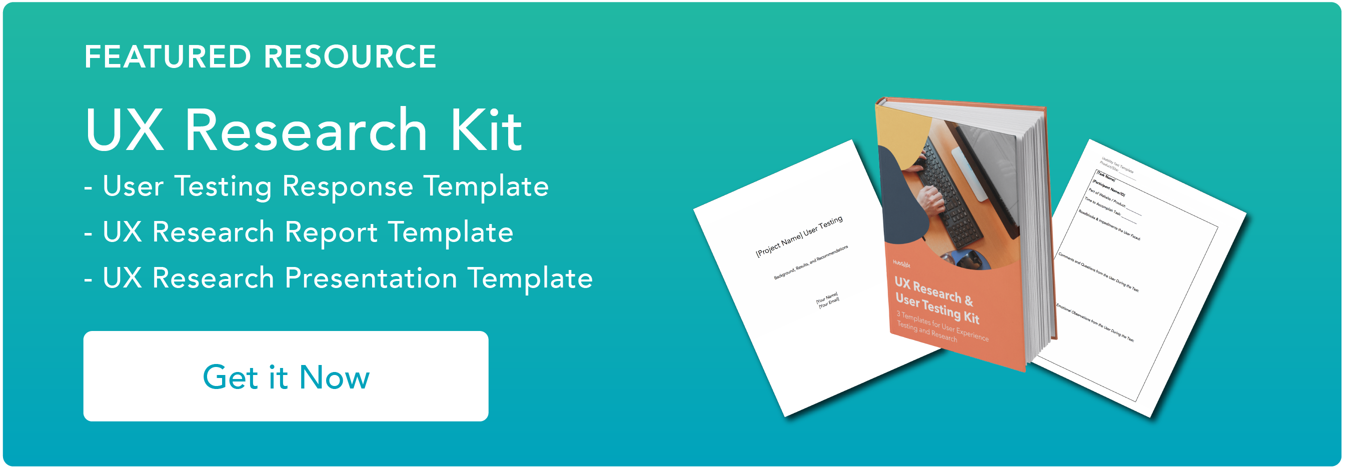
Download Our Free UX Research & Testing Kit
What are usability testing tools?
Usability testing tools help companies find testers, implement testing processes, and automate specific test functions. Implemented effectively, these tools can help companies pinpoint website pain points and make changes that directly improve the user experience.
Why conduct usability testing?
Usability testing lets you find and correct website issues ASAP. This is critical because users won’t suffer through sites that are slow to respond or hard to navigate. Instead, they’ll just take their business elsewhere.
4 Benefits of Usability Testing Tools
Usability tools offer four big benefits for your business:
They’re unbiased.
If you're a one-person operation, your team (or just you) has a vested interest in your website’s success. Ordinary users don’t care.
They have no emotional or financial investment, making them the ideal candidates to provide truthful, unbiased responses.
They’re convenient.
Usability testing tools don’t require special equipment or hardware. Simply install and run them on your site to see what users are doing and start collecting valuable data.
They’re accurate.
While surveys and questionnaires provide useful feedback on your site and its operation, they’re effectively second-hand information. Usability tools capture customer behavior as it happens to create an accurate record.
They provide immediate feedback.
By tracking user actions as they happen, usability testing tools can provide immediate feedback about issues on your site.
For example, if tools show that your site is consistently taking 10, 15, or more seconds to load and users are leaving as a result, you can take steps to solve the problem.
Common Types of Usability Testing
There are four common types of usability testing, each of which offers advantages.
First up is quantitative testing. This type is all about the numbers: How many users are taking a specific action on your site? How long did each user spend on average viewing your homepage before they left?
Qualitative testing is the opposite end of the spectrum. It looks for why, not what. Results can include descriptions of how users felt or what they experienced while on your website.
For example, if your site takes longer than average to load, qualitative testing might ask users how it made them feel — such as frustrated, angry, or bored.
Qualitative testing could also ask why users chose to leave your site, which can help pinpoint common problems.
Moderated and unmoderated testing form the last two types. In moderated testing, users are monitored by a researcher or employee during the test and asked questions directly.
In unmoderated testing, users explore your site on their own. Both have benefits.
Moderated lets companies ask why users are doing (or not doing) things in real-time, while unmoderated testing provides results more reflective of natural user behavior.
10 Best Usability Testing Tools
Are you Ready to start with usability testing but need help determining which tools to use? We’ve got you covered with 10 of the best tools in the business.
1. UXtweak

UXtweak is used by big brands such as Michelin and HP to discover user pain points, but it’s also accessible enough that sites of any size can see the benefit.
Described as an “all-in-one-solution,” UXtweak includes testing tools such as preference and five-second testing, which help discover which designs best communicate your intent and stick with users after they leave your site.
You can also test where users click first on your site, evaluate your mobile site's performance, and even test prototypes before they go live.
What we like: UXtweak offers many powerful testing tools and a free trial if you’re interested. All tools are available for free with no time limit.
Business and enterprise plans, meanwhile, let you create your own studies and tasks and come with expert technical support.
2. Lookback

Lookback lets you look forward with qualitative research across web and mobile sites. Your team can watch and interact as users experience your site in real-time.
This allows you to see exactly what visitors are doing, where they’re having trouble, and how you can address the issue.
This usability testing tool lets you run all of your qualitative studies in one place and conduct different types of research within the same project.
What we like: Along with the ability to transcribe your sessions for future reference, you can also upload other research conducted outside the platform and then analyze it in Lookback’s player.
3. Hotjar

Hotjar is all about heatmaps — colored images that range from red hot to cool blue and represent where users prefer to interact with your site.
For example, links to product pages or sales offers at the top of your site might be bright red, while informational content farther down might be yellow, green, or even blue.
You can get started free with Hotjar; while the basics are free forever, you can upgrade to a paid plan anytime.
What we like: Hotjar provides instant visual feedback about the most popular parts of your website.
While it can’t compare to some of the other tools in our list regarding the sheer variety of testing options, it’s a great way to get started collecting user feedback and lets your team take immediate action.
4. Loop11

Loop11 is all about quantitative data gathering. Digital testing options include moderated and unmoderated testing, which can be performed across desktop, mobile, and tablet devices.
Businesses also get access to AI-driven analysis to produce more accurate and in-depth results.
What we like: Loop11 offers flexible plans and no contracts. This means you can upgrade, downgrade, or cancel at any time without penalty.
In addition, the platform is all about simplicity — you can create a usability test in less than 30 minutes.
5. Useberry

Useberry works with companies like Lego, IBM, and Samsung to collect user insights. Testing methods are divided into three broad categories: Information architecture, preference and impression testing, and evolution.
This tool includes card sorting and the “tree test,” which help discover how users categorize information and explore the hierarchical structure of your site.
Preference testing includes first-click and 5-second options, while evaluation lets you ask users to complete a single task to see its impact on metrics such as conversion rates, bounces, and direct paths.
What we like: You can get started for free with Useberry anytime and book a free demo if you’re not sure how the tool can best help your business.
6. Maze

Maze provides various tools for companies to gather and analyze user actions. Using a drag-and-drop builder, businesses can create testing toolsets that help deliver accurate and timely results.
Choose from pre-approved testers or bring in your own to evaluate your site.
What we like: With more than 60,000 teams now using Maze’s AI-driven research worldwide, companies get access to a continually growing body of common knowledge that can help them improve their website experience.
7. Userpeek

Userpeek is all about finding out why. Why do users behave in certain ways? Why are they selecting one choice over another? Why are they opting to leave? Or stay?
To help companies find the answers, Userpeek offers advanced remote usability testing. Brands can watch videos of real people using their website and provide comments about the experience.
By viewing the direct user experience, companies can go beyond surveys and questionnaires to discover how design choices impact users.
What we like: Userpeek offers automatic transcription of users’ spoken language, making it easier for businesses to get from observation to insight.
8. Ballpark

Ballpark is all about capturing high-quality feedback using a combination of surveys, tasks, and video testing.
For example, you can test a new tagline or website copy with just a few clicks or record user audio during testing sessions for more in-depth feedback.
You can also conduct live screen recordings and watch users interacting with your site in real-time.
Worth noting? There is no free option with Ballpark. Starter plans start at $100 per month.
What we like: Ballpark is designed to be intuitive and user-friendly, making it an excellent choice for small and midsize businesses looking to fast-track website improvements.
9. Trymata

Trymata is used by brands like Amazon, NBC, and BOSE to better understand their customers. The platform includes UX, UI, e-commerce, remote, and unified user testing.
The goal? To give businesses a 360-degree view of their websites and applications, allowing them to discover what’s working and prioritize what needs to change.
What we like: Trymata offers a free trial for researchers and makes it easy for new testers to sign up, providing a steady flow of new user insights.
10. Optimal Workshop

Optimal Workshop provides a granular analysis of user behavior to help companies improve websites and applications.
In addition to familiar tools such as surveys and task tracking, the platform also provides a “similarity matrix” which helps companies better understand how users group certain concepts, products, and content.
What we like: Optimal Workshop offers access to more than 239 million testers worldwide. Businesses can easily find and recruit their testing panel directly from the Optimal Workshop app.
Testing, Testing…
More testing means more insight. By understanding what users are doing — and why they’re doing it — companies can improve website experiences, enhance user satisfaction, and ultimately increase revenue.
Ready to level up your site? Start with any of these 10 testing tools and learn more about what users want.
User Experience