Design efforts prioritizing the UX are now critical to reducing user friction and frustration when they land on your site. While initial UX efforts focused mainly on website and page loading speed, the discipline has broadened recently. Now, sites need full-fledged UX strategies to maximize content impact and site efficiency and keep users coming back.
Let’s explore the evolving concept of UX strategy, why it matters, and review some examples of quality strategy in action.
Table of Contents
- What is UX strategy?
- UX Strategy Components
- Why does UX strategy matter?
- Why UX Strategy Is Important
- UX Strategy Examples
- How to Improve Your UX Strategy
- Key Experience Indicators
What is UX Strategy?
The better the user experience, the better your chances of capturing interest and driving conversions. The challenge? Given the scope and scale of addressing every potential website issue — and balancing the needs and wants of multiple users with different priorities — trying to create UX that’s everything to everyone often ends with the opposite result.
UX strategy helps solve this issue by identifying which features impact overall user experience, which functions need the most improvement, and how current technology and budget limitations inform these needs.
In practice, UX strategy combines your business mission with your IT capabilities and your top user needs to help ensure you’re addressing the right concerns with the right resources.
UX Strategy Components
Now, let’s look at the components of a good UX Strategy.
Long-Term Vision
This step is simple. You need to know your end goal before laying out your strategy. It comes down to knowing your target user and what you want to provide for them. With this knowledge, you can decide which parts of your site to put front and center.
For example, your mission statement may be to create an intuitive and accessible forum to educate web developers. In this case, you’ll emphasize the courses you offer on the home page. You may also make an interactive forum a prominent part of your site.
Innovation
A good UX strategy is always evolving based on new technology and customer needs. Emphasize innovation within your company and never be satisfied with how things are.
You can innovate your design by incorporating cutting-edge elements on your site. That may include animated elements, top-notch accessibility, and elements to keep up with the ever-changing world of SEO best practices.
Customer Research
As with any product, everything starts with your customers. The great thing about UX strategy is that you can often collect real-time feedback by having a support desk. By analyzing the most common issues brought up by your customers, you will always be on top of customer pain points.
If you’re in the process of redesigning your website, you can gather a focus group to see the pain points users face today. You can then incorporate this feedback into your UX strategy for your relaunch.
Design
This should be self-explanatory. Your design should bring value to the customer, be visually pleasing, and complement your product. Here, you’ll focus on choosing the right color scheme, layout, fonts, and product images.
If you’re not an expert, consider working with someone with a graphic design or web development background. You can also find inspiration in the examples we have chosen below.
Why does UX strategy matter?
You’ve probably seen the often-referenced statistic that consumers will take their business elsewhere if sites don’t load within three seconds. While it remains a relevant metric — Google recently started factoring in page speed as part of their site ranking analysis — speed alone isn’t enough to deliver great UX.
According to Google, the probability of a user bouncing increases 32% as page load time goes from one second to three seconds. However, of web designers, 73% believe that a non-responsive design is a top reason why visitors leave a website.
Further, 49% of surveyed digital and marketing professionals cited improving their UX as their top priority in 2022. More than two-thirds of digital professionals say UX positively impacts customer satisfaction. Additionally, 62% say it improves brand perception.
For business owners, the implication is clear: While page speed helps get users onto your site, it’s not enough to keep them. If pages don’t load properly, navigation is difficult, or ads are overwhelming, any goodwill you’ve built from quick loading times vanishes almost instantly.
Combined with rapidly-changing consumer behavior — such as the move to mobile-first connections and the desire for seamless customer service across multiple channels — the experience becomes the defining factor in site success.
Put simply? If you want to make more sales and increase customer loyalty, you need a strong UX strategy.
Why UX Strategy Is Important
A UX strategy is important for both the business and the end users. Without one, you’re basically flying blind; you’ll have no idea of where you’re going, how you’ll reach your destination, or whether you’re making progress.
Here are a few reasons why your business needs a UX strategy.

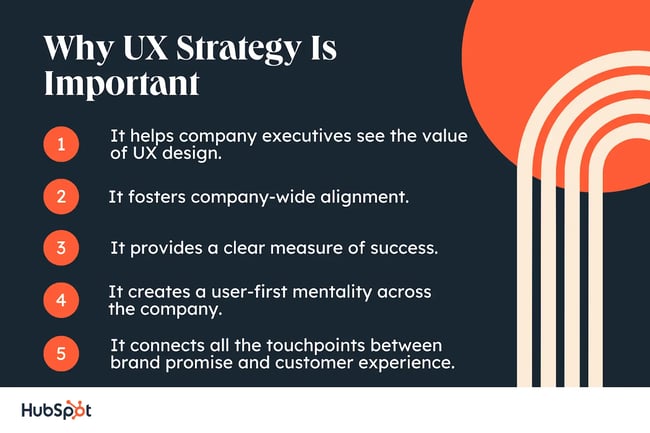
1. It helps company executives see the value of UX design.
A UX strategy shows the role that design plays in helping a business achieve its goals — from improving customer loyalty to increasing market share to giving the business a competitive advantage over companies that don’t prioritize design. This helps company executives, clients, and stakeholders understand the value of what your UX team is doing.
With a great UX strategy, leadership will see exactly what the UX team is working on, how their work impacts the business’ bottom line, and how implementing good design now can help the business save resources on fixing mistakes in the future.
2. It fosters company-wide alignment.
A UX strategy aligns business goals, user needs/expectations, and the business’ tech stack. It represents the overarching vision that every team should work towards.
Having this strategy as a team reference ensures that everyone is unified and makes decisions with the same goal. Not only does this promote internal collaboration, but it also saves time and resources during the design process and provides a cohesive brand experience for customers.
3. It provides a clear measure of success.
Crafting a UX strategy requires setting smart UX goals before starting a project. Knowing what you want to achieve, how you want to achieve it, and how to measure your progress prevents you from wasting time, energy, and resources on futile design methods and failed attempts.
Instead, you’ll be able to gauge the impact of your decisions on the eventual customer experience and keep the product moving in the right direction.
4. It creates a user-first mentality across the company.
The main goal of a UX designer is to create products that solve the right problems for the right people. This differs from higher-up executives, who are more concerned about ROI, profit margins, and annual revenue.
A good UX strategy contains a breakdown of user research that helps everyone, including designers, marketers, customer service reps, and CEOs, better understand the end users, including their goals and pain points.
You can then make customer-centric decisions, resulting in increased conversions/sales, a stronger brand reputation, and a competitive edge in the market.
5. It connects all the touchpoints between brand promise and customer experience.
Whatever product you sell, there’s a good chance that many other companies offer the same products with the promise of solving your target audience’s problems. When your brand’s promise doesn’t match the actual experience your customers are having with your product, they’re more likely to take their business to another, more reputable brand.
A UX strategy ensures that what your business is promising aligns with what users feel when they use your product. It also shows you how to make your brand promise and customer experience more in sync, ultimately increasing brand trust and customer loyalty.
UX Strategy Examples
So, what does a good UX strategy look like? Let’s break down a few examples.
1.Google
The Google search page is a thing of UX beauty. Here’s why: It’s simple and does exactly what you’d expect. While there are options to access Gmail, Google Images, or your Google Account, the vast majority of the webpage is white space.

What we like: Clean lines and minimal clutter make the central search bar the primary focus, and users are not confused about how the search function works.
2.LinkedIn
The LinkedIn onboarding process is a great example of UX helping guide users through improving their own experience. New users are given specific tasks to accomplish that help them “get the most out of LinkedIn,” with each task broken down into simple steps that start with a single click.

What we like: This simple interactive design keeps users engaged while conveying the utility of what they can expect from LinkedIn's service.
3.Rover
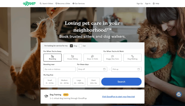
Pet care service, Rover, provides a superior UX experience from the moment users land on the homepage. Visitors find a simple form that asks what type of care they want — boarding, house sitting, dog walking, etc. The form then asks where they live, when they need care, and what size dog or cat they have.
Armed with this information, Rover can quickly generate relevant search results that reduce the time users spend sifting through care information that doesn’t apply to their circumstances.

What we like: Unlike our previous two examples, Rover takes a detailed approach to their UX to find out how they can deliver the best results for their customers.
How to Improve Your UX Strategy
For Jesse James Garrett, a pioneer of UX design, current efforts often miss the mark when it comes to delivering a truly human-centered experience.
In a recent Fast Company article, he notes that many UX efforts “amount to little more than UX theatre: creating the appearance of due diligence and a patina of legitimacy that’s just enough to look like a robust design process.” In other words, most UX efforts are just for show.
So how do you ensure that UX strategy actually delivers the intended results? Jumpstart the process with these three steps.

1. Consider current conditions.
To get where you’re going, you need to know where you are. This starts with an assessment of the current UX efforts across your website. The goal is to identify what’s working, what isn’t, and what changes are your top priority.
While customer feedback is valuable, it can be difficult to glean consistent data from a broad user base. Staff members, meanwhile, offer an excellent and readily available sounding board — encourage them to explore your current website and offer honest (and anonymous) feedback. This process can help identify common and recurring complaints and inform the next step of your UX strategy.
2. Identify specific objectives.
Next is identifying and defining specific objectives. Here’s why: If user feedback indicates your site design is confusing and frustrating, targeting this problem at scale is tempting.
The scope and scale of site features and functions, however, make this difficult, if not impossible. When you change one part of your site, others shift in response, causing a feedback loop of frustration.
Instead, select specific objectives. For example, if the menu navigation on your current WordPress site is cumbersome and clunky, start there. Prioritize that specific interaction and its resolution before moving on to other efforts.
3. Map out the journey.
Once you’ve identified key UX objectives, you need a step-by-step plan to fix them. Consider the WordPress site example above. If your goal is to improve navigation, what tools will help you accomplish this goal? Do you need a new template or theme? A different set of plugins? Does the site itself need a refresh and redesign to ensure menu items are relevant and easy to access?
By mapping out your UX journey before getting to work, you can reduce the risk of potential missteps and increase the quality of end results.
Key Experience Indicators
Metrics matter. But how do you measure the impact of your UX efforts and UX strategy deliverables? Start with these key experience indicators.

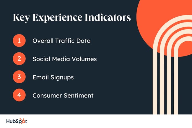
1. Overall Traffic Data
More traffic typically suggests that the UX changes you’re making are starting to work. By measuring traffic data on specific pages before and after implementing a UX strategy, you can evaluate at a general level if efforts are paying off.
While increased traffic doesn’t guarantee UX success, it indicates you’re on the right track.
2. Social Media Volumes
Increased interactions with your social posts can also indicate increased user satisfaction due to improved UX — especially if they comment, share, and like your posts. This is because social actions require effort on the part of users — an effort they won’t bother making if your website UX puts them off the moment they arrive.
3. Email Signups
If your email newsletter and marketing signups are on the rise, chances are your UX strategy is working.
Why? Because email signups indicate that users find your content compelling enough to click through and provide their contact information — something that only happens when the online experience is sufficient to keep their attention.
4. Consumer Sentiment
It’s also worth conducting regular consumer surveys to see what they think of your current UX. While participation is generally low — typically 30% or less — this indicator helps assess user attitude rather than behavior, which can help provide a more nuanced view of your UX strategy.
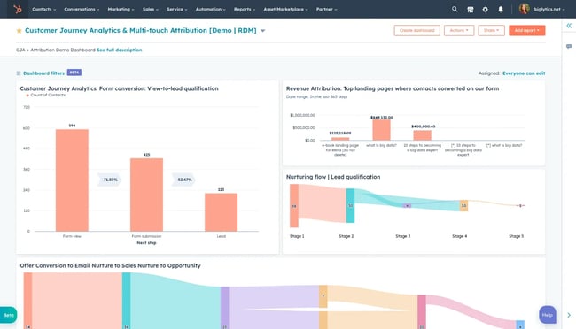
You can gather all this data (and more) with HubSpot's Customer Journey Analytics tool. This tool allows you to use multi-touch revenue attribution reporting, and the customer journey analytics feature allows you to visualize the impact of your marketing campaigns.
With this tool, you can track how your leads interact with your landing pages, email campaigns, and social media. You can also analyze conversion rates and see what’s working (and what isn’t). This way, you can tweak your strategies and get better results.

Get started with HubSpot’s Customer Journey Analytics
Solving for UX Strategy
The world of UX is ever-changing, and it’s impossible to fully “solve” the challenge of UX strategy permanently. However, the right UX approach can lead your business to sustained experience improvement over time.
By regularly assessing current conditions and implementing step-by-step solutions, you can streamline site actions, reduce user frustrations, and boost overall engagement to increase total ROI.
.png?width=112&height=112&name=Image%20Hackathon%20%E2%80%93%20Square%20(10).png)


![How to become a UX designer, a step-by-step guide [expert tips]](https://53.fs1.hubspotusercontent-na1.net/hubfs/53/become-a-ux-designer-1-20240731-321437.webp)


![How to Add a Parallax Scrolling Effect to Your Website [Examples]](https://53.fs1.hubspotusercontent-na1.net/hubfs/53/scroll-Aug-11-2023-05-24-08-8793-PM.png)

![20 UX Design Examples Hand-Picked by Experts [With Analysis]](https://53.fs1.hubspotusercontent-na1.net/hubfs/53/ux-design-examples-1-20250404-8425368.webp)
