I was lost for words upon learning that Facebook’s signature color is blue because Mark Zuckerberg is color blind. And Mark isn’t alone. Around 300 million people live with color blindness globally. A higher statistic by the WHO says 1.3 billion people worldwide live with some form of disability.
Building an ecommerce site that’s accessible to everyone isn’t just the right thing to do — it’s a smart move for your business. Many ecommerce brands overlook this demographic by designing sites that are not fully accessible. So, in this article, I’ll walk you through practical steps to make your ecommerce site accessible to all shoppers.
Table of Contents
- Why Does Accessibility Matter for Ecommerce Sites?
- How to Make an Ecommerce Site Accessible
- Tips for Designing an Accessible Ecommerce Site
Why Does Accessibility Matter for Ecommerce Sites?
Accessibility is important for ecommerce sites because online shopping is vital to 2.64 billion people. This includes people with disabilities who need to access products and services just like everyone else.
If you don’t have a disability or know someone who does, you might not fully understand the challenges they face when shopping online. To put this in context, I tried to navigate Amazon using my keyboard and the voice command feature in my browser.
I typed “Black Western Boots” into my browser, turned on my Windows 10 screen narrator (Windows logo + Ctrl + Enter), and closed my eyes. I kept pressing the tab and arrow keys, and honestly, I got lost. I couldn’t tell if I was hearing the number of reviews for each boot, or something else. The descriptions weren’t helpful, and worst of all, I didn’t know if there were any discounts. It was a frustrating experience.
.png)
Website Accessibility Checklist
This checklist will help you make the following more accessible on your website:
- Web Pages
- Navigation
- Video & Media
- And More!
Download Free
All fields are required.
.png)
And here’s the thing — I knew the screen narrator was incorrect because the tab key was in the wrong position when I opened my eyes.
This issue isn’t just with Amazon. WebAIM’s 2024 accessibility report shows that 95% of the top 1 million ecommerce websites aren’t accessible. That means these websites aren’t fully designed so people with disabilities — like visual and hearing impairments, motor, cognitive, speech, and neurological disabilities — can easily use them.
Beyond being the right and inclusive thing to do, making your ecommerce website accessible offers several benefits. Here are four.
1. Accessible ecommerce websites improve user experience.
Some key features of an accessible website are clear navigation, alt text for images, and keyboard-friendly design. Interestingly, these features improve the user experience for all ecommerce users, not just those with disabilities.
Take the title tag that specifies a page’s title as an example. This element helps users without disability to understand the content on the page and decide if it‘s what they want. For visually impaired users, screen readers announce the page title by using the title tag. This helps the user to confirm they’ve reached the correct page. To illustrate, I did a Google Lighthouse SEO audit on the Winn-Dixie homepage and found they fulfilled this requirement.

Pro tip: When creating title tags, stick to short and descriptive ones, which are best for everyone. People without a disability can skim them immediately, while those with disabilities don’t have to spend several seconds waiting to hear the page title only to realize they’re on the wrong page.
2. Accessible sites can rank high on search engines.
Search engines have a core tenet of being inclusive for all. As such, their SEO guidelines align with the W3C accessibility guidelines. This implies that accessible websites will have higher organic rankings on search engines.
Take lists and content hierarchy, for instance. Both help me structure my website with headings (like H1, H2, H3), making it easier for search engines to crawl my content. Using ordered or unordered lists can also help in earning a “featured snippet” position on Google.
Bet Hannon, a web accessibility & ecommerce expert, corroborated my point in the Food Blogger Pro podcast. “For users with disabilities, particularly those with visual impairments, an ecommerce site with a clear content hierarchy and well-organized lists is easier to navigate,” says Hannon.
Accessibility also helps with SEO when an ecommerce website uses descriptive links known as anchor text. Descriptive anchors tell search engines the purpose of the link. Anchors like “click here” or “read more” are unclear and cannot convey the link’s destination, making it harder to navigate sites effectively. But descriptive anchors, such as “shop our latest collection” or “learn more about our services,” help disabled people understand where they are on your site when the screen reader reads it out loud.
3. An accessible site gives you a competitive advantage.
Over 61 million people in America live with disabilities, and 50% of them shop online at least once a week. These shoppers visit accessible ecommerce sites, including those that provide an accessibility support icon or offer community assistance.
Sadly, most ecommerce sites aren't accessible, causing 55% of these shoppers to abandon their purchases. The result? A $6.9 billion loss in sales. To top this loss, 92% of online shoppers rely on recommendations from friends or family to buy products. This means inaccessible websites may lose referrals from the disability community.
While many ecommerce sites focus on branding to stand out, I recommend setting yours apart by prioritizing accessibility, too. Why? As far back as 2019, 86% of disabled people said they would spend more on an ecommerce site with fewer accessibility barriers, even if their prices are higher. That percentage is likely to have increased as accessibility awareness rises.
4. Creating an accessible site helps you comply with the law.
Before writing this article, I thought accessibility was just a nice-to-have. It turns out I was wrong because it’s a legal requirement.
Title III of the Americans with Disabilities Act (ADA) requires businesses and public entities to offer services and facilities that are accessible to people with disabilities. Even though Title III didn’t mention “websites” specifically, many courts have ruled that websites need to follow this law.
In 2019, there was a legal tussle between Domino‘s Pizza and a blind customer, Guillermo Robles. This case was popular because Domino’s refused the rulings of a lower court and filed an appeal to the Supreme Court, which then refused to hear their case. Although the court didn’t fine Domino's, it ordered Domino’s to improve its website accessibility.
Domino’s Pizza was lucky with this one because website accessibility lawsuits attract fines ranging from $75,000 for initial cases to $150,000 for subsequent violations. So, unless you've got money to burn, I advise you to read on to learn how to make your ecommerce website accessible.
How to Make an Ecommerce Site Accessible
Product Pages
I consider product pages the most important pages on any ecommerce website. A product page must tell a good story to win the sale.
For users with disabilities, one key accessibility issue is the presence of product image animations. In a podcast episode by accessibility experts Ilana Davis and Kurt Elster, they said slideshows and animations on product pages are off-putting, especially for people with cognitive disabilities. These animations can also be problematic for those who use visual readers.
Instead of using slideshows to show different angles of your product, I recommend a grid view. If you prefer a carousel, make sure it's not on auto-rotate. But if you want it to auto-rotate, include a clear pause/play button so users can control it.
Testing It Out
Do you see how Etsy showed a grid view of the sides of these lumbar pillowcases? The arrows allow shoppers to navigate between the previous and the subsequent pictures.
I turned on my screen recorder and tried using only my keyboard to navigate these images. It was easy to navigate, and the first image had a descriptive alt text. Although other pictures didn’t have an alt text, I’ll give them an 8/10.
List Pages
List pages make it easy for shoppers to browse and compare multiple products without clicking individual product pages. So if a shopper with a disability can’t tell the difference between product categories, then the whole point of the list page is lost.
According to Davis, many category headers on top ecommerce websites are incompatible with screen readers. This means visually impaired shoppers using screen readers can’t distinguish between categories because the headers aren’t being read out.
I tested this by navigating the list pages of the top three ecommerce sites in the U.S. They include Etsy‘s Halloween page, eBay’s electronics page, and Walmart's Groceries & Essentials page.
Sure enough, Ilana was right.
On Walmart’s Groceries & Essentials page, I couldn’t tell when I switched from “Shop Groceries” to “Shop Essentials” or to “Build Your Cart.” The same thing happened on Etsy’s Halloween list page.
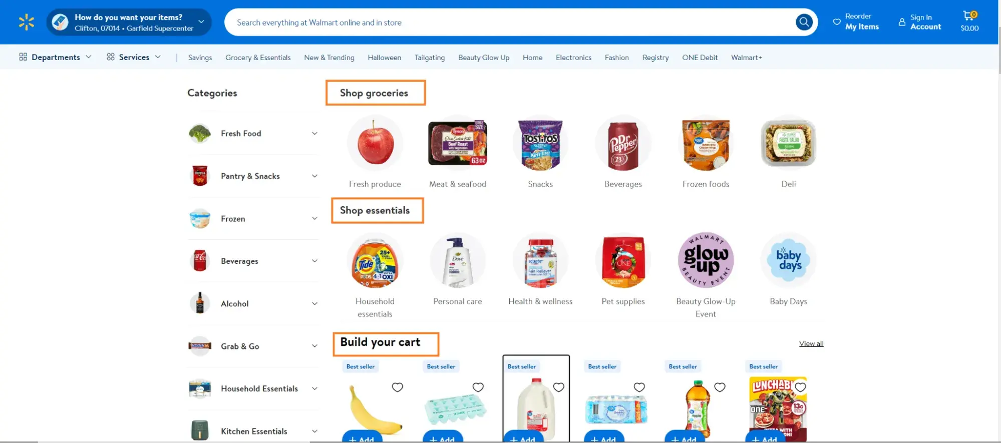
To fix this on your list page, wrap each category header in heading tags (<h1>, <h2>, etc.) to signal its importance in the page structure so screen readers can announce them and help users navigate between categories.
Also, if your category heading is a custom element, use ARIA (Accessible Rich Internet Applications) attributes to show its importance.
For example, this code: <div role=“heading” aria-level=“2”>Men’s Clothing</div> tells the screen reader that “Men’s Clothing” is a key category and should be announced.
.png)
Website Accessibility Checklist
This checklist will help you make the following more accessible on your website:
- Web Pages
- Navigation
- Video & Media
- And More!
Download Free
All fields are required.
.png)
Testing It Out
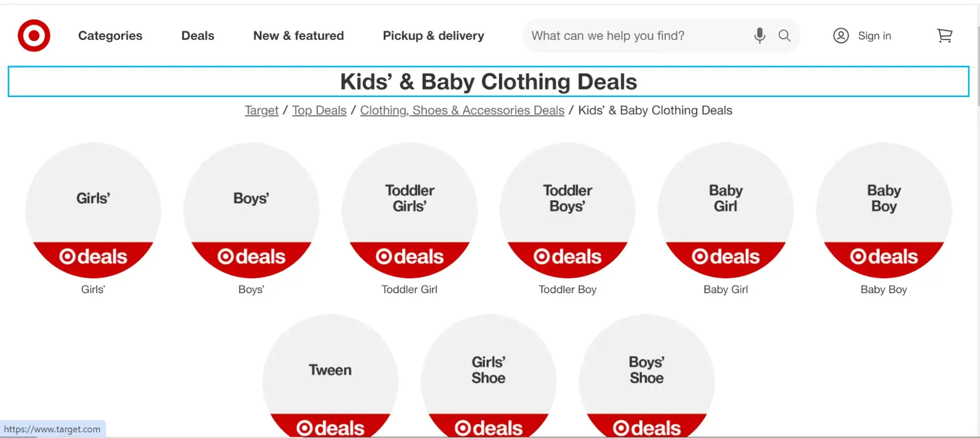
To test this out, I used Target’s “Kids clothing” list page. I discovered all their category headings were discoverable by my screen reader. This removed any confusion when I shut my eyes and used my keyboard to navigate the site.
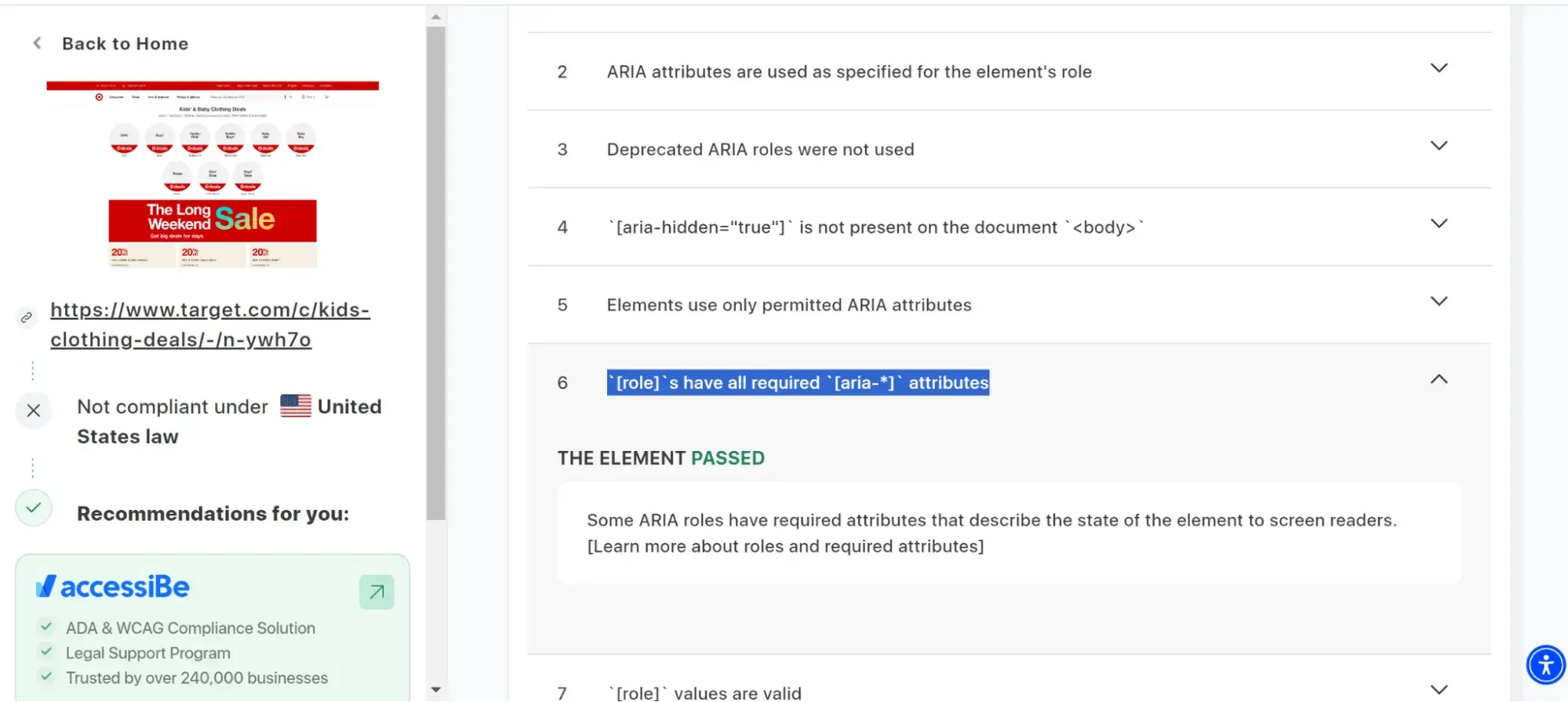
I also ran the web page through Accessibe’s online accessibility checker, and Target’s “Kids Clothing” list page passed the audit for having all their [role]s with the required [aria-*] attributes. This means every part of the website that needs to be announced, like a heading, has the right labels, allowing screen readers to read them out correctly.
Shopping Cart
The shopping cart section is the last stop before shoppers head to the checkout page. For most shoppers, it‘s simple to navigate — just click the plus or minus button on a product page, and you’ll see the cart icon update with the new total.
But for shoppers with disabilities, it’s not always straightforward. One challenge is the lack of clear indicators to show when they’ve added an item to their cart.
Davis shared a story about a disabled shopper who kept clicking the “add to cart” button and found they had a $500 total when they navigated to the checkout page. This happened because the ecommerce site lacked a pop-up or notification that a screen reader could announce to confirm that an item had been added to the cart.
You can fix this in two ways:
- Implement ARIA live regions in the cart section so that when a shopper adds an item to the cart, a visually hidden element with aria-live=“assertive” attribute can alert the screen readers to announce the addition to shoppers.
- You can also use Javascript to trigger a modal or toast notification whenever a shopper adds an item to the cart. This notification should be focusable so that shoppers using keyboard navigation can highlight it to draw the attention of visually impaired shoppers.
Testing It Out
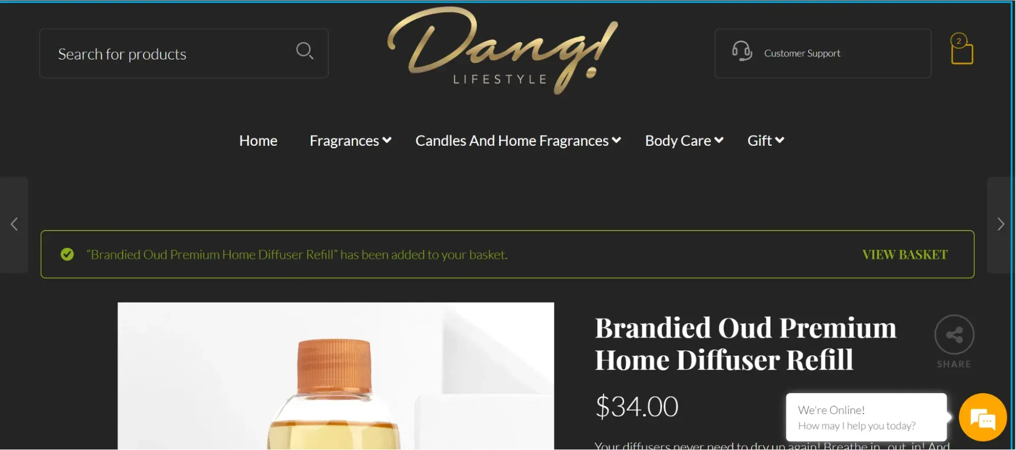
I turned on my screen reader and used my keyboard to add the “Brandied Oud Premium Home Diffuser Refill” to my cart on the Dang Lifestyle website. Almost immediately, the screen reader kept announcing (so much that it got annoying) that I had added the product to my cart. When I looked, I saw the cursor had moved to the top of the page, where a pop-up was flashing to show the item was in my cart.
Checkout Page
Having a confusing checkout process is an issue that causes over 70% of online shoppers to abandon their carts. This affects everyone, irrespective of their ability.
For a shopper with disabilities, pop-ups and ads on the checkout page often create difficulties for screen readers to announce important elements without distractions.
Also, if the credit card fields aren’t clearly labeled, the screen reader just says “edit text” without telling shoppers if they're to enter their card number, expiration date, CVV, etc. To aggravate the situation, shoppers with a disability might not be able to select a shipping method because the drop-down menu isn’t keyboard accessible.
To fix this:
- Keep your checkout page clean and free of unnecessary clutter like pop-ups, irrelevant ads, and offers. If you need to add offers, keep them minimal to avoid distracting screen readers.
- Clearly label all form fields, especially in the payment section. Use aria-label or aria-labeled by attributes so screen readers can tell disabled users exactly what to enter.
- Ensure all interactive elements, like drop-down menus and buttons, are keyboard accessible. This will make the checkout process smoother for shoppers with disabilities.
Testing It Out
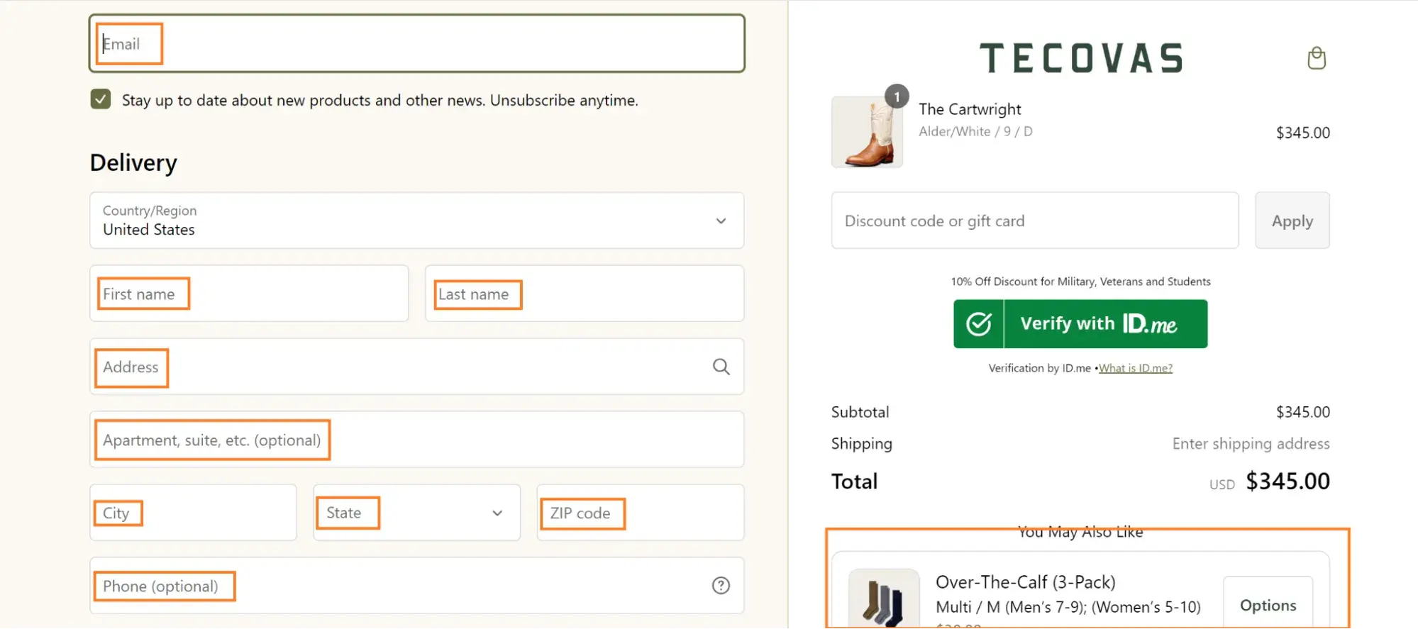
Take Tecova's checkout page, for instance: all form fields are well-labeled, and there are zero pop-ups or ads. Also, I noticed they split their checkout page into two columns: the left side for the form and the right side for a summary of what the shopper is buying.
At the bottom of the right column, there’s a single upselling offer, but it's placed where the screen reader won’t announce it until the shopper has completed the checkout process. This setup makes the experience smoother and less confusing.
Search Feature
Sometimes I don’t remember the exact name of what I want to buy, but I recollect a word or two of the product name. When I enter these words into the search bar on an ecommerce site, the autocomplete shows the name of the item.
If I were visually impaired, the situation would be different because I wouldn‘t see those autosuggestions unless the screen reader announced them. And if your ecommerce site isn’t keyboard accessible, I can't navigate or select from those suggestions.
Take Best Buy's ecommerce website, for example. Even though the screen reader says “suggestions available” and gives instructions to “navigate to hear suggestions,” I couldn't access them using my keyboard. When I tried, the screen reader just said, “Unable to move narrator cursor.”
To fix this on your ecommerce website, add the tabindex=“0” attribute to your autosuggestions. This makes each suggestion focusable, so shoppers with disabilities can navigate through them using the arrow keys and select one with the Enter key.
Testing It Out
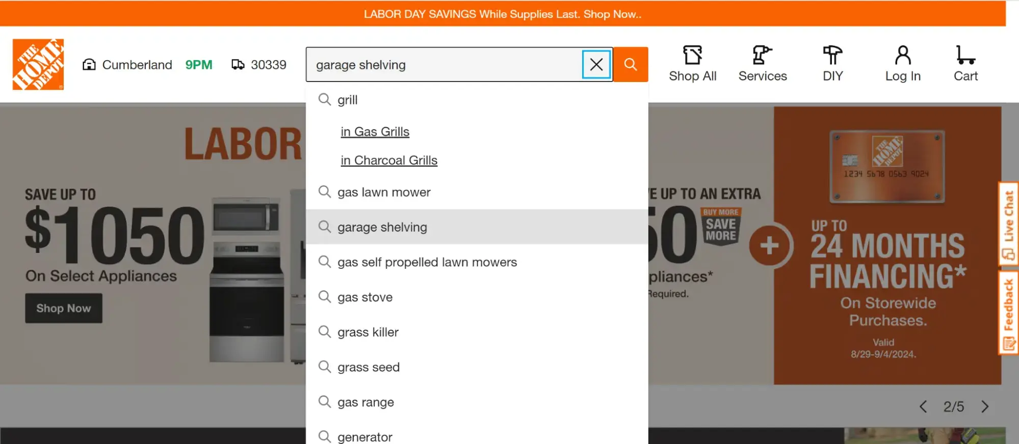
Home Depot added this accessibility feature to their website, so when I used my keyboard to navigate to their search bar, the screen reader told me autosuggestions were available. Also, I could then use the up and down arrow keys to browse through all the suggestions and pick the search term I was looking for.
Tips for Designing an Accessible Ecommerce Site
Besides the above page-specific accessibility tips, here are some best practices from experts that will make your ecommerce site accessible.
Tip 1: Keep your alt text simple.
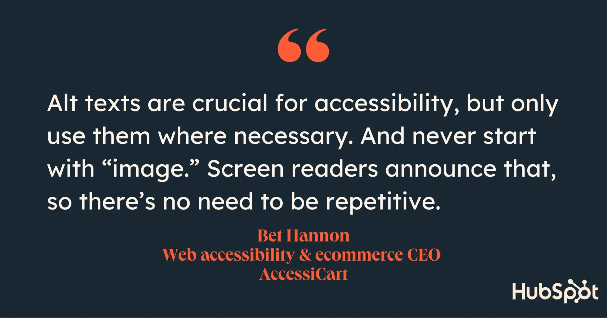
Alt texts are crucial for accessibility, but only use them where necessary. And never start with “image.” Screen readers announce that, so there’s no need to be repetitive.
Bet Hannon
Web Accessibility & ecommerce CEO at AccessiCart
In my experience, the best way to write an alt text for accessibility is to imagine you're describing the image to someone over the phone. Instead of writing something generic like “image of a dog,” go for something more vivid like “a fierce-looking bulldog with a red collar sitting in a park.” This helps a shopper with a disability to get a clear picture of what the keyboard navigation highlighted.
Even though alt text is important for both SEO and accessibility, it can be unnecessary when an image is purely decorative. So, as a general rule, only use alt text when the image adds to the user’s shopping experience. Also, heed Hannons’s advice on not starting your alt text with the word “image.” I‘ve noticed screen readers already repeat words on most ecommerce sites, so let’s not add to the clutter. Keep it simple and helpful.
Tip 2: Use a “Skip Content” button.
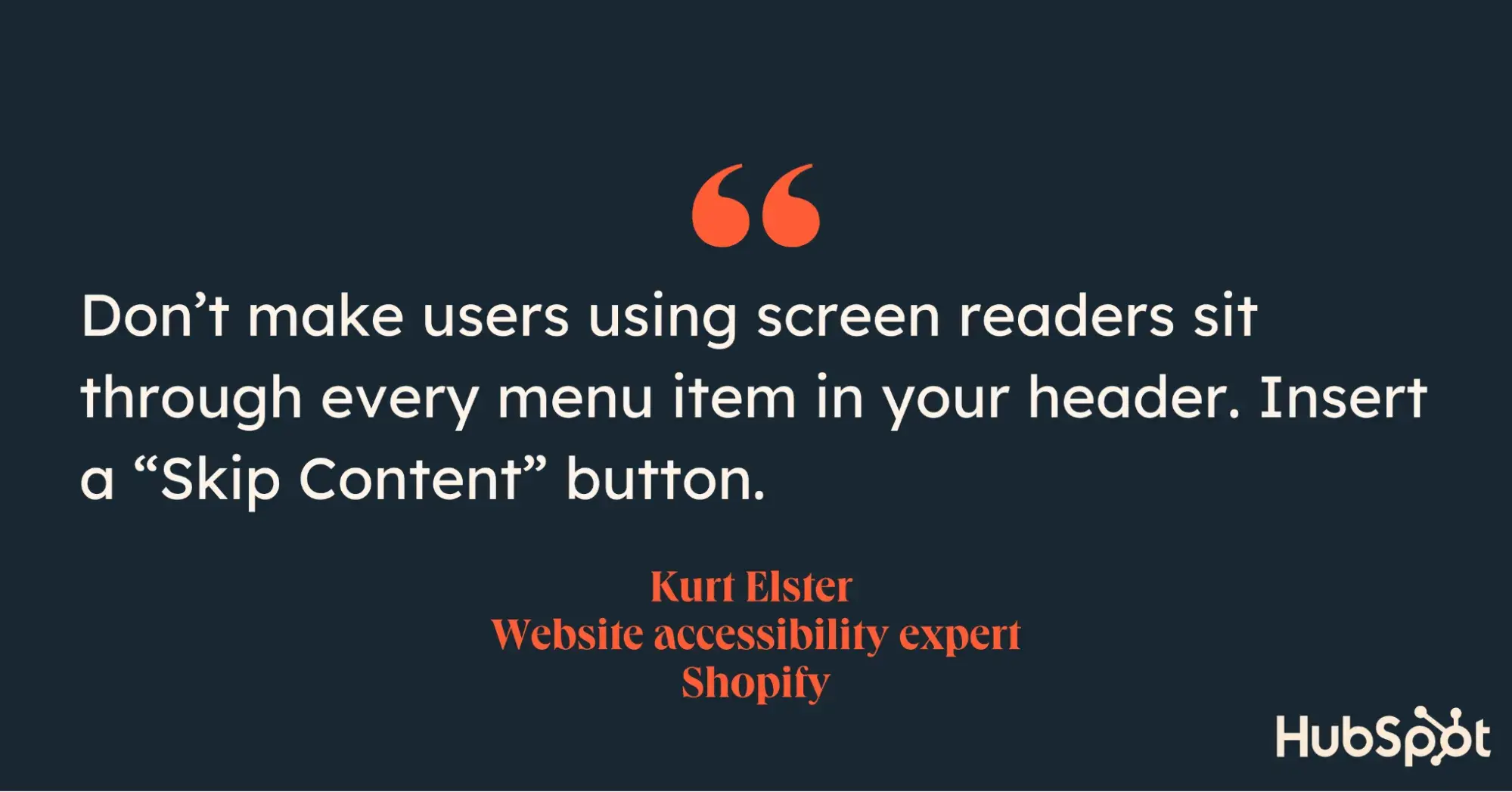
Nobody really reads the headings on ecommerce sites; they jump straight to the products they want to buy. So, don’t make users using screen readers sit through every menu item in your header. Insert a “Skip Content” button.
Kurt Elster
Shopify Website Accessibility Expert
I agree with Elster.
When I was browsing Home Depot's website, it took me ages to filter through their menu items to get to the list and product pages. This is a big contrast to ecommerce sites like Etsy and Fashion Nova, which have a clear “Skip to content” button that lets me jump straight to what I want.
Tip 3: Have an accessibility policy and “contact us” form.
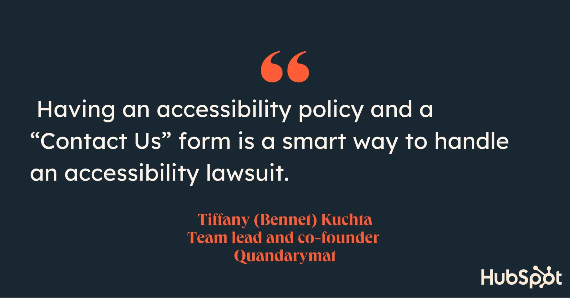
Having an accessibility policy and a “Contact Us” form is a smart way to handle an accessibility lawsuit. When it comes, because it almost certainly will if you’re running an ecommerce site, this might buy you extra time to work on making your website more accessible.
Tiffany (Bennet) Kuchta
Team Lead/Co-Founder at Quandarymat
Tiffany’s tip buys you time to make your website fully accessible. It also provides a way to gather feedback from customers with disabilities about your website's accessibility.
Take Etsy, for instance: they have an “accessibility survey” button shortly after their “skip content” button. When clicked, this accessibility survey button brings down a survey dialogue box where users can suggest accessibility tips to help them improve.

This gives Etsy access to feedback directly from people who rely on these features to shop. Implementing a similar button will help you address accessibility issues you might have missed.
Making Your Ecommerce Website Accessible
No website is ever 100% accessible. Notice that the ecommerce sites I mentioned are accessible in some ways and not in others. This shows that accessibility is a gradual, ongoing process.
I believe it’s easier to make new ecommerce websites accessible since such sites don’t have existing content to worry about. For older sites, the best approach is to make all new content and pages accessible. Afterward, gradually improve the accessibility of older content and pages.
For your site’s overall design, I recommend improving your accessibility site-wide. Often, such a project is best done during a rebranding process. In my experience, rebranding usually happens every 3-5 years. That said, accessibility is also a legal requirement. As such, you might need to move that timeline up to ensure compliance.
.png)
Website Accessibility Checklist
This checklist will help you make the following more accessible on your website:
- Web Pages
- Navigation
- Video & Media
- And More!
Download Free
All fields are required.
.png)


