-2.png)
And that’s the inspiration for this “How It’s Made” series. I’m going to walk you through how I built my first website from top to bottom and share what I learned along the way, including tips that might save you some time when building your first site.
First up, the home page.

HubSpot's Free Website Builder
Create and customize your own business website with an easy drag-and-drop website builder.
- Build a website without any coding skills.
- Pre-built themes and templates.
- Built-in marketing tools and features.
- And more!
It’s a trap…
If you’re like me, you might think your home page is the most logical place to start building a website. I’m not saying I was wrong, but I definitely wasn’t right.
Homepages are a tough starting point – especially when you don’t have a theme or layout in mind. I knew I needed a blog and a few landing pages, but I didn’t consider how the navigation would work, what elements I would include on the home page, or even what colors I would use for my theme.
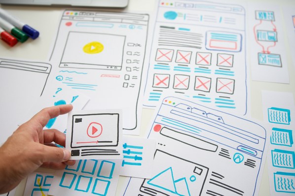
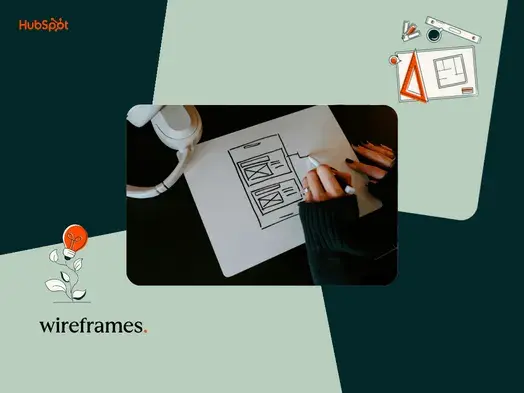
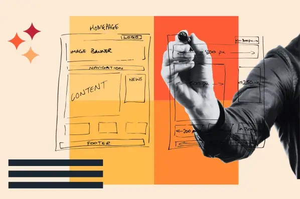
If I could do it again, I would have started with a wireframe. This is a rough blueprint for a website that outlines the main features and layout of your pages. It gives you a reference point that you can lean on as a checklist when searching through pre-built templates. It will also save you time working in the CMS because you won’t be testing designs willy-nilly searching for the right one, like yours truly – you’ll cut right to the layout and theme that you’re looking for.
Speaking of themes.
I’m sensing a theme.
I used HubSpot for my website (shocker) but most CMS systems offer some sort of theme marketplace. If yours doesn’t, you can also look through third-party marketplaces, like this one.
Themes are components that are present on every web page of your site. This includes elements like colors, fonts, page structures, and more. They’re a good starting point for any website because they give you an idea of what to expect for web design on each page.
In my case, I went with a theme called “Session.” I really liked the minimalist design and the templates offered within this theme matched what I needed for my site.

I’m home.
It’s not that the home page was the worst place to start, it was just a daunting task compared to the rest of the pages I completed. If you’re looking for quick wins, I’d recommend starting with a landing page like your contact page. But, if you’re looking to get the hard stuff out of the way, then the home page is your starter.
It’s also important to note that I didn’t complete the home page and then move on in chronological order. I worked a little on the home page, then started the blog, then went back to the home page, and so on. Little by little I designed the layout, wrote the copy, and added in images to spice things up a bit.
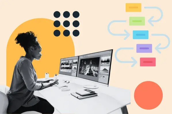
My process looked a little bit like this:

The point is: try not to get overwhelmed. It’s a process and you can always update things over time.
To make things a little easier to follow, these are the elements that I added in no particular order.
HubSpot's Free Website Builder
Create and customize your own business website with an easy drag-and-drop website builder.
- Build a website without any coding skills.
- Pre-built themes and templates.
- Built-in marketing tools and features.
- And more!
Web Elements for Your Home Page
Navigation
In place of a wireframe, I used my nav bar to outline different pages for my website. I started by adding placeholder links to pages that I would create later. This gave me an idea of what I would feature on the homepage and how I would lay things out.

Blog RSS Feed
I wanted my home page to show quick bits of other areas of my site like small previews that you could click into and read more. The blog RSS feed was perfect for this because it displayed links to my most recent posts and included short descriptions and images from each. Not to mention the feed would update automatically, so I didn’t have to go back and add new content each week.

Email Subscription Form
I added this email subscription form to the center of my page, so readers could receive ongoing updates. This was as simple as dragging a form module into my template along with this picture of Yogi, my childhood dog.

Banner Image
Can you keep a secret? That banner image is not from my trip. I created the website before I left. So, that’s a stock image that I resized to fit the banner module.

Now that I got that off my chest, I can tell you that banner images are a little tricky. You have to make sure you know the size of the image the module is asking you for so it doesn’t distort to fit the size of the module box.
Fortunately, knowing your module dimensions is the hard part. Once you have that, you can use a free image resizer or just crop the image to the exact specifications of your template.
CTA’s
I really liked this section of my home page because it felt like a mini landing page built right into the center of the template. It gives readers a place to learn more about why I created a website and how they can get involved in the Pedaling4Pups cause.

This layout can be used for almost any type of business or website. From online courses to product catalogs, this is a very effective way of directing visitors to a specific landing page.
Image Sliders
The last section that I added was “Pictures From the Trail” which featured three, HTML image sliders in a row.
Here’s where I would go back and enhance my design a bit. I don’t like how small the images are and since there are several in each slider, the high volume of navigational dots below each image creates awkward spacing between the header and the slider. I would play around with some of the HTML and CSS here so that it only displays a few dots each and makes the dots smaller so the spacing looks equal.

These were the main elements that I used on my homepage, but you can certainly add a lot more than what’s mentioned here. I saw templates that featured background videos, audio, and CSS animations that really made the site stand out.
To wrap things up, I’m going to highlight a few lessons that I learned about building homepages – and websites in general – from this experience.
Lessons Learned (About Homepages) From the Trail
1. Take your time and create a wireframe.
If you’re like me and are building a website for fun, dive right on in and embrace the chaos.
But, if you’re creating a website for your business, take the time to do it the right way. Create a wireframe and consider what you want to accomplish with your website.
Are you trying to sell a product? Who is your target audience? What resources do you have at your disposal?
The more detailed your plans are, the easier it will be to produce an effective website in a timely manner.
2. Be honest about your experience.
We all have an idea of what we want our website to look like. But, keep in mind that the more complex your site is, the more experience you’ll need to bring that vision to life.
If this is your first time building a website, keep it simple. There are plenty of themes and templates you can use to save time (and a lot of headaches). They may feel a little cookie-cutter to a more experienced developer, but most offer plenty of customization options that enable you to create a very unique design.
3. Ask others for help if needed.
If you have an ambitious idea for your website, don’t be afraid to ask for outside help – especially if you have the budget to do so.
Nothing can replace the expertise of a professional developer, but you can tap into some of that knowledge via community forums and blogs just like this one.
Another option is AI tools like ChatGPT. If you want to create a custom module for your website, you can use ChatGPT to write code. Then, you can input it into your website via a simple html module or file.
Just be cautious about going too far down a rabbit hole with AI. You can spend half a day writing code only to find it doesn’t work with your template. My advice would be to stick to simple projects and features, testing them one by one so you can confirm they will work with your site.
Finding Your Way Home
The home page was definitely the hardest page to build for my site. But, when I was finished with the first draft, it was much easier to improve over time. As I created more pages, I borrowed elements from each one and infused them into my home page, giving it a more robust and complete look.
If you’re getting started on your website’s home page, remember that it’s going to take time to complete. It might even change drastically as you finalize your wireframe and add pages over time. Be patient, and try not to get discouraged. If you do get frustrated, I’d recommend long-distance bikebacking – it’s a great way to blow off steam.
HubSpot's Free Website Builder
Create and customize your own business website with an easy drag-and-drop website builder.
- Build a website without any coding skills.
- Pre-built themes and templates.
- Built-in marketing tools and features.
- And more!
Website Design Process
![How to create a website to sell products: 7 steps I used [+ expert tips]](https://53.fs1.hubspotusercontent-na1.net/hubfs/53/how-to-create-a-website-to-sell-products-1-20240909-6141294.webp)
![Website design proposal: A streamlined approach to pitching [+ templates]](https://53.fs1.hubspotusercontent-na1.net/hubfs/53/%5BUse%20(1)-Oct-23-2025-03-34-31-8363-PM.webp)

.png)