.png?width=112&height=112&name=Image%20Hackathon%20%E2%80%93%20Vertical%20(50).png)

I'll also share what I like about each layout, along with some tips on how to choose the right layout for your own website.
Table of Contents
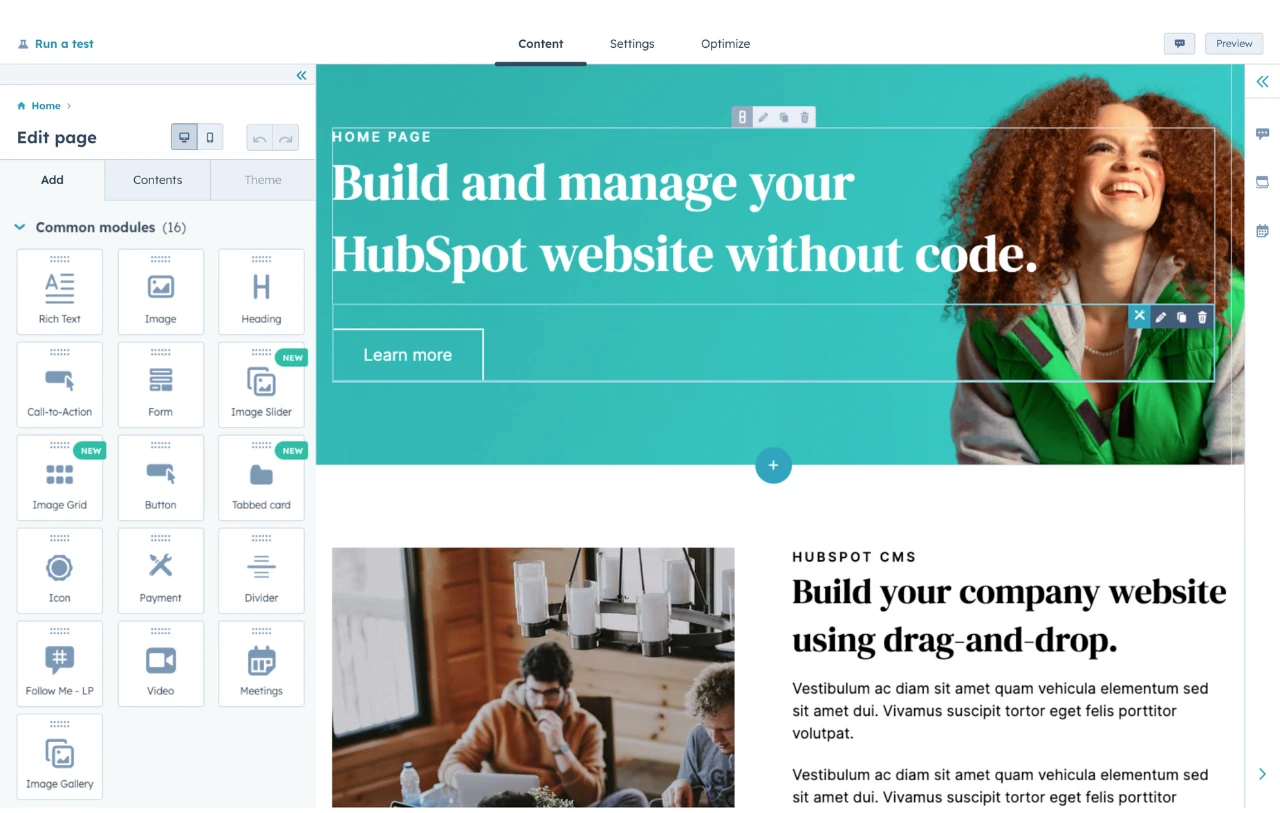
HubSpot's Free Website Builder
Create and customize your own business website with an easy drag-and-drop website builder.
- Build a website without any coding skills.
- Pre-built themes and templates.
- Built-in marketing tools and features.
- And more!
17 Examples of Different Types of Website Layouts
1. Single-Page Layout Example
The single-page layout is an uncomplicated layout you can use for your website. This layout fits all the information you want to show your audience on one page. Then, with the aid of clickable texts, link them to other pages containing more information about your brand or business.

Alex Tkachev is a freelance digital designer who uses his single-page website to showcase his brand and portfolio.
What I like: What makes the site unique is its static layout. I like how Alex fits all the necessary information into just one page. As every portfolio website should, the brand image and services take center stage while everything else comes second.
Another unique thing about this website is the animation page that appears when you click the “MENU” button. Clicking this button pops up a different layout showing relevant information about Alex.
If you’re a freelancer or someone looking to build a personal website to advertise your brand, I think you should take a leaf from Alex’s book and consider implementing this layout in your website’s design.
2. Text-Based Layout Example
The text-based layout design focuses more on copy and text than visuals or graphics.
You should go with this layout design if you don’t want images or graphics on your website or are faced with choosing suitable images or graphics. It’s easy to design and relatively cost-effective.
Between The Ears is a fitness and wellness brand whose website informs its visitors and users about health and wellness while advertising its services using a primarily text-based layout.

What I like: Between The Ears does nothing over the top with its design or color scheme. It chooses a simple black-and-white color combination to tell its story without losing finesse. I think this type of classic approach can work really great for a text-based layout, as the text-based layout already evokes a classic feeling (such as a newspaper).

3. Fixed Navigation Bar With Section Layout Example
You’ll find the fixed top navigation bar on most websites. Many designers opt for this layout style because it allows the viewers convenient access to the site’s important pages.
I think that the most classic example of this layout is Apple, which uses a sectional layout with a fixed, minimalist navigation bar at the top. The navigation bar opens a pop-up page when you hover over each text.

What I like: Apple centers an image of its recently released iPhone 15 Pro, along with a simple copy and call-to-action (CTA), directing its site visitors to either learn more about the phone or buy it. The presentation is efficient and straightforward, showing that Apple is well aware of how the fusion of imagery and copy can affect visitors.
Overall, the sectional layout is simple and effective — I might even say “classic.” Putting your product in your audience’s face becomes easier because this layout design centers images of your product expertly merged with a short and compelling copy and then the CTA.
4. Scrollable Animation Layout Example
A scrollable animation layout can make for a stunning experience. It relies on the user’s interaction to function — as the user scrolls, the site responds visually in unconventional ways.
Though this design may be cost-intensive, if you want your website to transport your visitors into a world of your creation, you can consider implementing it.
Storiaverse is a great example of this layout, with an immersive scrolling experience. I recommend clicking through to the website, as a single screenshot doesn't do it justice.

What I like: Storiaverse offers animation services to writers and creatives, allowing them to bring their stories to life with animated images. By using an animation layout design, Storia showcases its services to prospective users.
You’ll see various animation styles as you scroll through Storia’s homepage. Instead of a one-page scroll animation, Storia uses different animations for each section of its website.
Overall, I think it's a great example of choosing a website layout that matches the intent of your website. If you want people to believe that you offer great animation services, creating an engaging, scrollable website layout is a great way to do that.
5. Single-Page Video Effect Layout Example
The single-page video effect layout is even more technical than the scrollable animation layout. It works like the animation layout but uses video effects instead of animation.
I think that this layout is perfect if your brand is a parent brand to other smaller brands and you want a singular website for all of them. You can create this layout using your major brand and link to the other brands.
Ensure that you use graphics or video images that immersively tell your brand’s story and transport your viewer into a world of its own.
The luxury conglomerate LVMH's “The Journey” website is a great example of this approach. Its immersive design would take anyone into a world of its own.

What I like: The layout of LVMH’s The Journey website is beautiful, which fits with the luxury nature of the brand.
As soon as you enter the website, you can see how much thought was put into designing its layout. It features an interactive video layout with responsive icons and images that link to other pages. LVMH’s The Journey homepage acts like an access portal to all the brand websites of the LVMH brand.
.png)
Free Website Design Inspiration Guide
77 Brilliant Examples of Homepages, Blogs & Landing Pages to Inspire You
- Agency Pages
- Ecommerce Pages
- Tech Company Pages
- And More!
Download Free
All fields are required.
Form not available
6. Grid Layout Example
Grid-style site layouts are found all across the web, including online marketplaces and music websites. It’s relatively easy to implement and visually simple, if you need a layout done on a budget.
This layout works well for ecommerce sites and brands with many product offerings.
However, don’t just put text in a box. Place them side by side, and call it a day. Design the box, and style your texts. Use high-quality images and graphics to get your audience's attention.

What I like: iHeart is one of the websites that executes the grid style perfectly. It’s pretty apparent why iHeart chooses a grid layout for its website — it’s simple to show your audience what you want them to see if you put it in a box.
iHeart’s grid layout is typical. Each box in the grid contains a different product and links to another page containing relevant content about the product.
If you don't want to reinvent the wheel but you still want something effective, I think a grid layout is a great option to consider.
7. Asymmetrical Layout Example
An asymmetrical layout is popular among news sites, magazines, gossip blogs, and journals. As the name implies, the layout has no set structure. If you are designing an online publication, consider using an asymmetrical layout. Embrace the creativity in disorganization.
You'll see this layout on most major news publishers, including The New York Times website.

What I like: The New York Times’ layout is one where the order and structure change daily depending on its content, which I think is a really good fit for the asymmetrical design.
Recently, asymmetry has been synonymous with edginess and progressiveness. That’s why most progressive news sites like The New York Times have embraced the chaos of asymmetry in their site layouts.
8. Static Sidebar/Navigation Bar Layout Example
The static sidebar or navigation bar layout is another style that is easy to design and usually takes one page. Try the static sidebar/navigation bar website layout if you run an online kitchen or a restaurant or if your site will include many categories.
For example, the Arbor Restaurant in Bournemouth opted to use the static sidebar approach.
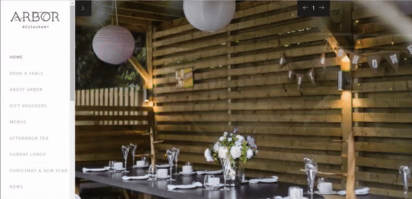
What I like: Arbor does nothing over the top design-wise with its restaurant website layout. All it does is make sure it centers its brand with slideshow images showing its services and a fixed sidebar.
The site removes the typical top-style navigation bar in favor of a fixed, scrollable sidebar. What that gives you is a simple website layout masterpiece. In my experience, it's a simple way to cut out the noise and focus solely on advertising your products and services.
9. Single-Column Layout Example
The single-column layout is one of the easiest types of website layouts when it comes to design simplicity. It’s regularly used by social media sites, online forums, or pages with lists.
If you’re a small business/brand or looking to build a forum or news feed, consider implementing this layout. You can also implement this design for a personal blog or online journal.
One of the most well-known examples of this type of website layout is Reddit.

What I like: Reddit is the perfect example of the single-column layout design. It is consistent with both its mobile and desktop versions. Although the homepage uses the three-section layout, every other page uses the single-column one.
Reddit also doesn’t separate its posts with spaces. They are all separated by a single line and merged to allow flow. I think this creates a very engaging experience that helps keep visitors scrolling down the page.
10. Fullscreen Hero Page Media Layout Example
If the primary aim of your website’s design is to capture your viewer’s attention, a media banner on your homepage is an excellent choice. Start by making a bold statement, then follow up with a gallery of your top products and a section showing how your product or service can help people achieve their goals.
Some common approaches here are to use a full-width video or an image slider.
For example, Gotham implements the full-screen media layout style by using sliding images.
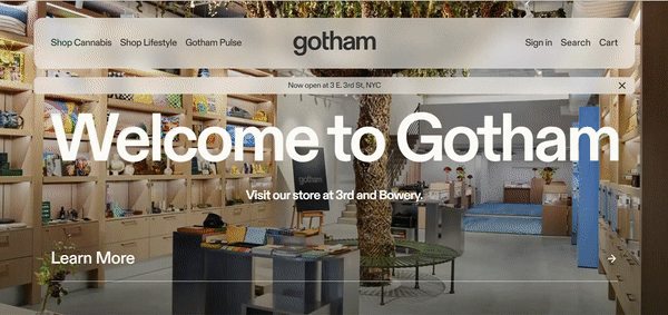
What I like: Gotham implements the full-screen media layout style with sliding images. The first section of the website layout features a sliding animation image background and a responsive navigation bar. Each background features a different center text and clickable CTA at the bottom.
Instead of a regular section-after-section layout, Gotham uses a single-page layout with interactive clickable texts on its top navigation bar. Plus, the site uses a zoom response animation when you hover over the buttons in its navigation bar and draw out new pages showcasing Gotham’s collections with largely visible CTAs.
I think that all these techniques come together to create an engaging multimedia experience for visitors.
Free Website Design Inspiration Guide
77 Brilliant Examples of Homepages, Blogs & Landing Pages to Inspire You
- Agency Pages
- Ecommerce Pages
- Tech Company Pages
- And More!
Download Free
All fields are required.
Form not available
11. The Z-Style Layout Example
The Z-Style layout is another simple layout. The idea behind this layout is to imitate the pattern the eye follows when reading — left to right, top to bottom. This means your site visitors will read your site from left to right or in a zig-zag pattern.
Artykul, an RSS app for internet readers, implements this design to perfection.


What I like: This layout is very classic. The first section has an image placed on the left side of the page, followed by text beside it. Then, it alternates it with texts on the left and an image on the right — the zig-zag pattern.
I think the zig-zag pattern makes it easy for Artykul to separate the distinct features from one another. It‘s also easy for visitors to learn about these features. If you’re offering some type of SaaS or similar businesses, I believe it's a good layout to consider.
12. Section Page Layout Example
Like its name, the Section Page layout assigns a page to every section. This means that every section of your website will take up the full width of the user’s browser window. You‘ll see this approach on a lot of one-page websites, though it’s not limited to that area.
Digital Present is a great example of this website layout in action.

What I like: Digital Present is a creative digital agency, and its homepage does well to let any visitor know that. The banner on the homepage infuses every element of making a captivating copy in its design. It shows a block of text artistically overlaying a graphic with moving particles, instantly capturing the viewer’s attention.
I think that one fascinating detail about Digital Present’s website layout is its understanding of color combinations. It shows this on the services section of its homepage.
13. Featured Hero Layout Example
This layout is similar to the fullscreen hero page example above. However, it skips the fullscreen effect and instead adds a featured image or video on one side, with a headline and subheading on the other side. Most websites using this layout also include a CTA button (or two) below the headings.
Of all the types of website layouts, I think this one is especially popular with SaaS tools, though it's not limited to that area.
LowFruits, a keyword research tool, uses this approach to great effect. The LowFruits website has an explainer video on the right side of the hero section with headings and CTA buttons on the left.

What I like: This is a classic layout example because it makes it easy to quickly communicate your website's value proposition, while still letting you include some visual media as well.
For more complex tools, I love the approach that LowFruits has used, with a strong value proposition in the headings and then a short explainer video on the other side of the hero section.
14. Centered Hero Layout Example
While a lot of websites use the featured hero layout from the previous section, I've also noticed a trend with some websites shifting to a centered hero layout. This skips the image or media content and instead centers the headings and CTA right in the middle.
One great example of this layout in action is Elementor, a visual builder for WordPress.

What I like: I like this layout because it really puts the focus on the text. If you have a strong value proposition, I think that emphasizing it like this can be a really effective approach.
Elementor actually has a very visual tool (and uses lots of visuals further down the page). But they‘ve still opted to go with the text-based hero approach because of the tool’s strong value proposition.
15. Card-Based Layout Example
With a card-based layout example, you show each piece of information on its own separate “card.” You can then display these cards in various types of layouts — typically some type of grid.
For example, one of the most popular card-based website layouts is probably Pinterest, which shows each “pin” on the page as its own card.

What I like: I think that this layout is especially effective if you need to display lots of discrete pieces of information on one page. Because Pinterest is displaying dozens (or even hundreds) of “pins” on a single page, it needs a layout that's efficient for that.
The card-based layout lets them accomplish it, while also showing relevant information for each element, such as associated boards and tags.
Free Website Design Inspiration Guide
77 Brilliant Examples of Homepages, Blogs & Landing Pages to Inspire You
- Agency Pages
- Ecommerce Pages
- Tech Company Pages
- And More!
Download Free
All fields are required.
Form not available
16. Vertical Split-Screen Layout Example
The vertical split-screen layout is a very bold layout that splits the screen into two or more vertical columns.
While it limits the amount of horizontal space that you can have in each column, it can create a very engaging effect, especially as users scroll down the page.
The Stout Collective website is a cool example of this in action.

What I like: I think that Stout Collective is an especially unique example of this layout because the design actually switches between using two and three columns at different parts of the layout.
Visitors can also click the hamburger icon to “convert” the left-hand column into a navigation menu, which provides some similarities with the static sidebar layout that I shared earlier in this post.
17. Box Layout Example
Whenever I see the box website layout, my first thought always goes to the original Windows Phone interface, which used a very boxy UI (also shared by the operating system).
However, this same layout can also work really well for websites. It lets you quickly highlight specific features or link to separate areas of your site.
One of my favorite implementations of this was the website for Honk, a real-time messaging app that has unfortunately since been discontinued.

What I like: The box layout lets Honk feature all of its unique features in a really unique way. In general, I think it lets you present a lot of information in an engaging format that doesn't require much scrolling, which I think can be especially impactful for B2C brands.
How to Choose Your Website Layout Design
1. Define your site’s purpose.
As I mentioned earlier, you must determine your site’s purpose before drafting designs. To find your site’s purpose, ask questions like:
- What is the main action I want visitors to take after visiting my site?
- What do I aim to achieve by designing a website for my brand?
- How can I achieve my brand/business goals with my website?
Your answers will be the foundation for your site’s design and layout.
2. Determine your content.
You can’t create a page layout without determining the content of that layout. So, think up content for your website. A simple best practice is to create content from whatever service or product you’ll offer on your website. Plan the content to fit your website and create a story from it.
In my experience, choosing a layout before creating content would force your content to take whatever layout you’ve chosen. However, when you have your content first, you can then carefully choose what layout would be the best way to present it to your audience.
3. Check what others are doing.
While you don’t want to copy, checking how others, especially your competitors, designed their websites is essential.
As you research these other websites, you’ll likely see design choices you like or dislike. You might also notice things like how much white space a website uses, the animations, or how they use videos and images.
All the “experience” you gain by examining other websites can help you make better decisions concerning your site.
4. Choose a layout design.
When you have figured out your site’s purpose, set realistic goals, and curated or created the right content for your site, it’s now time to choose a layout design.
However, don’t get carried away with aesthetics. Design your layout and map out an appropriate framework by mapping out page placement and where each element will go.
You can draft your layout on paper or use wireframe software — whichever allows your creativity to flow and makes your job easier.
5. Take your site live.
Finally, make your idea come alive. After creating a content plan and a design sketch for your layout, the next step is to bring your idea to life.
You can pay a professional website designer to help you bring your idea to life or leverage a tool like HubSpot's Content Hub to do it yourself.
The good thing about using a website builder to design your website layout is that they constantly update their design tools and themes, so you will always have themes and design ideas for your website design.
Get Inspired for Your Website Layout
Trust me, I know how difficult it can be to choose a layout for your website. But with the real-world website layout examples that I shared above, I hope you now have some inspiration and an idea of which direction you want to take your website in.
If you‘re still unsure where to begin, I recommend going with one of the more classic website layouts. While they might not be "exciting," it’s hard to go wrong with something classic, and that's the approach that I use for most of my own websites.
Editor's note: This post was originally published in December 2023 and has been updated for comprehensiveness.
Website Design Examples

![15 black and white website designs to inspire your own [+ pro tips]](https://53.fs1.hubspotusercontent-na1.net/hubfs/53/black-and-white-website-design-1-20250520-1336267.webp)
![Gradient Website Design Examples That Prove This Trend Is Far From Over [+Tutorials]](https://lh7-us.googleusercontent.com/htOWIbyCIoCMxSjC4gJunkGnhCzXpccjTrL8NwoGdRdCsSiEmEAxe_qBFkMrzy2Y8d3cwEr_DMzSGHq9Xi-hQFnMJCo8HDQJ1yQGigcSfFxI2QKXo0s7xXSB2sY-eALG1iUqnHXgomcDsnp7AHRSH1s)
![15 Brochure Website Examples to Inspire You [+ How to Make One]](https://53.fs1.hubspotusercontent-na1.net/hubfs/53/brochure-website-examples-1-20250319-362228.webp)
![28 Types of Websites to Inspire You [+ Real-Life Examples]](https://53.fs1.hubspotusercontent-na1.net/hubfs/53/types-of-websites.png)