Google's mobile-friendly algorithm change in 2015 (and a few more since then) was evidence that the search engine recognizes its responsibility to surface websites that painlessly get users what they need at the time that they need it.
Google doesn't want to send mobile users to websites that provide a frustrating browsing experience — that would damage its promise to its users to always deliver helpful, relevant content.
Moreover, this algorithm change was and is a signal of a much larger shift that’s afoot — consumer behavior is changing, and it's your job to adapt.
Building a mobile-friendly website is step one, but tweaking your website will not keep you ahead of consumers’ changing behavior and expectations.
In short, you have to infuse your marketing strategy with a mobile-first mindset. Here's how.
1. Map your customer journey.
Imagine the experience of Sally, a young marketer who has just moved to Chicago. While out for a walk, Sally passes by a hair salon and realizes she needs a haircut. She pulls out her phone a search for hairstylists in Chicago who specialize in curls and color. Her Google search pops up Joann’s Stylez.
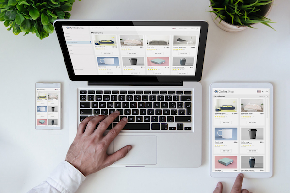
She flips through the website quickly and wants to research more, but it’s too hard while on the move — so she texts herself a link. When she gets home, she opens her texts on her tablet and quickly checks Yelp reviews, examines her calendar, and then books an appointment using the simple form on the Joann’s website.
When Sally loads up her laptop later that night to check her email, she discovers an email from Joann’s that confirms her appointment and gives her the option to add it to her calendar. The next day, 30 minutes before her appointment, she receives a push notification on her work computer reminding her of the appointment.
The next day, Sally receives a mobile email asking for feedback on the cut and offering to set up a recurring appointment at a discounted rate. She’s sold.
Sally’s experience is illustrative of the cross-device, omnichannel journey that many customers now make as they move through the marketing funnel. Every day, consumers switch a handful of different devices when completing common tasks such as online shopping, readying blog posts, booking appointments, or communicating with each other.
Consumers now expect this type of experience from all of their digital interactions. They want to be able to accomplish whatever fits their fancy on whatever device is at hand. This means that simply adapting your site to look nice on different devices is not enough. As a marketer, you must dig deeper into your customers’ and prospects’ lives.
For example, at HubSpot, we know that a visitor on a mobile device is very unlikely to fill out a long form on one of our landing pages. So we started using Content Hub to automatically shorten the form when a mobile viewer is looking at it. By doing this, our mobile prospects increased by 5x.
2. Seize intent-rich micro-moments.
You’ve likely already developed a strong set of buyer personas. You’ve conducted user research and testing to understand which content and CTAs to present to each persona as they move down the funnel. You must now go a step further. You must understand both the rhythm and rhyme to when, why, with what, and from where people are interacting with your website and content.
Google encourages marketers to identify the “micro-moments” in a customer's journey:
Micro-moments occur when people reflexively turn to a device — increasingly a smartphone — to act on a need to learn something, do something, discover something, watch something, or buy something. They are intent-rich moments when decisions are made and preferences shaped.
A number of brands have figured out how to anticipate and capitalize on these micro-moments. Apple Passbook loads up your Starbucks card when you’re near a coffee shop. Hertz sends you an email when your plane lands to let your know that your car is ready. Starwood allows you to check in and open your hotel room with your smartphone.
Consumers are increasingly becoming acclimated to companies offering such intimately responsive experiences. 59% of shoppers say that being able to shop on mobile is important when deciding which brand or retailer to buy from, and 39% of smartphone users are more likely to browse or shop a company or brand’s mobile app because it’s easier or faster to make a purchase.
How can you figure out these micro-moments and design your content to meet prospects’ intent? Tap into your data. Here are three analyses you should start with:
- Search: Which queries, ads and keywords are bringing users on different devices to your website and landing pages? Once they land on your site, what types of searches are users on different devices performing?
- Content: Examine the content that users access by stage in the funnel and by device. Is there a trend around what prospects on their phones are downloading? Sharing?
- Flow: Dig into a flow analysis segmented by device. What is the path mobile-using prospects follow? What is the path tablet-using customers follow? From what sites and sources are these visitors arriving?
After building your trove of micro-moments, it would be easy to think: “Okay, we just need to strip our website down to the specific things our visitors will mostly likely want to access on the go.”
But mobile users are not limited to completing short, simple tasks. The device does not directly imply location or intent.
A busy professional may use her commute time to conduct in-depth industry research on her phone, process her email inbox on her tablet while watching a movie with her family, and browse the websites of potential contractors while flying across the country.
Confirming this intuition, the Pew Research Center’s study of U.S. smartphone found that 99% of smartphone owners use their phone at home, 82% use their phones while in transit, and 69% use their phone at work each week. (This study was conducted in 2015, but we believe it's still relevant, if not more so, today.)
People don't want a stripped down set of content. Instead, they want quick and easy access to the materials they need on whatever device they happen to be using.Thus, while you want to optimize your site, landing pages, emails, etc. for micro-moments, you do not want to force visitors into a box from which they cannot escape.
3. Consider (and reconsider) your metrics.
The metrics you established in the desktop-centric days may not seamlessly translate to our new multi-device, micro-moment world. For example, you might have fought tirelessly to find ways to increase visitors’ time on your site, recognizing that more time means higher engagement, which translates to higher conversion.
The micro-moments you identify for mobile visitors, however, might suggest that you want a lower time-on-site. A prospect visiting the website of a consulting firm may be looking for:
- An infographic they want to show a coworker
- The bio of a partner with whom they are about to meet
- A case study to read while traveling
In order to meet this prospect's expectations for their mobile experience, you must design your website to quickly and intuitively help them find the specific piece of information for which they are looking. If their mobile visit is distracting, frustrating, or too time consuming, you’ve damaged their perception of your brand.
4. Embrace the intimacy of mobile.
For better or worse, I go to bed with my phone (reviewing tomorrow’s schedule and reading a nighttime meditation) and I wake up with my phone (silencing the alarm and checking the weather). I communicate with my partner and my best friends everyday — all through my phone. When my MBA classmate sends a GIF of Tyra Banks being sassy, I turn my phone to the person next to me, and we have a good laugh together.
Day-in and day-out, these interactions create an intimate connection between my phone and me. And I’m not alone: Most consumers imbue their mobile experiences with more intimacy than desktop experiences. The Pew Research Center found that Americans view their smartphones as freeing, connecting, and helpful, and associate their phones with feelings of happiness and productivity. These associations can inspire greater engagement with and interest in content.
As marketers, we should take advantage of these trends and consider how to make our prospects’ mobile experience more personal and social. Perhaps change your website to increase the proportion of social CTAs you display when someone arrives on mobile.
5. Remember the basics and think ahead.
Overall, embracing the mobile mindset means ensuring that the entire customer journey is responsive, relevant, actionable, and frictionless. As a marketer, you want to help consumers quickly and easily find what they want to find and do what they want to do. Again, this means thinking ahead, understanding when, with what device, and from where your prospects will interact with your content.
This can seem daunting, but mostly it means diligently applying the basics across channels. For example, since nearly half of all emails are opened on mobile, ensure your emails are mobile optimized. We recommend doing the following:
- Use large, easy-to-read text.
- Use large, clear images and reduce file sizes.
- Keep layouts simple and invest in responsive templates.
- Use large, mobile-friendly calls-to-action and links.
Recognizing the personal associations people have with their phones, you’ll want to ensure that the “From” name is familiar and that the preview text is inviting. And think ahead: Don’t email a link to a form or an event registration landing page that is not mobile-friendly.
Over to You: Time to Optimize
Follow these tips and you will be well on your way to living the mobile mindset and weathering the change in consumers’ digital behavior. Move quickly and your organization could be at the head of the pack.
Editor's note: This post was originally published in June 2015 and has been updated for comprehensiveness.
Mobile Optimization
-1.png?width=112&height=112&name=Image%20Hackathon%20%E2%80%93%20Vertical%20(50)-1.png)



![10 Best Mobile Friendliness Tests [+ What Does it Mean to be Mobile Friendly?]](https://53.fs1.hubspotusercontent-na1.net/hubfs/53/mobile-friendliness-test.jpg)

