.png?width=112&height=112&name=Image%20Hackathon%20%E2%80%93%20Horizontal%20(56).png)

As a user, registering for websites is no fun.
Because it's on a computer, it's only slightly less annoying than filling out paper forms -- falling somewhere between standing in line and watching water boil on the spectrum of most tedious activities in the world.

But it's part of doing business in the online world, and because most website visitors are quite used to the process, they've also come to have pet peeves over UX and UI choices businesses make around their registration process.
Why does this matter? Because if you rub your site visitors the wrong way when they're trying to register for something on your site, you might just lose a lead or customer because of it. Turns out 11% of US adults have abandoned an online purchase because they didn't want to register online or the site was asking for too much information, according to Forrester Research. "To put this in context," they say, "a retailer with $200m of annual online revenue could be leaving a further $22m on the table simply due to the complexity of the registration step in their checkout process."
Even more startling, eMarketer reports that 88% of people have intentionally left website registration information blank or inserted false information. Whether it's due to privacy concerns or frustration, online shoppers have higher standards than ever before for a sleek and simple registration process. If online registration is something your business can't live without, let's examine the ways to make it the least annoying process possible for your site visitors.
12 Ways to Create a Seamless Website Registration Process for Your Visitors
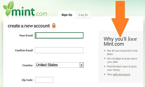
1.) Build value around registration. Right off the bat, explain why a visitor should register with your site, like Mint.com does below. Notice how little copy they use to describe the benefits -- a large, clear heading with a few bullet points laying out the value of registering with the website is all that's needed to quickly explain to a visitor what registered users can do.
2.) Eliminate as many fields as possible. Just as with landing pages, the fewer form fields you can get away with in your registration process, the less likely you'll suffer mid-form abandonment. Consider what information you absolutely must gather. And if you're asking for information that isn't required to help with your lead nurturing, make sure those fields are clearly marked as optional so users know they don't need to divulge that information.
3.) Group fields logically. Some sites require a whole lot of information to register -- shipping address, billing address, contact information, credit card information, a list of your greatest fears (optional). If it's all really necessary to complete the registration process, most users will comply, unless you lay it out in an illogical order.
People have become used to delivering their personal information in a certain order, and it's based on the most logical flow, generally something like: name, phone number, email address, billing/shipping address with a check box if they're the same, and credit card information.
But if the billing address comes first, then email address, then shipping information, then name, then credit card information, then phone number, your visitors will be disoriented at best, and unnerved at worst -- perhaps enough to leave your site without completing their registration.
4.) Break up long registration processes into steps. For many ecommerce sites, the registration process is combined with the checkout process, which means a bigger time investment and more opportunities for users to get frustrated. Break up the process into clearly labeled steps, like ModCloth, for example.

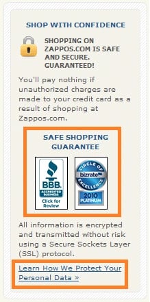
5.) Make your security and privacy policies clear as day.Privacy and security is a hot button issue, so reassure your visitors that their information is safe with you. Include a clear link to your privacy policy and visual indications of your site's security with verification badges from third parties like VeriSign, the BBB, and TRUSTe, like Zappos has done on its registration page.
6.) Make password requirements secure, but not ridiculous. Security is important, but when a new registrant is selecting a password for your site, they probably have a few variations from which they're used to drawing. Sure, a mix of characters and caps is a good idea, but keep your expectations reasonable. If your password requirements are too narrow -- it must be less than 7 characters, use at least one number, one punctuation mark, one instance of caps, and none of the following terms -- the options become quite narrow. Take a cue from Google and create strong requirements, and indicate their progress with a "password strength" visual.
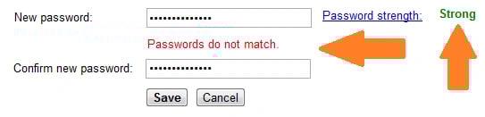
Also, if you're asking a user to confirm their password by typing it in again, don't wait until the entire form is filled out to ensure they've typed it in correctly both times; let them know right away before moving on to another form field that their passwords do not match.
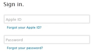
7.) Make password recovery easy. Ever go to what you thought was a brand new site, only to find out you've apparently not only been there before, but actually registered with them? If you've tried to register again with the same email address, you know it's quite impossible to get to the next step unless you somehow remember the password you selected. A Janrain study reveals that 45% of consumers will leave a website after forgetting their password or log-in information. I've definitely been in that camp when a password reset option isn't clear and simple. Unless your user can complete their end goal without registering for your website, make it easy as pie for them to reset their password so they don't abandon your site.
8.) Give the option to refresh Captcha. If your site requires that registrants authenticate that they are indeed living, breathing human beings with a Captcha form, give them the option to refresh the results that are delivered.

If you've ever been on the receiving end of an unintelligible Captcha, you know how welcoming it is to not have to struggle through an attempt to parse those wobbly, stretched, and warped letters when there's likely a clearer option next in line.
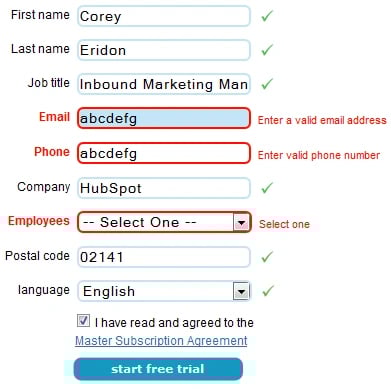
9.) Clearly identify and explain form field errors. Whether due to fumbling fingers or misinterpretation of what a field required, users will make mistakes when filling out registration forms on your site. If a field isn't completed correctly, don't just tell them they made a mistake. Show them in which field the error occurred, and explain the correct way to fill out the field. Do it in bright colors so it stands out and they don't have to re-read every form field they entered, scanning for mistakes. Some sites even scroll automatically to the offending field, making corrections even easier!
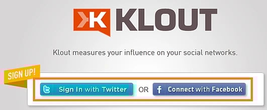
10.) Consider offering social sign-in. Social sign-in, also known as social authentication, lets visitors sign in to your site using a social network like Facebook or Twitter, or even an Apple ID or Google account. According to Marketing Pilgrim, 77% of online buyers said they think sites should offer social signup. Not only does this let visitors register for your site quicker, but it also helps you gather more valid data about your registrants.
11.) Provide a guest checkout option. Not everyone should have to complete the full registration process; provide the option to complete a purchase without registering. Yes, I know, it's more convenient to register now if they're going to return at a later date to check order history, shipping information, or account information. But maybe they're in a rush. Or maybe they intend to be a one time customer. Ultimately, wouldn't you rather see a transaction completed than collect more robust lead information?
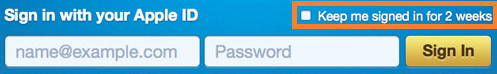
12.) Let visitors determine how long to stay signed in. If your registrants tend to come back to your site frequently -- daily or even multiple times a day -- give them the option to stay signed in. It's a little added benefit that makes your site more user-friendly for your most engaged users that choose to take advantage of the option.
When selecting a registration or shopping cart system, ask if these types of functionality are available to ensure you can create the best user experience possible. And if you're an ecommerce site, you can even utilize HubSpot's Ecommerce Integration to help you get full closed-loop reporting and lead nurturing benefits. And as you make improvements to your registration process, be sure to approach it with a scientific methodology. See what changes are helping improve your conversion rate and prevent form abandonment, and throw out the changes that add no value to the registration process, or worse, harm it.
![Blog - Website Redesign Workbook Guide [List-Based]](https://no-cache.hubspot.com/cta/default/53/4b5bb572-5d0e-45b8-8115-f79e2adc966b.png)
Website Design

![What makes a good website? Here are 16 things I look at [new data]](https://53.fs1.hubspotusercontent-na1.net/hubfs/53/what-makes-a-good-website-1-20250527-1287063.webp)