


We talk a lot about how critical landing pages are to the effectiveness of your inbound marketing. But no matter how many landing pages you have and how well-optimized they are, no one will get to see them if you haven't mastered the art and science of creating killer calls-to-action. They're the gatekeepers of your landing pages, after all! Those tiny little buggers have to jump out to your visitors, convince them of the value of your offer, and get them clicking -- which is why it's crucial that marketers don't make silly mistakes that could seriously harm their CTA click-through rates.
Luckily, this blog post can serve as your reference next time you create a new CTA or modify an existing one. If you're making any of these common mistakes when creating your calls-to-action, get in touch with your designer ASAP (or just break into your inbound marketing software) and fix these conversion-killing faux pas.
13 Common Mistakes Marketers Make With Calls-to-Action
1) Overselling and Under-Delivering
Your call-to-action sets certain expectations with your visitor -- the language you use tells them what they're going to get if they redeem your offer. The thing is, sometimes calls-to-action promise the sun and the moon to ensure they capture a click, but then don't actually deliver on those high-falutin' promises. Let's take a random CTA from HubSpot's website as an example:
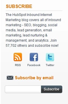
This call-to-action to subscribe to our blog promises the visitor that he or she will receive email updates of HubSpot blog content, and that content will cover all inbound marketing topics like SEO, blogging, social media, and the other topics listed in the copy above. You know what would really grind our visitors' gears? If they don't end up getting what that call-to-action promises. If we aren't able to live up to our end of the bargain -- let's say we stop writing about social media, for example -- it's crucial to remove that promise from the CTA copy so we aren't accused of pulling the ol' bait and switch and losing the trust of our audience.
2) Using Different Language in Your CTA and Landing Page
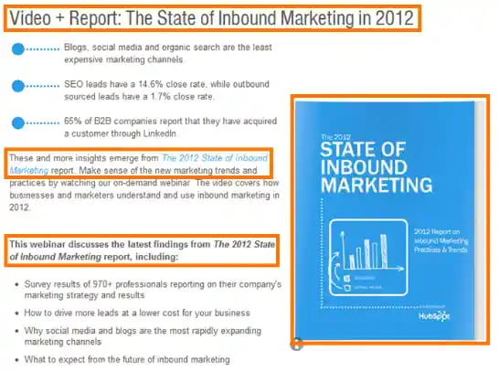
You know what's just as bad as pulling the ol' bait and switch described in mistake number one? Having your visitors think you did ... when you really didn't. This sort of confusion happens when the copy in your call-to-action appears to say something totally different than the copy on your landing page, leading visitors to believe that filling out your landing page form will not truly yield the offer your call-to-action promised. For example, see this CTA that offers the visitor a free webinar and report on the state of inbound marketing in 2012?
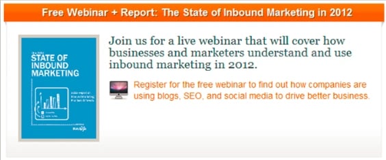
It works because it's followed by a landing page that uses those exact same words, phrases, and even image so the visitor enjoys a consistent experience from CTA to landing page.
You can learn more about writing fantastic landing page copy in our blog post, The 7-Point Checklist for Powerful Landing Page Copy.
3) Blending In
Really great designers are able to make calls-to-action that have the same visual appeal as the rest of your website -- sometimes even the exact same skin. The problem with this is that the CTAs are so well designed, they blend in with the other elements on the page and your visitor doesn't even notice them. Whether you're using a text or visual CTA, make sure it really "pops" out at you. With text CTAs, this means using a different color for hyperlinks so it's clear to readers that the text is clickable and an action can be taken. For visual CTAs, this means you should use a color that starkly contrasts the rest of your page. So if you have a white and blue background, for example, you should use red or orange call-to-action buttons so your visitors can easily identify where to go to redeem your offer.
4) Making it Hard to Find
It's not enough to be bold in color; you have to be big, too! That means your call-to-action is big enough to be seen clearly so visitors aren't left hunting for your button -- or not even realizing there is a button to click in the first place. And remember that a giant call-to-action means nothing if it appears below the fold (meaning visitors have to scroll down on the page to see it). Before publishing a new page or sending a new email, test different browsers and email clients to ensure the CTA appears above the fold for everyone.
5) Using Vague, Passive Language
It's not that your visitors are dumb ... they're not! They're just really busy, and multi-tasking their butts off. That means they don't have time to read through vague language and figure out what you want them to do. It's up to you to tell them exactly what you want them to do by using strong, active language. Take a look at this advertisement from the Discovery Channel, for example:

What am I supposed to do with dead sea scrolls? Well, if I go all the way to the bottom right of the ad, there's some very small text that tells me I'm supposed to buy tickets to see the exhibit. The problem is, most eyes will only glance at the large, headline copy at the top of this ad, and be left wondering what action they're meant to perform. Adding in a verb like "view," "explore," or "visit" would make it much clearer for visitors that they have the opportunity to actually interact with these scrolls.
6) Not Conveying Value
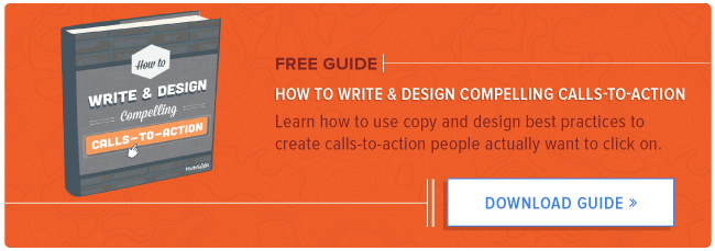
It's easy to narrow down your offer -- you're promoting an ebook about SEO, a kit about mobile marketing, or a free trial of your software. What's not easy is identifying and conveying the value of that offer -- or what I like to call the "so what?" If you can't explain to a visitor why your offer is going to help them in some way, why would they click through to redeem it? Take a look at this call-to-action for an ebook about, well, calls-to-action.
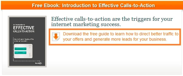
Instead of simply directing visitors to download the free ebook about calls-to-action, the copy called out in orange above explains why the content therein is valuable -- readers will learn how to direct better traffic to their offers, and generate more leads for their business!
7) Being Too Wordy
Like I mentioned in mistake number 5, your readers are busy and have their attention split between many tasks. So the quicker you can get to the point, the better your click-through rate will be. In fact, HubSpot Social Media Scientist Dan Zarrella conducted some research to determine the ideal length of a press release headline to get people clicking, and found that the sweet spot was between 90 and 150 characters. Use this as a guide when crafting your own CTA headlines, and remove extraneous words from your copy that don't help clarify meaning or convey value for your visitors.
8) Not Leveraging Numbers
One creative way to alleviate wordiness is by using numbers. I've said it before on this blog -- just as a picture's worth a thousand words, sometimes, so is a data point when you're trying to convey a concept within a constrained character limit. For example, our blog subscription call-to-action leverages numbers and the power of social proof with the sentence, "Join 57,702 others and subscribe now!" Or, one could use numbers to set expectations like we do in our 15 Business Blogging Mistakes ebook call-to-action -- reiterating that the ebook will provide 15 steps lets the visitor know just how in-depth this offer will be.
9) Misaligning CTAs With the Visitor's Stage in the Sales Cycle
Here's the thing ... if someone's on your pricing page, they're probably a bit further along in the sales process than if they're checking out your blog content. It would be a huge miss if the call-to-action on your pricing page was something as low-commitment as an ebook download! Instead, make sure you're offering something that's more purchase-oriented, like a free trial, a coupon, or the opportunity to speak with a salesperson. If you need a refresher on which offers align with which stages in the sales cycle, take a peek at this table we created!

10) Having Competing CTAs on Landing Pages
Calls-to-action are one of those things in marketing where more is not always better. To get a visitor to convert on your landing pages, you need to provide the utmost focus. So while calls-to-action are important, having more than one on your landing page will cause some serious distraction and harm your landing page conversion rates.
So if you, say, send a visitor to a landing page that asks him or her to redeem your complimentary guide to high fashion unicorn hair styles, you can imagine why they might get confused if on that same landing page you also prompt them to redeem a complimentary consultation with a unicorn groomer. Having a competing call-to-action of this nature will take away from the impact of the landing page.
11) Having No Secondary CTAs
But all of this doesn't mean you shouldn't have some secondary calls-to-action in other parts of your marketing! Here's the thing ... your visitors might not be ready to click your primary CTA and fill out a form. But they may be ready to subscribe to your blog, follow you on Twitter, or like you on Facebook. We just started applying this principle to our very own blog, in fact. Take a look at the two calls-to-action in the bottom of our blog posts:

The 15 Business Blogging Mistakes ebook is our primary call-to-action, but we supplement it with a secondary call-to-action below that gives visitors that aren't interested in the ebook another option -- subscribing to our blog! Neglecting to include secondary calls-to-action on your blog articles, thank-you pages, and in email copy is a lost opportunity to engage with visitors and leads in more diverse ways than just collecting information about them to beef up their lead record.
12) Forgetting to Put CTAs on Just About Every Single Marketing Thing You Do
You know that every email and blog post should have a call-to-action. But did you know there are plenty of other places in your marketing materials that you can make use of CTAs? If not, you're guilty of this mistake -- and seriously missing out on some lead generation opportunities. We've written an entire blog post outlining important places to put CTAs in your marketing, but here are just a few: your Twitter background, in LinkedIn Answers, within your public presentations, and in your marketing videos.
Was your mind just blown at the lead generation potential? We sure hope so.
13) Not Testing and Iterating
Despite everything in this blog post, there's one thing every marketer knows -- the truth is in the numbers. That means you should make it a common practice to test the design, placement, and copy of your calls-to-action to find what combination performs best for you. The thing is, the tips in this post are all best practices that dictate how most businesses find success with their CTAs. But there are always exceptions to the rule! See what tweaks you can make to your own calls-to-action that will improve your click-through rate, even if those changes flout conventions.
What other mistakes should marketers avoid when creating calls-to-action?
Image credit: renaissancechambara


![How the HubSpot Blog Generates Leads [+ How Yours Can, Too]](https://www.hubspot.com/hubfs/17_Lead%20Generation.png)

![28 CTA Templates to Design Clickable CTAs in PowerPoint [Download]](https://www.hubspot.com/hubfs/cta-template.jpg)

![What is a CRO Test? [+ the 5 Steps to Perform Them Yourself]](https://www.hubspot.com/hubfs/conversion-rate-optimization-tests_4.webp)

![How to Add Slide-In Calls-to-Action to Your Blog Posts [Tutorial]](https://www.hubspot.com/hubfs/Slide-in_CTAs.webp)