Visitors judge the value of your website in a matter of seconds. Hours and hours of hard work are distilled into one glance, when they decide whether or not your website is worth their time. This, of course, is what we marketers call "The Blink Test," and it refers to the commonly accepted 3-5 seconds during which a visitor lands on your website, judges it, and decides if they want to stay there and do something, or abandon ship.
You need to grab attention, get your message across, and spark interest in your viewers ... all within just a few seconds. Seems pretty difficult, but there are some best practices you can refer to for your web pages to ensure you're not losing visitors to silly, easily remedied mistakes. After all, the repercussions of an F on your blink test means lost conversion opportunities, as in lost opportunities for new leads and customers. Yikes. That's one test you don't want to fail.
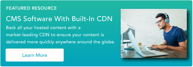
Speed Up Your Website with HubSpot's Built-In CDN
12 Ways to Ensure Your Website Passes the Blink Test
1) Build Pages That Load Quickly
The more you add to your site, the longer it takes to load. In this age of instant gratification, if your site doesn’t load immediately, it will be abandoned. In fact, according to a study done by Gomez, the average online shopper expects a page to load in two seconds or less, down from four seconds in 2006; and after three seconds, up to 40% will abandon your website.
Because load time is increased with images, scripts, and multimedia, it’s important to use them judiciously, and test loading times -- you can use free tools like Page Speed or YSlow for this. And to ensure your images load quickly enough, change the file format to the following:
- Use a GIF if the image has only a few colors, like a logo.
- Use a JPEG if the image has a lot of colors and details, like photos.
- Use a PNG for high quality, transparent images.
You can also take a high quality resolution picture, and downsize it to an appropriately viewable size for your website. For example, if you start off with an image at 3000px resolution, scale it down before you upload it to your website, and it won’t compromise your quality or slow down your load time.
2) Use Attractive Visual Design
Your website should be attractive and easy to consume. Captivate people -- without confusing them -- using high quality images that align with your site's message. That last part's critical -- the most beautiful image in the world doesn't mean anything if a site visitor doesn't immediately understand how it relates to what your company does. Apple does a great job of quickly explaining their brand with images; here, take a look:
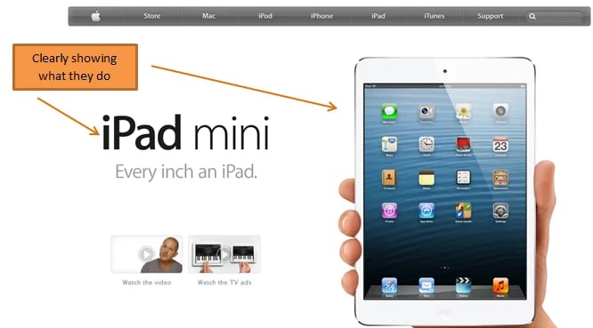
With a giant, high quality picture of an iPad mini, Apple's message is obvious and impressive.
Don’t be afraid to be bold when designing your website, though. If you create a website with a design that stands out from competitors, that's good, too. It's different. It's memorable. It makes people want to stay and check your website out. Just make sure your structure is simple and organized so people can easily find what they’re looking for without getting overwhelmed. It’s wise to limit your page to a one- or two-column layout, and avoid jamming too many things onto your homepage. If you think you're suffering from some visual clutter, find opportunities to eliminate unnecessary elements, and embrace white space to make your page more clean-cut.
3) Start With an Informative Headline That Conveys Your Value Proposition
Your audience won’t take the time to search your page for the most important material, because they expect to see it right when they arrive. According to Brian Clark, the founder of Copyblogger, eight out of ten people read a page’s headline, and only two of ten read the first paragraph. Start with a headline that states what you feature, and the benefit to the audience. This part of your website should be concise and informational. If you start off with “Welcome to our website,” for instance, you’re going to be losing visitors pretty quickly.
In addition to a clear message, it’s important to write a simple, pertinent, one sentence value proposition to explain to your reader why you’re better than your competition. For example, if you’re marketing a sandwich shop, your company value proposition could be something like “We use garden-fresh, local ingredients to craft made-to-order, high quality sandwiches and wraps in the Back Bay area.” This statement will help customers see the unique benefits of coming to your shop, and why it’s better than other sandwich shops in the area.
4) Provide Easy Navigation
Your website's navigation should be intuitive and easy to use. Provide people with the options they might expect upon visiting your site, and make sure the top-level categories of your navigation reveal the most important, easy to understand content. Going along with the sandwich shop example, a good list of top navigation tabs could be: Menu, Nutritional Info, Special Event Catering, Our Locations, Contact, and Home. These tabs organize every important aspect of the website, are clear in their wording, and can bring customers to where they want to go with the click of button.
5) Use Images That Explain What You Do, and Support Your Copy
A picture's worth a thousand words. Are yours communicating what you want them to? Everyone has seen the corny hero shots of people shaking hands, and groups of people in suits jumping in the air. These mean nothing. It’s imperative that your pictures help explain what your company is really about. Use unique, quality photos that actually represent who you are and what you do. So, not like this:

Instead, choose something like this, where you choose photos of your actual customers and/or employees:

6) Provide Content That's Easy to Consume
Visitors aren’t willing to read a novel to understand what you’re trying to say. People are always in a hurry on the web, so make sure your writing is extremely clear and focused. Optimize content so it's easy to scan, and convey the maximum amount of information in as few words as possible, to hold people’s attention. Some ways you can achieve this are:
- Write copy devoid of jargon. People don’t like what they don’t understand.
- Use viewer-focused language, like "You" and "Your" instead of "We" and "Us."
- Speak in the voice and tone to which your target persona is most accustomed.
7) Create a Congruous Experience
This means you've ensured the path to your site is logical, and bump-free. If someone clicks on a result in a search engine, a banner ad, or a pay per click ad, they're expecting to find what the description stated. For example, if someone clicks on a banner ad advertising black flats, they need to see black flats instantly featured on the ad’s landing page. If there is a disconnect between the ad and the matching landing page, you could lose a visitor’s trust, leading them to leave your page without further action. Here, take a look at an example from Zappos. If a searcher inputs the term "back flats," here's what will appear:

And if you click either of those listing, you'll land here, the flats section of their website:

8) Prove Your Site Is Credible
Today, 94% of Americans are worried “bad things” can happen when using the internet. A study conducted by Harris Interactive and sponsored by Mancx found that whether it’s the fear of getting a computer virus, losing money, or risking fraud, people are very concerned about the safety features of websites they visit. If a reader thinks your information or your intentions are less than noble, he will immediately leave your site in search of something more credible.
If you want to keep visitors on your site, present professional, trustworthy material by including testimonials, privacy trust seals, and a detailed privacy policy. This furniture company, Olejo, does a great job showing their site is credible.
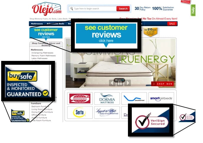
As you can see, they include an eye-catching customer review button right at the top of the page. This gives customers the option to click and see honest feedback from people who have used the site before. Also, two privacy trust seals are included in the bottom corners of the page to show visitors the business is legally registered and follows good security practices. Olejo also includes a privacy policy tab at the bottom of their page that describes what they do with customer information, credit card transactions, and other security concerns.
9) Put Important Information on the Top of Your Page
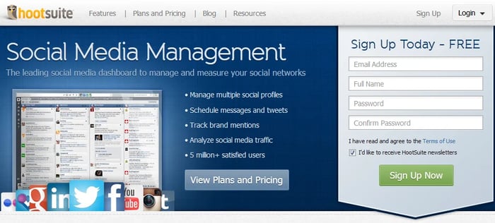
Web users spend 80% of their time looking at the information above the page fold according to a study by the Nielsen Norman Group. This means people spend most of their time on the part of the page that is visible, and then maybe they'll scroll down for a brief period of time to see what's below the fold. You stand a much better chance of keeping people on your site if they immediately see what they're looking for after the page loads. Visitors have short attention spans, and consider reading and scrolling to be extra work. Anything truly important should be in the real-estate above the fold. Below is a great example of HootSuite's expert use of their space above the fold.
10) Avoid Excessive Calls-to-Action
When a visitor arrives on your page and is immediately greeted by a pop-up asking to subscribe to your blog, a blinking CTA offering a free trial of your product, and another asking to download your latest ebook, that visitor will most likely become paralyzed with too many choices and leave your site. To stop people from quickly clicking the "Back" button, be sure to pick the most important and relevant calls-to-action to build your design around.
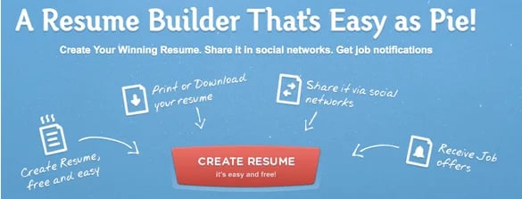
11) Make it Easy to Take the Next Step
Give your visitors a clear path to follow; you don’t want to require people to think too much when they arrive on your site, nor should they have to dig around to figure out what to do next. Keep your call-to-action above the fold and near the top of the screen so no scrolling or eye-darting is necessary to find it. Additionally, your CTA should look clickable, preferably resembling an actual button so visitors know what to do. To make it stand out more, you can provide a little extra white space around it. Finally, make sure you use obvious language so your visitor knows what to expect when clicking on your CTA. For a little inspiration, take a look at a CTA that makes it easy as pie to figure out what to do next.
12) Optimize for Mobile and Tablet
Today, people often surf the web on devices other than desktop computers. According to Pew Research Center, 45% of American adults own a smartphone, and 25% have a tablet. Making your website easy to read and fully functional on a mobile device is critical. To do this, be sure to:
- Scale your page to size using responsive web design.
- Make your images viewable on mobile devices -- use HTML5, jQuery, or JPGs so content can be rendered.
- Make text concise and easily readable.
- Make links easily clickable -- the area should be large enough for thumbs.
- Present your content in a single column.
- Keep the CTA above the fold.
- Use simple forms.
Don't miss out on conversions. Be sure to optimize your site to pass the blink test for mobile devices, as well as desktop.
So, does your website pass the test? What other tips can you share to help marketers design websites that will keep visitors' attention?