Inbound Internet Marketing Blog

SEO, Blogging, Social Media, Landing Pages, Lead Generation and Analytics

SUBSCRIBE

The HubSpot Inbound Internet Marketing blog covers all of inbound marketing - SEO, blogging, social media, lead generation, email marketing, lead nurturing & management, and analytics. Join 53,183 others and subscribe now!

Subscribe to RSS feed Add us on Facebook! Follow us on Twitter

Get Free Marketing Info!

Get the world's best marketing resources right to your inbox! Join more than 817,000 inbound marketers!

Subscribe by email

Your email:

Listen to this blog!

HubSpot's Inbound Internet Marketing Blog

Current Articles | RSS Feed RSS Feed

Don't "Submit" To Landing Page Button Text


.

describe the image This post is a sneak-peak of data from the upcoming Science of Lead Generation webinar that will teach you scientifically proven ways to get more leads. Click here to register now.

The one element that all landing pages have in common is the button - all web forms have one. So when I was researching landing page conversion rates, I wanted to look at the submit button closely.

The default text on a submit button is "Submit," so the first thing I did was compare the conversion rate of landing pages that kept this default to those pages that changed the default. I looked at over 40,000 HubSpot-customer landing pages.

submit resized 600

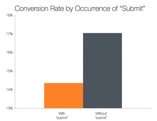
I found that landing pages with submit buttons actually labeled "submit" tended to have lower conversion rates than those that used other wording.

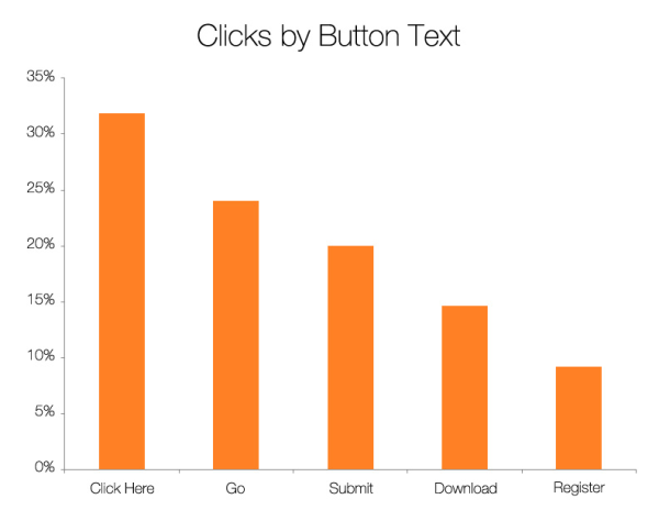
To get an idea of what kinds of language perform better than "submit" in general, I conducted a simple, context-less test. I showed people 5 different buttons (ordered randomly) and asked them to click on of them (quickly, and without over thinking it). Over 400 people clicked one of these buttons.

buttons resized 600

I found that the top performing variations were "click here" and "go." Compared to the other options, these buttons feel much less committal and imply a lower investment of time and effort.

Every landing page and instance is different, so this data should be taken only as a starting point, to give you some ideas of what to test.

Free Webinar: Science of Lead Generation

Free Webinar:  Science of Lead Generation

Posted by Dan Zarrella on Fri, Oct 08, 2010 @ 11:00 AM

COMMENTS

Wow. This is really powerful. Thank you so much for sharing this. I will re-think my buttons.

posted on Friday, October 08, 2010 at 11:12 AM by Jill Fratianne


Will you be testing the color of the submit buttons also? I hear that Orange is the best color to use.

posted on Friday, October 08, 2010 at 11:16 AM by Kelly Marsh


What about reinforcing the call-to-action? "Sign me up now!", "Send me white paper", etc. Are there any signs that these work to reinforce what the user is signing up for?

posted on Friday, October 08, 2010 at 11:16 AM by Collabrax


Hi Dan, 


I just made this change to 3 landing pages on our website. It took 5 minutes. We use the HubSpot CMS, so making changes like this are really easy. I don't know HTML...I'm a marketing guy. Keep these tips coming. 


posted on Friday, October 08, 2010 at 11:23 AM by Mark Lennon


I'm looking forward to your Webinar and hearing the rest of what you found in your testing and research. Thanks for the sneak-peek!

posted on Friday, October 08, 2010 at 11:24 AM by Natalie C.


Doesn't it stand to reason that, in a test where you're asking people which button they will "click" on, they would be more likely to click on the button that actually says "click" -- that is, "click here."  
 
Maybe this data shows us that people prefer to act on the button that reflects the action they're expecting to do. Or maybe it shows that "submit" isn't particularly meaningful to people. Or maybe the places you have submit are places where the bar IS actually higher.  
 
Without the full set of data, it's impossible to verify the conclusion from the 40,000 landing pages or the subsequent situationally agnostic test which primes the word "click." 
 
I'll grant that "go" and "click here" are lower barriers linguistically. But were all 40,000 forms the same? Were they asking similar things? Did people fill out a full form of data and then not click the button because it said "submit" and not "go" or "click here."  
 
I guess I'd really like to understand the full set of circumstances before deciding wholesale that "submit" is bad and "click here" is good.  
 
I know you're not pushing this but . . . just had to comment.

posted on Friday, October 08, 2010 at 11:54 AM by Lars


Made the change - My 'Submit' button is now my 'Click here' button. Keep those tips coming - much appreciated.

posted on Friday, October 08, 2010 at 12:01 PM by Patrick Lefler


Those are some impressive numbers. I really like seeing the clicks by button text. Definitely brings to light some testing I should do.  
 
There is a question that comes to mind which I think should be part of the evaluation before just taking those conversion numbers at face value: is the page content or form structure similar across them all? My assumption is, those not using the standard "submit" would also be doing something different on the page as well (call to action, flashier graphics, less/more graphics or text, better usability, etc), and that's what is actually effecting the conversion rate... something I'll definitely be checking out.

posted on Friday, October 08, 2010 at 12:03 PM by Loren McDonald


Wow this really is great stuff. As soon as I read this I went directly to my website to see what my buttons say. Thanks

posted on Friday, October 08, 2010 at 12:19 PM by Autumn Garcia


Makes a lot of sense psychologically that most would be more inclined to click on 'click here' or 'go' than something that sounds like it involves a greater commitment like 'register', 'download', or 'submit'.  
Really great bit of information. Thanks!

posted on Friday, October 08, 2010 at 12:25 PM by Jill Maloney


Great food for thought thanks for sharing. I would offer the suggestion that 'Click Here' and 'Go' are both positive commands to the unconscious mind which appear without danger... could be completely wrong but it would work for me!

posted on Friday, October 08, 2010 at 3:26 PM by Amanda Ollier


Thank you for this analysis. I'm in the process of moving my website hub over to my blog and design is heavy on my mind. This is SUCH useful info! Thanks again.

posted on Friday, October 08, 2010 at 3:27 PM by Kerry Rego


Maybe it is because the 'Click Here' and 'Go' buttons seem harmless and more positive than the other ones.

posted on Saturday, October 09, 2010 at 8:16 AM by boulie15


Dan, great stuff! I was keyed into color, position and prominence. Didn't consider the text factor. 
 
Thanks.

posted on Saturday, October 09, 2010 at 8:12 PM by Willie Thompson


This is really useful stuff - thanks for sharing. The rest of the research will be fascinating. 
 
M

posted on Monday, October 11, 2010 at 8:47 AM by Matthew Simmons


Having conducted some conversion testing on buttons, I have seen better results when using a specific and immediate call-to-action e.g. "Claim Your FREE E-Book Now!"

posted on Monday, October 11, 2010 at 9:10 AM by Richard G Lewis


I like Richard's idea -- "Claim Your ..." Claim is a good button title as well as Click Here.

posted on Tuesday, October 12, 2010 at 10:41 AM by Beth


Submit just stinks, let's face it, how many customers or should I say shoppers in the real world are clamouring to submit? It's just a geeky overhang of yesteryear that perpetuates exclusionary vocabularly from the mainstream. 
 
Furthermore, just like this form, submit has a hideous cousin that is post
 
I've known people to confuse this term with the real world equivalent of sending something in the mail. 
 
Don't make people think, make it joyously obvious.

posted on Tuesday, November 02, 2010 at 9:34 AM by Paul Gailey


I have the same hypothesis that Lars. The ask people to click on the first thing that comes to mind - without thinking too much - and labeling a button "click here" is warranted to get more attention as it describes your goal. 
 
What would happen if you ask people to get a free shirt but that they have 3 seconds to make the choice or the button disappears (and then you label the buttons "Claim Shirt!!!!" and then the others "No shirt", "Lose" and "Try again"). 
 
I bet 2 dollars what the result will be.

posted on Friday, November 05, 2010 at 12:14 AM by FF


Comments have been closed for this article.