Inbound Internet Marketing Blog

SEO, Blogging, Social Media, Landing Pages, Lead Generation and Analytics

SUBSCRIBE

The HubSpot Inbound Internet Marketing blog covers all of inbound marketing - SEO, blogging, social media, lead generation, email marketing, lead nurturing & management, and analytics. Join 57,702 others and subscribe now!

Subscribe to RSS feed Add us on Facebook! Follow us on Twitter

Get Free Marketing Info!

Get the world's best marketing resources right to your inbox! Join more than 817,000 inbound marketers!

Subscribe by email

Your email:

HubSpot's Inbound Internet Marketing Blog

Current Articles | RSS Feed RSS Feed

5 Common Landing Page Mistakes


.

landing page sample
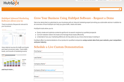
1) Remove Navigation and Other Distractions

Your landing page should have one simple purpose: Get someone excited enough about your offer so that they're willing to hand over their information. For best results, you'll want to remove distractions like navigation and additional offers. Keep your visitor's focus on the offer at hand. 


2) Use Your Headline to Explain the Value of Your Offer - What's in it for Me?

People's attention spans are short, especially online. Because of this, you'll want to make sure that your offer is as clear as possible. The best way to achieve this is to have a clear title. Specifically, you'll want to make sure your title contains:

  • A clear action (e.g. "Download our Guide")
  • A clear description of your offer (e.g. "Download our Guide to Effective Landing Pages")
  • An explanation of the value of your offer (e.g. "Download our Guide to Effective Landing Pages and Learn How to Increase Conversions by over 10%")

I've seen many landing pages that miss one of these three key details.

3) Use Caption Text Under Your Image(s)

As far as I'm conceded, you should always include at least one image on your landing pages. Images are engaging, they make your offers more tangible, and people like them. 

That said, one of the most commonly overlooked elements on landing pages is image caption text. Behaviorally, people are much more likely to read the caption text on an image then to read the body text of your landing page. 

Use your caption text to help underline the value of your offer. 

4) Use Thank You Pages & Suggest Next Steps

When someone has finished filling out your landing page, what do they see? You should think carefully about this question.

Your "thank you" page is a great opportunity to suggest your lead's next action and should help them further connect with your company or brand. "Subscribe to our newsletter," "Read our blog," "Connect with us on Twitter," or "Share this offer with a friend are all are excellent examples of things you can suggest on a thank you page. 

5) Make Your “Submit” Button Engaging

No one get’s excited about submitting their information to a marketing database. Because of this, you should always change the default text of your "submit" button. 

The best practice here is to use an action word and to remind your visitors about what they're going to get. Think about which button you'd rather click below:

better submit button

submit

Bonus Tip: Avoid “Contact Us,” - Create Stronger Offers

As far as I'm concerned “Contact Us” does not count as a landing page. If this is the only "offer" on your site, you’re just going to attract spam and sales people. Diversify and create more offers.

Specifically, create one early-stage and one late-stage offer. For example, an early-stage offer could be a guide, a kit, or a white paper. A late stage offer can be a free consultation, an estimate / price quote or a free trial. 

Next Steps and Other Suggestions

Following these simple tips is an easy way to increase your landing page conversion rate

If you've had success with other tactics, please share them in the comments below. 

An Introductory Guide to Building Landing Pages

An Introductory Guide to Building Landing Pages

Learn how to use landing pages to convert more of your website visitors into leads!

Download the free guide to get started building effective landing pages that will capture more leads for your business.

Posted by Andrew Pitre on Tue, Jan 25, 2011 @ 08:00 AM

COMMENTS

Andy, should you lead nurture your landing pages? I heard that you get a better velocity and results if you nurture. Can you confirm or deny?

posted on Tuesday, January 25, 2011 at 8:05 AM by Dan Tyre


Mr. Tyre, that's a great question. In the interest of keeping it simple, I decided to focus this post on things a marketer can do to increase conversions on their landing pages.  
 
That said, you are completely right; using lead nurturing campaigns (aka marketing automation) after a prospect has converted on your landing page is a smart, effective way to drive leads farther down the sales funnel. 
 
For those of you who are interested in reading more about lead nurturing, I suggest checking out the following articles: 
 
http://blog.hubspot.com/blog/tabid/6307/bid/7019/Lead-Nurturing-Explained-3-Tips-to-Increase-Qualified-Leads.aspx 
 
http://blog.hubspot.com/blog/tabid/6307/bid/5917/5-Best-Practices-for-Lead-Nurturing-Emails.aspx 
 
http://blog.hubspot.com/blog/tabid/6307/bid/5027/1-200-Leads-in-4-Weeks-A-Lead-Nurturing-Success-Story.aspx

posted on Tuesday, January 25, 2011 at 8:44 AM by Andrew Pitre


I agree by not say just click here or submit..people are aware of this now and more likely to just walk away from the offer.. 
 
"Black Seo Guy "Signing Off"

posted on Tuesday, January 25, 2011 at 9:02 AM by TrafficColeman


These are all great tips. I also like to break information up into pieces so that visitors can get more info without having to leave the page and without making the page too text heavy. Here's a landing page I made that uses tabs to accomplish this: 
 
http://www.mobileepiphany.com/asset-management-solutions

posted on Tuesday, January 25, 2011 at 9:42 AM by Jason Klass


Thank you for making this so simple and "action ready"! I'm going make sure I have instituted ALL these suggestions immediately. 
 
Man, I love hubspot... 
 
Leanne

posted on Tuesday, January 25, 2011 at 10:04 AM by Leanne Wheeler


All your points are excellent. Practice of #1 and #4 alone would improve many of the landing pages I see. 
 
As an aside, I noticed that your blog post title is, "5 Common Landing Page Mistakes", leading the reader to believe that your post will be a list of mistakes, but it's actually a list of "should do" items.

posted on Tuesday, January 25, 2011 at 10:45 AM by Constance Semler


Yes. Think of the architecture of your message...What is the big idea? Are you shining a bright white light on it? Or, are you trying to cram too much into the message?(Remember: "less is more"). What are the stages from intro to final action? What thoughts/aspirations/emotions should be triggered at each stage? What words and images and structure will trigger them?

posted on Tuesday, January 25, 2011 at 10:55 AM by Mike Dombrow


Andrew went right to the heart of the landing page design. I am one who forgets to include next steps, although I preach this. In my own case I am evolving CTAs every time I learn something like today from Andrew. I hope to share some insight

posted on Tuesday, January 25, 2011 at 3:35 PM by Don Graff


Good points here. I often find I get so wrapped up in what I'm doing I often forget the fundermentials, then suddenly have a lightbulb moment - like this thanks

posted on Wednesday, January 26, 2011 at 9:01 AM by Toby Russell


I just noticed last week that Hubspot didn't have any nav buttons on an internal page. When I showed that internally and suggested we try it, I had a riot on my hands. Thanks for blatantly stating this. Maybe this article will help people accept it more readily!

posted on Wednesday, January 26, 2011 at 3:59 PM by Stacey


That's a very interesting article that makes sense, it is engaging, well written and sound pro. 
But I have one question: Looking at both your blog and website landing page, I couldn't see the application of your recommendations there, starting with number 1) 
Why would that be?

posted on Sunday, January 30, 2011 at 11:14 PM by Froggystyle


Useful article and we can concur that after creating a more engaging, easy to read, does what it says, landing page, we have had more clients from it. 
 

posted on Wednesday, February 02, 2011 at 9:23 AM by BetterTAX


Good article-useful information. A tactic I use is giving away a FREE CD along with a newsletter that's free for a month to entice visitors on my squeeze page. It seems to put them more in a buying mood! Works great on the upsale pages too!

posted on Saturday, February 12, 2011 at 1:40 PM by Jeff A. Jones


Comments have been closed for this article.