
Have you ever wanted to create a single chart for two different (yet related) pieces of data? Maybe you wanted to see the raw number of leads you're generating from each channel and what the conversion rate of the channel is.
Having those two sets of data on one graph is extremely helpful to picking out patterns and identifying full-funnel trends. ![Download Now: 50+ Excel Hacks [Free Guide]](https://no-cache.hubspot.com/cta/default/53/067360a3-cf50-4923-b737-86af07177c39.png)
But there's a problem. Those two sets of data have two Y axes with two different scales -- the number of leads and the conversion rate -- making your chart look really wonky.
Luckily, there's an easy fix. You need something called a secondary axis: it allows you to use the same X axis with two different sets of Y-axis data with two different scales. To help you solve this pesky graphing problem, we'll show you how to add a secondary axis in Excel on a Mac, PC, or in a Google Doc spreadsheet.
(And for even more Excel tips, check out our post about how to use Excel.)
.png)
50 Excel Hacks To Help You Master Excel
Tips to help you tackle Excel, including a guided template, GIF demonstrations, and a graph generator.
- 50 Excel Hacks
- A Guided Template
- GIF Visuals
- Excel Graph Generators
Download Free
All fields are required.
Note: Although the following Mac and Windows instructions used Microsoft Excel 2016 and 2013, respectively, users can create a secondary axis for their chart in most versions of Excel using variations of these steps. Keep in mind the options shown in each screenshot might be in different locations depending on the version of Excel you're using.
How to Add Secondary Axis in Excel
- Gather your data into a spreadsheet in Excel.
- Create a chart with your data.
- Add your second data series.
- Switch this data series from your primary Y axis to your secondary Y axis.
- Adjust your formatting.
On a Mac Computer (Using Excel 2016)
1. Gather your data into a spreadsheet in Excel.
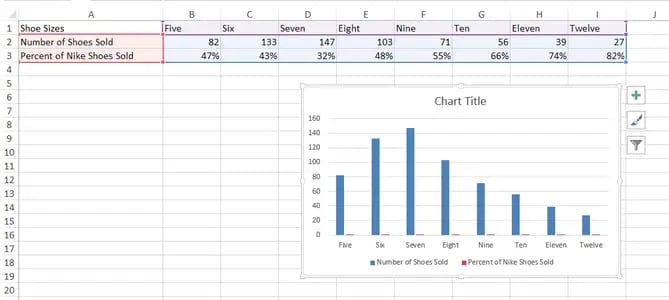
For the purposes of this process, we'll create three rows of data on Nike shoe sales in a blank spreadsheet:
- Shoe sizes
- Number of shoes sold per size
- Percentage of that size's inventory that was sold
Make Row 1 your X axis and Rows 2 and 3 your two Y axes. For this example, Row 3 will be our secondary axis.

2. Create a chart with your data.
Want a detailed guide to creating a chart in Excel? Click here.
Otherwise, you can highlight the data you want to include in your chart and click "Insert" on the top-lefthand corner of your navigation bar. Then, click "Charts," navigate to the "Column" section, and select "Clustered Column" -- the first option, as shown below.

Your chart will then appear below your data set.

3. Add your second data series.
Now it's time to turn the "Percent of Nike Shoes Sold" data -- currently row 3 in the spreadsheet -- into your chart's secondary Y axis. Head over to your top navigation bar and click on "Format." This should pop up in dark green next to "Chart Design," as shown to the far right in the screenshot below.
Having selected "Format," navigate to the dropdown menu on the top-lefthand corner of your menu bar, where it might currently say "Chart Area." Click this dropdown and select "Series 'Percent of Nike Shoes Sold'" (or whichever series you want as your secondary axis).

After you select "Series 'Percent of Nike Shoes Sold,'" click on the "Format Selection" button -- it's right below the dropdown. A pop-up will come out that gives you the option to select a secondary axis. If you're using a version of Excel that doesn't provide you with this formatting button, move on to the fourth step below.
4. Switch this data series from your primary Y axis to your secondary Y axis.
You'll see your new data series added to your chart, but currently, this data is being measured as a low-laying series of columns on your primary Y axis. To give this data a secondary Y axis, click on one of these bars just above the X axis line until they become highlighted.
Having highlighted this additional data series on your chart, a menu bar labeled "Format Data Series" should appear on the right of your screen, as shown below.

In this menu bar, click the "Secondary Axis" bubble to switch your Percentage of Nike Shoes Sold data from your primary Y axis to its own secondary Y axis.
5. Adjust your formatting.
You now have your percentages on their own Y axis on the right side of your chart, but we're still not done. See how you have "Percent of Nike Shoes Sold" overlapping with the "Number of Shoes Sold" columns? Ideally, you want to present your secondary data series in a different form than your columns. Let's do that.

Click your orange columns -- as shown in the screenshot above -- to highlight your second data series again. Then, click into "Chart Design" on the menu bar on top of your Excel spreadsheet.
On the far righthand side, select the "Change Chart Type" icon and hover over the "Line" graph option. Select the first line graph option that appears, as shown below.

Voilà! Your chart is ready, showing both the number of shoes sold and percent, according to shoe size.

On a Windows PC (Using Excel 2013)
1. Gather your data into a spreadsheet in Excel.
Set your spreadsheet up so that Row 1 is your X axis and Rows 2 and 3 are your two Y axes. For this example, Row 3 will be our secondary axis.

2. Create a chart with your data.
Highlight the data you want to include in your chart. Next, click on the "Insert" tab, two buttons to the right of "File." Here, you'll find a "Charts" section. Click on the small vertical bar chart icon at the top left of this section. You'll now see a few different chart options. Select the first option: 2-D Column.

Once clicked, you'll see the chart appear below your data.
3. Add your second data series.
Now it's time to add the "Percent of Nike Shoes Sold" data to your secondary axis. After your chart appears, you will see that two new tabs appear at the end of your dashboard: "Design," and "Format." Click on "Format."
Then, on the far left where it reads "Current Selection," click on the dropdown that reads "Chart Area." Select "Series 'Percent of Nike Shoes Sold'" -- or whichever you want your secondary axis to be.

4. Switch this data series from your primary Y axis to your secondary Y axis.
You'll see your new data series added to your chart, but currently, this data is being measured as a low-laying series of columns on your primary Y axis. To give this data a secondary Y axis, double-click on one of these bars just above the X axis line until they become highlighted.
Having highlighted this additional data series on your chart, a menu bar labeled "Format Data Series" should appear on the right of your screen.
In this menu bar, click the "Secondary Axis" bubble to switch your Percentage of Nike Shoes Sold data from your primary Y axis to its own secondary Y axis.

5. Adjust your formatting.
Notice how your "Percent of Nike Shoes Sold" data is now overlapping with your "Number of Shoes Sold" columns? Let's fix that so your secondary data series is presented separately from your primary data series.

Click and highlight your secondary bar data -- the red columns -- and select the "Design" tab (which is located next to the "Format" tab at the top of your screen). Then, click "Change Chart Type."

You will see the following pop-up modal. Next to "Percent of Nike Shoes Sold" at the bottom, click on the dropdown, and select an option below "Line." This will change this data series into a line graph.

Make sure the "Secondary Axis" check box next to the dropdown is selected as well.
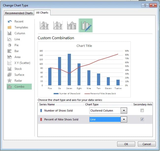
Voilà! Your chart is ready.

How to Add a Secondary Axis in a Google Doc Spreadsheet
Step 1: Gather your data into the spreadsheet.
Make Row 1 your X-axis and Rows 2 and 3 your two Y-axes.

Step 2: Create a chart with your data.
Highlight your data. Then click on "Insert" on your menu, and click "Chart" -- it's located toward the bottom of the drop-down. This module will appear.

Step 3: Add your secondary axis.
Under the "Start" tab, click on the graph at the bottom right showing a bar graph with a line over it. If that doesn't appear in the preview immediately, click on "More >>" next to the "Recommended charts" header, and you will be able to select it there.
Make sure that "Use column A as headers" is checked at the top. If the chart still doesn't look right, you can also check the option to "Switch rows / columns."

Step 4: Adjust your formatting.
Now it's time to fix your formatting. Under the "Customize" tab, scroll down to the bottom where it says "Series Number of Shoes Sold." Click on that dropdown, and click on your secondary axis name, which, in this case is "Percent of Nike Shoes Sold." Under the "Axis" drop-down, change the "Left" option to "Right." This will make your secondary axis appear clearly. Then click "Insert" to put the chart in your spreadsheet.

Voilà! Your chart is ready.

Want more Excel tips? Check out this tutorial on how to create a pivot table.
50 Excel Hacks To Help You Master Excel
Tips to help you tackle Excel, including a guided template, GIF demonstrations, and a graph generator.
- 50 Excel Hacks
- A Guided Template
- GIF Visuals
- Excel Graph Generators
Download Free
All fields are required.