-Aug-24-2021-10-23-11-99-PM.png)
11
- Unique Typography
- Engaging and Responsive Hero Images
- Background Videos
- Semi-flat Design
- Hamburger Menus
- High-quality Product Images
- Card Design
- Feature Videos
- Mobile-Friendly Layout
- White Space
- Speed Optimization
1. Unique Typography
Most companies have a particular font or typography that they use to help their customers immediately identify them versus their competitors. In recent years, designers have access to a larger selection of fonts making it easier for businesses to more accurately express their brands through typography.
For example, The New Yorker is recognized instantly through its use of the unique font, Adobe Caslon Pro.

Why is unique typography useful in modern web design?
Typography is a singular design element that gives a uniform look across each page on a website. For instance, The New Yorker website leads visitors from one section to another based on the typography and font sizes.
When creating your company's brand, your choice in typography can indicate subtle hints about what you represent. Is your business fun or serious? Functional or informational? Regardless of what font you choose, be sure your designer considers its applicability across browsers and computers. Choosing a font that is not supported by common browsers and computers could mean that your website will display awkwardly on different devices.
2. Engaging & Responsive Hero Images
You don't have to go far beyond the popular publishing website Medium to see an example of a great hero image.
 Images like this one do away with the concept of above and below the fold, instead offering a singular point of view. By focusing on just the image with text rather than a CTA or social buttons, Medium creates a strong visual experience that encourages you to scroll down to read more.
Hero images are also often placed in the background with text and other content overlaid on top. Regardless of the approach you utilize, large images can help visually tell your story without having to rely on just text.
Why is it useful?
Hero images set the tone for your website without the need for text or video — the right image can instantly give visitors a sense of what your brand is about, what you do, or what makes you unique. As a result, it’s a good idea to both brainstorm hero image ideas and get feedback from multiple sources to see which image offers the biggest impact.
3. Background Videos
Videos that automatically play in the background can add a lot of intrigue to a page. They can be used to tell a story and significantly reduce the amount of other content that is needed to explain your business.
Take Wistia's website, for example. When you land on their homepage a large video automatically starts playing in the background, and by clicking on the play button, you get a deeper look at the company:

This background video serves as a brilliant way to get the visitor to click-through and stay on the page longer.
Why is it useful?
Background videos focus on enticing the visitor from the moment they land on your page. The video allows your visitor to understand the key points about your company without ever having to read a single line of text.
In addition, video is processed 60,000 times faster by our brains compared to text. While people are often hesitant to read heavy blocks of text, videos appear effortless and can be consumed very quickly. It also helps that connection speeds are increasing and mobile device sizes are growing, making for better video experiences.
4. Semi-Flat Design
Simply put, flat design is any element that does not include or give the perception of three dimensions, such as shadows. Not only is flat design easier for users to understand, but it can also load more quickly on websites without complicated or overly technical elements.
Many organizations — both large and small — have shifted from realistic skeuomorphism to flat design. However, companies like Uber have put their own spin on the style by adding subtle shadows and dimensions.
As you can see in the image below, the graphic elements have a sense of depth thanks to the shadows around them without overdoing it.

Why is it useful?
Flat design helps the visitor understand your content more quickly, and adding some elements of depth can bring it to life. Regardless of whether you fully design your website using flat design or utilize shadows and other elements, it's important to be consistent throughout your website. Ensure that your homepage, product pages, and any other key sections of your website all utilize the same design cues so that visitors can instantly understand what they're viewing.
5. Hamburger Menus
Most websites have long menus of options to choose from. The advantage of this is that the menu can take the visitor directly to where they want to go. The disadvantage is that they generally take up a ton of valuable screen space. The hidden, or hamburger, menu changes this. This condensed menu saves space and is intuitive for users to navigate.
Wondering why it's called a hamburger menu?
If you use your imagination, the three lines that are stacked on top of one another look like two burger buns and a patty. Clever.
Why is it useful?
The pages of your website should have a clear path for the user to take. Removing a busy navigation makes the experience cleaner and distraction free. This increases the likelihood that users will find the information they need to complete a desired action.
6. High-Quality Product Images
Many B2B websites are starting to display large product images on their sites to highlight different features or parts of their product, and this isn’t by accident.
To give you a better idea of what we're talking about, let's take a look at the product page for HubSpot’s Marketing Hub:

There is a large featured image on this page, and as you scroll down, you’ll find additional in-depth product images. The images are also responsive which aims to ensure an optimized experience for viewers coming from different devices, as we mentioned earlier.
Why is it useful?
High-quality product images help designers highlight different features of a product in a more efficient and effective way.
This approach reinforces the benefits of a feature by providing the opportunity to highlight the most valuable pieces.
These large images are also scan-friendly. They help visitors generate a solid understanding of what the different product features do by conveying them through images instead of words.
7. Card Design
With the rise of Pinterest, designers and marketers alike have become fascinated with cards. Individual cards help distribute information in a visual way so the visitors can easily consume bite-sized pieces of content without being overwhelmed.
Miiryia’s homepage serves as a great example of card design in action:

By breaking up different pieces of content into cards, users can pick and choose which articles they want to expand. This helps to keep the homepage feeling clean and organized, without relying on a ton of text.
Why is it useful?
Card design is becoming more and more popular across B2B and B2C websites because it helps to deliver easily digestible chunks of information for users. Using this design on your site can help highlight multiple products or solutions side-by-side.
Keep in mind that your cards should be responsive. This means that as the screen size gets smaller or larger, the number and size of cards shown should adapt accordingly.
8. Feature Videos
In addition to background videos, short product or feature videos are also on trend as they can be used to highlight a specific use case. These short videos are great at bringing your solution to life, while not overwhelming the visitor with a long experience that they must sit through.
A strong example of this comes from the folks at InVision. They display this short illustrator of how easy it is to use their product by dragging-and-dropping a design directly on their homepage:

Why is it useful?
B2B companies benefit from videos that explain their products to help positively influence the buyer's decision-making process.
9. Mobile-Friendly Layouts

First-generation websites were designed for desktops. As a result, they were built to accommodate larger monitors and point-and-click mouse control. The rise of mobile devices, however, means that web traffic may come from multiple sources — and your website must deliver the same experience regardless of user device type.
In practice, this means creating mobile-friendly website layouts that leverage the principle of responsive web design, which allows website elements such as images, text and user interfaces (UIs) to automatically rescale and resize depending on the device used to access the site.
Why is it useful?
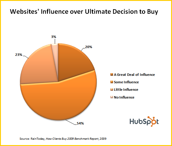
Mobile device traffic now accounts for more than 54 percent of all web traffic worldwide. This means that if your site isn’t mobile-friendly, you could be losing up to half of all prospective customers.
Consider a desktop-friendly site accessed by a smartphone user. If text, images and buttons don’t resize to match touchscreen controls and smaller screen size, it’s almost impossible for prospective customers to find what they’re looking for — after a few misclicks they’ll likely take their business elsewhere.
10. White Space

White space is an often-used element of minimalist web design, but is now a critical feature of effective modern site frameworks. By balancing content such as links, text and videos with similar amounts of white space, users are naturally drawn to key aspects of your site. While there’s no hard-and-fast standard for the amount of white space you need, a good rule of thumb is to create at least some white space between every content element.
Why is it useful?
Website navigation plays a critical role in user satisfaction. If visitors struggle to find your product or contact pages, they’re far less likely to click through and begin the conversion process.
White space helps focus user attention on the elements that matter most to your business. For example, if you have a featured product image or video at the top of your homepage, separate it from further content with white space. This helps it stand alone and highlights its importance compared to the rest of your site. If you surround it with visually noisy elements, however, the focus is quickly lost.
11. Speed Optimization

Having an engaging, content-rich website won’t help drive conversions if your site loads slowly and users point their browsers elsewhere. As a result, it’s critical to optimize all elements of your site for speed to reduce the amount of time between click and content.
In practice, this means optimizing all images to balance image quality and file size. For example, while PNG images offer higher quality and transparency, they’re much larger than JPEG images; in most cases JPEGs offer the best balance between speed and quality. GIFs, meanwhile, are ideal for animated images but use fewer colors, making them less-than-ideal for static images.
It’s also a good idea to compress any files hosted on your site — many modern compression tools can significantly reduce file size without any commensurate loss of function. Site owners should additionally consider their hosting environment: For example, dedicated or VPS hosting will typically provide faster site loading speeds than shared hosting solutions.
Why is it useful?
According to statistics from Google, as page load times increase from 1 second to 10 seconds, visitor bounce rate rises by 123 percent. The search giant also notes that despite the shift to more robust 4G connections, “the majority of mobile sites are still slow and bloated with too many elements.”
As a result, even small investments into website speed optimization can pay significant dividends, especially since landing page speed is now used by Google as a ranking factor for mobile searches and Google Ads.
The Elements of Style
Modern web design requires regular evaluation to ensure your site delivers compelling visuals, engaging content and offers a unified experience for users, regardless of device. The elements listed above offer a solid starting point to create stylish, streamlined, and speedy websites that capture user interest and help drive conversions.
Editor's note: This post was originally published in August 2018 and has been updated for comprehensiveness.

Design Trends