

Some presentations are better than others. They may have gorgeous designs. Others have insanely actionable takeaways. Some just give down-to-earth advice. But the best presentations represent all three.
![→ Free Download: 10 PowerPoint Presentation Templates [Access Now]](https://no-cache.hubspot.com/cta/default/53/2d0b5298-2daa-4812-b2d4-fa65cd354a8e.png)
And if you're looking to get started making your own presentation, why not learn from the best of the best?
To help you kick your own presentations up a notch, we've curated 20 awesome PowerPoint and SlideShare decks below.
When you're clicking through the presentations below, notice how they weave an interesting story through the format, design their slides, and make their presentations interactive with features exclusive to the platform on which they were created.
These are all crucial elements to making an awesome presentation — ones that you can certainly adapt and apply to your own with the right approach.
Even better — you may just learn something new about marketing while you're at it.
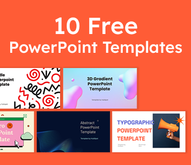
10 Free PowerPoint Templates
Download ten free PowerPoint templates for a better presentation.
- Creative templates.
- Data-driven templates.
- Professional templates.
- And more!
What do good presentations have in common
The best presenters rehearse the material for smooth delivery, use eye contact, and engage their audience. You’ll also find great slides and a strong storyline.
Here are five elements you’ll find in every great digital presentation.
The presentation is highly relevant to the audience.
The best way to engage your audience is to talk about things that matter to them. By choosing topics that are genuinely interesting, solve their problems, answer their questions, or offer actionable ideas, you’re on the right track for a great presentation.
The icing on the cake? Having great titles. Your slide titles should pique people’s interest and curiosity while clearly stating the topic so your audience can decide if it’s relevant.
The presentation has a clear objective.
People sitting in on a presentation should have a reasonably clear idea of what you’re covering.
Whatever the topic, your slides and commentary should clearly relate to your key takeaways.
The presentation follows an organized storyline.
While closely related to the item above, your slides should tell a story that your audience can follow, with a beginning, a middle, and an end.
By following the key elements of storytelling, it’s much easier to demonstrate the point you’re leading towards.
The audience understands the next steps.
Defining the action you want your audience to take at the conclusion of your presentation and offering a compelling reason to do so helps them understand and follow your ideal course of action.
While this is often a call to action, it can also be a thought-provoking question or a list of key takeaways.
The audiences leave with contact information and/or resources.
Often, your audience wants to dive deeper into your material or topic. Offering contact information or additional resources helps listeners find what they need, whether it’s a conversation with you or a link to more information.
How to Create a Presentation
- Less is more.
- Keep text to a minimum.
- Rethink visuals.
- Incorporate multimedia.
Now that you know what to look for in a great slide deck, let’s dive in and explain how you can create your own. Follow these four guidelines for the best results.
1. Less is more.
Keep your slides simple when delivering a presentation to an audience in-person. You want the focus to be on the message, rather than just the slides themselves. Keep the slides on-topic but simple enough that people can still pay attention to what you're saying.
Remember, your visuals and text support your message. The true power is in your delivery.
2. Keep text to a minimum.
One way to accomplish the aforementioned simplicity is to reduce the amount of text in your presentation. Too much text can leave your audience overwhelmed. They’ll be preoccupied with reading your slides instead of listening.
Instead of large amounts of text, think about fewer words in a bigger font. This will help your audience up close and in the back of the room read your slides.
3. Rethink visuals.
People recall information better when it’s paired with images (as opposed to text). When you reduce the amount of text in your slides, you'll need compelling visuals to support the message you're delivering to your audience.
That doesn't mean you can just throw some nice-looking photos onto your deck and move on. Like any other content strategy, the visual elements of your presentation need to be strategic and relevant. We’ll discuss different types of visuals, and their best practices, below.
Template
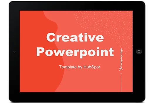
Download 10 PowerPoint Templates for Free
While PowerPoint templates have come a long way since the program was first unveiled to the world, chances are, they're still commonly used.
To make your presentation unique, choose a theme that your audience hasn't seen dozens of times before — one that matches your brand and complements the topic you're speaking about.
Sometimes, it pays to look at presentation platforms other than PowerPoint to find templates, like Prezi.
There are also many visual content design sites that offer customizable templates that you can adapt for your own brand and topic, like Canva. In fact, in addition to templates, Canva also offers its very own platform for building presentations from scratch.
Additionally, you can also take a look at Venngage's free presentation maker for more professionally designed templates, icons, and high-quality stock photos that you can use right away.
Charts and Graphs
One of the best ways to support the message you're delivering in your presentation is by including data and statistics. That's where charts and graphs come in: They provide a colorful and engaging way to present the details that support your point.
That said, make sure they fit in with the rest of your presentation's visual theme. Otherwise, your data points can distract the audience from what you're talking about, rather than enhancing it.
Color Theme
There's been some research on the way color can influence our emotions, especially when used in marketing.
While the goal of your presentation may not necessarily be to make a sale, you might be trying to invoke certain feelings or impressions, which a strategic use of color can help you do.
Check out Coschedule's guide on the psychology of color in marketing, which highlights the ways different tones, shades, and combinations can influence purchasing decisions.
10 Free PowerPoint Templates
Download ten free PowerPoint templates for a better presentation.
- Creative templates.
- Data-driven templates.
- Professional templates.
- And more!
Font
When you include text, you want it to be easy to read and interpret. If you include text that's too small or dense to easily read, participants become too focused on trying to decipher it to pay attention to what you're saying.
That's why the designers at Visage recommend choosing Sans Serif fonts that opt for "legibility over fun," noting that text should not only be big enough for people in the back of the room to read but also presented in the right color to maintain visibility over your background.
Image Quality
Incorporating this fabulous visual content into your presentation will go to waste if the images are low-quality. Make sure your photos and other visual assets are high-resolution enough to be crisp and clear when displayed on a huge presentation screen.
4. Incorporate multimedia.
There's a reason why we love examples. You can give out the best advice available, but sometimes, in order to believe it, people need to see it in practice.
Multimedia is one way to achieve that — in a manner that can also capture and maintain your audience's attention.
A simple Google search for "music in presentations" yields enough soundtrack results to suggest that it's a unique way of engaging your audience, or at least creating a welcoming atmosphere before and after you speak.
Within the presentation itself, video serves as valuable visual content to keep your audience engaged. After all, 43% of people want to see more video content from marketers.
Video helps to illustrate and explain theories in practice in a way that the spoken word or photographs can't do alone.
Best PowerPoint Presentations
Every item on this list meets the criteria for a great PowerPoint presentation. As you peruse these examples, take inspiration from our favorites and use what you learn to create your best presentation yet.
1. ChatGPT What It Is and How Writers Can Use It by Ads
We all get writer's block sometimes. You'll stare at a screen, hoping for inspiration to strike — and for that idea to be amazing. ChatGPT can help with the writing process.
The presentation below explains what ChatGPT is and all of its functionality, all with the goal of making the writing process easy.
What we love: This presentation maintains a limited color palette. The designer makes use of bold white text over a blue background to call out important headings. Key definitions are centered in white space, allowing these sections to naturally catch the viewer’s eye.
2. How Google Works by Eric Schmid
Ever wonder what it's actually like to work at Google? The presentation below from Eric Schmidt (Alphabet, Inc.'s Executive Chairman and ex-CEO of Google) could clue you in.
This presentation outlines some of the top lessons he and his team have learned from running and hiring at one of the top companies in the world. Besides giving you a peek behind the scenes, Schmidt inspires you to make changes to the way your business runs.
What we love: This presentation has minimalist slides that balance simple illustrations with short text. Viewers can consume information quickly. Just as valuable, Schmidt ends with a thought-provoking question and information about where to go for more information.
3. Fix Your Really Bad PowerPoint by Slide Comet
This presentation has some awesome takeaways we all could learn from. Even if you're following all the tips in this presentation (inspired by Seth Godin's ebook), you can surely be inspired by its expert copy and design.
Seth Godin is arguably one of the greatest marketing minds of our time, so a presentation based on his book had to achieve high marks. In addition to the compelling design, the simplicity of the text stands out, making it easy for viewers to follow along.
What we love: This presentation example is best for understanding principles of great design and organization, while simultaneously teaching you how to create better slides.
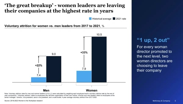
4. 2022 Women in the Workplace Briefing by McKinsey & Compan
This presentation outlines the key findings from McKinsey’s 2022 research on women in the workplace. Focusing on original data, the slides below use a variety of graphs and visual representations to show how the expectations women face at work have changed over time.
Pro tip: If your presentation focuses on original research, use multiple types of graphs to show your finding. Only using bar graphs or pie charts can be tedious. Using many forms of data analysis will keep your presentation engaging.
5. Email Marketing Trends by Gabriel Blanche
Most marketers are looking to grow, but sometimes they can get stuck making incremental improvements. To help you get unstuck, Gabriel Blanchet shares trends to keep an eye out for.
What we love: These slides use a bright color pallet and use clean flow charts to present information. Best of all, it drives action by explaining each trend and explaining why it works.
6. Digital Strategy 101 by Bud Caddel
Even though this presentation is almost 100 slides long, its content is pure gold. Caddell answers some of the biggest FAQs about digital strategy in a very accessible way.
The reason his slides are so straightforward is because of the way he's laid them out. He's really adept at making "animated" slides that explain his story — something we all should learn how to do.
What we love: In the first few slides, Caddell lays out his objective and explains exactly what the presentation will cover. Viewers instantly understand what they’re going to get out of the presentation.
10 Free PowerPoint Templates
Download ten free PowerPoint templates for a better presentation.
- Creative templates.
- Data-driven templates.
- Professional templates.
- And more!
7. A Product Manager's Job by Josh Elma
Product managers are the backbone of every new initiative. These slides from Josh Elman describe what the role actually entails on a daily basis.
This presentation uses limited text in big font to drive home the highlights of the role. Plus, Elman starts off by discussing brands he’s worked with in the past, giving his presentation credibility.
What we love: Elman’s slides have a consistent color. By adding a blue filter to images, each slide in the presentation feels cohesive.
8. SEO, PPC, and AI in 2023 and Beyond by Lily Ra
Smart designers choose a consistent theme for their presentations. In this presentation, Lily Ray and her co-presenter pull from the world of science fiction.
When discussing AI and the future of marketing, they playfully evoke imagery reminiscent of Blade Runner or Ghost in the Shell.
Pro tip: Picking a theme with cinematic imagery will help you stand out in a sea of corporate clipart.
9. The HubSpot Culture Code by HubSpot CTO Dharmesh Sha
Not to toot our own horn, but this presentation has been one of our most successful. The secret? Dharmesh chooses a central theme, the acronym HEART (Humble, Empathetic, Adaptable, Remarkable, and Transparent).
This simple phrase provides a concise framing of our company’s values, as well as a central message for the presentation. Plus, heart icons in the presentation make the connection clear.
Pro tip: Consider adding a theme or acronym that ties your presentation together.
10. How I Got 2.5 Million Views on SlideShare by Nick Deme
Feeling inspired to create a SlideShare of your own? Make sure you flip through Nick Demey's presentation first. He shares some tried-and-true tips for creating awesome presentations that rack up tons of views.
Here’s what works: right off the bat, Demey tells you how to get in touch with him. He’s already successful, so if someone wanted to reach out directly to his agency, they don’t have to wait until the end to connect with him.
11. Intro to Azure Data Platform by Karen Lope
Making technical information easy to digest is a formidable challenge, especially in a slide deck. Karen Lopez tackles the challenge in her slide deck. Her presentation makes use of tables and flowcharts — creating clear visual representations of complex technical ideas.
Pro tip: If you’re presenting on a complex process, find ways to explain each step using charts and infographics. A few images can help a greater portion of your audience understand what you do.
12. Insights from the 2022 Legal Trends Report by Clio
From a design perspective, your presentation should have imagery. However, these images don’t need to be photographs of a boring office. Consider something more abstract, like Clio has done below.
Each slide of the presentation includes simple objects, like triangles, rectangles, and circles. These shapes seamlessly integrate with the different charts and graphs in the presentation.
Pro tip: Instead of using cliche visuals, shapes, and patterns can give your presentation an artistic flair.
13. Displaying Data by Bipul Deb Nat
We admire this presentation for its exceptional display of data — now this post will explain how to do the same in your own presentations.
I also love how this presentation is concise and minimal, as it helps communicate a fairly advanced topic in an easy-to-understand way.
What works: This presentation example has a clear objective — showing the audience how to effectively display data. Because of that, the visuals here take center stage, expanding on the meaning of the text, which makes it easy to absorb the key takeaways from the presentation.
14. 2022 GWI's Social Report by GWI
In this presentation, Leticia Xavier shows the power of a limited color scheme. She uses different shapes of pink and purple to create contrast. All of the graphs, backgrounds, and images use different hues of the same colors.
When she breaks the color scheme, as she does on slide 12, the viewer’s attention is immediately recaptured.
Pro tip: If you’re worried about contrasting visuals, pick one or two colors. You can then choose different hues and tints of these colors to make your slides cohesive.
15. Digital 2023 Global Overview Report
If you’re looking for a dark color scheme to replicate, look no further. This slide deck from DataReportal uses a deep blue background throughout its presentation. Graphs are in bright yellows and greens, while the text is white.
Remember to keep a high level of contrast between your text and your background. This will make your slides easy to read.
Pro tip: If you’re going to present in person, consider your environment when choosing a color scheme. If the lights will be off in the room, a dark background will work for your slides. If everything will be bright, a light background with dark text will be easier to read.
10 Free PowerPoint Templates
Download ten free PowerPoint templates for a better presentation.
- Creative templates.
- Data-driven templates.
- Professional templates.
- And more!
16. How to Turn Wild Opinions into Traffic, Backlinks, and Social Proof by Animalz
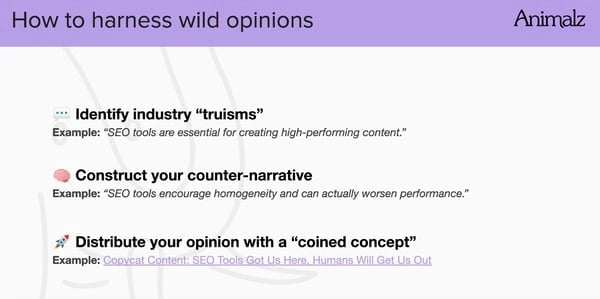
SEO’s changed a lot in the past two decades. Most of us are concerned with keeping up with the latest and greatest changes. This presentation walks through today’s marketing landscape, where everyone has both opinions and ways to express them.
What we love: This presentation uses emojis, a staple of the social media world, as a stand-in for bullet points. Smart presenters match design elements with their subject matter.
17. 5 Killer Ways to Design the Same Slide by Crispy Presentations
While keeping everything consistent can be good for branding, it can also prevent people from noticing the new content you’ve put together. This presentation shows you a few different ways you can design the same slide — all depending on what you want it to accomplish.
What we love: Everyone who sees the title instantly knows what they’re going to learn. It’s short, which makes it easy to consume in very little time.
18. The HubSpot Customer Code by HubSpot CTO Dharmesh Shah

When it comes to working with a company, it helps to set customer expectations and to clearly lay out your value proposition. HubSpot does both in the slide deck below. Instead of relying solely on product images, this presentation includes drawn images and lively colors.
Pro tip: Use bright colors for different words and phrases that you want to stand out. These will naturally catch your viewers’ eyes.
19. ThinkNow Culture Report 2022 by ThinkNow
Thus far, we’ve seen slides that use neutral backgrounds that contrast with colorful charts and graphs. In this presentation, ThinkNow successfully subverts expectations.
The slides use colorful icons and accent colors in magenta and yellow. Meanwhile, graphs throughout the piece are made in black and white. This works well by creating high-contrast, easy-to-read visual representations.
Pro tip: Don’t be afraid of using classic color schemes like black and white. These simple colors can balance out loud accents.
20. How to Gain a Massive Following on Instagram by Buffer
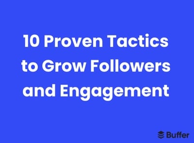
When choosing a presentation topic, find ways to hook your audience. For example, this presentation from Buffer makes use of a numbered list. Listeners know exactly what they’ll get from the presentation and how far along in the presentation they are.
Pro tip: Keep your slides simple. Instead of choosing a text-heavy design, Buffer limits text on the slide just to each tip.
The best PowerPoint presentations have gorgeous designs, give insanely actionable takeaways, and provide down-to-earth advice.
Learn from the presentation examples above to create your own that represents all three.
![Blog - Beautiful PowerPoint Presentation Template [List-Based]](https://no-cache.hubspot.com/cta/default/53/013286c0-2cc2-45f8-a6db-c71dad0835b8.png)
![17 PowerPoint Presentation Tips From Pro Presenters [+ Templates]](https://blog.hubspot.com/hubfs/powerpoint-design-tricks_7.webp)
![How to Write an Ecommerce Business Plan [Examples & Template]](https://blog.hubspot.com/hubfs/ecommerce%20business%20plan.png)
![How to Create an Infographic in Under an Hour — the 2024 Guide [+ Free Templates]](https://blog.hubspot.com/hubfs/Make-infographic-hero%20%28598%20%C3%97%20398%20px%29.jpg)
![20 Great Examples of PowerPoint Presentation Design [+ Templates]](https://blog.hubspot.com/hubfs/powerpoint-presentation-examples.webp)


![How to Start a Presentation [+ Examples]](https://blog.hubspot.com/hubfs/how-to-start-presenting.webp)


![How to Create a Stunning Presentation Cover Page [+ Examples]](https://blog.hubspot.com/hubfs/presentation-cover-page_3.webp)