
In my opinion, this is an example of a company rebranding correctly and out of necessity. In a competitive entertainment landscape fighting for kids’ attention, Nickelodeon knew we couldn’t keep doing more of the same.
Sometimes (but not all the time!), one of the best ways to move forward is by leaning on and adapting past successes.
It’s not easy to know when is the right time to invest in a rebrand and how to handle that rebrand successfully, so I‘ve prepared this post to help guide the process, plus examples of other brands who’ve successfully rebranded their website, name, logo, mission, and purpose.
Table of Contents
What is rebranding?
Rebranding is when your company rethinks your marketing strategy with a new name, logo, or design, with the intention of developing a new, differentiated identity in the minds of customers and other stakeholders.
Understanding what rebranding is is only part of the battle. Now, you must ensure you have the right reasons to rebrand.

Free Brand Building Guide
A comprehensive guide to effectively define, launch, scale, and monitor your brand.
- Understanding brands today.
- Incorporating brand in marketing.
- Creating brand strategy.
- Measuring brand impact.
Download Free
All fields are required.
The Right (and Wrong) Reasons to Rebrand
Rebrands are complicated and carry big risks.
Even big brands aren't immune — just look at X, which is considered one of the biggest recent rebranding fails. Elon Musk rebranded Twitter as X in 2023 by renaming and restyling the entire brand.
As a result, 78% of U.S. iOS users gave the app 1-star reviews, compared to 50% two weeks prior. Most of the negative reviews mentioned disliking the new name and logo.
While it will take time to see the true long-term effects of this rebranding, it’s clear that abrupt, random changes to brands with generally positive sentiments and long-standing reputations can be incredibly detrimental.
That’s why knowing the risks of rebranding can help determine whether or not you're jumping into a rebrand for the right reasons.
If sales have been slow or brand awareness efforts don't seem to be paying off, rebranding may not be the best immediate step.
These issues can potentially be solved with a new content marketing strategy or by conducting market research to identify the underlying cause.
But if you‘re considering a rebrand because your company’s vision, mission, values, and market are no longer reflected in your brand, then a rebrand might be the right decision.
There are a few other major reasons you might consider a rebrand. I will demonstrate these reasons using my fictitious indoor cycling business, Psyched 2 Cyc.
4 Right Reasons for Rebranding
New Locations
Psyched 2 Cyc started as a singular, local studio in New York City, so I selected a punny name that likely only works in English.
After growing throughout NYC and the country, my business is now looking to expand to non-English, international markets that may not identify with the business name. This could be a good time to consider a full brand rename.
Market Repositioning
The name Psyched 2 Cyc was chosen with young fitness enthusiasts at heart — hence the abbreviated word “Cyc” and the use of “2” instead of “to.”
But I’d now like to target older consumers interested in improving their fitness with a low-impact workout like indoor cycling.
Thus, I may need to refresh my brand name (or consider rewriting it in full as Psyched to Cycle) to better resonate with people of all ages.
New Philosophy
I started my business as primarily an indoor cycling studio. Thus, our mission, vision, and values all surround the idea of fitness, health, and wellness through the use of an indoor bike.
If I want to expand my business to include another modality, such as strength, yoga, or running, it makes sense to want to reevaluate my brand. That way, I can build new MVVs that align with the growing business offerings.
Mergers and Acquisitions
To grow my business, audience, and offerings, I have partnered with a strength training studio, Sweat Power.
Combining our two brands either means that we agree to adopt the branding of one of the studios, or we must work together to come up with a new name, logo, and positioning that best reflects our new brand.
Additionally, here are a few reasons not to rebrand.
4 Wrong Reasons for Rebranding
Boredom
It’s been more than two decades, and I’m feeling uninspired by the logo and slogan I selected back when I first launched Psyched 2 Cyc. I’m itching for some change that will refresh my business and make it look more elevated.
However, my customers (who see my branding much less frequently) might love — or quickly recognize — the signature color and logo I’ve come to loathe. I should consider how a sudden change to my branding could leave consumers confused or disappointed.
Covering Up a Crisis
One of my business’s executives recently received bad press that has reflected badly on Psyched 2 Cyc. I’m desperate for a big rebranding shift that will help us move past this period of negativity.
However, most consumers and employees are smart enough to see right through my rebrand and recognize it for what it is — a cover-up. It’s best to handle bad press with respect, authenticity, and actionable change.
Impact and Ego
I’ve recently hired some new leaders who are excited about a rebranding as they feel they were brought in to help freshen up Psyched 2 Cyc’s brand. They want to refresh our mission statement and values.
However, the kind of institutional change they want to implement doesn’t justify a rebrand. It’s more about them making their mark and producing radical change.
Looking for Attention
Classes have been half-full at best, and several instructors have recently quit. I’m tempted to execute a rebrand to bring life back to the brand and encourage new instructors to want to teach at Psyched 2 Cyc.
At best, this may generate some short-term buzz without any sales and marketing strategy to sustain it. At worst, I could lose brand recognition and set back sales and marketing efforts even more.
If you've determined a rebrand is still the right choice for you, keep reading to learn how to devise a rebranding strategy.
Rebranding Strategy
To successfully implement a rebranding strategy, start by identifying whether the brand needs a partial or total rebrand. Next, reestablish the brand's target market through research to identify what demographic to attract with a rebrand. Finally, redefine the vision, mission, and values, and use these new definitions as guideposts for the overall rebranding strategy.
Rebranding efforts may include:
1. Creating a new logo.
One of the main strategies of rebranding is creating a new logo. A new logo is a clear sign to consumers that your brand's identity is different. A new logo can involve new colors, modern typography, or a new icon that better represents your brand.
Pro tip: Use your brand's vision, mission, and values to inspire your new aesthetic. For instance, Pepsi rebranded in 2023 for the first time in 14 years for its 125th anniversary.
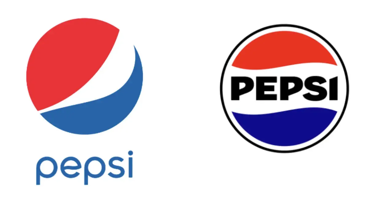
The logo still uses the essence of the past logo, which helps maintain consistency and brand recognition with loyal customers. However, the new logo incorporates bolder colors and a vintage appearance that ties back to the company’s long heritage.
I also appreciate that the logo is now more compact, making it easier to place on products and ads. Lastly, Pepsi has made its brand name much easier to read in the new logo, in all-caps and bold black font, rather than the blue, wavy, lower-case previous version.
Free Brand Building Guide
A comprehensive guide to effectively define, launch, scale, and monitor your brand.
- Understanding brands today.
- Incorporating brand in marketing.
- Creating brand strategy.
- Measuring brand impact.
Download Free
All fields are required.
2. Shifting brand position.
Unfortunately, rebranding isn’t as easy as hiring an agency to redesign your logo. It’s essential to shift your brand positioning.
The products, services, or content being marketed need to communicate a certain message, whether that's a mission, values, or vision.
This is the best way to set your brand apart from competitors and draw in consumers aligned with these beliefs.
Pro tip: Chances are, you'll need to reestablish a unique selling proposition and take stock of what distinguishes your brand from the crowd. This will help you better connect with you target audience and understand your position in the market.
In 2015, Gucci shifted its brand positioning to appeal to younger generations. To do this, they pivoted from polished and provocative to quirky and contemporary. They also focused more on communication that would resonate on Instagram and adopted a progressive stance on gender fluidity.

These changes significantly increased sales with Millennial and Gen Z consumers who were able to better resonate with Gucci’s mission, values, and vision.
3. Creating new ads.
Once the logo and messaging are locked, it's time to create new advertisements and content with this messaging in mind.
These ads should communicate the changes to your brand and what they mean for customers. This can help draw in a new demographic and reach larger audiences.
Pro tip: New logos and messaging will only go far if you can invest in marketing to show the world these rebranding changes. For instance, Eurostar rebranded in 2023 after merging with Thalys, a French-Belgian high-speed train operator, as part of a goal to reach 30 million passengers by 2030.
After updating visual elements, the brand, now Eurostar Group, created an ad campaign around the slogan “Together We Go Further,” involving a promo, out-of-home, and digital.
The campaign highlighted the brand’s key traits — European, inclusive, unique, and sustainable — to emphasize the excitement of discovering a vibrant world of travel through Europe.

The overall rebranding strategy resulted in route growth in 2023 in major routes, such as Paris to London and Paris to Amsterdam, as well as an increase in online sales, website conversions, and mobile app downloads.
4. Changing your brand's voice.
The last step of a solid rebranding strategy is changing the brand‘s voice.
This is the perspective from which you write all your marketing content. Your voice can be formal, casual, witty, or whatever tone best reflects your brand. Change your brand’s voice accordingly and announce your rebrand in this new tone.
Pro tip: Think of your brand as a person. When they walk into a party, are they cracking jokes and the life of the party, or are they professional and no-nonsense? Use your brand personality to inform this brand voice.
Duolingo began as a traditional language learning app and has since evolved into a silly, humorously-aggressive brand. Users started creating memes in 2019 about the evil owl mascot, Duo, who would berate them to practice.
The brand leaned into this personality and adapted its brand voice to fit this new persona.
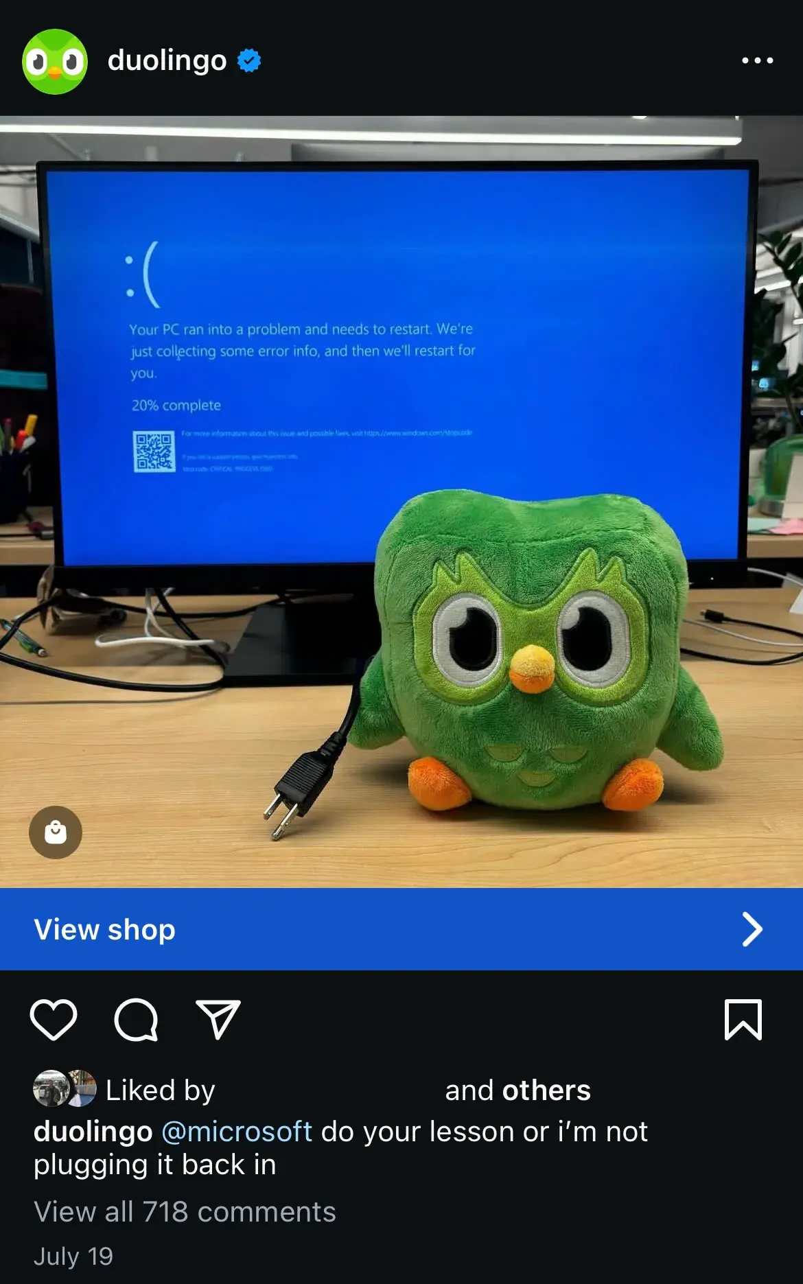
The brand voice is now very quirky, personable, and young, and, at times, leans into the “evil Duo” voice which has made it ultra-popular on social media.
Embracing this brand voice has aided Duolingo’s entire rebranding strategy, as it now leans on the voice to dictate its brand identity, marketing methods, goals, and target audience.
Not all rebrands are created equal, so let's first consider whether a partial or total rebrand is the best option for your business.
Partial vs. Total Rebrand
The more established your business and brand, the more you have to lose from a rebrand. If your business is more mature, a partial rebrand can help you retain the brand loyalty you've built, while refreshing your image to keep up with the times.
Think of a partial rebrand as an adjustment focused on visual brand identity to suit new offerings or markets, as opposed to a complete identity crisis.
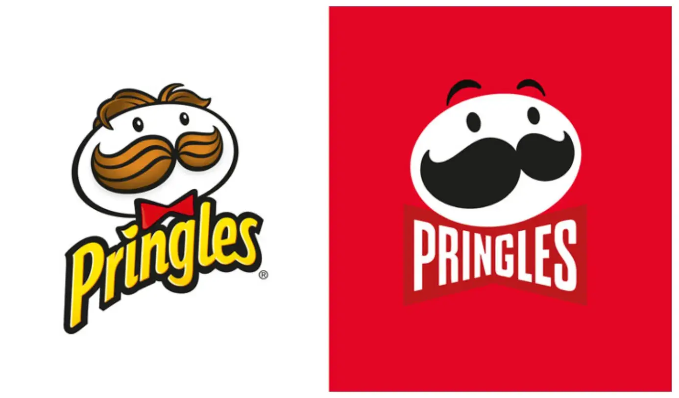
That‘s not to say that a partial rebrand can’t be effective. Just look at Pringles.
They redesigned their mascot, Mr. P, in 2021 with a more simple, contemporary look. This partial rebrand helped them maintain their iconic brand identity while giving their mascot a bold, refreshed appearance.
However, if the goal is a complete identity shift involving your company's mission, vision, and values, a total rebrand might be necessary.
This option is typically suited to situations like mergers, product overhauls, and other similarly foundational shifts.
If a partial rebrand is a quick touch-up, the total rebrand is a complete makeover.
Take a look at the following five steps to successfully implement a rebrand.
How to Rebrand a Company
- Reestablish your brand's audience and market.
- Redefine your company's vision, mission, and values.
- Rename your company during a rebrand.
- Reconsider your brand's slogan.
- Rebuild your brand identity.
- Track brand sentiment.
- Plan a successful launch.
1. Reestablish your brand's audience and market.
Let’s return to my fictional indoor cycling business, Psyched 2 Cyc. When I got into this business, I expected my target audience to be in their 20s and early 30s, since that is the most common demographic for other cycling studios like SoulCycle.
However, after extensive market research, I realized my target market was different from what I had assumed.
Key research found that 50% of respondents spend less than 10 minutes traveling to cycling classes, and 92% complete the trip in under 30 minutes. That means only 8% of participants are willing to travel more than 30 minutes to my studio.
This has changed my entire philosophy since the neighborhood my studio launched in has a slightly older demographic (30s-40s adults with families).
Now, I can re-establish my brand’s audience and market, knowing I will have the most luck drawing in new members who live within 30 (or ideally 10!) minutes of the studio.
Pro tip: Focus groups are a great way to discover (or re-discover) your target market. You may be surprised to find that your audience isn’t who you thought it was.
Free Brand Building Guide
A comprehensive guide to effectively define, launch, scale, and monitor your brand.
- Understanding brands today.
- Incorporating brand in marketing.
- Creating brand strategy.
- Measuring brand impact.
Download Free
All fields are required.
2. Redefine your company's vision, mission, and values.
What am I doing? How am I doing it? Why am I doing it?
These are the three questions I will ask myself when reevaluating my vision, mission, and values for Psyched 2 Cyc’s rebrand. These messaging foundations will likely change as my company grows.
New products, priorities, services, or stakeholders can completely undo what once seemed like a given.
Here is how I will analyze the following factors to gauge which parts of my brand will need some TLC.
Vision
Vision is the “What am I doing?” of the puzzle. It’s the North Star for every action my company undertakes, and it's critical to have a firm understanding of my vision before moving forward.
Originally when I founded Psyched 2 Cyc, I simply wanted to build a new cycling studio since it’s a modality I love. Now that I have established my brand in this way, I can adapt my vision to be more specific or forward-thinking.
I founded the studio originally to target women since women are a large portion of indoor cycling participants. After all, 67% of U.S. Peloton owners are women, and women are the fastest-growing demographic in indoor cycling in 2024, with a 9% increase in cycling activities.
However, now that I’ve established my brand in the eyes of women, I’d like to rebrand to be more inclusive to both men and women.
Just because women are a large percentage of indoor cycling enthusiasts doesn’t mean there isn’t a place for men here, too.
Mission
The mission is the “How am I doing it?” component. This is my company's roadmap for how we will achieve the vision of drawing in more males to my brand.
I’m interested in adding a virtual component to my brand since 26% of Les Mills survey respondents regularly attend virtual indoor cycling classes. On top of that, data found that men are more likely to attend virtual classes than women.
This could be a great way to draw in men who may not be as inclined to take classes in a live studio but would be interested in doing so at home.
My mission is to incorporate virtual classes to target more men in a predominantly female space.
Values
Values are the “Why am I doing this” element. It’s why I’m working towards my vision and dedicated to my mission.
Now that I have adapted my vision and mission, I should accordingly adapt my values to align with this new strategy. For example, I will incorporate the following new values:
- Raise the bar. This is both a play on words (since the handlebar is a key part of any bike) and a commitment to continuously compete with yesterday’s performance.
- Room for all. This again has a dual meaning: as I embark on a journey to create a more inclusive space for all people in a predominantly young, female environment, this value will be essential. But it also indicates that Psyched 2 Cyc will create a literal “room” for all; whether in our studio room or your room at home taking a virtual class.
Understandably, some of my founding values might become unsustainable. It’s more effective to prioritize new values rather than cling to past ones, which may limit change.
Brand Voice
Now that I’ve shifted my vision, mission, and values while rebranding, how I convey these aspects of my company will also have to change. What I’m saying is changing, so how I say it will also need to change.
For instance, I have been using a tone of voice that’s young, modern, and feminine. Now that I’m shifting to target a slightly older demographic and males, I will want to adapt my language to be more attractive to these audiences.
3. Rename your company during a rebrand.
Changing names is a big undertaking and can cost brand recognition and organic search traffic in one fell swoop. I would only rename Psyched 2 Cyc if it’s a dire need and I had a plan for recovery as part of my post-rebrand strategy.
As mentioned earlier, I selected the name to attract a younger audience, which is why I used “2” instead of “to” and the shortened term “Cyc.”
Perhaps, in wanting to rebrand to attract my slightly older target audience, I may reconsider changing the name to resonate better with the residents in the surrounding area.
Ideally, the best course of action is to keep the same name to retain brand recognition, but if I want to better align with my new company identity, I can return to the drawing board.
Pro tip: It can be difficult to begin your brainstorming session. Some starter ideas for the renaming process are:
- Make a new word
- Use an old word in new ways
- Say what I do (literally)
- Modify a word's spelling
- Add a prefix or suffix
- Look to other languages
- Bring two words together
- Create an acronym
- Use a location
4. Reconsider your brand's slogan.
A good slogan is catchy and will capture my company's mission and vision. Unlike changing names, changing slogans is a little easier for my marketing efforts, so I won’t lose sight of my existing customers tied to the Psyched 2 Cyc brand.
That doesn’t mean I won’t still consider this carefully and ensure I’m changing the slogan for the right reasons.
Repetition builds recognition, and I don’t want to change too many aspects of my brand that people have come to love and remember.
An idea for a new slogan for Psyched 2 Cyc that can better represent my new mission and vision would be “Spin, Your Way.”
This highlights the purpose (an indoor cycling studio) and emphasizes that we are trying to be more inclusive and that there is space for anyone, regardless of age, ability, or class style preference.
Pro tip: Slogans can be equally as difficult to come up with as brand names. Some ways to discover new ideas for slogans are:
- Make a claim
- Get metaphorical
- Use poetic language
- Provide instructions
- Leverage labels
- Compliment customers
5. Rebuild your brand identity.
The tangible elements I use to communicate the Psyched 2 Cyc brand have been in play for several years, which has given me plenty of time to reconsider their strengths and weaknesses before deciding to replace some of them.
Refreshing some of the visual components of my brand could be a great way to rebrand without changing something as drastic as the company name or slogan.
I can consider redesigning my logo, using new colors in my brand material, or even creating new brand guidelines.
Logo
When I selected my initial logo, I had little budget and couldn’t invest dollars into hiring an external agency to design some options. Instead, I had the help of an artist friend who designed my idea for me.
Unfortunately, I don’t think my logo has a real impact on customers. It’s very generic and doesn’t reflect what is unique about Psyched 2 Cyc. So, I will return to the basics of what makes a good logo to help me get it right this time.
- Stay simple. Jamming as much symbolism as possible into a logo generally doesn't work well and can become too complex or confusing for customers to understand. Now that my brand is more established, I can show confidence with a simple, clean logo.
- Make an impact. While it’s important to be simple, I still want to make my logo memorable. There are a lot of indoor cycling brands out there, and I want my logo to be bold enough to stand out amongst competitors.
- Be adaptable. I didn’t initially consider the limitations of my original logo. Now that I know all the places my logo lives — digitally on my website, app, and social media; in print on products like fitness apparel, water bottles, and our cycling shoes; and in a huge, neon sign in the studio — I can keep these channels in mind during the redesign.
- Aim for appropriate. I designed the logo for a younger, female audience, and now that I’m expanding my target market, I might want a logo that better attracts this audience.
- Look to the long term. This rebrand will likely cost me a lot of money, so I don’t want to do another one anytime soon. Therefore, I will consider my vision, mission, values, and purpose to ensure my new logo can support them in the long run.
- Maintain through-lines. The logo, while not as much as the name, is still one of my brand's most memorable components. I want to avoid losing brand recognition by maintaining the parts of my old logo that worked.
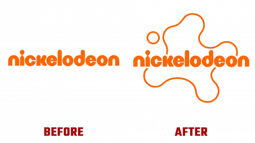
Take a look at the Nickelodeon logo change from 2023 below. We retained the same iconic orange color and font but re-incorporated the “splat,” which would be memorable with parents.
Color Palette
I know color is very impactful in branding — some colors are now synonymous with the brands that use them, like McDonald's yellow. However, choosing the right color can be difficult, so I might consider changing the color to reflect Psyched 2 Cyc’s rebrand.
For example, our brand logo is currently red, which I chose since red is a vibrant, powerful color that reflects fitness well. However, I now see how many competitors also have red logos, such as CycleBar, and want to choose a new color that can stand out.
According to the psychology of color, green can represent growth, freshness, and health, which resonates with fitness well. It also has an adventurous, competitive personality, which ties fairly well with cycling.
Therefore, I might consider changing my logo to dark green, especially since I don’t know many fitness brands with a green logo.
Before making any drastic changes, I will check how the color shows up on-screen and in print to ensure consistency and that I like the look.
Typography
I chose an expressive, regal font for my original logo to help it pop and appear elevated against competitors. However, I now realize that it doesn’t represent my brand well — too much sophistication can make the brand come across as elite and inaccessible to the average person, which is not what Psyched 2 Cyc is about.
When reevaluating fonts, I will ensure the font is consistent with my target market and messaging uncovered in the rebrand. A more traditional serif or sans-serif font may be better suited when trying to attract a slightly older demographic.
I will also ensure that the font is easily accessible for web design and offers various weights and cuts for different channels.
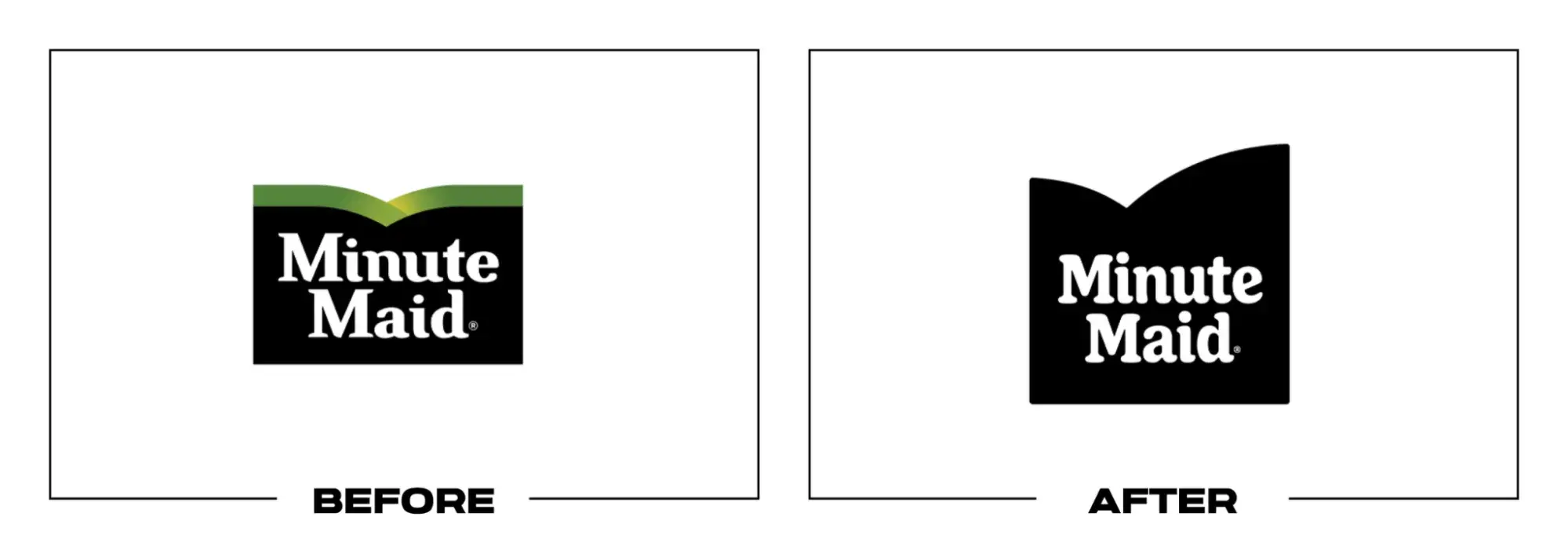
Take the 2023 Minute Maid logo rebrand, for instance, in which they adopted a softer, bolder, and more inviting new font.
Shapes and Imagery Revisited
Like logo, color palette, and typography, my imagery and shapes play a vital role in Psyched 2 Cyc’s brand identity. In changing those other visual elements, it makes sense to reconsider my imagery and shapes to keep everything cohesive in the rebrand.
Since I want my studio to be more approachable to new demographics, such as older people and men, I might consider softer lines and rounder shapes that provide a more welcoming appearance to new customers.
Of course, having everything visually aligned isn’t enough. These visual elements must support the core messages of my brand, too.
Brand Guidelines
After going through all the trouble of creating a new brand identity for my business, I want to use all these elements correctly.
Having brand guidelines will help guide me in the rebranding process to ensure consistency in this new stage for Psyched 2 Cyc.
Brand guidelines will be especially critical when showcasing my new logo. These guidelines will make it as easy as possible for customers to see, recognize, and remember my logo, making up for any lost familiarity from the original logo.
When writing my logo guidelines, I will consider the following:
- Logo elements. What visual elements make up my logo? When and how are each of them used?
- Color variations. What does the colored version of my logo look like? What about black and white? When are each of these used?
- Clear space. Also called padding, this is the space around my logo that prevents overlap or obscuring. I will aim for at least 10% of width at all times.
- Unacceptable uses. What can never be done to my logo? What color variations, rotations, scaling, etc. do I want to avoid?
These guidelines will be essential for me to distribute to my team so everyone has the information they need to handle the rebrand effortlessly.
It will be important for my team members and external agencies we hire to help us with the website and app redesign, building out our rebrand campaign, and creating new marketing materials.
6. Track brand sentiment along the way.
Though part of the reason for my rebrand is to attract new customers, my current customers are loyal and trusted. Therefore, I will get feedback from them on the rebrand elements I am considering.
I plan to conduct focus groups to see if the new branding images and messages communicate my new mission, values, and vision. If I don't receive positive feedback, I may need to go back to the drawing board.
I know one of the most crucial steps in rebranding is tracking brand sentiment before, during, and after a rebrand launch, so I will look at brand sentiment before the rebrand to see what current or potential customers like and dislike about Psyched 2 Cyc’s branding.
Is it clear what our brand offers? Is the branding consistent? How does it compare to similar indoor cycling studios? What is something about our branding that either drew them in or made them reconsider joining our studio?
With these answers in mind, I can conduct my rebrand strategically, adding new messaging that aligns with my audience. As a plus, this also helps my current customers feel valued since their thoughts will be taken into consideration.
Free Brand Building Guide
A comprehensive guide to effectively define, launch, scale, and monitor your brand.
- Understanding brands today.
- Incorporating brand in marketing.
- Creating brand strategy.
- Measuring brand impact.
Download Free
All fields are required.
7. Plan a successful launch.
The rebrand will only be successful and meaningful if people actually know it’s happening. Therefore, I know that I can’t simply change the colors, fonts, and logo on our Psyched 2 Cyc website, app, and social media. I need to communicate what the rebrand means and let people know we’ve made intentional growth.
First, I plan to run a marketing campaign involving digital display banners, print ads, and a short promo that can run on TV and social media.
I will also organize a press release to announce the launch of our rebrand that will sit on our website and social channels. This allows me to share exactly why Psyched 2 Cyc needed a rebrand and what it means for our future.
This will be the perfect way for us to reset and remain consistent and on-brand in all marketing efforts moving forward.
We’ve lost our way over the past few years as priorities changed to membership retention, but I believe a solid rebrand will help redefine our branding.
Now that we‘ve explored various aspects of rebranding regarding my fictional brand Psyched 2 Cyc, let’s take a look at some real-world examples for further inspiration.
Rebranding Examples
- 7UP
- LG
- Jell-O
1. 7UP
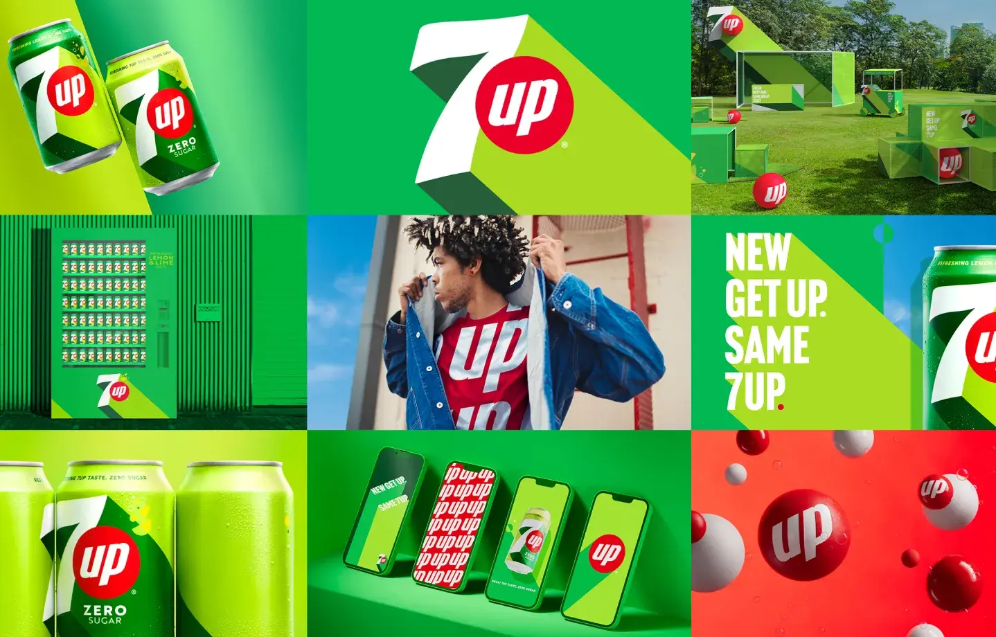
7UP’s new identity was inspired by the soda itself. The company wanted to create a new visual identity that captures the soda’s effervescent essence while modernizing with changing times.
They first handled this with a new “UPliftment” positioning, based on its history of being enjoyed in joyful moments with loved ones. This new strategy promises to “offer light relief from the mundanities of daily life.”
To feed into this “UP” movement, the brand angled its new logo up to focus on upward movement. 7UP also wanted to embrace its global audience, so the packaging logo was designed to be translated into various languages for worldwide unification.
These changes, and the new citrus colors in the palette, have helped 7UP create a bolder, brighter, more confident, and “bubbly” persona, while still staying true to its green color. This rebrand has been widely applauded for its simplistic, minimalistic, and modern execution.
2. LG
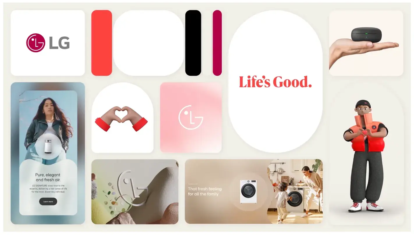
LG first hinted at its upcoming rebrand in April 2023 with the debut of its new and improved logo — maintaining the same icon but transitioning it from 3D to 2D. The new logo is also animated and expressive and can perform eight motions (including nodding and winking).
Beyond the logo change, LG introduced a younger and more playful appearance in August 2023 with new brand characters, Joy and Ryder, that showcase LG’s fun side while playing into the company’s heritage and Korean culture.
To add even more energy to their rebrand, LG also integrated a brighter, bolder shade of red into their color palette.

They even incorporated new values, such as “Warmth to Power a Smile,” and made their “Life’s Good” slogan more prominent in marketing. These changes were part of an effort to attract Millennial and Gen Z audiences and redefine the brand as innovative, modern, and people-centric.
3. Reddit

The biggest change in Reddit’s 2023 rebrand was bringing their iconic mascot Snoo to life with a new dynamic 3D look. Snoo is less robotic and more a playful creature who can perform eight motions, such as spinning.
The brand repositioned Reddit as “the heart of the internet” to highlight its role in society as a space for communication and discourse. This repositioning is also evident in the frame around Snoo and the “d” in the Reddit logo, which are now speech bubbles to emphasize the same point.
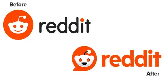
Reddit’s new brand identity also involves four pillars: “inherently eclectic”, “positively different”, “delightfully absurd”, and “genuinely candid”, which help tie all these changes and refreshes together.
The rebrand was done to modernize Reddit’s look with changes such as 3D design elements, a simplified color palette, and new typefaces, while re-emphasizing what people already know and love Reddit for — being a hub for community and conversation.
4. Jell-O
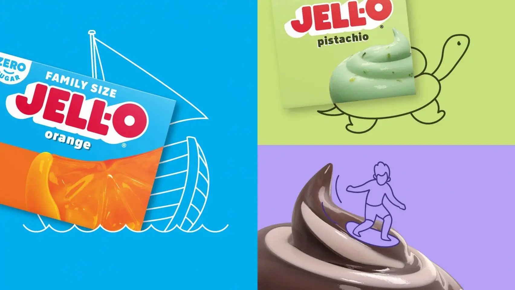
The 2023 Jell-O rebrand involved a change in logo and packaging for all products. The goal was to attract younger parents and kids with playful, simple, colorful imagery and bring back some of the “jiggly fun and...wonder” that has always been associated with the brand.
This new positioning played into the new designs by incorporating a modern aesthetic while showcasing the many fun flavors Jell-O has to offer. The logo shifted to a blockier sans serif font against a white background for a 3D effect, with the “O” resting slightly above.
The packaging also now includes cartoonish images of pudding swirls and jelly fruit instead of the more realistic images previously shown. This helps the brand target younger parents with fruit images that reveal healthier options while making the packaging more eccentric and light-hearted.
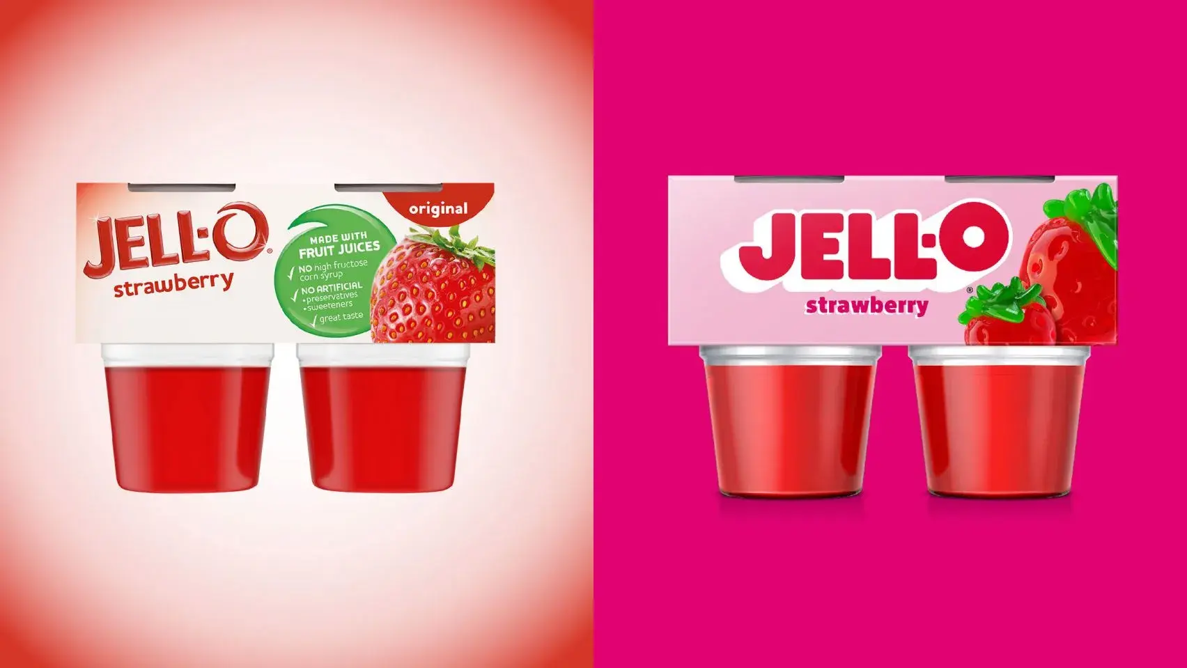
This rebrand was well-received as consumers saw it as a way to significantly modernize the branding while maintaining some of its classic, beloved traits.
5. WhatsApp
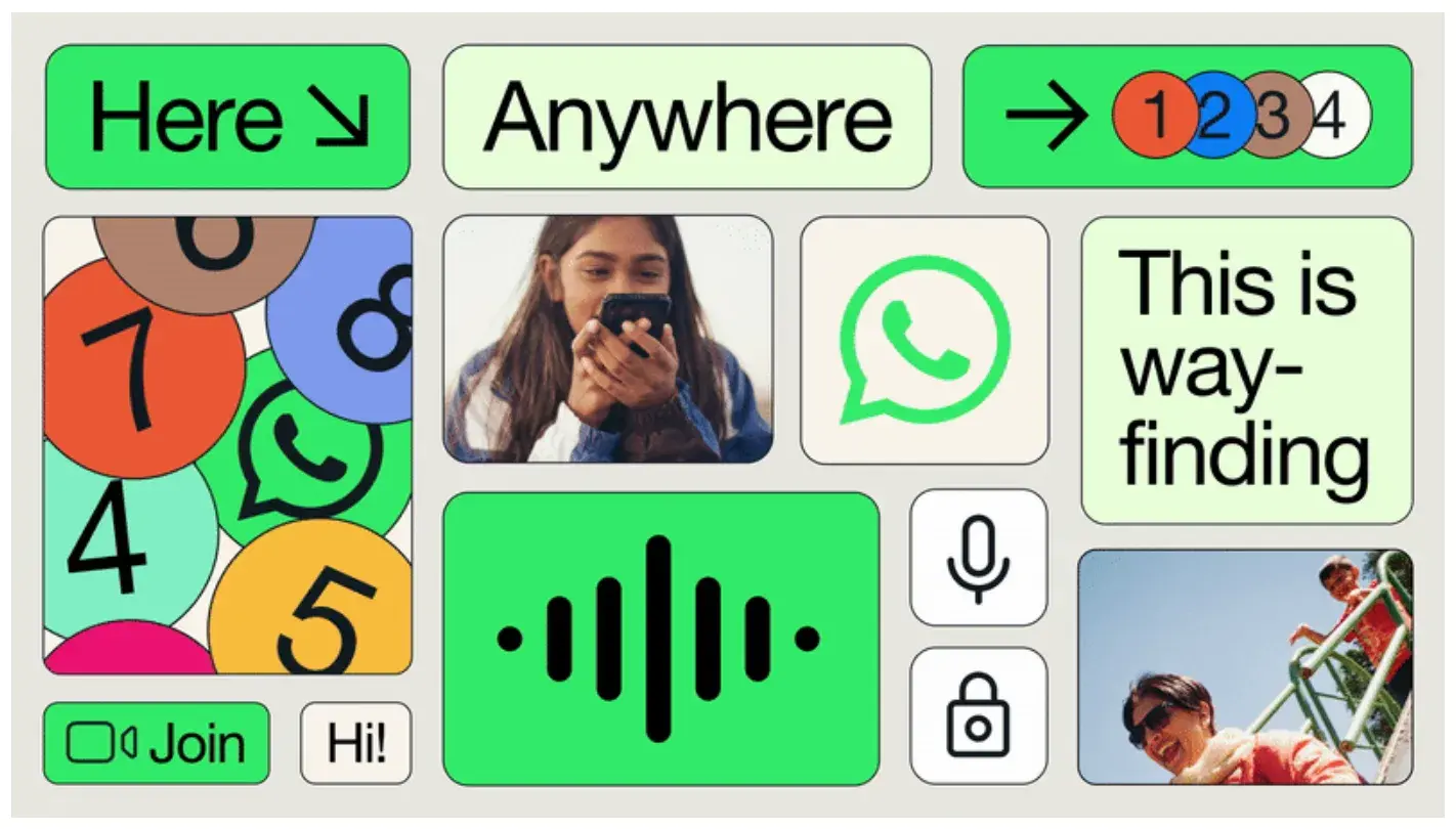
As part of the parent company Meta, which faced significant backlash for its 2021 rebrand, WhatsApp has remained relatively scandal-free. Thus, it seems the 2023 rebrand was aimed at helping set WhatsApp apart from the rest of Meta’s brands.
The goal was to evolve the brand from a social media tool to a “secure, intimate product designed to give anyone … the ability to connect and enact change.” The team worked to further the notion of “Forward. Together” based on WhatsApp being a trusted platform for safe, reliable global connection.
The color palette aligns with various product touchpoints, and new graphic modules allow for flexible storytelling. They also capture the spirit of WhatsApp by visually showcasing how back and forth communication looks.
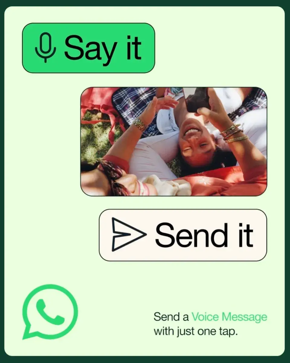
Since WhatsApp has nearly three billion global active users, the rebrand created a unified look that would resonate with people everywhere, regardless of age, region, literacy, or bandwidth.
It successfully established itself as a communication tool while prioritizing brand recognition with an unchanged logo and commitment to the brand’s iconic green color.
Bad Rebranding Examples
1. Comcast
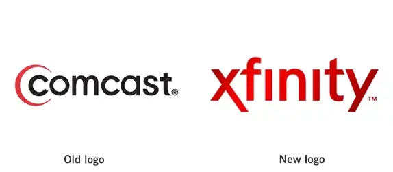
Comcast has been known to have the most hated customer service in the United States. So, the company changed its name and rebranded its logo to Xfinity. However, the company didn't change its history of bad practices.
While the company could have worked on improving customer support, they spent money on a cosmetic upgrade, which didn't help them earn back the trust of their customers. Superficial updates like a name and logo change can’t help a company unless followed by brand identity and reputation changes.
Beyond this, the name change itself is perplexing and, frankly, a waste of money and time. Many customers were confused about whether Comcast and Xfinity were the same thing, or if one owned the other. This is the exact fear in an abrupt brand name change — causing audience confusion or ridicule which can lead to a loss in current and potential customers.
2. Gap
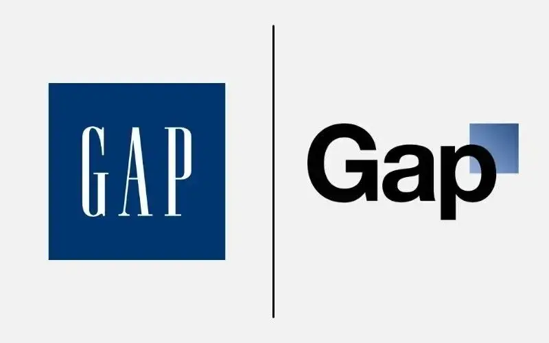
Remember that list of reasons to and not to rebrand above? Gap made the mistake of rebranding for seemingly no reason. The company changed its logo and caused outrage among its customers. Just six days later, the company returned to its original logo.
The new logo didn't communicate anything new about the brand and took the personality out of Gap’s logo. Additionally, customers had an emotional bond with the logo, and changing it for no reason caused upset customers.
Rather than immediately coming clean, Gap tried to justify the new logo as a deliberate move to crowdsource new ideas for a logo. As this was met with even more criticism, the brand quickly reinstated its original logo and finally acknowledged its error.
Overall, the urge to quickly modernize a logo has been seen as a panic strategy, rather than one rooted in a true desire to shift a brand’s positioning or perception. If there’s nothing to back up a move this big (and expensive), it is more than likely to receive negative backlash.
3. Weight Watchers
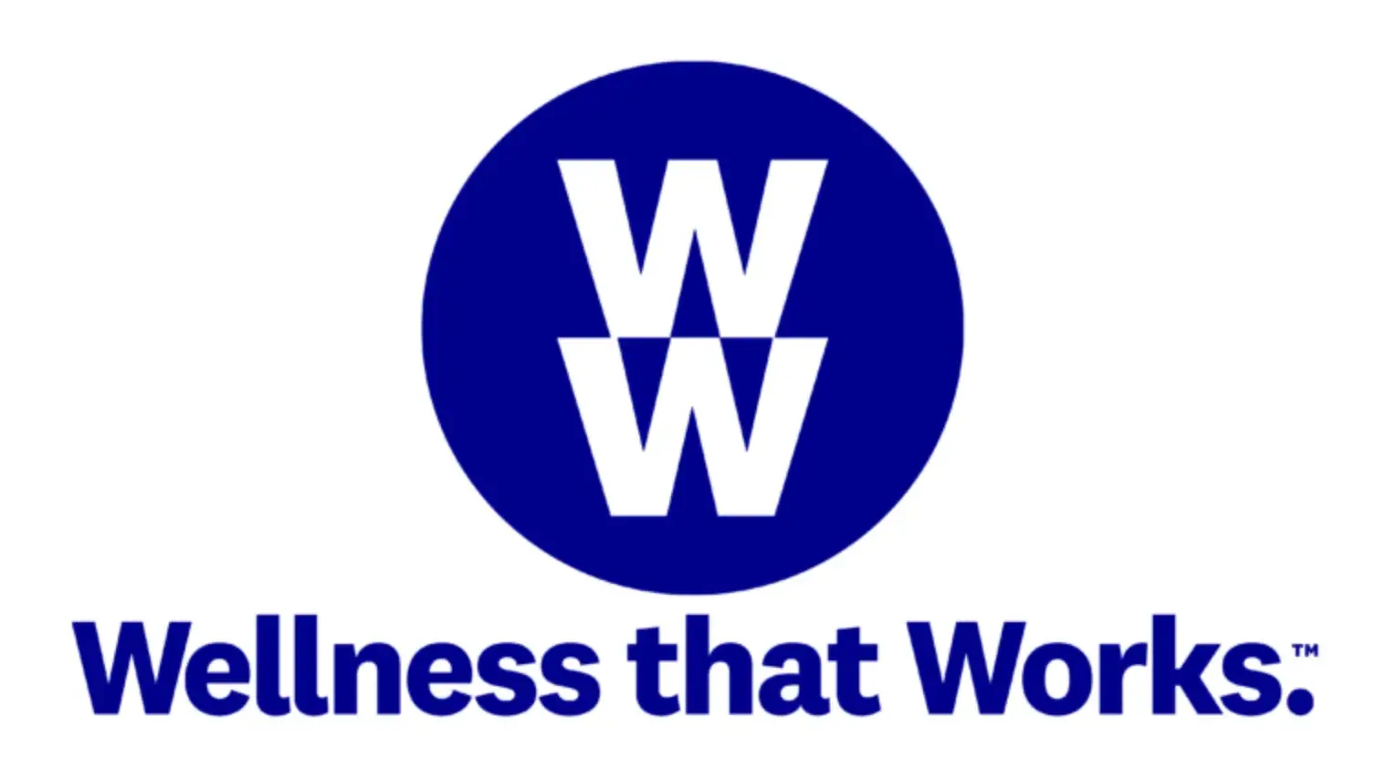
Weight Watchers changed its name and logo to shift its focus from weight loss and dieting to wellness. However, the new name WW left consumers confused. People didn’t know what it stood for, and it erased brand recognition.
The rebrand was also handled rather abruptly. There wasn’t enough lead time to prepare consumers for the name and strategy change. To add to it, the "Wellness that Works” slogan didn’t inform consumers of what was going to change about the brand.
While the reasoning behind the rebrand was positive, the follow-through left people wanting more. Weight Watchers should have better explained why it was making this shift and how it would handle this change — preferably with new product or service offerings.
Are you ready to rebrand?
From the examples shared above, it’s clear that the most successful rebrands were ones that were centered around customers in some way.
Whether it was LG aligning with the interests of younger consumers or Jell-O returning to its playful roots, these brands made necessary changes to restate their presence in either the same or a new market.
The important thing to keep in mind if your business is ready to tackle a rebrand is that clear intentions and brand consistency are key. This post taught me that you need legitimate reasons for seeing a rebrand through.
But you also need to be able to handle the time and budget it will take to make all the changes and launch a marketing campaign to reveal the rebrand to your audience.
When you’re ready to make these changes, make them count.
Editor's note: This post was originally published in August 2014 and has been updated for comprehensiveness.
Free Brand Building Guide
A comprehensive guide to effectively define, launch, scale, and monitor your brand.
- Understanding brands today.
- Incorporating brand in marketing.
- Creating brand strategy.
- Measuring brand impact.
Download Free
All fields are required.


![Brand Refresh vs Rebrand: Which is Best for You? [+Checklist]](https://53.fs1.hubspotusercontent-na1.net/hubfs/53/marketing%20team%20determining%20whether%20a%20brand%20refresh%20or%20rebrand%20is%20best%20for%20the%20company.jpg)