Did you know that roughly 12% of all product sales online are purchased by mobile or tablet device users?


Ever since the rise of the remote workplace in 2020, consumers are increasingly switching back and forth from desktop computers to mobile devices when making purchases. This means that your website’s mobile experience is more important than ever.
Table of Contents
- What is responsive design?
- 4 Reasons Why Responsive Web Design is Important in 2024
- How to Make a Responsive Design Website (Infographic)
- Responsive vs. Adaptive Design
What is responsive design?
A website has a responsive design when mobile users can easily access your content, click on tabs, and explore your media. However, responsive design isn’t only limited to mobile users. Tablets, iPads, desktop computers, and more must be able to adapt to your website for it to be considered responsive.
For more info on how responsive design works, check out this blog.
4 Reasons Why Responsive Web Design is Important in 2024
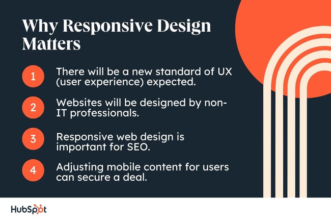
1. There will be a new standard of UX (user experience) expected.
Having a website with top-tier UX design is nothing new, but it’s never been more important than it is right now. In fact, responsive design will be a top priority for website and UX designers in the coming years, with cross-platform design being a key focus.
2. Websites will be designed by non-IT professionals.
By 2024, the majority of our websites will be built by people outside of the technology industry. This is due to the never-ending rise in how many websites businesses need, coupled with how much easier it is to design a website today.
Responsive design will need to take priority as it’s not likely that someone without a background in technology will understand the UX requirements of both desktop and mobile users.
3. Responsive web design is important for SEO.
Since 2018, Google has switched to predominantly using the mobile version of your website for indexing and ranking (also known as mobile index ranking), making the mobile experience of your website a vital part of SEO.
4. Adjusting mobile content for users can secure a deal.
Depending on what platform you use for updating content on your website, you can adjust keywords specifically for mobile users. You can target the exact keywords that would influence a mobile user to buy your product.
In fact, some businesses have decided to take a “mobile first strategy” with the expectation that mobile users are more likely to buy their products than traditional desktop users. It makes sense when you consider that a desktop user is likely browsing while at work, while a mobile user probably has more time to do an in-depth search and comparison of your product.
How to Make a Responsive Design Website
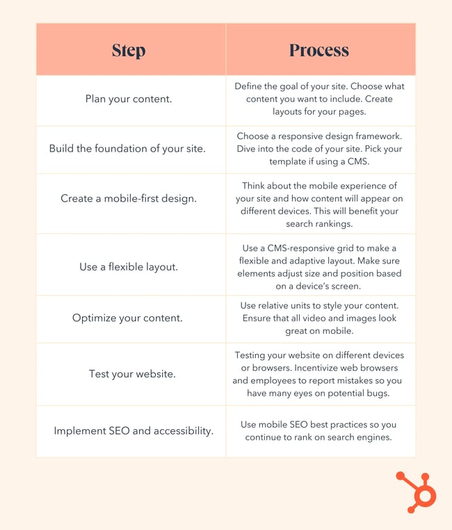
Step 1. Plan your content.
You know you want to build a website that everyone can access, but what exactly will your website do? Start by identifying the purpose of your website, your target audience, and your goals. From there, you can decide what types of content your website will need.
Will your work focus on blog posts? Will you include images? Will videos be a mainstay of your content? Knowing what elements you’ll include will decide what elements will need to be responsive. Check out this blog on creating a content plan for more information.
Once you have a content plan, use this to create a layout template for each webpage on your website. Order elements by their importance, remembering you want to provide value before asking for someone’s information in a form or having them add an item to their shopping cart.
Step 2. Build the foundation of your site.
Research and select a responsive design framework that fits your needs on websites such as Hubspot, Bootstrap, or Foundation. Follow that framework’s guide for implementing responsive design.
You’ll likely need to delve into coding. Begin with an HTML structure that uses proper tags such as header, nav, main, section, etc. Include the viewport tag to ensure your site works for mobile devices: <meta name=“viewport” content=“width=device-width, initial-scale=1”>.
If you don’t have the coding experience to build your site from scratch, consider a CMS with templates to help you design your site.
Step 3. Create a mobile-first design.
In September 2020, Google announced a switch to mobile-first indexing and rankings. This means that mobile-friendly content and elements — like pictures, videos, and gifs — would be optimized first. Desktop would follow. This means it’s even more important to make sure your site functions well on mobile. Test and adjust your website during each step of the process to maintain responsiveness.
Step 4. Use a flexible layout.
A CMS-responsive grid is key to creating a flexible and adaptive website layout. Luckily, most frameworks will have a CMS responsive grid, so you can make sure each element adjusts size and position based on a device’s screen.
You will want to double-check this by having someone log onto a page on both their mobile device and desktop to make sure everything is working properly.
Step 5. Optimize your content.
Depending on how your website is built, you’ll need to optimize your content. If you’re using a pre-existing theme, you’ll want to ensure that your text and images adapt to different screen sizes. In some cases, you can adjust what content is displayed based on screen size.
If you’re coding everything yourself, ensuring responsiveness is more work. Make sure you use relative units (percentages, em, rem, etc.) that can be optimized for font size. You’ll also want to define padding and margins for different screens.
Your images should also respond to which device they are being viewed on. Use techniques such as srcset and the picture element to make sure they optimize based on screen size and resolution.
Step 6. Test your website.
Regularly testing your website on different devices or browsers is a good habit for any web developer, but it’s especially important for making sure your website still follows responsive design. Consider incentivizing web browsers and employees to identify and report mistakes so you can have many eyes on potential bugs.
Step 7. Implement SEO and accessibility.
Be sure to use mobile SEO best practices so you continue to rank on search engines. Make sure your website is accessible to those who are deaf or blind with closed captions on videos, image alt text, and easy-to-understand text-to-speech.
Responsive vs. Adaptive Design
What is adaptive design?
Adaptive design serves up graphical user interfaces (GUIs) that are able to adjust to screen size. To use adaptive design, designers must create multiple GUI templates of different sizes so the most appropriate size can be displayed based on the viewer.
Adaptive design is a framework that works under the idea that the majority of site visitors will have a screen size that fits a specific template, improving their experience.
Pros and Cons of Responsive and Adaptive Design
Pro: Responsive design is easier to maintain.
Responsive design is easier to create, implement, and maintain. It relies heavily on the framework that it works under rather than a created template-like adaptive design. Responsive design might be cheaper because it’s unlikely that you’ll need to spend the same amount of time as you would if you take the adaptive design approach.
Con: With responsive design, your options are limited.
You are limited when it comes to optimization, meaning your website visitors might not have the best user experience possible. This also means you have less control over the way your website appears on different devices and potential performance issues such as long load times.
Pro: With adaptive design, you can optimize everything.
Adaptive design allows allowing you to tailor a specific design for each type of device. Your performance is likely to improve if you use adaptive design because you will be able to include only the necessary elements for each device user, meaning larger images or embedded videos won’t need to load.
You will also have more design control, allowing you to customize your user experience to a greater degree than you can use responsive design.
Con: Adaptive design has a high price tag.
The initial development cost. Building multiple layouts or templates will be more expensive, time-consuming, and complex than using a responsive design.
If your web developer isn’t an expert at adaptive design, it’s likely things might fall through the cracks, leading to maintenance issues. Search engines like Google also have a harder time indexing content when it’s optimized to spread across different URLs for different devices.
Responsive vs. Adaptive Design: Which should you choose?
It really depends on the goals you created for your website in the very first step of this article. Responsive design is more popular because it’s easier to maintain and doesn’t cost as much as adaptive design. However, if you need more creative control over your user experience, adaptive design could be worth the investment.
Perhaps more important than deciding which approach to take is ensuring that you continually follow up on maintenance issues, bugs, and optimization because these are the elements that will be the most forward-facing to your web visitors.
Editor's note: This article was originally published in December 2014 and has been updated for comprehensiveness.
![Blog - Website Redesign Workbook Guide [List-Based]](https://no-cache.hubspot.com/cta/default/53/4b5bb572-5d0e-45b8-8115-f79e2adc966b.png)

![Why You Need a Responsive Web Design and How to Do It [+ Examples]](https://blog.hubspot.com/hubfs/responsive-web-design-1.jpg)


![The Definition of Responsive Design [In Under 100 Words]](https://blog.hubspot.com/hs-fs/hub/53/file-597040093-jpg/Blog-Related_Images/Homepage_Images/responsive-design-1.jpg)