Table of Contents
- What Is UX Design?
- How to Improve User Experience
- Take a consultative approach.
- Determine calls to action.
- Test and monitor results.
- Implement responsive web design.
- Track what's hot and what's not.
- Make it social.
- Try good, old-fashion testing.
- Avoid overwhelming users.
- Educate your customers.
- User customer surveys.
- Interview users.
- Optimize language capabilities.
- User Experience Is More Than User Interface
What Is UX Design?
UX design focuses on the experience your customers have using your product. The "product" extends beyond the tangible good or service you're selling -- it includes the content you create to reach and interact with your customers before they've even touched your merchandise.
When developing a website with the user experience in mind, the goal is to escort your visitors through your business in a way that shows them exactly what you want them to see and understand at specific points in the buying process.
When tackling the user experience of a physical product, the goal is to offer a unique solution that corresponds with the need your user has at that moment. The product can then offer a new solution as the user's need changes.
How to Improve the User Experience
The following answers are provided by the Young Entrepreneur Council (YEC), an invite-only organization comprised of the world's most promising young entrepreneurs. In partnership with Citi, the YEC recently launched #StartupLab, a free virtual mentorship program that helps millions of entrepreneurs start and grow businesses via live video chats, an expert content library and email lessons.
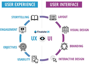
Let's start by identifying what actually is user experience. Often, user experience (UX) and user interface (UI) end up being used interchangeably. However, this is not accurate as they both approach different aspects of user interactions. Let's look at the image below to see what aspects fall under each of these design theories.
1. Taking a Consultative Approach to Improve User Experience
Our products require a lot of technical information that not every customer will have, so we are in the process of revamping our sales funnel to take a consultative approach to the sales process. It will create three distinct sales funnels that are based on the customers' skill level: straight to the shopping cart for professionals and a question/answer for novices.
2. Determining Calls to Action
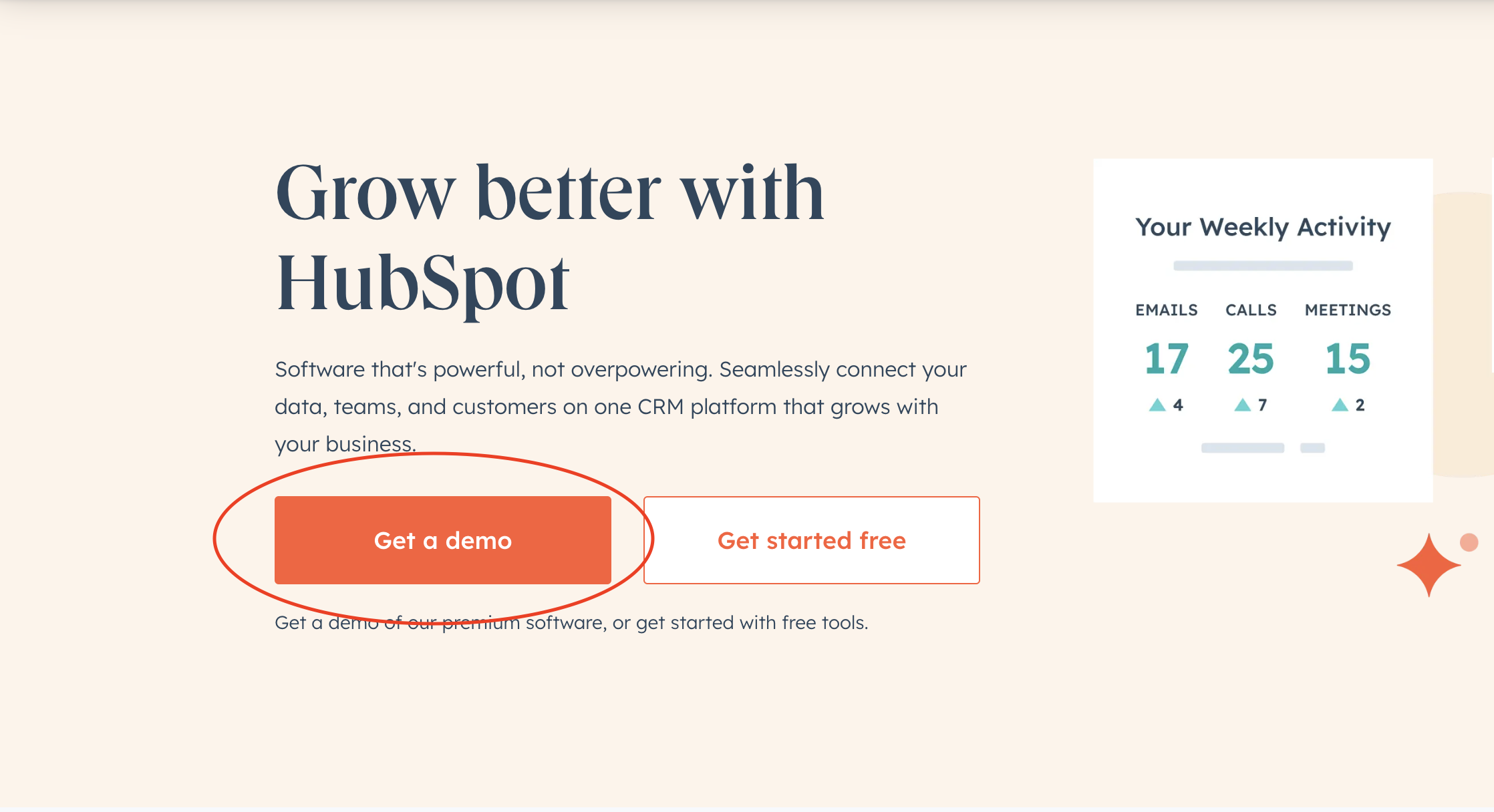
We are always playing around with our call-to-action buttons or flow. In order to properly optimize, you need to first determine the number one action that you are optimizing for. For us, it's to contact us for more information, so everything we do in our design and UX complements that. Once you know what action you want a user to take, A/B test a few different approaches to see what works best.
Here's an example of what a call-to-action button looks like on HubSpot's home page:
3. Testing and Monitoring
We use screen capture tools like Inspectlet to see what people are doing on-site, host user-testing days where we can observe people using our website live and listen to them narrate their experience and pay attention to the metrics on our site. These three tactics tell us where people are having trouble, what their opinions are about the site, and what they are doing numerically.
— Nick Soman, Decent
4. Implementing Responsive Web Design
RWD is a ux strategy aimed at crafting sites to provide an optimal viewing experience — easy reading and navigation with a minimum of resizing, panning, and scrolling — across a wide range of devices (from desktop computer monitors to mobile phones).
Here's what the home page of Magic Logix looks like while on mobile:

5. Tracking What's Hot and What's Not
We use Crazy Egg to track and understand what users do on our sites. Crazy Egg provides visual heat maps and scroll maps that show you where users click and what they do. We use this information to make changes on our sites that aim to increase conversions. Using this tool is a great way to add elements that improve a user's experience.
— Brett Farmiloe, Digital Marketing Agency
6. Making It Social
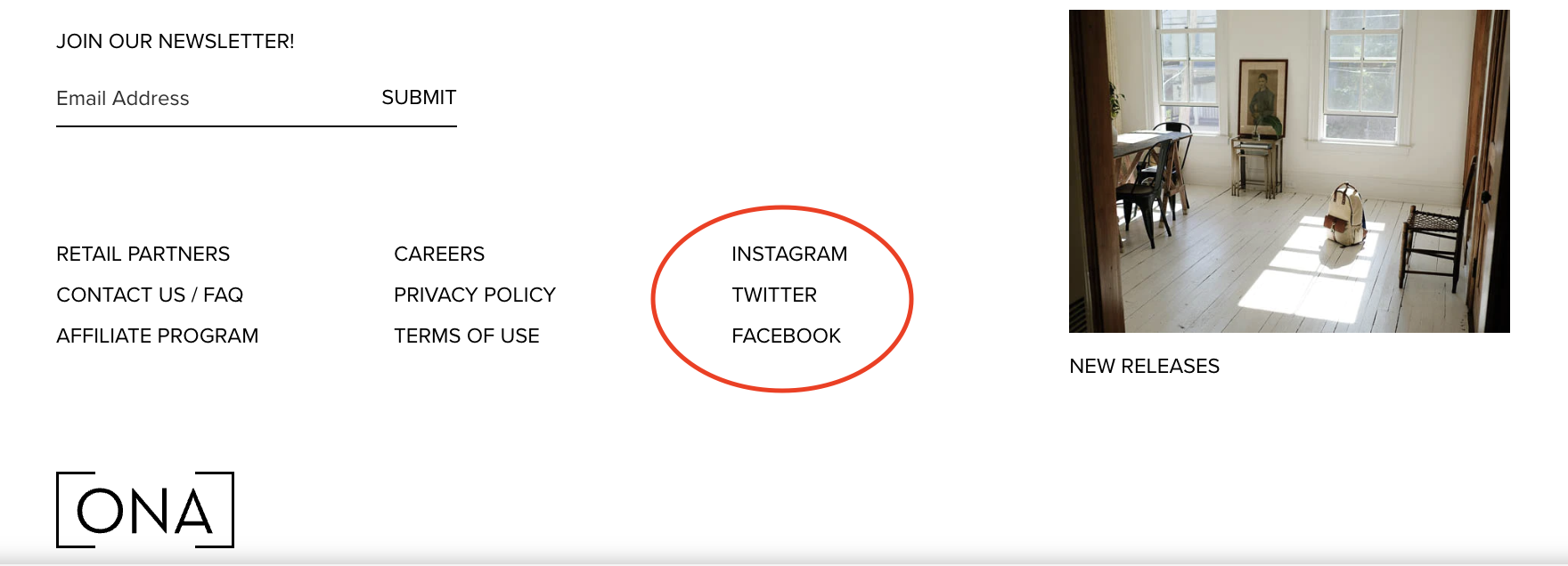
We're very intentional about making it easy for visitors to connect with us on various social platforms. We include links to our social networks on every page, not just for the heck of it, but because social networks are where visitors can interact and get an even better feel for who we are as a company and a brand.
— Tracy Foster, ONA
Here's what one of the social links looks like on ONA's website:
7. Trying Good Old-Fashioned Testing
There are many tools that allow you to improve the user experience of websites and apps, even to the level of watching videos of their mouse moving around on-screen. But nothing beats good old-fashioned in-person usability testing. We offer $25 gift cards to random people who come into our office and use our product for 30 minutes. This is almost always the most valuable 30 minutes of our week.
— James Simpson, GoldFire Studios
8. Avoiding Overwhelming Users With Data Entry
Inputting a bunch of crap into a thousand form fields before even using an app is awful. This is very common with business and enterprise software. We believe that business software doesn't have to stick, so we use a "drip" methodology for data entry. We ask users to input 30 bits of data over 30 days, rather than inputting 30 bits of data right now over 30 minutes.
9. Educating Consumers
The user experience itself is highly intuitive and the result of significant research and development in the early days. We now invest our time and efforts in consumer education and familiarizing users with a behavior that is still relatively new, and we are making some good traction here. We are also working on integrating our app more seamlessly with social media.
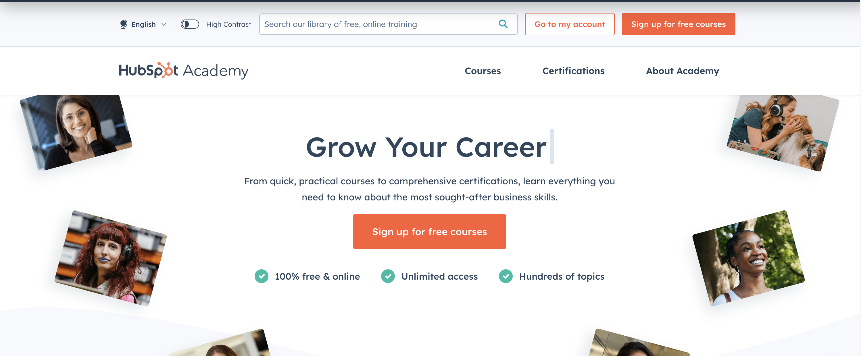
One way that HubSpot educates its customers is through the HubSpot Academy. Where users not only learn how to use the product, but how the product fits into their everyday workflow and how they can leverage it to maximize success.
10. Using Customer Surveys
We employ customer service surveys and have constant communication between our customer service department and our tech team. Barton is a 100 percent online company, so it is critical that the purchase and fulfillment process runs smoothly. We take immediate action on any problems we find, and we continually split-test our website processes to make them better for our customers.
— Joe Barton, Barton Publishing
11. Interviewing Users
We use Mixpanel to send push notifications to our most active users and conduct interviews with them. These interviews help us understand how to segment our users and learn the precise value they derive from the app. This is hard to ascertain simply by staring at numbers and graphs in our analytics platforms, which is why qualitative feedback is a very important counterpart to quantitative data.
— Michael Simpson, DJZ
Here's an example of what the Mixpanel interface looks like: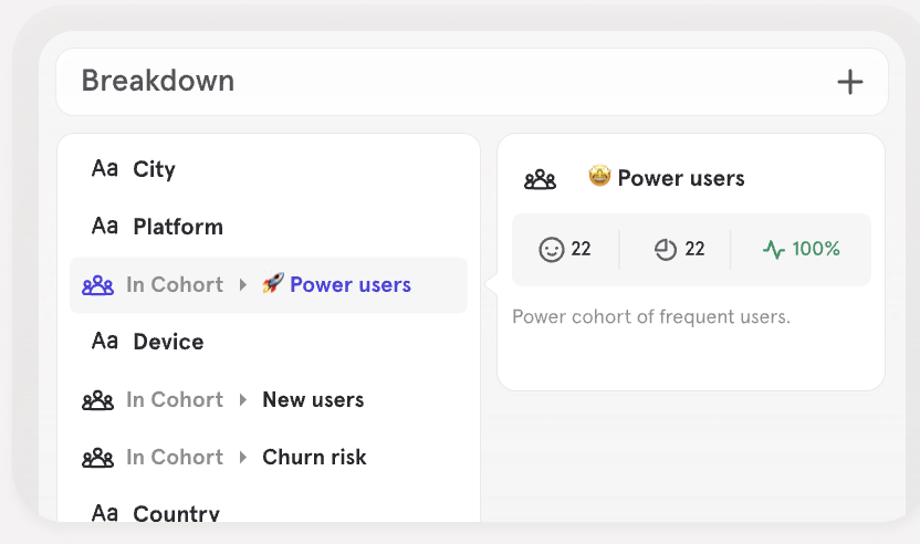
12. Optimizing Language Capabilities
Adding SaaS language translation and interactive audio/visual chat features is helping me improve website user experiences. Communicating with customers in their native languages builds credibility and brand loyalty.
— Joseph Yi, A Forever Recovery
Finally, for the sake of being thorough, let's look at some more abstract ideas on how you can use the above concepts to build a better user experience. The video below covers five different ways that you can accomplish UX optimization. When used with the aforementioned concepts, you can improve your site dramatically.
User Experience Is More Than User Interface Design
A good UX design is not one-size-fits-all; it must be tailored to meet the specific needs of your users. This is why UX designers must consider the entire customer journey to create a great user experience. This means focusing on things like branding, site architecture, and how they will troubleshoot the product so they can account for every type of interaction your users will have with your website.
The point here is that web designers need to look beyond the user interface if they want to improve the overall user experience. Yes, there are fundamental best practices you should follow to create a user-friendly site, but understanding your users wants, needs, and expectations will help you create an interface that feels intended for your audience.
Improving Your User Experience
Learning how to build an effective user experience can feel like a heavy task, but with the right information, you can set yourself up for success with very little effort. This post covers a lot of information, from various things to consider and ways to plan and test your changes. Using all of this information together can effectively improve your entire site and do so very quickly.
User Experience
